Embed Size (px)
Citation preview
Name: Andy PattersonCandidate Number: 4113Center Name: St. Andrew’s Catholic SchoolCenter Number: 64135
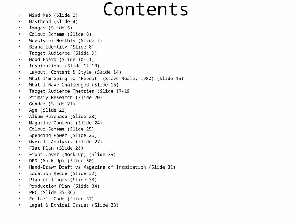
Contents• Mind Map (Slide 3)• Masthead (Slide 4)• Images (Slide 5)• Colour Scheme (Slide 6)• Weekly or Monthly (Slide 7)• Brand Identity (Slide 8)• Target Audience (Slide 9)• Mood Board (Slide 10-11)• Inspirations (Slide 12-13)• Layout, Content & Style (Slide 14)• What I’m Going to “Repeat” (Steve Neale, 1980) (Slide 15)• What I Have Challenged (Slide 16)• Target Audience Theories (Slide 17-19)• Primary Research (Slide 20)• Gender (Slide 21)• Age (Slide 22)• Album Purchase (Slide 23)• Magazine Content (Slide 24)• Colour Scheme (Slide 25)• Spending Power (Slide 26)• Overall Analysis (Slide 27)• Flat Plan (Slide 28)• Front Cover (Mock-Up) (Slide 29)• DPS (Mock-Up) (Slide 30)• Hand-Drawn Draft vs Magazine of Inspiration (Slide 31)• Location Recce (Slide 32)• Plan of Images (Slide 33)• Production Plan (Slide 34)• PPC (Slide 35-36)• Editor’s Code (Slide 37)• Legal & Ethical Issues (Slide 38)
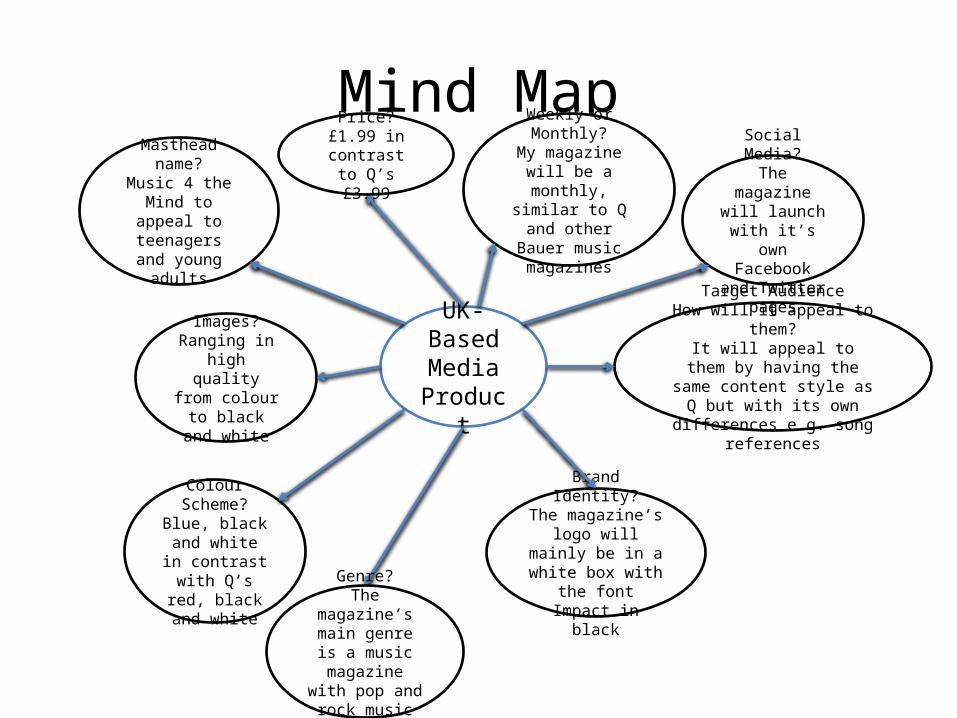
Mind Map
UK-Based Media
Product
Masthead name?Music 4 the Mind
to appeal to teenagers and young adults
Colour Scheme?Blue, black and
white in contrast with Q’s red,
black and white
Brand Identity?The magazine’s logo will mainly be in a white box with the font Impact in black
Images?Ranging in high
quality from colour to black
and white
Weekly or Monthly?
My magazine will be a monthly,
similar to Q and other Bauer music
magazines
Target AudienceHow will it appeal to them?
It will appeal to them by having the same content style as Q but with its own differences
e.g. song references
Genre?The magazine’s main genre is a music magazine
with pop and rock music genres
Social Media?The magazine
will launch with it’s own
Facebook and Twitter pages
Price?£1.99 in
contrast to Q’s £3.99
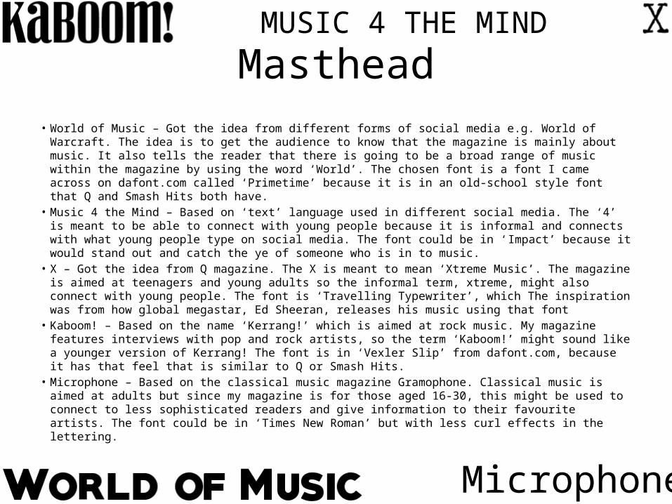
Masthead• World of Music – Got the idea from different forms of social media e.g. World of Warcraft. The idea is to
get the audience to know that the magazine is mainly about music. It also tells the reader that there is going to be a broad range of music within the magazine by using the word ‘World’. The chosen font is a font I came across on dafont.com called ‘Primetime’ because it is in an old-school style font that Q and Smash Hits both have.
• Music 4 the Mind – Based on ‘text’ language used in different social media. The ‘4’ is meant to be able to connect with young people because it is informal and connects with what young people type on social media. The font could be in ‘Impact’ because it would stand out and catch the ye of someone who is in to music.
• X – Got the idea from Q magazine. The X is meant to mean ‘Xtreme Music’. The magazine is aimed at teenagers and young adults so the informal term, xtreme, might also connect with young people. The font is ‘Travelling Typewriter’, which The inspiration was from how global megastar, Ed Sheeran, releases his music using that font
• Kaboom! – Based on the name ‘Kerrang!’ which is aimed at rock music. My magazine features interviews with pop and rock artists, so the term ‘Kaboom!’ might sound like a younger version of Kerrang! The font is in ‘Vexler Slip’ from dafont.com, because it has that feel that is similar to Q or Smash Hits.
• Microphone – Based on the classical music magazine Gramophone. Classical music is aimed at adults but since my magazine is for those aged 16-30, this might be used to connect to less sophisticated readers and give information to their favourite artists. The font could be in ‘Times New Roman’ but with less curl effects in the lettering.
MUSIC 4 THE MIND
Microphone
Images
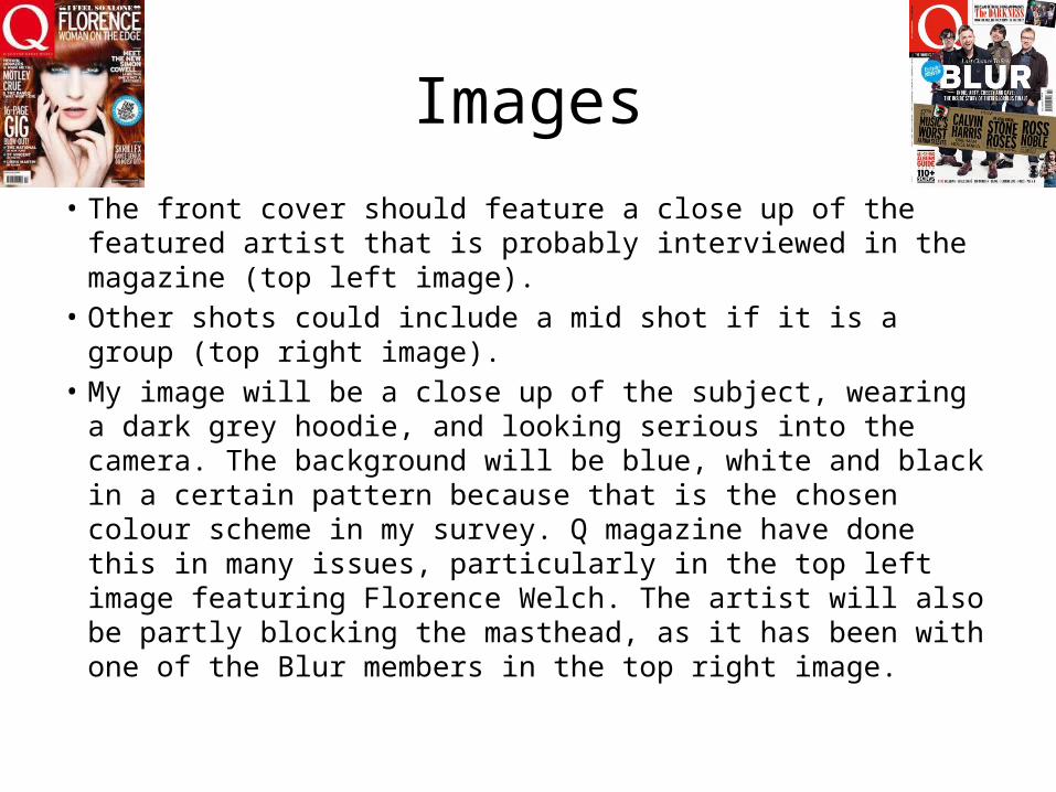
• The front cover should feature a close up of the featured artist that is probably interviewed in the magazine (top left image).
• Other shots could include a mid shot if it is a group (top right image).
• My image will be a close up of the subject, wearing a dark grey hoodie, and looking serious into the camera. The background will be blue, white and black in a certain pattern because that is the chosen colour scheme in my survey. Q magazine have done this in many issues, particularly in the top left image featuring Florence Welch. The artist will also be partly blocking the masthead, as it has been with one of the Blur members in the top right image.
Colour Scheme
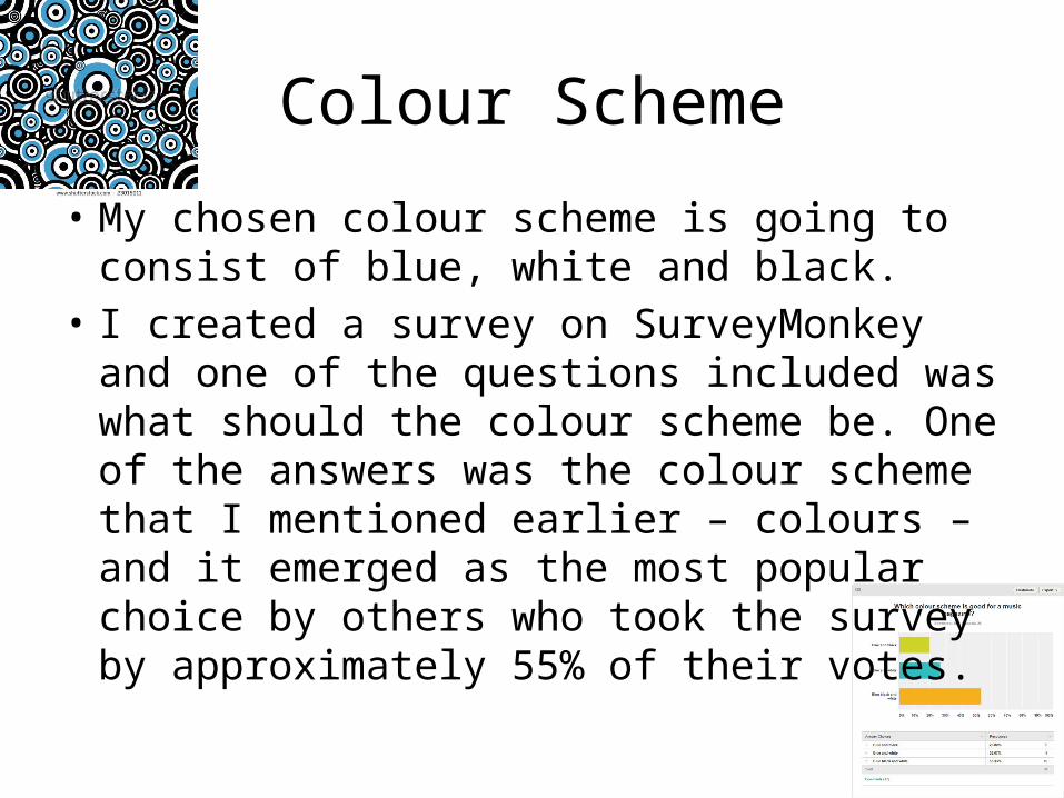
• My chosen colour scheme is going to consist of blue, white and black.
• I created a survey on SurveyMonkey and one of the questions included was what should the colour scheme be. One of the answers was the colour scheme that I mentioned earlier – colours – and it emerged as the most popular choice by others who took the survey by approximately 55% of their votes.
Weekly or Monthly?
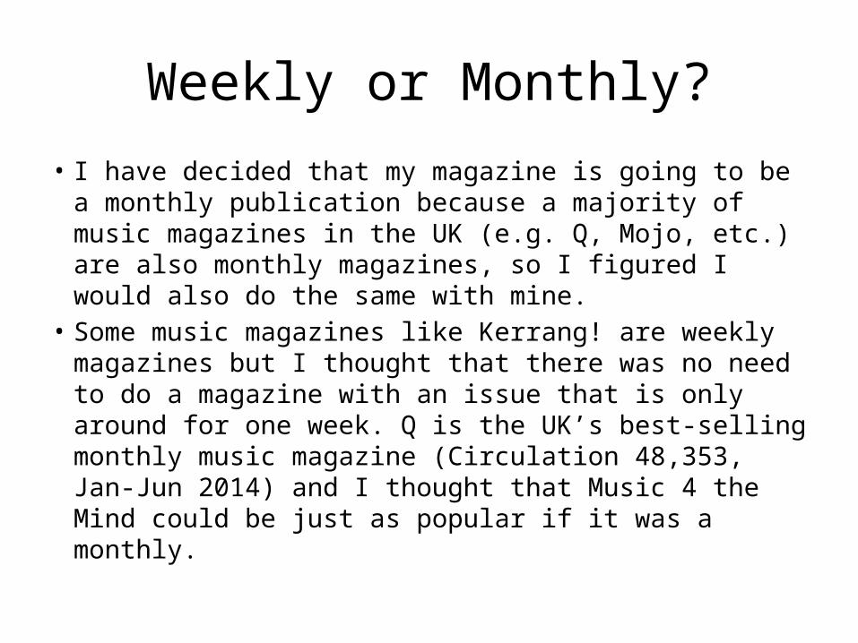
• I have decided that my magazine is going to be a monthly publication because a majority of music magazines in the UK (e.g. Q, Mojo, etc.) are also monthly magazines, so I figured I would also do the same with mine.
• Some music magazines like Kerrang! are weekly magazines but I thought that there was no need to do a magazine with an issue that is only around for one week. Q is the UK’s best-selling monthly music magazine (Circulation 48,353, Jan-Jun 2014) and I thought that Music 4 the Mind could be just as popular if it was a monthly.
Brand Identity
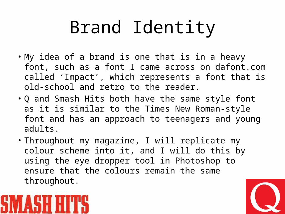
• My idea of a brand is one that is in a heavy font, such as a font I came across on dafont.com called ‘Impact’, which represents a font that is old-school and retro to the reader.
• Q and Smash Hits both have the same style font as it is similar to the Times New Roman-style font and has an approach to teenagers and young adults.
• Throughout my magazine, I will replicate my colour scheme into it, and I will do this by using the eye dropper tool in Photoshop to ensure that the colours remain the same throughout.
Target Audience – How will it appeal to them?
• My target audience is for teenagers and young adults and my magazine will have that appeal that is similar to Q.
• Q is mainly targeted for those aged 15-34 (a very broad age range which is significant to the depth of it’s appeal), who are looking for a more sophisticated magazine and want to know more about the artist by what he/she does. My magazine is for those who are younger and will be interested in what the artist also does e.g. what they do while touring or what they secretly do that no-one would expect.
Inspired by Q and Smash Hits
• People who loved Smash Hits in the 90s have grown up into mature Q readers. Music 4 the Mind will have a cheeky yet well-informed editorial tone which will make previous Smash Hits familiar with what they read before, for example, in the Smash Hits Michael Jackson issue it features articles on how to moonwalk and the Bubbles Story: “The ultimate guide to the life and times of the world’s most famous chimpanzee. Steps before current ‘violent’ period”.
• My magazine will have similarly irreverent and amusing storylines.
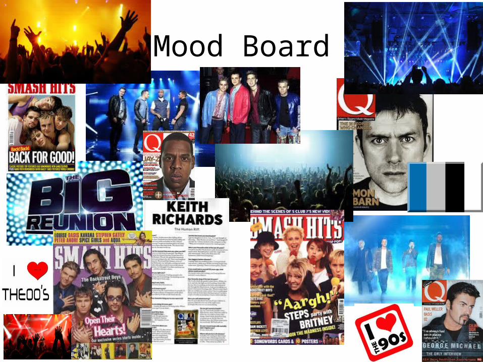
Mood Board
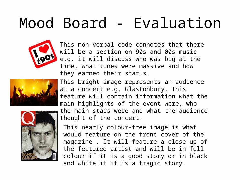
Mood Board - EvaluationThis non-verbal code connotes that there will be a section on 90s and 00s music e.g. it will discuss who was big at the time, what tunes were massive and how they earned their status.
This bright image represents an audience at a concert e.g. Glastonbury. This feature will contain information what the main highlights of the event were, who the main stars were and what the audience thought of the concert.
This nearly colour-free image is what would feature on the front cover of the magazine . It will feature a close-up of the featured artist and will be in full colour if it is a good story or in black and white if it is a tragic story.
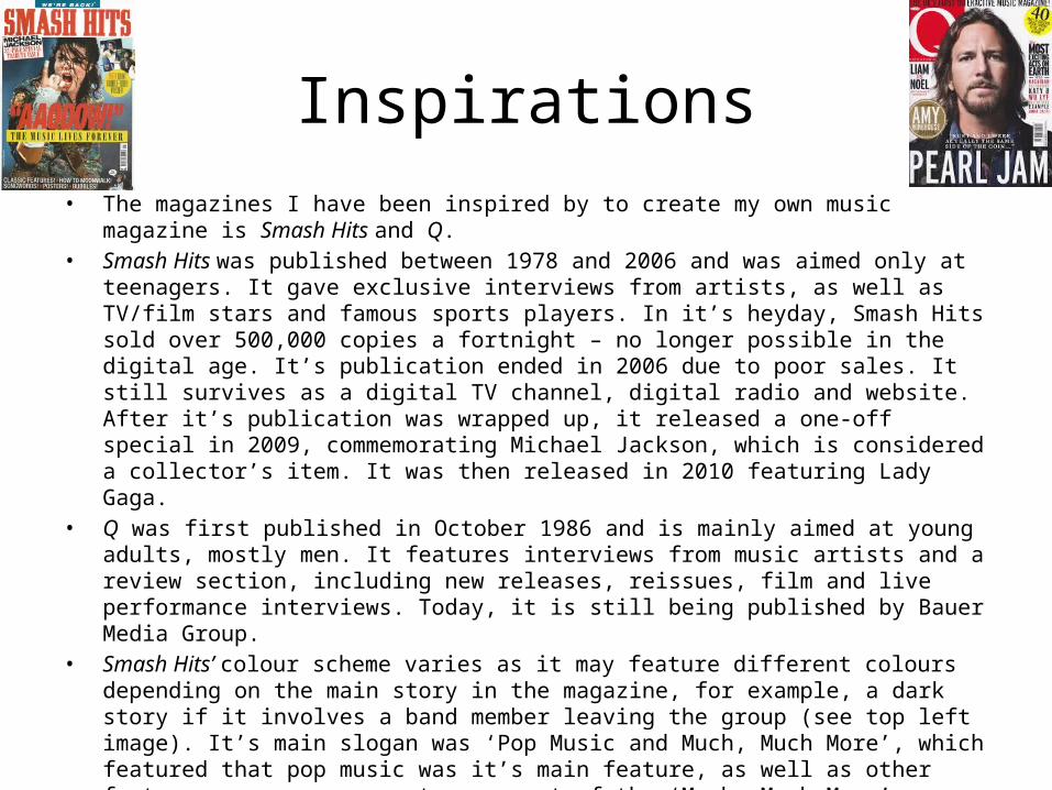
Inspirations• The magazines I have been inspired by to create my own music magazine is Smash Hits and Q.• Smash Hits was published between 1978 and 2006 and was aimed only at teenagers. It gave
exclusive interviews from artists, as well as TV/film stars and famous sports players. In it’s heyday, Smash Hits sold over 500,000 copies a fortnight – no longer possible in the digital age. It’s publication ended in 2006 due to poor sales. It still survives as a digital TV channel, digital radio and website. After it’s publication was wrapped up, it released a one-off special in 2009, commemorating Michael Jackson, which is considered a collector’s item. It was then released in 2010 featuring Lady Gaga.
• Q was first published in October 1986 and is mainly aimed at young adults, mostly men. It features interviews from music artists and a review section, including new releases, reissues, film and live performance interviews. Today, it is still being published by Bauer Media Group.
• Smash Hits’ colour scheme varies as it may feature different colours depending on the main story in the magazine, for example, a dark story if it involves a band member leaving the group (see top left image). It’s main slogan was ‘Pop Music and Much, Much More’, which featured that pop music was it’s main feature, as well as other features e.g. soap secrets are part of the ‘Much, Much More’.
• Q’s colour scheme is mostly a white background, as it is more mature than Smash Hits, along with the red ‘Q’ logo on the top left of the issue. Other colour schemes include different colours of the font on the front cover. The verbal code of its strapline ‘Discover Great Music’ ‘informs’ (Katz) the reader that there is more to the artist than the music made, for example how music is made and what the possible inspirations for it were. I will consider what I have found out when I create my own strapline and I intend it to entertain, as Katz’ theory was ‘inform and entertain’.

Inspirations Continued• Smash Hits and Q were inspirations for me because over the years,
it had various covers of different music artists on each issue and that got me thinking that I should create a music magazine that has the same format that has the same feature on the front cover.
• I was also inspired by an interview with Jake Bugg in Q Magazine talking about his newfound success and his future in the music industry. This was also featured in Smash Hits, where it talked about a band member leaving the group, and other artists giving their say on the event.
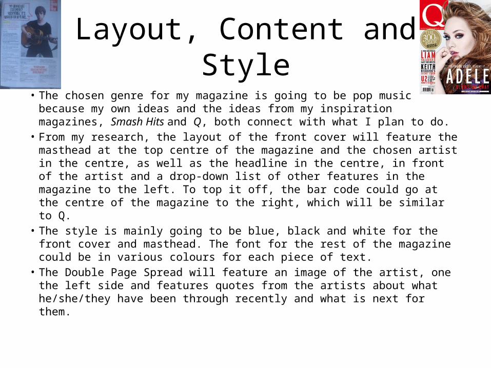
Layout, Content and Style• The chosen genre for my magazine is going to be pop music because my
own ideas and the ideas from my inspiration magazines, Smash Hits and Q, both connect with what I plan to do.
• From my research, the layout of the front cover will feature the masthead at the top centre of the magazine and the chosen artist in the centre, as well as the headline in the centre, in front of the artist and a drop-down list of other features in the magazine to the left. To top it off, the bar code could go at the centre of the magazine to the right, which will be similar to Q.
• The style is mainly going to be blue, black and white for the front cover and masthead. The font for the rest of the magazine could be in various colours for each piece of text.
• The Double Page Spread will feature an image of the artist, one the left side and features quotes from the artists about what he/she/they have been through recently and what is next for them.
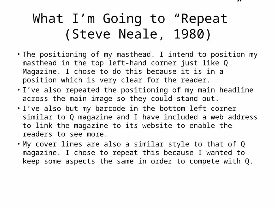
What I’m Going to “Repeat” (Steve Neale, 1980)
• The positioning of my masthead. I intend to position my masthead in the top left-hand corner just like Q Magazine. I chose to do this because it is in a position which is very clear for the reader.
• I’ve also repeated the positioning of my main headline across the main image so they could stand out.
• I’ve also but my barcode in the bottom left corner similar to Q magazine and I have included a web address to link the magazine to its website to enable the readers to see more.
• My cover lines are also a similar style to that of Q magazine. I chose to repeat this because I wanted to keep some aspects the same in order to compete with Q.
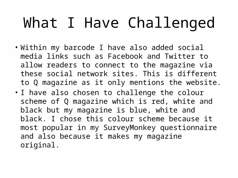
What I Have Challenged
• Within my barcode I have also added social media links such as Facebook and Twitter to allow readers to connect to the magazine via these social network sites. This is different to Q magazine as it only mentions the website.
• I have also chosen to challenge the colour scheme of Q magazine which is red, white and black but my magazine is blue, white and black. I chose this colour scheme because it most popular in my SurveyMonkey questionnaire and also because it makes my magazine original.

Target Audience• Hartley’s 7 Subjectivities• Age Group – The age group is mainly for those aged 16-30, because my
magazine is aimed at teenagers and young adults, like Smash Hits but older• Gender – The gender for this magazine is for both genders, but I think that it will
be a 50/50 division of the majority of the gender that reads magazines. I am very encouraged by my SurveyMonkey research which shows that women like my offering. I think that is because Smash Hits had a very high female readership and I am hoping to catch the grown up Smash Hits/Q reader.
• Self-Image – May offer readers advice on how to be famous• Family – Place in the family, most likely to be child.• Nation – The nationality will be English, as the magazine will initially not be sold
anywhere else other than the UK.• Ethnicity – The ethnic group can be for any race that is familiar to pop music• Class – Some stars might be living rough, after being successful for a few years
e.g. having lost everything
Target Audience Continued
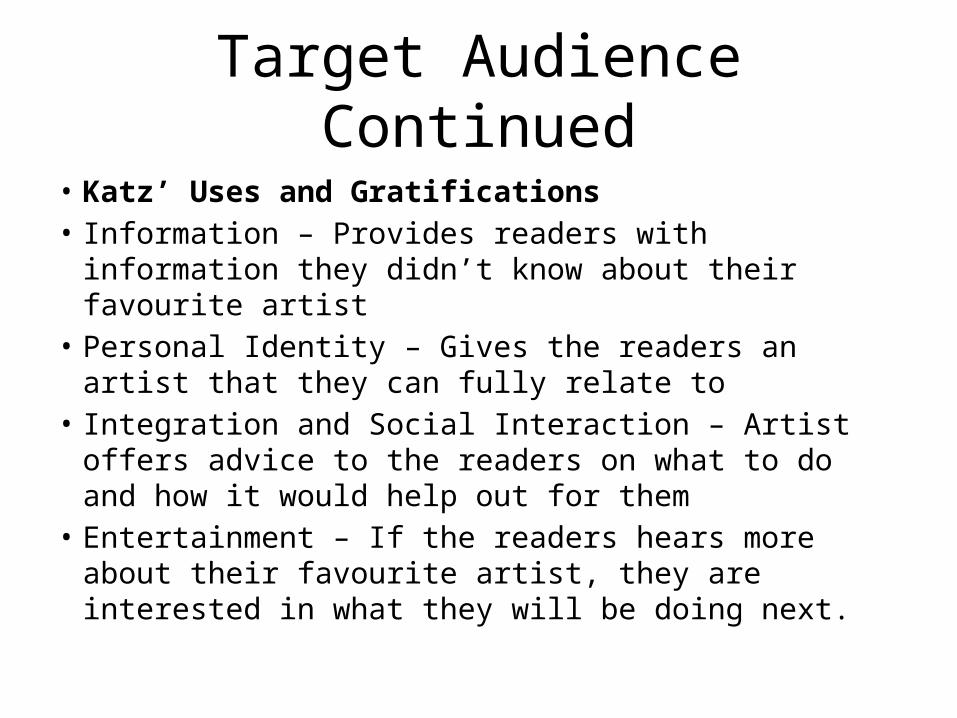
• Katz’ Uses and Gratifications• Information – Provides readers with information they
didn’t know about their favourite artist• Personal Identity – Gives the readers an artist that they can
fully relate to• Integration and Social Interaction – Artist offers advice to
the readers on what to do and how it would help out for them
• Entertainment – If the readers hears more about their favourite artist, they are interested in what they will be doing next.

Target Audience Continued
• Socio-Economic Needs• My magazine is mostly aimed at the ‘C2’, ‘D’ and ‘E’
categories in the ABC1 chart because my target audience is teenagers and young adults who are unemployed, still at school or working casually. This group is very hard to reach in magazines these days, however my SurveyMonkey shows that they are prepared to pay £1.99 of their own money to buy Music 4 the Mind.
• Other members of that group are pensioners or widows, but my magazine doesn’t appeal to them
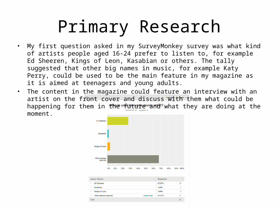
Primary Research• My first question asked in my SurveyMonkey survey was what kind of artists people aged 16-
24 prefer to listen to, for example Ed Sheeren, Kings of Leon, Kasabian or others. The tally suggested that other big names in music, for example Katy Perry, could be used to be the main feature in my magazine as it is aimed at teenagers and young adults.
• The content in the magazine could feature an interview with an artist on the front cover and discuss with them what could be happening for them in the future and what they are doing at the moment.

Gender
• According to my Survey, over half of the respondents were female. The majority of Q readers are male and so in order to compete with this magazine I have to take this into consideration when analysing the rest of my results in this questionnaire. As mostly women answered my questionnaire I need to be aware that they may have different opinions to men. However as I intend to target my magazine at both men and women the results will be very useful.

Age
• Over 80% of people who answered my questionnaire were under 18. I intend my magazine to be targeted at teenagers and young adults and so the results that these respondents have given will benefit me greatly.
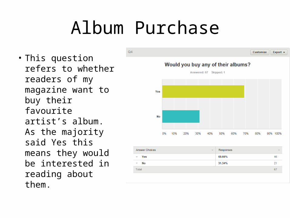
• This question refers to whether readers of my magazine want to buy their favourite artist’s album. As the majority said Yes this means they would be interested in reading about them.
Album Purchase
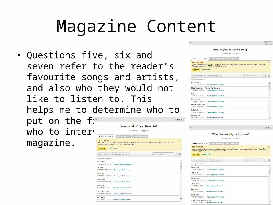
• Questions five, six and seven refer to the reader’s favourite songs and artists, and also who they would not like to listen to. This helps me to determine who to put on the front cover and who to interview within my magazine.
Magazine Content
Colour Scheme
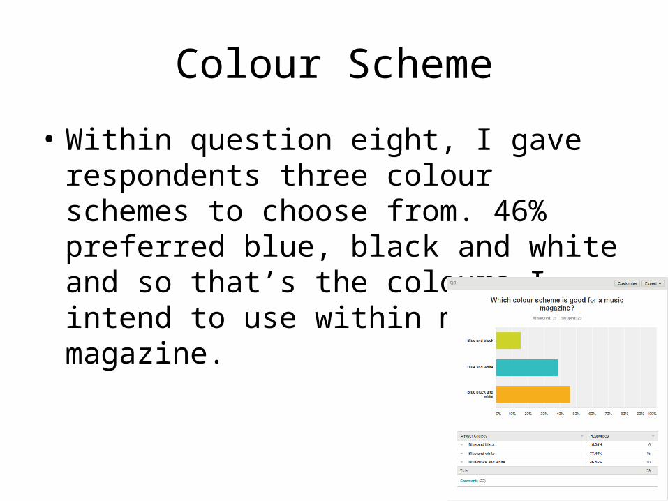
• Within question eight, I gave respondents three colour schemes to choose from. 46% preferred blue, black and white and so that’s the colours I intend to use within my magazine.
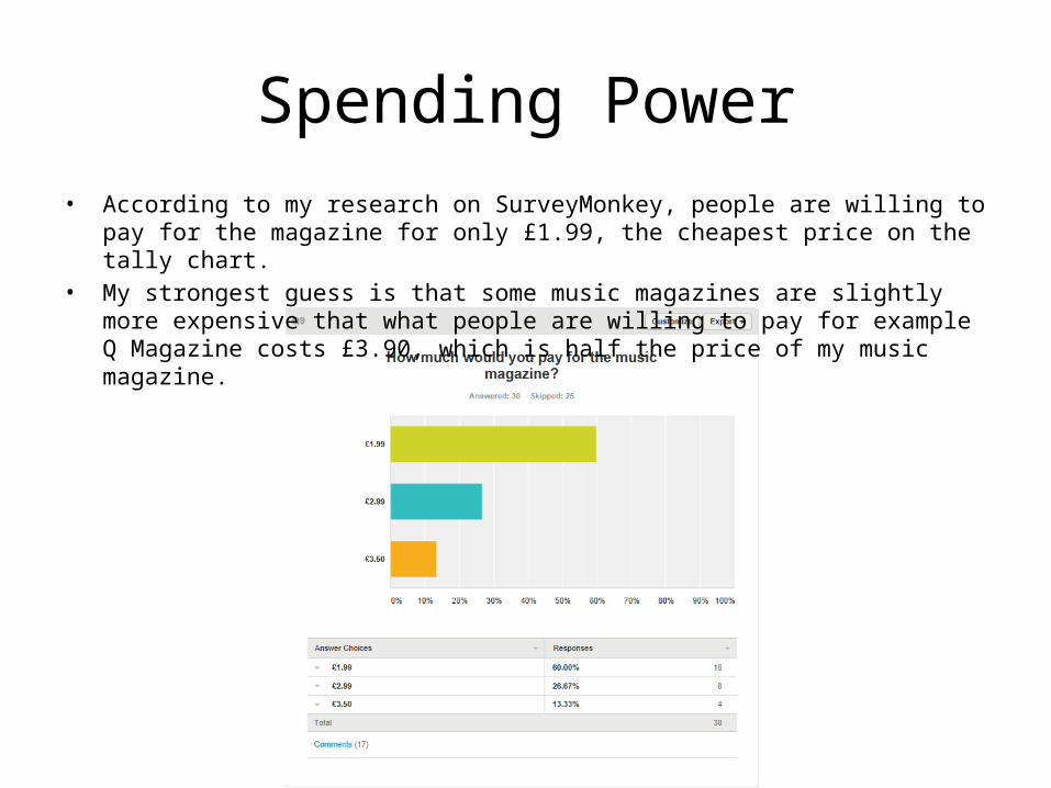
Spending Power• According to my research on SurveyMonkey, people are willing to pay for the magazine for
only £1.99, the cheapest price on the tally chart.• My strongest guess is that some music magazines are slightly more expensive that what
people are willing to pay for example Q Magazine costs £3.90, which is half the price of my music magazine.
Overall Analysis
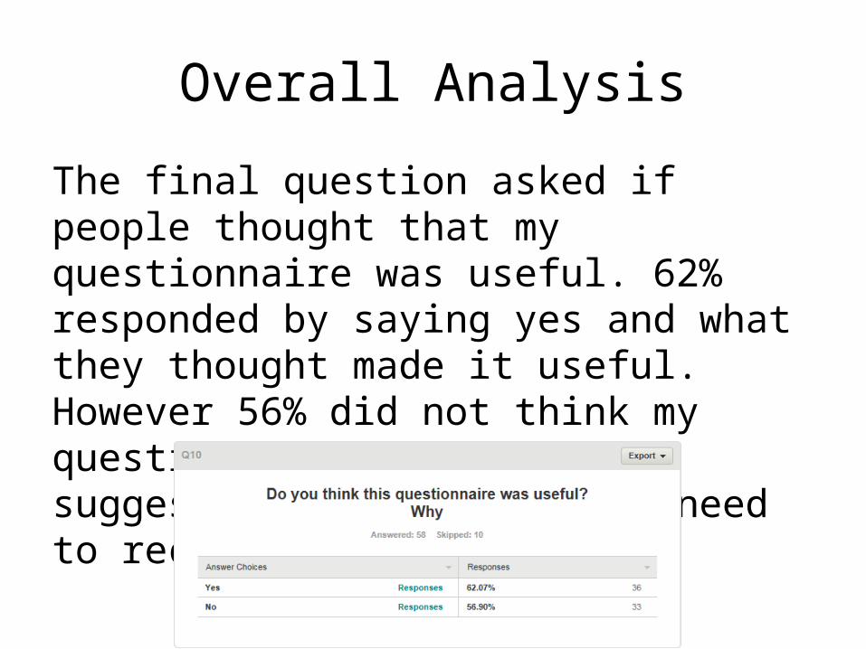
The final question asked if people thought that my questionnaire was useful. 62% responded by saying yes and what they thought made it useful. However 56% did not think my questionnaire was useful suggesting that I possibly need to reconsider my questions.
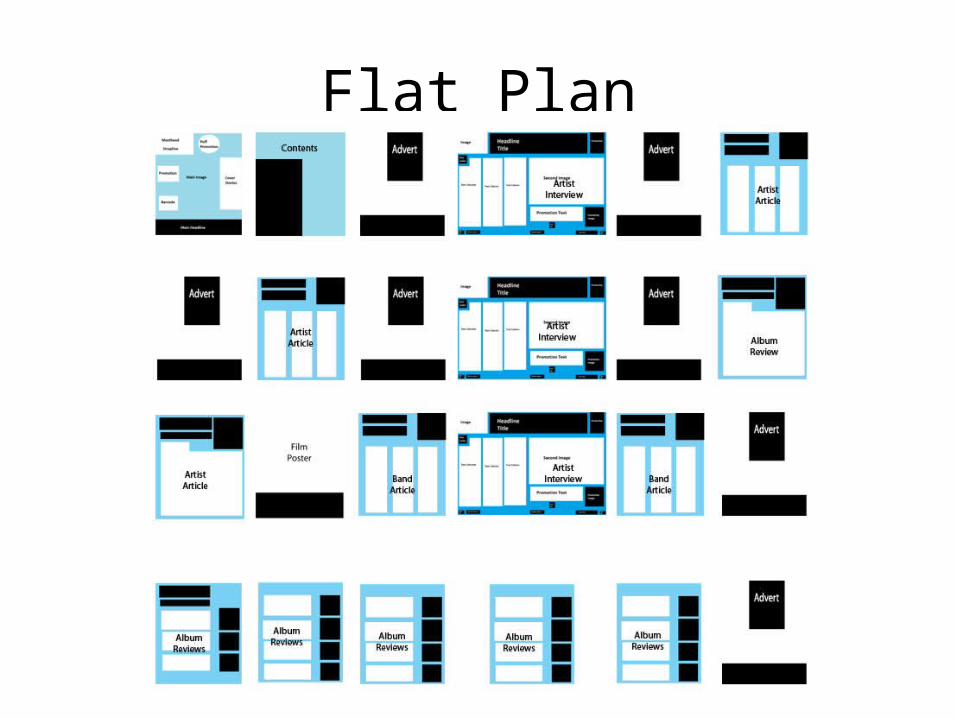
Flat Plan
Front Cover (Mock Up)
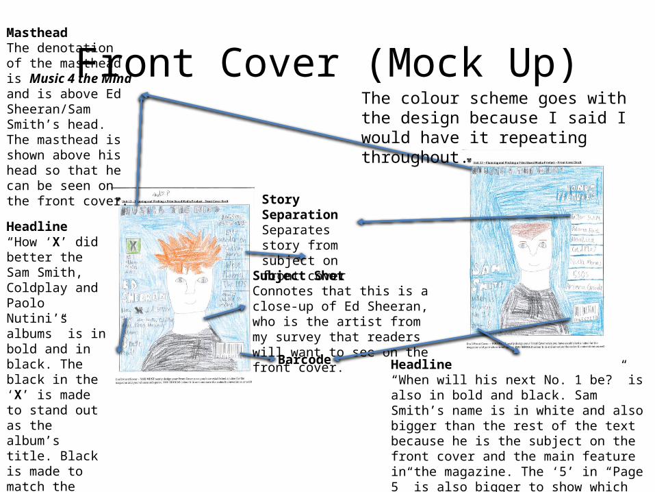
Barcode
Story SeparationSeparates story from subject on front cover
Headline“How ‘X’ did better the Sam Smith, Coldplay and Paolo Nutini’s albums” is in bold and in black. The black in the ‘X’ is made to stand out as the album’s title. Black is made to match the colour on the album cover. The ‘3’ in “3 Page Read” is white so it stands out against the blue background.
MastheadThe denotation of the masthead is Music 4 the Mind and is above Ed Sheeran/Sam Smith’s head. The masthead is shown above his head so that he can be seen on the front cover.
Subject ShotConnotes that this is a close-up of Ed Sheeran, who is the artist from my survey that readers will want to see on the front cover.
Headline“When will his next No. 1 be?” is also in bold and black. Sam Smith’s name is in white and also bigger than the rest of the text because he is the subject on the front cover and the main feature in the magazine. The ‘5’ in “Page 5” is also bigger to show which page Sam Smith is featured in.
The colour scheme goes with the design because I said I would have it repeating throughout.
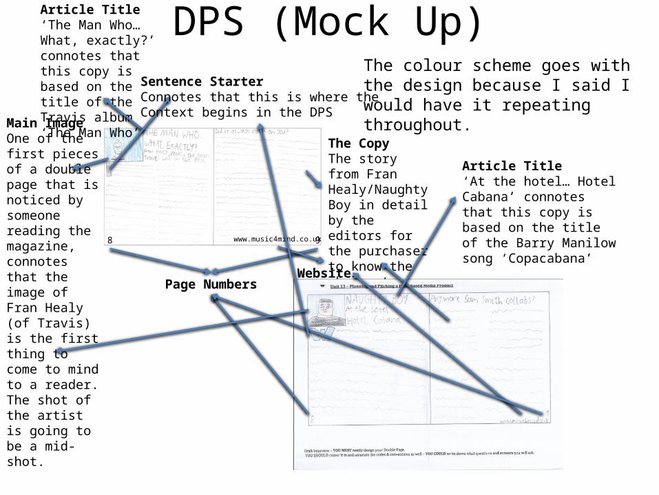
DPS (Mock Up)
8 9
Article Title‘The Man Who… What, exactly?’ connotes that this copy is based on the title of the Travis album ‘The Man Who’
Main ImageOne of the first pieces of a double page that is noticed by someone reading the magazine, connotes that the image of Fran Healy (of Travis) is the first thing to come to mind to a reader. The shot of the artist is going to be a mid-shot.
www.music4mind.co.uk
The CopyThe story from Fran Healy/Naughty Boy in detail by the editors for the purchaser to know the whole story about.
Page NumbersWebsite
Sentence StarterConnotes that this is where theContext begins in the DPS
Article Title‘At the hotel… Hotel Cabana’ connotes that this copy is based on the title of the Barry Manilow song ‘Copacabana’
The colour scheme goes with the design because I said I would have it repeating throughout.
Hand-Drawn Draft vs.
Magazine of Inspiration
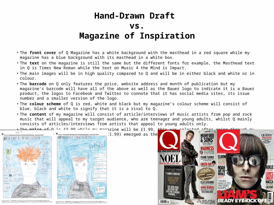
• The front cover of Q Magazine has a white background with the masthead in a red square while my magazine has a blue background with its masthead in a white box.
• The text on the magazine is still the same but the different fonts for example, the Masthead text in Q is Times New Roman while the text on Music 4 the Mind is Impact.
• The main images will be in high quality compared to Q and will be in either black and white or in colour.• The barcode on Q only features the price, website address and month of publication but my magazine’s barcode
will have all of the above as well as the Bauer logo to indicate it is a Bauer product, the logos to Facebook and Twitter to connote that it has social media sites, its issue number and a smaller version of the logo.
• The colour scheme of Q is red, white and black but my magazine’s colour scheme will consist of blue, black and white to signify that it is a rival to Q.
• The content of my magazine will consist of article/interviews of music artists from pop and rock music that will appeal to my target audience, who are teenager and young adults, whilst Q mainly consists of articles/interviews from artists that appeal to young adults only.
• The price of Q is £3.99 while my magazine will be £1.99, this was selected after going through my SurveyMonkey results and the price (£1.99) emerged as the most popular by those who took the survey.
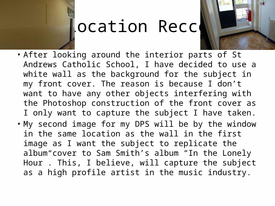
Location Recce
• After looking around the interior parts of St Andrews Catholic School, I have decided to use a white wall as the background for the subject in my front cover. The reason is because I don’t want to have any other objects interfering with the Photoshop construction of the front cover as I only want to capture the subject I have taken.
• My second image for my DPS will be by the window in the same location as the wall in the first image as I want the subject to replicate the album cover to Sam Smith’s album “In the Lonely Hour”. This, I believe, will capture the subject as a high profile artist in the music industry.
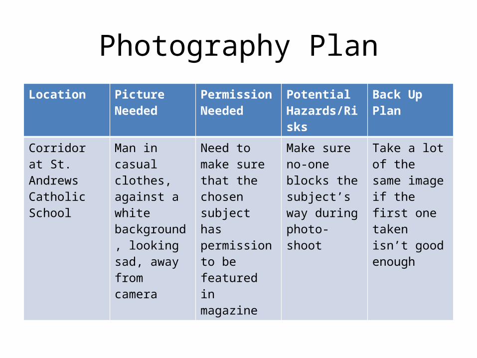
Photography PlanLocation Picture
NeededPermission Needed
Potential Hazards/Risks
Back Up Plan
Corridor at St. Andrews Catholic School
Man in casual clothes, against a white background, looking sad, away from camera
Need to make sure that the chosen subject has permission to be featured in magazine
Make sure no-one blocks the subject’s way during photo-shoot
Take a lot of the same image if the first one taken isn’t good enough
Production Plan• Date of publication – the first thing to do is to set up a date of publication. • Managing the schedule – this is a really important step that you should not take for granted
when it comes to the production of a magazine.• Editorial and budgetary decision – the next step that is taken during the production process
of a magazine is the editorial decision.• Content Acquisition – the most important step because without content we can’t have the
magazine in the first place. Content therefore is the main piece.• Sub-editing – this focuses on one major thing, which is quality control.• Page Layout – in big publications, there is a special team responsible for page layouts called
the layout staff.• Proofreading – once the above stage has been completed, the next stage is the proofreading.• File emailed to printer – After the proofreading stage, the desktop publishing file of the
entire magazine is sent to the printer whose job will be to print the magazine.• Distribution – the printing company, having finished with the printing of the magazines, will
package them neatly and send them to a warehouse.• http://hosbeg.com/the-magazine-production-process/
Press Complaints Commission• The Press Complaints Commission is currently in a phase of transition; and it will soon
be replaced by a new structure of independent self-regulation for the newspaper and magazine industries. Following the recommendations Sir Brian Leveson made in his Report published in November 2012, the magazine and newspaper industries have been creating a new, self-regulatory body - the Independent Press Standards Organisation (IPSO), in accordance with the Leveson principles. It is expected that IPSO will commence operations in September 2014. Barring unforeseen circumstances, the PCC will therefore be closing down in September.
• In the meantime, the PCC will continue to deal with complaints from members of the public, which can be made in the normal way throughout the transition period. All complaints that are already being handled on the closing down of the PCC will be carried over to IPSO. The terms of the Editors' Code of Practice remain the same, and members of PCC staff are available at any time to offer advice, including on an emergency out-of-hours basis for concerns relating to harassment or attention from journalists and photographers.
• http://www.pcc.org.uk/about/index.html
PCC Continued• All members of the press have a duty to maintain the highest professional standards. The
Code, which includes this preamble and the public interest exceptions below, sets the benchmark for those ethical standards, protecting both the rights of the individual and the public's right to know. It is the cornerstone of the system of self-regulation to which the industry has made a binding commitment.
• It is essential that an agreed code be honoured not only to the letter but in the full spirit. It should not be interpreted so narrowly as to compromise its commitment to respect the rights of the individual, nor so broadly that it constitutes an unnecessary interference with freedom of expression or prevents publication in the public interest.
• It is the responsibility of editors and publishers to apply the Code to editorial material in both printed and online versions of publications. They should take care to ensure it is observed rigorously by all editorial staff and external contributors, including non-journalists, in printed and online versions of publications.
• Editors should co-operate swiftly with the Press Complaints Commission in the resolution of complaints. Any publication judged to have breached the Code must publish the adjudication in full and with due prominence agreed by the Commission's Director, including headline reference to the PCC.
• http://www.pcc.org.uk/cop/practice.html
Editor’s Code• When creating my magazine I have to protect the rights of the subject
and ask permission to feature the subject if he/she is free.• As editor, it is my responsibility to follow the rules and regulations of the
editor's code. I will therefore have to check all editorial work, as well as any advertisements, feature before going into publication. I need to check that any advertisements won’t feature any swear words or false accusations.
• When it comes to writing an interview for a Double Page Spread (DPS), I need to make sure that it is not misleading and it is accurate in what is said. It should not feature any swear words; they will be blocked by the asterisk symbol.
• I also have to make sure that there is nothing that is featured without copyright. I will make sure that everything featured in the magazine is my own work.

Legal & Ethical Issues• “As free as the press may be in this country, there are still certain restrictions and
limitations that writers must keep firmly in mind. The most important of these, for your purposes, are the laws pertaining to libel, privacy and copyright. However, there are also some pertinent ethical restrictions not governed by law. Ethics are a personal, private matter to be decided by each writer according to the dictates of conscience, but publishing etiquette demands adherence to some basic ethical principles.” - http://www.zeepedia.com/read.php?legal_and_ethical_considerations_for_writers_libel_doctoring_quotes_feature_and_column_writing&b=74&c=44
• I am going to conform to these guidelines by only getting the writers to interview what is going on with the interviewee. However, they are not allowed to write about anything private about the subject in a magazine article for example who they are dating or any false information about the subject.
• Copyright – On the front cover of my magazine, the logos for Facebook and Twitter are found in the barcode. I am not allowed to reference them in my magazine without copyrighting them to their rightful owners.
• IP – I will use this in my magazine to copyright anything that does not belong to Bauer Media such as the Facebook/Twitter logos on the front cover.