Embed Size (px)
Citation preview
Deconstruction of film poster
Conventions
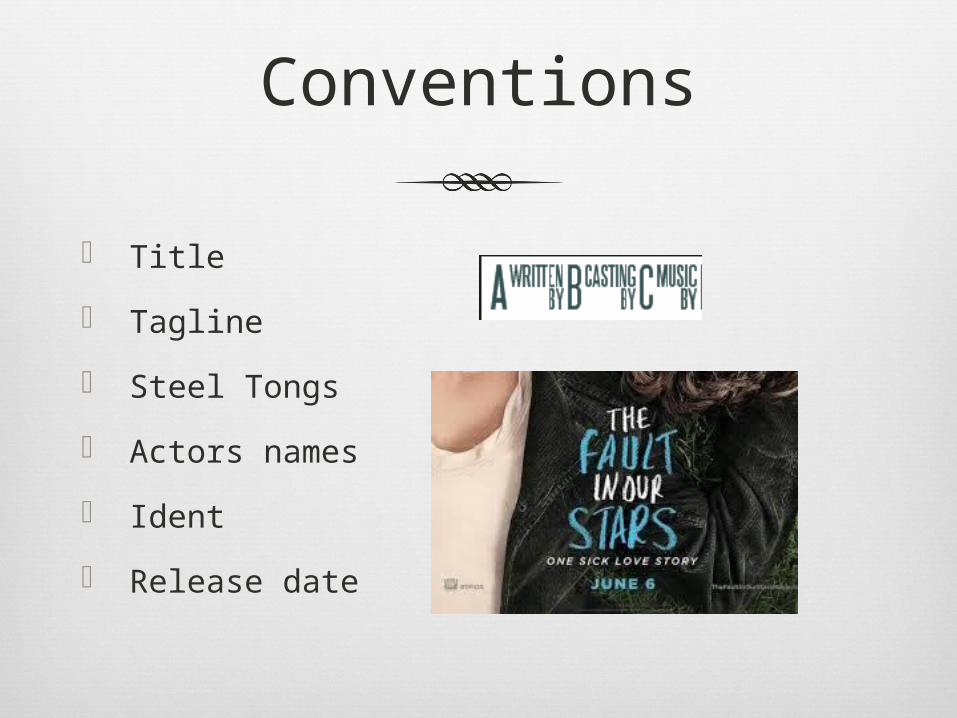
Title
Tagline
Steel Tongs
Actors names
Ident
Release date
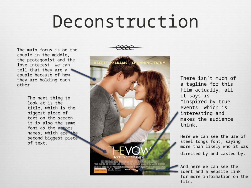
DeconstructionThe main focus is on the couple in the middle, the protagonist and the love interest. We can tell that they are a couple because of how they are holding each other.
The next thing to look at is the title, which is the biggest piece of text on the screen, it is also the same font as the actors names, which are the second biggest piece of text.
There isn’t much of a tagline for this film actually, all it says is “Inspired by true events” which is interesting and makes the audience think.
Here we can see the use of steel tongs font, saying more than likely who it was directed
by and casted by.
And here we can see the ident and a website link for more information on the film.
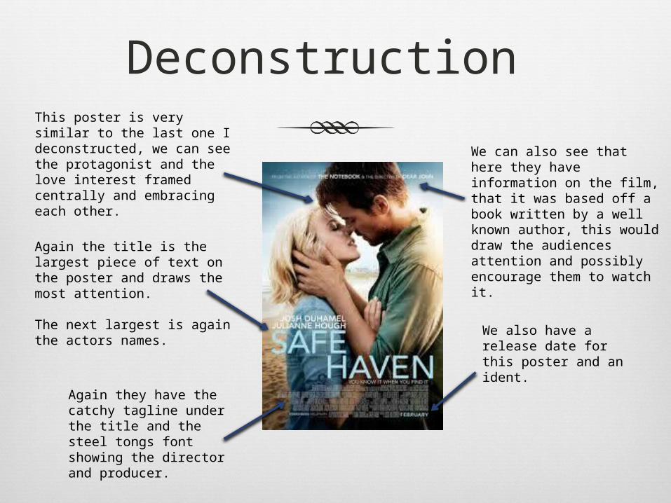
Deconstruction This poster is very similar to the last one I deconstructed, we can see the protagonist and the love interest framed centrally and embracing each other.
Again the title is the largest piece of text on the poster and draws the most attention.
The next largest is again the actors names.
We can also see that here they have information on the film, that it was based off a book written by a well known author, this would draw the audiences attention and possibly encourage them to watch it.
Again they have the catchy tagline under the title and the steel tongs font showing the director and producer.
We also have a release date for this poster and an ident.
Conclusion
A lot of romance films have the same conventions for their posters:
Two people in the centre frame usually embracing each other
A large bold and eye catching title with the actors names being the second largest piece of text.
Steel tongs font always at the bottom of the poster listing the director, casting director and the producer.
A catchy tagline and an ident at the bottom of the page.