Embed Size (px)
Citation preview

Making the Double-page Spread
Zachariah J. Rowell

Stage 1 - Drafting
• As with the front cover and contents page of my final product, I began by creating three drafts from which I could choose the best based on likeness to a real double-page spread and what I considered to be the requirements of my target audience.
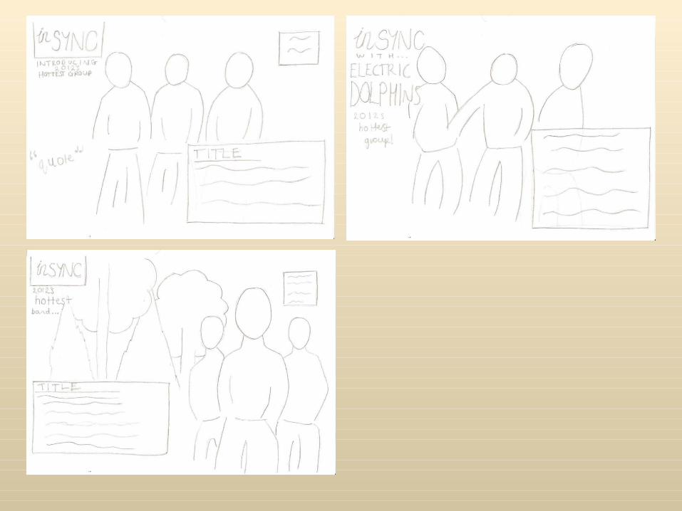

This is the design that appealed to me the most.
Stage 2 – Digital Mock-up
• After selecting my favourite draft, I progressed to make a digital mock-up of it. The reason I did this was to uncover any problems I might encounter in the process of making my final double-page spread ahead of time, and to give me a basic idea of what the spread might look like.

• This is how the mock-up turned out. I did not face any problems when creating this, but instead found a fade effect that I liked.
Stage 3 – Final Draft
• The final stage of my planning was to create a final hand-drawn draft from which I would construct the final double-page spread. As with the front cover and contents page, I took into account discoveries from the digital mock-up when creating this.

• This is the final draft of my double-page spread. I labelled it with a rough colour scheme which, again, follows on from the house style I had established on the front cover and contents page.

Stage 4 – Double-page Spread (Attempt 1)
• This is my first attempt at creating a double-page spread.
• I did not like this version for a number of reasons. The balance of beige and white seemed too unequal; the main image seemed too dark and it occurred to me that one model had his eyes closed; the fade effect at the top seemed pointless when “new for 2012” summed up the feature succinctly; and the caption beginning “from left to right...” seemed to be in the wrong place.

Stage 4 – Double-page Spread (Attempt 1)
• I attempted to improve the contrast and brightness of the image but I still thought the double-page spread looked unsuitable for my product, largely because of the fact that the model’s eyes were closed. It seemed too far away from professional standards. I did, however, like the brightness of the image.

Stage 4 – Double-page Spread (Attempt 2)
• This is my second attempt at the double-page spread. I made a number of changes and scrapped the old image altogether.
• I included an “inSync” logo at the top left of the spread along with “2012” to the right of it, but I felt this did not do a good job of indicating the feature was about a fresh group. I thought it seemed more like a poster.
• I used thicker text for the big quote. I liked the weight of this text but felt that it seemed too flat and mundane. The whole spread seemed like it could use some more work.

Stage 4 – Double-page Spread (Attempt 2)
• As an experiment, I edited my second attempt and used a spectrum effect on the photograph to communicate the feel of the music discussed in the article. I thought it was visually pleasing to some extent, but still too dark.
• I edited the logo at the top left in an attempt to better communicate that the feature was about a new band for 2012, but I thought it seemed tacky and didn’t blend in well with the background.
• The same can be said about the edit I made to the big quote – it seemed like it had been lifted off another page and dropped in place.
• I once again disliked the location of the caption.

Stage 4 – Double-page Spread (Final Version)
• This is the final version of my double-page spread.
• I was satisfied with this version because I had ironed out the issues other attempts had. I used a different picture where one model looks directly at the camera. This seemed more like a typical magazine photograph to me. I made sure that the image was bright and high contrast.
• I had also sorted out the problem with using the logo of my product on the spread, replacing it with a simple “new for 2012” banner (which follows the colour scheme). Finally, I used alternating text colours, as other media products do this and I thought it likened my product to real products more.