Embed Size (px)
Citation preview
Mobile Website Best Practices
Amanda OldhamWebsite Coordinator
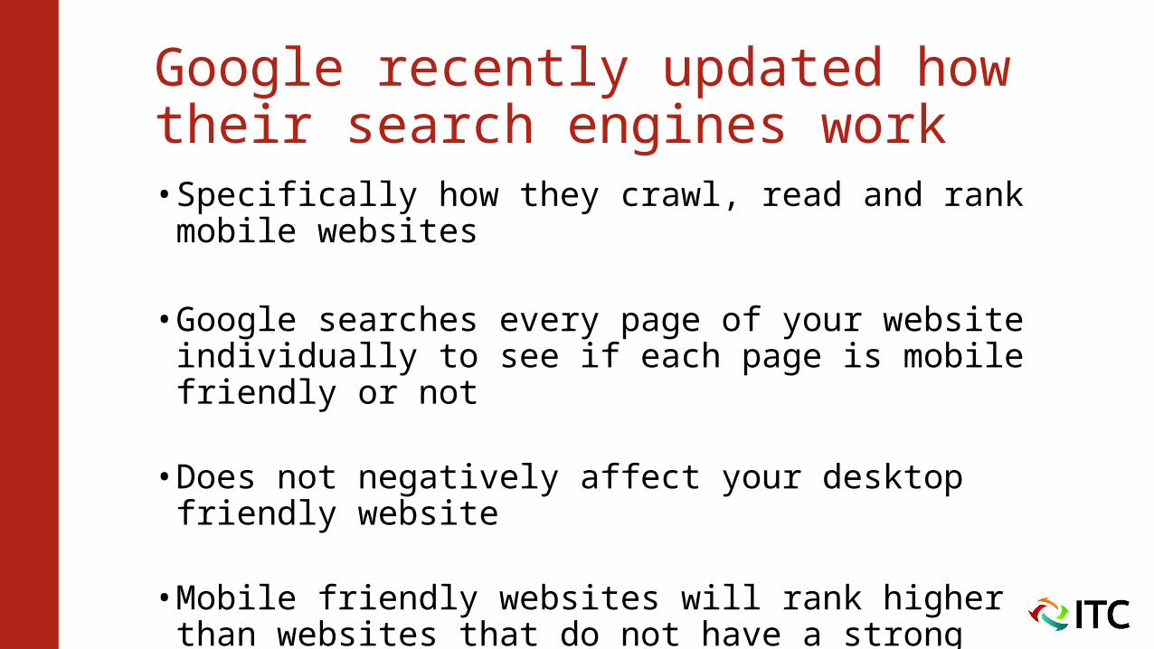
Google recently updated how their search engines work• Specifically how they crawl, read and rank mobile
websites
• Google searches every page of your website individually to see if each page is mobile friendly or not
• Does not negatively affect your desktop friendly website
• Mobile friendly websites will rank higher than websites that do not have a strong mobile presence
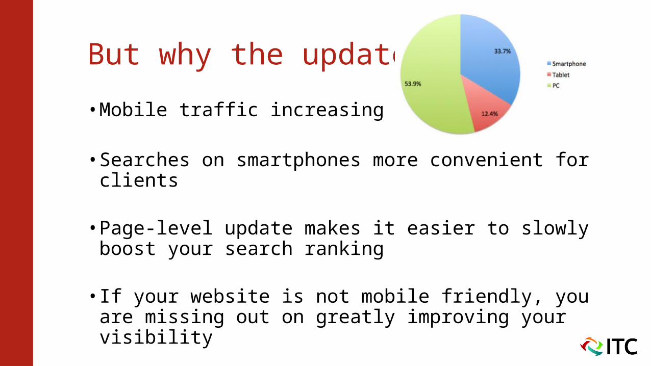
But why the update?
• Mobile traffic increasing rapidly
• Searches on smartphones more convenient for clients
• Page-level update makes it easier to slowly boost your search ranking
• If your website is not mobile friendly, you are missing out on greatly improving your visibility
What Can You Do to Improve Your Mobile Website?
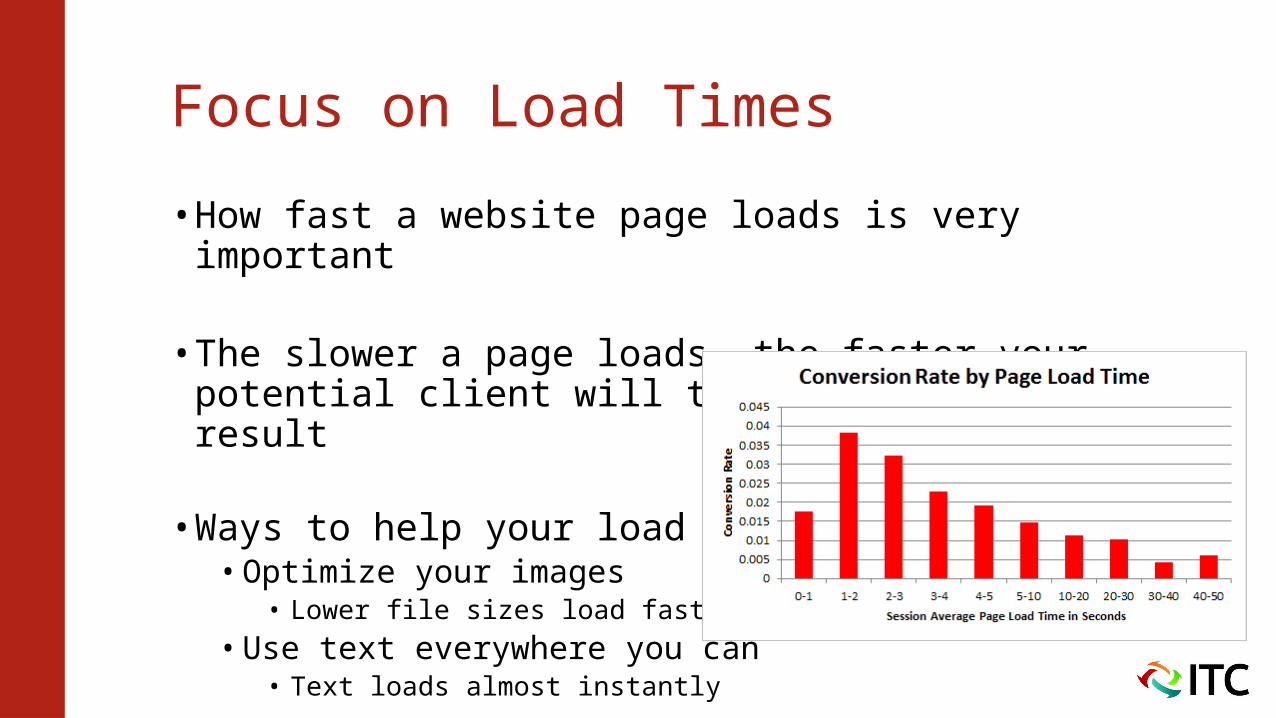
Focus on Load Times
• How fast a website page loads is very important
• The slower a page loads, the faster your potential client will try the next search result
• Ways to help your load times:• Optimize your images
• Lower file sizes load faster
• Use text everywhere you can• Text loads almost instantly
Wean Yourself Off Flash
• Apple devices have never been fond of Flash
• iOS devices (iPhones) do not support Flash files and they make up half of the smartphone market
• Flash files can slow your load times
Responsive Elements
• Your desktop website does not need to be responsive
• But your mobile website should have responsive elements
• Your mobile pages should easily scale to the display size
• When coding, focus on using percentages, instead of completely defining a set width• For example, use 25%, instead of 250 pixels
Simplify Your Website
• Mobile websites do not need to have every bell and whistle, they need to be able to perform their basic functions• If a potential client is searching on their smartphone, they
probably have one specific goal in mind
• Make it easy for customers to get where they want to go• The less clicks it takes for them to get there, the better
• Focus on the most important functions of your website• At most 3-4 big features easily visible on your home page
Function is Vital
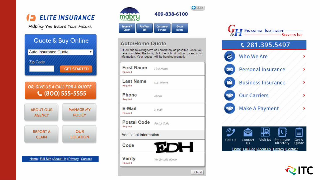
• If your website is mainly a lead generation source, make sure that your quote forms are easy to use on the go
• Shorter quote forms have greater success on mobile websites than longer, more in depth forms• Less fields, easier to fill out, increases chance of completion
• If you focus on customer service, keep service forms short as well. And have click to call phone numbers ready
• Provide easy to click links for payment and claim options
Easy to Use
• Mobiles websites should be easy to use and navigate
• Make all phone numbers “click to call”• Easier for clients to quickly reach out to you
• Space your links and buttons farther apart• Fingers replace mouse cursor on mobile websites• Fingers are larger and have more room for error to hit
their target
Easy to Use
• Minimize the amount of typing your client has to do• Between faulty touch screens and autocorrect, typing on
smartphones can be a pain• Less typing they have to do, the more willing they’ll be to
continue using your website
• All text should be at a legible size• Too big and clients will have to endless scroll to read
everything• Too small and your text will be too hard to see on a tiny
display
Thank you for watching!
Follow ITC for more great marketing tip!