Embed Size (px)
Citation preview
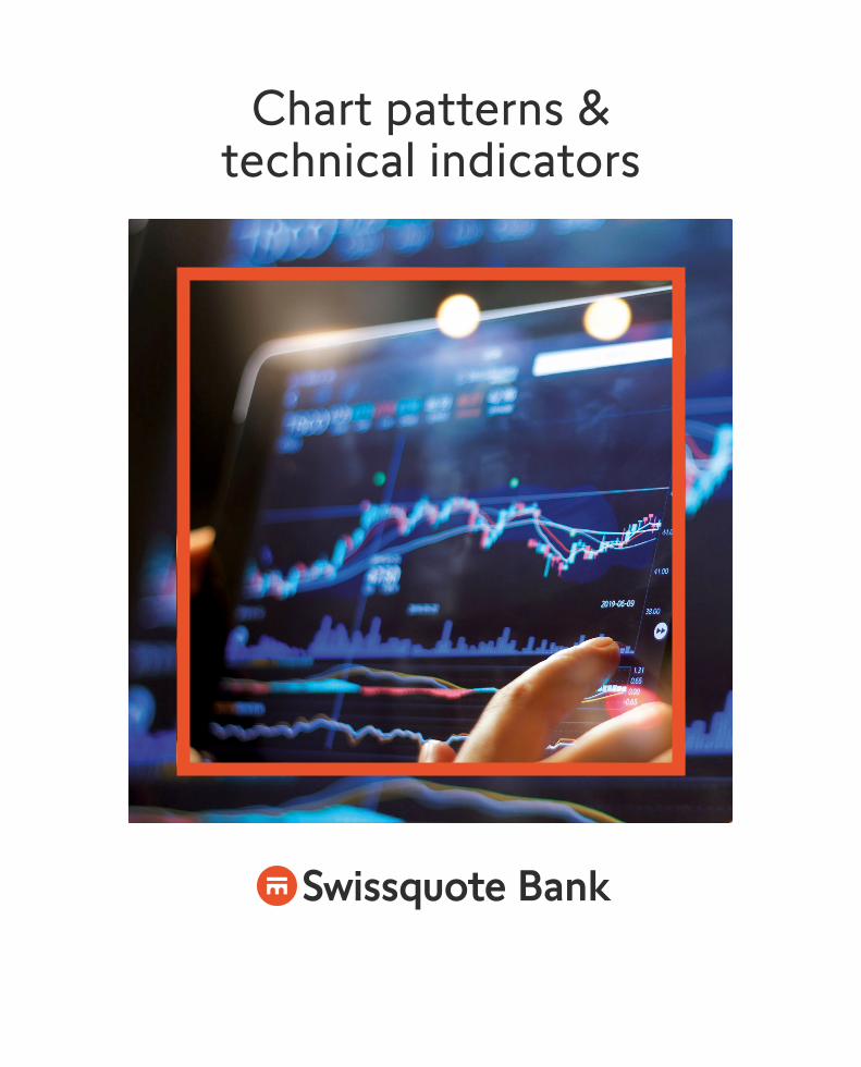
Chart patterns & technical indicators
◚⯎ Bank
«Fundamentalists who say they are not going to pay any attention to the charts are like a doctor who says he is not going to take a patient’s temperature.»Bruce Kovner Investor, hedge fund manager, and philanthropist
Table of contents
Chart patterns 4
Continuation patterns 5
Reversal patterns 7
Technical indicators 9
Next steps – Start trading with Swissquote 15
5© Swissquote Bank Ltd | Forex and CFD trading involves a high degree of risk and is not suitable to all investorsAny reproduction without the authorization of the editor is prohibited.
4
Chart patterns
Forex traders often use charts to decide when to enter and exit
trades, and technical traders in particular analyse price patterns
to find trading opportunities. By using charts, and weighing price,
volume, volatility, and timing, it is possible to find and execute
profitable trades.
Traders discern between chart patterns, which can be seen on
a price chart, and indicators, which are calculated based on the
prices of the chart.
Over time, many different ways of analysing a chart have been developed, and many are readily available on
our trading platforms. Some are classics, others are difficult to apply, and still others are well suited to some
currencies but not to others.
In general, chart patterns can be grouped into those that indicate a continuing trend, and those that indicate
an upcoming reversal of the trend. Usually, several analyses are used together to identify profitable trading
opportunities.
Read more about continuation patterns on page 5, and about reversal patterns on page 7.
Trends, support and resistanceA trend is simply the prevailing direction of a price. If the price of a currency repeatedly reaches a
given value but does not rise above or fall below it, the currency is said to have found a resistance
or support level. Many traders keep an eye on past patterns to discern how far the price will move if
it does break the support or resistance level.
Continuation patterns
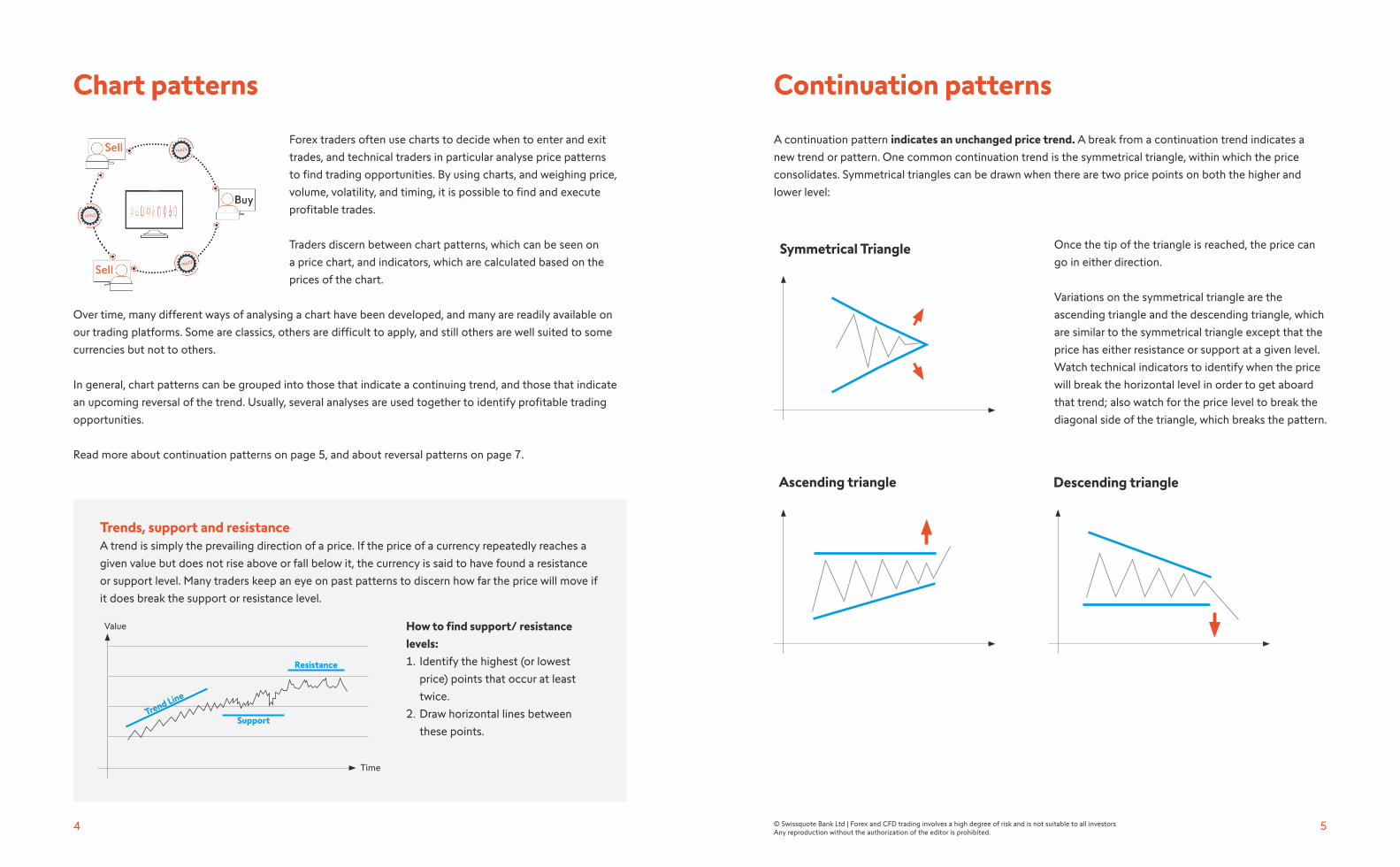
A continuation pattern indicates an unchanged price trend. A break from a continuation trend indicates a
new trend or pattern. One common continuation trend is the symmetrical triangle, within which the price
consolidates. Symmetrical triangles can be drawn when there are two price points on both the higher and
lower level:
Once the tip of the triangle is reached, the price can
go in either direction.
Variations on the symmetrical triangle are the
ascending triangle and the descending triangle, which
are similar to the symmetrical triangle except that the
price has either resistance or support at a given level.
Watch technical indicators to identify when the price
will break the horizontal level in order to get aboard
that trend; also watch for the price level to break the
diagonal side of the triangle, which breaks the pattern.
Symmetrical Triangle
How to find support/ resistance
levels:
1. Identify the highest (or lowest
price) points that occur at least
twice.
2. Draw horizontal lines between
these points.
Value
Trend Line
Resistance
Support
Time
Ascending triangle Descending triangle
7© Swissquote Bank Ltd | Forex and CFD trading involves a high degree of risk and is not suitable to all investorsAny reproduction without the authorization of the editor is prohibited.
6
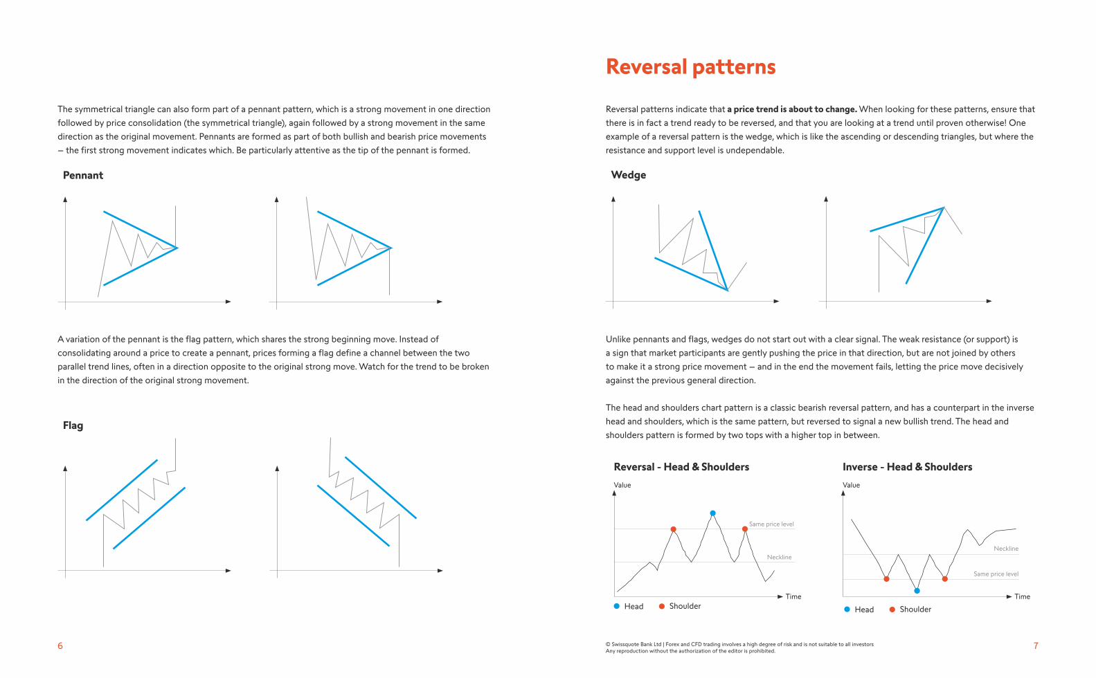
The symmetrical triangle can also form part of a pennant pattern, which is a strong movement in one direction
followed by price consolidation (the symmetrical triangle), again followed by a strong movement in the same
direction as the original movement. Pennants are formed as part of both bullish and bearish price movements
– the first strong movement indicates which. Be particularly attentive as the tip of the pennant is formed.
Pennant
A variation of the pennant is the flag pattern, which shares the strong beginning move. Instead of
consolidating around a price to create a pennant, prices forming a flag define a channel between the two
parallel trend lines, often in a direction opposite to the original strong move. Watch for the trend to be broken
in the direction of the original strong movement.
Reversal patterns
Reversal patterns indicate that a price trend is about to change. When looking for these patterns, ensure that
there is in fact a trend ready to be reversed, and that you are looking at a trend until proven otherwise! One
example of a reversal pattern is the wedge, which is like the ascending or descending triangles, but where the
resistance and support level is undependable.
Wedge
Unlike pennants and flags, wedges do not start out with a clear signal. The weak resistance (or support) is
a sign that market participants are gently pushing the price in that direction, but are not joined by others
to make it a strong price movement – and in the end the movement fails, letting the price move decisively
against the previous general direction.
The head and shoulders chart pattern is a classic bearish reversal pattern, and has a counterpart in the inverse
head and shoulders, which is the same pattern, but reversed to signal a new bullish trend. The head and
shoulders pattern is formed by two tops with a higher top in between.
Value
Time
Reversal - Head & Shoulders
Neckline
Same price level
Head Shoulder
Flag
Value
Time
Inverse - Head & Shoulders
Neckline
Same price level
Head Shoulder
9© Swissquote Bank Ltd | Forex and CFD trading involves a high degree of risk and is not suitable to all investorsAny reproduction without the authorization of the editor is prohibited.
8
Value
Time
Double top (
W
) and bottom (W)
Double Top
Double bottom
Technical indicators
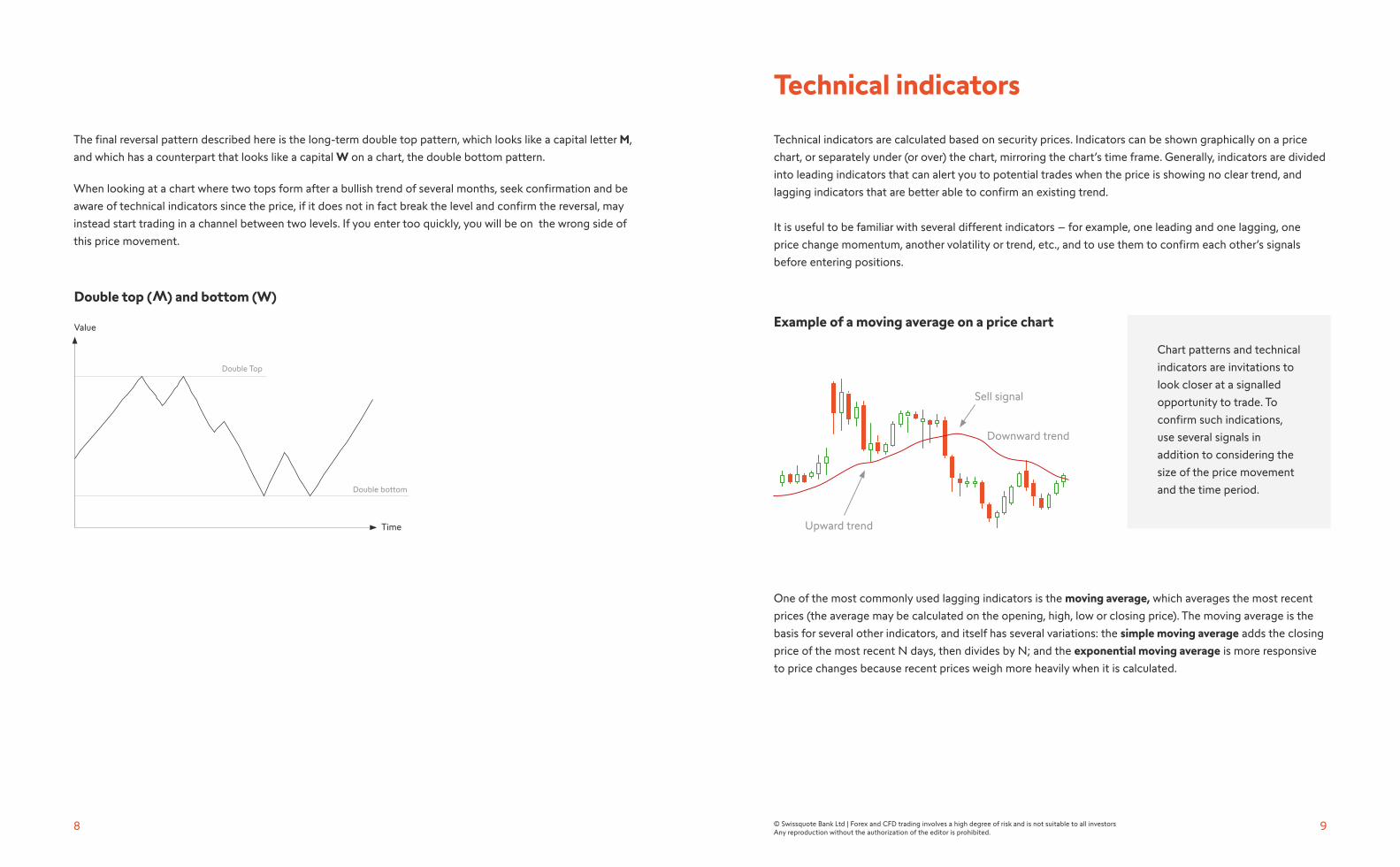
Technical indicators are calculated based on security prices. Indicators can be shown graphically on a price
chart, or separately under (or over) the chart, mirroring the chart’s time frame. Generally, indicators are divided
into leading indicators that can alert you to potential trades when the price is showing no clear trend, and
lagging indicators that are better able to confirm an existing trend.
It is useful to be familiar with several different indicators – for example, one leading and one lagging, one
price change momentum, another volatility or trend, etc., and to use them to confirm each other’s signals
before entering positions.
One of the most commonly used lagging indicators is the moving average, which averages the most recent
prices (the average may be calculated on the opening, high, low or closing price). The moving average is the
basis for several other indicators, and itself has several variations: the simple moving average adds the closing
price of the most recent N days, then divides by N; and the exponential moving average is more responsive
to price changes because recent prices weigh more heavily when it is calculated.
Chart patterns and technical
indicators are invitations to
look closer at a signalled
opportunity to trade. To
confirm such indications,
use several signals in
addition to considering the
size of the price movement
and the time period.
Example of a moving average on a price chart
Sell signal
Downward trend
Upward trend
The final reversal pattern described here is the long-term double top pattern, which looks like a capital letter M,
and which has a counterpart that looks like a capital W on a chart, the double bottom pattern.
When looking at a chart where two tops form after a bullish trend of several months, seek confirmation and be
aware of technical indicators since the price, if it does not in fact break the level and confirm the reversal, may
instead start trading in a channel between two levels. If you enter too quickly, you will be on the wrong side of
this price movement.
11© Swissquote Bank Ltd | Forex and CFD trading involves a high degree of risk and is not suitable to all investorsAny reproduction without the authorization of the editor is prohibited.
10
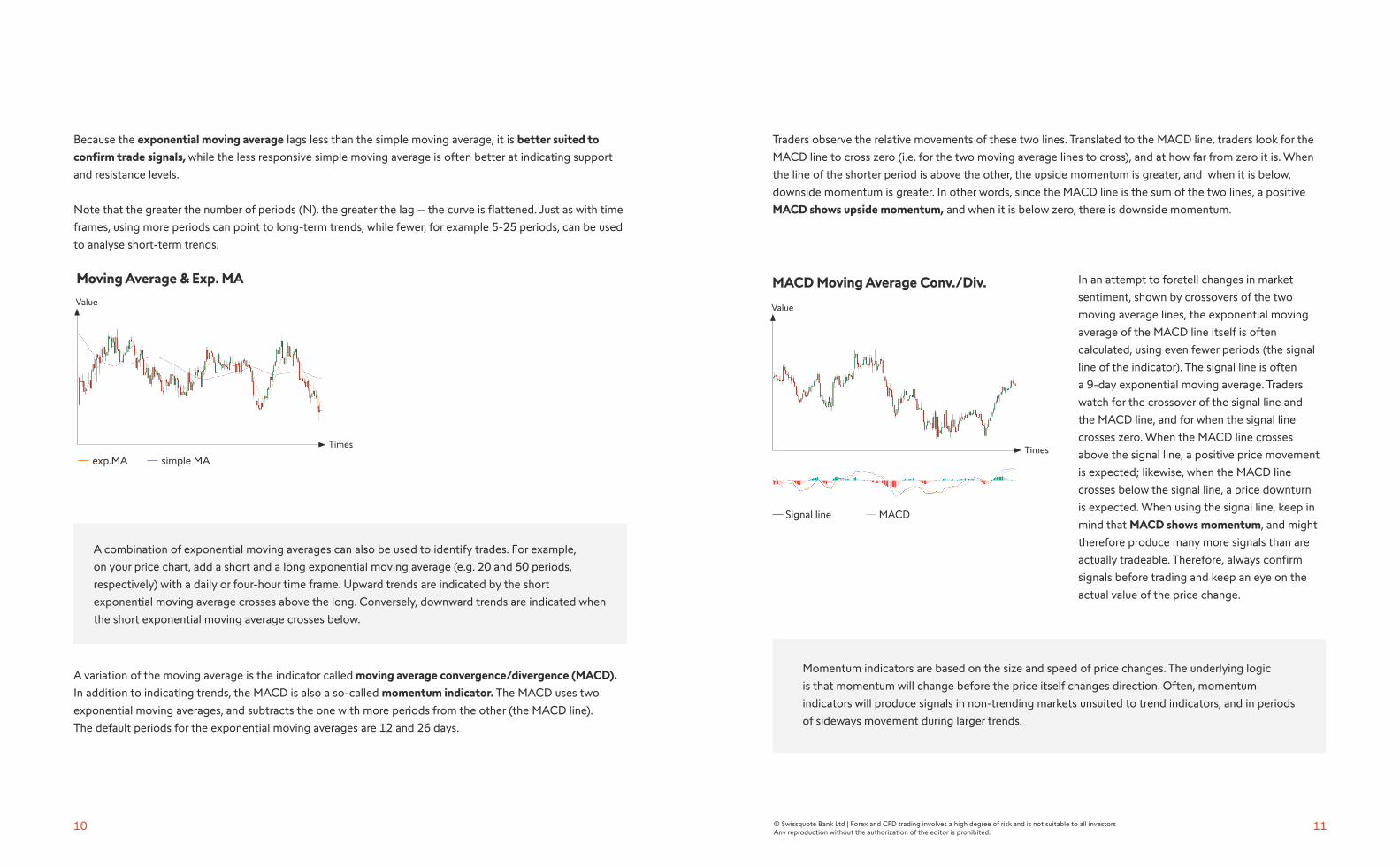
Because the exponential moving average lags less than the simple moving average, it is better suited to
confirm trade signals, while the less responsive simple moving average is often better at indicating support
and resistance levels.
Note that the greater the number of periods (N), the greater the lag – the curve is flattened. Just as with time
frames, using more periods can point to long-term trends, while fewer, for example 5-25 periods, can be used
to analyse short-term trends.
A combination of exponential moving averages can also be used to identify trades. For example,
on your price chart, add a short and a long exponential moving average (e.g. 20 and 50 periods,
respectively) with a daily or four-hour time frame. Upward trends are indicated by the short
exponential moving average crosses above the long. Conversely, downward trends are indicated when
the short exponential moving average crosses below.
A variation of the moving average is the indicator called moving average convergence/divergence (MACD).
In addition to indicating trends, the MACD is also a so-called momentum indicator. The MACD uses two
exponential moving averages, and subtracts the one with more periods from the other (the MACD line).
The default periods for the exponential moving averages are 12 and 26 days.
Traders observe the relative movements of these two lines. Translated to the MACD line, traders look for the
MACD line to cross zero (i.e. for the two moving average lines to cross), and at how far from zero it is. When
the line of the shorter period is above the other, the upside momentum is greater, and when it is below,
downside momentum is greater. In other words, since the MACD line is the sum of the two lines, a positive
MACD shows upside momentum, and when it is below zero, there is downside momentum.
In an attempt to foretell changes in market
sentiment, shown by crossovers of the two
moving average lines, the exponential moving
average of the MACD line itself is often
calculated, using even fewer periods (the signal
line of the indicator). The signal line is often
a 9-day exponential moving average. Traders
watch for the crossover of the signal line and
the MACD line, and for when the signal line
crosses zero. When the MACD line crosses
above the signal line, a positive price movement
is expected; likewise, when the MACD line
crosses below the signal line, a price downturn
is expected. When using the signal line, keep in
mind that MACD shows momentum, and might
therefore produce many more signals than are
actually tradeable. Therefore, always confirm
signals before trading and keep an eye on the
actual value of the price change.
Momentum indicators are based on the size and speed of price changes. The underlying logic
is that momentum will change before the price itself changes direction. Often, momentum
indicators will produce signals in non-trending markets unsuited to trend indicators, and in periods
of sideways movement during larger trends.
Value
Times
Moving Average & Exp. MA
exp.MA simple MA
Value
Times
MACD Moving Average Conv./Div.
MACD Signal line
13© Swissquote Bank Ltd | Forex and CFD trading involves a high degree of risk and is not suitable to all investorsAny reproduction without the authorization of the editor is prohibited.
12
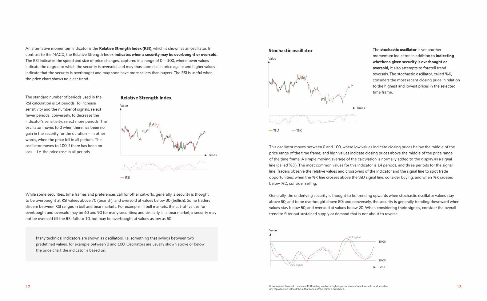
An alternative momentum indicator is the Relative Strength Index (RSI), which is shown as an oscillator. In
contrast to the MACD, the Relative Strength Index indicates when a security may be overbought or oversold.
The RSI indicates the speed and size of price changes, captured in a range of 0 – 100, where lower values
indicate the degree to which the security is oversold, and may thus soon rise in price again; and higher values
indicate that the security is overbought and may soon have more sellers than buyers. The RSI is useful when
the price chart shows no clear trend.
The standard number of periods used in the
RSI calculation is 14 periods. To increase
sensitivity and the number of signals, select
fewer periods; conversely, to decrease the
indicator’s sensitivity, select more periods. The
oscillator moves to 0 when there has been no
gain in the security for the duration – in other
words, when the price fell in all periods. The
oscillator moves to 100 if there has been no
loss – i.e. the price rose in all periods.
While some securities, time frames and preferences call for other cut-offs, generally, a security is thought
to be overbought at RSI values above 70 (bearish), and oversold at values below 30 (bullish). Some traders
discern between RSI ranges in bull and bear markets. For example, in bull markets, the cut-off values for
overbought and oversold may be 40 and 90 for many securities; and similarly, in a bear market, a security may
not be oversold till the RSI falls to 10, but may be overbought at values as low as 60.
Many technical indicators are shown as oscillators, i.e. something that swings between two
predefined values, for example between 0 and 100. Oscillators are usually shown above or below
the price chart the indicator is based on.
The stochastic oscillator is yet another
momentum indicator. In addition to indicating
whether a given security is overbought or
oversold, it also attempts to foretell trend
reversals. The stochastic oscillator, called %K,
considers the most recent closing price in relation
to the highest and lowest prices in the selected
time frame.
This oscillator moves between 0 and 100, where low values indicate closing prices below the middle of the
price range of the time frame; and high values indicate closing prices above the middle of the price range
of the time frame. A simple moving average of the calculation is normally added to the display as a signal
line (called %D). The most common values for this indicator is 14 periods, and three periods for the signal
line. Traders observe the relative values and crossovers of the indicator and the signal line to spot trade
opportunities: when the %K line crosses above the %D signal line, consider buying; and when %K crosses
below %D, consider selling.
Generally, the underlying security is thought to be trending upwards when stochastic oscillator values stay
above 50, and to be overbought above 80; and conversely, the security is generally trending downward when
values stay below 50, and oversold at values below 20. When considering trade signals, consider the overall
trend to filter out sustained supply or demand that is not about to reverse.
Time
Value
20.00
80.00
Sell signal
Buy signal
Value
Times
Relative Strength Index
RSI
Value
Times
Stochastic oscillator
%D %K
15© Swissquote Bank Ltd | Forex and CFD trading involves a high degree of risk and is not suitable to all investorsAny reproduction without the authorization of the editor is prohibited.
14
Here is how %K is calculated for 14 periods. Note the elements included - the most recent closing price
in relation to the highest and lowest prices in the selected time frame.
%K= 100(C-L14)/(H14-L14) • «C» is the most recent closing price.
• «L14» is the lowest price traded in the 14 most recent trading sessions.
• «H14» is the highest price traded in the 14 most recent trading sessions.
Traders who like the Relative Strength Index (RSI) indicator, but who would like it to generate more trading
signals, have three options: reduce the number of periods to make it more sensitive; choose different cut-off
values for overbought and oversold; or combine it with the stochastic oscillator to calculate the momentum of
the momentum! In other words, instead of calculating the stochastic oscillator based on prices, the calculation
is based on the RSI momentum indicator. Note that this stochastic RSI a rather lively indicator, and always
confirm signals with other sources of information.
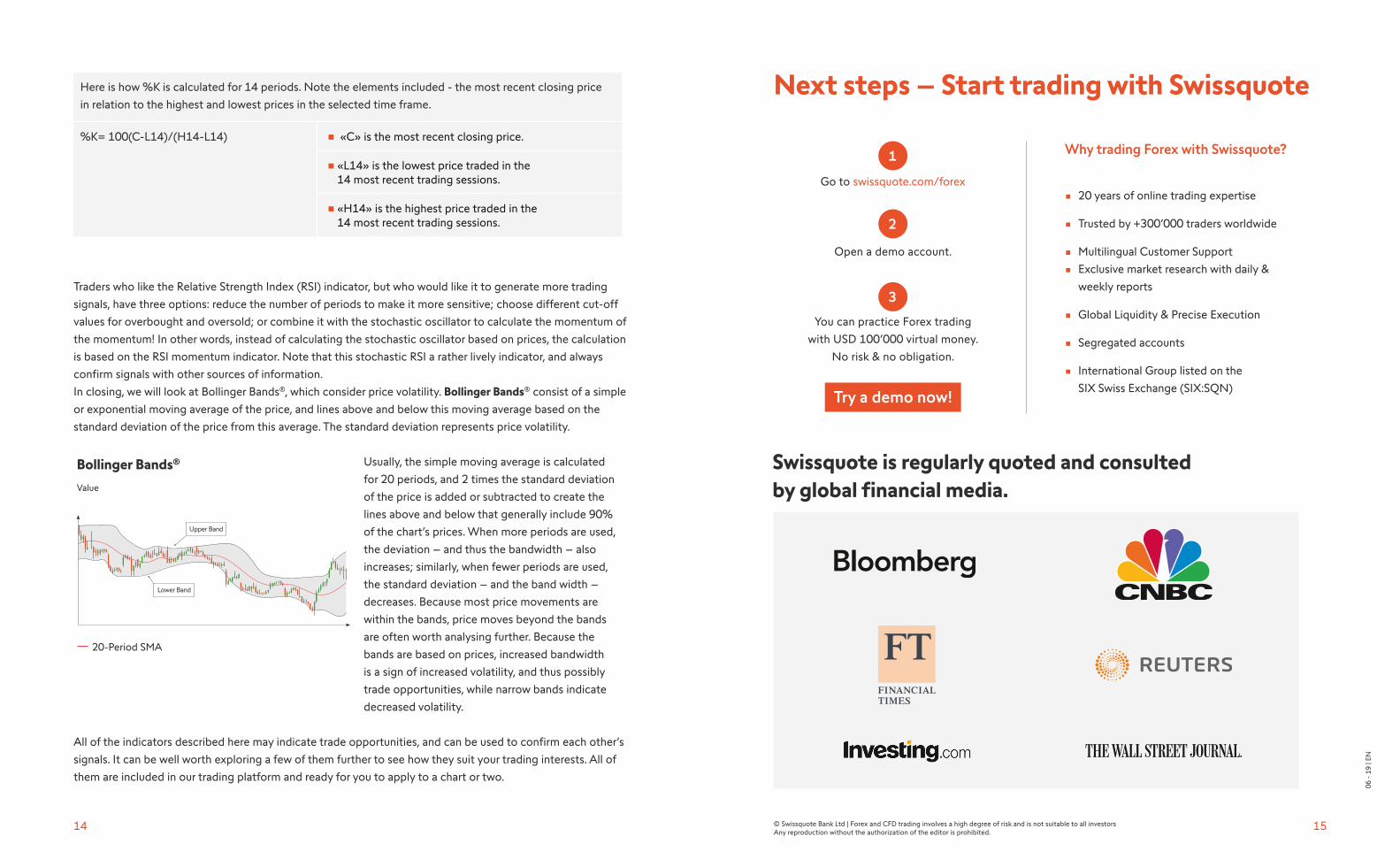
In closing, we will look at Bollinger Bands®, which consider price volatility. Bollinger Bands® consist of a simple
or exponential moving average of the price, and lines above and below this moving average based on the
standard deviation of the price from this average. The standard deviation represents price volatility.
Usually, the simple moving average is calculated
for 20 periods, and 2 times the standard deviation
of the price is added or subtracted to create the
lines above and below that generally include 90%
of the chart’s prices. When more periods are used,
the deviation – and thus the bandwidth – also
increases; similarly, when fewer periods are used,
the standard deviation – and the band width –
decreases. Because most price movements are
within the bands, price moves beyond the bands
are often worth analysing further. Because the
bands are based on prices, increased bandwidth
is a sign of increased volatility, and thus possibly
trade opportunities, while narrow bands indicate
decreased volatility.
All of the indicators described here may indicate trade opportunities, and can be used to confirm each other’s
signals. It can be well worth exploring a few of them further to see how they suit your trading interests. All of
them are included in our trading platform and ready for you to apply to a chart or two.
Swissquote is regularly quoted and consulted by global financial media.
Go to swissquote.com/forex
Open a demo account.
You can practice Forex trading
with USD 100’000 virtual money.
No risk & no obligation.
Why trading Forex with Swissquote?
• 20 years of online trading expertise
• Trusted by +300’000 traders worldwide
• Multilingual Customer Support
• Exclusive market research with daily &
weekly reports
• Global Liquidity & Precise Execution
• Segregated accounts
• International Group listed on the
SIX Swiss Exchange (SIX:SQN)Try a demo now!
Next steps – Start trading with Swissquote
1
2
3
06 -
19
| EN
Value
Bollinger Bands®
20-Period SMA

16
swissquote.com/education
Geneva - Zurich - Bern - London - Luxembourg - Malta - Dubai - Hong Kong