Embed Size (px)
Citation preview

Interactive Visualization for Low Literacy Users: From Lessons Learnt To Design
Neesha Kodagoda, B L William Wong, Chris Rooney, Nawaz Khan Middlesex University, London, NW4 4BT, UK
{n.kodagoda, w.wong, c.rooney, n.khan}@mdx.ac.uk
ABSTRACT This paper aims to address the problems low literacy (LL) users face when searching for information online. The first part of this paper summarizes the problems that LL user’s face, and establishes a set of design principles for interfaces suitable for LL users. This is followed by a description of how these design principles are mapped to a novel interface for interactive data retrieval. The interface was realized into a working system and evaluated against a traditional web interface for both high literacy (HL) and LL users. The suitability of the designs was analyzed using performance data, subjective feedback and an observational analysis. The findings from the study suggest that LL users perform better and prefer the proposed designs over a traditional web interface.
Author Keywords Low literacy; high literacy; mental models; design principles; visualization; user interface;
ACM Classification Keywords H.5.2 User Interfaces (D.2.2, H.1.2, I.3.6).
General Terms Design, Experimentation, Verification.
INTRODUCTION The definition of literacy is one’s ability to read, write and speak depending on the expectations of the social economic environment they live in [20]. In the United Kingdom alone, however, 16% (5.2 million) of the population are classified as low literate [46], which is defined as having reading and comprehension levels that are below secondary school level (equivalent to a reading age of 11) [14].
Government Departments and other non-profit organizations are placing an increasing amount of information on the web whilst at the same time reducing face-to-face advice. This creates a challenge for low literacy (LL) users who have difficulty accessing information through traditional web interfaces [42]. Those
who manage to overcome these initial barriers are further challenged by information that requires higher reading skills, hierarchical menu structures, and inconsistent layouts across different websites [42].
Previous research has shown LL users to be less successful in finding information during online information seeking [12,42]. They exhibit different behaviors compared to high literacy (HL) users such as reading word-for-word when confronted with long and dense pages, having a narrow field of view, skipping chunks of text, being satisfied with information quickly, and avoiding searching as it requires spelling [43]. It becomes increasingly important to recognize that interfaces designed primarily for HL users are not used in the same way by LL users.
This presents two challenges: (i) being able to understand LL users in a way that allows for new designs, not typically found in a designer’s repertoire, to be considered, and (ii) understanding the problem that needs addressing. The first part of this paper summarizes the problems LL users face, and establishes a set of design principles for interfaces suitable for LL users. This is followed by a description of how these design principles are mapped to the design concepts of a novel interface for interactive data retrieval [41].
For the purpose of this paper the above interface was realized into a working system and evaluated against a traditional web interface, which is described in the later part of this paper. As well as user performance and subjective feedback, an observational analysis of the effectiveness of the design principles is also described.
PROBLEMS WITH LOW LITERACY Research carried out to identify whether differences exist between HL and LL users when seeking information online identified clear differences in user performance [15]. LL users took nine times longer to complete an information seeking task, visited eight times more web pages, back-tracked thirteen times more, were four times more likely to re-visit a web page, spent a third more time on a web page, and were thirteen times more likely to get lost.
A follow-up study investigated what causes these performance differences and identified variations in information seeking behavior strategies for HL and LL users [17]. The findings identified differences in information seeking behavior strategies, the following: reading strategy (scanning vs. word-for-word), focus (wide
Permission to make digital or hard copies of all or part of this work for personal or classroom use is granted without fee provided that copies are not made or distributed for profit or commercial advantage and that copies bear this notice and the full citation on the first page. To copy otherwise, or republish, to post on servers or to redistribute to lists, requires prior specific permission and/or a fee. CHI 2012, May 5-10, 2012, Austin, TX, USA. Copyright 2012 ACM 978-1-4503-1015-4/12/05...$10.00.

vs. narrow field of view), verification (optimizing vs. satisficing), recovery (good vs. poor), trajectories (homogeneous vs. heterogeneous), abandonment (tolerance vs. intolerance of uncertainty), and representation (good vs. poor system model). LL users had a tendency to read word-for-word and tended to focus narrowly on parts of the screen due to skipping chunks of text, whereas the HL users often scanned the page for relevant information. LL users tended to go for early closure instead of differentiating and verifying the information found for correctness. Then when they got lost (which they appeared to do very often), the LL users struggled to recover from their mistakes and resume the search task. The search paths or trajectories employed by LL users were observed to be more haphazard by trial and error, resembling patterns of use by one who has little understanding of how things are stored. In contrast, the HL users in that short time were able to quickly develop a reasonable mental model of the information architecture and therefore able to direct their search to a more successful one.
To investigate what support mechanisms need to be in place for LL users’ information seeking, the identified behavior strategies of HL and LL users were mapped to David Ellis’s [5] information seeking behavior model, using it as a theoretical lens [16]. The findings identified two refined information seeking behavior models for the HL and LL users which showed clear differences. The comparison of the two models revealed that the strategies, actions, and identifications employed by HL users were not evident with the LL users, contributing possible reasons as to why LL users were less successful.
Users will develop a mental model of information provided to them [22], and an ideal system will have a strong mapping between the users’ mental model and the system’s conceptual model [31]. A follow up study tried to determine if differences in literacy has an effect on users’ mental model of the information menu structure of a traditional website [18]. The results showed a difference in mental models between HL and LL users. However, while there was a consistency in the mental models of HL users, LL users’ mental models were heterogeneous to each other. This suggests difficulties if developing a hierarchical menu structure for traditional websites to suit all LL users.
While low literacy is assessed using reading levels, it is clear that the cognitive processes (i.e. users’ strategies, behavior and mental model) are also different, contributing to why LL users are less successful during information seeking [15,17,18]. Sherwani and colleagues [37] suggest that when designing for oral or LL users it is not only the reading levels that need to be taken into account but also their different ways of thinking. Medhi et al. [24] and colleagues reconfirm content designed for HL users is less likely to be appropriate for oral or LL users.
There is a large body of research that focuses on reading difficulties, which includes (i) lowering reading levels, (ii)
using multimodal interfaces with little or no text , (iii) audio facilities with voice feedback and voice input, (iv) the use of color and semi-abstract graphics, (v) using white space by minimizing clutter, (vi) increasing font size, and (vii) the use of flat menu structures [6,8,25,26,29,42]. These studies, however, do not take advantage of interactive visualization as a support mechanism to amplify the users abilities [44], including their ability to reason [47].
Shneiderman [39] states that by trying to dumb down interfaces, it prevents innovation and exploring a broader spectrum of design considerations. This is also confirmed by Nielsen [28], who argues that rather than just refining an existing design, completely redesigning allows conception of novel and useful interfaces. Rich [34] observed that adapted design techniques should be used when designing systems that are aimed at more than one group of users.
DESIGN RECOMMENDATIONS Based on the identified differences in LL users’ reading strategy, verification, recovery, and perceived mental model, this section proposes a number of recommendations for designing user interfaces for LL users.
Reading strategy As LL users are likely to have lower educational levels they are challenged with less critical and abstract thinking skills. The result of this is that LL users start word-for-word reading at a very early stage in their search [16]. Perfetti [32] explains that LL users devote a higher cognitive effort to low-level reading processes (word level), leaving less room for comprehension of the overall message. This makes it difficult to extract information from the text using simple inferences [4]. A likely coping mechanism they adopt is to follow a narrow field of view.
To improve LL users’ reading strategies on the internet, Frank-Stromborg and Olsen [8] suggested the removal of page clutter from the screen, avoiding long lists by boxing information separately to provide further focus, and the use of white space and color to draw attention. As LL are likely to have low spatial abilities, the use of visual momentum (animation) to assist with integrating and extracting information is also expected to improve their performance [44,48].
Verification During an information seeking task, LL users walked away with an adequate solution, suggesting that they employed a satisficing solution [17,29,33,40]. The satisficing theory suggests that individuals are most likely to find information that is most convenient, compromising accuracy, quality or efficiency.
HL users are able to revisit previously visited information without visual memory cues [16]. This allows them to investigate new information and verify it against previously visited information. Since word-by-word reading already

places a high cognitive load on LL users, they find it difficult to remember where they have been and, therefore, are satisfied easily. The steps discussed above on reducing the amount of word-for-word reading are likely to reduce LL users’ cognitive load, enabling them to move from a satisficing strategy to a verifying strategy.
Visual cues such as color change draw users’ attention and focus. Healy and colleagues [10] identified that users are able to pre-attentively recognize differences in color however, unable to recognize simultaneous variation of color plus shape. While traditional websites change the color of previously visited hyperlinks, the subtle change is not evident to LL users [15]. A more obvious cue is required.
The Google lists of lists design, that users are familiar with, is not a suitable representational form for users who reason in a less abstract fashion [8,45]. Also, users have been known to benefit from the ability to spatially arrange data [21]. The capability to spatially collate previously visited documents provides another cue for LL users.
Recovery Recovery occurs when HL or LL users identify irrelevant or incorrect content and then adjust the search to a more focused and successful one. However, LL users were less successful in recovering from identified irrelevant or wrong links to a successful search outcome. Again, the expecting reduction in cognitive load caused by the reading and verification design principles will support LL users in recovery. Functionality such as visual memory cues, the ability to spatially collate previously visited documents, and the ability to delete unwanted document can also be used to support recovery. Since some LL users fail to recover when lost in the detail, keeping the context of the search permanently visible will help them return to the original search and proceed down a new path [3].
Perceived mental model Traditional websites contain hierarchical information structures and links that require LL users to make early decisions, which is a problem because LL users have less of an understanding of hierarchical menu structures than HL users [24,37,42]. By adopting commands such as SEARCH, the user is presented with a discontinuous transition into new sections [11]. However, search is unable to give an overview of a conceptual model of the information menu system when compared with the hierarchical menu system. This is less of an issue since LL users struggle to conceptualize the spatial layout of the data. Allowing LL users to spatially arrange the data using techniques such as visual momentum [48] and display patterns [13] may help develop their mental model and reduce search abandonment.
INVISQUE This section describes a system called Invisque (INteractive VIsual Search and Query Environment), which was developed as a proof of concept prototype for creating queries and searching for information in an interactive and visual manner [41] (see Figure 2). The non-conventional visualization is based on a metaphor of index cards laid out on a tabletop. As an electronic representation, it has been embedded with a variety of functions not easily carried out in the physical world. The design itself is guided by principles such as visual cues and affordances, cognitive load theory, focus + context, and Gestalt principles of perception. These techniques can be incorporated yet keeping the system simple and learnable by empowering good interface design principles and heuristics [30,31].
The proof of concept was originally designed for use in electronic library systems for searching and retrieving scholarly and scientific publications [41]. Since the mock-up contained concepts that it was felt were relevant to LL users, a working prototype was created and further developed to meet the design requirements described above.
Invisque reduces the cognitive load of early word-for-word reading by boxing information on a white space, and allowing the amount of data visible to be altered through the use of a slider. Verification is addressed by using visual cues to draw attention to visited index cards, a wizard save tool for making memory notes, and the ability view multiple searches simultaneously. Recovery is also addressed by using obvious visual cues, and wizard delete tool for removing irrelevant search results. Finally, the ability to drag and cluster search results aims to improve LL users’ perceived mental models of the data.
Figure 1. Search canvas with two search results. A) data slider bar, B) data interval window, C) search term, D)
search results displayed by index cards , the index cards are organized in the X-axis by subject matter and Y-axis by demand, E) cluster close button , F) total number of results, G) information
drill down icon
When a user commences their search they are presented with a simple search box. Rather than a hierarchical menu a search box will minimize LL users’ mental model differences and prevent early word-for-word reading. The

results are presented as a cluster of index cards, with each index card representing a search result (see Figure 1). By placing each search item in an index card the amount of text is reduced and the information is boxed (the user is able to drill down to view more information if required, see Figure 1G). This addresses the reading strategy by reducing LL users’ cognitive load. Clustering the index cards together on the white space draws attention and reduces screen clutter [8].
To prevent LL users being overwhelmed, and prevent overlap, only the top eight results are displayed by default, which are the results mostly likely to be viewed [19]. The user is able to increase or decrease the number of index cards that they want to view by adjusting a slider (see Figure 1A). The index cards are ordered in both x and y axes depending on the metadata (e.g., relevance on the x axis and date on the y axis). Literature suggests visualizing information using meaningful dimensions have been shown to be useful [1,7,27,38].
Visual cues are used to help LL users verify their search. The index cards that have already been viewed (drilled down) are colored purple (see Figure 2A). This is consistent with traditional websites, however, changing the color of the index card is expected to be more noticeable than only changing the color of the text (hyperlink).
Users are able to create multiple searches in the same search canvas; this provides the user with an overview of multiple result sets. Transparency is used to distinguish between the current and previous searches. Zooming can be used to either draw focus on an area of interest, or give an overall view of the complete search space. With hierarchical menu systems, if LL users proceed down an incorrect path then they face the problem of “what was I looking for?”. In this situation, LL users can become lost in the data and unable to recover. By presenting the complete search space, LL users are able to see where they came from and proceed down a new path, thus addressing the problem of recovery.
Each index card can be dragged and placed anywhere on the canvas, giving the user the flexibility to arrange and order information as they see fit. This allows the user to group relevant index cards that come from different searches, supporting the verification process by reducing the need to memorize the location of relevant index cards.
Invisque also has a Wizard feature which allows users to delete or save index cards (Figure 2D shows the save area, and Figure 2C shows the delete area). The Wizard can also be toggled on or off by clicking a button on the task bar (see Figure 2F). If a user feels an index card is of a particular importance, then they can drag it into the save area. The results of which is that the index card is colored green, providing an obvious visual cue to the user (see Figure 2B).
Index cards can be deleted by dragging them to the bin icon (see Figure 2C), which is representative of dragging icons to the recycle bin on a Windows desktop, reducing clutter. Also the ability for LL users to discard data support the verification and recovery processes.
While the focus has been on bridging the gap between HL and LL users, the hope is that the designs will also support both literacy groups for performing search and query tasks.
Figure 2. Direct manipulation and grouping information.
A) Index cards viewed or drilled down are marked in purple, B) Index cards saved are marked in Green, C) and index card is
dragged here to be deleted, D) an index card is dragged here to be saved, E) the total number of index cards that has been saved, and
F) Wizard icon, which switches on or off the delete and save areas.
EVALUATION This evaluation compares Invisque with a traditional website for search and retrieval tasks. The aim is to investigate whether Invisque can improve the performance of LL users such that they match the performance of HL users. The performance measures are search outcome (successful, unsuccessful or abandon), time spent, and number of pages visited. In addition users’ perceived feedback on the two systems was captured using questionnaires. An observational analysis on how the design features support LL users is also reported.
Based on the literature and design principles the following two hypotheses were identified:
1. Both HL and LL users’ task success would be higher with Invisque than with a traditional website.
2. The time spent and number of pages visited for both HL and LL users would be lower in with Invisque than with a traditional website.
METHOD
Participants Participants were recruited from a local Citizens Advice Bureau (CAB). They had to have computer and internet literacy (weekly computer and internet usage between four – ten hours), and participants with any known learning disabilities were excluded (such as dyslexia). In total, 24
F

participants took part in the study. Twelve were HL while the remaining twelve were LL. Twelve were male and twelve were female, with a mean age of 39 years (ranging from 35 to 50).
Of the LL users who participated seven were unemployed (over six months) and the remaining five were working at the time of the study (two cleaners, one restaurant serving staff, one security officer, and one builder). Two of the HL users had been made redundant in the past two months and remaining ten were working at the time of the study (two admin staff, two sales reps, one counter worker, one receptionist, one office manager, one accountant and one nurse).
Ten of the LL users had left formal education prior to completing secondary school (GCSE level), and the remaining two LL users had left prior to completing collage or sixth form (A-level). Two of the HL users had left formal education prior to completing high school, while four had left prior to completing collage and finally the remaining six had university degrees.
Participants’ literacy was evaluated using the UK’s National Skills for life literacy survey [46]. The survey marks participants out of a score of 40, with any score under 29 being classed as LL. The HL participants for this study scored an average of 33 out of 40 (ranging from 30 to 38) while the LL participants scored an average of 13 out of 40 (ranging from 7 to 16).
Materials For the purpose of this study a social service website in the United Kingdom was selected (Adviceguide -http://www.adviceguide.org.uk). The content of the site is relevant to the needs of both the HL and LL participants. However, none of the participants had experience using the Adviceguide website beforehand.
The data from the Adviceguide was imported to the Invisque system. There were no changes made to the content or to the menu links, so both systems could be used to access the same data and, therefore, allow comparisons to be made between the two.
Procedure Six information search tasks were developed based on advice frequently requested by walk-in clients of the local CAB (between April 2005 and May 2007). For example, I am currently on Income Support, what other benefits am I entitled to? The search tasks were of varying task difficulties (easy, medium and difficult). One aspect of the task difficulty was influenced by web navigation of the Adviceguide website, which starts from general over view and then require users to drill down to reach more specific topics (e.g. from the home page to main sections and then, finally to subsections). Another aspect was if the webpage content focused on one or multiple concepts or topics. Finally, the third aspect was the reading levels of the text.
Participants were not permitted to use external websites or other search facilities, however, there were no restrictions within the Adviceguide site such as using the search or the hierarchical navigation structure.
The study was conducted in our usability lab. Each participant performed six tasks in total, three with Invisque and three with Adviceguide. For each interface participants performed one easy, one medium and one difficult task. Latin-square was used to counter balance the order of interface and tasks. Participants were first given time to familiarize themselves with both systems prior to the study. A two minute video demonstrating the functionality of Invisque was shown. Participants were given one task at a time. Each search task started from the home page of the system. In the case of Adviceguide, cache was reset for each task to minimize any confounding variable efforts such as cached page visits. Searching difficulties due to spelling was overcome by using a Wizard of Oz voice technique for the purpose of this study [2,9,23]. The participants declared when they had either found the answer or abandon the search. The answer or solution found for the task was written down on the answer sheet provided.
Participants were informed of the study procedure, and gave consent for video and audio recording. Multiple Cognitive Task Analysis (CTA) methods were used to extract and understand the participants’ decision process during their tasks. Methods such as think-aloud (video capture), user observation (video capture and field notes taken), semi-structured interviews (video play-back and field notes taken), and questionnaires focusing on the systems were used as data collection methods. Each participant’s level of literacy was evaluated once all tasks and interviews were completed [46].
Data collection For the purpose of this study questionnaires were used to capture participants’ subjective feedback. The post-test questionnaires [35] captured participants overall feedback about the system [36]. The questionnaires were rated on a seven-point Likert scale, ranging from strongly disagree to strongly agree.
Measurements The following dependent variables were measured using video and system log files for each condition: (i) Search outcome, defined as either: (a) successful – this is when the participants find the relevant information, (b) unsuccessful – when participants completed the task, but found the incorrect information, (c) abandon – this is when participants stopped the search because either they were unable to find any relevant information, or they assumed that the information was not available, (ii) time on task, the duration of the task from the moment a participant starts the task until he/she decides to stop the search (either due to finding the answer or abandoning the search), and (iii)
number of pages visited, which is the total number of pages a user views during the information task.
RESULTS The results will be discussed in three sections. The first is quantitative data analysis, second is the subjective feedback from the questionnaires and, finally, an analysis of how the features of Invisque supported the needs of LL users.
Quantitative Analysis
Task Success
Figure 3. HL and LL users’ successful task on Adviceguide and Invisque.
A Friedman test was carried out using task (E-easy, M-medium, D-difficult) and system (Adviceguide, Invisque) as within subject factors and literacy (HL, LL) as a between subject factor.
The Friedman test found there to be no significant effects on task success for HL users χ2(5, N = 12) = 4.00, p < 0.55. Kendall’s W was 0.07, indicating no strong effects either. The test also found there to be no significant effect on success for LL users χ2(5, N = 12) = 7.00, p < 0.22. Kendall’s W is 0.12, also indicating no strong effects.
Although the effects were not significant, Figure 3 shows that LL users became increasingly less successful as the task difficulty increased, however, this increase was more predominant with the Adviceguide system.
Time on task
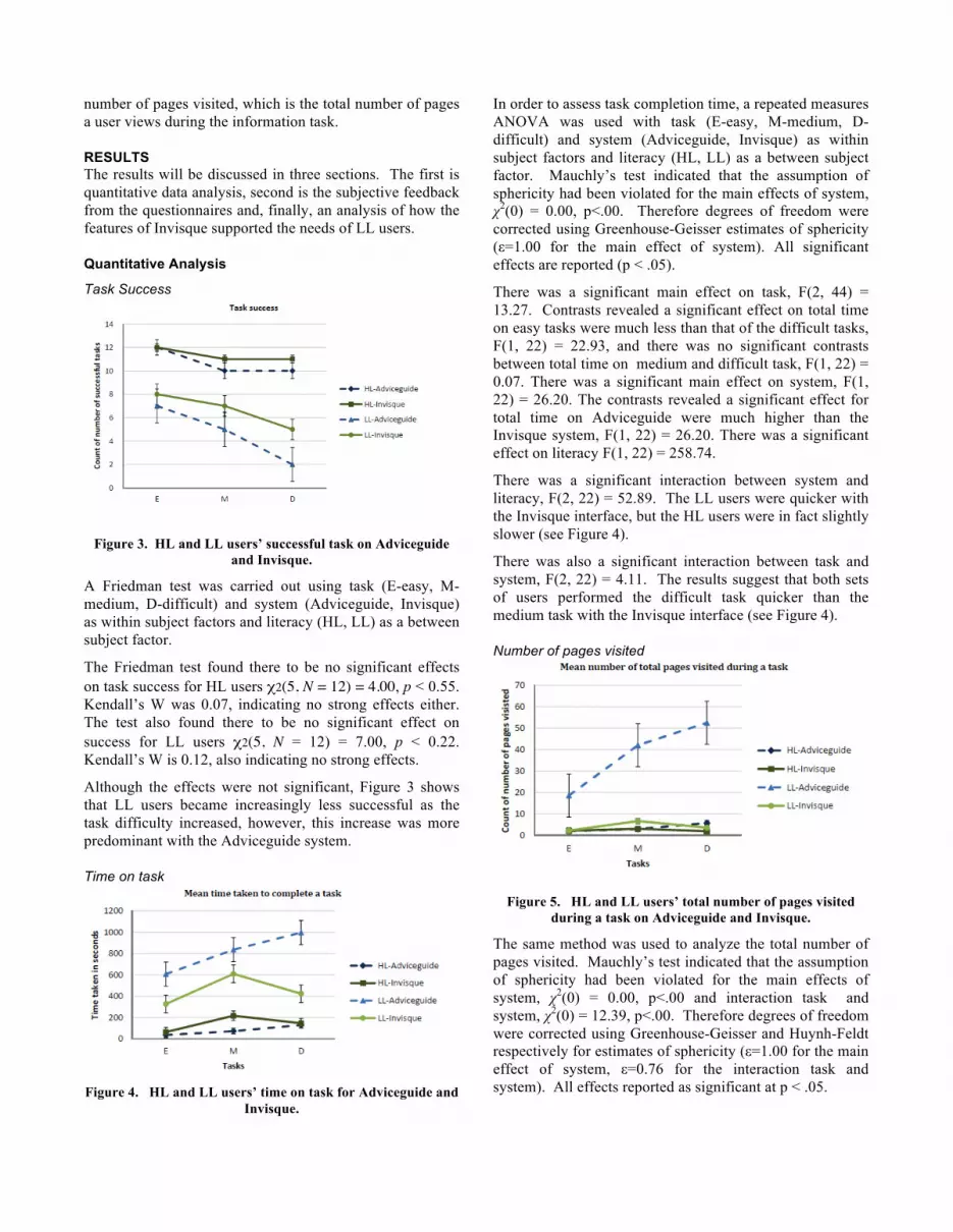
Figure 4. HL and LL users’ time on task for Adviceguide and
Invisque.
In order to assess task completion time, a repeated measures ANOVA was used with task (E-easy, M-medium, D-difficult) and system (Adviceguide, Invisque) as within subject factors and literacy (HL, LL) as a between subject factor. Mauchly’s test indicated that the assumption of sphericity had been violated for the main effects of system, χ2(0) = 0.00, p<.00. Therefore degrees of freedom were corrected using Greenhouse-Geisser estimates of sphericity (ε=1.00 for the main effect of system). All significant effects are reported (p < .05).
There was a significant main effect on task, F(2, 44) = 13.27. Contrasts revealed a significant effect on total time on easy tasks were much less than that of the difficult tasks, F(1, 22) = 22.93, and there was no significant contrasts between total time on medium and difficult task, F(1, 22) = 0.07. There was a significant main effect on system, F(1, 22) = 26.20. The contrasts revealed a significant effect for total time on Adviceguide were much higher than the Invisque system, F(1, 22) = 26.20. There was a significant effect on literacy F(1, 22) = 258.74.
There was a significant interaction between system and literacy, F(2, 22) = 52.89. The LL users were quicker with the Invisque interface, but the HL users were in fact slightly slower (see Figure 4).
There was also a significant interaction between task and system, F(2, 22) = 4.11. The results suggest that both sets of users performed the difficult task quicker than the medium task with the Invisque interface (see Figure 4).
Number of pages visited
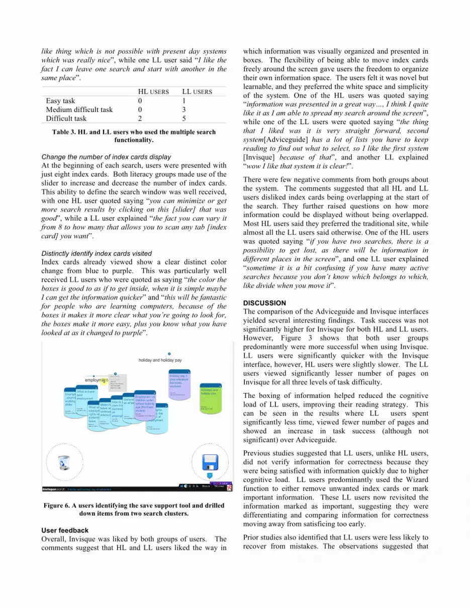
Figure 5. HL and LL users’ total number of pages visited during a task on Adviceguide and Invisque.
The same method was used to analyze the total number of pages visited. Mauchly’s test indicated that the assumption of sphericity had been violated for the main effects of system, χ2(0) = 0.00, p<.00 and interaction task and system, χ2(0) = 12.39, p<.00. Therefore degrees of freedom were corrected using Greenhouse-Geisser and Huynh-Feldt respectively for estimates of sphericity (ε=1.00 for the main effect of system, ε=0.76 for the interaction task and system). All effects reported as significant at p < .05.

There was a significant main effect on task, F(2, 44) = 82.88. The contrasts revealed that significantly fewer pages were visited on the easy tasks than the difficult tasks, F(1, 22) = 216.95, and fewer pages were visited on the medium tasks than the difficult tasks, F(1, 22) = 9.57. There was also a significant main effect on system, F(1, 22) = 1672.41. The contrasts revealed that significantly more pages were visited when using Adviceguide than Invisque, F(1, 22) = 1672.41. A significant effect on literacy indicated that HL users visited significantly fewer pages than LL users, F(1, 22) = 582.03.
There was a significant interaction effect between tasks, system and literacy, F(2, 44) = 63.46. Post-hoc tests showed that HL users viewed fewer pages on the Invisque system but only for the difficult tasks, and that LL users viewed significantly fewer pages on Invisque for all three levels of task difficulty (see Figure 5).
Subjective Feedback Paired t-tests were used to compare participants’ subjective feedback for the Adviceguide and Invisque systems that was captured by a questionnaire using a seven point Likert scale.
Both HL and LL users found Adviceguide to be significantly more familiar than Invisque (HL:p<.01, LL:p<.01), confirming that Adviceguide represents a traditional website while Invisque represent a type of interface that they have not seen before. HL users felt that both systems worked as they wanted them to, whereas, there was a significant difference between the way LL users wanted both systems to work (HL:p=1, LL:p<.01). This confirms that LL users are unhappy with traditional web based systems. Which is also supported by the fact that LL users would use Adviceguide less frequently than Invisque (HL:p=.75, LL:p<.01).
HL users required significantly less effort to use Adviceguide than Invisque, however, LL users required significantly more effort using Adviceguide (HL:p<.01, LL:p<.01). Similarly, HL users felt Invisque to be less useful than Adviceguide, while, LL users felt Adviceguide to be less useful than Invisque (HL:p=.06, LL:p<.01). HL users found both systems easy to search, while LL users found it significantly easier to search on Invisque (HL:p=.07, LL:p<.01).
Unlike HL users, LL users found Adviceguide significantly easier to learn (HL:p=.08, LL:p<.01), although the means were similar (M=7, SD=0 vs. M=6.33, SD=0.49). Both HL and LL users felt that Adviceguide could be used without instructions more than Invisque (HL:p=.02, LL:p<.01), again there was a marginal difference between the means (HL: M=7, SD=0 vs. M=6.58, SD=.52; LL: M=7, SD=0 vs. M=6.50,SD=.52). Both HL and LL users felt that Invisque was significantly more flexible than Adviceguide (HL:p<.01, LL:p<.01), and that they were
significantly more satisfied with Invisque than Adviceguide (HL:p<.01, LL:p<.01).
OBSERVATIONAL ANALYSIS OF SUPPORT TOOLS This section describes some of the features of Invisque that were predominantly used by LL users.
Wizard The Wizard was used to either to discard index cards or mark them as important. For the delete feature, results showed that HL users used this function less than LL users (see Table 1). There was also an increase for the LL users as the task difficulty increased.
During the interviews, none of the HL users mentioned the delete tool. Most of the LL users who used the tool at some point during their search mentioned about it during the interviews. The LL users reacted well to the ability to filter the data by removing unwanted index cards. One of the LL users quoted as saying “you want and get rid of the once you don’t want” when prompted to discuss their actions.
HL USERS LL USERS Easy task 0 2 Medium difficult task 1 5 Difficult task 3 6
Table 1. HL and LL users who used the deleting support tool.
Similarly, for the save feature, HL users were observed to use this function less than LL users (see Table 2). Again, there is an increase in usage for LL users, as the difficulty increased.
HL USERS LL USERS Easy task 0 3 Medium difficult task 3 6 Difficult task 4 7
Table 2. HL and LL users who used the save support tool. When prompted during the interviews, LL users reacted well to the save feature. One participant was quoted saying “I think I did another one, and I think the green one is the one I saved as that’s what I was looking for and I could not find anything similar in the other [another search cluster]”, while another one said that “because I look for different things in the normal sites and then I read something and then from there click on a link and go to another page and then you get lost and you cannot remember what you were looking for this was really brilliant”.
Performing multiple searches A user is classed as performing a multiple search if they have more than one search cluster open at any one time. Again, LL users made better use of this feature, and used it more frequently as the difficulty increased (see Table 3).
When they were prompted during the interview, a HL user was quoted saying “add another search in the same website
like thing which is not possible with present day systems which was really nice”, while one LL user said “I like the fact I can leave one search and start with another in the same place”.
HL USERS LL USERS Easy task 0 1 Medium difficult task 0 3 Difficult task 2 5
Table 3. HL and LL users who used the multiple search functionality.
Change the number of index cards display At the beginning of each search, users were presented with just eight index cards. Both literacy groups made use of the slider to increase and decrease the number of index cards. This ability to define the search window was well received, with one HL user quoted saying “you can minimize or get more search results by clicking on this [slider] that was good”, while a LL user explained “the fact you can vary it from 8 to how many that allows you to scan any tab [index card] you want”.
Distinctly identify index cards visited Index cards already viewed show a clear distinct color change from blue to purple. This was particularly well received LL users who were quoted as saying “the color the boxes is good to as if to get inside, when it is simple maybe I can get the information quicker” and “this will be fantastic for people who are learning computers, because of the boxes it makes it more clear what you’re going to look for, the boxes make it more easy, plus you know what you have looked at as it changed to purple”.
Figure 6. A users identifying the save support tool and drilled down items from two search clusters.
User feedback Overall, Invisque was liked by both groups of users. The comments suggest that HL and LL users liked the way in
which information was visually organized and presented in boxes. The flexibility of being able to move index cards freely around the screen gave users the freedom to organize their own information space. The users felt it was novel but learnable, and they preferred the white space and simplicity of the system. One of the HL users was quoted saying “information was presented in a great way…, I think I quite like it as I am able to spread my search around the screen”, while one of the LL users were quoted saying “the thing that I liked was it is very straight forward, second system[Adviceguide] has a lot of lists you have to keep reading to find out what to select, so I like the first system [Invisque] because of that”, and another LL explained “wow I like that system it is clear!”.
There were few negative comments from both groups about the system. The comments suggested that all HL and LL users disliked index cards being overlapping at the start of the search. They further raised questions on how more information could be displayed without being overlapped. Most HL users said they preferred the traditional site, while almost all the LL users said otherwise. One of the HL users was quoted saying “if you have two searches, there is a possibility to get lost, as there will be information in different places in the screen”, and one LL user explained “sometime it is a bit confusing if you have many active searches because you don’t know which belongs to which, like divide when you move it”.
DISCUSSION The comparison of the Adviceguide and Invisque interfaces yielded several interesting findings. Task success was not significantly higher for Invisque for both HL and LL users. However, Figure 3 shows that both user groups predominantly were more successful when using Invisque. LL users were significantly quicker with the Invisque interface, however, HL users were slightly slower. The LL users viewed significantly lesser number of pages on Invisque for all three levels of task difficulty.
The boxing of information helped reduced the cognitive load of LL users, improving their reading strategy. This can be seen in the results where LL users spent significantly less time, viewed fewer number of pages and showed an increase in task success (although not significant) over Adviceguide.
Previous studies suggested that LL users, unlike HL users, did not verify information for correctness because they were being satisfied with information quickly due to higher cognitive load. LL users predominantly used the Wizard function to either remove unwanted index cards or mark important information. These LL users now revisited the information marked as important, suggesting they were differentiating and comparing information for correctness moving away from satisficing too early.
Prior studies also identified that LL users were less likely to recover from mistakes. The observations suggested that

removing or deleted information of no relevance reduced unwanted clutter and prevented LL users from revisiting this information. Another observation was that LL users were likely clear the canvas and start a fresh search as a strategy to recover. Most importantly, the lack of hierarchy meant that users were less likely to abandon a search due to differences in conceptual and perceived mental models.
Overall, Invisque was well received by both groups of users. The subjective feedback reinforces that Invisque represents a novel interface that was easy to learn. This confirms that the affordances of the system provide strong interactive and visual cues [31].
CONCLUSION This paper summarized problems LL users face during information seeking, which suggest that it is not only reading levels and usability problems, but also caused by a different way of thinking [37,47]. Based on the identified differences of LL users’ reading strategy, verification, recovery and perceived mental models, design recommendations were suggested.
This paper presented Invisque, which is based on a set of design principles that were also expected to benefit LL users. To test these principles an evaluation was performed to compare Invisque against a traditional web interface for both HL and LL users. Invisque has shown to improve LL users’ performance and changed their behavior strategies. The results of the evaluation showed that users could retrieve information more quickly with Invisque.
These design principles were well received by the LL users based on the quantitative, subjective and observational data. LL users preferred the way information was presented (boxed), the flexibility to move index cards or clusters, use of Wizard to delete or mark information as important, visual cues, and finally the smooth transitions and less clutter due to the increase in white space.
Further investigation on proposed design principles and Invisque is required because, even though the system suited LL users, in some cases it affected the performance of HL users. This reinforce Neilsens’ observations that new designs are likely introduce new and unexpected problems [28].
One caveat to the present study is the small sample size that could influence the results observed. Reasons behind the current sample size were due to the in-depth nature of the study. It was difficult to recruit participants because of the length of the study, and not knowing their literacy prior to the study. It will be important to analyze and validate a larger sample size.
ACKNOWLEDGMENTS Our deepest appreciation goes to Mr Tim Clark and Ms Caroline Kahan, from Barnet Citizens Advice Bureau for giving their fullest support during our study, and to the 24
participants for their time. This study has approval from Middlesex University Research Ethics Committee.
REFERENCES 1. Ahlberg, C. and Shneidennan, B. Visual Information
Seeking : Tight Coupling of Dynamic Query Filters with Starfield Displays. Human Factors, (1994).
2. Buxton, W., Baecker, R., and Sellen, A. User Sketches : A Quick , Inexpensive , and Effective way to Elicit More Reflective User Feedback. Group, October (2006), 14-18.
3. Card, S.K., Mackinlay, J.D., and Shneiderman, B. Readings in information visualization: using vision to think. Morgan Kaufmann, 1999.
4. Cheung, V., Grypma, N., and Zhong, L. The influence of brand name and brand logo on new product evaluations of Low Literate Consumers. (1979). http://www.vkky.nl/Files/Pfolio/logo_research.pdf.
5. Ellis, D. Modelling the information seeking patterns of engineers and research scientists in an industrial environment. Management 53, 4 (1997), 384-403.
6. Findlater, L., Balakrishnan, R., and Toyama, K. Comparing semiliterate and illiterate users’ ability to transition from audio+text to text-only interaction. CHI, (2009), 1751.
7. Fox, E.A., Hix, D., Nowell, L.T., et al. Users, user interfaces, and objects: Envision, a digital library. Information Science 44, 8 (1983), 480 - 491.
8. Frank-Stromborg, M. and Olsen, S.J. Instruments for clinical health-care research. Jones & Bartlett Learning, 2004.
9. Gould, J.D., Conti, J., and Hovanyecz, T. Composing letters with a simulated listening typewriter. Communications of the ACM 26, 1983, 295-308.
10. Healey, C.G., Booth, K.S., and Enns, J.T. Visualizing Real-Time Multivariate Data Using Preattentive Processing. Current, (1995).
11. Hochberg, J.E. Perception. Prentice-Hall, Englewood Cliffs N.J., 1978.
12. Jensen, J.D., King, A.J., Davis, L. a, and Guntzviller, L.M. Utilization of internet technology by low-income adults: the role of health literacy, health numeracy, and computer assistance. Journal of aging and health 22, 6 (2010), 804-26.
13. Joshi, A., Welankar, N., Bl, N., Kanitkar, K., and Sheikh, R. Rangoli: A Visual Phonebook for Low-literate Users. MobileHCI, (2008), 217.
14. Kemp, G. and Eagle, L. Shared meanings or missed opportunities? The implications of functional health literacy for social marketing interventions. Springer Berlin / Heidelberg, 2008.

15. Kodagoda, N. and Wong, B.L.W. Effects of low & high literacy on user performance in information search and retrieval. HCI, (2008), 173-181.
16. Kodagoda, N., Wong, B.L.W., and Khan, N. Information seeking behaviour model as a theoretical lens: high and low literate users behaviour process analysed. ECCE, ACM Press (2010), 117-124.
17. Kodagoda, N., Wong, W., and Khan, N. Identifying Information Seeking Behaviours of Low and High Literacy Users : Combined Cognitive Task Analysis. NDM9, (2009), 347-354.
18. Kodagoda, N., Wong, W.B.L., and Khan, N. Open-Card Sort to Explain Why Low-Literate Users abandon their Web Searches Early. HCI, (2010).
19. Kummamuru, K., Lotlikar, R., Roy, S., Singal, K., and Krishnapuram, R. A hierarchical monothetic document clustering algorithm for summarization and browsing search results. WWW, (2004), 658.
20. Lonsdale, M. and McCurry, D. Literacy in the New Millennium. NCVER, (2004).
21. Maglio, P.P., Matlock, T., Raphaely, D., Chernicky, B., and Kirsh, D. Interactive skill in Scrabble. In M. H. a. S. C. Stoness (Ed.), Cognitive Science Society, Mahwah, NJ: Lawrence Erlbaum Associates, Inc (1999).
22. Marchionini, G. Information seeking in electronic environments. Cambridge University Press, 1995.
23. Medhi, I., Gautama, S.N.N., and Toyama, K. A comparison of mobile money-transfer UIs for non-literate and semi-literate users. ACM Press, New York, New York, USA, 2009.
24. Medhi, I., Menon, S.R., Cutrell, E., and Toyama, K. Beyond Strict Illiteracy : Abstracted Learning Among Low-Literate Users. Information and Communication Technologies and International Development, IEEE (2010).
25. Medhi, I., Prasad, A., and Toyama, K. Optimal audio-visual representations for illiterate users of computers. WWW ’07, (2007), 873.
26. Narasimhan, R. Characterizing literacy: a study of Western and Indian literacy experiences. SAGE, 2004.
27. Newell, L.T., France, K., and Heath, S. Visualizing Search Results : Some Alternatives To Query-Document Similarity. Computing, (1994), 67-75.
28. Nielsen, J. Iterative user-interface design. Computer 26, 11 (1993), 32-41.
29. Nielsen, J. Low-Literacy Users: Writing for a Broad Consumer Audience. Alerbox, 2005. http://www.useit.com/alertbox/20050314.html.
30. Nielsen, J. Ten Usability Heuristics Mean for MIMAS Websites and Web based Interfaces. Design, August 2006 (2007), 2007-2007.
31. Norman, D. The Design Of Everyday Things. Doubleday Business, 1988.
32. Perfetti, C.A. Reading Ability. Oxford University Press, USA, 1985.
33. Pirolli, P. Interview with Peter Pirolli. 877 (2010), 1-6. 34. Rich, E. Users are individuals: individualizing user
models. Man-Machine Studies 18, 3 (1983), 199-214. 35. Root, R.W. and Draper, S. Questionnaires as a Software
Evaluation Tool. CHI’83, ACM Press (1983), 83-87. 36. Sauro, J. and Dumas, J.S. Comparison of three one-
question, post-task usability questionnaires. CHI, (2009), 1599.
37. Sherwani, J., Ali, N., and Hall, W. Orality-Grounded HCID : Information Technologies and International Development 5, 4 (2009), 37-49.
38. Shneiderman, B., Feldman, D., Rose, A., and Grau, X.F. Visualizing digital library search results with categorical and hierarchical axes. DL, ACM Press (2000), 57-66.
39. Shneiderman, B. Universal usability: pushing human-computer interaction to empower every citizen. ACM 43, 5 (2000), 84-91.
40. Simon, H.A. Models of man: social and rational. John Wiley and Sons, Inc., New York, 1957.
41. Stelmaszewska, H., Wong, B.L.W., Attfield, S., and Chen, R. Electronic Resource Discovery Systems. ACM Press, New York, New York, USA, 2010.
42. Summers, K. and Summers, M. Making the Web Friendlier for Lower-Literacy Users. The Century Contemporary French Studies, (2003), 19-22.
43. Summers, K. and Summers, M. Reading and Navigational Strategies of Web Users with Lower Literacy Skills. ASIST, Richard B. Hill (2005).
44. Vicente, K. and Williges, R. Accommodating individual differences in searching a hierarchical file system. Man-Machine Studies 29, 6 (1988), 647-668.
45. Warschauer, M. Technology and Social Inclusion. MIT Press, 2002.
46. Williams, J., Clemens, S., Oleinikova, K., and Tarvin, K. The Skills for Life survey: A national needs and impact survey of literacy, numeracy and ICT skills. Literacy London: BM, (2003).
47. Wong, B.L.W. and Kodagoda, N. Designing UI For Low Literacy Users: Knowing Your User. Workshop Paper - IUI ’11, ACM Press (2011), 469.
48. Woods, D. Visual momentum: a concept to improve the cognitive coupling of person and computer. Man-Machine Studies 21, 3 (1984), 229-244.