Embed Size (px)
Citation preview

HAL Id: tel-00981521https://tel.archives-ouvertes.fr/tel-00981521v2
Submitted on 20 Feb 2018
HAL is a multi-disciplinary open accessarchive for the deposit and dissemination of sci-entific research documents, whether they are pub-lished or not. The documents may come fromteaching and research institutions in France orabroad, or from public or private research centers.
L’archive ouverte pluridisciplinaire HAL, estdestinée au dépôt et à la diffusion de documentsscientifiques de niveau recherche, publiés ou non,émanant des établissements d’enseignement et derecherche français ou étrangers, des laboratoirespublics ou privés.
Physical and tangible information visualizationYvonne Jansen
To cite this version:Yvonne Jansen. Physical and tangible information visualization. Other [cs.OH]. Université Paris Sud- Paris XI, 2014. English. �NNT : 2014PA112039�. �tel-00981521v2�
Université Paris-Sud
Ecole Doctorale Informatique Paris-Sud
Laboratoire Inria Saclay — Île-de-France
Discipline : Informatique
Thèse de doctorat
Soutenue le 10 Mars 2014 par
Yvonne Jansen
Physical and TangibleInformation Visualization
Directeur de thèse : Jean-Daniel Fekete Directeur de Recherche (Inria Saclay)
Co-directeur de thèse : Pierre Dragicevic Chargé de Recherche (Inria Saclay)
Composition du jury :
Président du jury : Michel Beaudouin-Lafon Profèsseur (Université Paris-Sud)
Rapporteurs : Jason Dykes Professeur (City University London)
Kasper Hornbæk Professeur (Université de Copenhague)
Examinateur : Sheelagh Carpendale Professeur (Université de Calgary)


Contents
Abstract xvii
Resumé xix
Acknowledgements xxi
Glossary xxiii
1 Introduction 1
1 The Value of Physicality for Information Visualization . . . . . . . . . . . . . . . . . . . . . . . . 5
2 Thesis Statement . . . . . . . . . . . . . . . . . . . . . . . . . . . . . . . . . . . . . . . . . . . . . . 6
3 Thesis Overview . . . . . . . . . . . . . . . . . . . . . . . . . . . . . . . . . . . . . . . . . . . . . . 6
2 Background 9
1 A Short History of Physical Representations of Information . . . . . . . . . . . . . . . . . . . . . 9
2 Tangible User Interfaces for Information Visualization . . . . . . . . . . . . . . . . . . . . . . . . 18
2.1 Tangible Controllers for On-Screen Visualization Systems . . . . . . . . . . . . . . . . . . 19
2.2 Tangible Displays . . . . . . . . . . . . . . . . . . . . . . . . . . . . . . . . . . . . . . . . . . 22
3 Data Sculptures . . . . . . . . . . . . . . . . . . . . . . . . . . . . . . . . . . . . . . . . . . . . . . . 26
3.1 Static Data Sculptures . . . . . . . . . . . . . . . . . . . . . . . . . . . . . . . . . . . . . . . 27
3.2 Dynamic Data Sculptures . . . . . . . . . . . . . . . . . . . . . . . . . . . . . . . . . . . . . 29
4 Conclusion . . . . . . . . . . . . . . . . . . . . . . . . . . . . . . . . . . . . . . . . . . . . . . . . . . 31
3 Concepts and Terminology 33
1 Introduction . . . . . . . . . . . . . . . . . . . . . . . . . . . . . . . . . . . . . . . . . . . . . . . . . 33

iv Contents
2 Forms and Purposes of Information Displays . . . . . . . . . . . . . . . . . . . . . . . . . . . . . . 34
2.1 Physical vs. Virtual Information Displays . . . . . . . . . . . . . . . . . . . . . . . . . . . . 34
2.2 Artistic vs. Pragmatic Information Displays . . . . . . . . . . . . . . . . . . . . . . . . . . 34
2.3 Active vs. Passive Information Displays . . . . . . . . . . . . . . . . . . . . . . . . . . . . . 35
2.4 Interactive vs. Non-interactive Information Displays . . . . . . . . . . . . . . . . . . . . . 35
2.5 Compound and Hybrid Information Displays . . . . . . . . . . . . . . . . . . . . . . . . . 36
3 Visualizations . . . . . . . . . . . . . . . . . . . . . . . . . . . . . . . . . . . . . . . . . . . . . . . . 36
3.1 Visualizations vs. Models . . . . . . . . . . . . . . . . . . . . . . . . . . . . . . . . . . . . . 36
3.2 Visual Marks as Basic Components of Visualizations . . . . . . . . . . . . . . . . . . . . . 37
3.3 Spatial Dimensionality . . . . . . . . . . . . . . . . . . . . . . . . . . . . . . . . . . . . . . . 38
3.4 The Physicalization of Visualizations . . . . . . . . . . . . . . . . . . . . . . . . . . . . . . 39
3.5 Conclusion . . . . . . . . . . . . . . . . . . . . . . . . . . . . . . . . . . . . . . . . . . . . . 39
4 Controls . . . . . . . . . . . . . . . . . . . . . . . . . . . . . . . . . . . . . . . . . . . . . . . . . . . 39
4.1 Physical vs. Virtual Controls . . . . . . . . . . . . . . . . . . . . . . . . . . . . . . . . . . . 40
4.2 Artistic vs. Pragmatic Controls . . . . . . . . . . . . . . . . . . . . . . . . . . . . . . . . . . 40
4.3 Active vs. Passive Controls . . . . . . . . . . . . . . . . . . . . . . . . . . . . . . . . . . . . 41
4.4 Interactive vs. Non-interactive Controls . . . . . . . . . . . . . . . . . . . . . . . . . . . . . 41
4.5 Instruments and the Instrumental Interaction Model . . . . . . . . . . . . . . . . . . . . . 41
4.6 Time- vs. Space-multiplexed Information Displays . . . . . . . . . . . . . . . . . . . . . . 42
4.7 Generic vs. Specific Instruments . . . . . . . . . . . . . . . . . . . . . . . . . . . . . . . . . 43
4.8 The Physicalization of Instruments . . . . . . . . . . . . . . . . . . . . . . . . . . . . . . . 43
4.9 Conclusion . . . . . . . . . . . . . . . . . . . . . . . . . . . . . . . . . . . . . . . . . . . . . 44
5 Embodiment of Information Displays . . . . . . . . . . . . . . . . . . . . . . . . . . . . . . . . . . 44
5.1 Defining Embodiment for Information Displays . . . . . . . . . . . . . . . . . . . . . . . . 45
5.2 General Examples . . . . . . . . . . . . . . . . . . . . . . . . . . . . . . . . . . . . . . . . . 47
5.3 Visualization Examples . . . . . . . . . . . . . . . . . . . . . . . . . . . . . . . . . . . . . . 49
5.4 Embodiment of Controls . . . . . . . . . . . . . . . . . . . . . . . . . . . . . . . . . . . . . 50
6 Conclusion . . . . . . . . . . . . . . . . . . . . . . . . . . . . . . . . . . . . . . . . . . . . . . . . . . 51

Contents v
4 Case Study: The Physicalization of Controls for Wall-Sized Display Interaction 53
1 Background . . . . . . . . . . . . . . . . . . . . . . . . . . . . . . . . . . . . . . . . . . . . . . . . . 53
1.1 Requirements for WSD Instruments . . . . . . . . . . . . . . . . . . . . . . . . . . . . . . . 54
1.2 Approaches to Large Display Interaction . . . . . . . . . . . . . . . . . . . . . . . . . . . . 55
1.3 Tangible Remote Controllers . . . . . . . . . . . . . . . . . . . . . . . . . . . . . . . . . . . 57
2 Tangible Remote Controller Prototype . . . . . . . . . . . . . . . . . . . . . . . . . . . . . . . . . . 59
2.1 Capacitive Sensing Design . . . . . . . . . . . . . . . . . . . . . . . . . . . . . . . . . . . . 60
2.2 Marker Design . . . . . . . . . . . . . . . . . . . . . . . . . . . . . . . . . . . . . . . . . . . 61
2.3 Body Design . . . . . . . . . . . . . . . . . . . . . . . . . . . . . . . . . . . . . . . . . . . . . 61
3 Sample Application . . . . . . . . . . . . . . . . . . . . . . . . . . . . . . . . . . . . . . . . . . . . . 62
3.1 Adding and Mapping Tangible Controls . . . . . . . . . . . . . . . . . . . . . . . . . . . . 63
3.2 Remapping Existing Controls . . . . . . . . . . . . . . . . . . . . . . . . . . . . . . . . . . . 64
3.3 Building Custom Control Boards . . . . . . . . . . . . . . . . . . . . . . . . . . . . . . . . . 64
3.4 Support for Locomotion . . . . . . . . . . . . . . . . . . . . . . . . . . . . . . . . . . . . . . 64
3.5 Future Extensions of this Prototype . . . . . . . . . . . . . . . . . . . . . . . . . . . . . . . 65
4 Evaluating the Effect of Embodiment of WSD Instruments . . . . . . . . . . . . . . . . . . . . . . 66
4.1 Previous Evaluations of TUIs . . . . . . . . . . . . . . . . . . . . . . . . . . . . . . . . . . . 66
4.2 Study Rationale . . . . . . . . . . . . . . . . . . . . . . . . . . . . . . . . . . . . . . . . . . . 67
4.3 Design . . . . . . . . . . . . . . . . . . . . . . . . . . . . . . . . . . . . . . . . . . . . . . . . 67
4.4 Apparatus . . . . . . . . . . . . . . . . . . . . . . . . . . . . . . . . . . . . . . . . . . . . . . 68
4.5 Task . . . . . . . . . . . . . . . . . . . . . . . . . . . . . . . . . . . . . . . . . . . . . . . . . 68
4.6 Participants . . . . . . . . . . . . . . . . . . . . . . . . . . . . . . . . . . . . . . . . . . . . . 70
4.7 Measures . . . . . . . . . . . . . . . . . . . . . . . . . . . . . . . . . . . . . . . . . . . . . . . 70
4.8 Hypotheses . . . . . . . . . . . . . . . . . . . . . . . . . . . . . . . . . . . . . . . . . . . . . 70
4.9 Results . . . . . . . . . . . . . . . . . . . . . . . . . . . . . . . . . . . . . . . . . . . . . . . . 71
4.10 Strategies . . . . . . . . . . . . . . . . . . . . . . . . . . . . . . . . . . . . . . . . . . . . . . 73
4.11 User Feedback . . . . . . . . . . . . . . . . . . . . . . . . . . . . . . . . . . . . . . . . . . . 73
4.12 Discussion . . . . . . . . . . . . . . . . . . . . . . . . . . . . . . . . . . . . . . . . . . . . . . 73

vi Contents
5 Conclusion . . . . . . . . . . . . . . . . . . . . . . . . . . . . . . . . . . . . . . . . . . . . . . . . . . 75
5 Case Study: Possible Benefits for the Physicalization of Information Displays 77
1 Background . . . . . . . . . . . . . . . . . . . . . . . . . . . . . . . . . . . . . . . . . . . . . . . . . 77
1.1 Related Studies . . . . . . . . . . . . . . . . . . . . . . . . . . . . . . . . . . . . . . . . . . . 78
1.2 Studies Involving Physical Visualizations . . . . . . . . . . . . . . . . . . . . . . . . . . . . 78
2 Study Design Rationale . . . . . . . . . . . . . . . . . . . . . . . . . . . . . . . . . . . . . . . . . . 79
2.1 Datasets . . . . . . . . . . . . . . . . . . . . . . . . . . . . . . . . . . . . . . . . . . . . . . . 80
2.2 Tasks . . . . . . . . . . . . . . . . . . . . . . . . . . . . . . . . . . . . . . . . . . . . . . . . . 81
2.3 Visualization . . . . . . . . . . . . . . . . . . . . . . . . . . . . . . . . . . . . . . . . . . . . 81
2.4 Additional Control Conditions . . . . . . . . . . . . . . . . . . . . . . . . . . . . . . . . . . 84
3 First Experiment . . . . . . . . . . . . . . . . . . . . . . . . . . . . . . . . . . . . . . . . . . . . . . . 85
3.1 Results . . . . . . . . . . . . . . . . . . . . . . . . . . . . . . . . . . . . . . . . . . . . . . . . 87
3.2 Discussion . . . . . . . . . . . . . . . . . . . . . . . . . . . . . . . . . . . . . . . . . . . . . . 89
4 Second Experiment . . . . . . . . . . . . . . . . . . . . . . . . . . . . . . . . . . . . . . . . . . . . . 91
4.1 Techniques . . . . . . . . . . . . . . . . . . . . . . . . . . . . . . . . . . . . . . . . . . . . . . 91
4.2 Modifications to the Experimental Design . . . . . . . . . . . . . . . . . . . . . . . . . . . 92
4.3 Hypotheses . . . . . . . . . . . . . . . . . . . . . . . . . . . . . . . . . . . . . . . . . . . . . 93
4.4 Results . . . . . . . . . . . . . . . . . . . . . . . . . . . . . . . . . . . . . . . . . . . . . . . . 93
4.5 Discussion . . . . . . . . . . . . . . . . . . . . . . . . . . . . . . . . . . . . . . . . . . . . . . 94
5 Limitations of the Study . . . . . . . . . . . . . . . . . . . . . . . . . . . . . . . . . . . . . . . . . . 95
6 Conclusion . . . . . . . . . . . . . . . . . . . . . . . . . . . . . . . . . . . . . . . . . . . . . . . . . . 96
6 Interaction Model for Beyond Desktop Visualizations 97
1 An Adapted Infovis Pipeline . . . . . . . . . . . . . . . . . . . . . . . . . . . . . . . . . . . . . . . 97
1.1 Previous Pipeline Descriptions . . . . . . . . . . . . . . . . . . . . . . . . . . . . . . . . . . 98
1.2 From Raw Data to Physical Presentation . . . . . . . . . . . . . . . . . . . . . . . . . . . . 100
1.3 From Physical Presentation to Insights . . . . . . . . . . . . . . . . . . . . . . . . . . . . . 102
1.4 Branches . . . . . . . . . . . . . . . . . . . . . . . . . . . . . . . . . . . . . . . . . . . . . . . 104
Contents vii
1.5 Concrete vs. Conceptual Pipelines . . . . . . . . . . . . . . . . . . . . . . . . . . . . . . . . 104
1.6 Information loss . . . . . . . . . . . . . . . . . . . . . . . . . . . . . . . . . . . . . . . . . . 106
2 Interactivity . . . . . . . . . . . . . . . . . . . . . . . . . . . . . . . . . . . . . . . . . . . . . . . . . 107
2.1 Goals . . . . . . . . . . . . . . . . . . . . . . . . . . . . . . . . . . . . . . . . . . . . . . . . . 107
2.2 Effects — The Pipeline’s Perspective . . . . . . . . . . . . . . . . . . . . . . . . . . . . . . . 108
2.3 Means — The Pipeline’s Perspective . . . . . . . . . . . . . . . . . . . . . . . . . . . . . . . 109
2.4 Effects — The User’s Perspective . . . . . . . . . . . . . . . . . . . . . . . . . . . . . . . . . 114
2.5 Means — The User’s Perspective . . . . . . . . . . . . . . . . . . . . . . . . . . . . . . . . . 115
3 Visualizing Experimental Designs . . . . . . . . . . . . . . . . . . . . . . . . . . . . . . . . . . . . 118
3.1 Evaluating the Effect of Embodiment of WSD Instruments from Chapter 4 . . . . . . . . 118
3.2 First Experiment from Chapter 5 “Case Study: Possible Benefits for the Physicalizationof Information Displays” . . . . . . . . . . . . . . . . . . . . . . . . . . . . . . . . . . . . . 119
3.3 Second Experiment from Chapter 5 “Case Study: Possible Benefits for the Physicaliza-tion of Information Displays” . . . . . . . . . . . . . . . . . . . . . . . . . . . . . . . . . . . 121
4 Case Studies of Existing Beyond-Desktop Visualizations . . . . . . . . . . . . . . . . . . . . . . . 122
4.1 Interacting with Large-Scale Visualizations . . . . . . . . . . . . . . . . . . . . . . . . . . . 122
4.2 Interacting with Physical Visualizations . . . . . . . . . . . . . . . . . . . . . . . . . . . . . 125
5 Design Recommendations . . . . . . . . . . . . . . . . . . . . . . . . . . . . . . . . . . . . . . . . . 130
6 Discussion . . . . . . . . . . . . . . . . . . . . . . . . . . . . . . . . . . . . . . . . . . . . . . . . . . 131
7 Conclusion . . . . . . . . . . . . . . . . . . . . . . . . . . . . . . . . . . . . . . . . . . . . . . . . . . 132
7 The Creation of Physical Visualizations 135
1 Introduction . . . . . . . . . . . . . . . . . . . . . . . . . . . . . . . . . . . . . . . . . . . . . . . . . 136
2 Background . . . . . . . . . . . . . . . . . . . . . . . . . . . . . . . . . . . . . . . . . . . . . . . . . 136
2.1 Authoring Tools for Information Visualization . . . . . . . . . . . . . . . . . . . . . . . . . 136
2.2 Digital Fabrication: Problems and Tools . . . . . . . . . . . . . . . . . . . . . . . . . . . . . 137
3 Case Studies of Current Practices . . . . . . . . . . . . . . . . . . . . . . . . . . . . . . . . . . . . . 139
3.1 Mostly Manual Fabrication . . . . . . . . . . . . . . . . . . . . . . . . . . . . . . . . . . . . 139
3.2 Semi-Automatic Fabrication, Standard Software . . . . . . . . . . . . . . . . . . . . . . . . 139

viii Contents
3.3 Semi-Automatic Fabrication, Custom Software . . . . . . . . . . . . . . . . . . . . . . . . . 140
3.4 (Nearly) Fully-Automated Fabrication . . . . . . . . . . . . . . . . . . . . . . . . . . . . . . 141
3.5 Summary . . . . . . . . . . . . . . . . . . . . . . . . . . . . . . . . . . . . . . . . . . . . . . 142
4 MakerVis . . . . . . . . . . . . . . . . . . . . . . . . . . . . . . . . . . . . . . . . . . . . . . . . . . . 142
4.1 Current Features . . . . . . . . . . . . . . . . . . . . . . . . . . . . . . . . . . . . . . . . . . 142
4.2 Workflow and User Interface . . . . . . . . . . . . . . . . . . . . . . . . . . . . . . . . . . . 143
4.3 Implementation and Extensibility . . . . . . . . . . . . . . . . . . . . . . . . . . . . . . . . 145
4.4 Support for the Fabrication Process and Current Limitations . . . . . . . . . . . . . . . . 146
5 Discussion & Conclusion . . . . . . . . . . . . . . . . . . . . . . . . . . . . . . . . . . . . . . . . . . 149
8 Summary and Perspectives 151
1 Summary . . . . . . . . . . . . . . . . . . . . . . . . . . . . . . . . . . . . . . . . . . . . . . . . . . . 151
2 Perspectives . . . . . . . . . . . . . . . . . . . . . . . . . . . . . . . . . . . . . . . . . . . . . . . . . 154
2.1 Physical Variables . . . . . . . . . . . . . . . . . . . . . . . . . . . . . . . . . . . . . . . . . 154
2.2 Physical Interactions . . . . . . . . . . . . . . . . . . . . . . . . . . . . . . . . . . . . . . . . 155
2.3 Dynamic Physical Information Displays . . . . . . . . . . . . . . . . . . . . . . . . . . . . 157
3 Conclusion . . . . . . . . . . . . . . . . . . . . . . . . . . . . . . . . . . . . . . . . . . . . . . . . . . 158
A Additional Material for the Study in Chapter 5 159
1 Dataset Descriptions . . . . . . . . . . . . . . . . . . . . . . . . . . . . . . . . . . . . . . . . . . . . 159
2 Laser Stencils . . . . . . . . . . . . . . . . . . . . . . . . . . . . . . . . . . . . . . . . . . . . . . . . 161
3 Instructions . . . . . . . . . . . . . . . . . . . . . . . . . . . . . . . . . . . . . . . . . . . . . . . . . 162
B Features of the Mesopotamian Token System 173
List of Publications 175
Bibliography 177

List of Figures
1.1 Chart by William Playfair showing the price of wheat and weekly wages. . . . . . . . . . . . . . 1
1.2 Napoleon’s march on Russia by Charles Minard. . . . . . . . . . . . . . . . . . . . . . . . . . . . . 2
1.3 A GUI’s mental model of a user. . . . . . . . . . . . . . . . . . . . . . . . . . . . . . . . . . . . . . 3
1.4 Classification of human grasping gestures. . . . . . . . . . . . . . . . . . . . . . . . . . . . . . . . 4
1.5 Physical visualizations of penicillin and temperature curves of Helsinki. . . . . . . . . . . . . . . 5
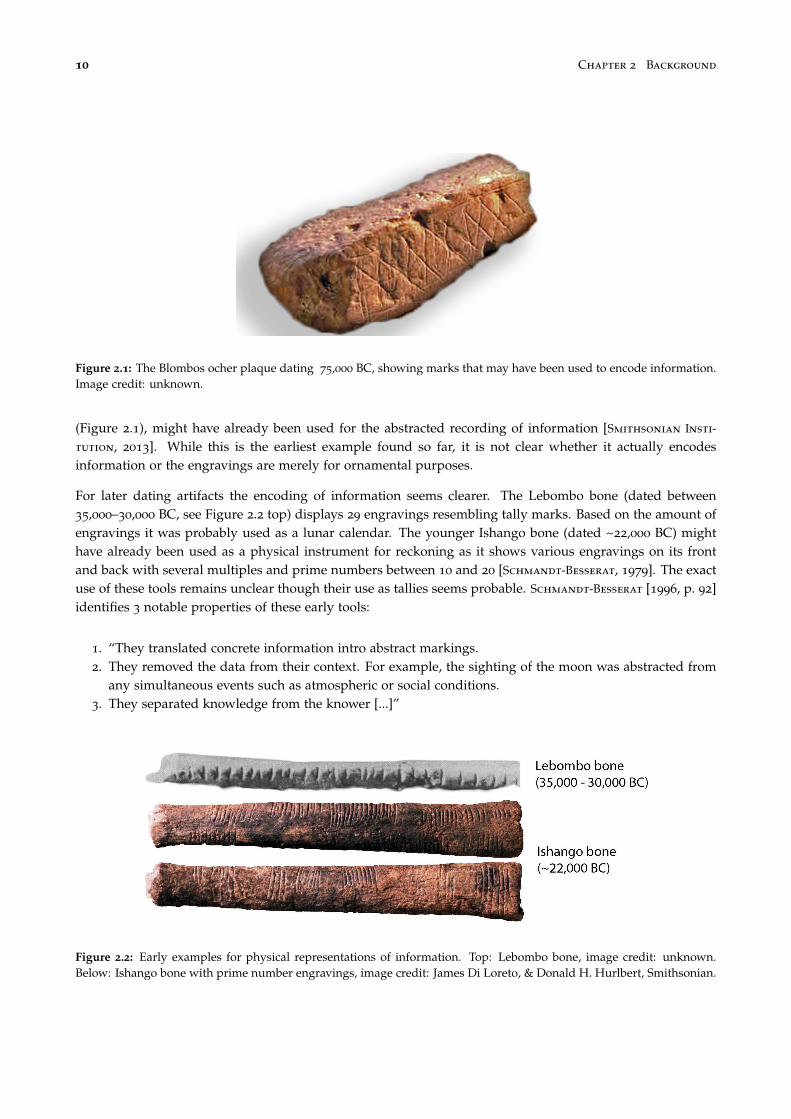
2.1 The Blombo ocher plaque. . . . . . . . . . . . . . . . . . . . . . . . . . . . . . . . . . . . . . . . . . 10
2.2 Lebombo and Ishango bone. Early examples for physical representations. . . . . . . . . . . . . . 10
2.3 Mesopotamian clay tokens. . . . . . . . . . . . . . . . . . . . . . . . . . . . . . . . . . . . . . . . . 11
2.4 An example of a quipu from the Inca Empire. . . . . . . . . . . . . . . . . . . . . . . . . . . . . . 12
2.5 Plan reliefs models from the 18th century. . . . . . . . . . . . . . . . . . . . . . . . . . . . . . . . . 13
2.6 Street car load in Frankfurt a. M. (Germany). . . . . . . . . . . . . . . . . . . . . . . . . . . . . . . 13
2.7 The cosmograph device for creating flow charts. . . . . . . . . . . . . . . . . . . . . . . . . . . . . 14
2.8 Three-dimensional curves of power consumptions from 1935. . . . . . . . . . . . . . . . . . . . . 14
2.9 Max Perutz. . . . . . . . . . . . . . . . . . . . . . . . . . . . . . . . . . . . . . . . . . . . . . . . . . 15
2.10 A reorderable physical matrix created by Jacques Bertin [Bertin, 1977]. . . . . . . . . . . . . . . 15
2.11 General Motors’ Lego visualization. . . . . . . . . . . . . . . . . . . . . . . . . . . . . . . . . . . . 16
2.12 Three Lego visualizations. . . . . . . . . . . . . . . . . . . . . . . . . . . . . . . . . . . . . . . . . . 16
2.13 Examples of tactile maps for vision impaired people. . . . . . . . . . . . . . . . . . . . . . . . . . 17
2.14 The Talking Campus Model at the Perkins School for the Blind. . . . . . . . . . . . . . . . . . . . . 17
2.15 Durrell Bishop’s marble answering machine. . . . . . . . . . . . . . . . . . . . . . . . . . . . . . . 18
2.16 Passive props to select 2D cuts out of 3D brain imaging data by Hinckley et al. . . . . . . . . . . 19

x List of Figures
2.17 The metaDESK system by Ullmer et al. . . . . . . . . . . . . . . . . . . . . . . . . . . . . . . . . . 19
2.18 Tangible query interfaces by Ullmer et al. [2003] . . . . . . . . . . . . . . . . . . . . . . . . . . . 20
2.19 Casier, tangible controllers by Ullmer et al. . . . . . . . . . . . . . . . . . . . . . . . . . . . . . . . 20
2.20 Tangible and touch navigation for circular tree structures by Hancock et al. . . . . . . . . . . . . 21
2.21 Stacked tangibles to perform faceted search by Klum et al. . . . . . . . . . . . . . . . . . . . . . . 21
2.22 Stereoscopic coral exploration. . . . . . . . . . . . . . . . . . . . . . . . . . . . . . . . . . . . . . . 22
2.23 Tangible urban planning tool by Underkoffler et al. . . . . . . . . . . . . . . . . . . . . . . . . . . 23
2.24 Tangible matrix system by Jacob et al. . . . . . . . . . . . . . . . . . . . . . . . . . . . . . . . . . . 23
2.25 Tangible views for tabletop displays by Spindler et al. . . . . . . . . . . . . . . . . . . . . . . . . . 24
2.26 Tangible props for structural biology analysis by Gillet al. . . . . . . . . . . . . . . . . . . . . . . 24
2.27 3D tangible landscape analysis system by Piper et al. . . . . . . . . . . . . . . . . . . . . . . . . . 25
2.28 Three different relief displays. . . . . . . . . . . . . . . . . . . . . . . . . . . . . . . . . . . . . . . . 25
2.29 Tangible, shape display composed of bars by Follmer et al. . . . . . . . . . . . . . . . . . . . . . . 26
2.30 Global Cities data sculpture. . . . . . . . . . . . . . . . . . . . . . . . . . . . . . . . . . . . . . . . . 27
2.31 Just use Lego by Samuel Granados. . . . . . . . . . . . . . . . . . . . . . . . . . . . . . . . . . . . 27
2.32 Fundament by Andreas Nicolas Fischer. . . . . . . . . . . . . . . . . . . . . . . . . . . . . . . . . . 28
2.33 Data sculptures based on weather data. . . . . . . . . . . . . . . . . . . . . . . . . . . . . . . . . . 28
2.34 Data sculptures based on acoustic data. . . . . . . . . . . . . . . . . . . . . . . . . . . . . . . . . . 29
2.35 Data Morphose by Christiane Keller. . . . . . . . . . . . . . . . . . . . . . . . . . . . . . . . . . . . 29
2.36 Pulse by Markus Kison. . . . . . . . . . . . . . . . . . . . . . . . . . . . . . . . . . . . . . . . . . . 30
2.37 The Centograph exhibit using 10 acrylic bars to visualize changes in trends for news coverageover the course of 100 years. The bars function as a display and are controlled by a separatecomputer terminal. . . . . . . . . . . . . . . . . . . . . . . . . . . . . . . . . . . . . . . . . . . . . . 30
2.38 The emoto data sculpture. . . . . . . . . . . . . . . . . . . . . . . . . . . . . . . . . . . . . . . . . . 31
3.1 Example for naturally occurring self-visualization. . . . . . . . . . . . . . . . . . . . . . . . . . . . 37
3.2 Quantitative and qualitative visual variables. . . . . . . . . . . . . . . . . . . . . . . . . . . . . . . 38
3.3 Examples for extruded 2D physical visualizations. . . . . . . . . . . . . . . . . . . . . . . . . . . . 39
3.4 Tangible controls in a hybrid information display. . . . . . . . . . . . . . . . . . . . . . . . . . . . 40
List of Figures xi
3.5 The instrumental interaction model. . . . . . . . . . . . . . . . . . . . . . . . . . . . . . . . . . . . 42
3.6 Tool definition. . . . . . . . . . . . . . . . . . . . . . . . . . . . . . . . . . . . . . . . . . . . . . . . 43
3.7 The Sketchpad system. . . . . . . . . . . . . . . . . . . . . . . . . . . . . . . . . . . . . . . . . . . . 44
3.8 Marie-Antoinette’s garden. . . . . . . . . . . . . . . . . . . . . . . . . . . . . . . . . . . . . . . . . 45
3.9 Example of an unembodied information display (left) and an embodied information display(right). . . . . . . . . . . . . . . . . . . . . . . . . . . . . . . . . . . . . . . . . . . . . . . . . . . . . 46
3.10 Street art in Paris. . . . . . . . . . . . . . . . . . . . . . . . . . . . . . . . . . . . . . . . . . . . . . . 47
3.11 Anamorphic streetart. . . . . . . . . . . . . . . . . . . . . . . . . . . . . . . . . . . . . . . . . . . . 48
3.12 Ceiling of the Sant Ignazio church in Rome. . . . . . . . . . . . . . . . . . . . . . . . . . . . . . . 48
3.13 Example for an embodied barchart (left) and an unembodied barchart (right). . . . . . . . . . . 49
3.14 Sculpture by Mike Knuepfel. . . . . . . . . . . . . . . . . . . . . . . . . . . . . . . . . . . . . . . . 49
3.15 Emoto, a hybrid information display. . . . . . . . . . . . . . . . . . . . . . . . . . . . . . . . . . . 49
3.16 Fog display. . . . . . . . . . . . . . . . . . . . . . . . . . . . . . . . . . . . . . . . . . . . . . . . . . 50
3.17 Embodied vs. unembodied control with equivalent functionality. . . . . . . . . . . . . . . . . . . 50
4.1 The WILD room display wall. . . . . . . . . . . . . . . . . . . . . . . . . . . . . . . . . . . . . . . . 54
4.2 Close-up tangible remote controller. . . . . . . . . . . . . . . . . . . . . . . . . . . . . . . . . . . . 58
4.3 Cardboard + copper tape prototypes and acrylic controls. . . . . . . . . . . . . . . . . . . . . . . 59
4.4 Mutual capacitance touch sensing . . . . . . . . . . . . . . . . . . . . . . . . . . . . . . . . . . . . 60
4.5 The functional design of our capacitive widgets, here of the tangible range slider. . . . . . . . . 60
4.6 Tangible remote controller system overview. . . . . . . . . . . . . . . . . . . . . . . . . . . . . . . 62
4.7 Toolbar showing all controls available with the infovis toolkit. . . . . . . . . . . . . . . . . . . . . 62
4.8 Mapping a tangible range slider to a dynamic query axis. . . . . . . . . . . . . . . . . . . . . . . 63
4.9 Top view of the tablet with the touch and the tangible slider. . . . . . . . . . . . . . . . . . . . . 68
4.10 Experimental setup for tangible/touch experiment. . . . . . . . . . . . . . . . . . . . . . . . . . . 69
4.11 Results for our three measures, averaged across trials. . . . . . . . . . . . . . . . . . . . . . . . . 71
4.12 User strategies for glances touch/tangible. . . . . . . . . . . . . . . . . . . . . . . . . . . . . . . . 72
4.13 Touch traces from the TRC experiment . . . . . . . . . . . . . . . . . . . . . . . . . . . . . . . . . 72
5.1 Physical visualizations that have been evaluated. . . . . . . . . . . . . . . . . . . . . . . . . . . . 79

xii List of Figures
5.2 Visual designs used in our experiment. . . . . . . . . . . . . . . . . . . . . . . . . . . . . . . . . . 82
5.3 Creation of physical barcharts. . . . . . . . . . . . . . . . . . . . . . . . . . . . . . . . . . . . . . . 83
5.4 Possible design for the 2D baseline. . . . . . . . . . . . . . . . . . . . . . . . . . . . . . . . . . . . 84
5.5 Setup for the first experiment. . . . . . . . . . . . . . . . . . . . . . . . . . . . . . . . . . . . . . . . 86
5.6 Time ratios between techniques, with 95% CIs. . . . . . . . . . . . . . . . . . . . . . . . . . . . . . 88
5.7 Average time on task for experiment 1. . . . . . . . . . . . . . . . . . . . . . . . . . . . . . . . . . 88
5.8 The four conditions included in the second experiment. . . . . . . . . . . . . . . . . . . . . . . . 91
5.9 The 3D tracking unit. . . . . . . . . . . . . . . . . . . . . . . . . . . . . . . . . . . . . . . . . . . . . 92
5.10 Time ratios between techniques, with 95% CIs of the second experiment. . . . . . . . . . . . . . 93
5.11 Mean times per technique, with 95% CIs of the second experiment. . . . . . . . . . . . . . . . . . 94
5.12 Subsurface crystal engraving does not support touch as it encloses data in glass cubes. . . . . . 95
6.1 Reference model for visualization by Card et al. . . . . . . . . . . . . . . . . . . . . . . . . . . . . 98
6.2 The visualization reference model by Chi and Riedl, and by Carpendale. . . . . . . . . . . . . . 99
6.3 Our extended infovis pipeline. . . . . . . . . . . . . . . . . . . . . . . . . . . . . . . . . . . . . . . 100
6.4 Notation: branches. . . . . . . . . . . . . . . . . . . . . . . . . . . . . . . . . . . . . . . . . . . . . . 104
6.5 Visual notation system. . . . . . . . . . . . . . . . . . . . . . . . . . . . . . . . . . . . . . . . . . . . 105
6.6 Notation: concrete vs. conceptual pipelines. . . . . . . . . . . . . . . . . . . . . . . . . . . . . . . 105
6.7 Notation: faithful rendering. . . . . . . . . . . . . . . . . . . . . . . . . . . . . . . . . . . . . . . . 106
6.8 Hans Rosling using physical objects to represent data during his TED talks. . . . . . . . . . . . . 108
6.9 Fishtank virtual reality. . . . . . . . . . . . . . . . . . . . . . . . . . . . . . . . . . . . . . . . . . . . 108
6.10 Tally marks. . . . . . . . . . . . . . . . . . . . . . . . . . . . . . . . . . . . . . . . . . . . . . . . . . 109
6.11 Brushing in a scatterplot matrix. . . . . . . . . . . . . . . . . . . . . . . . . . . . . . . . . . . . . . 110
6.12 Notation: propagation. . . . . . . . . . . . . . . . . . . . . . . . . . . . . . . . . . . . . . . . . . . . 111
6.13 Notation to model a range slider instrument. . . . . . . . . . . . . . . . . . . . . . . . . . . . . . . 112
6.14 Scented widgets by Willett et al. . . . . . . . . . . . . . . . . . . . . . . . . . . . . . . . . . . . . . 113
6.15 Visual notation: instrumental manipulation vs. operation. . . . . . . . . . . . . . . . . . . . . . . 116
6.16 Physical manipulation. . . . . . . . . . . . . . . . . . . . . . . . . . . . . . . . . . . . . . . . . . . . 117

List of Figures xiii
6.17 The tablets with the unembodied touch control (left) and the embodied tangible control (right)in front of the wall display showing also a slider and the participant’s drift relative to a pre-computed 1D path. . . . . . . . . . . . . . . . . . . . . . . . . . . . . . . . . . . . . . . . . . . . . . 118
6.18 Example for notation of the experiment in Chapter 4 Section 4 on page 66 . . . . . . . . . . . . . 119
6.19 Example for notation of the experiment in Chapter 5 Section 3 on page 85 . . . . . . . . . . . . . 120
6.20 Example for notation of the experiment in Chapter 5 Section 4 on page 91 . . . . . . . . . . . . . 121
6.21 Tangible Remote Controllers (Chapter 4) are physical widgets attached to tablet devices thatsupport mobile interaction with wall-size displays. . . . . . . . . . . . . . . . . . . . . . . . . . . 123
6.22 FatFonts [Nacenta et al., 2012] appear as a heatmap from far and shows numbers from close.By moving around, users conceptually switch between two visual mappings. . . . . . . . . . . . 124
6.23 Emoto [Stefaner and Hemment, 2012], a large-scale visualization operated with a jog wheel. . . 125
6.24 Using a physical prop to navigate an on-screen visualization [Kruszynski and Liere, 2009]. . . . 126
6.25 A reorderable physical chart rendered by digital fabrication as part of our own design explo-rations. . . . . . . . . . . . . . . . . . . . . . . . . . . . . . . . . . . . . . . . . . . . . . . . . . . . . 127
6.26 Data input with Lego bricks [Hunger, 2008] and DailyStack [Højmose and Thielke, 2010]. . . . . 128
6.27 Direct interaction with topographic data using Relief [Leithinger et al., 2011]. . . . . . . . . . . 129
7.1 Common fabrication machines. . . . . . . . . . . . . . . . . . . . . . . . . . . . . . . . . . . . . . . 137
7.2 Physical map of schools in San Francisco . . . . . . . . . . . . . . . . . . . . . . . . . . . . . . . . 139
7.3 The emoto data sculpture created from Twitter data by Moritz Stefaner, Drew Hemment, andStudio NAND. . . . . . . . . . . . . . . . . . . . . . . . . . . . . . . . . . . . . . . . . . . . . . . . . 140
7.4 Custom mapping and design of weather data from Canberra by Mitchell Whitelaw. . . . . . . . 140
7.5 Data jewelry as offered by meshu.io based on personal travel data. . . . . . . . . . . . . . . . . . 141
7.6 Examples of physical visualizations created with MakerVis. . . . . . . . . . . . . . . . . . . . . . 143
7.7 The MakerVis user interface. . . . . . . . . . . . . . . . . . . . . . . . . . . . . . . . . . . . . . . . 144
7.8 MakerVis: support for physical interactivity. . . . . . . . . . . . . . . . . . . . . . . . . . . . . . . 146
7.9 Different joint types. . . . . . . . . . . . . . . . . . . . . . . . . . . . . . . . . . . . . . . . . . . . . 147
7.10 Make it stand: carving of 3D models for balance purposes. . . . . . . . . . . . . . . . . . . . . . . 148
7.11 Solidity check by the Sculpteo webapp. . . . . . . . . . . . . . . . . . . . . . . . . . . . . . . . . . 148
7.12 Physical materials with different properties that could be used as encoding variables for avisualization. . . . . . . . . . . . . . . . . . . . . . . . . . . . . . . . . . . . . . . . . . . . . . . . . 149

xiv List of Figures
8.1 Physicalized, embodied controls from the first case study. . . . . . . . . . . . . . . . . . . . . . . 152
8.2 Experimental conditions for embodied and unembodied visualizations evaluated as part of thesecond case study. . . . . . . . . . . . . . . . . . . . . . . . . . . . . . . . . . . . . . . . . . . . . . . 153
8.3 The visual notation which is part of the interaction model. . . . . . . . . . . . . . . . . . . . . . . 153
8.4 Examples created with the MakerVis tool. . . . . . . . . . . . . . . . . . . . . . . . . . . . . . . . . 154
8.5 Physical material properties. . . . . . . . . . . . . . . . . . . . . . . . . . . . . . . . . . . . . . . . 155
8.6 Physical interactions with modular barcharts (left) and Lego bricks (right). . . . . . . . . . . . . 156
8.7 Example for thermochromic ink. . . . . . . . . . . . . . . . . . . . . . . . . . . . . . . . . . . . . . 157
8.8 Examples of technology for dynamic physical information displays. . . . . . . . . . . . . . . . . 157
A.1 Example laser stencil. . . . . . . . . . . . . . . . . . . . . . . . . . . . . . . . . . . . . . . . . . . . . 161
A.2 Instructions for experiment in Chapter 5 . . . . . . . . . . . . . . . . . . . . . . . . . . . . . . . . 162
A.3 Instructions for the range task. . . . . . . . . . . . . . . . . . . . . . . . . . . . . . . . . . . . . . . . 163
A.4 Instructions for the order task. . . . . . . . . . . . . . . . . . . . . . . . . . . . . . . . . . . . . . . . 164
A.5 Instructions for the compare task. . . . . . . . . . . . . . . . . . . . . . . . . . . . . . . . . . . . . . 165
A.6 General instructions concerning answer strategies. . . . . . . . . . . . . . . . . . . . . . . . . . . . 166
A.7 Instructions for the physical condition. . . . . . . . . . . . . . . . . . . . . . . . . . . . . . . . . . . 167
A.8 Instructions for the mono condition. . . . . . . . . . . . . . . . . . . . . . . . . . . . . . . . . . . . 168
A.9 Instructions for the stereo condition. . . . . . . . . . . . . . . . . . . . . . . . . . . . . . . . . . . . 169
A.10 Instructions for the 2D condition. . . . . . . . . . . . . . . . . . . . . . . . . . . . . . . . . . . . . . 170
A.11 Instructions informing participants about practice trials. . . . . . . . . . . . . . . . . . . . . . . . 171

List of Tables
4.1 Classification of interaction techniques for WSDs by input range and input type, with examplesof previous work. . . . . . . . . . . . . . . . . . . . . . . . . . . . . . . . . . . . . . . . . . . . . . . 56
5.1 Possible comparisons for visualization designs across modalities or visual encodings. . . . . . . 80
5.2 The four technique conditions. . . . . . . . . . . . . . . . . . . . . . . . . . . . . . . . . . . . . . . 85
5.3 Summary of comparisons between physical and on-screen modality. Positive marks indicateand advantage for the physical condition. . . . . . . . . . . . . . . . . . . . . . . . . . . . . . . . . 90


Abstract
Visualizations in the most general sense of external, physical representations of information are olderthan the invention of writing. Generally, external representations promote external cognition and visualthinking, and humans developed a rich set of skills for crafting and exploring them.
Computers immensely increased the amount of data we can collect and process as well as diversifiedthe ways we can represent it visually. Computer-supported visualization systems, studied in the field ofinformation visualization (infovis), have become powerful and complex, and sophisticated interactiontechniques are now necessary to control them. With the widening of technological possibilities beyondclassic desktop settings, new opportunities have emerged. Not only display surfaces of arbitrary shapesand sizes can be used to show richer visualizations, but also new input technologies can be used tomanipulate them. For example, tangible user interfaces are an emerging input technology that capital-izes on humans’ abilities to manipulate physical objects. However, these technologies have been barelystudied in the field of information visualization.
A first problem is a poorly defined terminology. In this dissertation, I define and explore the conceptualspace of embodiment for information visualization. For visualizations, embodiment refers to the levelof congruence between the visual elements of the visualization and their physical shape. This conceptsubsumes previously introduced concepts such as tangibility and physicality. For example, tangiblecomputing aims to represent virtual objects through a physical form but the form is not necessarilycongruent with the virtual object.
A second problem is the scarcity of convincing applications of tangible user interfaces for infovis pur-poses. In information visualization, standard computer displays and input devices are still widespreadand considered as most effective. Both of these provide however opportunities for embodiment: inputdevices can be specialized and adapted so that their physical shape reflects their functionality withinthe system; computer displays can be substituted by transformable shape changing displays or, eventu-ally, by programmable matter which can take any physical shape imaginable. Research on such shape-changing interfaces has so far been technology-driven while the utility of such interfaces for informationvisualization remained unexploited.
In this thesis, I propose embodiment as a design principle for infovis purposes, I demonstrate andvalidate the efficiency and usability of both embodied visualization controls and embodied visualizationdisplays through three controlled user experiments. I then present a conceptual interaction model andvisual notation system that facilitates the description, comparison and criticism of various types ofvisualization systems and illustrate it through case studies of currently existing point solutions. Finally,to aid the creation of physical visualizations, I present a software tool that supports users in buildingtheir own visualizations. The tool is suitable for users new to both visualization and digital fabrication,and can help to increase users’ awareness of and interest in data in their everyday live. In summary, thisthesis contributes to the understanding of the value of emerging physical representations for informationvisualization.
Keywords: information visualization, physical visualization, physvis, beyond-desktop visualizations,embodiment, infovis, wall-sized displays, tangible user interfaces, visual exploration, evaluation, inter-action model, notational system, digital fabrication


Resumé
Les visualisations, dans le sens général de représentations externes et physiques de données, sont plusanciennes que l’invention de l’écriture. De manière générale, les représentations externes encouragentla cognition et la pensée visuelle, et nous avons développé des savoir-faire pour les créer et les exploiter.
La révolution informatique a augmenté la quantité de données qu’il est possible de collecter et de traiter,et a diversifié les façons de les représenter visuellement. Les systèmes de visualisation assistés par or-dinateur, et étudiés dans le domaine de la visualisation d’information, sont aujourd’hui si puissants etcomplexes que nous avons besoin de techniques d’interaction très sophistiqués. Grâce au développe-ment des possibilités technologiques au-delà des ordinateurs de bureau, un large éventail d’utilisationsémerge. Non seulement des surfaces d’affichage de formes et de tailles variées permettent de mon-trer des visualisations plus riches, mais aussi des dispositifs d’entrée de nouvelle génération peuventêtre utilisés qui exploitent les aptitudes humaines à manipuler les objets physiques. Cependant, cestechnologies sont peu étudiées dans le contexte de la visualisation d’information.
Tout d’abord, un premier problème découle d’une terminologie insuffisante. Dans cette thèse, je définiset étudie entre autres le concept de corporalisation (embodiment) pour la visualisation d’information.Concernant les visualisations, la corporalisation réfère à la congruence entre les éléments visuels d’unevisualisation et leurs formes physiques. Ce concept intègre des concepts déjà connus tels que la tan-gibilité. Par exemple, l’interaction tangible s’attache à la représentation d’objets virtuels par des objetsphysiques. Mais en réalité, leur forme physique n’est pas nécessairement congruente avec l’objet virtuel.
Un second problème découle du peu d’exemples convaincants d’interfaces tangibles appliquées à lavisualisation d’information. Dans le domaine de la visualisation d’information, les écrans standard etles dispositifs d’entrée génériques tels que la souris, sont toujours les plus courants et considérés commeles plus efficaces. Cependant, aussi bien la partie affichage que la partie contrôle fournit des possibilitésde corporalisation : les dispositifs d’entrée peuvent être spécialisés et adaptés de façon à ce que leurforme physique ressemble à leur fonction; les écrans peuvent être rendus déformables ou, dans l’avenir,être composés d’une matière programmable capable de prendre n’importe quelle forme imaginable.Mais la recherche sur les écrans et matières déformables est pour l’instant principalement dirigée parl’innovation technologique sans tenir compte des applications possibles à la visualisation d’information.
Dans cette thèse, je propose la corporalisation comme principe de conception pour la visualisationd’information. Je démontre l’efficacité et l’utilisabilité des dispositifs d’entrée corporalisés ainsi que desaffichages corporalisés, en présentant trois expériences contrôlées. Par la suite, je présente un modèled’interaction conceptuel et un système de notation visuelle pour décrire, comparer et critiquer différentstypes de systèmes de visualisation, et j’illustre l’utilisation de ce modèle à partir d’études de cas. En-fin, je présente un outil de conception pour aider à la création de visualisations physiques. Cet outils’adresse à des utilisateurs novices en visualisation d’information et en fabrication numérique, et peutcontribuer à sensibiliser ces utilisateurs à l’intérêt d’explorer des données qui les concernent dans leurvie quotidienne. En résumé, cette thèse contribue à la compréhension de la valeur ajoutée des interfacesphysiques pour la visualisation d’information.

xx Resumé
Mots-clès : visualisation d’information, visualisation physique, physvis, visualisations au-delà du bureau,corporalisation, infovis, murs d’écrans, interfaces utilisateur tangibles, exploration visuelle, évaluation, mod-èle d’interaction, système de notation, fabrication numérique

Acknowledgements
I would like to thank all those people who, whether knowingly or unknowingly, helped, supported, oraccompanied me throughout the last three years.
Most importantly, I like to thank my two thesis advisors, Jean-Daniel Fekete and Pierre Dragicevic. I amforever grateful for the many fruitful discussions over the last three years and for their help in shaping mywork into presentable form. Jean-Daniel, thank you for taking me on as a phd student, for providing awelcoming and inspiring working environment, and for always having an open ear. You make the Aviz teaman amazing place to work, and I feel lucky to have been a part of this great team. Pierre, thank you forteaching me what it means to be a researcher, for offering support when I needed it, as well as for lettingme explore different possible solutions on my own, and for having a good intuition on when which one tochoose. Thank you also for helping me to get organized and to manage my time more efficiently.
Then, of course, I thank all the members of the Aviz team. Thank you for all the fruitful discussions, yoursupport, your feedback and encouragement, and your willingness to listen to my early and unpolished testtalks. You have been a great help, and it was a pleasure to work with all of you. I also thank all the anonymousvolunteers who participated in any of my studies.
I would like to thank Paul Milgram for philosophizing with me about what it could mean for a visualizationto be embodied. Our discussion and his input was instrumental in shaping my thinking to focus on howa visualization is perceived and which purpose it serves. I thank Geoff Cumming and Barbara Tverskyfor sharing their thoughts on the article submission underlying Chapter 5. Geoff, thank you specificallyfor inspiring me to report all experiments contained in this thesis entirely based on estimation using thenew statistics while completely avoiding null hypothesis significance testing. Brygg Ullmer, thank you forencouraging and challenging my research in the early stages of my thesis.
Thanks go also to the Aviz band as well as the musika mishto project and the numerous people with whomI had the pleasure to play music during my time in Paris. Playing with all of you was a most welcomeafter-work distraction, and I’m glad we got to play publicly even if only for la fête de la musique. I hope wewill play again when I return to visit Paris.
Thanks go also to Jad Abumrad and Robert Krulwich, Dan Carlin, Desiree Schell, and David McRaney formaking the RER trip to the lab an interesting and at times insightful experience.
I especially thank my parents for their support, understanding, and encouragement to go abroad and topursue a Ph.D.
Last but not least I thank the members of my jury, Michel Beaudouin-Lafon, Sheelagh Carpendale, JasonDykes, and Kasper Hornbæk for their time and effort of reviewing this thesis and their valuable feedback.

xxii Acknowledgements
Picture Credits
Thanks go also to those who appear visually in this thesis: Nadia Boukhelifa, thank you for being my modelin some of the pictures; Benjamin Bach and Samuel Huron: thank you for letting me sketch you for someof the illustrations I use in this thesis and for the slides of my presentations. Charles, thanks for actingconvincingly surprised when shooting my fast forward video.

Glossary
The definitions provided here are of stipulative nature and designed for the purpose of this thesis. Numbersindicate the page where a term is defined and where examples can be found that illustrate the term and itsdefinition.
A
Abstract Visual Form The abstract visual form is a stage in the infovis pipeline and refers to the outcomeof the visual mapping transformation. It is abstract because the visualization is at this point not yet fullydefined. 101
C
Conceptual Equivalence Two pipelines are conceptually equivalent if they yield the same end result.Pipelines can be partially equivalent up to a certain stage before the physical presentation. 106
Control A control is an information display that can cause meaningful changes on another informationdisplay. 39
Active Control An active control requires electricity to function as a control. 41
Artistic Control An artistic control does not make its modu operandi readily available to an observer. It isusually designed for playful or artistic exploration, rather than to be operated efficiently. 40
Interactive Control An interactive information control is one that changes the information it displays toreflect the manipulations of an observer. 41
Non-interactive Control A non-interactive control has no means of reflecting an observers manipulationsitself. It can only affect the information display it controls without affecting its own visual appearance. 41
Passive Control A passive control can always perform its intended use without requiring any electricity.41
Physical Control A physical control is a physical information display to control another information dis-play. 40
Pragmatic Control A pragmatic control is designed for efficiency. 40
Tangible Control A tangible control is a physical control that is linked to a virtual information display andhence often results in a hybrid information display. 40
D
Data Sculptures Data sculptures are artistic physical information displays. 26–31, 35
Data Transformation Data transformation is part of the infovis pipeline and defines how raw data is pro-cessed into a form that is suitable for visualization. 100

xxiv Glossary
Decoding + Insight Formation The decoding + insight formation is a transformation in the infovis pipelineand refers to the inverse application of the visual mapping function by an observer to extract informationfrom a visual presentation. 103
E
Embodied Information Display An information display that elicits a stable and robust perception of con-gruence between the surfaces of the physical display medium itself and the surfaces it is meant to display,without visual or haptic discrepancies, is embodied. 46
Embodied Control A control is embodied if the surfaces it means to display are embodied. For a control,these surfaces are the ones that communicate the control’s perceived affordances, i.e., all surfaces necessaryto communicate to an observer that it is a control, how to operate it, and in what state it currently is. 50
Embodied Visualization A visualization is embodied if the surfaces that constitute its visual marks areembodied. 49
Encoding Visual Variables All visual variables available in a visualization technique that are mapped to adata dimension are called encoding visual variables. 101
F
Faithfulness A faithful rendering transformation is one that preserves all information contained in the visualpresentation and reflects it in the resulting physical presentation. 106
Free Visual Variables All visual variables available in a visualization technique that are not mapped to anydata dimension are called free visual variables. 101
I
Information (observer side) As part of the oberver side of the infovis pipeline, information here refers tothe knowledge an observer gained from a visualization or the knowledge an observer intends to add to anexisting visualization. 103
Information Display An information display is an artifact that presents information to an observer in visualform. 33
Active Information Display An active information display depends on electricity to convey its informa-tion.. 35
Artistic Information Display An artistic information display does not make its information readily avail-able to an observer. It is usually designed to communicate a concern, rather than to show data efficiently.34
Compound Information Display A compound information display is composed of two or more informa-tion displays that are commonly linked in some way. 36
Hybrid Information Display A hybrid information display is a compound information display whoseparts differ along at least one of the dimensions active – passive or physical – virtual. 36
Interactive Information Display The level of interactivity of an information display refers to the amountof meaningful changes an observer can perform on an information display. 35
Passive Information Display A passive information display is one that is always able to convey its infor-mation without requiring electricity. It is thereby always on. 35
Physical Information Display A physical information display is one that is made of physical matter. 34
Pragmatic Information Display A pragmatic information display is one that is designed for analyticalpurposes with visual efficiency as a key criterion. 34

Glossary xxv
Time-multiplexed Information Display A time-multiplexed information display can reflect different in-formation over time. 42
Virtual Information Display A virtual information display is one that is or presented on a computer screenor projected on a surface. 34
Infovis Pipeline The infovis pipeline is a conceptual model of the visualization process. It is described as asequence of transformations applied to some data that finally results in a representation which observers canperceive visually.
Conceptual Pipeline A conceptual pipeline is a pipeline that, if it was made concrete, would yield thesame physical presentation as a concrete pipeline but through possibly different means. 104
Concrete Pipeline A concrete pipeline is a pipeline whose stages and transformations have an actualexistence in the world. 104
Instruments Instruments are a specific way of looking at controls through the lens of the instrumental inter-action model. 41
Integration The integration transformation is part of the infovis pipeline and defines how a new percept iscombined with previous percepts to update a mental visual model of the visual presentation. 103
M
Mental Visual Model The mental visual model is a stage in the infovis pipeline and refers to a rough sketchof a visual presentation that helps users maintain an overview of what is where and remain oriented duringthe visual exploration process. 103
O
On-screen Modality On-screen modality refers to a virtual information display that presents its informationthrough a (computer) screen. 34
P
Percept A percept is a stage in the infovis pipeline that refers to what an observer sees at a given point intime. 102
Percept Transformation The percept transformation is part of the infovis pipeline and defines how the phys-ical presentation becomes a percept. 102
Physical Modality Physical modality refers to a physical information display. 34
Physical Presentation The physical presentation is a stage in the infovis pipeline and refers to the physicalobject or apparatus that makes the visualization observable, in the state defined by the rendering transfor-mation. A physical presentation is an information display. 102
Physicalization Physicalization is the process of creating a physical information display. 39
Physicalization of Instruments The physicalization of instruments refers to the process of transferring moreof the logical part of instruments into the physical world in a way that the physical handles are better adaptedto the logical parts of the instruments they control. 43
Presentation Mapping Presentation mapping is a transformation in the infovis pipeline and sets all free,non-encoding, visual variables. 101
Processed Data Processed data is a stage in the infovis pipeline and refers to data in a synthetic format thatis suitable as input for a visual mapping. 101
R

xxvi Glossary
Rendering The rendering transformation is part of the infovis pipeline and makes the visual presentationperceivable by bringing it into existence in the physical world as a physical presentation. 102
V
Visual Mapping Visual mapping is a transformation in the infovis pipeline that defines an initial visual formfor some processed data by mapping data entities to visual marks and data dimensions to visual variables.101
Visual Presentation The visual presentation is a stage in the infovis pipeline and refers to a complete visualspecification of a visualization which can be thought of as a bitmap image, a scenegraph, or a 3D model in acomputer implementation. 102

Figure 1.1: Chart by William Playfair (1821) showing the price of wheat and weekly wages.
1Introduction
“There is a magic in graphs. The profile of a curve reveals in a flash a whole situation—the life of anepidemic, a panic, or an era of prosperity. The curve informs the mind, awakens the imagination,
convinces.”
—Henry D. Hubbard

2 Chapter 1 Introduction
Figure 1.2: Charles Minard’s 1869 chart showing the diminishing number of men in Napoleon’s 1812 Russian campaignarmy, their movements, as well as the temperature they encountered on their return path.
The visual representation of information as an augmentation of human intellect has a by now long history.External representations allow one to reason about abstract information using vision to detect trends, corre-lations, or anomalies. Playfair, who is credited for inventing barcharts and linecharts in the 18th century (e.g.,Figure 1.1), already noted:
“As the eye is the best judge of proportion, being able to estimate it with more quickness andaccuracy than any other of our organs, it follows, that wherever relative quantities are in question,a gradual increase or decrease of any revenue, receipt, or expenditure, of money, or other value isto be stated, this mode of representing it is peculiarly applicable; it gives a simple, accurate, andpermanent idea, by giving form and shape to a number of separate ideas, which are otherwiseabstract and unconnected.”
—William Playfair [Playfair, 1801, p. X]
This insight into the value of visual representations prevailed over the course of the 19th century and led toa rich variety of data graphics especially in the context of population statistics and business intelligence (seee.g., [Brinton, 1914]). The creation of data graphics was at the time however a laborious and time-consumingtask requiring skill and patience as these charts were drawn by hand.
With the advent of the computer, the automatic creation of charts, even for large datasets, became possible,and shortly thereafter dynamic data graphics emerged in the form of statistical graphics [Andrews et al., 1988].Since then, information visualization (infovis) has been established as a field [Card et al., 1999] encompassinga wide range of research into different aspects of visualization such as the efficiency of different visualencodings due to basic human perception [Cleveland and McGill, 1984], visualization techniques for varioustypes of data (e.g., temporal, spatial, multi-variate, high-dimensional), programming toolkits [Fekete, 2004;

3
Heer et al., 2005], interaction techniques to support the data analysis process, or theoretical contributionssuch as models [Munzner, 2009; Card et al., 1999; Chi and Riedl, 1998] and taxonomies [Amar et al., 2005;Morse et al., 2000].
Figure 1.3: A GUI’s mental model ofa user [O’Sullivan and Igoe, 2004;Klemmer et al., 2006]
Most of this research assumes however a user working in a desktop envi-ronment, operating a computer with a two-dimensional display, a mouseand a keyboard (Figure 1.3). More recently, interest in visualizationsbeyond the desktop has arisen [Lee et al., 2012]. While this work bringsforward new interaction techniques, it still mostly focuses on screen-based visualizations, extending now to large viewing environments andto touch-operated devices. For example, multi-touch devices are oftenconsidered to be more physical and closer to real world interactions thanthe standard desktop setup as they allow users to “touch” visualizations,and are therefore considered as being more direct. However the physicalactions supported by touch screens only account for a small subset ofpossible hand gestures. The expressive power of the human hand is muchricher than what can be utilized by flat touch screens [Victor, 2011] (seeFigure 1.4 as an illustrative example for the richness of possible gesturesto perform grasping depending on task, power, and object size).
Tangible interaction techniques incorporate some of this expressiveness through the use of physical controlsthereby leveraging our ability to manipulate real world objects as proxies for virtual content [Ishii and Ullmer,1997]. Within in the field of general human computer interaction, tangible interaction is today a well estab-lished subfield. Still, the notion of tangible interaction has for infovis applications so far only been appliedfor some point solutions, e.g., [Jetter et al., 2011; Klum et al., 2012; Spindler et al., 2010; Ullmer et al., 2003].The possibility of giving physical shape to information itself, and not just to controls, has however been mostlydisregarded—at least since the appearance of computer supported visualizations.
Looking back, we find that physical representations of information are even older than the invention ofwriting [Schmandt-Besserat, 1996]. Prehistoric archaeological founds attest to the use of physical objectssuch as tally sticks for record-keeping and reckoning at least as far back as the Upper Paleolithic (~30,000 to12,000 years ago) [Schmandt-Besserat, 1979]. In result to changes in lifestyle and societal organization suchobjects then first diversified towards separate, more expressive counting tokens and eventually converged todrawn representations on two-dimensional surfaces — first on clay tablets, later on paper, and nowadayson computer screens. While drawn representations are versatile and can be fast to create and recreate, welost one spatial dimension and now information displays are mainly flat surfaces that are inaccessible to directmanual interaction. The physical origins of information visualization have been mostly forgotten in the field.
Through tangible user interfaces (TUIs), a contemporary trend in human computer interaction (HCI), three-dimensional physical objects are merged into today’s computing systems by marrying physical objects withsome associated digital information. The idea behind is to provide richer physical handles for either pieces ofinformation or for computing functionality. While the concept blossoms overall in the field of HCI, it hasonly been occasionally applied to infovis systems [Lee et al., 2012]. Overall such technology has the potentialto loosen the restrictions of desktop computing and to leverage our well-trained real-world abilities for objectperception and object manipulation ( Figure 1.4 on the next page).

4 Chapter 1 Introduction
Figure 1.4: Classification of manual grasping gestures by Cutkosky and Howe [1990].
Nonetheless, TUIs bring foremost the user input side back into the physical world while most of these systemsstill use 2D displays as information displays. Admittedly, the actual shape of these displays can vary betweena multitude of small displays and fewer very large displays walls as predicted by Mark Weiser in 1991
[Weiser, 1991], and some displays are even bendable [Schwesig et al., 2004], foldable [Khalilbeigi et al., 2012],or rollable [Khalilbeigi et al., 2011] so that their shape can be adapted to fit different environments or usecases. However, these changes in shape are currently only possible within very limited, pre-defined ranges.
For infovis applications, visual parameters such as position, size, color, and shape encode data [Bertin, 1967].Consequently, detailed and accurate control about the exact physical properties of a display is desirable.Ideally, the shape and other physical properties of an information display, can be used to encode data.Currently available techniques for shape-changing interfaces [Rasmussen et al., 2012] have not yet exploredtheir applicability for visualization purposes or have done so only very limited using specific visualizationtypes such as bar charts [Follmer et al., 2013]. Ongoing research on freely programmable matter [Wissner-
Gross, 2008] and the concept of radical atoms promise to diversify possible shapes immensely [Ishii et al.,2012], but remain for the foreseeable future unavailable.

Section 1 The Value of Physicality for Information Visualization 5
Figure 1.5: Left: the structure of penicillin by Dorothy Hodgkin-Crowfoot, 1945. Right: time series of temperature datafrom Helsinki, Finland, 2009/10 by Miska Knapek.
Parallel to the evolution of computing systems, mainly artists and designers but also analysts have beencrafting three-dimensional physical visualizations (e.g., Figure 1.5). The freedom of shape for such objects isonly limited by available materials and the laws of physics. Despite these limitations a rich variety of suchvisualizations has been created and exists to this day [Dragicevic and Jansen, 2013] as they seem to be morecompelling [Gwilt et al., 2012], more expressive [Vande Moere, 2008], and, as we show in Chapter 5, in somecases even more effective than on-screen visualizations. So far physical visualizations as pragmatic supple-ments to on-screen visualizations have received little attention within the field of information visualization.It is unclear what exactly we can gain by encoding information physically.
1 The Value of Physicality for Information Visualization
Van Wijk [2005] proposed an economic model to evaluate the value of a visualization method. While themodel’s purpose is not to put an exact value on a specific visualization, it is well suited to contrast relativedifferences in cost and value between techniques. Van Wijk identifies four different costs that need to betaken into account when considering the value of a visualization method:
1. initial development costs resulting from developing, implementing, and being able to present a visualiza-tion method.
2. initial costs per user capturing users’ time investment to select, acquire, understand, and customize avisualization method according to their needs.
3. initial costs per session occur for each instantiation of a visualization method for a new data set.4. perception and exploration costs include the time and cognitive effort users invest to perceive and under-
stand, as well as manipulate, a visualization to explore the contained data.

6 Chapter 1 Introduction
Physical information displays, such as data sculptures (Figure 1.5), seem, at first sight, to increase initialdevelopment costs as well as costs per user and session. Each visualization instance requires crafting toexist as an object in the physical world. With recent technological advances in the area of digital fabricationhowever [Gershenfeld, 2008], the costs are constantly decreasing and might at some point become negligible.This leaves the question whether the perception and exploration costs are significantly lower than those ofalternative solutions.
2 Thesis Statement
I promote a change in the view we design information visualization systems. Technology is diversifying andnow provides a wide range of interactive environments of which information visualization systems can takeadvantage. Specifically technology that can give physical shape to information displays and their controls area promising avenue to leverage human skills for real-world perception and manipulation of physical objects.New environments provide new opportunities, and to make efficient use of these we need new models andempirical data that take the entire environment and the people within into account.
Physical and tangible information visualizations have so far received little attention within the field of infovis.This thesis provides a first formal exploration of possible benefits and current limitations of physical andtangible information visualizations, formal methods to describe, compare, and criticize such systems, andtools to support users in creating such systems. This thesis contributes to the understanding of the value ofemerging physical representations for information visualization.
3 Thesis Overview
Chapter 2 “Background” (on page 9)In this chapter, I provide an overview of the previous use of physical artifacts for the purpose of visualizinginformation. Historically, different domains have visualized data using physical artifacts. Initially, this wasthe only way as no computing technology was available. Then, such artifacts became virtual and computerssimplified the at the time laborious task of crafting visualizations. Towards the end of the 20th centurytangible interfaces emerged, partially bringing computer functionality back into the physical world. Morerecently mainly artists and designer started to create data sculptures as digital fabrication now simplifies theircreation.
Chapter 3 “Concepts and Terminology” (on page 33)In this chapter, I introduce and define concepts and terminology used throughout this thesis. The definitionsprovided here allow a consistent description of pragmatic properties of physical visualization artifacts as wellas methods to investigate their perceived properties.
Chapter 4 “Case Study: The Physicalization of Controls for Wall-Sized Display Interaction” (on page 53)In this chapter, I investigate customizable tangible remote controllers for visualizations in a large viewingenvironment. I present details on the physical design and the construction of the physical controls, and asoftware prototype exploring the feasibility of the approach. Finally, I report empirical results comparing theperformance of physical controls against virtual, touch operated controls suggesting that the tangible controlsmake it easier for users to focus on the visual display while they interact with it.
Chapter 5 “Case Study: Possible Benefits for the Physicalization of Information Displays” (on page 77)In this chapter, I consider the physicalization of the display part of a visualization system. I present the firstinfovis study comparing physical to on-screen visualizations for information retrieval tasks. The visualiza-

Section 3 Thesis Overview 7
tions are designed such that they differ in modality but not in their visual encoding. The study suggests thatthe efficiency of physical visualizations seems to stem from features that are unique to physical objects, suchas their ability to be touched and their perfect visual realism.
Chapter 6 “Interaction Model for Beyond Desktop Visualizations” (on page 97)Many more experiments are required to fully establish the value and understand all the properties of physicalinformation displays. To structure this exploration, I present a generalized model to capture and comparethe variety of possible systems. I therefore introduce an interaction model for visualizations beyond the desktop todescribe and compare different visualization systems. I also introduce a visual notation system to illustrateand visualize equivalence and differences between visualizations. I demonstrate its usefulness by visualizingthe experimental conditions of the three experiments described before, and by analyzing 8 case studies takenfrom the field of beyond-desktop visualizations.
Chapter 7 “The Creation of Physical Visualizations” (on page 135)In this chapter, I describe current practices and problems that arise when creating physical visualizations.Based on this problem analysis, I present a tool to create physical visualizations. Such a tool further de-creases the initial development costs and initial costs per session for the creation of physical visualizations. Inconsequence, such a tool can facilitate the gathering of further evidence for the usefulness of physical infor-mation visualizations.
Chapter 8 “Summary and Perspectives” (on page 151)After summarizing the findings of this thesis, I lay out perspectives for future research. Specifically, I discussthe extended range of so far mostly unexplored physical variables available to a visualization designer whencreating a physical visualization and the extend to which interactivity can embedded in the physical designof a visualization.


2Background
“Interaction in the physical world changes as it becomes fluid. If hurdles are removed, interactionbecomes invisible –– it disappears from your conscious mind and your train of thought is not broken; you
concentrate on the purpose and not the process. You don’t have to think about doing the action. Eventuallythe physical object becomes what it does and in our minds you no longer see it as a set of mechanisms. It
simply becomes its purpose. [...] I see the process as working like this: You have to be able to see thepotential of something in order to act on it. When you do act on it, what you get must be worth the effort of
the activity needed in getting it. The way of getting to something should become quicker with practice.When you no longer have to think about how you get to something then the objects become what it
does — it becomes part of our physical language.”
—Durrell Bishop. Connecting the digital world with print.
In this chapter I give an overview over previous work from different domains that can be classified as someform of physical visualization of data or that makes use of physical objects to interact with data. To thatpurpose I first provide a short history of the physical visualization of data throughout human history followedby an overview of how physical interaction entered the world of computing systems in the form of the tangibleuser interface (TUI) paradigm. Finally I present a selection of data sculptures, recent work from the art anddesign community, whose designs are data-driven.
The purpose of this chapter is not an exhaustive account but an illustration of the diversity of physicalinformation representations throughout history and across different domains and communities. Exampleswere selected to demonstrate this diversity as well as some common and recurring properties as discussedthroughout this chapter.
1 A Short History of Physical Representations of Information
The physical representation of information is much older than the existence of computational devices andeven of paper. One of the oldest archaeological founds, the more than 75.000 year old Blombo ocher plaque
10 Chapter 2 Background
Figure 2.1: The Blombos ocher plaque dating 75,000 BC, showing marks that may have been used to encode information.Image credit: unknown.
(Figure 2.1), might have already been used for the abstracted recording of information [Smithsonian Insti-
tution, 2013]. While this is the earliest example found so far, it is not clear whether it actually encodesinformation or the engravings are merely for ornamental purposes.
For later dating artifacts the encoding of information seems clearer. The Lebombo bone (dated between35,000–30,000 BC, see Figure 2.2 top) displays 29 engravings resembling tally marks. Based on the amount ofengravings it was probably used as a lunar calendar. The younger Ishango bone (dated ~22,000 BC) mighthave already been used as a physical instrument for reckoning as it shows various engravings on its frontand back with several multiples and prime numbers between 10 and 20 [Schmandt-Besserat, 1979]. The exactuse of these tools remains unclear though their use as tallies seems probable. Schmandt-Besserat [1996, p. 92]identifies 3 notable properties of these early tools:
1. “They translated concrete information intro abstract markings.2. They removed the data from their context. For example, the sighting of the moon was abstracted from
any simultaneous events such as atmospheric or social conditions.3. They separated knowledge from the knower [...]”
Figure 2.2: Early examples for physical representations of information. Top: Lebombo bone, image credit: unknown.Below: Ishango bone with prime number engravings, image credit: James Di Loreto, & Donald H. Hurlbert, Smithsonian.

Section 1 A Short History of Physical Representations of Information 11
Still, their use was quited limited as only one type of information could be collected, and only the knowerknew what it encoded. Furthermore, these tallies were only suitable for accumulative information since thenotches were permanent and tallies could not be disassembled.
Clay tokens. Around 8,000 BC, concurrently with the beginnings of agriculture, the clay token system (seeFigure 2.3) developed in Mesopotamia and spread throughout the Middle East [Schmandt-Besserat, 1996,p.26f]. Each token represented a physical entity or a certain amount of it, such as a sheep or a jar of oil.Such a system is called a concrete counting system where different objects are used to count different things.Concrete counting is more flexible than the earlier tally counting, a one-to-one correspondence system. Withtallybones, only one type of item can be counted per bone: if one bone was used to count sheep, then anotherone was required to count the number of animal kills a hunter achieved.
With tokens this information was encoded in the shape of the token while the number of tokens of a specificshape indicated the amount. Token systems developed at around the same time as agricultural settlements.Earlier hunter and gatherer societies had no need for complex token systems. They were egalitarian societieswhere commodities were hunted or gathered and distributed on a daily basis among all members of societiesbased on their social status. With agriculture, longer term planning became necessary. Furthermore, statesformed and taxation appeared that required to keep records on who paid how much and when.
Note that the token system was in use before the invention of writing and that evidence suggests that thespoken language had not yet a concept of abstract numbers to reckon independently from the subject ofreckoning. Counting was performed as “the repeated addition of one unit” [Schmandt-Besserat, 1996, p. 114],while it is not unlikely that reckoning was performed as a visual task at this point in time. For example, weknow that these tokens were used for barter trade. The parties involved in such a trade transaction might verywell have negotiated the exchange rates with these tokens “until it looked right”. The agreed upon exchangewas then sealed in an envelope or strung on a string whose ends were then sealed by a so-called bulla. Sinceenvelopes were also made of clay, they were opaque. The tokens inside were impressed on the outside of theenvelope for later identification. These impressions are however already a 2.5D representation of the actualtokens, and more difficult to recognize accurately. The spatial placement of impressions thereby became
Figure 2.3: Mesopotamian clay tokens and a clay envelope with impressions of the tokens contained in it. Image credit:Denise Schmandt-Besserat

12 Chapter 2 Background
important to facilitate the disambiguation of impressions. Later these impressions were further abstractedand developed into the Cuneiform writing system [Schmandt-Besserat, 1996, p. 84ff].
To summarize, the token system was an early abstract codified system that supported visual reckoning. To-kens “translated concrete information into abstract markings, removed the data from their context, separatedthe knowledge from the knower, and increased objectivity” [Schmandt-Besserat, 1996, p. 97]; more of theirproperties are listed in Appendix B on page 173 (quoted directly from [Schmandt-Besserat, 1996]). But to-kens did not allow people to abstract the amount of something from that something. So their advantage ofeasy physical “manipulation of information to add, subtract or rectify data at will” [Schmandt-Besserat, 1996,p. 96] was also their biggest drawback: “although they were small, the counters were also cumbersome whenused in large quantities” [Schmandt-Besserat, 1996, p. 97]. With writing systems this drawback was alleviatedat the cost of the easy manipulability of abstract information.
Quipus. A more complex and powerful information recording and visualization system was the quipu (seeFigure 2.4) used by the Incas starting around 3,000 BC up to the 17th century our time. Quipus use a spatialencoding based on a variety of knots in strings of various colors. While we are not able to decipher themcompletely nowadays, it is clear that they encode mostly numerical information in base 10. Information isencoded through the amount of knots in a string, the position of knots relative to each other and to otherstrings, the knot type, and possibly the color of the string to encode qualitative information. Quipus wereprobably among others used as an accounting system. Due to the abstract encoding probably only thequipu maker was able to read his quipu which might have been the reason why the system was eventuallysuppressed by the Spanish conquerors. Quipus were the only information preserving tool available to theIncas. They developed no other writing systems.
After the invention of writing and eventually of paper, paper became the preferred medium to externalizeinformation. Many discoveries were made in terms of new visual encodings, such as the cartesian coordinatesystem [Descartes, 1637] to create scatterplots or bar- and linecharts [Playfair, 1801] (see Figure 1.1 and Fig-ure 1.2 in Chapter 1). These are usually considered as the beginnings of information visualization. However,despite the prevalence of paper and ink, information was in some cases still externalized in physical form. Igive notable examples here.
Figure 2.4: Left: an example of a quipu from the Inca Empire. Right: example for a hypothetical encoding of an event.

Section 1 A Short History of Physical Representations of Information 13
Figure 2.5: Plan-reliefs models as used for military defense planning in Europe. Left: Mont Saint Michel (image credit:Giorgos Michalogiorgakis via flickr.com), right: model of the attack on a French fortress for analytic purposes (imagecredit: Bolt of Blue via flickr.com).
Plan-relief models. In 16th century Europe engineers started to build miniature models of cities and itsfortifications (see Figure 2.5). This tradition is today still alive as architects continue to create physical modelsfor buildings in planning. Apart from showing the details of a planned construction these relief models wereused to analyze the topographical specifics of an area or fortification–both for planning its defense or to planattacks. In contrast to the tally sticks, tokens, and quipus, these plan-relief models do not encode abstractinformation. I discuss such differences in the next chapter.
Figure 2.6: A map of the load of the street car network inFrankfurt a. M. from 1913.
Figure 2.6 shows a map of the street car networkin Frankfurt a. M. (Germany) from 1913 [Brinton,1914, p. 224ff.]. While the map itself is a flat two-dimensional representation of the city, additionaldata is encoded in height. It visualizes how manypassengers each lines transports within 24h throughwooden strips carefully glued on top of each other inalternating colors. Each color strip stands for 4,000
passengers. In so far, this example uses a visual en-coding — height indicates amount of passengers —as opposed to the previously mentioned plan-reliefmodels.
Flow charts. In the 1930’s the cosmograph was introduced to facilitate the creation of flow charts [Strick-
land, 2012; Brinton, 1939]. A cosmograph consists of 1000 strips of paper that can be arranged to visualizethe distribution, for example of a company’s budget (see Figure 2.7). The creation of flowcharts by drawingwas at the time a very laborious task and required skills to plan and compute the exact layout of the graph.With the Cosmograph IBM provided a simple tool where the same outcome could be achieved by manip-ulating strips of paper. Colored marks for each 1% and 5% group of strips further facilitated the creationof a chart. Once done it was photographed to achieve the final figure that could be used for example in anewspaper or a business report.

14 Chapter 2 Background
Figure 2.7: Flow charts from 1930’s created with a cosmograph. Left: manual plotting of the data flows, right: examplefor a finished chart showing sale distributions. Image credit: [Brinton, 1939].
Area charts. In 1935 three different American electrical companies created three-dimensional physical visu-alizations to better anticipate the power demands of their customers [Brinton, 1939] (see Figure 2.8). Eachof these plots the energy consumption per day (short axis) for one year (long axis). The perspective shownin Figure 2.8 left, illustrates the changes across one day while the perspective of the middle picture empha-sizes the changes across the year, and the right picture hints at visible interactions between season and timeof day. These visualizations were created completely manually by cutting curves out of wood sheets andstacking them together to create the three-dimensional shape. The creation of these visualizations must haveconsumed considerable resources for each of the companies suggesting they expected a valuable return fortheir investments.
Figure 2.8: Visualizations of power consumptions by different companies [Brinton, 1939]. Left: the CommonwealthEdison Company. Middle: the Pacific Gas and Electric Company. Right: the Detroit Edison Company.
Molecule models. Figure 2.9 shows an example for the use of a physical model as an external thinkingaid, i.e., to solve a problem through physical manipulation instead of mental simulation [Kirsh and Maglio,1994]. The biologist Max Perutz and his colleagues worked out the structure of the haemoglobin moleculewhile creating a physical model for it. The complex structure of the molecule became more accessible to the

Section 1 A Short History of Physical Representations of Information 15
Figure 2.9: Max Perutz constructingand manipulating a physical represen-tation of the haemoglobin molecule towork out its structure.
researchers as they were able to physically manipulate the model. They were later awarded for their workwith the Nobel price.
Matrices. Figure 2.10 shows “Domino”,a physical visualization for matrix data created by Jacques Bertin[Bertin, 1977]. All rows and columns are mechanically designed in a way that they can be reordered man-ually by unlocking either dimension. Bertin emphasized the importance of manipulation for visualizationdesign [Bertin, 1977]. For different data types, such as maps, matrix data, or timelines he proposed methodsto visualize the data in a way that it becomes a mobile image. The analyst then could rearrange the parts,constrained as appropriate for the underlying data, to explore the data and uncover patterns. These matrixvisualizations differ from the examples presented earlier in this chapter in two ways. First, it can be reusedrepeatedly with different datasets, i.e., it is a universal visualization method that can be applied to manydifferent multidimensional datasets. Second and most importantly, the analyst can interact with it and ac-tively explore the data by manipulating rows and columns to expose patterns in the data. Its design therebydirectly supports visual thinking through action [Kirsh and Maglio, 1994].
Figure 2.10: Domino, a reorderablephysical matrix created by JacquesBertin [Bertin, 1977].

16 Chapter 2 Background
Another revolution long after the invention of writing systems and of paper and ink, was the invention of thegraphical computer display, marking the beginnings of information visualization in the sense of computer-supported visual data analysis [Card et al., 1999]. Despite the power and flexibility of computer-supportedsystems, information is still occasionally encoded physically. I give examples here involving Lego™ bricksbefore discussing more specifically tangible user interfaces and data sculptures.
Figure 2.11: Production pipeline management used at General Motors, based on Lego bricks [Wilson, 2012].
Lego-based visualizations Recent visualizations supporting the two previously mentioned properties—re-usability and internal manipulability—are shown in Figures 2.11 and 2.12. Note that these examples are inuse nowadays where computing systems are ubiquitously available. The shown examples are based on thepopular Lego™ brick system and support different types of data and different tasks. At General Motors aLego based visualization is used to manage the production pipeline planning (Figure 2.11). Different stagesin the pipeline are represented as rows and time is represented in columns (one column/week). The managercan easily read the current state as well as past performance and the planning for the next week. Changescan be easily made as they only require the repositioning of Lego bricks.
The three visualizations shown in Figure 2.12 are also used to track events over time (left: progress of a thesiswriting process [Schneider, 2012], middle: time distribution between different projects per week [Hunger,2008], right: bug tracking for software developers [Kakeda, 2008]). All of these examples make use of Legobricks as universal building units for some kind of underlying data. Furthermore, such systems can beextended by designing custom bricks as illustrated by the thesis board visualization to alleviate the drawbackthat Lego bricks are generic and by themselves allow no adaptation to a specific dataset.
Figure 2.12: Physical visualizations using Lego bricks. Left: thesis board [Schneider, 2012], middle: personal timetracking [Hunger, 2008], right: bug tracking for software developers [Kakeda, 2008].

Section 1 A Short History of Physical Representations of Information 17
Tactile Maps. A specific area of application is the physical representation of information targeted at visionimpaired people. This application area is the basis for a large body of research1. Figure 2.13 shows examplesusing height reliefs (left), different textures (center) and a combination of both (right). Different productiontechniques exist ranging from bronze sculptures (left), to the use of specific materials such as microcapsulepaper [Edman, 1992] (center) or vacuum forming [Perkins, 2001] to the use digital fabrication technologies(right). With the democratization of such technologies [Gershenfeld, 2008], the creation of such tactile mapsis becoming more accessible.
Figure 2.13: Examples of tactile maps for vision impaired people: left) relief based map of Edinburgh by David Westby,middle) texture based map of South America, right) a laser cut map of Aachen from the haptorender project combining a1mm relief with textures and braille text.
Beyond the static examples introduced above, computer augmented examples are now being created. Fig-ure 2.14 shows an interactive tactile map coated with an ink that allows the system to detect the tactileexploration of a user and provides additional auditory information for the areas the user explores.
Figure 2.14: The Talking Campus Model at the Perkins School for the Blind designed by Steve Landau of Touch Graphics.
While tactile maps for vision impaired people represent an important area of research, such representationsof information demand special considerations to effectively support their vision impaired users, e.g., howto combine tactile and auditory information or how to support synoptic perception of the information, i.e.,how to provide an overview of the available information in case of vision impaired users. Such questions areimportant to consider for this specific application area but beyond the scope of this thesis.
1see http://tinyurl.com/tactilemaps for an overview of the history, available tools, and ongoing research on the topic.
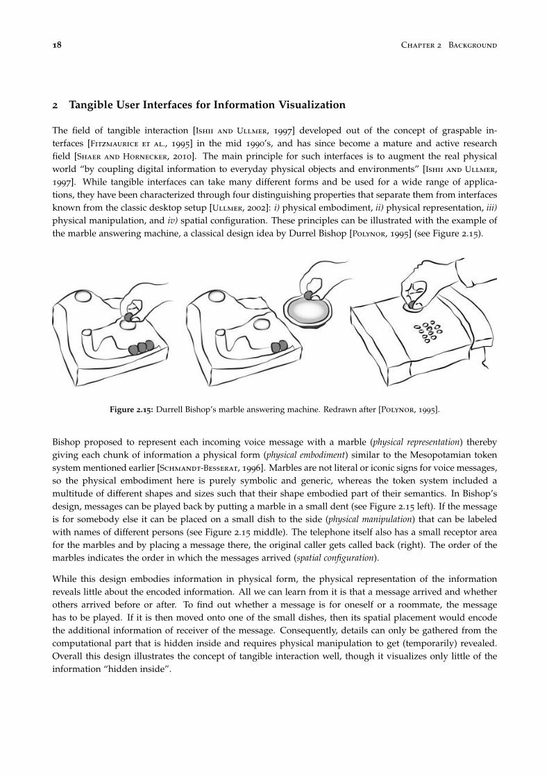
18 Chapter 2 Background
2 Tangible User Interfaces for Information Visualization
The field of tangible interaction [Ishii and Ullmer, 1997] developed out of the concept of graspable in-terfaces [Fitzmaurice et al., 1995] in the mid 1990’s, and has since become a mature and active researchfield [Shaer and Hornecker, 2010]. The main principle for such interfaces is to augment the real physicalworld “by coupling digital information to everyday physical objects and environments” [Ishii and Ullmer,1997]. While tangible interfaces can take many different forms and be used for a wide range of applica-tions, they have been characterized through four distinguishing properties that separate them from interfacesknown from the classic desktop setup [Ullmer, 2002]: i) physical embodiment, ii) physical representation, iii)physical manipulation, and iv) spatial configuration. These principles can be illustrated with the example ofthe marble answering machine, a classical design idea by Durrel Bishop [Polynor, 1995] (see Figure 2.15).
Figure 2.15: Durrell Bishop’s marble answering machine. Redrawn after [Polynor, 1995].
Bishop proposed to represent each incoming voice message with a marble (physical representation) therebygiving each chunk of information a physical form (physical embodiment) similar to the Mesopotamian tokensystem mentioned earlier [Schmandt-Besserat, 1996]. Marbles are not literal or iconic signs for voice messages,so the physical embodiment here is purely symbolic and generic, whereas the token system included amultitude of different shapes and sizes such that their shape embodied part of their semantics. In Bishop’sdesign, messages can be played back by putting a marble in a small dent (see Figure 2.15 left). If the messageis for somebody else it can be placed on a small dish to the side (physical manipulation) that can be labeledwith names of different persons (see Figure 2.15 middle). The telephone itself also has a small receptor areafor the marbles and by placing a message there, the original caller gets called back (right). The order of themarbles indicates the order in which the messages arrived (spatial configuration).
While this design embodies information in physical form, the physical representation of the informationreveals little about the encoded information. All we can learn from it is that a message arrived and whetherothers arrived before or after. To find out whether a message is for oneself or a roommate, the messagehas to be played. If it is then moved onto one of the small dishes, then its spatial placement would encodethe additional information of receiver of the message. Consequently, details can only be gathered from thecomputational part that is hidden inside and requires physical manipulation to get (temporarily) revealed.Overall this design illustrates the concept of tangible interaction well, though it visualizes only little of theinformation “hidden inside”.

Section 2 Tangible User Interfaces for Information Visualization 19
Only some point solutions using tangible elements for visualization systems have been developed so far. Thesecan be roughly divided into two categories: tangible controllers and tangible displays. I detail here thedifferences and present examples from these two categories. The common claim for these systems is thatthey supposedly improve the effectiveness or efficiency of similar desktop environment systems. I hencediscuss in how far the respective authors of these systems evaluated this claim.
2.1 Tangible Controllers for On-Screen Visualization Systems
Figure 2.16: Passive props to select 2D cuts out of 3D brainimaging data by Hinckley et al.
Several systems have been proposed using tangiblecontrollers while the visual output, i.e., the visual-ization itself, is still presented on a vertical or table-top display. Hinckley et al. [1994] presented a tangi-ble interface for neurosurgeons to navigate throughthree-dimensional MRI data. Analysts of such dataare usually interested in selecting different 2D cuts.Accordingly, the interface was designed such thatthe user held a doll’s head in one hand and a platein the other whose relative position to each otherindicated the desired cut to be displayed on a sep-arate display (see Figure 2.16). While this interac-tion improved users’ orientation within the three-dimensional data, the interface has some indirec-tions as the plate can only be held next to the doll’shead instead of indicating the demanded cut in place.
Ullmer and Ishii [1997] proposed TUI instantiations of graphical user interface (GUI) elements to enrich GUIswith physical handles that resemble their virtual functionality. Most notably it introduces phicons (physicalicons), and physical instruments such as an active lens tracked in 3D space and a passive lens with surfacetracking (see Figure 2.17). While this system brings interactions previously only known from virtual on-screen systems into the physical world, the authors focus in their article on implementation details withoutvalidating their hypotheses on possible benefits for user interactions.
Figure 2.17: The metaDESK system introducing tangible icons and physical instruments by Ullmer et al.

20 Chapter 2 Background
Figure 2.18: Tangible query interfaces by Ullmer et al.
Ullmer et al. [2003] later developed the concept of physical instruments further with their tangible queryinterfaces which consisted of tangible parameter wheels and parameter bars (sliders) to control a visualizationdisplayed on an adjacent horizontal surface. They performed a preliminary user study comparing TUI con-trols (the parameter wheels) against GUI controls (range slider). While the results hint at advantages towardsbimanual actions, the experimental design varied to many factors between these two conditions to provideconclusive results concerning overall user performance. For example, the TUI condition required explicit as-sociation steps by the users whereas the GUI did not. Furthermore the TUI required a rotary motion whereasthe GUI contained linear controls. Tangible query interfaces were later generalized to the concept of casiers, con-tainers with which sets of tangible control instruments for specific applications could be assembled [Ullmer
et al., 2011] (see Figure 2.19).
Figure 2.19: Tangible controllers that can be compiled according to intended application by Ullmer et al. [2011]

Section 2 Tangible User Interfaces for Information Visualization 21
Figure 2.20: Tangible and touch navigation for circular tree structures by Hancock et al.
Hancock et al. [2009] compare touch against a tangible control to navigate through tree structures on ahorizontal touch surface (see Figure 2.20). The tangible itself is used as a handle to directly translate androtate the circular tree visualization on the tabletop. A trackball mounted on the tangible is used to navigatethrough the tree structure. Even though the system uses a tangible, the interactions to navigate through thetree are rather indirect and resemble a desktop setup with a trackball input device.
Klum et al. [2012] presented a tangible faceted search interface combining a large display visualization withone tangible control for each search facet. A facet is defined through a tangible device containing a displayand parameter wheels (see Figure 2.21). The display shows information on available facets to inform usersduring the facet-to-tangible mapping process and during the manipulation of the facet’s range, once assigned.The search result is presented on a vertical display in front of the user. The system underwent a usabilityevaluation to validate that users understood the concept and were able to perform searches. The authors notethat users switched their attention “seamlessly” between the result screen and the tangible displays thoughmention that range selections were problematic due to implementation issues. Detailed results on users’division of visual attention would be interesting but are not provided.
Figure 2.21: Stacked tangibles to per-form faceted search by Klum et al.

22 Chapter 2 Background
Figure 2.22: Coral exploration on a stereoscopic screen using a coral print-out to navigate within the data [Kruszynski
and Liere, 2009]
Kruszynski and Liere [Kruszynski and Liere, 2009] propose to use a stylus and 3D printed models of coralsto navigate and annotate higher-resolution virtual models of the same corals (see Figure 2.22). Similarly,Konchada et al. [Konchada et al., 2011] propose to use low-resolution 3D printed models and a stylus tohelp users explore multivariate volumetric data displayed on a screen. Although these systems suggestthat physical imitations of on-screen 3D visualizations may help navigation, these are only used as inputdevices and are not directly intended as tangible displays themselves. Also, neither of these systems has beenformally evaluated.
2.2 Tangible Displays
While tangible controllers diversify the shapes of input devices, and they only transfer more of the control partof a visualization system into the physical world. The group of tangible displays represents systems wherecontrols and displays are more closely integrated and which were often implemented as a combination oftangible controllers, computer vision detection and projected information — using the so-called I/O bulbprinciple [Underkoffler and Ishii, 1998, 1999].
Underkoffler and Ishii [1999] presented Urp, an urban planning tool. The system included tangibles that wereeither used as structures (for buildings) or as tools to invoke computations (see Figure 2.23). These couldbe freely arranged on a horizontal projection surface. A camera overlooking the projection surface detectedthe placement of the tangibles and allowed the computation of the corresponding projected visual feedback.After placing buildings, shadows depending on time of day and wind simulations could be invoked to informthe user about the consequences of her urban planning. Furthermore structures could be assigned a reflectivematerial that would additionally cast reflections to their shadows. The system allowed its users to exploredifferent alternatives of urban design and to simulate the effects of changes in real-time by using tangibleobjects which did not perfectly resemble the final houses but abstracted the system’s functionality effectivelyto communicate their usage. The system was however not formally evaluated with potential users.

Section 2 Tangible User Interfaces for Information Visualization 23
Figure 2.23: Tangible urban planning tool by Underkoffler et al.
Jacob et al. [2002] presented and evaluated a tangible matrix system. The focus of this work is again more ontangible manipulation than on visualization as the tangibles only displayed text without visual abstraction.Nonetheless, each tangible could invoke some details on demand and the overall placement of tangiblesprovided an overview (see Figure 2.24). The system was compared against a purely physical version usingonly pieces of paper and a pen-GUI system. The results show trends suggesting that the tangible systemperformed similar to the purely physical, paper-based setup.
Figure 2.24: Tangible matrix system by Jacob et al.
Spindler et al. [2010] explored the use of tangible views for horizontal displays. These views can, for example,function as magic lenses [Bier et al., 1993] or color palettes (see Figure 2.25). The system has later beenextended to make use of 3D space by incorporating headtracking of several users to generate viewpointdependent views [Spindler et al., 2012]. Both systems focus on technical implementations and design spaceexplorations without offering experimental evidence for possible benefits of these systems.

24 Chapter 2 Background
Figure 2.25: Tangible views for tabletop displays by Spindler et al.
Most of the systems discussed above focus on tangible input rather than physical data visualization: the datais projected and still presented virtually. Gillet et al. [2005] use tangible models of biological molecules,such as viruses or DNA strings, which represent a scaled model of the data itself but can additionally beenriched with augmented reality views by attaching markers to the physical models. The authors also createdarticulated models of different molecules where molecular connections are established by embedding magnets.A user thereby can explore how, for example, a DNA double helix “zips up”. Similarly, they created selfassembling physical virus models where separate pieces come together when a user shakes its componentsin a bottle (see Figure 2.26).
Figure 2.26: Left: tangible props for structural biology analysis by Gillet al. Middle and right: articulated physicalvisualizations using magnets.
Another interesting application area for dynamic physical displays is solid terrain modeling. Through dy-namicity physical relief models such as the historical relief models shown in Figure 2.5 can be enriched withadditional information.
Piper et al. [2002] presented Illuminating Clay, a 3D tangible system for landscape analysis. Users coulddeform a malleable clay like material to alter a landscapes topology. A laser continuously scanned thedeformation and depending on the application computational information was projected on top of the surface(see Figure 2.27). Possible applications included visualization of slope variations and curvatures, shadowsand solar radiation (also taken additional physical objects placed on top into account), or view-shed, i.e.,

Section 2 Tangible User Interfaces for Information Visualization 25
Figure 2.27: 3D tangible landscape analysis system by Piper et al. [2002]
field of view depending on position of the viewer. The system provides an interesting mixture of physicalshape and interactions with in-place visual content. However, the authors offer no evaluation comparingtheir system with less elaborate setups.
Figure 2.28 left shows PARM, a projected augmented relief model, where a passive, static physical relief isaugmented through projection thereby allowing visualization overlays. The system is overall dynamic andinteractive though changing the geographic location would require the fabrication of another physical relief.
Shape Displays. The middle image in Figure 2.28 shows the XenoVision Mark III Dynamic Sand Table.It contains 700 actuators to change its relief programmatically. Only little information is available on thisdisplay but it seems its main purpose is to function as a geospatial display for military applications withoutsupporting physical manipulations.
Figure 2.28: Three different terrain modeling displays.

26 Chapter 2 Background
The right image of Figure 2.28 shows the Relief display [Leithinger et al., 2011] containing a smaller number ofactuators. It combines a 2.5D shape display with a tracking system so that users can interact with the physicalshape either by directly manipulating the surface or through mid-air gestures performed over the area theuser wants to affect [Leithinger et al., 2011]. It functions thereby as a dynamic and interactive physicalvisualization (the system will be discussed in more detail on page 129). Follmer et al. [2013] present a largerand higher resolution follow-up of the Relief system (see Figure 2.29). The authors consider interactions withphysical objects but besides a simple barchart visualization and functions as shown in Figure 2.29, no infovisapplications are currently implemented.
Figure 2.29: Tangible shape display composed of bars by Follmer et al.
3 Data Sculptures
The examples for physical visualizations presented earlier were all created for pragmatic purposes, some ofthem long before efficient computer based visualization techniques were available or accessible. But physicalvisualizations also have an aesthetic appeal beyond being useful for reading 3D data, to physically rearrange,or as an external aid for visual thinking. Beyond pragmatic usefulness, physical visualizations provide acertain aesthetic and have in so far inspired many artists and designers whose focus is not on pragmaticbut artistic visualizations [Kosara, 2007]. Artistic visualizations are not necessarily recognizable as beingvisualizations, and often the underlying data is not readable by an observer. However, a visualization createdwith artistic intent can still be informative [Skog et al., 2003] and in some cases allow an observer to extractthe contained data. Physical visualizations created with artistic intent are commonly called data sculptures[Vande Moere, 2008]. With the democratization of digital fabrication technologies [Tanenbaum et al., 2013],the creation of data sculptures became popular (see [Dragicevic and Jansen, 2013] for a curated list of physicalvisualizations and data sculptures).

Section 3 Data Sculptures 27
3.1 Static Data Sculptures
Global Cities by Richard Burdett et al. Figure 2.30 shows part of an exhibit from the Tate Modern galleryon population densities in major cities. For each city, the local population density was mapped to the heightof the sculpture such that the densest areas loomed the highest. Even though visitors could not read theexact data, the exhibit allowed comparisons between different cities as to how densely populated they areand how they compare in overall size. Within a city, visitors could compare the variations of density betweenneighborhoods.
Figure 2.30: Data sculpture that was shown as part of the Global Cities exhibition at Tate Modern.
Just use Lego by Samuel Granados. Figure 2.31 shows data on emigration (left & right) and immigration(middle) in the Americas. Similar to the pragmatic visualizations shown in Figures 2.11 and 2.12 it is createdout of Lego bricks. However, in this case Lego was not used to support easy manipulation by the user butto simplify creation by the designer. While the exact data cannot be extracted, the visualization provides be-holders with an overview of trends between countries. The size of countries is distorted towards emphasizingthe trends similar to 2D cartograms.
Figure 2.31: Just use Lego visualization by Samuel Granados showing immigration data.

28 Chapter 2 Background
Fundament by Andreas Nicolas Fischer. This data sculpture (see Figure 2.32) is also based on a map layout.The gross domestic product is for each country mapped to the height of a dome (middle). This data iscombined with a grid overlay where height is mapped to the countries’ derivatives volume. While this datasculpture is an aesthetically pleasing physical artifact, it only allows rough comparisons between countries.The underlying map structure is not readily recognizable though visible once discovered. As such this datasculpture is an example of informative art [Kosara, 2007].
Figure 2.32: Data sculpture by Andreas Nicolas Fischer showing a superposition (left) of gross domestic product (middle)and derivative volume (right).
Sculptures based on weather data. A popular subject of data sculptures seems to be the representation ofweather data. Such data is often multidimensional without an inherent spatial dimension. Of the three datasculptures shown in Figure 2.33 neither one is readily recognizable as being a visualization. The most complexone on the left contains data about air, sea and sand temperatures collected over 18 months at Herring CoveBeach (Cape Cod). This sculpture was woven by artist Nathalie Miebach according to the data she collected.While a mapping of data to form exists for this example, it is not readable by observers. As for the examplescreated by Mitchell Whitelaw (middle & right), the exact data cannot be read but still information can beextracted as to changes over time, or across different locations in case of comparing multiple objects createdfrom different datasets.
Figure 2.33: Data sculptures based on weather data. Left: weather at Cape Cod by Nathalie Miebach, middle & right:1 year of weather data from Canberra (middle), 150 years of temperature data from Sydney (right) by Mitchell Whitelaw

Section 3 Data Sculptures 29
Sculptures based on acoustic data The data sculptures depicted in Figure 2.34 are all based on data gath-ered from music pieces. None of these are readily recognizable as such which is also most common forcomputer-based music visualizations. The original pieces of music from which each was created cannot bereconstructed–they are hence not readable as visualizations.
Figure 2.34: Data sculptures based on acoustic data. Left: Microsonic Landscapes by Juan Manuel de J. Escalante. Middle:Cylinder by Andy Huntington. Right: Reflection by Andreas Nicolas Fischer.
3.2 Dynamic Data Sculptures
Apart from the static data sculptures presented so far, some artists and designers also created dynamicsculptures. These are mainly driven by dynamic data independently from user actions though interactiveones also exist.
Data Morphose This actuated data sculpture is based on fabric sails whose position, orientation and tensionare controlled by motors (see Figure 2.35). The mapping between data and shape is not intuitively readable
Figure 2.35: Actuated data sculpture data morphose by Christiane Keller.

30 Chapter 2 Background
so that the artist added an additional numeric display below to allow an observer to understand the relationbetween the movement of the sails and the changing numbers. The design exhibit consists of three separateartifacts each reflecting a different dataset (Google searches, page visits, clock). Since all of these data sourcesare beyond direct control of a (single) user, the exhibit is not interactive but functions merely as a dynamicdisplay.
Figure 2.36: The pulse installation by Markus Kison showing current emotional expressions extracted from web logs.MarkusKison.de
Pulse The pulse installation visualizes aggregated data collected from web logs (Figure 2.36). It was createdas part of a Diploma thesis project by Markus Kison. It analyzes user comments for emotional expressionsand uses a complex model created by Robert Plutchik to map the level of eight basic human emotions ontoa cone featuring 24 areas [Plutchik, 1980]. For this installation a heart-shaped physical object represents thiscone (see Figure 2.36 right) and is spatially distorted by motors to reflect the current emotional state extractedfrom a multitude of internet blogs (see Figure 2.36 left). As the underlying data source is compiled from alarge group of users, this visualization is also dynamic but not interactive.
Figure 2.37: The Centograph exhibit using 10 acrylic bars to visu-alize changes in trends for news coverage over the course of 100
years. The bars function as a display and are controlled by a sepa-rate computer terminal.
Centograph. The Centograph uses 10 acrylicbars to visualize the change of keywords innews articles. Users can type a search queryinto a computer to query the usage of thesearch terms in newspaper articles. For eachdecade one value is generated and trans-formed into a specific height to control the setof bars, i.e., the height of the bars is automat-ically adjusted to reflect the result of the cur-rent search. Even though this is an interactivesystem where the shape of the physical visu-alization is controlled by a user, the user doesnot directly interact with the visualization butinstead interacts with a regular desktop com-puter system. Conceptually, this system can beseen as a shape display with a limited resolu-tion of 10 bars.

Section 4 Conclusion 31
Emoto. The emoto data sculpture by Moritz Stefaner, Drew Hemment and Studio NAND is a design exhibitdisplaying Twitter sentiment collected during the Olympic games 2012. The sentiments were extracted froma collection of Twitter messages and then transformed into a three-dimensional heatmap showing variationsover time.This heatmap was then used to create a physical timeline. Additional heatmaps focusing on specificthemes are projected on top of the physical shape. A user can interact with the visualization through a jogdial to either cycle through different themes, i.e., project different heatmaps, or to navigate through time anddisplay individual Tweets sent at a certain point in time.
Figure 2.38: The emoto data sculpture showing Twitter sentiments during the Olympic games 2012.
4 Conclusion
As the examples presented in this chapter illustrate, communities from different domains have taken interestin either creating physical visualizations, or in using physical controllers to manipulate on-screen visual-izations. As I illustrated, these examples stem from very different time periods spanning from pre-historicthen pre-computer up to today. Since computers became commonly available, the intended purpose for thecreation of physical information artifacts shifted from pragmatic to mostly artistic intent. The availability ofdigital fabrication technology however nowadays facilitates the creation of physical artifacts and the interestin utilizing this technology for pragmatic visualization purposes is increasing. The variety is enormous andeven if scattered evidence for the efficiency of specific systems exists, it is so far difficult to discern whichproperties are most influential and to generalize the findings to other designs. As a first step we thereforeneed a clear understanding of the different forms of physicality for information visualization.


3Concepts and Terminology
“Everything must be made as simple as possible. But not simpler.”
—Albert Einstein
In the previous chapter I presented a wide range of different systems which I introduced ordered by thedomains from which they stem. The purpose of this chapter is to introduce a set of terms and concepts thathelp to classify different types of artifacts. In Chapter 6 I will introduce a detailed model and additionalconcepts that allows one to better relate and compare the rich variety of existing and future systems.
1 Introduction
The only common property between all examples mentioned so far is that they make some data visible to anobserver. For the purpose of this thesis, I use the following stipulative definition of information display as anumbrella term for all of these:
Information Display:An information display is an artifact that presents information to an observer in visual form.
As an artifact, information displays are always human-made. The definition is purposefully kept broad andincludes the use of any material or device suitable to present information in visual form, e.g., computerscreens or projectors as well as paper, wood, or plaster. Now, from the above definition I can derive that aninformation display always supports two basic actions:
1. visual inspection, since it by definition presents information in visual form, and

34 Chapter 3 Concepts and Terminology
2. manipulation in varying degrees but at least in the sense that all materials or devices have some form ofexistence that can be altered.
All of the previously presented information displays support these two actions though to very differentextents and with different ratios of support between these two. Specifically, not all information displayssupport meaningful manipulations beyond changing one’s viewpoint or interfering with the presentation ofinformation, i.e., destructive acts. Furthermore, some information displays receive their data from internetstreams or are enclosed behind glass hindering manipulation.
2 Forms and Purposes of Information Displays
In this section I introduce several concepts that are common to both the visual aspect and the manipulationaspect of an information display.
2.1 Physical vs. Virtual Information Displays
The dichotomy between real/physical and virtual/digital in HCI is an elusive concept [Milgram and Kishino,1994]. When considering information displays, we find that everything objectively observable, requires eithersome form of physical manifestation in itself or a physical device that emits light. There is however no strictordering to classify one as more or less physical than another.
Even artifacts like paper and ink can be seen either as virtual (i.e., showing a picture as a “window into aworld”) or physical (i.e., the paper as an object that can be folded or piled up). Accordingly paper and inkwould rank low on physicality as a display but support physical manipulations. Then, is a flat piece of paper“less physical” than a folded one or does it “loose in physicality” if it is framed behind glass? Most of theexamples in Section 3.2 “Dynamic Data Sculptures” (on page 29) on the other hand are antipodal, i.e., theserank high on display physicality but low on manipulation physicality.
Then, to mark the extremes I define a physical information display as one that is (or appears as) made ofphysical matter (as presented in Section 1 “A Short History of Physical Representations of Information” (onpage 9) and Section 3.1 “Static Data Sculptures” (on page 27) ), as opposed to presented on a computerscreen or projected on a surface. This includes matter whose shape or properties change over time. Physicalmodality and on-screen modality refer to these two types of information displays throughout this thesis. Later Idiscuss in more detail the ways in which they differ and the continuum between these two extremes createdthrough combination.
2.2 Artistic vs. Pragmatic Information Displays
Information displays can be designed for specific purposes. Following Kosara’s definition [Kosara, 2007],a pragmatic information display is one that is designed for analytical purposes to “thoroughly understand”the displayed information with visual efficiency as a key criterion. An artistic information display howeveris usually designed “to communicate a concern, rather than to show data” [Kosara, 2007]. Consequently,an artistic information display does not make its information readily available to an observer but requires adeeper engagement — the “sublime” element of an artistic information display [Kosara, 2007].
For physical information displays, artistic ones dominate currently. Data sculptures are by far the most popularand common type of physical information displays (see Section 3.1 “Static Data Sculptures” (on page 27) ).

Section 2 Forms and Purposes of Information Displays 35
There is a large variety of data sculptures, which Vande Moere reviews and discusses extensively [Vande Mo-
ere, 2008; Vande Moere and Patel, 2009].
In an article targeted at an infovis audience [Vande Moere, 2008], Vande Moere stresses the limitations of thescreen medium and the advantages of information representations that can be “touched, explored, carried, oreven possessed”. He argues that data sculptures can convey messages beyond the data itself, can encouragepeople to reflect on its meaning and change their behavior, and can overall yield a more pleasurable, engaging,and educational experience. He predicts that data communication will progressively be “pushed outside ofthe digital screen, towards our everyday physical reality experiences”.
While pragmatic information displays often target expert users and consider visual efficiency as a relevantfeature, casual infovis targets large audiences and non-work situations [Pousman et al., 2007]. Vande Moereargues that on-screen information displays are associated with the former and advocates physical informationdisplays as an alternative to support the latter [Vande Moere, 2008].
However, artistic vs. pragmatic is not linked to physical vs. virtual as on-screen ones can also be very effectiveat supporting casual infovis, for example through the Web medium [Pousman et al., 2007]. Conversely,physical ones could also be very effective at supporting work-related activities, but this possibility has so farbeen little explored.
2.3 Active vs. Passive Information Displays
The defining difference between active and passive information displays is the use of electricity, i.e., a pas-sive information display is one that conveys its information without depending on electricity — it is alwayson — whereas an active information display requires electricity to convey its information. For example, apaper-based information display is passive whereas a on-screen information display is active. Note that thedistinction not necessarily depends on the employed technologies but rather the specific context of use of aninformation display. An interesting example is one that uses an e-ink display1. If this e-ink based informationdisplay shows non-changing information, e.g., a map in a building guiding its visitors, it classifies as a passiveone. But if it depends on changing the information it displays, e.g., a map showing traffic jams in Paris thatgets updated every 60s, then it would depend on electricity in this specific context, then it would count as anactive one.
2.4 Interactive vs. Non-interactive Information Displays
I define the level of interactivity through the amount of meaningful changes an observer can perform on aninformation display. For example, on a paper map, she can add annotations and highlights with a pen but shewill not be able to change a map of Paris to one of London. Using a map application on a computer system,she can easily switch from one city to another but the application might not allow her to add free-handannotations. Some information displays are almost entirely non-interactive by design, e.g., public displaysinforming observers about arrivals and departures of trains or airplanes can usually only be pointed at.Some only support “trivial” interactions such as picking up and rotating, if they are physical, or panningand zooming, if they are virtual. Consequently, I assume no strict ordering for the level of interactivity ofinformation displays and especially no strict boundary between interactive and non-interactive informationdisplays, similar to the previously discussed continuum between physical and virtual information display.
1E-ink displays are commonly used in ebook readers and are characterized by only requiring electricity to change the displayedinformation without requiring any to continuously display the information from that point onward.

36 Chapter 3 Concepts and Terminology
Note that the level of interactivity is orthogonal to the above discussed distinction between active and passiveinformation displays. Specifically, the distinction active/passive is unrelated to whether an informationdisplay is changeable by the observer or not. For a changeable information display, such a change can beinvoked by an observer (interactive), or by “outside forces”, i.e., without direct human intervention (non-interactive). For example, some passive information displays have movable parts can be manually rearranged,such as Bertin’s “Domino” matrices [Bertin, 1977] or the Lego block visualizations [Wilson, 2012]. These areinteractive but passive. Some active data sculptures have been built such as Pulse2 (on page 30, or Wable3, amotorized physical bar chart for monitoring RSS feeds. These are active but not interactive as they receivetheir data from external sources on which a single observer has no influence.
2.5 Compound and Hybrid Information Displays
Two or more information displays can be combined to form a compound information display. If the parts ofthis compound differ in the above discussed dimensions, it is a hybrid information display. Although purelyphysical information displays have been mostly ignored in computer science, there has been considerableinterest in “hybrid” systems that combine virtual with physical elements (systems from the TUI domainpresented in Chapter 2 Section 2 fall into this category). These systems potentially combine the advantage ofsupporting both physicality and changing data.
3 Visualizations
So far I only discussed information displays in the very general sense of presenting information in visual form.The main focus of this thesis however lies within the field of information visualization. I now clarify thedifferences and detail the properties of information displays that fall into this category and are of mainconcern for this thesis.
3.1 Visualizations vs. Models
A model is a reproduction or schematic of a real object, usually at a different scale and/or with a different levelof abstraction. Examples include architectural models (e.g., as in Figure 2.5 on page 13) and molecule models(as in Figure 2.9 on page 15 or Figure 2.26 on page 24). In contrast, a visualization involves the process ofvisual mapping, i.e., the choice of visual variables (color, position, size, ...) to encode data [Chi, 2000]. Althoughboth models and visualizations can be displayed on-screen or made physical, and I included examples fromboth categories, this thesis focuses on visualizations. I consider however both pure information visualizationswhere the data is non-spatial (e.g., social networks or hard drive usage) and scientific visualizations wheremodels and visualizations are combined (e.g., fMRI scans or fluid simulations) [Munzner, 2008].
The definition of information displays insists on them being artifacts and thereby implicitly excludes naturallyoccurring self-visualizations such as shown in Figure 3.1. The reason I choose to exclude these is that I wantto be able to assume for any information display human intent to abstract and encode information in visualform.
2http://www.tinyurl.com/pulse-vis3http://www.tinyurl.com/wable

Section 3 Visualizations 37
Figure 3.1: Example of a naturally occurring self-visualization through rock sedimentation (Utah). Image courtesy offlickr user Éole Wind.
3.2 Visual Marks as Basic Components of Visualizations
Visualizations do not occur naturally, aside from self-visualizations such as, for example, the history of rockformations visible through sedimentation as shown in Figure 3.1. Accordingly, we have no experience inhandling physical objects that are visualizations.
We do however have a long history of creating physical objects that encode information (as demonstratedin Section 1). Pre-historic artifacts such as the tally bones described in Chapter 2, already show 3 notableproperties that persist throughout the history of visualization [Schmandt-Besserat, 1996, p. 92]:
1. “They translated concrete information intro abstract markings.2. They removed the data from their context. For example, the sighting of the moon was abstracted from
any simultaneous events such as atmospheric or social conditions.3. They separated knowledge from the knower [...]”
While visualization techniques evolved immensely since these early beginnings they still show these proper-ties. The way this is done is through mapping of data to visual marks.
A visual mark is a visual entity that represents a piece of information [Bertin, 1967]. For example, on thebefore mentioned tally bones, each notch is a visual mark that stands, e.g., for one sighting of the moon.With the tokens described on on page 11, shape encodes differences between different token types and sizeencodes different quantities. Many more features of a visual mark, called visual variables, can be used toencode information and their respective efficiency to do so has been extensively studied for two-dimensionalinformation displays on screens or on paper [Bertin, 1967; Cleveland and McGill, 1984]. Figure 3.2 showsrecommendations for the use of different visual marks (columns) and available visual variables (rows) toencode qualitative and quantitative data on thematic maps [Slocum et al., 2009].

38 Chapter 3 Concepts and Terminology
Figure 3.2: Visual variables for quantitative and qualitative purposes and their use depending on the spatial dimension-ality of the visualization technique [Slocum et al., 2009]
3.3 Spatial Dimensionality
When visualizing data, the choice of visual mapping, i.e., visual marks, is an issue that is orthogonal to thechoice of modality, e.g., on-screen vs. physical. A key part of the visual mapping process consists in mappingdata to positions, either in 2D or in 3D. Both 2D and 3D visualizations can be shown on a screen or exist asphysical objects. Overall 3D visualizations are not recommended since they are subject to serious occlusion,distortion, and navigation issues [Shneiderman, 2003]. They are however difficult to avoid when the data isinherently 3D, as often in scientific visualization [Chi, 2000]. 3D information visualizations have also beenshown to be useful in some tasks [Risden et al., 2000; Kjellin et al., 2008]. In addition, some of them arewidely used and new visual mapping techniques are regularly being proposed.
However, the controversy of 2D versus 3D only concerns the on-screen modality. For the physical modalitythese issues may be mitigated, as we are used to perceive and manipulate 3D physical objects. In fact,although some physical visualizations are simply extruded 2D visualizations4 (see Figure 3.3), most of themexploit the three dimensions of space.
4see http://www.tinyurl.com/callaghan-vis and http://www.tinyurl.com/tohoku-vis
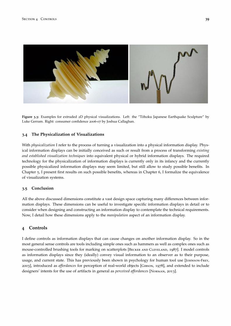
Section 4 Controls 39
Figure 3.3: Examples for extruded 2D physical visualizations. Left: the “Tohoku Japanese Earthquake Sculpture” byLuke Gerram. Right: consumer confidence 2006-07 by Joshua Callaghan.
3.4 The Physicalization of Visualizations
With physicalization I refer to the process of turning a visualization into a physical information display. Phys-ical information displays can be initially conceived as such or result from a process of transforming existingand established visualization techniques into equivalent physical or hybrid information displays. The requiredtechnology for the physicalization of information displays is currently only in its infancy and the currentlypossible physicalized information displays may seem limited, but still allow to study possible benefits. InChapter 5, I present first results on such possible benefits, whereas in Chapter 6, I formalize the equivalenceof visualization systems.
3.5 Conclusion
All the above discussed dimensions constitute a vast design space capturing many differences between infor-mation displays. These dimensions can be useful to investigate specific information displays in detail or toconsider when designing and constructing an information display to contemplate the technical requirements.Now, I detail how these dimensions apply to the manipulation aspect of an information display.
4 Controls
I define controls as information displays that can cause changes on another information display. So in themost general sense controls are tools including simple ones such as hammers as well as complex ones such asmouse-controlled brushing tools for marking on scatterplots [Becker and Cleveland, 1987]. I model controlsas information displays since they (ideally) convey visual information to an observer as to their purpose,usage, and current state. This has previously been shown in psychology for human tool use [Johnson-Frey,2003], introduced as affordances for perception of real-world objects [Gibson, 1978], and extended to includedesigners’ intents for the use of artifacts in general as perceived affordances [Norman, 2013].
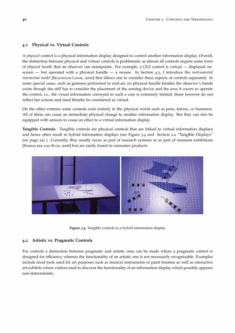
40 Chapter 3 Concepts and Terminology
4.1 Physical vs. Virtual Controls
A physical control is a physical information display designed to control another information display. Overall,the distinction between physical and virtual controls is problematic as almost all controls require some formof physical handle that an observer can manipulate. For example, a GUI control is virtual — displayed on-screen — but operated with a physical handle — a mouse. In Section 4.5, I introduce the instrumentalinteraction model [Beaudouin-Lafon, 2000] that allows one to consider these aspects of controls separately. Insome special cases, such as gestures performed in mid-air, no physical handle besides the observer’s handsexists though she still has to consider the placement of the sensing device and the area it covers to operatethe control, i.e., the visual information conveyed in such a case is extremely limited, those however do notreflect her actions and need thereby be considered as virtual.
On the other extreme some controls exist entirely in the physical world such as pens, knives, or hammers.All of these can cause an immediate physical change to another information display. But they can also beequipped with sensors to cause an effect to a virtual information display.
Tangible Controls. Tangible controls are physical controls that are linked to virtual information displaysand hence often result in hybrid information displays (see Figure 3.4 and Section 2.2 “Tangible Displays”(on page 22) ). Currently, they mostly occur as part of research systems or as part of museum exhibitions[Hornecker and Buur, 2006] but are rarely found in consumer products.
Figure 3.4: Tangible controls in a hybrid information display.
4.2 Artistic vs. Pragmatic Controls
For controls a distinction between pragmatic and artistic ones can be made where a pragmatic control isdesigned for efficiency whereas the functionality of an artistic one is not necessarily recognizable. Examplesinclude most tools used for art purposes such as musical instruments or paint brushes as well as interactiveart exhibits where visitors need to discover the functionality of an information display which possibly appearsnon-deterministic.

Section 4 Controls 41
4.3 Active vs. Passive Controls
Consistent with my previous definition of active vs. passive information displays, active controls requireelectricity whereas passive ones do not. For example, a pen is passive whereas an Anoto pen5 is active. Thisdistinction is however not binary but can be rather seen as a continuum as many active controls are alsopassive controls, e.g., an Anoto pen is always a pen even when it is out of battery, or the doll head and plate(Figure 2.16 on page 19) can always be used by a neurosurgeon to inform a patient from which orientation acertain paper printout of his brain scan stems. However, as long as a control requires electricity to perform itsfunction as a control, i.e., to cause changes on a another information display, it cannot be considered as beingpassive. For example, consider Urp, the urban planning tool by Underkoffler and Ishii [1999]. None of thecontrols used within this system contain any electronic components. As information displays, these controlsare passive. However, to perform their function as controls in the urban planning context, they requireelectricity to be sensed and to adapt the projected rendering according to their position. Consequently, theseare not completely passive controls.
4.4 Interactive vs. Non-interactive Controls
I define an interactive information control as one that changes the information it displays to reflect the ma-nipulations of an observer. For example, a trackball device would look exactly the same after it changedthe zoom factor of a map, i.e., it is a non-interactive control, whereas a physical zoom slider would reflectthe new factor visually — it is an interactive control. Note that this definition is in concordance with myearlier definition of interactivity as the amount of changes an observer can cause on an information display. Sincethe defining factor of a control is to change another information display, its interactivity captures its abilityto reflect such changes by itself due to its quality as an information display.
4.5 Instruments and the Instrumental Interaction Model
Instruments are a more specific method to model controls. With the instrumental interaction model,Beaudouin-Lafon extends and generalizes the direct manipulation principles [Shneiderman, 1983]. Interac-tions with a computing system are modeled following the theoretical framework of Activity Theory [Bodker,1990] “as a mediation process between users and objects of interest.” [Beaudouin-Lafon, 2000] (see Figure 3.5).
Domain objects. The set of domain objects for a user of a computer system are all potential objects of interestfor a user. For example, a user could be interested in exploring a scatterplot visualization. The scatterplotis therefore his domain object. It is characterized by a set of parameters such as color mappings, or filtersettings. Initially, the visualization is his object of interest but during his exploration process his focus cantemporarily shift to one of the visualization’s parameters which can thereby temporarily become his object ofinterest.
Interaction instruments. As Figure 3.5 illustrates, instruments are mediators between users and domainobjects. Instruments usually consist of a physical handle — a mouse in Figure 3.5 — and a logical part — herea virtual range slider. Desktop computer systems usually have a very limited amount of physical handles —typically one mouse and one keyboard — whereas the software they run usually provides a multitude oflogical instruments. Users therefore need to frequently re-purpose their physical handle to activate differentinstruments (this will be further discussed later).
5www.anoto.com

42 Chapter 3 Concepts and Terminology
Figure 3.5: Interaction instrument mediating the interaction between a user and a domain object. (Adapted to a visual-ization example after Beaudouin-Lafon [1997; 2000])
Interaction sequence. A typical interaction sequence starts with the user moving the physical handle topoint on the logical part of the instrument he wants to use — here a range slider controlling the filtering ofthe y-axis of his scatterplot (Figure 3.5). He activates the instrument by pressing the mouse button, and therange slider stays activated as long as he keeps pressing the button. The instrument provides a reaction tothis user action by highlighting the slider thumb (Figure 3.5). When he now moves the physical handle, theinstrument provides further feedback by moving the slider thumb up and down and by changing the bluearea displayed between the two slider thumbs. Furthermore, his action is transformed into a filter commandinterpreted by the scatterplot visualization which responds by removing all points that are outside the rangeindicated by the blue area.
As this example illustrates, on desktop computers the use of instruments and the physical actions theyrequire are not well connected. Users always use the same physical handle to perform a wide variety offunctions. The logical parts of instruments are often well-adapted to the commands they evoke on domainobjects whereas the physical handles of instruments receive only little attention and specialization.
4.6 Time- vs. Space-multiplexed Information Displays
For controls, the distinction between time-multiplexing and space-multiplexing has been previously intro-duced for tangible controls [Fitzmaurice et al., 1995]: a mouse or pen-based input device is consideredas time-multiplexed — one physical handle activates different instruments over time — whereas in a space-multiplexed setting a physical handle exists in space for each instrument. With time-multiplexed controls, aninput device can activate a wide range of different instruments. Space-multiplexed controls however usuallyhave a fixed assignment between a physical handle and a logical instrument, and a user has several of theseto his disposal — each instrument has its own physical handle.
I generalize this distinction to all information displays. All examples introduced in Section 3.1 “Static DataSculptures” (on page 27) can be considered as space-multiplexed. Each one is unique and displays onedataset. Another instance displaying a different dataset can only exist at a separate point in space. Thedynamic examples introduced in Section 3.2 “Dynamic Data Sculptures” (on page 29) however are time-multiplexed. They also can only display one dataset at any point in time but the dataset can be changedto reflect different or dynamic changes in the data. Some cases, such as those using Lego bricks, could be

Section 4 Controls 43
Figure 3.6: A tool is a mediator to enhance human capabilities to fit a certain need. Image source: Bret Victor [Victor,2011].
considered as time-multiplexed if the creator modifies the specific instance or as space-multiplexed if hecreates instead a new one.
4.7 Generic vs. Specific Instruments
Human tools use are traditionally adapted to fit the human at one end and the object to work on at the otherend [Victor, 2011] (as illustrated in Figure 3.6 on this page). Tools are thereby mediators between observersand their needs and they can be optimized in two directions: one is towards generalization — making atool suitable for a wide range of needs — the other is towards specialization — optimizing a tool so that itperfectly fits a specific purpose. Furthermore, a tool can be optimized to better fit the object or the observer.
For computers, the mouse is nowadays the most common input device since, if taken to its extreme, mostinteractions with a computer can be reduced to a series of point+click operations. Early examples for op-timization in both dimensions (generic and specific) exist (cf. the Sketchpad system [Sutherland, 1964], seeFigure 3.7) but the mouse + keyboard combination, originally introduced by Douglas Englebart [Engelbart
and English, 1968], proved to be a useful tradeoff between genericity and specialization for many years. Buteven though the mouse is a powerful and efficient physical handle to operate a wide range of different sys-tem functions, it cannot be optimized to fit the person for all the various needs occurring when operating acomputer [Dragicevic, 2004].
4.8 The Physicalization of Instruments
The physicalization of instruments refers to the process of transferring more of the logical part of instru-ments into the physical world. Specifically, the physical handles are better adapted to the logical parts of theinstruments they control. Usually, the physicalization of instruments results in a space-multiplexed setting
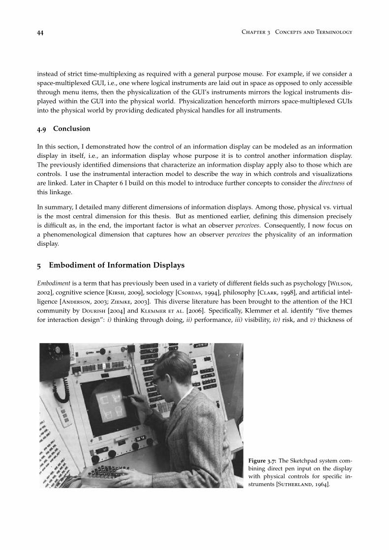
44 Chapter 3 Concepts and Terminology
instead of strict time-multiplexing as required with a general purpose mouse. For example, if we consider aspace-multiplexed GUI, i.e., one where logical instruments are laid out in space as opposed to only accessiblethrough menu items, then the physicalization of the GUI’s instruments mirrors the logical instruments dis-played within the GUI into the physical world. Physicalization henceforth mirrors space-multiplexed GUIsinto the physical world by providing dedicated physical handles for all instruments.
4.9 Conclusion
In this section, I demonstrated how the control of an information display can be modeled as an informationdisplay in itself, i.e., an information display whose purpose it is to control another information display.The previously identified dimensions that characterize an information display apply also to those which arecontrols. I use the instrumental interaction model to describe the way in which controls and visualizationsare linked. Later in Chapter 6 I build on this model to introduce further concepts to consider the directness ofthis linkage.
In summary, I detailed many different dimensions of information displays. Among those, physical vs. virtualis the most central dimension for this thesis. But as mentioned earlier, defining this dimension preciselyis difficult as, in the end, the important factor is what an observer perceives. Consequently, I now focus ona phenomenological dimension that captures how an observer perceives the physicality of an informationdisplay.
5 Embodiment of Information Displays
Embodiment is a term that has previously been used in a variety of different fields such as psychology [Wilson,2002], cognitive science [Kirsh, 2009], sociology [Csordas, 1994], philosophy [Clark, 1998], and artificial intel-ligence [Anderson, 2003; Ziemke, 2003]. This diverse literature has been brought to the attention of the HCIcommunity by Dourish [2004] and Klemmer et al. [2006]. Specifically, Klemmer et al. identify “five themesfor interaction design”: i) thinking through doing, ii) performance, iii) visibility, iv) risk, and v) thickness of
Figure 3.7: The Sketchpad system com-bining direct pen input on the displaywith physical controls for specific in-struments [Sutherland, 1964].

Section 5 Embodiment of Information Displays 45
practice. While thinking through doing, performance, and visibility are indeed of some relevance for this thesislater on, all of this previous work refer to the body of the observer when considering embodiment whereas Iconsider the “body” of an information display.
Consequently, in this thesis, embodiment captures the perceived relationship between the visual and controlaspect of an information display and their respective physical manifestations. Embodiment has in a somewhatsimilar sense been previously used for data sculptures to describe their “metaphorical distance to reality”,i.e., how closely a data sculpture resembles its underlying data [Zhao and Vande Moere, 2008]. However,Zhao and Vande Moere only consider data sculptures, i.e., artistic physical information displays, and do notdefine embodiment in clear terms.
5.1 Defining Embodiment for Information Displays
As stated earlier, any information display presents information in visual form. Furthermore, I identified phys-ical modality and on-screen modality as the two extremes of a physicality continuum. Gibson [1978] considered asimilar distinction between pictures and reality that proves useful to consider the perceived physicality of aninformation display.
“A picture is both a surface in its own right and a display of information about something else.The viewer cannot help but see both, yet this is a paradox, for the two kinds of awareness arediscrepant. We distinguish between the surface of the picture and the surfaces in the picture.In the case of paintings like those of the impressionists we can see the difference between theillumination of the picture and the illumination in the picture. The two sets of surfaces are notcomparable, and the two kinds of illumination are not commensurable. [...]
I once took a good sharp photograph of a lawn with trees and a paved walk and had it enlargedabout 20 times so that it could be mounted on a six-foot panel. The observer stood at a point wherethe visual angle of the picture at his eye was the same as the visual angle of the array admittedto the camera. He was told to estimate distances in terms of the number of paces needed. To thequestion, “How far away from you is the elm tree?” he would visualize himself walking up to itand reply “Thirty paces”. But to the question, “How far away from you is the picture?” he wouldpause and reply “Oh, that’s four paces”. For the latter estimate he had to shift the operation ofhis visual system so as to pick up quite different invariants. The lawn in the picture was notconnected with the floor of the room.” [Gibson, 1978]
Figure 3.8: The garden of Marie Antoinette, Ver-sailles, France. Image courtesy of Flickr userAlexandra.
When looking at a photo such as Figure 3.8 we usually focuson its content — the surfaces in the picture. But just as easilywe can refocus to instead notice the surface of the paper or thescreen used to display this page. According to Gibson, a pictureinvokes a discrepant awareness of these surfaces — the surfaceof the picture, e.g., the canvas, screen, or piece of paper, and thesurfaces in the picture. Note that an observer is not necessarilyaware of this discrepancy, but usually able to shift his attentionfrom one to the other if asked to or when his attention is drawnto one or the other, e.g., in case of an occluding scratch on thesurface of the picture. This duality is equally present in virtual
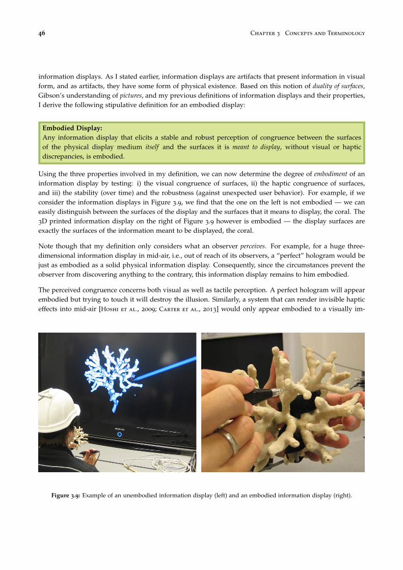
46 Chapter 3 Concepts and Terminology
information displays. As I stated earlier, information displays are artifacts that present information in visualform, and as artifacts, they have some form of physical existence. Based on this notion of duality of surfaces,Gibson’s understanding of pictures, and my previous definitions of information displays and their properties,I derive the following stipulative definition for an embodied display:
Embodied Display:Any information display that elicits a stable and robust perception of congruence between the surfacesof the physical display medium itself and the surfaces it is meant to display, without visual or hapticdiscrepancies, is embodied.
Using the three properties involved in my definition, we can now determine the degree of embodiment of aninformation display by testing: i) the visual congruence of surfaces, ii) the haptic congruence of surfaces,and iii) the stability (over time) and the robustness (against unexpected user behavior). For example, if weconsider the information displays in Figure 3.9, we find that the one on the left is not embodied — we caneasily distinguish between the surfaces of the display and the surfaces that it means to display, the coral. The3D printed information display on the right of Figure 3.9 however is embodied — the display surfaces areexactly the surfaces of the information meant to be displayed, the coral.
Note though that my definition only considers what an observer perceives. For example, for a huge three-dimensional information display in mid-air, i.e., out of reach of its observers, a “perfect” hologram would bejust as embodied as a solid physical information display. Consequently, since the circumstances prevent theobserver from discovering anything to the contrary, this information display remains to him embodied.
The perceived congruence concerns both visual as well as tactile perception. A perfect hologram will appearembodied but trying to touch it will destroy the illusion. Similarly, a system that can render invisible hapticeffects into mid-air [Hoshi et al., 2009; Carter et al., 2013] would only appear embodied to a visually im-
Figure 3.9: Example of an unembodied information display (left) and an embodied information display (right).

Section 5 Embodiment of Information Displays 47
Figure 3.10: A wall in Paris with graffiti depicting people sleeping in front of the wall. Image courtesy of Flickr userStéphane Peres.
paired observer. In fact to him it would appear equivalent to a solid information display that also displaysits information visually and fulfills all three conditions.
Furthermore, the perceived embodiment of an information display has to be stable, i.e., its state of embodimentneeds to persist over time, and be robust against unexpected conditions. For example, a fog display mightinitially appear embodied, but any disturbance of the air around it or a user’s hand reaching in immediatelydestroys the illusion.
5.2 General Examples
If we consider the plan-reliefs models mentioned in Chapter 1 “Plan-relief models” (p. 12), we find that thesurfaces they display and the surfaces they mean to display are congruent, i.e., these are not images butembodied displays. If we consider however the photograph of these models that is depicted in this thesis,than that photograph is clearly not an embodied display.
To illustrate how different levels of embodiment can be combined on one display medium consider a plan-relief model of today’s Paris that includes graffiti paintings on walls (similar to Figure 3.10). These graffitiwould be pictures since the observer can shift her attention between the surfaces that constitute the graffitiand the surfaces on which the graffiti are painted, the wall. Hence, the model of the city would be anembodied display, but the graffiti would still be only pictures. This effect can also be observed on hybridinformation displays as presented earlier in Chapter 2 Section 2.2 which use projections — the surfaces onwhich these hybrid information displays project are not necessarily but possibly congruent with the surfacesthat are projected.
With anamorphic images as illustrated in Figure 3.11 a very specific vantage point (right) lets an otherwisedistorted image (left) jump into life and appear as existing in 3D space. If we can only observe a pictureof such an information display, then it is clearly not embodied. We might however fall for the illusion andconsider the image as appearing embodied to the woman shown next to it in the picture. The picture to theleft however allows us to asses the situation better.

48 Chapter 3 Concepts and Terminology
Figure 3.11: Anamorphic streetart by Julian Beever.
The illusion is hence neither stable nor robust and ideally perceived with one eye closed. Similar effects canbe observed on flat displays showing a well-rendered 3D model — if we only see a static picture it mightlook realistic but by moving relative to the screen we quickly discover wrong perspectives.
Anamorphic illusions work better for situations where the observer is sure to have a sufficient distance. Forexample, the entire ceiling of the Sant’Ignazio church in Rome is only painted to appear arched and featuringa dome whereas it actually is completely flat (see Figure 3.12). The vantage point for this anamorphic paintingis larger thereby making it difficult to spot the corners of the ceiling on a photo alone. Also, since this is aceiling painting an observer is unlikely to detect haptic discrepancies.
Figure 3.12: The ceiling of the Sant’Ignazio church in Rome appearing arched and featuring a “dome” while beingcompletely flat.

Section 5 Embodiment of Information Displays 49
5.3 Visualization Examples
Figure 3.13: Example for an embodied barchart(left) and an unembodied barchart (right).
So far I only considered models to illustrate embodiment. Forvisualization it is important to consider what the surfaces meantto be displayed are. As I described earlier, visualizations are com-posed of visual marks, for example, bottom-aligned boxes inthe case of bar charts. Even though a visualization combinesusually other elements to facilitate its interpretation, the infor-mation it represents is encoded in the composition of visualmarks. Therefore, the most important “surfaces” of a visual-ization are its visual marks. For example, in Figure 3.13, thebarchart to the left is embodied — the surfaces of the physicaldisplay medium are congruent with the surfaces of the visualmarks — whereas the barchart to the right is not embodied — itis always displayed on a screen or printed on paper and hencethe surfaces of the visual marks are not congruent with the sur-faces of the screen or the paper. Even though a 2D barchartprinted on paper is on the same physical 2D plane as the pieceof paper itself, a duality of surfaces persists since an observercan easily focus either on the multiple surfaces that make up the2D barchart or on the paper surface itself (a single surface).
Figure 3.14: Sculpture by Mike Knuepfel.
Figure 3.14 shows the frequency with which each letter on akeyboard is used for typing. This is an example of an embodiedvisualization: the visual marks are bars placed on top of eachkey of the keyboard, i.e., position encodes the “name” of eachvisual mark — the letter it represents — and the height of eachbar encodes the frequency of use for that letter. Consequently,all visual marks appear congruent to their physical form bothto the tactile and visual sense. As a passive information display,it is also stable and robust.
Figure 3.15: Emoto, a hybrid informationdisplay.
A more complex example is the emoto sculpture (see Figure 3.15
and pages 31 & 140 ). This is a hybrid information displaycombining a passive, non-interactive, physical information dis-play (the three-dimensional surfaces) with an active, interactive,virtual information display (the additional projected informa-tion). The physical surfaces are clearly embodied as they matchthe surfaces that are meant to be displayed. The projection ap-pears embodied when only considering visual inspection froma distance since the physical shapes appear colored in them-selves. However, since this is a projection, the illusion breaks assoon as an observer explores the information display by touchas the observer would then cause occlusion and the projectionwould be on his hand instead of the physical surfaces.

50 Chapter 3 Concepts and Terminology
Regular computer screens are never embodied displays. Anything displayed on a computer screen is alwaysa picture (in the Gibsonian sense) as a observer will always be able to shift his attention between the displayitself and the displayed visual marks. For 3D visualizations, I hypothesize perceptual advantages for em-bodied vs. unembodied information displays. However, embodiment is of less concern for 2D visualizationswhich are most common on computer screens. In Chapter 6 I introduce more general concepts that are bettersuited to capture properties of 2D information displays.
Figure 3.16: Physical interaction interrupting a fogdisplay.
As mentioned before, if we imagine a perfect holographicsystem displaying a 3D scatterplot, then we find no visualdiscrepancies. But as soon as he he reaches out to touch thedisplay, his hand would find no resistance against the visu-ally perceived surface of the data points (similar to the inter-ruption of an observer reaching into a fog display as shownin Figure 3.16). The perceived embodiment therefore breaksdown, and he realizes that it was only an illusion.
If we consider another imaginary system that can defy grav-ity such that the data points of a scatterplot have existenceto both visual as haptic senses, then all requirements of em-bodiment would be fulfilled, and an observer would have astable and robust perception of congruence.
5.4 Embodiment of Controls
As defined before, a control is also an information display. To determine whether a control is embodied,we need to consider what surfaces it means to display. I define these as the surfaces that communicate theinstrument’s perceived affordances [Norman, 2013], i.e., all surfaces necessary to communicate to an observerthat it is an instrument, how to operate it, and in what state it currently is. Following the general definition ofan embodied display, this needs to be true whether the surfaces are perceived visually or haptically. For ex-
Figure 3.17: Embodied vs. unembodied control with equivalent functionality.
ample, Figure 3.17 shows two instruments that control the same information display. Both instruments allowto translate and rotate the connected information display and to navigate through a circular tree structurewith a red dot as a pointer indicating the current location within the tree. The touch-operated version is not
Section 6 Conclusion 51
embodied as no physical handle exists that could display its existence, state, and modus operandi. The phys-ical instrument exhibits no information concerning its state, but embodies the interactions of the informationdisplay it controls, i.e., translation, rotation, and navigation through the tree structure by by rolling the trackball. However, it also allows actions that are not supported such as twisting the trackball while navigatingthe outer levels of the tree structure. The instrument is thereby not restrictive enough to limit the actionsof an observer to meaningful ones. This relationship is discussed in the instrumental interaction framework[Beaudouin-Lafon, 2000] and is covered in this thesis in Chapter 6. However, the example illustrates that em-bodiment of a control is not binary but depends on the complex relationship between all perceived affordancesof a control and their effect on the information display it controls.
6 Conclusion
In this chapter, I introduced the necessary vocabulary and concepts to classify the wide variety of existingas well as hypothetical systems. Any of these systems can be described as an information display with acertain set of properties. Some information displays can function as a control for others. I showed how theinner workings of such a connection can be modeled through concepts from the instrumental interactionmodel [Beaudouin-Lafon, 2000]. Finally, I introduced a definition of embodiment for information displaysthat captures how the physicality of an information display is perceived by an observer. In the followingchapters, I now investigate this notion through concrete case studies on the physicalization of instrumentsand visualizations.


4Case Study: The Physicalization ofControls for Wall-Sized DisplayInteraction
“When working with our hands, touch does the driving, and vision helps out from the back seat.”
—Bret Victor
In this chapter, I focus on the embodiment of controls for otherwise unembodied visualizations displayed onwall-sized displays. The physicalization of controls presents possible benefits for interaction with large-scalevisualizations. Among all the possible embodied controls usable with a wall-sized display visualization, Ifocus here on those which support eyes-free interaction, so that users’ attention can remain on the visualiza-tion, and locomotion, so that users can move around within the large viewing environment while operatingthe controls.
Main portions of this chapter were previously published in Jansen et al. [2012a]. Thus any use of “we” inthis chapter refers to Yvonne Jansen, Pierre Dragicevic, and Jean-Daniel Fekete.
1 Background
Interaction with visualizations on a wall-sized display (WSD) presents an interesting problem space for em-bodied controls as there are currently no standard input devices and techniques for this environment. In thissection we discuss the requirements for interaction techniques to conveniently support visual explorationtasks on large displays, and how well they are met by existing approaches. We then motivate the use of tan-gible remote controllers, present an example implementation to demonstrate the feasibility of the approachand discuss previous evaluations of tangible user interfaces to show why more studies are needed to validate

54 Chapter 4 Case Study: The Physicalization of Controls for Wall-Sized Display Interaction
our approach. Our study then explicitly targets the comparisons of embodied versus unembodied controlsfor vision-intensive environments, i.e., large-scale visualizations presented on WSD.
1.1 Requirements for WSD Instruments
WSDs provide huge amounts of screen real-estate suitable for the presentation of visualizations with multiplelevels of detail. Visualizations designed for such an environment benefit [Ball and North, 2008] and some-times even depend [Isenberg et al., 2013; Nacenta et al., 2012] on user locomotion. We derive the followingfive requirements for WSD instruments for visual exploration:
R1 Little visual attention: instruments should demand as little visual attention as possible. For example, ascientist who is tuning the parameters of a simulation should be able to observe the results directly onthe large display without having to constantly switch attention between display and physical handle.
R2 Little visual clutter: the primary focus of the task is the visual information displayed, therefore the logicalpart of an instrument should not require visual feedback on the WSD but ideally be integrated askinesthetic feedback in the physical handle. For example, a pop-up menu can occlude the data beingvisualized and disrupt the exploration process or disturb other users.
R3 Mobility: WSD instruments should allow for locomotion. This is especially important on high-resolutionWSDs, where users can get an overview of a complex visualization when standing at a distance, whilemoving towards the screen provides them with previously illegible details [Ball and North, 2008;Beaudouin-Lafon, 2011].
Figure 4.1: A typical visualization scenario in a wall size display environment with several users who are free to movearound.

Section 1 Background 55
R4 Task-specificity: the appropriateness of an instrument depends on the task. Physical handles for WSDs havebeen categorized by their degree of guidance into 3D, 2D and 1D [Nancel et al., 2011], and guidanceshould best match the number of degrees of freedom of the task [Beaudouin-Lafon, 2000]. For example,most information visualization applications heavily rely on 2D object selection and 1D dynamic queries[Ahlberg et al., 1992].
R5 Genericity & Versatility: while devices and techniques should be ideally targeted towards applications,many visual exploration applications exist depending on the domain. For practical reasons we thereforeneed to access a wide range of applications with the same technology and interaction styles.
There is a natural tension between task-specificity and genericity, which on standard desktop computers hasbeen partly addressed by the use of a generic input device (the mouse) and a set of versatile logical tools thatare half-way between generic and specific (GUI widgets). But it is not clear yet how this tension should beaddressed in WSD environments, especially since previous work has mostly focused on either very generictasks (pointing) or on very specific applications.
1.2 Approaches to Large Display Interaction
We discuss existing approaches for WSD interaction with respect to our requirements. We classify themaccording to their input range — user positioning in front of the WSD — and the type of input they involve(Table 4.1 on the next page). The first two types of input are from [Nancel et al., 2011]. We focus on manualinput; other modalities such as whole-body interaction [Wagner et al., 2013; Krueger et al., 1985], gaze/headtracking [Skaburskis et al., 2003] and speech recognition [Bolt, 1980] can be quite useful as they often allowfor mobility and in some cases eyes-free operation, but they are best used as complements to manual inputfor tasks that only require a minimum amount of input bandwidth.
Mid-Air Interaction Techniques. Mid-air or freehand techniques are techniques where the user’s hand isfree to move in 3D space [Nancel et al., 2011] (Table 4.1 top row). Some techniques are explicitly designedto support mobility while others are bound to certain ranges as a result of technological restrictions due totheir specific implementation.
The large majority of these techniques however do support mobility (Table 4.1 right column). They com-bine hand or handheld device tracking with interaction techniques such as ray-casting and hand posturerecognition to let users perform tasks such as selecting objects or panning-and-zooming (e.g., [Vogel and
Balakrishnan, 2005; Nancel et al., 2011]). Other mid-air techniques need to be operated from a desk [Malik
et al., 2005] (Table 4.1 mid column) and sensing technologies also exist that only work close to the display[Balali Moghaddam et al., 2011] (Table 4.1 left column).
Mid-air interaction supports mobility (R3) — although techniques such as ray casting are not well-suited toup-close interaction — but it is inherently limited in accuracy and often subject to fatigue. Eyes-free operationis possible (R1) but most mid-air techniques require additional visual feedback on the display (R2). Althoughpointing is the most common task, a large design space exists for techniques that are more task-specific,especially 3D tasks for which mid-air input is particularly well-suited. For precise 2D or 1D input, however,other approaches exist that seem more adequate.
Surface-Based Interaction Techniques. With surface-based techniques, the hand’s motion is constrained bya 2-D surface [Nancel et al., 2011] (Table 4.1, second row). Note though that this surface is not necessarily

56 Chapter 4 Case Study: The Physicalization of Controls for Wall-Sized Display Interaction
Input range
Inpu
tty
pe
Up-close Fixed in the room Mobile
Mid-airdepth sensing [Bal-ali Moghaddam et al.,2011]
desktop hand tracking [Malik
et al., 2005]
laser & hand pointing [Vogel
and Balakrishnan, 2005], gy-roscopic mice, hand gestures[Nancel et al., 2011]
Surface
touch and pen-based [Khan
et al., 2004; Bezerianos and
Balakrishnan, 2005], touch de-vices as magic lens [Sanneblad
and Holmquist, 2006]
desktop mice [Johanson et al.,2002], horizontal touch dis-plays, chair-mounted tablets[Streitz et al., 1999]
remote control with touch de-vices [Rekimoto, 1998; Myers
et al., 1998], point & shoot withtouch devices [Boring et al.,2010]
Physicalcontrols
display-integrated controls control boards classical remote controllers
Tangible
sticky or magnetic props [Vil-lar and Gellersen, 2007] andcontrols [Leitner and Haller,2011]
configurable control boards[Greenberg and Fitchett,2001; Ullmer et al., 2003;Villar and Gellersen, 2007],props [Fitzmaurice et al.,1995; Kurtenbach et al., 1997]and controls [Weiss et al.,2009] on an horizontal display
tangible remote controllers,[Ullmer et al., 2011]
Table 4.1: Classification of interaction techniques for WSDs by input range and input type, with examples of previouswork.
the surface of the WSD, and that surface-based techniques therefore also vary as to how well they supportmobility.
A first type of approach uses the WSD itself as the constraining surface (Table 4.1 left column), and thismostly includes pen-based and touch interaction. A problem is that users need to move in front of objectsto select them, and although a number of reaching techniques have been proposed (e.g, [Khan et al., 2004;Bezerianos and Balakrishnan, 2005]), touch- and pen-based input unavoidably require users to be close tothe display (R3).
A second type of approach uses horizontally constrained surfaces separate from the wall, such as a desk anda mouse (e.g., [Johanson et al., 2002]) or touch-sensitive tabletops (Table 4.1 center column). But this type ofapproach, as well as solutions such as chair-mounted touch tablets [Streitz et al., 1999], restrict locomotion(R3).
A third type of approach uses handheld surfaces such as PDAs and touch tablets (e.g., [Boring et al., 2010;Myers et al., 1998; Rekimoto, 1998]) (Table 4.1 right column). Users are free to move around as if they wereusing a remote controller (R3). This approach opens up a wide range of possibilities, such as deportingthe application’s widgets to the handheld device, or eliminating the need for visual feedback on the wall(R2). However, this also implies users switching focus from the display to the input device, something whichshould be rather avoided for visual exploration tasks (R1).
Fixed Physical Controls. Physical controls such as buttons, sliders and knobs are widely used in everydaylife and can be useful in WSD environments as well (Table 4.1 third row). Physical controls can be placed ata fixed location, either at a distance from the display (e.g., control boards or mixing consoles, see Table 4.1

Section 1 Background 57
center column) or on the display’s structure (e.g., buttons on Smartboard displays, see Table 4.1 left column).However, the best solution for mobility are remote controllers (Table 4.1 right column). One simple exampleare hand-held devices used to navigate in slides during presentations, and a more sophisticated version couldbe devised for navigation in visualizations.
One advantage of physical controls is that they provide richer tactile feedback than flat 2D surfaces andtherefore they might be easier to find and operate eyes-free (R1). In addition, continuous controls such assliders or knobs are especially well-suited to 1D tasks since they are path constrained [Nancel et al., 2011](R4). But despite the fact that some controllers exist that are programmable, classical remote controllers arenot flexible enough to accommodate a wide range of tasks (R5).
Tangible Interaction Techniques. TUIs employ physical rather than virtual objects to interact with appli-cations [Fitzmaurice et al., 1995]. In contrast with the previous category, most tangibles are reconfigurablein space (R5) and are sometimes sufficiently generic to be re-used with other applications [Ullmer and Ishii,1997; Ullmer et al., 2003]. So far TUIs have rarely been used with WSDs, consequently our classificationalso includes techniques that can potentially be employed with WSDs and specifically in conjunction withvisualizations (Table 4.1 bottom row). We make a distinction between physical props, i.e., objects that can bemoved around and whose primary purpose is to specify positions and orientations, and controls, i.e., objectswith moving parts such as buttons and sliders that are usually fixed.
Most existing TUI systems are not mobile (R3) (Table 4.1 center column). Early systems involve application-specific props [Fitzmaurice et al., 1995; Kurtenbach et al., 1997]. Systems with generic controls have alsobeen proposed that include configurable control boards [Greenberg and Fitchett, 2001; Villar and Gellersen,2007] and hybrid systems [Weiss et al., 2009] where controls are laid out on horizontal touch displays. Hybridsystems have the advantage of supporting both 2D surface and tangible interaction (R4), and allow dynamiccontrol relabeling (R2, R5).
Other techniques have been designed for vertical surfaces, and include sticky or magnetic props and controls[Leitner and Haller, 2011]. These, like other techniques on the left column of Table 4.1, have the drawbackof requiring close-up interaction (R3).
The casier system by [Ullmer et al., 2011] uses constraint-overlays for touch surfaces (including portable touchtablets) similar to [Buxton et al., 1985] without providing embodied form to the instruments. Underneath,the system still depends on touch surfaces. The constraint-overlay should enable users to locate controls eyes-free (R1) though they still lack haptic feedback on the current state of a control, e.g., the current setting ofthe thumbs of a range slider. Specific overlays can be designed, adapted to specific applications (R4 & R5)though only when designing an overlay. Users can not customize overlays once they are fabricated.
So far no system combining embodied tangible instruments and mobility has been proposed for wall interac-tion (bottom right cell in our taxonomy). Hybrid tangible systems have started to be built for touch-phonesand tablets. We review them in more detail in the next section.
1.3 Tangible Remote Controllers
Based on our the previously defined requirements and classification of techniques, we propose to use tangibleremote controllers to perform visual exploration tasks on a WSD. Remote controllers fully support mobility(R3) and compared to early PDA-based systems [Rekimoto, 1998; Myers et al., 1998], we expect tangible

58 Chapter 4 Case Study: The Physicalization of Controls for Wall-Sized Display Interaction
controls to be easier to acquire and operate when the display requires full user attention (R1) as is commonfor visual exploration scenarios.
Technically speaking, we propose a hybrid solution similar to SLAP widgets [Weiss et al., 2009] but based onportable tablets instead of a tabletop (see Figure 4.2). Compared to a display-less configurable control boarddesign [Greenberg and Fitchett, 2001], this approach combines physical controls, flexible relabeling (R2, R5),and 2-D positional input. Both phone and tablet form factors are commercially available, the latter beingespecially suited to input-rich applications as a trade-off between available real estate for screen and inputsurface and portability to minimize user fatigue.
Figure 4.2: Example for a tangible remote controller, here equipped with 2 range sliders and two categorical sliders.
Like GUI widgets, tangible controls can be built that are between generic and task-specific (R4, R5). Sincewidgets are already widely used in desktop applications — including in information visualization applica-tions — this approach can facilitate both the porting of existing applications to WSDs and knowledge transferof end users.
Tangibles have already started to be combined with portable touch devices. With the introduction of theiPhone and iPad, the do-it-yourself community developed tutorials on how to build tangible add-ons fortouch tablets such as styli, props and knobs1. One of them, the Fling Joystick2, is commercially available. [Yu
et al., 2011a] also recently proposed TUIC, a capacitive marker design relying either on spatial markers, or ontime-multiplexed active markers that are detected by a distinctive tap pattern produced by micro-controllers.Other more complex and stackable widgets are possible using special materials [Chan et al., 2012].
Our tangible remote controller prototype uses a similar technology. However, with the exception of theFling Joystick and Clip-On buttons [Yu et al., 2011b], existing systems require the tablet to lie flat so that thetangibles do not glide off it, which defeats the mobile nature of tablets (R3). Also, no previous system has
1http://labs.teague.com/?p=5792http://tenonedesign.com/fling

Section 2 Tangible Remote Controller Prototype 59
been designed to be used as remote controllers. In isolation, such augmented tablets are of limited use sincetangibles and visual output from applications compete for the same (limited) space. Using them with WSDsis, we believe, a more compelling application, as tangible remote controllers meet all the before mentionedrequirements posed by this environment.
2 Tangible Remote Controller Prototype
In this section we present the design of our remote controller prototype. Similar to recent work [Yu et al.,2011a], we lay out tangible widgets on off-the-shelf capacitive touch tablets, as these are now widely availableand support wireless communication necessary for WSD interaction. In addition to supporting the tangiblecontrols, such tablets provide 2D touch and display capabilities to provide user feedback on the state andconfiguration of tangible controls.
In contrast to previous work, we specifically designed our system to be used as a remote controller for WSDs.This involves technical requirements, some of which we directly derive from our general requirements forWSD techniques.
Since users need to be able to move with the remote controller and operate it in any orientation (R3), thetangible controls should stick to the screen and be kept small to save screen real estate. Users should beable to control as many applications as possible (R5), hence tangible controls should be kept generic andideally mimic widgets that are commonly found in existing GUI toolbars (see Figure 4.3). Additionally theremote controller should be fully reconfigurable to allow the control of different applications or different setsof controls depending on the current task (R4). This requires support for dynamic control reassignment, andalso requires tangibles to be easy to remove and to replace on the tablet surface.
We explain how to build a tangible remote controller that addresses these requirements. We focus here onthe hardware aspects; remote communication with WSD applications and mechanisms for mapping controlsto applications will be discussed in the section Sample Application.
Figure 4.3: Cardboard + copper tapeprototypes and acrylic controls.

60 Chapter 4 Case Study: The Physicalization of Controls for Wall-Sized Display Interaction
2.1 Capacitive Sensing Design
Our tangible controls are tracked using capacitive sensing. Most multi-touch tablets use mutual capacitancebetween row and column electrodes to detect touch (see Figure 4.4): each row / column crossing exhibits abaseline capacitance that decreases when a grounded conductive object gets close enough [Rekimoto, 2002].Small conductive items such as metal paper clips typically produce small changes which cannot be dis-criminated from the sensor noise, whereas bigger objects like scissors or human bodies produce measurablechanges. On a capacitive tablet, a touch event is typically produced when the capacitance exceeds a threshold.
Figure 4.4: Mutual capacitance touchsensing. Redrawn after Davis andKolokowsky [2012]
Figure 4.5: The functional design of our capacitive widgets,here of the tangible range slider.
Tangibles can in principle be designed so that theyare constantly tracked as in vision-based systems[Voelker et al., 2013]. However, the number of si-multaneous touches that can be tracked is limited,which limits the number and complexity of con-stantly tracked tangibles. We therefore chose tohave our tangibles detected and tracked only whiletouched. This allows the concurrent use of morecontrols and works well in practice, since our tan-gibles stick to the tablet and their moving partsare unlikely to move unless touched (see Davis and
Kolokowsky [2012] for a comprehensive descriptionof mutual capacitance sensing and Voelker et al.
[2013] for the difference between sensing of touchedand untouched tangibles).
To have tangibles detected and tracked only when touched, we used non-conductive bodies with a conductivecoating that forwards user touch to the capacitive screen (see Figure 4.5). For rapid prototyping we experi-mented with electrostatic bags, graphite spray paint, copper tape and conductive foam (see Figure 4.3). For amore finished look we used transparent conductive ink based on carbon nanotubes3 or PEDOT:PSS4.
3http://www.nano-lab.com/nink.html4http://www.clevios.com

Section 2 Tangible Remote Controller Prototype 61
2.2 Marker Design
We use capacitive markers so that the tablet can track the geometry (position and/or orientation) of tangiblecontrols and their moving parts. We opted for passive rather than active markers since an active design wouldrequire more space for electronics and batteries [Yu et al., 2011a]. We decided against encoding individualcontrol IDs in order to save space for the markers. Once a control has been placed on the tablet, its type,location and orientation are registered. All controls stick in place, so their identity and the identity of theirmoving parts can be subsequently retrieved from the position of touch events. By doing so our system scalesup to the available screen real estate without imposing restrictions on how many tangibles can be detected.Encoding of control IDs in markers require both more space to attach them to the control which would bothincrease the overall size of the tangible controls and at the same prevent that space from being used for visualfeedback needed during configuration phases.
Since it might be useful to let users interact with the available tablet surface in addition to operating thetangible controls, we need to discriminate between tangible operation and actual touch events. Our prototypeuses Apple iPads whose API (iOS 4.3.2) only exposes information on touch location and the radius of its majoraxis. We therefore use a marker encoding scheme that uses distance between single touch points and theirmajor axis radii. For sliders we use two 3×10 mm feet, while buttons and knobs use three 5×5 mm feet. Thisproved enough to allow reliable detection of tangibles without false positives and false negatives.
2.3 Body Design
The body of our tangible controls has been built from laser-cut non-conductive material such as cardboardand acrylic (Figure 4.3). Our final prototypes are built from transparent acrylic to allow visual informationto be displayed underneath as in SLAP Widgets [Weiss et al., 2009]. All controls are based on a fixed frame,which is entirely coated with conductive ink such that users are free to touch them wherever they preferwhile preserving their transparency. The frames are directly connected to the feet to forward touch events.Moving parts are also coated with conductive ink and each part, i.e., button plate, inner knob, and sliderthumbs, creates its own touch event. Figure 4.5 illustrates the mechanism for the range slider.
In contrast to previous systems like TUIC [Yu et al., 2011a] we need to support mobile use and thereforerequire that the controls stick to the tablet. They should also be easy to remove and reposition and notrequire special modifications to the tablet. Consequently, we decided against magnets [Leitner and Haller,2011] as they require a ferromagnetic backing of the tablet. Suction cups as used by the Fling Joystick arebetter suited but take up considerable space or restrict the tangibles to the edge of the screen. Instead we usesuction cup tape, i.e., a film containing microscopic craters on its surface that act as suction cups5. We foundthat two to three small surfaces of about 20 mm2 are enough to provide a tight grip on tablets while beingeasy to remove without leaving traces.
5http://www.inventables.com/technologies/suction-cup-tape

62 Chapter 4 Case Study: The Physicalization of Controls for Wall-Sized Display Interaction
Figure 4.6: Example scenario for tangible remote controllers in a WSD environment. A scatterplot is displayed on theWSD and two users are controlling its parameters using their respective controllers.
3 Sample Application
We built a prototype system to explore how a tangible remote controller can be used to interact with avisualization shown on a WSD (see Figure 4.6). To this purpose we adapted the infovis toolkit (ivtk) [Fekete,2004] to run in a WSD environment. The ivtk contains a large number of GUI controls necessary to performvisual exploration tasks (see Figure 4.7). Our system runs on a 5.5m x 1.8m WSD of 32 screens of 30" each(see Figure 4.1 on page 54), controlled by a 18-computer cluster [Beaudouin-Lafon, 2011].
Figure 4.7: Widgets in ivtk to control a scatterplot. Only a small subset is required for a visual exploration task.

Section 3 Sample Application 63
The WSD server runs a modified version of the ivtk that allows the external control of its GUI elementsutilizing the tangible user interface objects (TUIO) protocol [Kaltenbrunner et al., 2005]. Each tablet that con-nects to the server running ivtk receives an interface description of all available GUI controls for the currentvisualization as an XML stream. The server assigns IDs to each GUI control which is then used by the tabletto send event updates for user interactions to back to the server.
3.1 Adding and Mapping Tangible Controls
When a user starts the system, the WSD shows an overview of the dataset and the tablet screen is initiallyempty. We imagine users keeping a set of tangibles around the bezel of their tablet for easy accessibility.
To start exploring the data the user can take one of the available tangible controls and stick it to the tablet’sscreen (see Figure 4.8–1&2). The tablet detects the touch points created by the tangible as a slider andpresents the user with a menu showing the available functions that are compatible with the detected control(see Figure 4.8–3).
Figure 4.8: Mapping a tangible range slider to a dynamic query axis.

64 Chapter 4 Case Study: The Physicalization of Controls for Wall-Sized Display Interaction
We only consider 2D scatterplots for our purposes. Since scatterplots only provide two spatial dimensionsto map data dimensions to, the user might not be aware of which data dimensions she wants to control.To help her choose interesting dimensions to filter, the menu shows histograms of data distributions forall dimensions. Our current implementation gives users access to any of the dataset dimensions necessaryto perform visual variable mapping or dynamic queries [Ahlberg et al., 1992]. Once assigned, the controldisplays its function and possibly additional visual information through the display (Figure 4.8–4).
The user can then operate the physical control or add new ones. Each new control only shows those functionsthat are not already mapped to a control. In a multi-user setting, the TUIO client keeps track of controls thatare already mapped and notifies all connected tablets about changes.
3.2 Remapping Existing Controls
Each physical control can be reassigned to another function by pulling the mapping menu with a swipegesture. This support for dynamic remapping of tangible controls allows users to make only those functionsavailable that are of immediate interest to them for the task at hand. For example, users searching in amultidimensional dataset typically start with the most discriminant attributes (e.g., price and location whensearching for a house), then progressively refine their search with secondary attributes [Elmqvist et al.,2008b]. A dynamic query control can therefore be mapped to a new attribute once the user is fully satisfiedwith the settings for the current attribute.
Such a remapping mechanism lies somewhere between fully temporal multiplexing mechanisms where asingle control is used to access many functions and fully spatial multiplexing schemes where each functionhas a physical counterpart [Fitzmaurice and Buxton, 1997]. Although full spatial multiplexing is often themost effective (e.g., mixing consoles), it can require an amount of space that is unrealistic for mobile usage.
In some cases, a specific configuration will be used intensively over a period of time. In the house searchscenario, for example, the user might end up with too many or too few results that depend on attributes forwhich she has no clear preference (e.g., less rooms vs. smaller garden vs. no parking lot). In that case, theuser might need to go back-and-forth between these attributes to filter them and observe how this affects theresults. We expect tangible controls to facilitate this type of task.
3.3 Building Custom Control Boards
Because controls can be freely laid out on the tablet surface, users can experiment with different spatiallayouts and chose the ones that are the most meaningful to them. Although applications already exist that letusers customize the layout of toolbars, they require specific interaction techniques and mode switches thatare arguably not as natural to end users as simply moving physical controls around.
For example, on Figure 4.6, the topmost and leftmost sliders are used to change the mapping of the X and Yaxes of a scatterplot, and are laid out in a way that maximizes the degree of compatibility between actionsand visual responses [Beaudouin-Lafon, 2000], i.e., the X axis slider is positioned horizontally while the Yaxis slider is oriented vertically. Users can also group their controls by function to leverage spatial memoryor to facilitate their concurrent control.
3.4 Support for Locomotion
Finally, our controller is wireless and portable, and can therefore be operated from any location in the room,depending on users’ needs and on what they deem the most comfortable. This includes sitting on a chair and

Section 3 Sample Application 65
resting the controller on their lap or on a table, although rich visualizations on ultra high-resolution WSDstypically encourage users to move around to get an overview or to see more details [Beaudouin-Lafon, 2011;Shneiderman, 1996].
In addition to “locomotion-based pan and zoom”, our remote controller is compatible with location-awareinteraction techniques [Vogel and Balakrishnan, 2005] and can be sequentially combined with a number ofsurface interaction techniques. For example, a user operating tangible controls on a tabletop [Weiss et al.,2009] might need to perform selections on a touch-sensitive wall while keeping access to some of the param-eters she was controlling. With our system she could move some of the tangibles on the tablet and carry thetablet with her as she walks to the wall.
3.5 Future Extensions of this Prototype
Our information visualization control system is an initial prototype that has been developed for explorationpurposes and to illustrate the feasibility of the approach. It can easily be extended to add support for all ivtkfunctionalities and support non-expert use by including alternative mapping modes. For example, the tabletcould upon connection to the system directly display the most important functions as virtual widgets. If theuser starts using one of these, she can place a tangible control on top to better support eyes-free operationof the control. Another option could be to display a complete list of functions in a dedicated scrollablearea of the tablet from which users can choose. Furthermore, any free area on the tablet could be utilizedfor 2-D pointing or text entry to support search and object selection, two other fundamental task in visualexploration.
The presented prototype only makes use of one type of slider but could be extended with more specializedinstruments while maintaining a balance between genericity and task-specificity. For example, we currentlyuse the same basic slider design for continuous data dimensions as well as for performing visual mapping.Users can modify their sliders solely by adding or removing thumbs thereby turning a simple slider into arange slider and vice versa (thereby supporting both R4 and R5). This approach can be further extended byadding more possible modifications to customize controls according to their purpose. For example, userscould add a ratcheting overlay that adds ticks to a slider control and turns it into an explicitly discretecontroller. By designing it in a way that it also slightly changes the controls footprint used for identificationof tangibles, the system could then for example only offer mapping options such as mapping of visualvariables.

66 Chapter 4 Case Study: The Physicalization of Controls for Wall-Sized Display Interaction
4 Evaluating the Effect of Embodiment of WSD Instruments
So far we made the assumption that tangible controls provide a benefit for eyes-free usage. As detailed earliersome studies exist that partially provide evidence for this assumption. However, none of these are directlyapplicable to our proposed use case as a tangible handle to control a visualization on a WSD that constantlyrequires visual attention.
Also, tangibles have a practical cost — they need to be built and carried around — so their benefits needto be clearly demonstrated to justify their use as the tablets by themselves already offer a touch sensitivecontrol surface. Intuition and common sense might suggest that tangible controls should always outperformtouch, but some preliminary studies show that it is not always the case [Kratz et al., 2011]. In fact, for use inresearch it is hard to build reliable and effective tangible controls, and other negative results likely exist thathave never been published due to reporting bias. Other studies suggest that touch devices can be operatedvery effectively, so the need for augmenting them with tangibles is unclear. For example, Buxton et al. [1985]informally observed that users quickly learned to find touch controls using tablet edges and operate themeyes- and error-free.
We set out to determine whether tangible, embodied controls provide benefits when using a tablet as aremote controller. Our goal was to keep the experiment design as simple as possible to make our findingsindependent from the task and get a better understanding of the causes of differences in performance.
Our approach can be evaluated in different ways. Concerning mobility, commercial touch phones and tabletsare designed to support it, so provided controllers stick to the display and can be conveniently carried whenunused, tangible systems built with these devices should inherently support mobility. A less clear claim isthat tangibles bring advantages compared to similar approaches that use touch only (right column secondrow in Table 4.1).
Research Question:What is the effect of embodiment for instruments targeted at wall-sized display interaction?
4.1 Previous Evaluations of TUIs
Since studies have been already carried out on general-purpose TUIs, we first review them. Fitzmaurice andBuxton [Fitzmaurice and Buxton, 1997] devised a task where various tangible objects had to be manipulatedto match their virtual counterparts on a screen. Baseline conditions involved multiple pens & pucks or aunique pen & puck (time multiplexing). Although tangibles were found to be more effective, touch inputwas not tested.
Tuddenham et al. [Tuddenham et al., 2010] repeated the study including a direct touch condition. Tangibleprops outperformed direct touch but in contrast to the original study, input and output spaces coincided sothere was no eyes-free component to the task.
Chipman et al. [Chipman et al., 2004] compared a physical slider used with a non-dominant hand to a mouse-operated scrollbar and a mousewheel for a scrolling and selection task. They found the slider to outperformthe scrollbar, which can also be attributed to the use of two-handed input but not necessarily of tangibleinput per se.

Section 4 Evaluating the Effect of Embodiment of WSD Instruments 67
One of the SLAP widgets [Weiss et al., 2009], the rotary knob, was evaluated in a task where subjects hadto reach back-and-forth between buttons placed near a video player requiring sustained attention and aknob controller placed outside the field of view but still conveniently reachable by the study participants.The tangible knob was found to outperform its touch counterpart. However, these results cannot be easilygeneralized to our setup where the user is free to move the tablet with respect to the visual display. Also, anunguided virtual knob is among the most difficult widgets to operate eyes-free due to drifting [Moscovich
and Hughes, 2004; Smith and schraefel, 2004] and it is not clear how to generalize the results to more commontypes of controls.
Overall these studies provide some support for the idea of augmenting remote controller tablets with tangi-bles, but they apply to situations that significantly differ from WSD interaction. Tuddenham’s study involvesan interactive table where input and output coincide, a very different setup from ours which requires oper-ating a hand-held device while observing visual feedback on a wall display. The SLAP widgets study didseparate input and visual output, yet its setup differs from ours since it lacked a physical frame of referenceand the controls could not be moved with respect to the display, both of which can make touch input harder.Also, Fitzmaurice and Tuddenham evaluate compound actions for which tangibles are known to be espe-cially suited and SLAP evaluates a touch widget that is known to be difficult to operate eyes-free [Smith and
schraefel, 2004]. We therefore propose a new study to address these concerns.
Another contribution of our study lies in clean performance metrics. Tuddenham and Fitzmaurice onlymeasure overall error and completion time. Device reacquisition is not controlled for and reacquisition timeis only inferred by comparing global user idle times per trial. We set out to determine not only if tangiblesare more effective overall but also when and why. We therefore measure control acquisition performance andcontrol operation performance separately, as well as how subjects allocate their visual attention.
In summary some interesting questions are still left open to which our study contributes possible answers:
1. Do tangible controls also provide a performance advantage for path-restricted manipulations?2. Is there a measurable difference for time needed to reacquire a tangible vs. a touch operated control
and how big is this effect?3. Do users behave differently when confronted with a task which benefits from eyes-free interaction
depending on whether they use a touch or a tangible control?
4.2 Study Rationale
We chose to examine interaction using a single control and opted for a slider because it is widely used andis neither too simple nor too complex. We decided to test it on a low-level tracking task, a task upon whichwe believe depends the performance of many higher-level visual exploration tasks, and added a secondarytask to test control acquisition. Furthermore, since we were not interested in user locomotion per se, we useda simplified setup where subjects stood in front of a wall-mounted display (see Figure 4.10).
4.3 Design
A repeated measures full-factorial within participants design was used. One factor was the instrument embod-iment, i.e., touch or tangible input. A second factor was the task, i.e., either pure tracking (tracking) or trackingwith a secondary task that forced subjects to release and reacquire the slider (tracking + reacquisition). 12

68 Chapter 4 Case Study: The Physicalization of Controls for Wall-Sized Display Interaction
participants were randomly assigned to one of four groups according to a balanced latin square 2 x 2 design.So the experiment consisted of:
12 participants× 2 techniques× 2 tasks× 4 repetitions= 192 trials
Each trial took 90 seconds, summing up to about 35 minutes including training for each participant.
4.4 Apparatus
We ran the experiment on a MacBook Air connected to a 121×68 cm (1920×1080 pixels) display mounted ona wall at a 125 cm height (bottom edge), and communicating wirelessly with an iPad 2. A table preventedsubjects from getting closer to the display than 230 cm. In the touch condition, the iPad displayed a virtualslider of 1.2×9.5 cm with an active touch area of 1.2×8.0 cm. The slider thumb jumped to the touch position.The rationale for this design decision is to allow for the possibility of eyes-free operation of an unembodiedcontrol. As the tablet provides a rough frame of reference, subjects might be able to quickly learn where tofind the control. With the standard slider widget design, a slider thumb has to be explicitly acquired reducingthe target size to 1.2×0.4 cm instead of 1.2×9.5 cm.
In the tangible condition, a 1.2×9.5×0.6 cm physical slider (1.2×0.4 cm thumb size), designed as explainedin the previous section, was placed on top of the virtual slider. As shown in Figure 4.9, the two sliders had asimilar appearance.
Figure 4.9: Top view of the tablet withthe touch and the tangible slider.
4.5 Task
The primary task for this experiment was loosely designed after the tracking task used by Fitzmaurice andBuxton [Fitzmaurice and Buxton, 1997]. Participants held the tablet, stood in front of a wall-mounted displayand had to continuously re-adjust the slider to track a target presented on the vertical display. The displayshowed a larger slider with both the current thumb position and the desired position (the target) (see Figure

Section 4 Evaluating the Effect of Embodiment of WSD Instruments 69
Figure 4.10: The experimental setup.
4.10). A red bar connected the two to highlight the error. Subjects were instructed to keep this error as smallas possible at all times.
The target followed a precomputed 1D path among four different paths whose order was randomized withineach block. Like in [Fitzmaurice and Buxton, 1997], the target moved at a constant speed, “darted off” atrandom intervals and changed direction when it reached an extremum. We used a target speed of 0.15 unitsper second, a dart-off distance of 0.3 units and a dart-off interval between 2 and 4 seconds. A unit equals theslider’s total range.
During the tracking + reacquisition task, the left side of the vertical display lit up red — which we refer to asthe tap stimulus, see Figure 4.10 — at pre-defined random intervals between 2 and 6 seconds (about 20 timesper trial). When this happened, subjects were instructed to tap the corresponding area of the tablet as soon asthey could, then promptly return to the tracking task. The tap area was large enough to allow for confidenteyes-free acquisition and its only purpose was to have participants release then reacquire the slider’s thumb.In case the tap stimulus was ignored (which rarely occurred during the experiment), each new tap stimuluswas queued and displayed immediately after the reacquisition of the slider.
Subjects were told to be as fast and accurate as possible throughout the experiment and that the tracking andtapping tasks were equally important. They were instructed to stand, hold the tablet in their non-dominanthand, and perform the taps with the index finger of their dominant hand in order to enforce the need forreleasing the slider. Subjects could otherwise hold the tablet and use the slider as they wished.

70 Chapter 4 Case Study: The Physicalization of Controls for Wall-Sized Display Interaction
Subjects were given an initial practice session of 90 seconds per technique with the tracking + reacquisitiontask. They were informed that holding the tablet could yield fatigue and were allowed to rest between trials.Subjects were videotaped during the experiment and, upon its completion, were given a questionnaire andwere asked to comment on the techniques.
4.6 Participants
7 male and 5 female unpaid volunteers participated in the experiment. 58% own a mobile phone with a touchscreen (no interaction with gender). All agreed to be videotaped.
4.7 Measures
Our three main dependent variables were:
• Tracking Error, the distance between the thumb and target as a percentage of the slider range, averagedover samples.
• Reacquisition Time, the average time between the moment the subject taps the left area of the tablet andthe first subsequent touch event within the slider’s active area.
• Glance Rate, the number of times the subject looked at the tablet as a percentage of the number of tapstimuli. Glances were accompanied with a clear downward head motion and were counted by viewingvideo recordings.
We additionally recorded the two following measures:
• Tap Reaction Time, the average time between the onset of the tap stimulus on the vertical display and themoment the subject taps this area on the tablet.
• Misacquisitions, the average number of times a subject misacquires the slider per tap stimulus.
A misacquisition was defined as a touch event that occurs i) outside the slider’s active touch area, ii) at a dis-tance less than 80 pixels to this area, iii) between a tap action and a reacquisition, iv) 200 ms or more beforethe reacquisition. These criteria were determined from event and video logs and effectively discriminatedbetween misacquisitions and accidental touches such as a different finger touching the tablet during a suc-cessful reacquisition, or the left hand touching the tablet. Our measure is thereby conservative. Accidentaltouches are a general issue of touch surfaces and methods are devised to limit their potentially disruptiveeffects [Hinckley and Sinclair, 1999; Benko et al., 2006]. In our experimental design, accidental touches hadno negative consequences.
4.8 Hypotheses
We conjectured that the tangible slider would be faster to reacquire and that we would hence observe lowertracking errors overall during tracking + reacquisition tasks than using touch. We also speculated that userswould be more confident and therefore would look less often at the tablet. However, we did not expectthe tangible slider to bring much benefit while users operate them, hence we supposed there would be nomeasurable difference between the techniques in the pure tracking task. Therefore, our hypotheses were:

Section 4 Evaluating the Effect of Embodiment of WSD Instruments 71
• For the tracking + reacquisition task:H1. The tangible condition yields a lower tracking error than the touch condition.H2. The tangible slider is faster to reacquire than the touch-operated slider.H3. The tangible condition yields less glances to the tablet than the touch condition.
• For the pure tracking task:H4. The 2 input technique perform similar in terms of tracking error.
4.9 Results
Due to growing concerns in various research fields over the limits of null hypothesis significance testing forreporting and interpreting experimental results [Cumming, 2014], we base all our analyses and discussions onestimation, i.e., effect sizes with confidence intervals [Cumming and Finch, 2005]. This approach also alignswith the latest recommendations from the APA [American Psychological Association, 2010]6.
Since the tracking only task as a baseline condition only provides data for the tracking Error measure, ourreport includes only for this measure results for both tasks. All other measures are specific to the tracking +reacquisition task.
Figure 4.11: Results for our three measures, averaged across trials.
Tracking Error. As Figure 4.11 illustrates, the tracking error varied little across techniques for the trackingtask (Mtouch=6.78%, 95% CI [6.27, 7.29], Mtangible=6.42%, 95% CI [5.95, 6.90]) thereby supporting H4. Forthe tracking + reacquisition task, the tracking error increased noticeably for the touch condition (Mtouch=9.90%,95% CI [8.70, 11.05]), while it only showed a slight increase for the tangible condition (Mtangible=7.56%, 95%CI [6.83, 8.30]) thereby supporting H1.
All following analyses are reported for the condition tracking + reacquisition only (see Figure 4.11).
Reacquisition Time. The higher tracking error for the touch technique is likely due to the higher reacquisi-tion time, i.e., the time from touching the tap area (Figure 4.9 on page 68) to a successful reacquisition of thecontrol, when using touch. Means were about 34% lower for the tangible control (Mtangible = 0.43s 95% CI[0.39, 0.48], Mtouch = 0.65s, [0.54s, 0.76s]), supporting hypothesis H2.
6 Furthermore, all experimental data is available for download on the project webpage: http://www.aviz.fr/trc

72 Chapter 4 Case Study: The Physicalization of Controls for Wall-Sized Display Interaction
Figure 4.12: User strategies forglances per stimulus.
Glance Rate. As Figure 4.12 illustrates, glance rates are not normallydistributed. We thereby report BCa bootstrap confidence intervals [Kirby
and Gerlanc, 2013]. Median glance rates are 1.1%, for tangible 95% CI[0, 3.8], and 86.4% for touch input, 95% CI [37, 102] hence supporting H3.
Tap Reaction Time. The tap reaction time shows only little varianceacross techniques: Mtouch=1.01s, 95% CI [0.70, 1.32], Mtangible=0.83s, 95%CI [0.75, 0.91].
Misacquisitions. Since total number of distractor stimulus could varyacross trials, we compute our measure as misacquisitions per tap stimulus.The number of misacquisitions is not normally distributed so we reportagain BCa bootstrap confidence intervals [Kirby and Gerlanc, 2013]. Forboth techniques, values are overall low: Mdntangible = 0, 95% CI [0, 0.001])than for touch (Mdntouch = 0.19, 95% CI [0.038, 0.27]).
Accidental touches. We computed accidental touches per minute of taskexecution. Values are again generally low: Mdntangible = 0.02, 95% CI[0.002, 0.07] and (Mdntouch = 0.02, 95% CI [0.003, 0.02].
Touch Patterns. The cinematic logs of our experiment allow us to replayall touch events that occurred during the experiment. Figure 4.13 showsan overplot of all registered touch events for one participant for all 16 trialsand illustrates characteristic patterns for each of the four conditions.
During the tangible conditions, all touch traces are along a narrow line — no straying of the participants’finger is possible as the movement of the tangible slider thumb follows a constrained 1D path. The recordedtraces for the touch condition illustrate the increasing stray of the participant’s finger. As we described before,one trial lasted 90sec. Accordingly, the traces for the touch only condition stray much further since in thetouch+distractor condition, participants had to reacquire the slider every 2–6 sec thereby resetting their touchlocation. However, the traces illustrate that even for short interaction cycles such as 2–6 sec considerable strayoccurs when using a touch screen (vertical height of the slider instrument was 8cm). While such a stray inour experimental setup had no negative consequences, it could lead to accidental activation of an adjacentcontrol in multi-control setups specifically in the release phase of a user’s finger.
Figure 4.13: Touch trace patterns for the slider operation of one user for all trials of all conditions. Red dots indicatemisacquisitions.

Section 4 Evaluating the Effect of Embodiment of WSD Instruments 73
4.10 Strategies
Subjects used 3 types of strategy for managing their attention:
• 7 subjects looked at the tablet at almost every tap / reacquisition under the touch condition (averageglance rate of 88%) and almost never looked with the tangible (1.6%),
• 3 subjects tried not to look at the tablet under both techniques (32% for touch and 0.72% for tangible),• 2 subjects consistently looked at the tablet under both techniques (103% for touch and 95% for tangible).
Most subjects who switched their attention to the tablet at each reacquisition did so while acquiring the taparea. During the touch and tracking + reacquisition condition, two subjects held the iPad in front of them fora few seconds then renounced, and one subject did so during a whole 90s trial.
In the tangible condition, two subjects reported using their whole hand to find the slider’s thumb. Somesubjects reported using a strategy consisting in using the edge of the iPad as a frame of reference [Hinckley
et al., 1997b], especially for the touch condition.
4.11 User Feedback
When asked about their preference, 10 subjects replied they preferred the tangible slider and 2 subjectsreported having no preference. Subjects’ comments and answers to our questionnaire were consistent withour objective measures.
Two subjects commented that the iPad was too heavy to hold for such a long period of time (despite thebreaks). 7 subjects commented negatively on the feeling provided by the touch screen while operating theslider (especially after extensive use) and/or commented positively on the feeling provided by the tangibleslider: “the screen was a bit sticky”, “after doing the task for a while I felt that the surface of the iPad was toosticky in a way”, “at one point my finger was getting sweaty and it was not that easy to move the slider”; “no(less) friction with the tangible slider.”, “the slider was more slippery”, “less friction, faster to slide”, “slidingfelt a little easier than touch input because it was ‘on rails’ ”.
4.12 Discussion
Our findings strongly suggest that an embodied instrument outperforms an unembodied one when interact-ing with a vertical display requiring visual attention. The tangible slider was faster to reacquire (about 2/3the time needed for a touch slider), which also yielded a smaller tracking error in the dual-task condition.This is despite the fact that the active area of the touch slider spanned the whole height of the slider andthus was larger than the physical thumb. However with the tangible slider, subjects could have used theirhand like an area cursor to first find the physical thumb, then switch to a precise grip based on the tactileinformation they got which is common when acquiring physical handles or manipulating physical objects ingeneral [MacKenzie and Iberall, 1994].
User Comfort. More importantly though, users glanced consistently less often at the tablet when using thephysical slider (Median 1.1% of the time versus 86.4%). Note that no critical event could be missed if subjectsbriefly switched their attention down, and they could easily catch up with the tracking task as they lookedback at the target. Despite the relatively low cost of looking down for performance, most subjects did so only

74 Chapter 4 Case Study: The Physicalization of Controls for Wall-Sized Display Interaction
once they became aware of frequent misacquisitions (the number of misacquisitions negatively correlateswith the glance rate, R = −0.708, 95% CI [-0.91, -0.23]).
Although most subjects reported feeling more effective when they could maintain their visual attention onthe vertical display, it is likely that they kept looking at the display also because it was simply more naturaland comfortable. One subject did report feeling uncomfortable switching back and forth between the twodisplays in the touch condition and mentioned neck discomfort at the end of the experiment.
User feedback further suggests that operating the tangible slider once acquired provides a better user experi-ence compared to dragging on the iPad’s touch surface. As for performance, we did not expect the tangibleslider to be more efficient to operate once acquired, but we did find a trend in the pure tracking task thatdeserves further examination considering that the mechanical design of our tangible sliders was very basic.Possibly, a smoother gliding behavior would result in a measurable effect.
Overall these findings provide another strong case for the use of embodied instruments. Still, although ourtangible underwent several iteration cycles and its design has been validated by our experiment, it does notmeasure up to commercial physical controls. One subject felt the slider was “flimsy” and did not movesmoothly enough and another felt its resistance was too low. Tracking errors also occurred, mainly due to amisplacement of the tangible slider. The slider had to be at a fixed position for the purpose of the experiment,i.e., the tangible had to placed exactly on top of the virtual slider displayed underneath. When used with oursample application, the virtual part of the instrument would align itself perfectly underneath the detectedtangible.
Limitations. Despite providing useful findings, our controlled experiment has a number of limitations thatdeserve further inquiry:
• we only tested sliders (other potential controls are buttons, rotary knobs, etc.),• the experiment does not capture the manipulation of multiple controls,• we only used a low-level tracking task instead of a real-world visual exploration task,• the experiment does not perfectly mimic interaction with an actual WSD environment (which includes
locomotion).
Furthermore, the experiment focuses on acquisition and manipulation of controls and does not provide anyinformation on how easy it is to lay them out on the tablet and map them to functions, as illustrated inSection 3 on page 62 “Sample Application”.
Support for our Requirements. Tangible remote controllers have unique properties that make them well-suited for tasks that demand mobility and visual attention on high-resolution wall-sized displays. Withrespect to our requirement R1, they demand little visual attention, especially compared with touch-onlysolutions. Our user experiment confirms that, at least for sliders and for low-level tracking tasks, tangiblecontrols are easier to operate when users’ attention is focused on a vertical display.
With respect to our other requirements: R2) tangible remote controllers require no external visual feedbackand therefore preserve information that is of immediate interest to users, the visualization displayed on thewall-sized display; R3) they support user locomotion; R4) tangible controls can come in different flavors,although most of them are especially suited to 1-D tasks like dynamic queries. Two other key tasks for visualexploration on wall-sized displays are object selection (through 2-D pointing) and search (through text input)which are outside the focus of this work.

Section 5 Conclusion 75
Finally, R5) our tangible controls are modeled after GUI widgets and are generic. They make it possible todeport GUI widgets from existing applications to a portable tablet, which can facilitate the porting of existingapplications and transfer of user knowledge. Tangible remote controllers can also be customized by end-users, who can choose the controls that are relevant to their task and lay them out in a way that is meaningfulto them.
5 Conclusion
We provided an exploration of the use of tangible remote controllers for interacting with wall-sized displays,and motivated their use for tasks that demand visual attention. We explained how tangible remote con-trollers can be built with off-the-shelf multi-touch tablets and custom-made tangible controls that exploit thecapacitive sensing capabilities of tablets.
The main focus for this work was to investigate the effects of embodiment for instruments. We therebyexplored the physicalization of existing visualization instruments considering the entire usage environment,i.e., to explore possible benefits of instruments whose physical handles are better adapted to fit the humanoperator in a usage environment that benefits from user locomotion and eyes-free interaction. Such instru-ments allow then to leverage capabilities that most users train implicitly throughout their life whenever theyinteract with their surroundings. One key benefit with this approach is that physicalized instruments retainthe specialization of existing GUI instruments for their intended domain object. Furthermore, the approachallowed the empirical comparison between similarly designed embodied and unembodied controls.
The main goal of the physicalization of instruments is the removal of bottlenecks in the line of communicationbetween a user and her domain object (see Figure 3.5). For many GUIs these bottlenecks are located betweenthe user and the logical part of an instrument: users often only have generic physical handles to their disposalwith which they can activate different instruments in a time-multiplexed fashion. TUIs on the other handsolve part of this issue through space-multiplexing, though possibly creating new bottlenecks, e.g., by intro-ducing less effective or efficient logical instruments. More research is needed to investigate which physicaldesigns beyond the physicalization of existing GUI controls are most effective and efficient depending on thethe user’s intended task.
With the democratization of digital fabrication technologies [Gershenfeld, 2008; Tanenbaum et al., 2013] userscan now create more and more physical artifacts. Soon such machines will be able to produce objects thatcan instantly be utilized as specialized input devices. However, more research is required to support usersefficiently in making such technology widely accessible even to non-expert users.
Besides supporting the physicalization of controls, such fabrication technology can also be used to physicalizea visualization itself. This appraoch seems promising as it removes the split of input and visual outputdomain. I discuss and study possible benefits of physicalized visualizations in the next chapter.


5Case Study: Possible Benefits for thePhysicalization of Information Displays
“Il y a un Relief de Namur dans les Tuileries, je vous demanderay d’avoir la complaisance de le venirvoir avec moy. Je vous feray toucher au doigt et à l’œil les deffauts de cette place qui sont en bon nombre et
à mesme temps apercevoir de quelle manière se pourroit corriger celuy qu’on m’impute.”
—Sébastien Le Prestre de Vauban
In the previous chapter, I presented and discussed a case study on the embodiment of controls. In this chapter,I now approach physicalization of information displays from the other side and evaluate the embodiment ofa visualization. My focus here is on showing why this can be useful, and which benefits can be expected bygiving physical form to a visualization.
We start with an overview of research in closely related areas, after which we motivate our experimentaldesign. We then report on a first experiment whose purpose was to estimate the effect of physicalization onuser efficiency for reading a visualization. We then report on a follow-up experiment whose purpose was tounderstand which unique features of physical visualizations may account for these results. We then concludewith a general discussion and suggestions for future work.
Main portions of this chapter were previously published in Jansen et al. [2013]. Thus any use of “we” in thischapter refers to Yvonne Jansen, Pierre Dragicevic, and Jean-Daniel Fekete.
1 Background
We discuss related work, including data sculptures, work from tangible computing, and studies on themanipulation and perception of physical objects.

78 Chapter 5 Case Study: Possible Benefits for the Physicalization of Information Displays
1.1 Related Studies
Three types of studies are relevant to physical visualizations: psychology studies on object manipulation andcognition, studies on object manipulation in virtual reality (VR) environments, and studies on 3D renderingand perception.
Physical Objects and Cognition. A vast body of research in educational science and developmental psy-chology suggests that the manipulation of physical objects can promote understanding and learning [Bara
et al., 2004; O’Malley et al., 2004; Zuckerman et al., 2005]. Part of this research is motivated by the embodiedcognition thesis, according to which cognition is supported by the body and the physical world [Wilson, 2002;Dourish, 2004]. However, we do not know of any study comparing physical with on-screen visualizations.
VR Object Manipulation. Virtual reality (VR) is interested in reproducing the physical world, including ournatural abilities to manipulate objects. Studies in VR suggest that for 6DOF tasks, 6DOF input devices likephysical props are more effective than 2DOF input devices like computer mice [Hinckley et al., 1997a]. Otherfactors such as lag or the spatial separation between motor actions and visual output are thought to impactperformance [Ware and Balakrishnan, 1994; Ware and Rose, 1999]. While providing interesting insights, thesestudies focus on tasks in the motor domain, where vision merely serves object manipulation. They do noteasily generalize to tasks in the visual domain, where object manipulation merely serves vision.
3D Rendering and Perception. While the physical world provides a plethora of powerful depth cues [Todd,1995], computer-generated content needs to create all these cues explicitly. Ware and Franck [Ware and
Mitchell, 2005] found that head-coupled stereo viewing and high rendering quality improve path followingin large 3D graphs to the point that they outperform 2D graphs. Volumetric displays have been shown toprovide the best depth perception but have low resolution [Grossman and Balakrishnan, 2006]. Despite recentadvances, current hardware is not yet able to closely mimic the perception of real objects.
1.2 Studies Involving Physical Visualizations
McGookin et al. [McGookin et al., 2010] studied how hybrid physical/virtual visualizations and sonificationcan help visually impaired users read charts. They mention several advantages of the physical modalitysuch as “two-handed interaction, quick overviews, spatial frame of reference and flexibility to employ fingersfor marking”. However, their study was only a usability evaluation and they made no comparison with adifferent modality.
In his thesis, Dwyer [Dwyer, 2004] compared a physical 3D visualization to printouts of small multiples forinfovis tasks, and found that the two differed depending on tasks. Although two different modalities wereused, the purpose was to compare visual mappings. Since each modality used a different visual mapping,the study provides no insight on the effect of modality.
Cockburn and McKenzie [Cockburn and McKenzie, 2002] compared physical versions of DataMountain (2D,2.5D and 3D) with equivalent on-screen representations. The 3D version performed worse than 2D overall,but the physical modality was found to outperform the on-screen modality. The study however focused onspatial memory and item retrieval times, not on infovis tasks.
Jacob et al. [Jacob et al., 2002] evaluated the effect of physical manipulation across different modalities (paper,tangible, pen+GUI). They found a slight advantage for the tangible interface which might likely be bigger

Section 2 Study Design Rationale 79
Figure 5.1: Physical visualizations used for evaluations: a) Data Mountain, b) 2.5D visualization created by Tim Dwyerto evaluate against small multiples representation of the same data.
with a higher performance tangible technology (lower latency etc.). The main focus of this study was howeverphysical manipulation and not visual information retrieval as only text was manipulated.
Similarly, [Waldner et al., 2006] evaluated user performance between tangible, touch screen, and paperpieces. The task required to manipulate pictures and uncover hidden ones below. Even though this was across modality comparison, the task stemmed not from the infovis domain.
2 Study Design Rationale
Visualization designs can be compared according to their visual encoding (including 2D and 3D) or the modalitythey use (including on-screen, physical and printouts). So each design can be seen as a cell in a table wherecolumns are encodings and rows are modalities (Table 5.1). Any two cells can be compared according toone or several metrics of interest (i.e., performance on specific tasks, insights, engagement, hedonic qualities,learning facilitation, etc.). The number of possible comparisons is huge and we can only address a smallsubset here.
The vast majority of previous studies involved horizontal comparisons across the “on-screen” row accordingto a few performance metrics. One exception is [Dwyer, 2004], a diagonal comparison across the “physical”row and different visual encoding columns. Given the rising popularity of data sculptures, we first setourselves to answer the following research question:

80 Chapter 5 Case Study: Possible Benefits for the Physicalization of Information Displays
visual encodings2D linecharts 2D barcharts 3D barcharts ...
modalities
paperon-screenphysical...
Table 5.1: Possible comparisons for visualization designs across modalities or visual encodings. Horizontal comparisonsare most common, some examples exist for diagonal comparisons, while vertical comparisons have so far not beenpublished.
Research Question:What effect has embodiment on the efficiency of reading 3D visualizations? Or more specifically, canphysical visualizations outperform equivalent on-screen visualizations at information retrieval tasks?
This question involves vertical comparisons, something that to our knowledge has never been considered.
We test a single visual encoding and a small set of tasks but attempt to carefully eliminate any possiblesource of confound or bias. We now first motivate our choices for the visual encoding (3D encodings are verytypical of physical visualizations while still widely used on computers) and for the tasks (we did not try tofind tasks for which 3D outperformed 2D — a horizontal comparison — but instead focused on having clear,unambiguous and reproducible tasks).
2.1 Datasets
We used country indicator data from Gapminder such as electricity consumptions, birth rates or car mor-talities. The availability of data varies highly across countries thereby we treated the raw datasets to selectsubsets according to properties as following:
1. country indicators must be easy to understand and all different from each other,2. country names must no longer than 15 characters,3. intervals between years must be evenly space,4. prefer countries with high variance across years,5. there must be at least one year X where all values across countries differ by at least 3% of the dataset’s
maximum values, and6. the year X must not be the first or last year included in the dataset.
The reason for 1) is that many datasets, available from the Gapminder databank, are difficult to interpret. Weomitted these to avoid confusing users. The reason for 2) is to avoid that long names can be spotted within avisualization simply through pre-attentive cues. With 3) we ensure a linear representation of time along thetime axis. Due to 4) all visualizations show occlusion when represented in 3D. This ensures that participantsneed to change their viewpoint to be able to complete the tasks. Requirements 5) and 6) are necessary so thattasks retains similar difficulty across datasets.

Section 2 Study Design Rationale 81
We generated 16 datasets in total, each consisting of the value of a country indicator for 10 countries over10 years (100 values total). Choosing small datasets allowed us to keep the experiment complexity underreasonable limits, and to use enough repetitions to level out task difficulty and possible adherence andattachment effects dues to specific datasets. We expect that if differences are found for small datasets, theyshould generalize and maybe even be magnified for larger datasets. All datasets used are described inAppendix 1 on page 159 and available for download online1.
2.2 Tasks
In contrast with evaluations of full infovis systems, we are not studying how advanced exploration tools canhelp users answer complex questions. Instead we are interested in the general usability of on-screen andphysical visualizations, we derived our tasks from taxonomies of low-level information retrieval tasks [Amar
et al., 2005; Wehrend and Lewis, 1990]. To keep the length of the experiment manageable we used data gainedfrom pilot studies to converge on 3 different tasks:
1. Range task. Indicate the range of values for a given country.2. Order task. Sort the values for a given year ascending.3. Compare task. Locate three given country/year pairs and determine which one has the lowest value.
We were initially interested in including overview tasks such as estimating trends [Wehrend and Lewis, 1990]or finding anomalies [Amar et al., 2005], but they turned out to be hard to operationalize. Nevertheless, ourthree tasks cover a range of elementary operations such as finding data points or comparing values, and theyrequire some cognitive effort. Each task was expressed in the data domain independently from any visualmapping. For example: “Indicate the range of suicide rates for Denmark”.
We used the 3D on-screen visualization (see below) to devise a range task, an order task and a compare taskper dataset. Since the datasets were real the difficulty of the tasks could not be fully controlled. However,since users could become familiar with a dataset after answering each question once per dataset, we changeddatasets after completion of the three tasks. We chose tasks that were hard enough but feasible when carriedout under the 3D on-screen condition, and further conducted a pilot study to level out difficulties.
2.3 Visualization
As discussed before we chose to assess the effect of modality when a 3D visualization is used, as we are morelikely to find interesting differences than with a 2D visualization. We chose 3D bar charts as they requirelow “visualization literacy" and are conceptually easy to understand. 3D bar charts are among the mostcommonly used 3D visualizations (e.g., recently for the Google Zeitgeist 2011 visualization, or in scientificarticles such as [VanCuren et al., 2005]) and are supported in most visualization and spreadsheet software(e.g., Spotfire, MS Excel). In addition, 3D bar charts can accommodate many different data types such astime series or matrix data. Most important for our purposes, they can be made perceptually similar onboth presentation modalities (see Figure 5.2 b, c) using standard software libraries and digital fabricationtechnology.
General Visual Design The 3D bar chart was an array of bars whose heights were proportional to the valueof the row/column pair (country and year). We tried several methods for limiting occlusions: a physical chart
1http://www.aviz.fr/physmaterial

82 Chapter 5 Case Study: Possible Benefits for the Physicalization of Information Displays
Figure 5.2: Education expenses data shown under the three conditions: a) on-screen 2D control; b) on-screen 3D barchart; c) physical 3D bar chart.
with transparent acrylic bars, and for the on-screen version, translucent and/or thin bars, showing only thetop of the bars, and combinations of both. They all turned out to have poor legibility. We therefore kept thetraditional bars.
Occlusion was instead minimized by ordering the countries using a similarity-based ordering algorithm foradjacency matrices [Henry, 2008]. This algorithm optimizes the matrix along one dimension to cluster coun-tries who are similar. As color coding is common in 3D bar charts, bars from each country were assigned aseparate color using a categorical scale from ColorBrewer2.org. Axis labellings were automatically computedusing the algorithm by Talbot et al [Talbot et al., 2010]. In order to facilitate the reading of values and asrecommended by Tufte [Tufte, 1986, p. 126], tick lines were also displayed on bars.
On-screen Design. The on-screen 3D bar chart visualization (Figure 5.2b) was developed using Jzy3d2, anopen source Java/OpenGL library for displaying 3D charts such as bar charts and scatterplots.
The key feature to support with this modality was 3D navigation. Although previous studies suggest thatthe mouse is not the most adequate device for 3D manipulation and navigation [Zhai and Milgram, 1998;Zhai et al., 1996; Hinckley et al., 1997a], not all 3D tasks require high-DOF control [Smith et al., 2001].In our case, tasks do not require to zoom or translate the chart, nor do they require rotations around theaxis perpendicular to the screen (roll). Therefore we simply mapped x and y mouse axes to yaw and pitchrotations, a technique that has been shown to be effective for 2-DOF rotations [Bade et al., 2005].
Although 3D visualization packages typically come with many features, we tried to take these out of theequation as much as possible to separate effects due to physical instruments from those due to physicaldisplays as much as possible (cf. on page 77). This is to facilitate the interpretation of our results, and alsobecause in the future physical models may support similar features. We therefore limited the features to:
• Label placement. We use jzy3d’s default text rendering that keeps labels horizontal and oriented towardsthe viewer. Although the physical modality does not benefit from this feature, it is so common in3D chart packages that we chose to keep it. In addition, we extended and fine-tuned the placementalgorithm so that labels almost never overlap.
2http://www.jzy3d.org

Section 2 Study Design Rationale 83
• Scale display. jzy3d automatically shows and hides scales depending on the chart orientation, so thatthey never occlude the bars. We chose to keep this feature as well because it is useful and commonlysupported in 3D charts.
• Bar highlighting. Bars can be marked and unmarked on mouse click. We support this feature becauseit is common, it greatly facilitates some tasks (especially Compare) and because bars can be touched inthe physical modality.
• Perspective switch. Since it was not clear which projection was best, we let users switch between perspec-tive and orthographic views with the mouse wheel. In the latter mode, the bar chart orientation couldsnap to the side views.
Considering today’s standard technologies (i.e., desktop computers, current 3D software and passive physicalvisualizations), we believe these features yield a rather fair comparison between modalities. Removing thosefeatures would have biased the comparison towards the physical modality, since today they are standard oncomputers but hard or impossible to support on physical visualizations.
Physical Design. The physical 3D bar charts (Figure 5.2c) were replicates of the on-screen 3D bar charts interms of layout, colors and proportions, with a few minor changes such as label placement. They were builtso that they could be held and turned around in a similar way to their on-screen counterparts.
Figure 5.3: Creation of the physical barcharts: a) laser stencil, b) spray-painting, c) engraved bar lines.
The bar charts were made of laser-cut acrylic. We generated laser stencils with custom software to auto-matically from the data to ensure accurate visualizations (see Figure 5.3 and Figure A.1 on page 161 for ascaled-down example). For each country in a given dataset, a 2D bar chart slice was cut (5×5mm for each bar,2mm spacing between bars). Each of these slices was then spray-painted following the same color scheme asused for the on-screen design (Figure 5.3b). Finally, Tufte’s bar lines [Tufte, 1986] were engraved on two sides(Figure 5.3c).
In addition, for each 3D bar chart two scales were made from transparent acrylic sheets, on which axis labelsand lines were engraved. The base of the model was built from five pieces of acrylic. Country and year labelswere engraved on all four sides of the base, using a vertical orientation. Although this may require rotatingthe object slightly to facilitate reading, it makes the object more compact and easier to handle.

84 Chapter 5 Case Study: Possible Benefits for the Physicalization of Information Displays
All pieces were assembled, then glued together to make the object feel sturdy. The outer dimensions were8×8cm, with a weight ranging from 270g to 350g depending on the dataset. A total of 13 such charts weremade for the study.
2.4 Additional Control Conditions
Although the focus of our study was to compare between the on-screen and the physical setups describedabove, we added two control conditions to use as baselines of comparison: a 3D stereoscopic condition andan interactive 2D condition.
Stereoscopic Control Condition. On-screen 3D charts provide depth cues through perspective and structurefrom motion. To assess the benefits of extra depth cues, we added a condition with stereoscopic rendering.
We used quad-buffered stereo rendering in OpenGL and presented the stereo images on a HP 2311 gt 23”,a 3D monitor based on polarized horizontal interlacing that only requires passive glasses. We removed theorthographic mode, because it is not possible to provide stereoscopic cues that are consistent with an infiniteviewing distance. Since the HP display can also be used as a normal monitor, the same display was used forthe normal (mono) on-screen condition.
2D Control Condition. Although our goal is not to compare 2D with 3D visualizations, we included anon-screen interactive 2D condition as a comparison baseline. We tested three such designs:
1. Line charts. Superimposed line charts are a common technique for displaying our type of data, butconsistent with previous findings [Javed et al., 2010], ten different overlapping time series caused toomuch visual clutter.
2. Small multiples. Cutting the 3D bar chart across its two main axes produces twenty 2D bar charts. Wedisplayed all of them, together with a magnified view. This option turned out to be confusing becausethe data was duplicated and it was hard to mentally switch between the two axes.
3. Matrix. The whole dataset can be displayed as a matrix and the values shown with squares within cells[Elmqvist et al., 2008a]. Since it is difficult to compare squares precisely, we let users select columns orrows to get the corresponding 2D bar chart.
Figure 5.4: The 3 designs we explored for the 2D baseline condition. All of them include a detailed 2D barchart to theright: a) line charts, b), small multiples, c) matrix.

Section 3 First Experiment 85
We chose the last approach as it seemed to be the most efficient (Figure 5.2a). It is also consistent with the3D chart in several respects: i) it supports the same types of datasets; ii) it has similar scalability; iii) it isconceptually similar: the matrix view is analogous to a top view of the 3D model and the 2D bar chart viewis analogous to a side cut.
Users could click and cross [Accot and Zhai, 2002] columns and row labels to update the 2D bar chart view.As in the 3D chart, they could also highlight individual bars, either on the matrix or on the bar chart view.The axis labeling, chart proportions, Tufte’s lines, colors and visual footprint were similar to the 3D chart.
3 First Experiment
The goal of this first experiment was to assess the efficiency of physical 3D visualizations with respect toequivalent 3D on-screen visualizations for information retrieval tasks. The experiment was of exploratorynature as participants did not receive concrete instructions on how to interact with the visualizations.
Techniques For this study we define a technique as a combination of a visual mapping and a modality, with allassociated interaction techniques. We included four such techniques (see Table 5.2, and the previous sectionfor details).
Technique Visual Mapping Modality Illustrationphysical 3D bar chart physical Figure 5.2cstereo 3D bar chart on-screen stereomono 3D bar chart on-screen Figure 5.2b2D matrix + 2D bar chart on-screen Figure 5.2a
Table 5.2: The four technique conditions.
Tasks. Tasks consisted in answering questions about country indicators, as explained in the previous section.We used 3 types of questions corresponding to the range task, the order task and the compare task describedon page 81.
Procedure. Subjects were first given initial instructions and explained the three types of questions (seeAppendix 3 “Instructions” (on page 162) for screenshots of all instructions presented to participants). Theywere then tested for correct stereovision using a subset of Julesz’ random-dot test [Julesz, 1971].
Subjects were then presented the 4 techniques one after the other. With every change of technique, theywere explained the technique and performed a training run on a dataset different from the experimentaldatasets, where they practiced answering each type of question. They then saw 3 datasets in sequence. Witheach change of dataset, they were briefly explained the country indicator and its meaning. They then had toanswer 3 questions, one per task type.
Below the question a “Start” button was displayed, and pressing it displayed the possible answers. For therange task, subjects had to set two sliders labeled like the axes. For the order question, they had to press 10
buttons labeled with country names in the right order. For the compare question, they had to press the correctbutton among three. These buttons were labeled with the values to search for (e.g., “Spain in 2010”) and wererevealed only after “Start” was pressed.

86 Chapter 5 Case Study: Possible Benefits for the Physicalization of Information Displays
Figure 5.5: Setup for the first experiment.
Subjects were initially instructed to read the questions carefully before hitting “Start” and turning to thevisualization. They were then asked to be as fast and accurate as possible before pressing “Done”. Each timea question was displayed, a message was displayed below the question to remind them of these instructions.
All instructions, questions, and possible answers were given on a separate touch tablet. All subjects agreedto be videotaped. The experiment lasted one hour on average.
Experimental Setup. Figure 5.5 shows the experimental setup for all technique conditions. Physical barcharts were placed on a foam block by the experimenter. The computer mouse and foam block were repo-sitionable. The computer mouse, 3D glasses and physical charts were present only during the relevantconditions.
Measures. We used two measures of performance: time on task and error rate. The time on task was theinterval between the press on “Start” and the press on “Done”. All errors were normalized between 0 and1. For the range task, the error was the average absolute difference between the entered min & max values tothe true values, divided by the total axis range. For the order task, the error was the normalized Kendall Taudistance (i.e., the number of pairwise disagreements) between the answer and the true order [Kendall, 1938].For the compare task, the error was 0 or 1, depending on whether the answer was correct or not.
Since all tasks were feasible with a low error rate under all conditions, time and errors should be linked bya speed-accuracy trade-off and should both capture task difficulty equally well. We instructed subjects to beaccurate, and therefore we do not expect to find sizable differences in terms of errors. If this is true this willallow us to base our analysis on time, a more sensitive measure than error rate.
Participants. 16 subjects (7 female, mean age 29) were recruited from our university campus. We consideredthat experience in solving infovis tasks might influence subjects performance and therefore recruited half ofour participants from researchers in the field of infovis. All had perfect or corrected to perfect vision andsuccessfully completed our stereo-vision test.

Section 3 First Experiment 87
Design. The mapping between datasets and techniques was counterbalanced across subjects by keeping theorder of datasets constant and having the presentation order of the techniques follow a balanced latin square(yielding 4 subject groups).
The main factor was technique (physical, stereo, mono, 2D). Secondary factors were infovisbg (yes, no), group(1..4) and task (range, order and compare). Therefore we had 16 participants × 4 techniques × 3 datasets ×3 tasks = 576 questions with performance measures.
Hypotheses. Currently no theories exist from which we could predict effect sizes. The purpose of thisexperiment is accordingly two-fold: i) confirm prespecified estimates derived from a pilot with four subjects,ii) provide data for an exploratory analysis — after testing our prespecified estimates — to inform the designof follow-up experiments. We published our prespecified estimates before running the final experiment[Jansen et al., 2012b]. Our hypotheses are based on this pilot:
H1 Task time with physical is about 15–20% lower than with both mono and stereo.H2 2D outperforms all other techniques by no more than 50% in time.H3 stereo is slightly faster than mono.
3.1 Results
Similar to the report of results in Chapter 4, we base all our analyses and discussions on estimation, i.e., effectsizes with confidence intervals [Cumming and Finch, 2005] in alignment with the latest recommendations fromthe APA [American Psychological Association, 2010]. The complete experimental data and all analyses fromthis experiment are publicly available online3.
We found technique to exhibit no important effect on the generally low error rate (Mdnmono = 0.119, 95% CI[0.005, 0.121], Mdnstereo = 0.119 [0.005, 0.124], Mdnphysical = 0.016 [0.009, 0.072], Mdn2D = 0.003 [0.001, 0.004]).
We thereby focus our analysis on time. All time on task measures were log-transformed to correct for skewness[Sauro and Lewis, 2010]. All reported means are antilogged and therefore indicate geometric means [Sauro
and Lewis, 2010]. Reported differences in pairwise comparisons are also antilogged and therefore indicateratios between geometric means.
Pairwise post-hoc comparisons reveal that all techniques differ except for mono / stereo.
Figure 5.6 summarizes the differences together with our initial hypotheses. The x-axis shows time ratiosbetween techniques (times being geometric means of all time on task measures), e.g., 0.8 means the firsttechnique takes on average 20% less time than the second. Intervals indicate all plausible values, theirmidpoint being about 7 times more likely than their endpoints [Cumming, 2011].
Overall our data is consistent with our hypotheses, with a few uncertainties as to the actual effect sizes.Physical may be slightly faster than expected. 2D may be slightly faster too, but not compared to physical.Contrary to H3, there is no evidence of stereo outperforming mono. Overall, we can safely conclude that thephysical 3D visualization is more efficient than its 3D on-screen counterpart, mono or stereo alike.
As Figure 5.7 shows, the main effect was mostly consistent across tasks with an interaction between techniqueand task, i.e., the advantage for the 2D technique was less pronounced for the compare task while showing a
3http://www.aviz.fr/physmaterial

88 Chapter 5 Case Study: Possible Benefits for the Physicalization of Information Displays
Figure 5.6: Time ratios between techniques, with 95% CIs. Hatched areas indicate expected effect sizes as expressed inour hypotheses.
Figure 5.7: Average time per technique and task, with 95% CIs.
stronger effect for the order task. So although 2D beats all 3D conditions, the effect is weaker if a task cannotbe solved by one 2D cut (compare task).
Neither infovisbg (infovis background) nor group (ordering of techniques) had a relevant effect on time on task(Mno infovisbg = 35.8s, 95% CI [31.1, 40.4], Minfovisbg = 33.9s [30.0, 37.8], Mgroup 1 = 33.2s [28.0, 38.4], Mgroup 2 =40.8s [35.7, 46.6], Mgroup 3 = 30.1s [25.1, 35.7], Mgroup 4 = 36.1s [29.2, 42.4]).
User Feedback. When asked to rank techniques according to preference, subjects gave median rankingsthat were consistent with technique speed. One subject mentioned finding the 2D matrix very efficient butpreferred the physical chart in terms of “fun and comfort”. Another found the physical chart “very easy tocontrol” and “easier to focus on the desired part of the chart” compared to on-screen 3D, where “I wouldloose my ‘mark’ easily during rotation”. One subject noted that for dealing with occlusion in 3D, a cuttingtool similar to the 2D condition would be useful (including for the physical chart, with the use of “LEDs andsensors”). One subject found it hard to read labels in stereo while another reported feeling “dizzy”.
Observations from Video recordings. The video recordings revealed differences between subjects in howthey approached the physical bar charts. Many were hesitant at first and inspected them while leavingthem on the foam support. Eventually, they picked them up which visibly increased comfort, especially forreading vertical labels. Most subjects used their fingers to temporarily “mark” rows and columns of interest.Eventually, almost everyone switched to putting their fingers directly on the bars relevant to the task. Itseemed that the sooner subjects converged on this strategy the faster they finished the tasks.
Section 3 First Experiment 89
3.2 Discussion
We confirmed that physicalizing 3D bar charts can facilitate their use. Now we discuss why this might be thecase. To this end, we list the elementary (motor, perceptual and cognitive) operations required to carry outour tasks on 3D bar charts, and then discuss how these operations are supported by the two modalities. Weconsider 7 such operations:
O1 orientation control: bring chart to a desired orientation.O2 visual perception: read labels, compare bar heights.O3 visual search: locate a new item (label or bar).O4 visual retrieval: relocate a previously identified item.O5 follow path: find intersections (rows and columns).O6 focus on subset: focus attention on a row or column.O7 keep state: maintain an item’s state (sorted / unsorted).
We now discuss the various ways in which the two modalities differ, and how these differences may affect thedifficulty of the elementary operations above. Some of the dimensions below are taken from the instrumentalinteraction model [Beaudouin-Lafon, 2000]. The discussion is summarized in Table 5.3 on the following page.
Degree of Parallelism. We observed from the video recordings that subjects often used their fingers ascognitive or visual aids for the operations O4, O5 and O7. We refer to these actions as “marking”. They wereable to perform these operations concurrently with O1 using both hands. With the on-screen bar chart, similarmarking actions can be emulated by clicking on bars to highlight them (O4 and O7) or by simply moving thecursor (O5). However, operations cannot be parallelized: users have to stop O1 to perform marking actions,and bars need to be marked one by one.
Degree of Integration. The degree of integration is the ratio between the number of DOFs of the object ofinterest and the input device [Beaudouin-Lafon, 2000]. For rotation/translation actions, it is equal to 1 for thephysical chart (6/6), as well as for the on-screen chart (2/2), since 2DOF rotation is sufficient to fully inspectthe chart. For marking actions, the degree of integration is 3/3 for the physical chart and 3/2 for the screen,since bars are located in 3D but selected in 2D. This makes it impossible to mark occluded bars and difficultto mark partially occluded ones, while on the physical chart fingers can reach behind bars. This could haveaffected the difficulty of operations like O4 or O7.
Degree of Compatibility. The degree of compatibility refers to the similarity between the user’s actions andthe response of the object [Beaudouin-Lafon, 2000]. In terms of rotation actions, compatibility is maximumfor the physical chart but low for the on-screen chart, due to the mapping of translational movements torotational movements. Although users got quickly used to this mapping, reaching a precise orientation canbe slow (O1). Since kinesthetic memory cannot be used, O4 can be affected as well. Nevertheless, thismapping allows a smooth and rapid rotation of the chart without clutching. In contrast, due to joint limits,the physical chart cannot be rotated to all possible viewpoints without interruption or the use of both hands.
The low degree of compatibility in rotation for the on-screen chart may also make it more difficult to visuallytrack items of interest, since the motion of the chart is less predictible than when it is directly rotated. Thisproblem was mentioned by a subject and may affect O6 when the chart has to be continuously rotated to dealwith occlusions. However, since O2 and O5 are short operations and the chart can be easily kept still, theseare less likely to be affected.

90 Chapter 5 Case Study: Possible Benefits for the Physicalization of Information Displays
operation parallelism integration compatibility indirection occlusion realism add. channels1 orientation control ++ = ++2 visual perception - ++ +3 visual search - -4 visual retrieval + ++ ++ ++5 follow path + ++6 focus on subset + ++7 keep state + ++ ++ ++
Table 5.3: Summary of comparisons between physical and on-screen modality. Positive marks indicate and advantagefor the physical condition.
In terms of marking actions, clicking on bars to highlight them has a lower degree of compatibility thanplacing fingers on physical bars, partly because they have to be toggled on and off. This might have affectedoperations like O4 or O7.
Degree of Indirection. The degree of indirection refers to the temporal and the spatial offset between theuser’s actions and the object’s response [Beaudouin-Lafon, 2000]. It is zero for the physical chart. For theon-screen modality, the lag is negligible. The mouse being a relative device, we consider the spatial offsetto the cursor. For rotation actions, this offset can be large due to incompatibility issues. When marking bars,it is appropriately low if we ignore integration issues, i.e., the mismatch of dimensions between the mousepointer in 2D coordinates and the object of interest in 3D. This suggests no issue with indirection per se.
Amount of Visual Occlusion. Both modalities have the same bar occlusion problems. In addition, thephysical chart can be occluded by hands or fingers, especially during marking tasks, which can impede O2and possibly O3. The on-screen chart does not have this problem.
Degree of Visual Realism. The 3D bar chart on the screen visually differs from the physical chart in manyrespects: 1) Definition: the screen has a resolution of 1920×1080 (interlaced in stereo mode) while the physicalchart has infinite resolution but was laser-cut with an effective precision of about 0.5mm. All tasks werehowever designed so that these definitions are more than enough; 2) Stereoscopic cues, although our experi-ment suggests these alone are not enough to help with the tasks; 3) Accomodation cues are absent from bothscreen conditions; 4) Shading: the screen chart uses simple direct illumination rendering; 5) Imperfections onthe physical chart mostly due to spray painting are absent from the screen chart. All these differences mightslightly affect O2 and maybe O4–O7.
Additional Perceptual Channels. The physical chart provides tactile information on its texture, its weight,its temperature, etc. We do not believe any of these can significantly facilitate the tasks, except the kinestheticfeedback provided by fingers touching the top of the bars. This information may make it possible to comparebars heights after marking them and without using vision, thereby facilitating O2 in the presence of fingerocclusion.
Questions. While this analysis provides a number of hypotheses to test and many possible experimentdesigns, we decided to focus on the three following questions:
• How important is touch? Touch seems to play a major role in information retrieval on the physical chart.Although we could have explored more elaborate on-screen marking techniques, we decided to measure

Section 4 Second Experiment 91
the importance of touch in the physical modality. To do so we will compare physical with a conditionwhere subjects are instructed not to touch the bars.
• How important is direct rotation? Although we do not know of any study comparing direct 3DOF ro-tations with 2DOF mouse rotations, it could be that direct rotations facilitate information retrieval on3D visualizations. We decided to test this by comparing mouse-based rotation (mono) with prop-basedrotation. To avoid confounds we remove selection tools.
• How important is visual realism? Although it is impossible to build a perfect 3D display, we decided topartly address this question by comparing the prop-based rotation condition above with the no-touchphysical condition.
4 Second Experiment
The goal of the second experiment was to further investigate factors contributing to the efficiency of physicalvisualizations and to answer the following research question:
Research Question:Which factors explain the increase in performance observed for experiment 1?
To answer this question we designed a second experiment where we added an “enhanced" version of the on-screen modality with an embodied control and an “impoverished" version of the physical chart that restrictedtactile exploration.
Figure 5.8: The four conditions included in the second experiment.
4.1 Techniques
We used the four following techniques (see Figure 5.8):
• touch: same as physical from the first experiment, except touch was explicitly encouraged in the instruc-tions.
• no touch: same as physical except subjects were told not to use their fingers to mark points of interest(labels & bars).
• prop: same as mono from the first experiment but using an embodied prop control, and without barhighlighting.
• mouse: same as mono but with bar highlighting disabled.

92 Chapter 5 Case Study: Possible Benefits for the Physicalization of Information Displays
The following chain illustrates our planned comparisons and the corresponding effects we are interested in.
mouse+ directrotation−−−−→ prop
+ visualrealism−−−−→ no touch + touch−−−−→ touch
In mouse and prop we deactivated bar highlighting to avoid confounds. No stereoscopic rendering was usedas the first experiment failed to provide clear evidence for advantages.
The embodied control for the prop condition was a regular physical chart marked prop with a tracker attachedunderneath (see Figure 5.9). This prop perfectly embodied the rotational control of the on-screen visualizationas it required the exact same handling as the physical visualizations from the no touch condition. Subjectswere told to ignore its data and refer to the one on the screen to answer the questions. The tracker was housedin an acrylic case containing a Sparkfun Razor IMU 3DOF rotation sensor, an XBee board and a LIPO battery,adding 8×8×1cm in size and 40g in weight. The sensor communicated wirelessly with the PC showing thechart. The total system lag, estimated by video frame counting, was 100-150ms4. The sensor was calibratedsuch that the on-screen chart mirrored the physical chart as seen by the user. The same sensor was attachedto all physical bar charts for all conditions to avoid confounds due to differences in form factor.
Figure 5.9: The tracker unit that attaches to the bottom of a physical bar chart.
4.2 Modifications to the Experimental Design
To get more sensitive measures we only used the cognitively most demanding task, i.e., compare. Newquestions were chosen such that there was no viewpoint with all three bars visible at the same time andhence answering them required rotations due to occlusions. The variation of values was also too low toreliably determine the lowest bar from a top view.
The procedure and experimental setup were similar to the previous experiment. In the prop, touch and notouch conditions, the rotation sensor was calibrated before each new data set. In the touch and no touchconditions, a reminder whether touch was allowed or not was displayed before each question.
4None of the study participants ever commented on perceiving a system lag hence we assume it to be negligible.

Section 4 Second Experiment 93
We recruited 16 subjects (2 female, mean age 29), 8 of which were randomly chosen from our previous poolto control for possible learning effects. We did not control for infovis experience as we previously did notfind any effect.
Our main factor was again technique. Secondary factors were former subject and group. We had 16 participants× 4 techniques × 2 datasets × 4 questions = 512 questions with performance measures. We again measuredtime and errors.
4.3 Hypotheses
As for the first experiment, estimated effect sizes are based on a pilot study involving 4 participants andprespecified planned comparisons as detailed in Section 4.1.
H1 touch requires 15-25% less time than no touch.H2 no touch requires at least 10% less time than prop.H3 prop and mouse differ by no more than 5%.
4.4 Results
The report of our results follows the same procedure as with the first experiment, i.e., we report effect sizeswith confidence intervals [Cumming and Finch, 2005] in alignment with the latest recommendations from theAPA [American Psychological Association, 2010].
We again found technique to exhibit no important effect on the generally low error rate (Mdntouch = 0.125, 95%CI [0, 0.125], Mdnno touch = 0 [0, 0.188], Mdnprop = 0.125 [0, 0.0625], Mdnmouse = 0.125 [0, 0.188]).
Figure 5.10 shows the results of our planned comparisons together with our hypotheses (hatched areas).Overall our data is consistent with our hypotheses but effect sizes may be slightly smaller than we expected.The possibility of prop being slightly faster than mouse should also be considered. Figure 5.11 shows meantimes per technique.
Figure 5.10: Time ratios between techniques, with 95% CIs. Hatched areas indicate expected effect sizes as expressed inour hypotheses.
Group again showed no important effect on time on task (Mgroup 1 = 45.2s, 95% CI [40.6, 52.1], Mgroup 2 = 41.8s[38.1, 46.2], Mgroup 3 = 50.8s [46.2, 56], Mgroup 4 = 40.6s [35.8, 46.4]).

94 Chapter 5 Case Study: Possible Benefits for the Physicalization of Information Displays
Figure 5.11: Mean times per technique, with 95% CIs. Results from our first experiment (task compare) have been includedfor reference (gray).
Strategies. After completing the experiment, participants were asked to complete a questionnaire inquiringhow they solved the task and asking to rank techniques according to their preference in terms of efficiencyand enjoyment. We found for the physical modality that subjects indicated having solved tasks visuallyby directly estimating the height of bars, whereas for the on-screen modalities they relied more on readingvalues using the scale labeling.
4.5 Discussion
Our follow-up experiment suggests that an embodied control for direct rotation is not critical for informationretrieval on 3D visualizations. The gains of using the prop were at best modest (3% less time CI [-4%, 10%]).This seems inconsistent with previous VR studies [Hinckley et al., 1997a], but recall these only consider3DOF rotation tasks. For visual inspection tasks, 2DOF mouse control seems appropriate [Bade et al., 2005].
It is unclear whether the prop condition could have been dramatically improved. The total lag was 100-150ms,but these values are low in VR standards and probably have little influence [Adamoli et al., 2010]. Filters werefine-tuned so that the chart was responsive when rotated and stood still during visual examination. Otherform factors could have been considered [Zhai et al., 1996] but form factor might not be critical [Ware and
Rose, 1999]. Elaborate mirror setups are possible that can co-locate motor input and visual output. Evidenceshows they do not help translation tasks but could facilitate rotation tasks [Ware and Rose, 1999]. However,improvements are less clear when using an egocentric calibration as we did [Ware and Arsenault, 2004].
Overall, it seems that our prop emulated the physical chart reasonably well in terms of rotation control.It was imperfect and likely slightly less efficient for demanding motor tasks, but these motor tasks are verydifferent from our visual information retrieval tasks. This together casts doubts on the ideas that i) the benefitsprovided by our physical 3D bar charts are mostly due to them being embodied controls , i.e., their facility ofbeing manipulated, and that ii) these benefits can be brought to screen setups using props, i.e., by enrichingscreen setups with embodied controls. Overall, our results suggest that embodied displays are more importantthan embodied controls alone. More experiments are required though to determine the relative importance ofembodiment for displays and controls while considering different infovis tasks, usage environments as well asdifferent collaborative settings.
Our experiment confirms that an advantage of the physical bar chart lies in its ability of being touched. Wedo not refer to the use of tactile sensory information but to the action of placing fingers to use them asvisual or memory aids. These actions effectively allowed subjects to unload cognitive effort into the physical

Section 5 Limitations of the Study 95
world [Wilson, 2002]. We found clear improvements when physical charts could be touched (15% less timeCI [7%, 22%]). Participants later reported they felt much more comfortable being able to use their fingers.Some even found it “frustrating” when they were not allowed to touch. Naturally, these complaints onlyconcerned the physical modality since not being able to touch 3D objects presented on a screen is taken forgranted. Accordingly, we can conclude that especially for cognitively demanding tasks being able to explorea physical object by touch increases performance as well as comfort, i.e., decreases cognitive load.
Mouse selection only poorly emulates finger marking. Improvements are possible, but reproducing all sen-sory cues provided while touching a real object is hard. On a multi-touch screen, fingers would not movewith the chart. Using a touch-sensitive prop to select bars can be hard if fingers are not visible on the screen.Such feedback could be added using video inlays or mirrors, but these setups are complex, and correctproprioceptive feedback would still be missing without the use of haptic technology or data-accurate props.
That the physical no touch condition outperformed the prop condition was also insightful (13% less time CI[5%, 20%]). The prop condition resulted in spatial indirection between control and display, but it is unlikelythat this alone can explain the difference [Ware and Rose, 1999]. The two conditions also differed in theirdegree of visual realism. We previously did not find clear benefits of stereoscopic cues alone, but multipledepth cues may still facilitate information retrieval in 3D visualizations. Consistent with this, participantsreported doing visual comparisons more often in the physical condition (3.6 vs 3.1 on a 5-point Likert scale),as opposed to reading values on scales.
Further experiments are necessary to separate these factors and assess their respective relevance. In general,lag can also be a problem but as we detailed before the lag was within acceptable ranges and no participantcommented on lag or insufficient prop performance.
5 Limitations of the Study
Figure 5.12: Subsurface crystal en-graving does not support touch as itencloses data in glass cubes.
Visual Mappings. Our study focused on bar charts. While we expect ourfindings to generalize to other 3D visualizations, more visual mappingsneed to be tested across modalities.
Modalities. We only partially investigated the continuum of embodimentof displays and controls. More research is needed to understand how theydiffer. Other modalities also need to be studied. Since touch seems to bean essential cognitive and visual aid, 2D visualizations might benefit frompaper-based or touchscreen setups.
Tasks. The low-level tasks we used are not targeted at 3D visualizations, al-though 2D seems less beneficial if tasks cannot be solved with a single 2Dcut (Figure 5.6). We expect this effect to increase for higher-level overviewtasks, but further studies are necessary. Also, cost-benefit analyses involv-ing factors other than pure performance [Vande Moere, 2008] are neededto assess when physical 3D visualizations are most useful in practice.
Implications for Design. Our findings suggest that i) if an analyst wishesto use a 3D visualization, physicalizing it is an option worth considering;ii) physical visualizations should be built to support direct touch and not

96 Chapter 5 Case Study: Possible Benefits for the Physicalization of Information Displays
enclose data (Figure 5.12), i.e., respect the tactile congruence property for embodied displays. However, thedesign of effective physical visualizations (size, materials, etc.) is an issue beyond the scope of this thesis.
6 Conclusion
The presented study is a first exploration of the effects of physicalization of an information display itself.While the previous chapter reported advantageous properties for physicalized controls due to their tactileproperties, I found that tactile properties here also played a significant role. Furthermore the results indicatethat the visual realism of a physicalized information display likely played a role. Interestingly, an embodiedcontrol for the virtual information display yielded no significant improvement for the efficiency of informa-tion retrieval from the virtual information display. An open question is of course why and whether theseresults contradict the results presented in the previous chapter.
As mentioned before, our study identified tactile embodiment as one key benefit of the physicalized in-formation display: an embodied information display allows observers to employ their fingers as cognitiveand navigational aids. During the first experiment, many participants intuitively performed such markingactions when inspecting the physicalized visualizations. Based on these findings, we can assume that thephysicalized visualizations have the perceived affordance of being touched during visual inspection. The propcontrol used in the second experiment was itself one of the physicalized visualizations, almost identical inappearance though showing a dataset that was irrelevant to the task participants had to perform. As a controlhowever, it only embodied the manual rotation affordance of the physicalized information display while it didnot embody the perceived affordance of the tactile marking affordance present in the physicalized visualiza-tion. Still, as an embodied information display itself, the control always exhibits this perceived affordance.A more elaborate experimental setup is necessary to investigate this possible confound. Such a setup wouldrequire that the control also embodied the tactile aspect, i.e., participants should be able to employ theirfingers in the same way as they did in the touch condition while still being required to refer to the virtualscreen for visual inspection.
Clearly more studies are required to further investigate to what extent embodied controls and embodiedvisualizations can help observers to retrieve information from visualizations and to explore the transferabilityof our results to other visual mappings. Furthermore, the design space of combining physical displays withphysical instruments is largely unexplored. As a basis for a structured exploration of this design space, wefirst need a consistent way of describing, comparing, and critiquing the wide variety of possible visualizationsystems and a way to contrast them with visualizations that use more conventional desktop setups.

6Interaction Model for Beyond DesktopVisualizations
“We adore chaos because we love to produce order.”
—M.C. Escher
In previous chapters, I discussed the physicalization of controls and the physicalization of visualizations tostudy the potential benefits of physicality for information visualization. These were specific case studies andmany other systems are possible. The design space to combine instruments and visualizations with varyingdegrees of physicality is vast. For a structured exploration of this vast design space, we first need a consistentway of describing, comparing, and critiquing the wide variety of possible visualization systems.
In this chapter, I present an interaction model and visual notation system that provides a formal mechanismto describe, compare, and critique visualization systems. The model is meant to be very general: its primaryfocus is to capture visualization systems beyond the desktop, i.e., visualization systems from the design spacethat results from combining controls and visualizations with varying degrees of physicality, though it can bejust as well applied to more conventional desktop systems.
Main portions of this chapter were previously published in Jansen and Dragicevic [2013]. Thus any use of“we” in this chapter refers to Yvonne Jansen and Pierre Dragicevic.
1 An Adapted Infovis Pipeline
In general, the process of information visualization can be described as a sequence of transformations appliedto some dataset that finally results in a representation which users can perceive visually. This process iscommonly referred to as the visualization reference model or the “infovis pipeline” and has been described by

98 Chapter 6 Interaction Model for Beyond Desktop Visualizations
Card et al. [Card et al., 1999] and Chi and Riedl [Chi and Riedl, 1998], and refined by others [Carpendale,1999; Tobiasz et al., 2009].
1.1 Previous Pipeline Descriptions
The origins of the visualization reference model can be found in the data-flow oriented pipeline model forscientific visualization (see [Moreland, 2013] for an overview). For infovis the pipeline is more seen as aconceptual model describing how raw data can be processed into visual output. Card et al. [1999] werethe first to describe the information visualization reference model to distinguish between different stepsinvolved in the visualization process (see Figure 6.1). It includes a user as an entity, with a task in mind,
Figure 6.1: Reference model for visualization (redrawn from Card et al.)
manipulating the pipeline at different stages by pushing a button. Of course, user interaction is consideredricher than pushing one button but still assumes a low input bandwidth desktop environment. The modelrather captures the creation of the visualization but neither user experience nor perception, i.e., it is notsuitable to visualize a visualization in an informative way. For example, while the model might allow todescribe how to create a hybrid-image visualization [Isenberg et al., 2013], it fails to capture the environmentin which such an image is best presented — a large viewing environment — and user interactions such aslocomotion to perceptually switch between a near and far view.
The reference model by Chi and Riedl [1998] modified the original model by defining explicit transforma-tion steps and introducing “operators” that manipulate the pipeline. However, it removes (at least visually)the user from the consideration (see Figure 6.2 on the next page left). User control is here considered totake place within the view space as a view operation or within the data space as a value operation. The dis-tinction between these two types of interactions is however not always clear since some user actions can beinterpreted either way. Overall, this variant has a strong focus on data transformations to process raw datainto visualizable form. While this is a relevant precursor for the authoring of any visualization, this modeldoes little in detailing the steps involved in turning the abstracted data into visual form. Only the very lasttransformation step, the visual mapping transformation deals with the mapping of data dimensions to visualvariables available in the visualization. The preceding step called visualization transformation is described astransforming the analytical abstraction of the data into visualizable form–in the example included in Figure 6.2

Section 1 An Adapted Infovis Pipeline 99
Figure 6.2: Left: the operator interaction framework (to be read from top to bottom) by Chi and Riedl [Chi and Riedl,1998]. Right: pipeline introducing the presentation space (to be read from bottom to top) by Carpendale [1999]
this step refers to multi-dimensional scaling which transforms text vectors into 3D surfaces. However, theoutput of multi-dimensional scaling can be mapped in different ways to visual forms, i.e. confounding thisin one transformation can lead to confusions.
Carpendale [Carpendale, 1999] expands this model (see Figure 6.2 right) by introducing a presentation layeras an additional step. Doing so allows her to define an “elastic” presentation space where a visualization isalready defined as a “basic image” but the spatial organization of the information content can be adjustedto better suit users’ tasks by, e.g., enlarging areas of interest while compressing surrounding ones. Chi andRiedl’s model does not allow to model such temporary rearrangements of the view space. In Carpendale’smodel, the visual abstraction defines an abstract mapping of data dimensions to visual variables, the presen-tation transformation captures all adjustments of the visual presentation that do not affect the informationcontent of the representation, e.g., spatial rearrangements and distortions, and the view transformation onlyaffects which parts of the entire visualization are currently presented to the user, e.g., through panning andzooming of the viewport.
None of these models however capture how a visualization is presented to an observer, i.e., how the in-formation display looks like, e.g., whether it is virtual or physical, and which instruments the observerhas to her disposal to interact with the visualization. For the purpose of this thesis an adapted infovispipeline is therefore necessary that shares many similarities with Carpendale’s model but has been extendedto address the above mentioned issues relevant for non-conventional setups. Specifically, we clarify Carpen-dale’s [Carpendale, 1999] and Heer’s [Heer and Agrawala, 2006] conceptual distinction between partiallydefined visualizations and ready-to-render visualizations, and then explicitly consider the physical render-

100 Chapter 6 Interaction Model for Beyond Desktop Visualizations
Figure 6.3: Our extended version of the infovis pipeline. The visualization system is on the top and reads left to right asin [Card et al., 1999]. The user is depicted underneath. User interactions can take place on any of the transformationsteps are discussed later in detail. All visual notations in this chapter are available under a creative commons license atwww.aviz.fr/beyond.
ing of the visualization into the real world. We then proceed to additional stages that roughly capture howthe visualization is seen and read. Explicitly introducing an observer into the pipeline helps understand howdifferent setups support external cognition in different ways. Including instruments (Section 4.5 on page 41)in the pipeline allows us to model supported interactions as perceived by the observer.
1.2 From Raw Data to Physical Presentation
We first describe the stages (rectangles in Figure 6.3) and transformations (ellipses) that are part of the vi-sualization system, and are typically implemented on a computer. The initial stage is raw data which couldbe a single dataset file as well as a set of single files that need to be processed, or even a real-time streamof data. Each subsequent stage of the infovis pipeline is a state that is entirely defined by the transforma-tion applied to the previous stage. In other terms, information in this pipeline is only stored in the rawdata, and all additional information defining the visual presentation to the user is stored in the subsequenttransformations.
Data Transformation
The role of data transformation is to process raw data into a form that is suitable for visualization. This caninclude compiling data from several sources [Card et al., 1999], filtering and aggregating the data to suit theanalyst’s questions, and making the data compatible with the visualization technique used in the next stage[Chi and Riedl, 1998; Heer et al., 2005].
For example, suppose a usability analyst wants to visualize the outcome of usability studies whose datahas been stored in multiple log files (e.g., a CSV file per participant). She is not interested in seeing allmeasurements but rather in getting an idea of the participants’ respective performances. Accordingly, thedata transformation can consist in deriving aggregated measures for each participant in a format that is
Section 1 An Adapted Infovis Pipeline 101
compatible with a given visualization. If boxplots are chosen, the format requires a table of five-numbersummaries [Wickham and Stryjewski, 2011]. This synthetic format corresponds to the processed data stage1.
Visual Mapping
On computer systems, those typically correspond to graphical primitives and graphical attributes. This stageconstitutes the core part of information visualization and is what distinguishes one visualization techniquefrom another.
For example, a 2D scatterplot visual mapping takes tabular data as input and creates a shape for each record.The shape’s position is a function of the record’s value on two data columns, and some of its attributes(size, shape, color) may also be mapped to other columns. A parallel coordinates visual mapping processesthe same data very differently. In our boxplot example, for each five-number summary, the visual mappingcreates a rectangle whose length is determined by the inter-quartile range, a line whose position is determinedby the median, and two T-shaped line pairs whose extremities are determined by the upper and lowerextremes [Wickham and Stryjewski, 2011]. While the visual mapping for boxplots is narrowly defined, e.g.,swapping medians and upper extremes would produce meaningless boxplots, a scatterplot visual mappingcan take any continuous dimension in any order. The visual mapping transformation also holds informationon dimension assignment, i.e., which dimensions of the processed data it takes as input and in which order.
The outcome of the visual mapping transformation makes up the abstract visual form. This form is abstractbecause the visualization at this point is not yet fully defined. For example, the boxplot visual mapping isindifferent to the vertical scale and to the horizontal placement of boxes and most of their visual attributes(color, border width, etc.). We call those free visual variables, to contrast them with encoding visual variablesthat are constrained by the visual mapping. Encoding visual variables may also be only partially defined:a scatterplot’s data points may be laid out in normalized coordinates (e.g., in the range [0, 1]) and given anormalized color index instead of an actual color.
Presentation Mapping
This transformation turns the abstract visual form into a fully-specified visual presentation that can (in the stepfollowing after) be displayed, printed or fabricated. This can involve various operations such as:
• Specialization involves specifying the final details of all encoding visual variables. This includes applyingscaling functions to normalized positions and applying color scales to color indices.
• Styling consists of assigning free visual variables in a consistent manner across the entire visualization. Forexample, all boxes from a boxplot can be filled with gray and drawn with a black border.
• Optimization consists in assigning free visual variables in a way that facilitates the reading of a visualization.An example is sorting boxplots from left to right per participant ID. More elaborate operations includegraph layout and matrix reordering.
• Decoration consists in adding non-coding graphical primitives to facilitate the reading and interpretationof a visualization. Examples include axis labels, grid lines, legends and captions.
The presentation mapping holds all parameters for these operations, e.g., which style or layout algorithm isused. In addition, it holds information on overriding operations, which are local visual operations that take
1This stage corresponds to Chi and Riedl’s visualization abstraction stage, which does not refer to an abstract visualization in our sensebut rather to an abstraction of data suitable for a particular family of visualizations [Chi and Riedl, 1998].
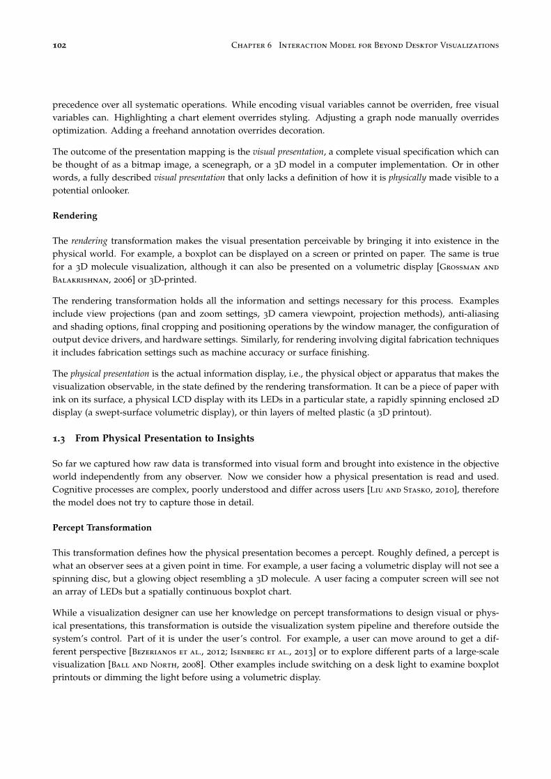
102 Chapter 6 Interaction Model for Beyond Desktop Visualizations
precedence over all systematic operations. While encoding visual variables cannot be overriden, free visualvariables can. Highlighting a chart element overrides styling. Adjusting a graph node manually overridesoptimization. Adding a freehand annotation overrides decoration.
The outcome of the presentation mapping is the visual presentation, a complete visual specification which canbe thought of as a bitmap image, a scenegraph, or a 3D model in a computer implementation. Or in otherwords, a fully described visual presentation that only lacks a definition of how it is physically made visible to apotential onlooker.
Rendering
The rendering transformation makes the visual presentation perceivable by bringing it into existence in thephysical world. For example, a boxplot can be displayed on a screen or printed on paper. The same is truefor a 3D molecule visualization, although it can also be presented on a volumetric display [Grossman and
Balakrishnan, 2006] or 3D-printed.
The rendering transformation holds all the information and settings necessary for this process. Examplesinclude view projections (pan and zoom settings, 3D camera viewpoint, projection methods), anti-aliasingand shading options, final cropping and positioning operations by the window manager, the configuration ofoutput device drivers, and hardware settings. Similarly, for rendering involving digital fabrication techniquesit includes fabrication settings such as machine accuracy or surface finishing.
The physical presentation is the actual information display, i.e., the physical object or apparatus that makes thevisualization observable, in the state defined by the rendering transformation. It can be a piece of paper withink on its surface, a physical LCD display with its LEDs in a particular state, a rapidly spinning enclosed 2Ddisplay (a swept-surface volumetric display), or thin layers of melted plastic (a 3D printout).
1.3 From Physical Presentation to Insights
So far we captured how raw data is transformed into visual form and brought into existence in the objectiveworld independently from any observer. Now we consider how a physical presentation is read and used.Cognitive processes are complex, poorly understood and differ across users [Liu and Stasko, 2010], thereforethe model does not try to capture those in detail.
Percept Transformation
This transformation defines how the physical presentation becomes a percept. Roughly defined, a percept iswhat an observer sees at a given point in time. For example, a user facing a volumetric display will not see aspinning disc, but a glowing object resembling a 3D molecule. A user facing a computer screen will see notan array of LEDs but a spatially continuous boxplot chart.
While a visualization designer can use her knowledge on percept transformations to design visual or phys-ical presentations, this transformation is outside the visualization system pipeline and therefore outside thesystem’s control. Part of it is under the user’s control. For example, a user can move around to get a dif-ferent perspective [Bezerianos et al., 2012; Isenberg et al., 2013] or to explore different parts of a large-scalevisualization [Ball and North, 2008]. Other examples include switching on a desk light to examine boxplotprintouts or dimming the light before using a volumetric display.

Section 1 An Adapted Infovis Pipeline 103
Modifications to the percept transformation can also affect an observer’s perception of embodiment of an infor-mation display. We can now refine our earlier definitions in Section 5 “Embodiment of Information Displays”(on page 44) of an embodied display and an embodied visualization using our pipeline model. A visualizationhenceforth is embodied if it elicits a stable and robust perception of congruence between the surfaces of thephysical presentation and the surfaces defined by the encoding visual variables. By inspecting a visualiza-tion system’s visual mapping and its physical presentation from an authoring perspective, we can determinewhether that visualization is indeed embodied. However, our definition stresses the subjective perception ofcongruence by an observer instead of an objective inspection. Consequently, percept transformations such aslocomotion of the observer or haptic interactions can lead to breakdowns (see [Svanaes, 2000, pp. 45, 55, 76,165]) in the perceived embodiment of a visualization (cf. the examples discussed in Section 5.1 on page 45).
Environmental factors determine how distal stimuli (physical presentations) are turned into proximal stimuli(retinal images). In addition, the percept transformation includes all psychophysical mechanisms that turnproximal stimuli into percepts, and that are largely outside the user’s control. These include general mech-anisms like light adaptation and individual factors like color blindness. Those also include the mechanismsthat make the time- and space-discretized stimuli from electronic displays appear as coherent shapes.
All of these examples illustrate how percept transformations can affect what users perceive while beingmostly out of the control of the visualization designer. While possible negative effect of some factors can bealleviated, e.g., by using colorblind safe colors to avoid lack of contrast for color-blind users, others are morechallenging such as detecting and correcting for stereo blindness.
Integration
This transformation defines how a new percept is combined with previous percepts to update a mentalvisual model of the visual presentation. For example, inspecting a molecular model from different angles orpanning and zooming a dense 2D visualization helps to construct a visual mental model that aligns with theoriginal visual presentation. However, both percepts and mental visual models are ephemeral in nature andextremely incomplete [Liu and Stasko, 2010]. Most of the visual information gathered from the external worldis forgotten and re-accessed when it is needed [Rensink, 2002]. Mental visual models are only rough sketchesthat help users maintain an overview of what is where and remain oriented during the visual informationgathering activity. Hence, we consider the mental visual model only as a control stage from which users canthen extract information and organize their actions.
Decoding + Insight Formation
This transformation defines how information is extracted from the visual mental model. Decoding refers tothe extraction of data values, such as retrieving the median performance of a specific participant. Decodinginitially requires identifying which visual mapping function has been applied and subsequently being ableto “invert” it. The ease of this process is determined by the recognizability and readability of a visualization,which in turn depend on the user’s visual literacy and degree of training [Kosara, 2007; Liu and Stasko, 2010].
Once the visual mapping is understood, not all information retrieval tasks require explicit decoding, as tasksin the data domain can translate into tasks in the visual domain [Hegarty, 2011]. For example, mediansbetween participants can be compared by looking at relative positions of lines. Higher-level information canbe gathered directly from the boxplot’s visual presentation, such as the degree of variation between medians,the existence of possible outliers, or performance trends per age.

104 Chapter 6 Interaction Model for Beyond Desktop Visualizations
Similarly to the visual mental model, the information gained from a visualization is ephemeral due to limitsof short term memory, but can serve to guide later visual information retrieval such as obtaining relevantdetailed information [Shneiderman, 1996]. Also, once combined and put into context, multiple pieces ofinformation can lead to insights that can be remembered and guide decision making [Card et al., 1999]. Forexample, our usability analyst might realize that elder users have issues with the new user interface anddecide to have her team explore alternative designs.
1.4 Branches
Figure 6.4: Branches inour visual notation sys-tem.
At each stage of the pipeline, a separate visualization pipeline can branch out (seeFigure 6.4 and also Figure 6.3 on page 100). For example, the usability analyst mayuse the boxplot together with a scatterplot that shows mean performance againstage for each participant. In that case another branch starts from raw data and goesthrough an alternative data transformation and visual mapping.
Branches can also exist higher up in the pipeline. For example, the processed dataused by the boxplot can also feed a bar chart showing only median performances. Orthe boxplot’s abstract visual form can be fed to a secondary visual presentation witha different participant ordering.
Branches can merge, a common example being multiple visual presentations shownon a single screen — or multiple “views”. Multiple views can be merged by the ren-dering transformation at the window manager level. Integrated views such as magiclenses [Bier et al., 1993] can be merged further below in the pipeline. Branchedpipelines can also lead to separate physical presentations, i.e., a boxplot and a scat-terplot can be shown on two separate screens or printed on separate sheets of paper.When seen by a single user, those two physical presentations lead to two visual men-
tal models that can later be merged by the decoding+insight formation transformation. When the same visualpresentation is shown twice (e.g., at different scales), the merging can be done by the integration transforma-tion.
In colocated collaborative settings multiple users can be observing the same physical presentation. In thatcase, each user has a unique viewpoint onto the shared physical presentation and a unique percept transfor-mation. In a distributed pipeline system such as a web app, multiple users can be observing the same visualpresentation through separate and possibly remote physical presentations.
1.5 Concrete vs. Conceptual Pipelines
A pipeline can be either concrete or conceptual. A concrete pipeline is a pipeline whose stages and transforma-tions have an actual existence in the world. One example is an implemented computer visualization system:the raw data is stored on a hard-drive or in memory and all transformations exist as executable code. As aresult, images can be automatically produced on the screen from the raw data. By applying the same set oftransformations defined by this concrete pipeline to different raw data, another concrete pipeline gets created.Since concrete pipelines require detailed knowledge of the definition of the transformations, they are mainlyof interest to reason about the authoring and implementation process of visualizations.
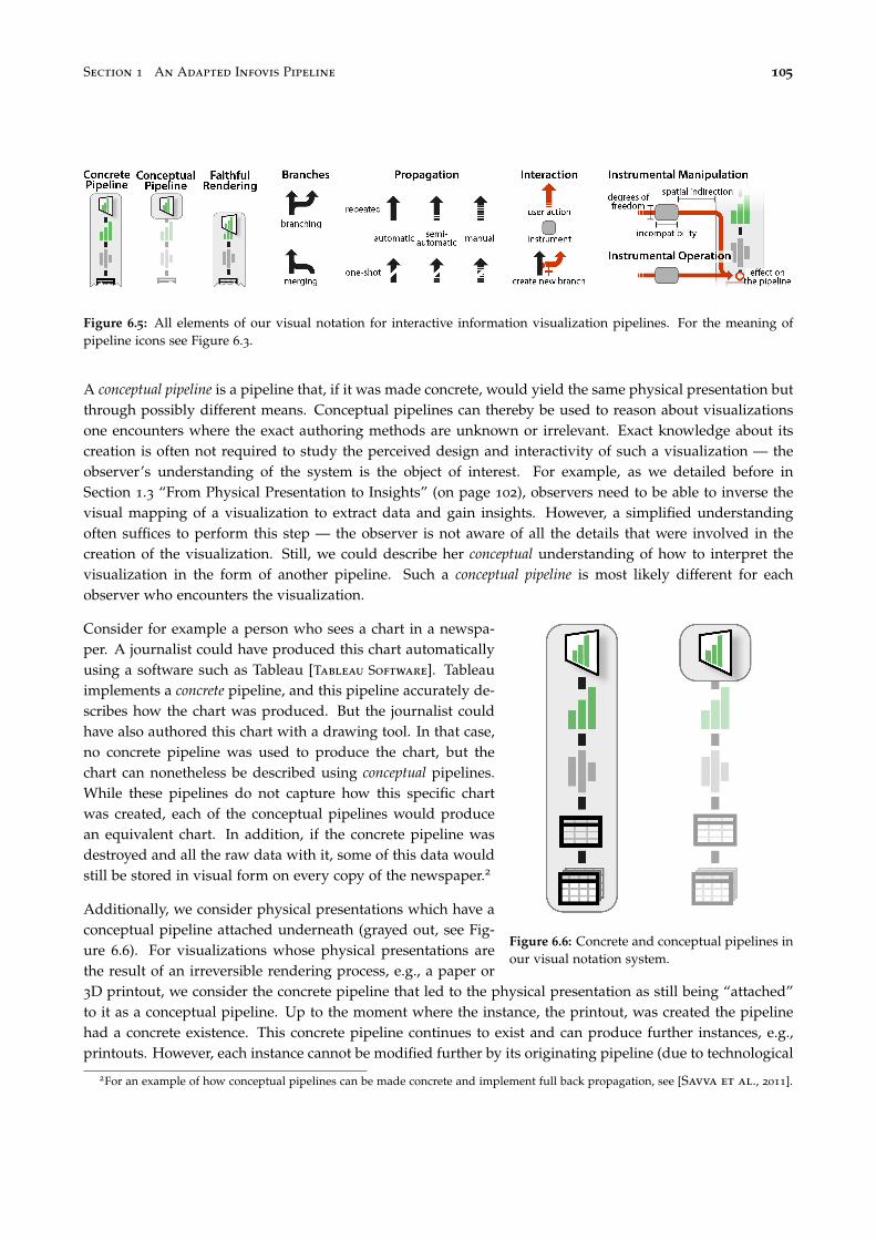
Section 1 An Adapted Infovis Pipeline 105
Figure 6.5: All elements of our visual notation for interactive information visualization pipelines. For the meaning ofpipeline icons see Figure 6.3.
A conceptual pipeline is a pipeline that, if it was made concrete, would yield the same physical presentation butthrough possibly different means. Conceptual pipelines can thereby be used to reason about visualizationsone encounters where the exact authoring methods are unknown or irrelevant. Exact knowledge about itscreation is often not required to study the perceived design and interactivity of such a visualization — theobserver’s understanding of the system is the object of interest. For example, as we detailed before inSection 1.3 “From Physical Presentation to Insights” (on page 102), observers need to be able to inverse thevisual mapping of a visualization to extract data and gain insights. However, a simplified understandingoften suffices to perform this step — the observer is not aware of all the details that were involved in thecreation of the visualization. Still, we could describe her conceptual understanding of how to interpret thevisualization in the form of another pipeline. Such a conceptual pipeline is most likely different for eachobserver who encounters the visualization.
Figure 6.6: Concrete and conceptual pipelines inour visual notation system.
Consider for example a person who sees a chart in a newspa-per. A journalist could have produced this chart automaticallyusing a software such as Tableau [Tableau Software]. Tableauimplements a concrete pipeline, and this pipeline accurately de-scribes how the chart was produced. But the journalist couldhave also authored this chart with a drawing tool. In that case,no concrete pipeline was used to produce the chart, but thechart can nonetheless be described using conceptual pipelines.While these pipelines do not capture how this specific chartwas created, each of the conceptual pipelines would producean equivalent chart. In addition, if the concrete pipeline wasdestroyed and all the raw data with it, some of this data wouldstill be stored in visual form on every copy of the newspaper.2
Additionally, we consider physical presentations which have aconceptual pipeline attached underneath (grayed out, see Fig-ure 6.6). For visualizations whose physical presentations arethe result of an irreversible rendering process, e.g., a paper or3D printout, we consider the concrete pipeline that led to the physical presentation as still being “attached”to it as a conceptual pipeline. Up to the moment where the instance, the printout, was created the pipelinehad a concrete existence. This concrete pipeline continues to exist and can produce further instances, e.g.,printouts. However, each instance cannot be modified further by its originating pipeline (due to technological
2For an example of how conceptual pipelines can be made concrete and implement full back propagation, see [Savva et al., 2011].

106 Chapter 6 Interaction Model for Beyond Desktop Visualizations
constraints typical for printouts). But still observers can modify an instance through other means, e.g., bydrawing annotations on it. To capture such observer actions, we consider the originating, concrete pipeline forsuch a visualization as being attached to the physical presentation as a conceptual pipeline. Then, by drawingannotations or other modifications to the instance, a user modifies the instance’s conceptual pipeline. Con-crete examples for such modifications of conceptual pipelines will be provided in Section 4 “Case Studies ofExisting Beyond-Desktop Visualizations” (on page 122) .
Two pipelines are conceptually equivalent if they yield the same end result. So theoretically, there can bean infinite number of conceptually equivalent pipelines for any given visualization. A manually-authoredinfographics or data sculpture may or may not have a conceptual pipeline. When no conceptual pipelineexists, the artifact cannot be generalized to other datasets and therefore does not qualify as a visualization[Kosara, 2007].
Note that the terms concrete and conceptual are not used to qualify this model, but the entities that arebeing modeled. The infovis pipeline model is a conceptual model. But we can use it to reason about,e.g., a hypothetical visualization system that uses self-reconfigurable matter as output, in which case we arereasoning about a concrete pipeline.
1.6 Information loss
Transformations can be seen as functions that are preferably but not necessarily bijective [Ziemkiewicz and
Kosara, 2009]. Information is often intentionally filtered out during data transformation. During rendering,some information can be lost due to display limitations, and lots of information can also be lost whencropping a visual presentation to fit a viewport or projecting a 3D visual presentation on 2D.
Figure 6.7: Proximitybetween visual andphysical presenta-tion indicates faithfulrendering.
By faithfulness we refer to the ability of a rendering transformation to preserve infor-mation. In our visual notation, this is represented by the amount of overlap betweenthe visual and physical presentation icons (see Figure 6.7). Note that even with afaithful rendition a large quantity of information can be lost at the percept trans-formation and subsequent stages, due to limits in human abilities to perceive andinterpret visual information [Hegarty, 2011].
Information loss can also be intentional [Ziemkiewicz and Kosara, 2009]. Althoughusers cannot reconstruct lost information, they can extract and reason about uncertaininformation all the way down to the raw data level. For example, box plots helpthe usability analyst reason about raw measurement data, even though an infinitenumber of measurement datasets could theoretically produce the same five-numbersummaries and the same box plots [Anscombe, 1973].
Faithfulness and Embodiment. A physical presentation is a faithful representationfor a visual presentation if no information loss occurs during the rendering trans-formation. It is therefore an information-theoretical concept. For example, if thevisual presentation is three-dimensional, then a faithful rendering necessarily resultsin a three-dimensional physical presentation to prevent loss of information. Whilefaithful rendering is easier to achieve for physical visualizations, many interactiontechniques for desktop systems lead to information loss, e.g., zooming often resultsin clipping, and hence the rendering on desktop systems is often not faithful.
Section 2 Interactivity 107
In contrast, embodiment is a phenomenological concept concerning an observer’s perception and subjectiveexperience of an information display. Embodiment requires visual and tactile congruence between the sur-faces meant to display — the visual marks — and the surfaces of the physical presentation itself. Whilefaithfulness is reflected in our visual notation, embodiment is not.
2 Interactivity
By interactivity we refer to users’ ability to alter the infovis pipeline. While several interaction taxonomiesfor visualization have been proposed all of them try to answer one or several of the following questions:
1. What is the user doing?That is, what is the effect of the interaction?
2. Why is she doing it?That is, what is the goal of effecting this interaction?
3. How does she do it?That is, what are the means by which she achieves this effect?
Immediate goals have been previously addressed in task taxonomies [Amar et al., 2005; Heer and Shneider-
man, 2012; Shneiderman, 1996; Yi et al., 2007; Roth, 2013; Schulz et al., 2013; Brehmer and Munzner, 2013]while more general goals have been discussed in textbooks and essays [Card et al., 1999; Van Wijk, 2005].Effects and means have received comparatively less attention and can vary widely across systems.
Effects and means can be understood from two perspectives. From the pipeline’s perspective (i.e., in a real orconceptual system), they refer to what is affected in the pipeline (e.g., which level is modified) and how (e.g.,what hardware and software mechanisms are involved). From the user’s perspective, effects and means refer tothe user’s subjective perception of what is being modified (e.g, what happens to the visualization) and howthis modification is achieved (e.g, through direct manipulation or done automatically by the system).
We first briefly discuss goals, then address effects and means from the pipeline’s perspective, and finally addressthe effects and means from the users’ perspective.
2.1 Goals
As mentioned in the previous section, information can be filtered out or aggregated in the pipeline eitherbecause of technical limitations or in order to simplify the visualization and perception of very large datasets.The primary function of interactivity in visualization systems is to allow users to dynamically alter thepipeline to reveal other aspects of the data. Users can then integrate the various percepts and pieces ofinformation over time in order to build a richer picture of the data and accumulate insights. This dynamicprocess is often referred to as data exploration [Card et al., 1999]. Data exploration can be thought of asbeing goal-directed and decomposable into elementary tasks such as “compare”, “filter” or “find anomalies”[Wehrend and Lewis, 1990; Shneiderman, 1996; Amar et al., 2005; Yi et al., 2007].
Interactivity can be used not only to explore, but also to correct, update or collect data. Data collection isoften considered a problem outside the realm of infovis: raw data is “given”. Although raw data can beautomatically collected from the physical world (e.g., temperature measurements), an abundant amount ofinformation initially only exists in human minds (e.g., opinion polls) and need to be explicitly externalized.

108 Chapter 6 Interaction Model for Beyond Desktop Visualizations
When the person using a visualization system is the same as the person who provides (or is able to corrector update) the data, data input becomes an infovis problem. This problem has started to be addressed inresearch [Baudel, 2006] and for specific cases has already been addressed by software such as calendar tools,which provide both visualizations of personal data and the means to enter and update this data.
Finally, interactivity can also have social functions, such as helping users coordinate and communicate incollaborative settings or helping analysts present data to an audience [Isenberg et al., 2011; Heer and Shnei-
derman, 2012]. An example of storytelling involving interaction with a simple physical visualization is “HansRosling’s shortest Ted Talk” [Rosling, 2012].
Figure 6.8: Hans Rosling using physical objects to represent data for storytelling purposes during his TED talks. Left:“Global population growth, box by box” (TED@Cannes, June 2010). Right: “The shortest TED talk ever given” (TEDx-Summit 2012, Doha, Qatar)
2.2 Effects — The Pipeline’s Perspective
Figure 6.9: Head-coupled stereo display setup as pro-posed first for a fishtank virtual reality setup [Ware
et al., 1993].
From the pipeline’s perspective, the effect refers to thepart of the pipeline that is modified during interactionand the nature of the change. Any part of a visualizationsystem’s pipeline that stores information can potentiallybe modified, namely the raw data level and all subsequenttransformations. An example for a data transformation mod-ification is changing the range of a filter. An example fora visual mapping modification is swapping two axes on ascatterplot. An example for a presentation mapping modi-fication is reordering a matrix visualization. An examplefor a rendering modification is zooming.
Percept transformations can also be modified. Examples in-clude repositioning a laptop computer, moving aroundin a large display environment, and virtually any actionthat implicitly changes the percept of a physical presen-tation: turning off the room’s lights, placing one’s fingeron a screen, closing an eye, covering someone else’s eyes,wearing corrective glasses etc. Wearing glasses for stereo-

Section 2 Interactivity 109
scopic displays is also a percept transformation since these glasses allow the wearer to perceive a stereoscopicrendering whereas a bystander without glasses perceives two images set off to each other. In more elaborateenvironments, such as a fishtank virtual reality setting with head tracking [Ware et al., 1993], part of the per-cept transformation of the user can even be sensed and used to adapt the rendering transformation accordingto the position of the user’s head (see Figure 6.9).
Figure 6.10: Tally marks to keep track of players’scores over a series of card games.
As already mentioned before, conceptual pipelines can alsobe modified. A conceptual pipeline is modified when theconcrete entity it is connected to changes. For example,consider a card player who keeps scores using tally markson a paper sheet (ass in Figure 6.10). A simple concep-tual pipeline is one that takes the scores as raw data, cre-ates a visual form using a “tally mark” visual mapping,then produces a physical presentation consisting in inkon paper. But if the card player adds a mark, the origi-nal pipeline becomes inconsistent with the changed phys-ical presentation. A correct conceptual pipeline has to besubstituted, and a parsimonious one would use the newscores as raw data and leave the rest unchanged. Therefore, drawing a tally mark conceptually modifies thepipeline at the raw data level.
As will be discussed in the next section, the effect of an interaction can also consist in a higher-level modifi-cation, such as creating a new branch on the pipeline or removing an existing branch.
2.3 Means — The Pipeline’s Perspective
From the pipeline’s perspective, the means consist in interaction techniques, i.e., all the hardware and soft-ware elements that provide a way for users to produce the effect of interest on the pipeline [Tucker, 2004].Many interaction techniques can produce the same effect. For example, a scatterplot can be filtered throughSQL queries, dynamics queries [Card et al., 1999], using tangible props (see Chapter 4), or even by speechrecognition.
Interaction techniques can be complex and can require elaborate forms of communication between differ-ent levels of the pipeline. We call these mechanisms propagation. An example of propagation is the abovementioned fishtank VR system where a user’s percept transformation is propagated to the rendering transfor-mation. We first describe the different types of propagation (see legend in Figure 6.5 on page 105), and thendiscuss how interaction techniques can be modeled in our pipeline in the form of instruments.
Forward and Back Propagation
As a general principle effects propagate upward, e.g., if a user changes the data transformation, then the newtransformation is applied to the raw data, after which all the subsequent transformations are applied all theway to the physical presentation. This type of propagation is common to almost all infovis pipelines (arrowsin Figure 6.3 on page 100) and will be referred to as forward propagation.
In addition to forward propagation, some interaction techniques also require back propagation. For example,consider brushing & linking on a scatterplot matrix [Becker and Cleveland, 1987] (see Figure 6.11): every

110 Chapter 6 Interaction Model for Beyond Desktop Visualizations
Figure 6.11: Brushing in a scatterplotmatrix: brushing one area highlightsthe contained data points in all otherscatterplots [Becker and Cleveland,1987].
time the mouse moves, its position needs to be translated from screen coordinates into visual presentationcoordinates, then the glyph below this point needs to be matched to the corresponding data record [Con-
versy, 2011]. In other terms, all geometrical transformations from the data transformation to the physicalpresentation are inverted. Then the “highlighted” attribute of the data point is set to true and the change ispropagated forward to all other scatterplots.
Branching
Branching consists in creating a new branch in a pipeline (see Section 1.4 on page 104). This involves instanti-ating all pipeline entities from the branching point upwards, then performing a forward propagation. Branchingalso serves to generate an initial pipeline from a raw dataset.
In a desktop setting, a common example of branching interaction is creating a new “view” (e.g., window) ofthe same data, or activating a magic lens [Bier et al., 1993]. In both cases, the two branches usually mergebefore the physical presentation level, whereas printing a visualization on paper creates a branch with aseparate physical presentation.
Branches can also be suppressed (e.g., closing a window). In addition, some visualization systems supportbranch substitution [Tableau Software; Viegas et al., 2007]. Branch substitution consists in suppressing abranch starting from a certain level (e.g., processed data), then creating a new branch that ends up beingdisplayed at the same physical location. One example is switching from parallel coordinates to a matrixvisualization.

Section 2 Interactivity 111
Automatic vs. Manual Propagation
Propagation in a concrete pipeline can be either fully automatic, fully manual, or in-between. Forward propa-gations in advanced computer visualization systems are typically fully automatic: every change to one levelis immediately reflected to the levels above — i.e., all transformations are applied — without further userintervention.
Figure 6.12: Propagation in our visual notation system.
An example of user intervention at the data trans-formation level is exporting part of a dataset as agraphml file to be visualized as a node-link diagram.Another example at the rendering level would be ex-porting a molecule visualization as a 3D model tobe displayed by a separate viewer. In both exam-ples, every time the raw data changes, updating thephysical presentation requires user intervention.
There is a continuum between automatic and man-ual propagation. For example, opening a rawdataset with a spreadsheet, computing and copyingvalues one by one into another spreadsheet wouldbe a rather manual way of doing data transforma-tion. Invoking a parsing script instead would be amore automatic — yet not fully automatic — way of doing the same job. The creation of physical visualiza-tions can involve varying degrees of automaticity at different levels of the pipeline (Chapter 7 Section 3 onpage 139 presents a series of case studies illustrating varying degrees of manual intervention).
Repeated vs. One-shot Propagation
At any level of a pipeline, forward propagation can be either repeated or one-shot. Repeated forward propagationmeans that information is propagated forward more than once. A computer visualization system typicallysupports repeated forward propagation at all levels, meaning that changes to the raw data can be reflectedon the same physical presentation. If propagations are also fully automatic, the physical presentation can becontinuously updated and display streaming data [Norton et al., 2001].
Propagation can also be one-shot, meaning that forward propagation is only performed when the branchis initially created, and is hard or impossible afterwards. Examples of one-shot propagation at the renderinglevel include paper printouts and 3D fabrication. Any change affecting layers below the physical presentationare not propagated any more to these physical presentations. Seeing the changes would require branching,i.e., producing a new printout or physical 3D model. Each physical presentation can however possess aconceptual pipeline that is a snapshot of the pipeline initially used to create it, and that can be modifiedconceptually.
Instruments
As explained earlier in Chapter 3 Section 4.5 on page 41, instruments model the mechanism how a controlchanges another information displays. Instruments are inspired by physical tools: a screwdriver is an instru-ment that acts as a mediator between humans and screws. In interactive systems, an instrument acts as a

112 Chapter 6 Interaction Model for Beyond Desktop Visualizations
Figure 6.13: Filtering scatterplot data through a dynamic query instrument. The flow of propagation is marked in red.
mediator between the user and the object being modified — in our case, the visualization pipeline. The roleof the instrument is to interpret user input into modifications of the pipeline and to provide user feedback.
We saw earlier that, following Beaudouin-Lafon’s model, instruments have a physical part and a logicalpart [Beaudouin-Lafon, 2000]. Within our model, an instrument can have two physical parts: i) a physicalhandle, i.e., an object that the user can physically operate; and ii) a physical presentation that provides userfeedback. An instrument’s physical handle can be colocated with its physical presentation (resulting in aninteractive control, e.g., a touch control), physically remote (as often case with non-interactive controls, e.g.,a mouse), or non-existing (e.g., with virtual controls such as mid-air pointing) [Nancel et al., 2011].
Since it is most common for instruments for infovis applications to provide a physical presentation, wemodel the logical part of an instrument also as a pipeline. Several intercommunicating pipelines can forma compound instrument. Figure 6.13 details an example for a mouse-controlled dynamic query instrument[Ahlberg et al., 1992]. A scatterplot pipeline (to the right) is augmented with a range slider instrument, as wellas a mouse instrument. The scatterplot’s data transformation exposes its parameters to the range slider as rawdata (1). A subset of this raw data — the range for filtering a given data dimension — is visualized in theform of two slider thumbs (2). The mouse instrument has a physical handle (3) whose position is shown asa mouse cursor. All three pipelines merge at the rendering level, which displays the range slider next to thescatterplot and overlays the mouse cursor on top.
When the mouse’s physical handle is operated (3), the raw sensor data is updated, the new position of themouse cursor is computed and visualized on the screen. An event is also generated (e.g., a mouse drag). Thismouse event is interpreted by the rendering transformation and sent to the range slider’s visual presentation(2), who back-propagates the change to the scatterplot’s data transformation (1) [Conversy, 2011].

Section 2 Interactivity 113
This is only one example, and many other forms of instruments exist. In general, an instrument is composedof one or several secondary pipelines that intercommunicate. These pipelines provide visual feedback andfeedforward, and can sometimes be considered as visualizations by themselves. For example, a range slidercan show the data distribution [Fekete, 2004; Willett et al., 2007] (e.g., see Figure 6.14 and also Figure 4.7 onpage 62 and Figure 4.8 on page 63 in Chapter 4), or a data view can be temporarily used as an instrumentfor controlling another view [Becker and Cleveland, 1987] (Figure 6.11 on page 110). In all cases, at oneend manipulating a physical handle produces raw sensor data, and at the other end, the main visualizationpipeline is modified at a specific level. We will see later in Section 2.5 how to simplify the representation ofinstruments by ignoring the internals of an instrument’s pipeline and focusing on users’ subjective experience.
Versatility and Genericity
In order to avoid the proliferation of instruments and to facilitate learning, it is important for instruments tobe versatile. Beaudouin-Lafon introduced the notion of polymorphism for instruments such that they “shouldoperate in as many different contexts as possible, as long as this makes sense to the user” [Beaudouin-Lafon,2004]. Here we refine this notion into the concepts of versatility and genericity for the purposes of informationvisualization. An instrument is versatile if it is compatible with a large number of visualization pipelines.Generally, an instrument is versatile if it is only loosely coupled with the element it controls or if this elementis loosely coupled with the rest of the pipeline. We find this to be most often the case for instrumentsoperating on either extreme of the pipeline, i.e., data transformations or raw data and rendering. For example,dynamic query sliders are versatile because they operate on data transformations (i.e., range queries onquantitative or ordinal dimensions) that are compatible with many visualization techniques. Versatility isalso linked to usefulness: although range sliders could in principle be used with nominal data, such queriesare meaningless, and this therefore limits the versatility of the instrument. Versatile instruments also existat the rendering level, e.g., pan-and-zoom, interactive image processing [Elmqvist et al., 2011] or windowmanagement tools.
Instruments that operate on visual mappings and presentation mappings on the other hand tend to bevisualization-specific as they often require to interpret specific visual mappings. Examples include base-line adjustment tools for stacked histograms [Dix and Ellis, 1998], sorting tools for matrix visualizations, oredge deformation tools for node-link diagrams [Wong et al., 2003]. However, in many cases similar func-tionality can be achieved at the rendering level: tools could in principle be designed that perform advancedgeometrical operations on scenegraphs (e.g., alignment, sorting, overlap removal or annotation), without anyknowledge of the underlying visual mapping. Such rendering-level visualization-agnostic instruments seemto be a promising area of future research.
Figure 6.14: Examples of “scented widgets” [Willett et al., 2007], left: radio buttons, right: slider

114 Chapter 6 Interaction Model for Beyond Desktop Visualizations
An instrument is generic if it is versatile and if the same user actions produce the same effects on differ-ent visualization pipelines. For example, range sliders and pan-and-zoom instruments are generic becausethey are versatile and their effects are consistent across all compatible visualizations. An instrument that israther versatile but not generic is the rectangular selection tool: this tools lets users select 2D data ranges onscatterplots and line graphs [Hochheiser and Shneiderman, 2004], but has different semantics on node-linkdiagrams. Similarly, an instrument for dragging visual marks can be versatile but can have very differenteffects on different visualizations (e.g., reordering rows and columns on matrices whereas for scatterplotsit could change the raw data or perform panning). More generally, direct manipulation instruments thatrequire back-propagation may be versatile but are rarely generic because spatial manipulations need to beinterpreted according to the visual mapping used.
2.4 Effects — The User’s Perspective
So far we considered the effects of interactions on the visualization pipeline. We now discuss the user’sperception of these effects.
Instruments produce multiple observable effects. A user who operates the range slider of Figure 6.13 onpage 112 can look at the scatterplot but can also attend to the motion of the slider’s thumb, of the cursor onthe screen, or of the physical mouse. However, instruments are not the task’s focus, so unless they need tobe fixed or reconfigured [Svanaes, 2000, Chap.1][Beaudouin-Lafon and Mackay, 2000], users typically focus onthe physical presentation of the data being explored. In the instrumental interaction framework this wouldbe referred to as the domain object [Beaudouin-Lafon, 2000]. However, this framework does not consider thevisualization process and equates the domain object with its visual presentation. We therefore discuss wherein the pipeline effects are perceived to occur.
Although effects are made observable by the physical presentation, they are usually not perceived at this level.A person using a computer does not see pixels changing on a screen but instead perceives action happening“behind” [Svanaes, 2000, Chap.1]. In our pipeline model, the entity that best aligns with what the userperceives is the visual presentation.
The perception of changes in a pipeline’s transformations tends to shift towards the visual presentation level.For example, when panning and zooming a tree visualization or rotating a 3D molecule, one may perceivenot a “camera” motion, but a change to the position and orientation of the tree or of the molecule3. If thepresentation mapping changes (e.g., a tree branch is collapsed), the change will also be perceived as happeningto the tree or to the molecule.
As mentioned earlier in the context of conceptual pipelines (on page 105), the interpretation of changesoccurring lower in the pipeline likely varies across users, especially since probably only few users think ofvisualizations in terms of pipelines. For example, when comparing a boxplot with a newer version where aparticipant has been removed, an information visualization expert may “correctly” interpret the new versionas having a different data transformation. But other users may prefer to think of an alteration of the rawdataset, or may simply consider that a box has been removed from the visual presentation. Regardless, achange in the visual presentation is likely to be the initial perception for all users, while further interpretationsmay require additional cognition.
3Similarly, changes to the percept transformation can be shifted towards the physical presentation. Examples are rotating a computerscreen or placing a post-it note on a screen, which can be seen as happening to the screen.

Section 2 Interactivity 115
To summarize, the subjective perception of interaction effects may vary across time and across users but inmost typical situations, the dominant and immediate perception is that of changes happening to the visualpresentation of the data being explored.
2.5 Means — The User’s Perspective
From the user’s perspective, the means refer to how a user perceives he produces the effects he observes.This subjective experience depends on the instrument used. A category of instruments that have generatedconsiderable interest in HCI are “direct manipulation” techniques [Hutchins et al., 1985; Shneiderman, 1998;Gentner and Nielsen, 1996; Beaudouin-Lafon, 2000], which we discuss here in the context of infovis.
While the instrumental interaction framework [Beaudouin-Lafon, 2000] helpfully clarifies the different levelsof directness an instrument can elicit (as discussed for our experimental design in Chapter 5 Section 3.2 onpage 89), it does not capture the subjective experience of manipulation. We therefore introduce the conceptsof instrumental manipulation and instrumental operation.
Instrumental Manipulation vs. Operation
Instrumental manipulation is the experience of self-agency for the perceived effect. Anything else is instrumentaloperation.
The sense of self-agency, i.e., being the cause of something [Skinner, 1996], is a key component in how inter-actions are experienced. Consider a node-link diagram visualization where the user has two alternatives: i)the user presses a button and the diagram is automatically laid out by the computer; or ii) the user manuallydrags the nodes to the same final positions. The perceived outcome of both actions — i.e., the effect — isthe same change to the visual presentation, but in i), the user is doing instrumental operation while in ii), it isinstrumental manipulation.
Self-agency is experienced with the physical handle and can be transferred to the next instruments in thechain [Svanaes, 2000, Chap.7], sometimes with the feeling that previous instruments have been incorporatedto the body [Maravita and Iriki, 2004; Bassolino et al., 2010]. In the scenario i) above, the user feels he is theone who is depressing not only the physical mouse button, but also the widget on the screen, after which thecomputer takes over. With the range slider of Figure 6.13 on page 112, the user experiences self-agency formoving the physical mouse, as well as the mouse pointer and the range slider’s thumb. Then, self-agencymay or may not be experienced for the effects on the scatterplot’s visual presentation.
Self-agency is transferred when observed effects can be easily predicted from physical actions. This is the casewhen effects and actions have a high degree of compatibility [Beaudouin-Lafon, 2000], but also when they arelinked by a simple relationship [Maravita and Iriki, 2004; Johnson-Frey, 2003]. If the range slider operates ona scatterplot axis, actions and effects are directly correlated and the user may perceive he is “stretching” thescatterplot. If the scatterplot motions are reverted or rotated by 90 degrees, agency can still be transferred.But if another dimension is filtered, points will appear and disappear in an unpredictable manner, and self-agency will stop at the slider’s thumb. The visual presentation will not be experienced as being manipulatedand the user will be performing instrumental operation.
Since we base our understanding of self-agency on the predictability of actions, the distinction whether acertain user action should be considered as manipulation or operation finally depends on the user’s percep-tion — not on his conscious choices but on previous experiences and her knowledge and understanding of

116 Chapter 6 Interaction Model for Beyond Desktop Visualizations
the visualization system. For example, if we consider a user who has developed a graph layout algorithmwhose behavior he can predict, he might experience self-agency when triggering the action. However, formost users this is rather unlikely.
Figure 6.15: Instrumental manipulation and operation in our visual notation system.
Instruments have a simplified visual notation where the means from the pipeline’s perspective are not shown(cf. the short notation detailed in Figure 6.5 against the detailed depiction in Figure 6.13 on page 112 ). If theinstrument supports instrumental manipulation the icon is placed in front of the visual presentation. Otherwiseit faces the effect on the pipeline.
Direct vs. Indirect Instrumental Manipulation
In addition to providing the illusion that the visual presentation is being manipulated, some instruments givethe illusion that it is being directly manipulated. Factors that contribute to this include [Beaudouin-Lafon,2000]:
• A high degree of compatibility between actions and effects. For example, filtering a scatterplot by draggingan axis is more compatible than using a range slider, since motions are not reverted.
• A low degree of indirection, which refers to a low spatial and temporal offset between the user’s actions andthe observed effect. Here we interpret this as being the degree of indirection between the physical handleand the visual presentation.
• A degree of integration of 1, which refers to physical actions and the observed effect having the same dimen-sionality. A counter-example is using a computer mouse to operate the range slider: although the rangeslider has two degrees of freedom, only one degree of freedom of the mouse is used to operate it.
There is a continuum between indirect and direct instrumental manipulation. For example, dragging objectson a touchscreen feels very direct, yet the illusion is imperfect due to possible parallax and lag, inconsistenttactile cues, and impoverished hand gestures [Victor, 2011]. In our compacted visual notation, the position

Section 2 Interactivity 117
and shape of the icon, relative to the stages and transformation of the pipeline, encodes information abouthow direct the instrument feels (detailed in Figure 6.15 on the preceding page).
Physical Manipulation
We additionally introduce the notion of physical manipulation to capture manipulations of an observer withoutthe use of an instrument. Note that we refer here to direct physical manipulation of an information display(e.g., as shown in Figure 6.16). We earlier defined controls also as information displays that can change otherinformation displays. Physical manipulation can take place with controls if they are embodied. However,even though such a control is being physically manipulated, the control is usually not the object of interest ofthe manipulation. Hence, the information display that the control changes is most likely not being physicallymanipulated.We later introduce case studies as clarifying examples.
Figure 6.16: Physical manipulation of a physical information display.
To summarize, the user’s subjective experience of interacting with a visualization can be either
i) instrumental operation: no experience of self-agency, observed effect of action is not easily predictable,ii) instrumental manipulation: experience of self-agency, can be direct or indirect following the instrumental
interaction model,iii) physical manipulation: experience of self-agency, direct, no instruments as mediators.
For an instrument to elicit an experience of manipulation, changes shown at the visual presentation level haveto be predictable, e.g., bear similarities with the user’s physical gestures on the physical handle. Additionalfactors contribute to an experience of directness. Accordingly, physical manipulation can only be performed onphysical objects [Fishkin et al., 1999].

118 Chapter 6 Interaction Model for Beyond Desktop Visualizations
While direct instrumental manipulation can be extremely powerful [Hutchins et al., 1985; Shneiderman, 1998;Ahlberg et al., 1992], indirect instruments such as light switches are also useful [Beaudouin-Lafon, 2000].Instrumental operation is useful when the user wishes to partly relinquish control to the computer becausemanipulation would be too complex or too repetitive [Gentner and Nielsen, 1996] (e.g., reordering a matrix).
3 Visualizing Experimental Designs
We illustrate now how our notation system can be used to illustrate on which levels conditions of an ex-perimental design vary. Visualizing conditions in such a way can help to design experiments that carefullycontrol covariates by only manipulating factors of interest while keeping everything else constant.
3.1 Evaluating the Effect of Embodiment of WSD Instruments from Chapter 4
As detailed earlier in Chapter 4, we compared in this experiment an embodied, tangible slider control with anunembodied, touch slider control (see Figure 6.17) using a task requiring visual attention on a wall-mounteddisplay. The wall-mounted information display showed for each experimental repetition a 1D path in theform of an animated slider widget. Participants were instructed to follow this movement closely using eitherthe embodied or unembodied control (depending on the experimental condition). The drift between the 1Dpath and the participant’s control was displayed in-place with the slider widget on the wall-mounted display.Additionally, participants had to react to a distractor stimulus and reach over to the tap area (see Figure 6.17)in irregular intervals forcing them to reacquire their controls repeatedly over the course of the experiment.
Figure 6.18 visualizes the experimental design using our visual notation system. The visualization pipeline(on the right) renders a slider on a wall display (1) and the current drift of the user from the path she has tofollow (2). The two controls (shown to the left) display both the same visual presentation as the slider shownon the wall display. Parts of their pipelines can thereby be considered as conceptually equivalent (see definition
Figure 6.17: The tablets with the unembodied touch control (left) and the embodied tangible control (right) in front ofthe wall display showing also a slider and the participant’s drift relative to a pre-computed 1D path.
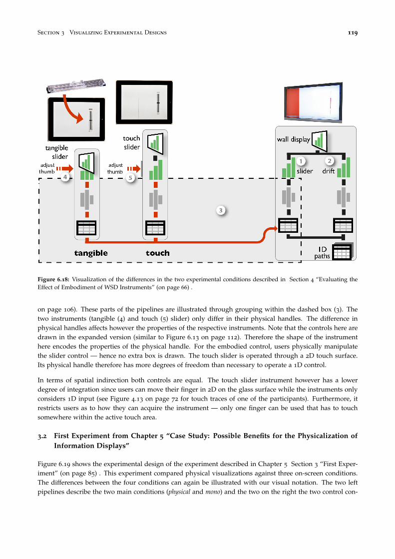
Section 3 Visualizing Experimental Designs 119
Figure 6.18: Visualization of the differences in the two experimental conditions described in Section 4 “Evaluating theEffect of Embodiment of WSD Instruments” (on page 66) .
on page 106). These parts of the pipelines are illustrated through grouping within the dashed box (3). Thetwo instruments (tangible (4) and touch (5) slider) only differ in their physical handles. The difference inphysical handles affects however the properties of the respective instruments. Note that the controls here aredrawn in the expanded version (similar to Figure 6.13 on page 112). Therefore the shape of the instrumenthere encodes the properties of the physical handle. For the embodied control, users physically manipulatethe slider control — hence no extra box is drawn. The touch slider is operated through a 2D touch surface.Its physical handle therefore has more degrees of freedom than necessary to operate a 1D control.
In terms of spatial indirection both controls are equal. The touch slider instrument however has a lowerdegree of integration since users can move their finger in 2D on the glass surface while the instruments onlyconsiders 1D input (see Figure 4.13 on page 72 for touch traces of one of the participants). Furthermore, itrestricts users as to how they can acquire the instrument — only one finger can be used that has to touchsomewhere within the active touch area.
3.2 First Experiment from Chapter 5 “Case Study: Possible Benefits for the Physicalization ofInformation Displays”
Figure 6.19 shows the experimental design of the experiment described in Chapter 5 Section 3 “First Exper-iment” (on page 85) . This experiment compared physical visualizations against three on-screen conditions.The differences between the four conditions can again be illustrated with our visual notation. The two leftpipelines describe the two main conditions (physical and mono) and the two on the right the two control con-

120 Chapter 6 Interaction Model for Beyond Desktop Visualizations
ditions (stereo and 2D). As before gray, hatched boxes indicate the parts of their respective pipelines whichare conceptually equivalent.
Mono and stereo utilize the same pipeline and only differ in their specific rendering, i.e., mono uses a perspec-tive or orthogonal projection to render the 3D chart on a 2D screen whereas stereo renders the same visualpresentation in stereoscopically. Stereo has thereby a more faithful rendering than mono as only informationdue to camera position and occlusion is lost during the rendering.
The physical and mono condition differ also slightly in their visual presentations due to different label place-ments but differ otherwise only in terms of rendering. The physical condition renders the 3D chart faithfully.
The 2D condition on the other hand has a very different and more complex pipeline with linked views.Figure 6.19 illustrates the higher complexity of the pipeline.
In the physical condition, participants manipulated the visualization directly without using any instrument —physical manipulation — thereby no instrument is drawn between the user action and the pipeline. In the monoand stereo condition, participants could rotate the visualization and mark elements using a mouse instrument.In both cases the instrument has some spatial indirection (shown as distance to the pipeline they control).For the rotation instrument the incompatibility between performed movement and perceived effect is rather
Figure 6.19: Visualization of the differences in the four experimental conditions described in Section 3 “First Experiment”(on page 85)

Section 3 Visualizing Experimental Designs 121
high since 2D movements on a horizontal surface are mapped to 3D rotations. For the marking instrumentthe incompatibility is slightly lower since the cursor moves on a 2D plane but points at a 3D object.
3.3 Second Experiment from Chapter 5 “Case Study: Possible Benefits for the Physicalizationof Information Displays”
Figure 6.20 shows the experimental design of the experiment described in Chapter 5 Section 4 “SecondExperiment” (on page 91) . For this experiment only the 3D bar chart visual presentation was used. Thedifferent techniques only vary in their respective rendering and the available instruments. As to the visual-ization pipelines, touch and no touch are equivalent to the physical condition in the previous section, and propand mouse are equivalent to the mono condition.
As for provided instruments, the touch and no touch condition differ in number of instruments since the touchcondition allows the use of fingers for temporary markings. The rotation instrument is equivalent betweenthe two conditions. All instruments for these two conditions are physical manipulations thereby no mediatinginstrument is required.
Figure 6.20: Visualization of the differences in the four experimental conditions described in Section 4 “Second Experi-ment” (on page 91)

122 Chapter 6 Interaction Model for Beyond Desktop Visualizations
The two on-screen conditions differ in rotation instruments. The prop condition provides participants witha 3DOF rotation instrument, a prop, that perfectly “imitates” the 3D visualization displayed on the screenas a rotation controller. The instrument thereby has minimal incompatibility, high degrees of freedom butsome spatial indirection. As to 3DOF rotation the instrument is embodied. However, it is not entirelycompatible with the effect it invokes on the pipeline as translations of the physical handle are disregarded.This was necessary for the experimental design to ensure identical visual size between the prop and monocondition. However, in our visualization of the instruments properties this leads to a slightly increased levelof incompatibility of the instrument. The mouse controlled rotation instrument is identical with the onedescribed in the previous subsection.
4 Case Studies of Existing Beyond-Desktop Visualizations
We now use our model to describe, discuss, and compare several interactive visualization systems that employnon-conventional hardware setups, including large-scale visualizations, tangible controls, physical visualiza-tions and shape displays. Terms from our model will be highlighted in italics.
4.1 Interacting with Large-Scale Visualizations
Large-scale visualizations involve physical presentations that are much larger than a regular computer screen.They provide new opportunities but also impose new constraints. One is that users need to be mobile to takefull advantage of the available space by which they inherently modify their percept transform.
Tangible Remote Controllers
Tangible remote controllers for wall-sized displays (TRC) solve mobility issues through portable instruments(see Section 1.3 “Tangible Remote Controllers” (on page 57) for a full description). Figure 6.21 illustrates atypical interaction involving dynamic queries performed on a scatterplot visualization displayed on a wall-sized display. A user is equipped with her personal set of physical controls attached to a tablet device. She istherefore mobile and can modify her percept transformation (1) to explore different areas of the visualization.She can also filter the data from any location by acquiring one of the tangible range sliders (2). By adjustingits thumbs, she defines a new range (3), effectively modifying the data transformation of the main pipeline(4). This interaction is continuously forwarded (automatic and repeated forward propagation), allowing her toobserve the effect of her action on the scatterplot. Note that the schematic in Figure 6.21 provides the samelevel of detail as Figure 6.13 for a desktop setup, i.e., the instrument is notated here in full to emphasize thatit moves relative with the user, not the physical presentation of the visualization. As a comparison, consideragain the desktop setup of Figure 6.13 on page 112:
• The instrument’s physical handle is bound to the scatterplot’s physical presentation, although on large displaysthis constraint can be relaxed with mobile physical handles or mid-air pointing [Nancel et al., 2011].
• In a desktop setting the visual presentation of the range slider and of the scatterplot are shown side-by-sideon the same physical presentation. While this is acceptable in a desktop setting, on a large display this wouldmake the instrument’s visual presentation hard to see from certain angles [Bezerianos et al., 2012] and thushard to operate. Deporting instruments’ physical presentation not only solves this problem but also bettersupports multiple users.

Section 4 Case Studies of Existing Beyond-Desktop Visualizations 123
Figure 6.21: Tangible Remote Controllers (Chapter 4) are physical widgets attached to tablet devices that support mobileinteraction with wall-size displays.
• Most importantly, Figure 6.13 involves a generic pointing instrument whereas in Figure 6.21 the userdirectly operates the range slider — a physicalized instrument — which considerably increases the instru-ment’s degrees of freedom.
• The range slider’s rendering transformation is more faithful and furthermore embodied. Both its physical handleand physical presentation match the user’s mental model of a slider.
As seen in Chapter 4, the system also supports other forms of interaction: physical controls can be freelyrearranged on the tablet surface (customization of the instrument’s visual presentation by true direct manip-ulation) and their function can be reassigned through pop-up menus (customization of the visual mappingtransformation). Such a high degree of flexibility is currently uncommon on desktop systems, where usuallyonly some toolbars can be customized to a certain degree but through often cumbersome interactions.

124 Chapter 6 Interaction Model for Beyond Desktop Visualizations
FatFonts
Figure 6.22: FatFonts [Nacenta et al., 2012] appear as a heatmap from far and shows numbers from close. By movingaround, users conceptually switch between two visual mappings.
While the TRC system supports multi-user mobile interaction, shared displays require coordination amongusers: if one user changes the visualization, then this affects all other users. FatFonts [Nacenta et al., 2012]provide an original solution to this problem by supporting interactions at the percept transform level, thatdo not affect the physical presentation (see also [Isenberg et al., 2013] for a more general approach and apsychophysical model).
FatFonts show data values with numbers whose thickness is also a function of the value, yielding visualiza-tions that elicit different percepts from different viewing distances. Top of Figure 6.22 shows a map overlaidwith an array of numbers indicating elevation. Users who are close can read the numbers (see inset) whileusers standing back perceive a heatmap. This can be modeled with a conceptual pipeline with two branches:one that uses a numeral visual mapping (1), and another one that employs a heatmap visual mapping (2). Therendering transform blends the two visual presentations depending on the user’s distance. Therefore eachuser has his “own” conceptual pipeline and when he moves around (3), he conceptually switches betweentwo visual mappings (2).
Although viewpoint-dependent visualization through user tracking would allow much more possibilities,FatFonts show how real-world interaction outside the pipeline also deserves to be considered.

Section 4 Case Studies of Existing Beyond-Desktop Visualizations 125
4.2 Interacting with Physical Visualizations
So far we only considered visualizations beyond the desktop involving traditional pixel-based displays — buton a larger scale. As illustrated in previous chapters, visualizations can also take physical shape themselves.This brings interesting possibilities, as physical visualizations can leverage our natural abilities to perceiveand manipulate physical objects.
The Emoto Data Sculpture
Emoto [Stefaner and Hemment, 2012] is a 3-meter wide museum installation showing Twitter sentimentscollected during the 2012 Olympic Games (see Figure 6.23). The system was created and exhibited as partof the London 2012 FutureEverything Festival and Cultural Olympiad. The system combines two concretepipelines: one where time-series data was visually encoded as a 3D surface and rendered as a physical objectthrough one-shot propagation (1), and another one where a subset of the data corresponding to a particulartheme is encoded as a heatmap and projected on the 3D surface (2). Both visual presentations thereby sharethe same physical presentation (3). Visitors can explore the data using a jog wheel instrument located nearby.Turning the wheel moves a time cursor and displays details about the Tweet underneath (4), while pushingthe wheel cycles through different Tweet themes and changes the whole heatmap (5).
This is another example of a large-scale visualization, although quite different from the wall-size displaysetup of Figure 6.21. The system combines physical/static and virtual/dynamic rendering to produce anextremely rich physical presentation. This richness affords data exploration through visual inspection andpercept transformation. The instrument is however limited: only one user can operate it at a time, and since it isfixed in the room, users cannot closely inspect or touch the visualization while they operate the instrument.
Figure 6.23: Emoto [Stefaner and Hemment, 2012], a large-scale visualization operated with a jog wheel.

126 Chapter 6 Interaction Model for Beyond Desktop Visualizations
Coral Props
While large-scale physical presentations cannot be easily manipulated, smaller-scale physical presentationscan. Figure 6.24 illustrates a system that combines physical and virtual rendering like Emoto, but at a smallerscale and through separate physical presentations [Kruszynski and Liere, 2009]. The pipeline visualizes sci-entific data on corals. The 3D model of a coral can be both 3D-printed (1) and shown on a large stereoscopicdisplay with additional information (3). The visual presentation of the 3D model becomes embodied througha semi-automatic one-shot propagation, i.e., a 3D printer renders it accurately into the physical world. This phys-ical presentation of the 3D model pipeline is then turned into an instrument to control the rendering of theon-screen physical presentation (2) by attaching a location and orientation sensor. The system also includesa pen (not shown) for selecting locations of interest on the physical coral and having the corresponding datadisplayed on the screen.
As a rotation and selection instrument, the physical coral has a perfect degree of integration and a high com-patibility, solely the spatial indirection is high. Its rendering is highly faithful and it is also embodied since thisobject is a physical model of a coral. But the associated numerical data is shown on the screen visualizationand the physical coral only serves as a physical prop [Hinckley et al., 1994] to rotate the model on the screenand navigate the data. Although the use of an actual physical model may facilitate these tasks, pen selectionlikely requires split visual attention. This problem can be addressed by using physical models not simply asinstruments, but as the visualizations themselves.
Figure 6.24: Using a physical prop to navigate an on-screen visualization [Kruszynski and Liere, 2009].

Section 4 Case Studies of Existing Beyond-Desktop Visualizations 127
Rearrangeable Physical Charts
Figure 6.25 shows one of our own design explorations: a physical 3D bar chart that has been rendered throughsemi-automatic one-shot propagation. All pieces were automatically laser-cut from the data, then painted andassembled manually. Their construction is similar to the ones described earlier in Chapter 5 on page 83 butmodified to be rearrangeable. It shows unemployment rates over 10 years for 10 countries. As opposed to thestatic model in Figure 6.24 on the facing page, this bar chart is modular and users can interact with it beyondsimple rotations. As a passive information display, this bar chart only supports physical manipulations.
The chart gives an overview over trends across both dimensions, without the drawbacks of 3D on-screenvisualizations (see Chapter5). In addition, each country is a 2D bar chart that can be taken out and manipu-lated separately. This simple design choice already enables a user to perform a range of tasks. She can sortcountries, filter them out by moving them away, or compare countries by superimposing them. Fingers canalso be used to bookmark data points. As mentioned earlier (on page 106), each of these interactions can beseen as modifying a conceptual pipeline. While here interactions are directly built into the physical design ofthe visualization [Fishkin et al., 1999], these tasks would on a desktop system be typically considered sepa-rately and supported by different instruments. As with the coral example, sensing technologies could turnthis visualization into an instrument connected to a concrete pipeline, which in turn could allow more elaborateinteractions such as brushing & linking with other visualizations.
Figure 6.25: A reorderable physical chart rendered by digital fabrication as part of our own design explorations.

128 Chapter 6 Interaction Model for Beyond Desktop Visualizations
Legos
Passive information displays can also support modifications to the raw data level of a conceptual pipeline.Figure 6.26 (left) shows how Lego bricks can help users keep track of their time management [Hunger, 2008].Each tower shows time use for one day and an entire board contains data for one week. Different colorsencode different projects. A layer is one hour, horizontally subdivided in four quarters of an hour. Whenthe user decides to switch to a new project (1), she encodes the information according to her self-definedmapping (2) by picking a brick of the appropriate color, and adds it to today’s tower (3).
The constant availability of this interface makes it easy for the user to log personal activity data on-the-fly,without interrupting her tasks. At any time, she can also use the same data storage interface as a visualizationto get insights. A new tower could be created each week to keep a personal record of time use. However,such a physical database would eventually consume considerable physical space and money.
Figure 6.26: Data input with Lego bricks [Hunger, 2008] and DailyStack [Højmose and Thielke, 2010].

Section 4 Case Studies of Existing Beyond-Desktop Visualizations 129
DailyStack
The DailyStack system [Højmose and Thielke, 2010] shown on the right of Figure 6.26 solves the Lego storageproblem by including radio ID tags in each of its pieces — here, stackable wooden blocks. The user’s wayof encoding (1), storing (2) and reading information is very similar to the Lego interface though operates ona daily instead of weekly basis, i.e., the physical stack only contains data for the current day whereas theon-screen stack provides the history for previous days. The main difference is that the DailyStack not onlymodifies the conceptual pipeline of the physical stack (3) but also propagates the change to a concrete pipelineon a computer (4). This pipeline visually encodes the data across several days and displays it on-screen on aseparate physical presentation (5). While this method allows data to be shown both physically and on dynamicdisplays, transfer of information is still one-way: there is no forward propagation from the concrete pipeline tothe physical stack. The same is true with the Lego bricks: even if new towers could be generated from databy 3D printing, this would only support automatic one-shot propagation, and not automatic repeated propagation.
Relief
Physical visualizations exist that fully support automatic repeated propagation but they are dataset-specific (seeChapter 2 on page 25). One type are shape displays, matrices of actuated bars whose height can be controlledby a computer, and that make it possible to display any 2.5D data in physical form.
The Relief system [Leithinger et al., 2011] explores user interaction with shape displays through back-propagation, by adding sensing capabilities to the bars as well as a depth camera sensing. In Figure 6.27,Relief shows a topographical map where elevation data is visualized by a shape display covered with a rub-ber sheet (1) and surface data is projected on top (2). The user can touch the surface to mark positions on themap (3) or use mid-air gestures to pan and zoom (4). In other demo applications, users can press the bars to,e.g., change data.
Figure 6.27: Direct interaction with topographic data using Relief [Leithinger et al., 2011].

130 Chapter 6 Interaction Model for Beyond Desktop Visualizations
Relief shows how instrumental manipulation and physical manipulation can coexist on a visualization system.However, as the authors discuss [Leithinger et al., 2011], shape displays impose many physical constraints.Bars cannot be pulled up, nor can they be pushed sideways: the only supported direct manipulation gestureis pushing on bars.
Interactive shape displays are only a first step towards the physicalization of information displays. The ma-nipulations supported by Relief capture only a small subset of what our hands are capable of in the physicalworld. We are still far from all the rich sorting and filtering manipulations that are possible on the physicalbar chart (Figure 6.25). However, in the near future, advanced and flexible display and sensing technologieswill become possible. In particular, programmable matter [Ishii et al., 2012; CMU & Intel Research, 2006]will allow to dynamically display arbitrary physical surfaces and will create new challenges for interactivevisualization design.
5 Design Recommendations
We only covered a small set of beyond-desktop visualizations for our case studies. Even though many moreexist, we can abstract some general design recommendations from the ones discussed here, some of whichfall in line with those previously discussed within the reality-based interaction framework for post-WIMPinterfaces [Jacob et al., 2008].
Consider Situated Interactions. Beyond-desktop visualizations need to be designed with the entire usageenvironment in mind. The size and arrangement of the physical presentation dictates how many users canbe accommodated, and whether applications need to support locomotion. Furthermore, it is important toconsider whether users work together, or independently from each other, e.g., in a museum context. TheFatFonts case study illustrates the power of interactions that take place in the physical world outside thevisualization pipeline. Real-world interactions can support several types of collaborative activities: whilelocomotion allows effects on a per-user basis, object manipulation allows one to share and communicate.Besides, these real-world interactions do not require special instruments as they leverage humans’ naturalabilities for locomotion and object manipulation. However, more research in this area is required to determinethe whole extent of possible interactions on this level.
Combine the Best of Both Worlds. As our case studies illustrate, “true” direct manipulation is only possiblewhen interacting with physical objects [Fishkin et al., 1999]. Entirely passive physical visualizations such asthe rearrangeable bar charts or the Lego system already support non-trivial visualization tasks. The entiredesign space of passive but interactive visualizations is largely unexplored with a few exceptions (e.g., Bertin’sreorderable matrix [Dragicevic and Jansen, 2013]). External cognition needs to be computer-supported, butmore powerful instruments can be designed with passive object manipulation in mind. Powerful instrumentsneed rich physical handles. A computer mouse is a poor handle. Touchscreens — and especially multitouchscreens — are richer but our hands can do more than just drag “pictures under glass” [Victor, 2011]. Still wewill always need instrumental operations as those allow to carry out powerful tasks that have no real worldcounterpart (e.g., automatic sorting, brushing & linking). More research is needed to find best practices forblending physical and computing elements in a sensible way.
Use Reality-Inspired Interactions. Our interaction model for beyond-desktop visualizations can help inspirethe design of interactive visualizations for more conventional setups. Effects on a pipeline are first inter-preted at the visual presentation level, so they must be easy to comprehend at this level. Smooth transitionshelp [Heer and Robertson, 2007], but more generally visual changes should resemble real-world changes that

Section 6 Discussion 131
are familiar to any human [Jacob et al., 2008]. To elicit a perception of “direct” manipulation, those samechanges should be triggered by the user through similar actions on the physical handle. Examples of elemen-tary interaction types that can achieve this do not abound. We identified three that can easily be supportedby passive, physical information displays:
• Changing viewpoint: We constantly switch viewpoints to inspect the world, either by moving our own bodyor moving and rotating objects of interest. Changes in viewpoint can give different perspectives on thedata and are trivial to comprehend.
• Rearranging: We rearrange the world around us for a variety of reasons. Our case studies show that manyvisual tasks can be supported by simply rearranging the elements of a visualization.
• Marking: We often superficially alter the world around us, either permanently (annotating or highlightingwith a pen), semi-permanently (folding a page, putting a sticky note) or temporarily (using a finger as abookmark). Marking visualizations with various levels of “permanentness” can accomplish a variety oftasks.
6 Discussion
The contributions of our model include:
• an extended infovis pipeline model that: i) clarifies the role of each level from the raw data to the visualpresentation through concrete examples, ii) introduces additional levels, from the physical presentation tothe information extracted by the user,
• a reframing of the problem of describing interaction through three questions: what (effects), why (goals) andhow (means),
• a characterization of the effects and means from the system’s perspective involving: i) the modeling of instru-ments as secondary pipelines that modify the visualization pipeline at specific levels, ii) a typology ofpropagation and branching mechanisms, iii) the explicit integration of data collection and modificationtasks, iv) the notion of conceptual pipelines to capture interactions happening in the physical world, v) thenotions of versatility and genericity,
• a characterization of the effects and means from the user’s perspective that captures the experiences of manip-ulation and of directness,
• a domain independent visual notation for a compact description of traditional and non-conventional inter-active visualization systems,
• eight case studies using the model to discuss and compare different types of beyond-desktop visualizationsetups.
While we believe our model can help abstract currently existing point solutions and reflect on best practices,it is only one step towards a fully comprehensive model. There is still a need for a holistic model thatcaptures both visual design and interaction design considerations, and the interplay between the two. Thewhy, i.e., tasks, goals and intents [Amar et al., 2005; Heer and Shneiderman, 2012; Liu and Stasko, 2010;Shneiderman, 1996; Wehrend and Lewis, 1990; Yi et al., 2007] also need to be integrated. Other importantaspects of interaction are not explicitly captured yet, such as the spatial arrangement of devices and users,the serial and concurrent use of multiple instruments [Beaudouin-Lafon, 2000], analytics activities acrossdifferent systems and environments [Pike et al., 2009], as well as history and provenance [Pike et al., 2009].

132 Chapter 6 Interaction Model for Beyond Desktop Visualizations
Still, as we showed earlier, the visual notation of our model allows us to clearly visualize and communicateexperimental designs. We strongly believe that there is a need for such a visual notation. Experimentsare important to evaluate visualization technique beyond simple usability studies. Only a careful controlof factors and well-designed conditions will allow us to generalize findings from experiments and designfollow-up experiments such that underlying factors can be identified and studied repeatedly across differentvisualization techniques.
An interaction model should ideally be descriptive, comparative, and generative [Beaudouin-Lafon, 2000]. Ourmodel retains the properties of the instrumental interaction model, although we only demonstrated its com-parative power through the comparison of our experimental designs and its descriptive power through ourcase studies. We nonetheless believe that a model that helps understand and relate unconventional designscan also help generate new designs. While our model helps to compare designs, it is neither prescriptive norpredictive: it does not provide recipes or metrics for choosing the best solution to a given problem. We believeinteractive visualizations need to be better understood before these goals can become realistic. Finally, ourmodel is not a taxonomy, although it does define concepts that can help build taxonomies. We believe thatclassifying instruments according to the what and the how, and then overlaying findings from user studies canbe a step towards a “science of interaction” [Pike et al., 2009]. Such a taxonomy could then help researchersidentify unexplored areas of research, contrast their contributions from existing work, and identify missingor conflicting evidence for the efficiency of various instruments given tasks of interest. We see our interactionmodel and the concepts it introduces as a toolbox for this important next step.
7 Conclusion
We presented an interaction model for beyond-desktop visualizations that refines and unifies the informa-tion visualization reference model [Card et al., 1999; Chi and Riedl, 1998] and the instrumental interactionmodel [Beaudouin-Lafon, 2000]. Beyond-desktop visualizations involve a wide range of emerging technolo-gies such as wall-sized displays, 3D and shape-changing displays, touch and tangible input, and physicalinformation visualizations. While these technologies allow for new forms of interaction, they are often stud-ied in isolation. New conceptual models are needed to build a coherent picture of what has been done andwhat is possible. We describe a modified pipeline model where raw data is processed into a visualizationand then rendered into the physical world. Users can explore or change data by directly manipulating visu-alizations or through the use of instruments. Interactions can also take place in the physical world outsidethe visualization system, such as when using locomotion to inspect a large scale visualization. Through casestudies we illustrate how this model can be used to describe both conventional and unconventional interactivevisualization systems, and compare different design alternatives.
With advances in technology, visualization systems will move further into the physical world. The classicdesktop setup might persist in parallel but will ideally blend in and get enriched with physicalized instru-ments and visualizations. The model introduced in this chapter facilitates the description of visualizationsystems while the notation system allows the visualization of the actual and perceived interactivity of a vi-sualization. It thereby provides a support for future research to illustrate in how far different visualizationsystems are similar, and to illustrate how direct interactions are perceived by users.
The design space of physical information displays — controls, visualizations and hybrid — is so far largelyunexplored. More empirical evidence is required to identify and study more important features, such asvisual realism or direct touch manipulation (see Chapter 5) or eyes-free operation (see Chapter 4). Theexploration of this field is at this point mainly limited by available technology as freely transformable and

Section 7 Conclusion 133
programmable matter [Ishii et al., 2012] is not yet available. Nonetheless, as illustrated by the case studies inthis chapter, physical visualizations provide already a rich “prototyping tool” to study and explore the field.
A limiting factor for the application of physical visualizations as prototyping tools is the cumbersome pro-cess of creating them. The empirical evaluation of physical visualizations requires the fabrication of manyinstances. I describe in the next chapter our efforts of facilitating this process.

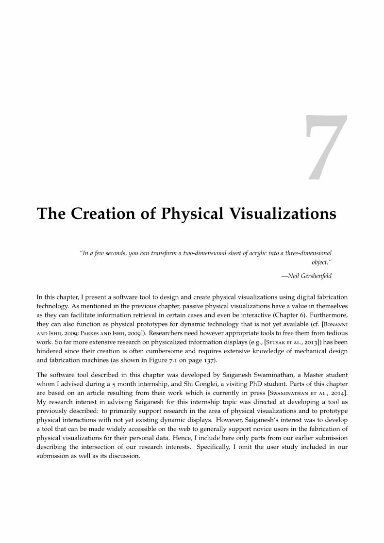
7The Creation of Physical Visualizations
“In a few seconds, you can transform a two-dimensional sheet of acrylic into a three-dimensionalobject.”
—Neil Gershenfeld
In this chapter, I present a software tool to design and create physical visualizations using digital fabricationtechnology. As mentioned in the previous chapter, passive physical visualizations have a value in themselvesas they can facilitate information retrieval in certain cases and even be interactive (Chapter 6). Furthermore,they can also function as physical prototypes for dynamic technology that is not yet available (cf. [Bonanni
and Ishii, 2009; Parkes and Ishii, 2009]). Researchers need however appropriate tools to free them from tediouswork. So far more extensive research on physicalized information displays (e.g., [Stusak et al., 2013]) has beenhindered since their creation is often cumbersome and requires extensive knowledge of mechanical designand fabrication machines (as shown in Figure 7.1 on page 137).
The software tool described in this chapter was developed by Saiganesh Swaminathan, a Master studentwhom I advised during a 5 month internship, and Shi Conglei, a visiting PhD student. Parts of this chapterare based on an article resulting from their work which is currently in press [Swaminathan et al., 2014].My research interest in advising Saiganesh for this internship topic was directed at developing a tool aspreviously described: to primarily support research in the area of physical visualizations and to prototypephysical interactions with not yet existing dynamic displays. However, Saiganesh’s interest was to developa tool that can be made widely accessible on the web to generally support novice users in the fabrication ofphysical visualizations for their personal data. Hence, I include here only parts from our earlier submissiondescribing the intersection of our research interests. Specifically, I omit the user study included in oursubmission as well as its discussion.

136 Chapter 7 The Creation of Physical Visualizations
Thus any use of “we” in this chapter refers to Saiganesh Swaminathan, Shi Conglei, Yvonne Jansen, PierreDragicevic, Lora Oehlberg, and Jean-Daniel Fekete, whereas the use of “I” indicates parts that are specific tothis thesis.
1 Introduction
A major bottleneck for ongoing research on physical information displays is the difficulty of creating phys-ical visualizations. While digital fabrication technologies are becoming increasingly accessible [Tanenbaum
et al., 2013; Gershenfeld, 2008], most software tools that drive these machines focus on static object modelsand ignore data-driven content. Conversely, a wealth of software tools exist for creating on-screen visualiza-tions [Stolte and Hanrahan, 2002; Viegas et al., 2007], but do not support the creation of physical objects. Inaddition to the fundamental differences between physical objects and graphical content (e.g, physical objectsare solid rather than flat and they are subject to physical laws such as gravity), fabrication machines haveunique constraints that differ from those of computer displays and 2D printers.
Since there is no integrated design tool, building physical visualizations remains a labor-intensive processthereby hindering replication of experiments [Gaines, 1991]. It requires complex workflows, a heterogeneousset of tools, and expertise in both data visualization and fabrication. The lack of proper tools ultimatelylimits researchers’ abilities to create physical visualizations of larger-scale data, to reuse an existing physicaldesign with new datasets, or to rapidly iterate through possible design variations. We address these problemsthrough the following contributions:
• By presenting case studies, we discuss users’ current design and fabrication process for physical visu-alizations, and how current tools support this process;
• We introduce MakerVis, a physical visualization design tool prototype that lets users import raw datatables and produce digital fabrication-ready design files (see Figure 7.6 on page 143 for examples);
• I discuss future avenues to diversify the range of currently existing physical visualizations and to fullyexploit their potential.
2 Background
In this section we give a brief overview of infovis authoring tools and digital fabrication. We discuss theproblems that each field tries to address and review current tools that attempt to address them. We explainwhy the design and fabrication of physical visualizations creates unique problems that neither communityis currently able to properly address. We also introduce terminology that will be useful in the rest of thischapter.
2.1 Authoring Tools for Information Visualization
As illustrated in Chapter 2, visualizations have been used for centuries and were initially hand-crafted.The simplest visualizations were created with a pencil and a ruler on paper, while later, more elaborate,visualizations were made using physical tools and materials [Bertin, 1969; Dragicevic and Jansen, 2013]. Theprocess was then slow and laborious, and required extensive know-how. Over the last 30 years, computersbecame ubiquitous, and many tools have been developed to simplify the creation of visualizations for screenand printed media (e.g., [Stolte and Hanrahan, 2002; Fekete, 2004; Heer et al., 2005]).

Section 2 Background 137
Early charting systems provided a few visual representations such as bar charts that were hand-tuned throughdialog boxes. Modern charting systems such as Tableau [Stolte and Hanrahan, 2002] provide direct ma-nipulation interfaces to tune visual parameters and polish the produced output. Popular statistical andnumerical-computing tools offer charts that can be customized more extensively, but only through scripting,thereby requiring programming skills. Support for full customizability and creativity is still an active topic ofresearch [Victor, 2013]. Nonetheless, the process of generating effective visualizations on screen and paper isnow accessible to a large audience with moderate training, and produces high-quality output. However, forphysical visualizations, this is not yet the case.
While a wide variety of physical visualizations are being built [Vande Moere and Patel, 2009; Dragicevic and
Jansen, 2013], most of these examples qualify as artistic data sculptures rather than pragmatic visualizations.Commonly, these examples are built by artists and designers for artistic or communicative purposes withlittle need for accuracy or readability. Designs are often unique and specific or inspired to the data used[Zhao and Vande Moere, 2008] thereby difficult to generalize to other datasets. While a tool supportingcreative expression for data sculptures would be an interesting contribution, our focus here is to supportmainly researchers, who are not specifically trained in fabrication and mechanical design, to rapidly prototypephysical designs for pragmatic visualizations.
Currently available infovis authoring toolkits and systems are meant for flat physical presentations, providingessentially 2D visualizations whereas physical visualizations usually utilize all three dimensions of spacefor data mapping purposes. The primitives managed by existing systems all take for granted the unifiedraster display abstraction, that allows any kind of image to be specified and rendered on any screen (CRT,LED) or 2D printing technology (laser, ink-jet). However, the raster model is not appropriate to producephysical visualizations as the fabrication machines require more specific descriptions to operate. For physicalvisualizations, there is no unified description of a 3D physical model that can be turned into an efficient setof instructions for a fabrication machine.
2.2 Digital Fabrication: Problems and Tools
In digital fabrication, digital design specifications are passed to computer-controlled manufacturing machines tocreate physical objects. Although many different machines exist, there are two main approaches to fabrication.Subtractive techniques (e.g., laser cutting, CNC milling) cut away or remove material (see Figure 7.1 right &
Figure 7.1: Common machines for digital fabrication: 3D printer, 3D milling machine, 2D lasercutter.

138 Chapter 7 The Creation of Physical Visualizations
middle). Additive techniques (e.g., 3D printing) build up material layer-by-layer (see Figure 7.1 left). Inaddition, fabrication techniques can be either 2D or 3D: laser cutters operate on flat sheets of material, whileCNC mills and 3D printers produce solid objects. The types of materials that can be used also vary based onthe manufacturing approach.
Fabrication of existing Design Specifications. A design specification can exist on a computer and yet not bemanufacturable. While several thousand objects models are available for free on the Internet 1, these modelsmay not be at the right scale, or maybe not be designed for 2D or 3D manufacturing. Many factors playtogether to determine the “manufacturability” of a design: floating parts and unconnected surfaces cannotbe interpreted by the machines, fragile designs are unable to support their own weight, or a design’s centerof mass leads to balance problems of the finished object.
Tools have been devised to address some of these issues. For example, Chopper [Luo et al., 2012] partitions3D digital models into parts that fit within the working volume constraints of a 3D printer. Similarly, Lauet al. [Lau et al., 2011] devised a tool that takes IKEA-style 3D models and applies formal grammars toidentify the parts and connectors needed to build it. Research tools such as crdbrd [Hildebrand et al., 2012]and commercially-available tools such as Autodesk’s 123DMake2 cut 3D models into 2D slices according touser-specified parameters. Tools like Make It Stand [Prévost et al., 2013] support users in optimizing thebalance of 3D designs.
Creation of Design Specifications. Although many tools focus on the fabrication of pre-defined objects,researchers have also tried connecting fabrication with design. SketchChair [Saul et al., 2011] lets users sketch2D profiles of chairs that are then extruded and transformed into design files for laser cutters or CNC mills.Savage et al.‘s Midas lets user define designs for customized touch-sensors and then processes them intofabrication-ready files and assembly instructions [Savage et al., 2012]. Also, real-time tools exist for digitalfabrication that enable users to concurrently design and fabricate [Mueller et al., 2012].
Our goal is to facilitate the design and fabrication of a particular class of objects (physical visualizations)without the necessity for domain-specific expertise, including knowledge of digital fabrication. To accountfor this, MakerVis considers physical visualizations as parametric objects whose final shape is driven both byraw data and by user preferences.
When parametrically defining a physical object, each feature can be defined as serving one or more amongthree main goals [Shah, 1995]:
• Design goals are features that help fulfill design requirements. For visualizations these features corre-spond to encoding variables, i.e., the visual variables that effectively convey data, effectively resulting inan embodied visualization. An example for a physical visualization is the height of a bar in a 3D barchart.
• Aesthetic features contribute to the overall aesthetic of the design. For visualizations these generallycorrespond to visual style elements and decorations (cf. Chapter 6). For example, the choice of materialfor a CNC-milled prism map is part of the visual style, while a title label is part of the decoration.
• Assembly / manufacturing features allow the design to be manufactured or assembled. There is no coun-terpart for on-screen visualizations. For physical visualizations, these include supporting material (e.g.,structures preventing floating data points to fall) and assembly features (e.g., notches that allow separateparts to be put together).
1e.g., http://www.thingiverse.com/ or http://sketchup.google.com/3dwarehouse/2http://www.123dapp.com/make

Section 3 Case Studies of Current Practices 139
Several goals can be addressed within the same feature — for example, a particular assembly technique maybe both practical for assembly, as well as aesthetically pleasing.
3 Case Studies of Current Practices
Currently, creating physical visualizations is a laborious process. It requires numerous manual interventionsand work-around practices, particularly because it relies on a chain of disparate visualization and 3D mod-eling and fabrication tools, and the combination of knowledge and skills from different areas. We discusscurrent practices through four real-world case studies taken from a curated list of data sculptures and phys-ical visualizations [Dragicevic and Jansen, 2013]. All four designs were documented online and involveddifferent degrees of manual, computerized and mechanized work.
3.1 Mostly Manual Fabrication
Figure 7.2: Manually created physical map showing the quality of elementary schools in San Francisco by Doug McCune.
Figure 7.2 illustrates the construction of a 3D heatmap created by Doug McCune in 2013 [McCune, 2013]based on quality ratings of elementary schools in the San Francisco city limits. McCune divided the entirecity area into 12×12 squares (see Figure 7.2a), and then for each square computed and binned weightedscores between the schools in and around that square (see Figure 7.2b). The score values for all squares werethen converted in heights. McCune then cut 144 pieces of wood according to these heights using a hand saw(Figure 7.2b). After spray-painting each bar according to its height (Figure 7.2c), he glued the bars together,resulting in the design shown in Figure 7.2d.
Apart from the initial steps of data collection and transformation, this visualization was created entirely byhand. This fabrication approach is not only very labor intensive, but also less accurate than using digitalmanufacturing. While visualizations based on binned values — such as this example — do not necessarilyrequire high physical resolution, showing precise data requires using digital manufacturing.
3.2 Semi-Automatic Fabrication, Standard Software
The emoto data sculpture shown in Figure 7.3c shows emotional responses to the London 2012 Olympicgames based on twitter traffic [Stefaner and Hemment, 2012]. This visualization was created through semi-automatic propagation (see Chapter 6 on page 111). It began as a heatmap visualization created in Tableau(Figure 7.3a), where lines and columns correspond to days and time of day respectively. The heatmap was

140 Chapter 7 The Creation of Physical Visualizations
Figure 7.3: The emoto data sculpture created from Twitter data by Moritz Stefaner, Drew Hemment, and Studio NAND.
then extruded into a 3D landscape using Grasshopper (Figure 7.3b), a graphical algorithm editor for Rhino3D. The model was then fabricated using a milling machine (one-shot propagation, Figure 7.3c).
The process used for emoto is digital from start to finish and therefore ensures a data-accurate physical visu-alization. The process however involved a significant amount of manual work (on the computer), involvingthe successive use of a chain of tools (semi-automatic propagation). This approach does not encourage it-erative design, since every change in the early stages such as filtering, or binning the data into timeslices,requires re-executing the entire process.
3.3 Semi-Automatic Fabrication, Custom Software
Figure 7.4: Custom mapping and design of weather data from Canberra by Mitchell Whitelaw.

Section 3 Case Studies of Current Practices 141
The design of Figure 7.4b, created by Mitchell Whitelaw in 2009 [Whitelaw, 2009], is a bracelet showingone year of temperature and rain fall data from Canberra. Whitelaw first used the Processing programmingenvironment3 to generate a 2D shape for the temperatures of each day (Figure 7.4a). His custom-madeprogram then arranged these shapes radially and connected them to form a continuous 3D object. The rainfalldata was aggregated per week and integrated in the 3D object as cylinders. However, the two features wereexported separately as Processing lacks support for Boolean operations on 3D objects. For the temperaturedata, Whitelaw first used MeshLab4 to remove redundant vertices and normalize all faces of his model tomake it ready for 3D printing. Then for the rainfall data, he used the 3D modeling software Blender5 tosubtract the cylinders from the temperature model (see Figure 7.4). The resulting model was exported andsent to the on-line 3D printing service Shapeways 6 (one-shot propagation).
This example shows how creating non-conventional visualizations requires writing custom software. Tradi-tional on-screen visualization tools suffer from the same issue, although several programming toolkits arealready available. Here, programming skills empowers the designer and gives him full control over hisdesign. Still, the 3D model created by Processing is not immediately suitable for digital fabrication and re-quires several semi-automatic post-processing steps that must be explicitly repeated if the design needs to bechanged or adjusted.
3.4 (Nearly) Fully-Automated Fabrication
Figure 7.5: Data jewelry as offered by meshu.io based on personal travel data.
Meshu.io7 is a Web service where users can create jewelry from their travel data, without any prior knowledgeof fabrication. Users can either grant the service access to their existing social media data, or enter citiesmanually. A 2D mesh is then built that spans the visited cities, upon which users can select the material andfabrication technique (3D printing or laser cutting). The object is then remotely fabricated and mailed to theuser, together with a map that helps decode the visualization.
3http://processing.org/4http://meshlab.sourceforge.net5http://www.blender.org6http://www.shapeways.com7http://meshu.io/

142 Chapter 7 The Creation of Physical Visualizations
In contrast with the previous case studies, this approach requires no expertise on visualization or fabrication.Users only have to upload data and tune parameters. On the other hand, they have very little control over thefinal design. Not only the visualization is very specific, but also the service only offers to re-orient the objectand select the fabrication material. Also, most of the process is automated (from the user’s perspective), butit takes several weeks to receive the object.
3.5 Summary
These case studies illustrate the need for tools that integrate the entire design workflow of physical visual-izations, from the data processing stage to the fabrication of the final object. This integration is important notonly for making data-accurate visualizations, but also for supporting short iteration cycles. In order to betterunderstand the challenges behind the construction of such a tool and end users’ needs, we built MakerVis,a first prototype that provides rudimentary support for this type of design workflow. We describe it in thenext section.
4 MakerVis
In this section we discuss and motivate the features (workflow, visualizations and fabrication technologies)currently supported by MakerVis. We then give an overview of its user interface, and finally discuss itsimplementation.
4.1 Current Features
MakerVis is an initial proof of concept whose goal is to help us get a deeper understanding of the issuesbehind building design tools for physical visualizations, and to better understand users’ needs. Although itis aware of all stages in the workflow, we chose not to focus on the earliest and latest stages, which are moregeneral problems of information visualization and digital fabrication respectively.
Concerning the data processing stage, MakerVis only has a rudimentary support for data processing (i.e.,filtering out data points) and more elaborate data processing operations are delegated to specialized toolssuch as Tableau [Stolte and Hanrahan, 2002]. Concerning the later stages, the support for final customization(e.g., adding a personalized title to a visualization) is limited and primarily delegated to specialized vectorgraphics and 3D authoring tools. The use of standard formats (i.e., CSV as input and SVG or STL as output)ensures compatibility with external tools.
The number of possible physical visualizations is enormous (see [Dragicevic and Jansen, 2013]), here wechose to focus on supporting pragmatic visualizations (see Chapter 3 Section 2.2 “Artistic vs. PragmaticInformation Displays” (on page 34) , and Figure 7.2 on page 139 and Figure 7.3 on page 140) rather than themore artistic data sculptures (such as in Figure 7.4 on page 140 and Figure 7.5 on the preceding page). Alarge family of such visualizations consists in layered (also called 2.5D [Dwyer, 2005]) visualizations. Withthese, at least one of the three dimensions is discrete such that the visualization can be constructed bystacking extruded 2D visualizations (see also Figure 5.1 on page 79). Such visualizations are well-suited, e.g.,to display complex temporal datasets. MakerVis currently supports layered bar charts, layered line charts,layered scatterplots and prism maps [Franklin and Lewis, 1978].
Figure 7.6 shows examples for each of the currently supported visualization types: a) shows a physicallayered scatterplot displaying fertility and life expectancy of the largest countries in the world across the last

Section 4 MakerVis 143
Figure 7.6: Examples for different physical visualizations: a) layered scatterplot, b) prism map, c&d) layered bar charts,e) layered line chart.
60 years, as famously presented in Hans Rosling’s TED Talk [Rosling, 2012], b) shows a prism map displayingthe happiness levels of US states in 2011, extracted from Tweets [Mitchell et al., 2013], c & d) show bar chartscreated by users from our design studies (cf. the article for details [Swaminathan et al., 2014]), and e) showstime-series of commits to different projects on a versioning server visualized as line charts.
In terms of fabrication technologies, MakerVis has extensive support for laser cutters and rudimentary sup-port for 3D printing and CNC milling (through an STL export function). Laser cutting is the most popularfabrication technology in fab labs and is one of the fastest. It is also an interesting fabrication approach to sup-port due to the richness of the materials involved and its 2D nature, i.e., it is challenging for 3D visualizationin general, but well-suited to layered visualizations.
4.2 Workflow and User Interface
The MakerVis user interface is shown in Figure 7.7 on the following page. The entire design process involvessix steps that follow more or less the infovis pipeline (as described in Chapter 6): 1) loading the data, 2)selecting a visualization, 3) mapping the data dimensions to visual variables, 4) setting the visualization’sgeometry, 5) setting the fabrication machine and parameters, 6) downloading the design file and assemblyinstructions. The user can return to a previous step at any point to iterate over a design.
After loading a data file in the CSV format (step 1), the user can choose an initial visualization type (step2). A premature commitment [Green and Petre, 1996] is necessary here since different visualization typesoffer different data mapping options. The user can however come back to this step later to try different types.Choosing the visualization type displays the available visual and spatial variables for that type. Step 3 consistsin dragging data dimensions to visualization dimensions in a similar way to Tableau [Stolte and Hanrahan,2002]. Bar charts and lines charts have three dimensions: Slices, X axis and Y axis, whereas scatterplots offerRadius and Color as extra dimensions. Prism maps differ in that they require to specify a map region thatcorresponds to the current data. In the example illustrated in Figure 7.7, the user loaded data about electricityconsumption of 10 countries across 10 years, and chose a layered bar chart (shown in the 3D preview) whereeach slice is a country, and each country is an extruded 2D bar chart showing electricity consumption overtime (visible in the laser stencil preview). The 3D preview of the physical visualization is shown immediatelyafter all visualization dimensions are mapped. The laser stencils for the laser cutter however are only shownif the user selects laser cutter as fabrication machine (step 5).

144 Chapter 7 The Creation of Physical Visualizations
Figure 7.7: Overview of the MakerVis user interface. The steps involved in the workflow are grouped horizontally on thetop with previews of the results, here 3D assembly and laser stencil preview, being placed below.
Step 4 allows tuning the geometry of the visualization. Geometry parameters include the size and spacing ofelements (such as bars for layered bar charts) and the size of the fonts. In parametric fabrication terminology,these parameters help adjust design goals, aesthetic features and assembly/manufacturing features. Changesin any of these parameters are directly reflected on all previews.
Then, in step 5, the user chooses a fabrication technique. Depending on the technique, she is presented withmachine specific parameters such as its working area, and materials available for the machine. As mentionedbefore, 3D printing and milling are rudimentary supported. The respective machines available to us for thesefabrication techniques only allow single material builds/machining. Consequently, we only allow users tochoose a default material for previewing the result, and then download the 3D design file.
Choosing the laser cutter activates the laser stencil preview. This preview uses the sheet size of the defaultmaterial to illustrate the placement of the parts. Then, due to the wide range of materials available for lasercutting, the user can customize her design and select different materials for each single part. The 3D previewshows all properties of the chosen materials, including their thicknesses, colors, and textures. The geometryof the 3D model is automatically adapted to accommodate changes in thicknesses.
The 3D and the laser stencil previews are both interactive. On the laser stencil preview, each tab contains aspecific sheet to be laser-cut. This indicates to the user how many sheets of materials are required to fabricatethe visualization with the current parameters. Individual pieces can be dragged around — which can help

Section 4 MakerVis 145
save material — and their attach material can be changed, in which case the piece moves to a different tab.All available materials are stored in human-readable files.
Once the user is satisfied with the design, she can download the design file (laser stencils as svg or 3D modelas stl file) and its assembly instructions (Step 6). The current assembly instructions are generic instructionsfor assembling the laser cutter design and tips for customizing it (e.g., using spray paint in case sheets areavailable in only one color). Alternatively, the design file can also be customized with separate softwarebefore being sent to the machine (e.g., CorelDraw for laser stencils and SketchUp for 3D models).
4.3 Implementation and Extensibility
MakerVis is a web application built on top of the frameworks NodeJS, D3, JQuery and ThreeJS. It uses Java asa backend to process SVG boolean operations requests that are currently not supported by Web browsers forcorrect previews and neither by laser cutter drivers interpreting the design files. The file formats supportedas input are CSV and topoJSON, used for creating prism maps. Export formats are SVG for laser stencils andSTL for 3D printers and CNC mills, both standard in fabrication.
Adding new Material
Materials for the laser cutter are specified in human-readable JSON files. The parameters currently supportedare name, thickness, color and texture (a bitmap file, that appears in the 3D and laser stencil previews). Newparameters, e.g., specifying a material’s density, shear strength, or thermal conductivity, can easily be added(note that MakerVis currently makes no use of such information). Textures for new materials could be createdthrough close-up snapshots of a sample piece. It is therefore easy to add new material. MakerVis could evenin principle be interfaced with a local supply chain or a remote fabrication service that would send theseJSON files.
Adding New Visualizations
MakerVis can be extended to support new layered visualizations. An abstract “layered visualization” classholds methods for i) generating the individual 2D visualization layers, ii) adding physical assembly fea-tures for laser cutters (e.g., notches), iii) specifying the way layers need to be geometrically assembled, iv)generating the parameter panels, v) generating a 3D model and vi) generating laser stencils.
Most of these methods do not need to be redefined. The default laser stencil generation method uses alayout manager that involves a simple bin packing algorithm and sorts the slices based on their material.The default 3D generation method extrudes the individual 2D slices, assembles them and merges them. Theslices are assembled as specified by the assembly logic (step iii) above), which is an array of 3D translationsand rotations that are applied to individual slices.
The 2D visualization that appears on each layer naturally needs to be implemented, but all drawing detailscan be delegated to D3. The physical visualization’s geometrical parameters also need to be coded. Theparameters are listed separately by the way of a JSON file. Once these two steps are completed users canimmediately test their visualization with MakerVis.
146 Chapter 7 The Creation of Physical Visualizations
Support for Physical Interactivity
So-called assembly helpers provide a unique functionality to physical visualization. The current implemen-tation includes a simple grid into which the individual 2D slices can be slid in (see Figure 7.8, similar toFigure 6.25 on page 127). These helpers not only offer functionality such as making elements sortable but arealso responsible for overall structural soundness of the physical visualization. By separating the definition ofthese helper structures MakerVis can be extended to support different structures and thereby visualizationssupporting different interactions [Stusak et al., 2013].
Figure 7.8: Left: a user moving in an as-sembly helper that will then allow himto add or change the actual data slices(right)
4.4 Support for the Fabrication Process and Current Limitations
Our goal for developing the MakerVis prototype was not to contribute a complete tool but rather to explorethe problem space behind building such a tool. While it already supports the design and fabrication of arange of physical visualizations (see Figure 7.6 on page 143), we identified several limitations.
Supporting the fabrication process means helping users ensure that their design meets desirable properties,most importantly: 1) manufacturability, 2) assembly fit, 3) balance & stability and 4) strength. There areseveral ways of supporting each of them.
A feedback through simulation and visualization, a strategy typically used by professional CAD tools.B the desirable property is met by design, i.e., it is satisfied for all parameter values;C the ranges of parameter values are constrained so that the property is always met.
Overall we recommend relying on strategies A and B to not restrict users in their explorations, and becausehow important a property is should be ultimately left to the user’s judgment (e.g., a user may want a hand-held visualization for which balance is not crucial). Currently, MakerVis employs strategy B, A sometimesand never C. The included designs never restrain users when setting parameters since a tool that allowsresearchers to prototype physical visualization designs cannot restrict parameters before valid ranges havebeen computationally (strategy A) or experimentally established.
Manufacturability. A design tool first needs to ensure that the design can be manufactured on the machineselected (typical limits include maximum fabrication size and precision). MakerVis partly addresses thisthrough strategy A): the laser stencil preview shows the size of the sheet material to visualize whether thecurrent design fits its size. For 3D printing and milling, a similar approach could be taken by displaying themachines’ working areas in the 3D preview.

Section 4 MakerVis 147
Assembly Fit. When designing multi-part visualizations (laser cutting in our case), the tool needs to makesure that all parts can be easily assembled and possibly taken apart again. MakerVis currently supportsthis by design (strategy B) by adding notches whose size and location are automatically computed from theobject’s geometry and material thickness. These can be easily added to new visualization types. Currently,only simple box joints are supported which work well for most materials but require gluing. In the future, weenvision a tool that supports a range of more elaborate attachment designs (e.g., press-fits) by incorporatingstart-of-the-art knowledge from mechanical engineering [Genc et al., 1998]. Including assembly techniquesthat allow to take pieces apart can stimulate the exploration of the design space of physical interactions withvisualizations. Such designs can support the addition of new data, merging of datasets, or different sort andcompare techniques (as suggested previously in Chapter 6 on page 125).
Figure 7.9: Examples for different joints for a variety of purposes taken from wood working. Image courtesy of SeanMichael Ragan based on Jochen Gros’s 50 Digital Wood Joints project.

148 Chapter 7 The Creation of Physical Visualizations
Figure 7.10: Make it stand: carving of 3D models for balancepurposes.
Balance & Stability. Once fabricated and assem-bled, most physical visualizations need to have astable resting state. All currently supported visu-alizations ensure this by design since their weight isdistributed on a flat, wide and solid base. One canhowever imagine more complex visualization typesbeing created in the future that are not inherentlybalanced. In that case, users may benefit from see-ing a physics simulation on the 3D preview (strat-egy A). Designs can also be post-processed to ensurebalance (strategy B) as proposed by Make It Stand[Prévost et al., 2013] (Figure 7.10). Carving of solidparts is indeed a possible solutions for this prob-lem — at least for 3D printing as fabrication tech-nique — and can furthermore also be used to con-trol the weight of parts or the entire visualization.
Similarly, visualizations with floating parts could be post-processed into physically plausible objects by auto-matically adding support material (strategy B) thereby allowing to implement visualization types such as 3Dscatterplots.
Strength. Finally, a visualization should not break too easily and support its own weight as well as humanforce under normal use. Although our visualization types partly support this by design, users are allowed tomake arbitrarily thin bars that can easily break. A 3D preview can help users detect such issues, but soliditycan be hard to predict and depends on the material and the scaling. A future tool could assist users throughstrategy A, by showing a heatmap stress visualization on the 3D preview, similar to the one provided by theSculpteo Web app8 (Figure 7.11). Also, an effective scale comparison is required to communicate the resultingphysical size of the finished visualization [Chevalier et al., 2013].
Figure 7.11: Visualization of solidity by highlighting problematic areas as provided by the Sculpteo online 3D printingservice.
8www.sculpteo.com

Section 5 Discussion & Conclusion 149
Figure 7.12: Physical materials with different properties that could be used as encoding variables for a visualization.
Material. When creating a physical visualization users are confronted with physical properties of the ma-terial they use to make their object. MakerVis already supports the choice of different materials and theassignment of different materials to different parts. With physical visualizations however, the physical prop-erties of materials could be used as encoding variables for a visualization (Figure 7.12). This is currentlyhowever not supported in MakerVis.
5 Discussion & Conclusion
The software tool described in this chapter is a first step towards opening the creation of physical visualiza-tions to a wider audience of end users and researchers without requiring knowledge in digital fabricationtechniques. With a tool like MakerVis, future research can go in different directions to deepen our un-derstanding of physical manipulations of information. MakerVis can be used for the two main directionsmentioned earlier, further evaluations of physical visualizations as in Chapter 5 “Case Study: Possible Ben-efits for the Physicalization of Information Displays” (on page 77) and using them to prototype interactionswith future technology such as shape displays and programmable matter [Bonanni and Ishii, 2009; Parkes
and Ishii, 2009]. The tool provides many hooks for future extensions to adapt it to researchers’ specific needsor to extend its support for different fabrication techniques. New visualization types can be added to allowan extensive exploration of the design space of physical information visualization.
By facilitating the design of tools for building physical visualizations, our work helps brings together infor-mation visualization and digital fabrication. Not only does this make a new medium accessible to informationvisualization, but it also expands the application range of digital fabrication technologies. Our work facilitatesthereby the design of new visualization techniques for physical visualizations and especially the replicationof research on effective physical visualization designs, and can further accelerate the research on and theadoption of useful physical visualizations [Gaines, 1991].


8Summary and Perspectives
“Do not spoil what you have by desiring what you have not; remember that what you now have wasonce among the things you only hoped for.”
—Epicurus
In this thesis, I promote a change in the view we design information visualization systems. Technology isdiversifying and now provides a wide range of interactive environments of which information visualizationsystems can take advantage. Specifically, technology which can give physical shape to visualizations andtheir controls are a promising avenue to leverage human skills for real-world perception and manipulation ofphysical objects. New environments provide new opportunities, and to make efficient use of these, we neednew models and empirical data that take the entire environment and the users within into account.
Physical and tangible information visualizations have so far received little attention within the field of infovis.This thesis provided a first formal exploration of possible benefits and current limitations of physical and tan-gible information visualizations, presented formal methods to describe, compare, and critique such systems,and tools to support users in creating such systems. This thesis thereby contributes to the understanding ofthe value of emerging physical representations for information visualization. After summarizing the findingsof this thesis, I discuss perspectives for future research.
1 Summary
I first gave an overview of previous work from different domains illustrating how different communitieshave taken interest in either creating physical visualizations, or in using physical controllers to manipulateon-screen visualizations. As I showed, these examples stem from very different time periods spanning frompre-historic through pre-computer times up to today. Since computers became commonly available, theintended purpose for the creation of physical information artifacts shifted from mostly pragmatic to mostly

152 Chapter 8 Summary and Perspectives
artistic intent. The availability of digital fabrication technology however nowadays facilitates the creationof physical artifacts, and the interest in utilizing this technology for pragmatic visualization purposes isincreasing.
I then introduced a set of terms and concepts that help to classify the wide variety of existing and hypotheticalvisualization systems. Any of these systems can be described as an information display with certain prop-erties. Some information displays can function as a control for others which can be modeled using conceptsborrowed from the instrumental interaction model [Beaudouin-Lafon, 2000]. Finally, I defined embodimentfor information displays to capture how the physicality of an information display is perceived by an observer.My notion of embodiment for this thesis is based on James J. Gibson’s definition of pictures [Gibson, 1978]which is characterized by a duality of surfaces. A visualization is embodied, if the surfaces that make up itsvisual marks and the physical surfaces which make these marks visible are congruent. A control is embodiedif the surfaces that communicate its perceived affordances are congruent with the physical surfaces that makeup the control.
I then investigated the notion of embodiment through two concrete case studies for the embodiment ofcontrols and the embodiment of visualizations.
Figure 8.1: Physicalized, embodied controls from the first case study.
The first case study on physicalized, embodied controls introduced tangible remote controllers — an explo-ration of the physicalization of existing visualization instruments to adapt them to new usage environments,here wall-sized display environments. The main focus for this work was to bring existing instruments — i.e.,range sliders — into the physical world to explore possible benefits of instruments whose physical handlesare better adapted to fit the human operator situated in a large-viewing environment (Figure 8.1). Users insuch environments benefit from locomotion and eyes-free interaction as the wall-sized display requires themto move around and captures their visual attention while they control the displayed visualization. I experi-mentally compared the embodied control with a touch-operated control to support the claim that embodiedcontrols facilitate eyes-free operation.
For the second case study, I looked into the effects of physicalization of an information display itself showingwhy this can be useful, and which benefits can be expected by giving physical form to a visualization. To thatpurpose I ran two controlled experiments (Figure 8.2). While in Chapter 4 I found advantageous propertiesfor physicalized controls due to their tactile properties, I found that the tactile embodiment of a visualizationwas a key benefit of physicalized information displays, i.e., they allowed observers to employ their fingers ascognitive and navigational aids. The visual realism of a physical information display also played a role.

Section 1 Summary 153
Figure 8.2: Experimental conditions for embodied and unembodied visualizations evaluated as part of the second casestudy.
Clearly more studies are required to further investigate to what extent embodied controls and embodiedvisualizations can help observers in their visual exploration tasks and to explore the transferability of ourresults to other visual mappings. Furthermore, the design space of combining physical displays with physicalinstruments is largely unexplored. As a basis for a directed exploration, we first need a consistent way ofdescribing and comparing the wide variety of possible visualization systems and a way to contrast them withvisualizations using more conventional desktop setups.
Figure 8.3: The visual notation which is part of the interaction model.
To that purpose, I then presented an interaction model and visual notation system that provides a formalmechanism to describe, compare, and critique visualization systems (Figure 8.3). The model expands onthe infovis reference model, i.e., the infovis pipeline, and the instrumental interaction model [Beaudouin-
Lafon, 2000]. The model is meant to be very general: its primary focus is to capture visualization systemsbeyond the desktop, i.e., visualization systems from the design space resulting from combining controls andvisualizations with varying degrees of physicality, though it can be just as well applied to more conventionaldesktop systems.
An interaction model should ideally be descriptive, comparative, and generative [Beaudouin-Lafon, 2000]. Sincethe presented model builds on the instrumental interaction model, it retains the properties of the instrumentalinteraction model. I illustrated the descriptive power of the model through case studies, and its comparativepower by applying it to the experimental setups of the studies described in this thesis.
As demonstrated with the second case study, passive physical visualizations have a value in themselvesas they can facilitate information retrieval in certain cases (Chapter 5) and even be interactive (Chapter 6).Furthermore, they can also function as physical prototypes for dynamic technology that is not yet available,

154 Chapter 8 Summary and Perspectives
such as shape changing displays and programmable matter. Future research can go in different directionsto deepen our understanding of physical manipulations of information. A limiting factor is however thecumbersome process of creating physical visualizations.
Figure 8.4: Examples created with the MakerVis tool.
I therefore introduced MakerVis as a first step towards opening the creation of physical visualizations to awider audience of researchers as well as end users without requiring knowledge in digital fabrication tech-niques (Figure 8.4). The MakerVis prototype can be used for the two main directions mentioned earlier: i)further evaluations of physical visualizations (as in Chapter 5 but using different visualization techniques),and ii) to prototype interactions with future technology [Bonanni and Ishii, 2009; Parkes and Ishii, 2009].MakerVis provides many hooks for future extensions to adapt it to researchers’ specific needs or to extendits support for different fabrication techniques. New visualization types can be added to allow an extensiveexploration of the design space of physical information visualization. The tool thereby facilitates the repli-cation of research on effective physical visualization designs, and can further accelerate a wider adoption ofuseful physical visualizations [Gaines, 1991].
With the democratization of digital fabrication technologies [Gershenfeld, 2008; Tanenbaum et al., 2013] userscan now create more and more physical artifacts for visualization as well as for control purposes. In thefuture, fabrication technology will allow to produce objects that can instantly be utilized as input devices.However, more research is needed to take full advantage of this technology for infovis purposes and tosupport users efficiently in making such technology widely accessible even to non-expert users.
2 Perspectives
This thesis is only the first work formally investigating physical and tangible information visualization andmore research is needed to fully explore its potential.
2.1 Physical Variables
For this thesis, I defined embodiment of a visualization through the congruence between the surfaces thatmake up its visual marks and the physical surfaces which make the visual marks observable. However,each of these visual marks exhibits several visual variables that can be used for data mapping. With thephysicalization of visualizations, visual variables become physical variables which are inherent properties ofthe used materials. Different data properties can then be mapped to sets of materials similar to how we

Section 2 Perspectives 155
use color palettes on screens to distinguish data points. Possible candidates for such material propertiesare elasticity, temperature, texture, reflection properties (including transparency, shininess) etc.1. Robertsand Walker [2010] have already argued for establishing a “unified theoretical approach to multi-sensoryinformation visualization” by extending Bertin’s visual variables [Bertin, 1969].
Figure 8.5: Physical materials provide a plethora of properties whose suitability for the encoding of information iscurrently unclear.
Similarly, Griffin [Griffin, 2001] discussed the suitability of haptic variables for cartographic purposes (Fig-ure 8.5). Apart from those derived from already used visual variables like size, shape, texture, orientationand elevation, she proposes kinesthetic variables such as resistance, friction, and kinesthetic location, and tactilevariables such as vibration, flutter, pressure, and temperature. While there are certainly interactions betweenall of these possible physical variables, empirical data is necessary to determine their suitability for data encod-ing and hence their use in information visualization and tools such as MakerVis. So far, no formal evaluationof available physical variables exists that could help visualization designers in employing these to build effec-tive physical visualizations. Extensive research is necessary to achieve this in a way as has been done forvisual variables [Cleveland and McGill, 1984].
2.2 Physical Interactions
The case studies presented in Chapter 6 illustrate the power of interactions that take place in the physicalworld outside the visualization system, such as locomotion and direct object manipulation. Physical objectmanipulation can be very versatile and even entirely passive physical visualizations such as the rearrangeablebar charts or the Lego system already support non-trivial visualization tasks (Figure 8.6). Furthermore, pas-sive physical visualizations can function as stand-ins for technology and materials that are not yet available.
1www.matweb.net
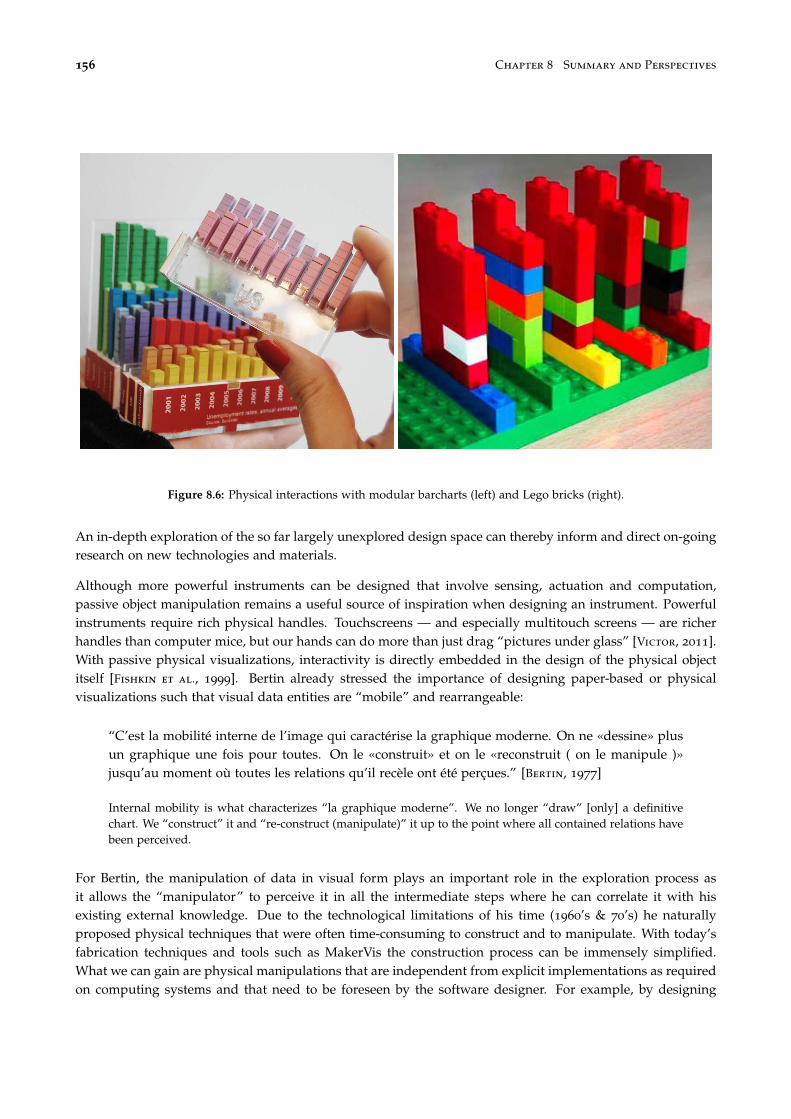
156 Chapter 8 Summary and Perspectives
Figure 8.6: Physical interactions with modular barcharts (left) and Lego bricks (right).
An in-depth exploration of the so far largely unexplored design space can thereby inform and direct on-goingresearch on new technologies and materials.
Although more powerful instruments can be designed that involve sensing, actuation and computation,passive object manipulation remains a useful source of inspiration when designing an instrument. Powerfulinstruments require rich physical handles. Touchscreens — and especially multitouch screens — are richerhandles than computer mice, but our hands can do more than just drag “pictures under glass” [Victor, 2011].With passive physical visualizations, interactivity is directly embedded in the design of the physical objectitself [Fishkin et al., 1999]. Bertin already stressed the importance of designing paper-based or physicalvisualizations such that visual data entities are “mobile” and rearrangeable:
“C’est la mobilité interne de l’image qui caractérise la graphique moderne. On ne «dessine» plusun graphique une fois pour toutes. On le «construit» et on le «reconstruit ( on le manipule )»jusqu’au moment où toutes les relations qu’il recèle ont été perçues.” [Bertin, 1977]
Internal mobility is what characterizes “la graphique moderne”. We no longer “draw” [only] a definitivechart. We “construct” it and “re-construct (manipulate)” it up to the point where all contained relations havebeen perceived.
For Bertin, the manipulation of data in visual form plays an important role in the exploration process asit allows the “manipulator” to perceive it in all the intermediate steps where he can correlate it with hisexisting external knowledge. Due to the technological limitations of his time (1960’s & 70’s) he naturallyproposed physical techniques that were often time-consuming to construct and to manipulate. With today’sfabrication techniques and tools such as MakerVis the construction process can be immensely simplified.What we can gain are physical manipulations that are independent from explicit implementations as requiredon computing systems and that need to be foreseen by the software designer. For example, by designing

Section 2 Perspectives 157
barchart shown in Figure 8.6 in a modular fashion, an observer can change the order of its elements, filterout irrelevant ones, substitute or update them with new elements that she fabricated, or directly comparea subset by taking them out. These manipulations are not explicitly “implemented” but result from themodular design alone.
Figure 8.7: The exact value of data point can be revealed bytouching a surface covered with thermochromic ink whileotherwise reducing visual clutter by hiding such details.
Other interactions common on computers can havephysical analogs. For example, smart materials suchas thermochromic ink [Siegel et al., 2009] can beused to temporarily show the provenance of user in-teractions — the user leaves a semi-permanent tracewhen touching a visualization (as mentioned earlierin Chapter 6 Section 5). The effect can also be usedto “implement” details on demand (see Figure 8.7).
Still, what remains is merging the advantages ofcomputing with physical visualizations such thatthe data analyst is freed from performing tedious,repetitive operations such as manual ordering of large datasets.
2.3 Dynamic Physical Information Displays
Most physical visualizations I discussed in this thesis are passive information displays, i.e., they do notrequire any electricity to convey their information. This property facilitates their creation especially withtools such as MakerVis. Furthermore, I showed in Chapter 5 their utility and illustrated in Chapter 6 theirpotential for interaction.
However, the visualization of dynamic data, i.e., data that changes over time or even in real-time, as well asthe support for operations that are tedious and repetitive if done manually, require compliant informationdisplays [Rasmussen et al., 2012]. A promising approach to the physical display of dynamic informationare shape displays, so far implemented as arrays of actuated bars resulting in 2.5D displays [Jonpasang,
Figure 8.8: Technology for dynamic physical information displays: inFORM, a shape display [Follmer et al., 2013] (left),Claytronics, a concept prototype for freely programmable matter [CMU & Intel Research, 2006].
158 Chapter 8 Summary and Perspectives
2012; Follmer et al., 2013; Poupyrev et al., 2004] (Figure 8.8 left). Cooperating nanorobots are also beingconsidered [Goldstein et al., 2005; Wissner-Gross, 2008; Ishii et al., 2012] (Figure 8.8 right). Although thesetechnologies seem to have a high potential for infovis applications, previous work has mostly focused eitheron general interaction without concrete application areas or on hardware issues.
Still, even assuming the availability of technology to realize dynamic physical information displays, passivephysical visualizations can still have their place. Just as we still print information on paper [Sellen and
Harper, 2003], physical printouts are easily imaginable, especially considering the expected decrease in costand effort for the fabrication of physical artifacts. In reference to the cost/benefit analysis in Chapter 1, wefind a tradeoff between initial costs and costs per session for dynamic vs. passive physvis, consequently bothhave their appropriate place. For passive information displays, new visualization techniques are easier torealize whereas they might require the acquisition or construction of new hardware for dynamic ones.
3 Conclusion
I believe that with future advances in technology, computer visualization systems will move further into thephysical world. The classic desktop setup might persist in parallel but will ideally blend in and get enrichedwith physicalized instruments. The concepts, model, and visual notation introduced in this thesis facilitatethe description of visualization systems while the notation system allows for the visualization of the actualand perceived interactivity of a visualization. It thereby provides support for future research to illustrate inhow far different visualization systems are similar, and to illustrate how direct users perceive interactions.
The design space of tangible and physical information visualization is so far largely unexplored. Moreempirical evidence is required to identify the most important features, such as visual realism or direct touchmanipulation. The exploration of this design space is at this point mainly limited by available technology.Nonetheless, as illustrated by the case studies throughout this thesis, physical visualizations provide alreadya rich “prototyping tool” to study and explore the design space. In summary, this thesis contributes to theunderstanding of the value of emerging physical representations for information visualization.

AAdditional Material for the Study inChapter 5
1 Dataset Descriptions
These are all the data sets we used for the experiments in Chapter 5.
Births This indicator gives the ratio of births attended by skilled health staff, i.e., the percentage of deliv-eries attended by personnel trained to give the necessary supervision, care, and advice to women duringpregnancy, labor, and the postpartum period. Source: UNICEF, State of the World’s Children, Childinfo, andDemographic and Health Surveys by Macro International.
Food Availability This indicator gives the total supply of food available in a country per person per day.Source: FAO stat";
Homicides This indicator gives homicide rates per 100.000 inhabitants. Sources: WHO, GBD, UNODC,GIMD."
Tax Revenues This indicator gives tax revenues, i.e., compulsory transfers to the central government forpublic purposes. Source: International Monetary Fund, Government Finance Statistics Yearbook and datafiles, and World Bank and OECD GDP estimates.
Agriculturalland This indicator gives the rates of agricultural land which refers to the share of land areathat is arable, under permanent crops, and under permanent pastures. Source: World Bank.
Army This indicator gives armed forces personnel in relation to total labor force. Armed forces personnelare active duty military personnel, including paramilitary forces if the training, organization, equipment, and

160 Chapter A Additional Material for the Study in Chapter 5
control suggest they may be used to support or replace regular military forces. Source: World DevelopmentIndicators.
Carmortality This indicator gives car road traffic mortality per 100 000. Source: GMID, WHO.
CO2 This indicator gives average CO2 emission in metric tons per person during the given year, calculatedfrom deviding the total CO2 with the total population of the countries. Source: CDIAC (Carbon DioxideInformation Analysis Center).
Education This indicator gives education aids as percentage of total aid. Source: OECD.
Electricity This indicator gives per capita consumption of electricity during the given year, counted inkilowatt-hours (kWh). Source: International Energy Agency.
External Debt This indicator gives the ratio of external debt stocks to gross national income. Total externaldebt is debt owed to nonresidents repayable in foreign currency, goods, or services. GNI (formerly GNP)is the sum of value added by all resident producers plus any product taxes. Source: World Bank, GlobalDevelopment Finance.
Gross Capital This indicator gives gross capital formation consisting of outlays on additions to the fixedassets of the economy plus net changes in the level of inventories. Source: World Bank.
Health This indicator gives the total expenditure on health as percentage of gross domestic product. Source:WHO.
HIV This indicator gives the estimated number of people living with HIV per 100 population of age group15-49. Source: UNAIDS.
Military Expenditures This indicator gives military expenditures, which includes all current and capitalexpenditures on the armed forces, including peacekeeping forces. Source: World Bank.
Suicides This indicator gives mortality rates due to self-inflicted injury, per 100 000 people. Source: WHO.

Section 2 Laser Stencils 161
2 Laser Stencils
All physical visualizations were created from automatically generated laser stencils ensuring data accuracy.All laser stencils are available for download at www.aviz.fr/physmaterial. One example is printed here forillustrative purposes scaled to fit the page size.
Figure A.1: Scaled down laser stencil for the suicide dataset.

162 Chapter A Additional Material for the Study in Chapter 5
3 Instructions
All instructions that we presented to participants before and during the experiments described in Chapter 5.
Figure A.2: Welcome screen.

Section 3 Instructions 163
Figure A.3: Instructions for the range task.

164 Chapter A Additional Material for the Study in Chapter 5
Figure A.4: Instructions for the order task.

Section 3 Instructions 165
Figure A.5: Instructions for the compare task.

166 Chapter A Additional Material for the Study in Chapter 5
Figure A.6: General instructions concerning answer strategies.

Section 3 Instructions 167
Figure A.7: Instructions for the physical condition.

168 Chapter A Additional Material for the Study in Chapter 5
Figure A.8: Instructions for the mono condition.

Section 3 Instructions 169
Figure A.9: Instructions for the stereo condition.

170 Chapter A Additional Material for the Study in Chapter 5
Figure A.10: Instructions for the 2D condition.

Section 3 Instructions 171
Figure A.11: Instructions informing participants about practice trials.


BFeatures of the Mesopotamian TokenSystem
Quoted from [Schmandt-Besserat, 1996, p. 97f.]
1. Semanticity: Each token was meaningful and communicated information.2. Discreteness: The information conveyed was specific. Each token shape, like each pictograph, was
bestowed a unique meaning. The incised ovoid, for example, like the sign ATU 733, stood for a unit ofoil.
3. Systematization: Each of the token shapes was systematically repeated in order to carry the same mean-ing. An incised ovoid, for example, always signified the same measure of oil.
4. Codification: The token system consisted of a multiplicity of interrelated elements. Besides the cone,which stood for a small measure of grain, the sphere represented a larger measure of grain, the ovoidmeant a jar of oil, the cylinder an animal, and so on. Consequently, the token system made it feasible,for the first time, to deal simultaneously with information concerning different items.
5. Openness: The repertory of tokens could be expanded at will by creating further shapes representingnew concepts. The tokens could also be combined to form any possible set. This made it feasible tostore an unlimited quantity of information concerning an unlimited number of items.
6. Arbitrariness: Many of the token forms were abstract; for example, the cylinder and lenticular disk stoodrespectively for one and ten(?) animals. Others were arbitrary representations; for instance, the head ofan animal bearing a collar symbolized the dog.
7. Discontinuity: Tokens of closely related shapes could refer to unrelated concepts. For example, thelenticular disk stood for ten(?) animals, whereas the flat disk referred to a large measure of grain.
8. Independence of phonetics: The tokens were concept signs standing for units of goods. They were inde-pendent of spoken language and phonetics and thus could be understood by people speaking differenttongues.

174 Chapter B Features of the Mesopotamian Token System
9. Syntax: The tokens were organized according to set rules. There is evidence, for example, that tokenswere arranged in lines of counters of the same kind, with the largest units placed at the right.
10. Economic content: The tokens, like the earliest written texts, were limited to handling information con-cerning real goods. It is only centuries later, about 2900 B.C., that writing began to record historicalevents and religious texts.

List of Publications
Journal Articles
Yvonne Jansen and Pierre Dragicevic. An interaction model for visualizations beyond the desktop. Visualiza-tion and Computer Graphics, IEEE Transactions on, 19(12):2396–2405, 2013.
Articles in Peer-reviewed Conference Proceedings
Yvonne Jansen, Thorsten Karrer, and Jan Borchers. Mudpad: tactile feedback and haptic texture overlay fortouch surfaces. In ACM International Conference on Interactive Tabletops and Surfaces, pages 11–14. ACM, 2010.
Yvonne Jansen, Pierre Dragicevic, and Jean-Daniel Fekete. Tangible remote controllers for wall-size displays.In Proceedings of the 2012 ACM annual conference on Human Factors in Computing Systems, pages 2865–2874.ACM, 2012.
Yvonne Jansen, Pierre Dragicevic, and Jean-Daniel Fekete. Evaluating the efficiency of physical visualizations.In Proceedings of the SIGCHI Conference on Human Factors in Computing Systems, pages 2593–2602. ACM, 2013.
Eric Lee, Marius Wolf, Yvonne Jansen, and Jan Borchers. Rexband: a multi-user interactive exhibit for explor-ing medieval music. In Proceedings of the 7th international conference on New interfaces for musical expression,pages 172–177. ACM, 2007.
Saiganesh Swaminathan, Conglei Shi, Yvonne Jansen, Pierre Dragicevic, Lora Oehlberg, and Jean-DanielFekete. Supporting the design and fabrication of physical visualizations. In CHI2014 - Proceedings of theSIGCHI Conference on Human Factors in Computing Systems, Toronto, ON, Canada, 2014. in press.
Malte Weiss, Julie Wagner, Yvonne Jansen, Roger Jennings, Ramsin Khoshabeh, James D Hollan, and JanBorchers. Slap widgets: bridging the gap between virtual and physical controls on tabletops. In Proceedingsof the SIGCHI Conference on Human Factors in Computing Systems, pages 481–490. ACM, 2009a.
Malte Weiss, Julie Wagner, Roger Jennings, Yvonne Jansen, Ramsin Khoshabeh, James D Hollan, and JanBorchers. Slapbook: tangible widgets on multi-touch tables in groupware environments. In Proceedings ofthe 3rd International Conference on Tangible and Embedded Interaction, pages 297–300. ACM, 2009b.
Posters
Benjamin Bach, Pierre Dragicevic, Samuel Huron, Petra Isenberg, Yvonne Jansen, Charles Perin, AndreSpritzer, Romain Vuillemot, Wesley Willett, and Tobias Isenberg. Illustrative data graphics in 18th-19th

176 List of Publications
century style: A case study. In Posters at the IEEE Conference on Visualization (IEEE VIS 2013, October 13–18,Atlanta, GA, USA), 2013.
Céline Coutrix, Guillaume Riviere, Katarzyna Borgiel, Julien Castet, Nadine Couture, Ullmer Brygg, GeelhaarJens, Patrick Reuter, Nawel Takouachet, Christophe Kolski, Sophie Lepreux, Jérémy Legardeur, SebastienKubicki, Yvonne Jansen, and Amira Bouadid. Methods for designing tangible ui: A first comparative casestudy. In Seventh International Conference on Tangible, Embedded and Embodied Interaction, 2013.
Pierre Dragicevic, Benjamin Bach, Nicole Dufournaud, Samuel Huron, Petra Isenberg, Yvonne Jansen, CharlesPerin, André Spritzer, Romain Vuillemot, Wesley Willett, et al. Visual showcase: An illustrative data graphicin an 18th-19th century style. In Visual Showcase at the Joint ACM/EG Symposium on Computational Aesthetics,Sketch-Based Interfaces and Modeling, and Non-Photorealistic Animation and Rendering (Expressive 2013, July19–20, Anaheim, CA, USA), 2013.
Yvonne Jansen. Mudpad: fluid haptics for multitouch surfaces. In CHI’10 Extended Abstracts on Human Factorsin Computing Systems, pages 4351–4356. ACM, 2010.
Yvonne Jansen, Pierre Dragicevic, and Jean-Daniel Fekete. Investigating physical visualizations. In Posters atthe IEEE Conference on Visualization (IEEE VIS 2012), 2012.
Exhibits
Yvonne Jansen, Thorsten Karrer, and Jan Borchers. Mudpad: a tactile memory game. In ACM InternationalConference on Interactive Tabletops and Surfaces, pages 306–306. ACM, 2010a.
Yvonne Jansen, Thorsten Karrer, and Jan Borchers. Mudpad: localized tactile feedback on touch surfaces.In Adjunct proceedings of the 23nd annual ACM symposium on User interface software and technology, pages385–386. ACM, 2010b.
Yvonne Jansen, Thorsten Karrer, and Jan Borchers. Mudpad: tactile feedback for touch surfaces. In Proceedingsof the 2011 annual conference extended abstracts on Human factors in computing systems, pages 323–328. ACM,2011.
Saiganesh Swaminathan, Conglei Shi, Yvonne Jansen, Pierre Dragicevic, Lora Oehlberg, and Jean-DanielFekete. Creating Physical Visualizations With MakerVis. In CHI2014 - Proceedings of the 2014 annual confer-ence extended abstracts on Human factors in computing systems, Toronto, ON, Canada, 2014. in press.
Malte Weiss, Julie Wagner, Roger Jennings, Yvonne Jansen, Ramsin Khoshabeh, James D Hollan, and JanBorchers. Slapbook: tangible widgets on multi-touch tables in groupware environments. In Proceedings ofthe 3rd International Conference on Tangible and Embedded Interaction, pages 297–300. ACM, 2009.

Bibliography
J. Accot and S. Zhai. More than dotting the i’s — foundations for crossing-based interfaces. In CHI ’02:CHI’02, pages 73–80, 2002.
A. Adamoli, M. Jovic, and M. Hauswirth. Lagalyzer: A latency profile analysis and visualization tool. InPerformance Analysis of Systems & Software (ISPASS), 2010 IEEE International Symposium on, pages 13–22.IEEE, 2010.
C. Ahlberg, C. Williamson, and B. Shneiderman. Dynamic queries for information exploration: An imple-mentation and evaluation. In Proc. of CHI’92, pages 619–626. ACM, 1992.
R. Amar, J. Eagan, and J. Stasko. Low-level components of analytic activity in information visualization. InInfoVis’05, 2005.
American Psychological Association. Publication manual of the American Psychological Association (6th ed.). Wash-ington, DC, 2010.
M. Anderson. Embodied cognition: A field guide. Artificial intelligence, 149(1):91–130, 2003.
D. Andrews, E. Fowlkes, and P. Tukey. Some approaches to interactive statistical graphics. Dynamic Graphicsfor Statistics, pages 73–90, 1988.
F. J. Anscombe. Graphs in statistical analysis. The American Statistician, 27(1):17–21, 1973.
R. Bade, F. Ritter, and B. Preim. Usability comparison of mouse-based interaction techniques for predictable3d rotation. In Smart Graphics, pages 924–924. Springer, 2005.
A. Balali Moghaddam, J. Svendsen, M. Tory, and A. Branzan Albu. Integrating touch and near touch interac-tions for information visualizations. In Proc. of CHI EA ’11, 2011.
R. Ball and C. North. The effects of peripheral vision and physical navigation on large scale visualization. InProceedings of graphics interface 2008, pages 9–16. Canadian Information Processing Society, 2008.
F. Bara, E. Gentaz, P. Colé, and L. Sprenger-Charolles. The visuo-haptic and haptic exploration of lettersincreases the kindergarten-children’s understanding of the alphabetic principle. Cognitive development, 19
(3):433–449, 2004.
M. Bassolino, A. Serino, S. Ubaldi, and E. Làdavas. Everyday use of the computer mouse extends peripersonalspace representation. Neuropsychologia, 48(3):803–811, 2010.
T. Baudel. From information visualization to direct manipulation: extending a generic visualization frame-work for the interactive editing of large datasets. In Proc. of UIST’06, pages 67–76. ACM, 2006.

178 Bibliography
M. Beaudouin-Lafon. Interaction instrumentale: de la manipulation directe à la réalité augmentée. ActesNeuvièmes journées francophones sur l’Interaction Homme Machine (IHM’97), Futuroscope, September, 1997.
M. Beaudouin-Lafon. Instrumental interaction: an interaction model for designing post-wimp user interfaces.In CHI ’00: Proceedings of the SIGCHI conference on Human factors in computing systems, pages 446–453, NewYork, NY, USA, 2000. ACM.
M. Beaudouin-Lafon. Designing interaction, not interfaces. In Proc. AVI’04, pages 15–22. ACM, 2004.
M. Beaudouin-Lafon. Lessons learned from the wild room, a multisurface interactive environment. In Proc.of IHM ’11. ACM, 2011. To appear.
M. Beaudouin-Lafon and W. E. Mackay. Reification, polymorphism and reuse: three principles for designingvisual interfaces. In Proc. of AVI 2000, pages 102–109. ACM, 2000.
R. A. Becker and W. S. Cleveland. Brushing scatterplots. Technometrics, 29(2):127–142, 1987.
H. Benko, A. D. Wilson, and P. Baudisch. Precise selection techniques for multi-touch screens. In Proceedingsof the SIGCHI conference on Human Factors in computing systems, pages 1263–1272. ACM, 2006.
J. Bertin. Sémiologie graphique. Mouton; Paris: Gauthier-Villars, 1967.
J. Bertin. Graphique et mathématique : généralisation du traitement graphique de l’information. Annales.Économies, Sociétés, Civilisations., (1):70–101, 1969.
J. Bertin. La graphique et le traitement graphique de l’information. Flammarion Paris, 1977.
A. Bezerianos and R. Balakrishnan. The vacuum: facilitating the manipulation of distant objects. In Proc. ofCHI’05, 2005.
A. Bezerianos, P. Isenberg, et al. Perception of visual variables on tiled wall-sized displays for informationvisualization applications. TVCG, 18(12), 2012.
E. A. Bier, M. C. Stone, K. Pier, W. Buxton, and T. D. DeRose. Toolglass and magic lenses: the see-throughinterface. In Proc. SIGGRAPH’93, pages 73–80. ACM, 1993.
S. Bodker. Through the interface: A human activity approach to user interface design. 1990.
R. A. Bolt. Put-that-there: Voice and gesture at the graphics interface. SIGGRAPH Comput. Graph., 14:262–270,July 1980.
L. Bonanni and H. Ishii. Stop-motion prototyping for tangible interfaces. In Proceedings of the 3rd InternationalConference on Tangible and Embedded Interaction, pages 315–316. ACM, 2009.
S. Boring, D. Baur, A. Butz, S. Gustafson, and P. Baudisch. Touch projector: mobile interaction through video.In Proc. of CHI ’10, 2010.
M. Brehmer and T. Munzner. A multi-level typology of abstract visualization tasks. Visualization and ComputerGraphics, IEEE Transactions on, 19(12):2376–2385, 2013.
W. C. Brinton. Graphic methods for presenting facts. Brinton associates, 1914.
W. C. Brinton. Graphic Presentation. Brinton associates, 1939.

Bibliography 179
W. Buxton, R. Hill, and P. Rowley. Issues and techniques in touch-sensitive tablet input. In SIGGRAPH ’85:Proceedings of the 12th annual conference on Computer graphics and interactive techniques, pages 215–224, NewYork, NY, USA, 1985. ACM.
S. Card, J. Mackinlay, and B. Shneiderman. Readings in information visualization: using vision to think, pages1–34. Morgan Kaufmann, 1999.
M. S. T. Carpendale. A framework for elastic presentation space. PhD thesis, Simon Fraser University, 1999.
T. Carter, S. A. Seah, B. Long, B. Drinkwater, and S. Subramanian. Ultrahaptics: multi-point mid-air hapticfeedback for touch surfaces. In Proceedings of the 26th annual ACM symposium on User interface software andtechnology, pages 505–514. ACM, 2013.
L. Chan, S. Müller, A. Roudaut, and P. Baudisch. Capstones and zebrawidgets: sensing stacks of buildingblocks, dials and sliders on capacitive touch screens. In Proceedings of the 2012 ACM annual conference onHuman Factors in Computing Systems, pages 2189–2192. ACM, 2012.
F. Chevalier, R. Vuillemot, and G. Gali. Using concrete scales: A practical framework for effective visualdepiction of complex measures. Visualization and Computer Graphics, IEEE Transactions on, 19(12):2426–2435,2013.
E. H. Chi. A taxonomy of visualization techniques using the data state reference model. In INFOVIS’00, 2000.
E. Chi and J. Riedl. An operator interaction framework for visualization systems. In Information Visualization,1998. Proceedings. IEEE Symposium on, pages 63–70. IEEE, 1998.
L. E. Chipman, B. B. Bederson, and J. A. Golbeck. Slidebar: analysis of a linear input device. Behav. Inf.Technol., 23, 2004.
A. Clark. Being there: Putting brain, body, and world together again. MIT press, 1998.
W. S. Cleveland and R. McGill. Graphical perception: Theory, experimentation, and application to the devel-opment of graphical methods. Journal of the American Statistical Association, 79(387):531–554, 1984.
CMU & Intel Research. Claytronics video. tinyurl.com/claytronics, 2006.
A. Cockburn and B. McKenzie. Evaluating the effectiveness of spatial memory in 2d and 3d physical andvirtual environments. In CHI’02, 2002.
S. Conversy. Improving usability of interactive graphics specification and implementation with picking viewsand inverse transformation. In Proc. VL/HCC’11, pages 153–160. IEEE, 2011.
T. J. Csordas. Embodiment and experience: the existential ground of culture and self, volume 2. Cambridge Univer-sity Press, 1994.
G. Cumming. Understanding the New Statistics: Effect Sizes, Confidence Intervals, and Meta-Analysis. MultivariateApplications Series. Routledge, 2011.
G. Cumming. The new statistics: Why and how. Psychological Science, 25(1):7–29, 2014.
G. Cumming and S. Finch. Inference by eye:< em> confidence intervals and how to read pictures ofdata</em>. American Psychologist, 60(2):170, 2005.
180 Bibliography
M. R. Cutkosky and R. D. Howe. Human grasp choice and robotic grasp analysis. In Dextrous robot hands,pages 5–31. Springer, 1990.
T. Davis and S. Kolokowsky. From touch to call: Tracing the path of a touch gesture.tinyurl.com/MutualCapacitance, 2012.
R. Descartes. La géométrie. 1637. (Appendix).
A. Dix and G. Ellis. Starting simple: adding value to static visualisation through simple interaction. In AVI’98: Proc. AVI’98, pages 124–134, New York, NY, USA, 1998. ACM.
P. Dourish. Where the action is: the foundations of embodied interaction. MIT press, 2004.
P. Dragicevic. Un modèle d’interaction en entrée pour des systèmes interactifs multi-dispositifs hautement config-urables. PhD thesis, Université de Nantes, 2004.
P. Dragicevic and Y. Jansen. List of physical visualizations. tinyurl.com/physvis, 2013. [Online; accessed10-Nov-2013].
T. Dwyer. Two-and-a-half-dimensional Visualisation of Relational Networks. PhD thesis, University of Sydney,2004.
T. Dwyer. Two-and-a-half-dimensional Visualisation of Relational Networks. PhD thesis, School of InformationTechnologies, Faculty of Science, University of Sydney, 2005.
P. Edman. Tactile graphics. American Foundation for the Blind, 1992.
N. Elmqvist, A. Moere, H. Jetter, D. Cernea, H. Reiterer, and T. Jankun-Kelly. Fluid interaction for informationvisualization. Information Visualization, 10(4):327–340, 2011.
N. Elmqvist, T.-N. Do, H. Goodell, N. Henry, and J.-D. Fekete. Zame: Interactive large-scale graph visualiza-tion. In Proceedings of the IEEE Pacific Visualization Symposium, pages 215–222, 2008a.
N. Elmqvist, P. Dragicevic, and J.-D. Fekete. Rolling the dice: Multidimensional visual exploration usingscatterplot matrix navigation. IEEE Transactions on Visualization and Computer Graphics, 14(6):1141–1148,2008b.
D. C. Engelbart and W. K. English. A research center for augmenting human intellect. In Proceedings of theDecember 9-11, 1968, fall joint computer conference, part I, pages 395–410. ACM, 1968.
J.-D. Fekete. The InfoVis Toolkit. In Proc. of InfoVis’04, 2004.
K. P. Fishkin, T. P. Moran, and B. L. Harrison. Embodied user interfaces: Towards invisible user interfaces. InEngineering for Human-Computer Interaction, pages 1–18. Springer, 1999.
G. W. Fitzmaurice, H. Ishii, and W. A. S. Buxton. Bricks: laying the foundations for graspable user interfaces.In Proc. of CHI’95, 1995.
G. W. Fitzmaurice and W. Buxton. An empirical evaluation of graspable user interfaces: towards specialized,space-multiplexed input. In Proc. of CHI’97, 1997.
S. Follmer, D. Leithinger, and A. O. A. H. H. Ishii. inform: dynamic physical affordances and constraintsthrough shape and object actuation. In Proceedings of the 26th annual ACM symposium on User interfacesoftware and technology, pages 417–426. ACM, 2013.
Bibliography 181
R. Franklin and H. R. Lewis. 3-d graphic display of discrete spatial data by prism maps. ACM SIGGRAPHComputer Graphics, volume 12, pages 70–75. ACM, 1978.
B. R. Gaines. Modeling and forecasting the information sciences. Information Sciences, 57:3–22, 1991.
S. Genc, R. W. Messler Jr, and G. A. Gabriele. A systematic approach to integral snap-fit attachment design.Research in Engineering Design, 10(2):84–93, 1998.
D. Gentner and J. Nielsen. The Anti-Mac interface. Commun. ACM, 39(8):70–82, August 1996.
N. Gershenfeld. Fab: the coming revolution on your desktop–from personal computers to personal fabrication. BasicBooks, 2008.
J. J. Gibson. The ecological approach to the visual perception of pictures. Leonardo, 11:227–235, 1978.
A. Gillet, M. Sanner, D. Stoffler, and A. Olson. Tangible interfaces for structural molecular biology. Structure,13(3):483–491, 2005.
S. C. Goldstein, J. D. Campbell, and T. C. Mowry. Programmable matter. IEEE Computer, 38(6):99–101, June2005.
T. R. G. Green and M. Petre. Usability analysis of visual programming environments: a ‘cognitive dimensions’framework. Journal of Visual Languages & Computing, 7(2):131–174, 1996.
S. Greenberg and C. Fitchett. Phidgets: Easy development of physical interfaces through physical widgets.In Proc. of UIST ’01, 2001.
A. L. Griffin. Feeling it out: the use of haptic visualization for exploratory geographic analysis. CartographicPerspectives, (39):12–29, 2001.
T. Grossman and R. Balakrishnan. An evaluation of depth perception on volumetric displays. In AVI’06, 2006.
I. Gwilt, A. Yoxall, and K. Sano. Enhancing the understanding of statistical data through the creation ofphysical objects. In Proc. ICDC2012, pages 117–126, 2012.
M. Hancock, O. Hilliges, C. Collins, D. Baur, and S. Carpendale. Exploring tangible and direct touch interfacesfor manipulating 2d and 3d information on a digital table. In Proc. of ITS ’09, 2009.
J. Heer and B. Shneiderman. Interactive dynamics for visual analysis. Queue, 10(2):30, 2012.
J. Heer and M. Agrawala. Software design patterns for information visualization. TVCG, 12(5):853–860, 2006.
J. Heer and G. G. Robertson. Animated transitions in statistical data graphics. TVCG, 13(6):1240–1247, 2007.
J. Heer, S. K. Card, and J. A. Landay. Prefuse: a toolkit for interactive information visualization. In Proc.CHI’05, pages 421–430. ACM, 2005.
M. Hegarty. The cognitive science of visual-spatial displays: Implications for design. Topics in CognitiveScience, 3(3):446–474, 2011.
N. Henry. Exploring large social networks with matrix-based representations. PhD thesis, Université Paris-Sud andUniversity of Sydney, 2008.
K. Hildebrand, B. Bickel, and M. Alexa. crdbrd: Shape fabrication by sliding planar slices. Comp. Graph.Forum, 31(2pt3):583–592, May 2012.

182 Bibliography
K. Hinckley, J. Tullio, R. Pausch, D. Proffitt, and N. Kassell. Usability analysis of 3d rotation techniques. InUIST’97, 1997a.
K. Hinckley and M. Sinclair. Touch-sensing input devices. In Proceedings of the SIGCHI conference on HumanFactors in Computing Systems, pages 223–230. ACM, 1999.
K. Hinckley, R. Pausch, J. C. Goble, and N. F. Kassell. Passive real-world interface props for neurosurgicalvisualization. In CHI’94, 1994.
K. Hinckley, R. Pausch, and D. Proffitt. Attention and visual feedback: the bimanual frame of reference. InProc. of the 1997 symposium on Interactive 3D graphics, 1997b.
H. Hochheiser and B. Shneiderman. Dynamic query tools for time series data sets: timebox widgets forinteractive exploration. Information Visualization, 3(1):1–18, March 2004.
A. Højmose and R. Thielke. Dailystack. tinyurl.com/dailystack, 2010.
E. Hornecker and J. Buur. Getting a grip on tangible interaction: a framework on physical space and socialinteraction. In Proc. of CHI ’06, 2006.
T. Hoshi, T. Iwamoto, and H. Shinoda. Non-contact tactile sensation synthesized by ultrasound transducers.In EuroHaptics conference, 2009 and Symposium on Haptic Interfaces for Virtual Environment and TeleoperatorSystems. World Haptics 2009. Third Joint, pages 256–260. IEEE, 2009.
M. Hunger. On lego powered time-tracking; my daily column. tinyurl.com/legotime, 2008. [accessed 2013-12-13].
E. L. Hutchins, J. D. Hollan, and D. A. Norman. Direct manipulation interfaces. Human–Computer Interaction,1(4):311–338, 1985.
P. Isenberg, N. Elmqvist, J. Scholtz, D. Cernea, K.-L. Ma, and H. Hagen. Collaborative visualization: defini-tion, challenges, and research agenda. Information Visualization, 10(4):310–326, 2011.
P. Isenberg, P. Dragicevic, W. Willett, A. Bezerianos, and J.-D. Fekete. Hybrid-Image Visualization for LargeViewing Environments. Transactions on Visualization and Computer Graphics, Nov 2013.
H. Ishii and B. Ullmer. Tangible bits: towards seamless interfaces between people, bits and atoms. In Proc.CHI’97, pages 234–241. ACM, 1997.
H. Ishii, D. Lakatos, L. Bonanni, and J.-B. Labrune. Radical atoms: beyond tangible bits, toward transformablematerials. interactions, 19(1):38–51, January 2012.
R. Jacob, A. Girouard, L. Hirshfield, M. Horn, O. Shaer, E. Solovey, and J. Zigelbaum. Reality-based interac-tion: A framework for post-wimp interfaces. In Proc. of CHI’08, 2008.
R. J. Jacob, H. Ishii, G. Pangaro, and J. Patten. A tangible interface for organizing information using a grid.In Proceedings of the SIGCHI conference on Human factors in computing systems: Changing our world, changingourselves, pages 339–346. ACM, 2002.
Y. Jansen and P. Dragicevic. An interaction model for visualizations beyond the desktop. Visualization andComputer Graphics, IEEE Transactions on, 19(12):2396–2405, 2013.
Y. Jansen, P. Dragicevic, and J.-D. Fekete. Tangible remote controllers for wall-size displays. In CHI ’12:Proc. of CHI’12, pages 2865–2874, New York, NY, USA, 2012a. ACM.

Bibliography 183
Y. Jansen, P. Dragicevic, and J.-D. Fekete. Investigating Physical Visualizations. 2012 IEEE Conference onInformation Visualization (INFOVIS), October 2012b.
Y. Jansen, P. Dragicevic, and J.-D. Fekete. Evaluating the efficiency of physical visualizations. In CHI ’13:Proceedings of the SIGCHI Conference on Human Factors in Computing Systems, pages 2593–2602, New York,NY, USA, 2013. ACM.
W. Javed, B. McDonnel, and N. Elmqvist. Graphical perception of multiple time series. Visualization andComputer Graphics, IEEE Transactions on, 16(6):927–934, 2010.
H. Jetter, J. Gerken, M. Zöllner, H. Reiterer, and N. Milic-Frayling. Materializing the query with facet-streams:A hybrid surface for collaborative search on tabletops. In Proc. of CHI’11, pages 3013–3022. ACM, 2011.
B. Johanson, A. Fox, and T. Winograd. The interactive workspaces project: Experiences with ubiquitouscomputing rooms. IEEE Pervasive Computing, 1:67–74, 2002.
S. H. Johnson-Frey. What’s so special about human tool use? Neuron, 39(2):201–4, 2003.
Jonpasang. Hypermatrix. http://vimeo.com/46857169, 2012.
B. Julesz. Foundations of cyclopean perception. U. Chicago Press, 1971.
T. Kakeda. Tangible bug tracking using lego bricks. Agile 2008 conference, 2008. tinyurl.com/bug-lego[accessed 2013-12-13].
M. Kaltenbrunner, T. Bovermann, R. Bencina, and E. Costanza. Tuio: A protocol for table-top tangible userinterfaces. In Proc. of the The 6th Int’l Workshop on Gesture in Human-Computer Interaction and Simulation,2005.
M. G. Kendall. A new measure of rank correlation. Biometrika, 30(1/2):81–93, 1938.
M. Khalilbeigi, R. Lissermann, M. Mühlhäuser, and J. Steimle. Xpaaand: interaction techniques for rollabledisplays. In Proceedings of the SIGCHI Conference on Human Factors in Computing Systems, pages 2729–2732.ACM, 2011.
M. Khalilbeigi, R. Lissermann, W. Kleine, and J. Steimle. Foldme: Interacting with double-sided foldabledisplays. In TEI ’12: Proceedings of the Sixth International Conference on Tangible, Embedded and EmbodiedInteraction, pages 33–40, New York, NY, USA, 2012. ACM.
A. Khan, G. Fitzmaurice, D. Almeida, N. Burtnyk, and G. Kurtenbach. A remote control interface for largedisplays. In Proc. of UIST ’04, 2004.
K. N. Kirby and D. Gerlanc. BootES: An r package for bootstrap confidence intervals on effect sizes. Behaviorresearch methods, 45(4):905–927, 2013.
D. Kirsh. Interaction, external representation and sense making. In Proceedings of the Thirty First AnnualConference of the Cognitive Science Society, pages 1103–1108, 2009.
D. Kirsh and P. Maglio. On distinguishing epistemic from pragmatic action. Cognitive science, 18(4):513–549,1994.
A. Kjellin, L. W. Pettersson, S. Seipel, and M. Lind. Evaluating 2d and 3d visualizations of spatiotemporalinformation. ACM Trans. Appl. Percept., 7(3):19:1–19:23, June 2008.

184 Bibliography
S. Klemmer, B. Hartmann, and L. Takayama. How bodies matter: five themes for interaction design. InProceedings of the 6th conference on Designing Interactive systems, pages 140–149. ACM, 2006.
S. Klum, P. Isenberg, R. Langner, J.-D. Fekete, and R. Dachselt. Stackables: combining tangibles for facetedbrowsing. In AVI ’12: Proc. of AVI’12, pages 241–248, New York, NY, USA, 2012. ACM.
V. Konchada, B. Jackson, T. Le, I. Borazjani, F. Sotiropoulos, and D. F. Keefe. Supporting internal visualizationof biomedical datasets via 3d rapid prototypes and sketch-based gestures. In I3D ’11, 2011.
R. Kosara. Visualization criticism-the missing link between information visualization and art. In InformationVisualization, 2007. IV’07. 11th International Conference, pages 631–636. IEEE, 2007.
S. Kratz, T. Westermann, M. Rohs, and G. Essl. Capwidgets: Tangible widgets versus multi-touch controls onmobile devices. In Proc. of CHI’11EA, 2011.
M. W. Krueger, T. Gionfriddo, and K. Hinrichsen. Videoplace - an artificial reality. In Proc. of CHI ’85, 1985.
K. J. Kruszynski and R. V. Liere. Tangible props for scientific visualization: concept, requirements, application.Virtual Reality, 13:235–244, 2009.
G. Kurtenbach, G. Fitzmaurice, T. Baudel, and B. Buxton. The design of a gui paradigm based on tablets,two-hands, and transparency. In Proc. of CHI ’97, 1997.
M. Lau, A. Ohgawara, J. Mitani, and T. Igarashi. Converting 3d furniture models to fabricatable parts andconnectors. ACM Trans. Graph., 30(4):85:1–85:6, July 2011.
B. Lee, P. Isenberg, N. Riche, S. Carpendale, et al. Beyond mouse and keyboard: Expanding design consider-ations for information visualization interactions. IEEE TVCG, 18(12), 2012.
D. Leithinger, D. Lakatos, A. DeVincenzi, M. Blackshaw, and H. Ishii. Direct and gestural interaction withrelief: A 2.5 d shape display. In UIST’11, 2011.
J. Leitner and M. Haller. Geckos: combining magnets and pressure images to enable new tangible-objectdesign and interaction. In Proc. of CHI ’11, 2011.
Z. Liu and J. T. Stasko. Mental models, visual reasoning and interaction in information visualization: Atop-down perspective. TVCG, 16(6):999–1008, 2010.
L. Luo, I. Baran, S. Rusinkiewicz, and W. Matusik. Chopper: partitioning models into 3d-printable parts.ACM Trans. Graph., 31(6):129:1–129:9, November 2012.
C. L. MacKenzie and T. Iberall. The grasping hand, volume 104. Access Online via Elsevier, 1994.
S. Malik, A. Ranjan, and R. Balakrishnan. Interacting with large displays from a distance with vision-trackedmulti-finger gestural input. In Proc. of UIST ’05, 2005.
A. Maravita and A. Iriki. Tools for the body (schema). Trends in cognitive sciences, 8(2):79–86, 2004.
D. McCune. Physical maps–from digital to analog. tinyurl.com/physicalmaps, 2013. [accessed 2013-09-02].
D. McGookin, E. Robertson, and S. Brewster. Clutching at straws: using tangible interaction to providenon-visual access to graphs. In Proceedings of the 28th international conference on Human factors in computingsystems, pages 1715–1724. ACM, 2010.

Bibliography 185
P. Milgram and F. Kishino. A taxonomy of mixed reality visual displays. IEICE Trans. Information Systems,E77-D(12), 1994.
L. Mitchell, M. R. Frank, K. D. Harris, P. S. Dodds, and C. M. Danforth. The geography of happiness:Connecting twitter sentiment and expression, demographics, and objective characteristics of place. PloSone, 8(5):e64417, 2013.
K. Moreland. A survey of visualization pipelines. Visualization and Computer Graphics, IEEE Transactions on,19(3):367–378, 2013.
E. Morse, M. Lewis, and K. Olsen. Evaluating visualizations: using a taxonomic guide. International Journalof Human-Computer Studies, 53(5):637–662, 2000.
T. Moscovich and J. F. Hughes. Navigating documents with the virtual scroll ring. In Proc. of UIST ’04, 2004.
S. Mueller, P. Lopes, and P. Baudisch. Interactive construction: interactive fabrication of functional mechanicaldevices. In Proc. of UIST 2012, pages 599–606. ACM, 2012.
T. Munzner. Information visualization. chapter Process and Pitfalls in Writing Information VisualizationResearch Papers, pages 134–153. Springer-Verlag, Berlin, Heidelberg, 2008.
T. Munzner. A nested model for visualization design and validation. Visualization and Computer Graphics,IEEE Transactions on, 15(6):921–928, 2009.
B. A. Myers, H. Stiel, and R. Gargiulo. Collaboration using multiple pdas connected to a pc. In Proc. of CSCW’98, 1998.
M. Nacenta, U. Hinrichs, and S. Carpendale. FatFonts: combining the symbolic and visual aspects of num-bers. In Proc. AVI’12, pages 407–414. ACM, 2012.
M. Nancel, J. Wagner, E. Pietriga, O. Chapuis, and W. Mackay. Mid-air pan-and-zoom on wall-sized displays.Proc. of CHI’11, 2011.
D. A. Norman. The design of everyday things (revised edition). Basic books, 2013.
A. Norton, M. Rubin, and L. Wilkinson. Streaming graphics. Statistical Computing and Graphics Newsletter, 12
(1):11–14, 2001.
C. O’Malley, D. S. Fraser, et al. Literature review in learning with tangible technologies. 2004.
D. O’Sullivan and T. Igoe. Physical computing: sensing and controlling the physical world with computers. CengageLearning, 2004.
A. Parkes and H. Ishii. Kinetic sketchup: motion prototyping in the tangible design process. In Proceedings ofthe 3rd International Conference on Tangible and Embedded Interaction, pages 367–372. ACM, 2009.
C. Perkins. Tactile campus mapping: Evaluating designs and production technologies. In 20th InternationalCartographic Conference, pages 2906–2913, 2001.
W. Pike, J. Stasko, R. Chang, and T. O’Connell. The science of interaction. Information Visualization, 8(4):263–274, 2009.
B. Piper, C. Ratti, and H. Ishii. Illuminating clay: a 3-d tangible interface for landscape analysis. In Proceedingsof the SIGCHI conference on Human factors in computing systems, pages 355–362. ACM, 2002.

186 Bibliography
W. Playfair. Playfair’s Commercial and Political Atlas and Statistical Breviary. Cambridge University Press, 2005,1801.
R. Plutchik. A general psychoevolutionary theory of emotion. Emotion: Theory, research, and experience, 1(3):3–33, 1980.
R. Polynor. The hand that rocks the cradle. International Design Magazine, pages 60–65, May/June 1995.
I. Poupyrev, T. Nashida, S. Maruyama, J. Rekimoto, and Y. Yamaji. Lumen: interactive visual and shapedisplay for calm computing. In SIGGRAPH’04 Emerging technologies, 2004.
Z. Pousman, J. Stasko, and M. Mateas. Casual information visualization: Depictions of data in everyday life.TVCG, 13(6), 2007.
R. Prévost, E. Whiting, S. Lefebvre, and O. Sorkine-Hornung. Make it stand: balancing shapes for 3d fabrica-tion. ACM Transactions on Graphics (TOG), 32(4):81, 2013.
M. K. Rasmussen, E. W. Pedersen, M. G. Petersen, and K. Hornbæk. Shape-changing interfaces: a review ofthe design space and open research questions. In CHI’12, 2012.
J. Rekimoto. Smartskin: an infrastructure for freehand manipulation on interactive surfaces. In Proc. of CHI’02,2002.
J. Rekimoto. A multiple device approach for supporting whiteboard-based interactions. In Proc. of CHI ’98,1998.
R. A. Rensink. Internal vs. external information in visual perception. In Proceedings of the 2nd internationalsymposium on Smart graphics, pages 63–70. ACM, 2002.
K. Risden, M. P. Czerwinski, T. Munzner, and D. B. Cook. An initial examination of ease of use for 2d and 3dinformation visualizations of web content. International Journal of Human-Computer Studies, 53(5):695 – 714,2000.
J. C. Roberts and R. Walker. Using all our senses: the need for a unified theoretical approach to multi-sensoryinformation visualization. In IEEE VisWeek 2010 Workshop: The Role of Theory in Information Visualization,2010.
H. Rosling. Shortest TED talk. http://youtu.be/UNs-ziziPyo, 2012.
R. E. Roth. An empirically-derived taxonomy of interaction primitives for interactive cartography and geovi-sualization. Visualization and Computer Graphics, IEEE Transactions on, 19(12):2356–2365, 2013.
J. Sanneblad and L. E. Holmquist. Ubiquitous graphics: combining hand-held and wall-size displays tointeract with large images. In Proc. of AVI ’06, 2006.
G. Saul, M. Lau, J. Mitani, and T. Igarashi. Sketchchair: an all-in-one chair design system for end users. InTEI ’11: Proc. of TEI 2011, pages 73–80. ACM, 2011.
J. Sauro and J. R. Lewis. Average task times in usability tests: what to report? In CHI’10, 2010.
V. Savage, X. Zhang, and B. Hartmann. Midas: fabricating custom capacitive touch sensors to prototypeinteractive objects. In Proc. of UIST 2012, pages 579–588. ACM, 2012.

Bibliography 187
M. Savva, N. Kong, A. Chhajta, L. Fei-Fei, M. Agrawala, and J. Heer. Revision: Automated classification,analysis and redesign of chart images. In Proc. of UIST’11, pages 393–402. ACM, 2011.
D. Schmandt-Besserat. How writing came about. University of Texas Press, 1996.
D. Schmandt-Besserat. Reckoning before writing. Archaeology New York, NY, 32(3):22–31, 1979.
D. K. Schneider. Lego-compatible thesis project board. tinyurl.com/legothesis, 2012. [accessed 2013-12-13].
H.-J. Schulz, T. Nocke, M. Heitzler, and H. Schumann. A design space of visualization tasks. Visualization andComputer Graphics, IEEE Transactions on, 19(12):2366–2375, 2013.
C. Schwesig, I. Poupyrev, and E. Mori. Gummi: a bendable computer. In Proc. of CHI’04, pages 263–270.ACM, 2004.
A. J. Sellen and R. Harper. The myth of the paperless office. The MIT Press, 2003.
O. Shaer and E. Hornecker. Tangible user interfaces: Past, present, and future directions. Found. TrendsHum.-Comput. Interact., 3:1–137, 2010.
J. J. Shah. Parametric and feature-based CAD/CAM: concepts, techniques, and applications. Wiley. com, 1995.
B. Shneiderman. The eyes have it: A task by data type taxonomy for information visualizations. In VisualLanguages, 1996. Proceedings., IEEE Symposium on, pages 336–343. IEEE, 1996.
B. Shneiderman. Designing the user interface. Pearson Education, 1998.
B. Shneiderman. Why not make interfaces better than 3d reality? IEEE Comput. Graph. Appl., 23(6), November2003.
I. Shneiderman. Direct manipulation: A step beyond programming languages. {IEEE} Computer, 16:57–69,1983.
A. C. Siegel, S. T. Phillips, B. J. Wiley, and G. M. Whitesides. Thin, lightweight, foldable thermochromicdisplays on paper. Lab on a Chip, 9(19):2775–2781, 2009.
A. W. Skaburskis, J. S. Shell, R. Vertegaal, and C. Dickie. Auramirror: artistically visualizing attention. InProc. of CHI EA ’03, 2003.
H. A. Skinner. A Guide to Constructs of Control. J Pers Soc Psychol., 71(3):549–570, September 1996.
T. Skog, S. Ljungblad, and L. E. Holmquist. Between aesthetics and utility: designing ambient informationvisualizations. In Information Visualization, 2003. INFOVIS 2003. IEEE Symposium on, pages 233–240. IEEE,2003.
T. A. Slocum, R. B. McMaster, F. C. Kessler, and H. H. Howard. Thematic cartography and geovisualization.Pearson Prentice Hall Upper Saddle River, NJ, 2009.
G. Smith, W. Stuerzlinger, T. Salzman, B. Watson, and J. Buchanan. 3d scene manipulation with 2d devicesand constraints. In Graphics Interface, pages 135–142, 2001.
G. M. Smith and m. c. schraefel. The radial scroll tool: scrolling support for stylus- or touch-based documentnavigation. In Proc. of UIST ’04, 2004.

188 Bibliography
Smithsonian Institution. Blombos ocher plaque. http://humanorigins.si.edu/evidence/behavior/blombos-ocher-plaque, 2013. [accessed 2013-12-16].
M. Spindler, C. Tominski, H. Schumann, and R. Dachselt. Tangible views for information visualization. InACM International Conference on Interactive Tabletops and Surfaces, pages 157–166. ACM, 2010.
M. Spindler, W. Büschel, and R. Dachselt. Use your head: tangible windows for 3d information spaces ina tabletop environment. In Proceedings of the 2012 ACM international conference on Interactive tabletops andsurfaces, pages 245–254. ACM, 2012.
M. Stefaner and D. Hemment. Emoto. tinyurl.com/emotovis, 2012.
C. Stolte and P. Hanrahan. Polaris: A system for query, analysis and visualization of multi-dimensionalrelational databases. IEEE TVCG, 8:52–65, 2002.
N. A. Streitz, J. Geissler, T. Holmer, S. Konomi, C. Müller-Tomfelde, W. Reischl, P. Rexroth, P. Seitz, andR. Steinmetz. i-land: an interactive landscape for creativity and innovation. In Proc. of CHI ’99, 1999.
J. Strickland. Cosmograph? what’s a cosmograph? Volunteer Information Exchange, 2(16):2–3, 2012.
S. Stusak, A. Tabard, and A. Butz. Can physical visualizations support analytical tasks? In Vis ’2013 (poster):, November 2013. In press.
I. E. Sutherland. Sketch pad a man-machine graphical communication system. In Proceedings of the SHAREdesign automation workshop, pages 6–329. ACM, 1964.
D. Svanaes. Understanding Interactivity: Steps to a Phenomenology of Human-Computer Interaction. PhD thesis,NTNU, 2000.
S. Swaminathan, C. Shi, Y. Jansen, P. Dragicevic, L. Oehlberg, and J.-D. Fekete. Supporting the design andfabrication of physical visualizations. In CHI2014 - Proceedings of the SIGCHI Conference on Human Factors inComputing Systems, Toronto, ON, Canada, April 2014.
Tableau Software. Business intelligence and analytics. www.tableausoftware.com. [accessed 2013-03-30].
J. Talbot, S. Lin, and P. Hanrahan. An extension of wilkinson’s algorithm for positioning tick labels on axes.INFOVIS’10, 2010.
J. G. Tanenbaum, A. M. Williams, A. Desjardins, and K. Tanenbaum. Democratizing technology: pleasure,utility and expressiveness in DIY and maker practice. In Proc. CHI 2013, pages 2603–2612. ACM, 2013.
M. Tobiasz, P. Isenberg, and S. Carpendale. Lark: Coordinating co-located collaboration with informationvisualization. TVCG, 15(6):1065–1072, 2009.
J. Todd. The visual perception of three-dimensional structure from motion. Handbook of perception and cognition,Volume 5: Perception of space and motion, pages 201–226, 1995.
A. B. Tucker. Computer science handbook. CRC press, 2004.
P. Tuddenham, D. Kirk, and S. Izadi. Graspables revisited: multi-touch vs. tangible input for tabletop displaysin acquisition and manipulation tasks. In Proc. of CHI’10, 2010.
E. R. Tufte. The visual display of quantitative information. Graphics Press, Cheshire, CT, USA, 1986.

Bibliography 189
B. Ullmer and H. Ishii. The metadesk: models and prototypes for tangible user interfaces. In Proceedings ofthe 10th annual ACM symposium on User interface software and technology, pages 223–232. ACM, 1997.
B. Ullmer, H. Ishii, and R. J. Jacob. Tangible query interfaces: Physically constrained tokens for manipulatingdatabase queries. Proc. of INTERACT, volume 2003, pages 279–286, 2003.
B. Ullmer, C. Dell, C. Gil, C. Toole Jr, C. Wiley, Z. Dever, L. Rogge, R. Bradford, G. Riviere, R. Sankaran, et al.Casier: structures for composing tangibles and complementary interactors for use across diverse systems.In Proceedings of the fifth international conference on Tangible, embedded, and embodied interaction, pages 229–236.ACM, 2011.
B. A. Ullmer. Tangible interfaces for manipulating aggregates of digital information. PhD thesis, MassachusettsInstitute of Technology, 2002.
J. Underkoffler and H. Ishii. Illuminating light: An optical design tool with a luminous-tangible interface. InCHI ’98: Proceedings of the SIGCHI Conference on Human Factors in Computing Systems, pages 542–549, NewYork, NY, USA, 1998. ACM Press/Addison-Wesley Publishing Co.
J. Underkoffler and H. Ishii. Urp: a luminous-tangible workbench for urban planning and design. In CHI’99,1999.
J. J. Van Wijk. The value of visualization. In Proc. VIS’05, pages 79–86. IEEE, 2005.
R. VanCuren, S. Cliff, K. Perry, and M. Jimenez-Cruz. Asian continental aerosol persistence above the marineboundary layer over the eastern north pacific. J. Geophys. Res, 110(D9), 2005.
A. Vande Moere. Beyond the tyranny of the pixel: Exploring the physicality of information visualization. InIV’08, 2008.
A. Vande Moere and S. Patel. Analyzing the design approaches of physical data sculptures in a designeducation context. In Visual Information Communications International (VINCI’09), 2009.
B. Victor. A brief rant on the future of interaction design. http://tinyurl.com/picsunderglass, 2011.
B. Victor. Drawing dynamic visualizations. vimeo.com/66085662, 2013. [Online; accessed 18-Sep-2013].
F. B. Viegas, M. Wattenberg, F. Van Ham, J. Kriss, and M. McKeon. Manyeyes: a site for visualization atinternet scale. TVCG, 13(6):1121–1128, 2007.
N. Villar and H. Gellersen. A malleable control structure for softwired user interfaces. In Proc. of TEI’07, 2007.
S. Voelker, K. Nakajima, C. Thoresen, Y. Itoh, K. I. Øvergård, and J. Borchers. Pucs: Detecting transparent,passive untouched capacitive widgets on unmodified multi-touch displays. In ITS ’13: Proceedings of theACM International Conference on Interactive Tabletops and Surfaces, pages 101–104, New York, NY, USA, 2013.ACM.
D. Vogel and R. Balakrishnan. Distant freehand pointing and clicking on very large, high resolution displays.In Proc. of UIST ’05, 2005.
J. Wagner, M. Nancel, S. G. Gustafson, S. Huot, and W. E. Mackay. Body-centric design space for multi-surfaceinteraction. In Proceedings of the SIGCHI Conference on Human Factors in Computing Systems, pages 1299–1308.ACM, 2013.

190 Bibliography
M. Waldner, J. Hauber, J. Zauner, M. Haller, and M. Billinghurst. Tangible tiles: design and evaluation ofa tangible user interface in a collaborative tabletop setup. In Proceedings of the 18th Australia conference onComputer-Human Interaction: Design: Activities, Artefacts and Environments, pages 151–158. ACM, 2006.
C. Ware and R. Arsenault. Frames of reference in virtual object rotation. In APGV ’04, 2004.
C. Ware and R. Balakrishnan. Reaching for objects in vr displays: lag and frame rate. ACM Trans. Comput.-Hum. Interact., 1(4):331–356, December 1994.
C. Ware and P. Mitchell. Reevaluating stereo and motion cues for visualizing graphs in three dimensions. InAPGV ’05, 2005.
C. Ware and J. Rose. Rotating virtual objects with real handles. ACM Trans. Comput.-Hum. Interact., 6(2):162–180, June 1999.
C. Ware, K. Arthur, and K. S. Booth. Fish tank virtual reality. In Proceedings of the INTERACT’93 and CHI’93conference on Human factors in computing systems, pages 37–42. ACM, 1993.
S. Wehrend and C. Lewis. A problem-oriented classification of visualization techniques. In Visualization’90,1990.
M. Weiser. The computer for the 21st century. Scientific american, 265(3):94–104, 1991.
M. Weiss, J. Wagner, Y. Jansen, R. Jennings, R. Khoshabeh, J. D. Hollan, and J. Borchers. SLAP widgets:bridging the gap between virtual and physical controls on tabletops. In Proc. of CHI’09, 2009.
M. Whitelaw. Weather bracelet–3d printed data-jewelry. tinyurl.com/weather-bracelet, 2009. [accessed 2013-09-02].
H. Wickham and L. Stryjewski. 40 years of boxplots. Am. Stat., 2011.
W. Willett, J. Heer, and M. Agrawala. Scented widgets: Improving navigation cues with embedded visualiza-tions. Visualization and Computer Graphics, IEEE Transactions on, 13(6):1129–1136, 2007.
M. Wilson. Six views of embodied cognition. Psychonomic Bulletin & Review, 9:625–636, 2002.
M. Wilson. How GM is saving cash using legos as a data viz tool. http://tinyurl.com/mwilson2012, April2012.
A. D. Wissner-Gross. Physically Programmable Surfaces. PhD thesis, Harvard University, 2008.
N. Wong, S. Carpendale, and S. Greenberg. Edgelens: an interactive method for managing edge congestionin graphs. In Proc. InfoVis’03, pages 51–58. IEEE, 2003.
J. Yi, Y. ah Kang, J. Stasko, and J. Jacko. Toward a deeper understanding of the role of interaction in informa-tion visualization. Visualization and Computer Graphics, IEEE Transactions on, 13(6):1224–1231, 2007.
N.-H. Yu, L.-W. Chan, S. Y. Lau, S.-S. Tsai, I.-C. Hsiao, D.-J. Tsai, F.-I. Hsiao, L.-P. Cheng, M. Chen, P. Huang,and Y.-P. Hung. TUIC: enabling tangible interaction on capacitive multi-touch displays. In Proc. of CHI’11,2011a.
N.-H. Yu, S.-S. Tsai, I.-C. Hsiao, D.-J. Tsai, M.-H. Lee, M. Y. Chen, Y.-P. Hung, et al. Clip-on gadgets: expand-ing multi-touch interaction area with unpowered tactile controls. In Proceedings of the 24th annual ACMsymposium on User interface software and technology, pages 367–372. ACM, 2011b.

Bibliography 191
S. Zhai and P. Milgram. Quantifying coordination in multiple dof movement and its application to evaluating6 dof input devices. In CHI’98, 1998.
S. Zhai, P. Milgram, and W. Buxton. The influence of muscle groups on performance of multiple degree-of-freedom input. In CHI’96, 1996.
J. Zhao and A. Vande Moere. Embodiment in data sculpture: a model of the physical visualization ofinformation. In Proceedings of the 3rd international conference on Digital Interactive Media in Entertainment andArts, pages 343–350. ACM, 2008.
T. Ziemke. What’s that thing called embodiment. In Proceedings of the 25th Annual meeting of the CognitiveScience Society, pages 1305–1310. Mahwah, NJ: Lawrence Erlbaum, 2003.
C. Ziemkiewicz and R. Kosara. Embedding information visualization within visual representation. In Ad-vances in Information and Intelligent Systems, pages 307–326. Springer, 2009.
O. Zuckerman, S. Arida, and M. Resnick. Extending tangible interfaces for education: digital montessori-inspired manipulatives. In Proceedings of the SIGCHI conference on Human factors in computing systems, pages859–868. ACM, 2005.


Typeset April 21, 2014


