Embed Size (px)
Citation preview
Color Psychology and Color Symbolism
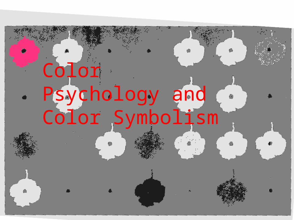
How would you feel if you spent time in this room?
What kinds of associations do you have with the décor and colors of this room?
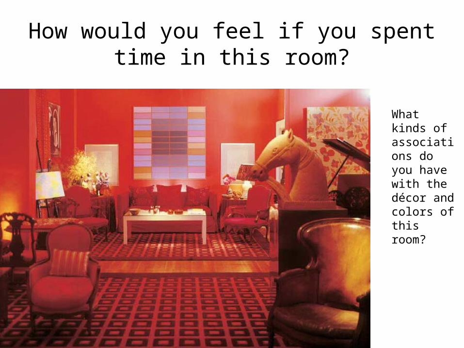
Color Preferences: Colors individuals gravitate towards
• Based on personality, color bias, color associations, environment, culture, etc.
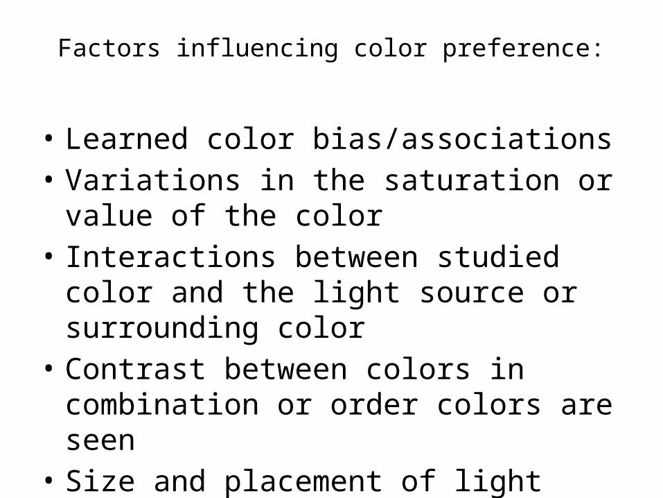
Factors influencing color preference:
• Learned color bias/associations• Variations in the saturation or value of the
color• Interactions between studied color and the
light source or surrounding color• Contrast between colors in combination or
order colors are seen• Size and placement of light sources
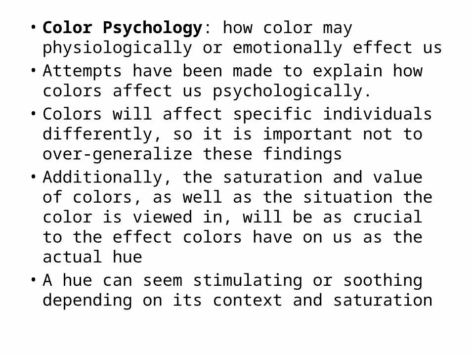
• Color Psychology: how color may physiologically or emotionally effect us
• Attempts have been made to explain how colors affect us psychologically.
• Colors will affect specific individuals differently, so it is important not to over-generalize these findings
• Additionally, the saturation and value of colors, as well as the situation the color is viewed in, will be as crucial to the effect colors have on us as the actual hue
• A hue can seem stimulating or soothing depending on its context and saturation
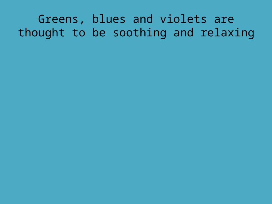
Greens, blues and violets are thought to be soothing and relaxing
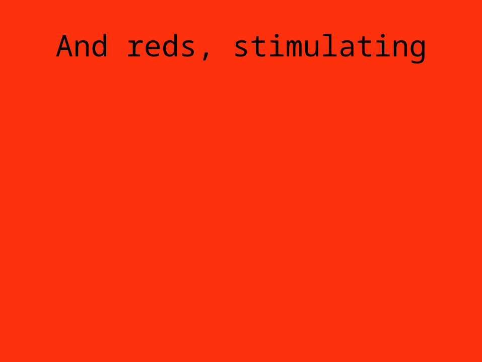
And reds, stimulating
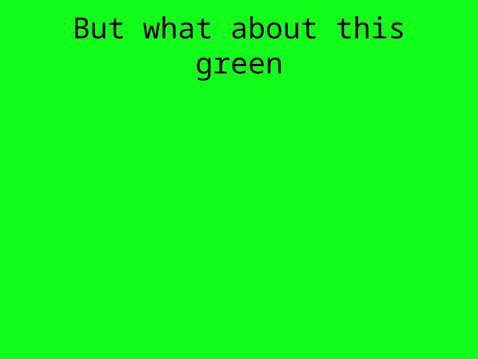
But what about this green
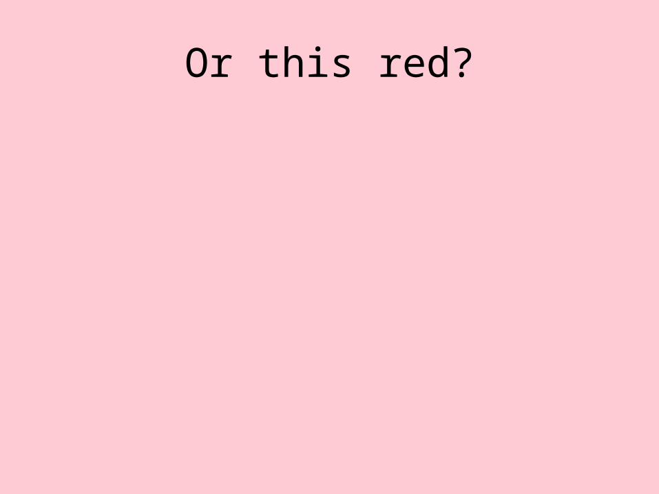
Or this red?
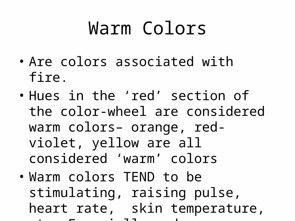
Warm Colors
• Are colors associated with fire.• Hues in the ‘red’ section of the color-wheel
are considered warm colors– orange, red-violet, yellow are all considered ‘warm’ colors
• Warm colors TEND to be stimulating, raising pulse, heart rate, skin temperature, etc. Especially red.
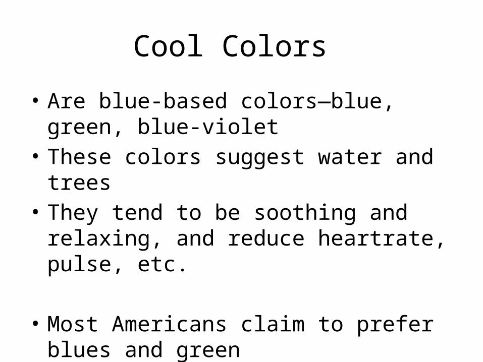
Cool Colors
• Are blue-based colors—blue, green, blue-violet
• These colors suggest water and trees• They tend to be soothing and relaxing, and
reduce heartrate, pulse, etc.
• Most Americans claim to prefer blues and green
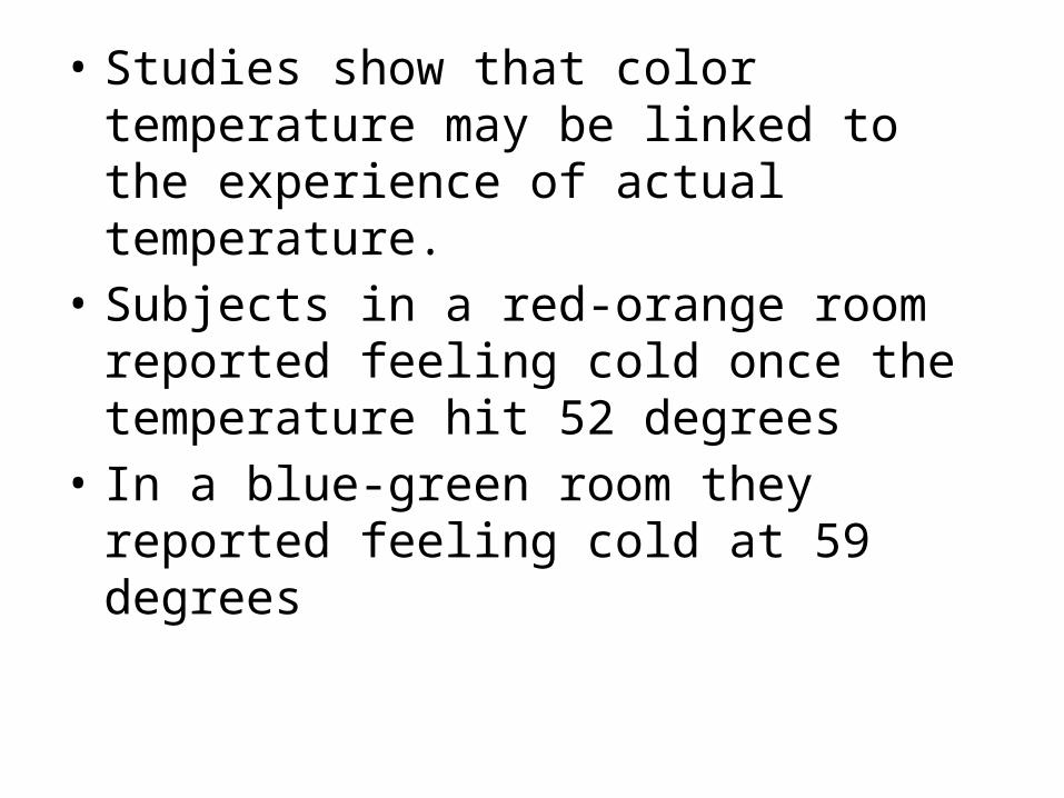
• Studies show that color temperature may be linked to the experience of actual temperature.
• Subjects in a red-orange room reported feeling cold once the temperature hit 52 degrees
• In a blue-green room they reported feeling cold at 59 degrees
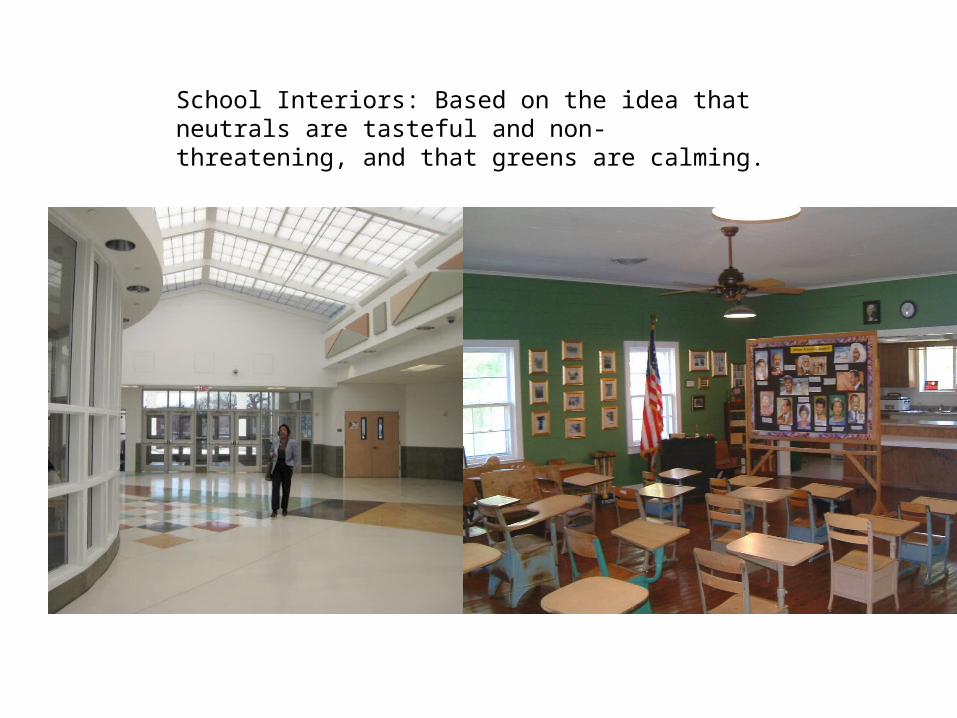
School Interiors: Based on the idea that neutrals are tasteful and non-threatening, and that greens are calming.
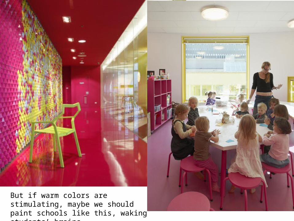
But if warm colors are stimulating, maybe we should paint schools like this, waking students’ brains
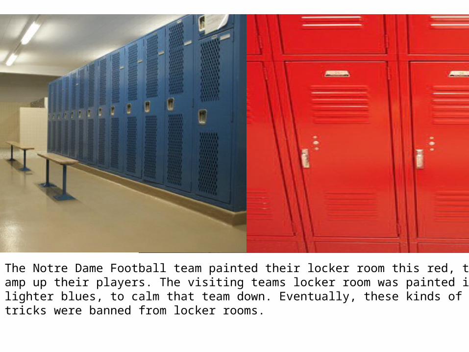
The Notre Dame Football team painted their locker room this red, to amp up their players. The visiting teams locker room was painted in lighter blues, to calm that team down. Eventually, these kinds of tricks were banned from locker rooms.
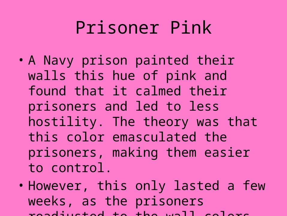
Prisoner Pink
• A Navy prison painted their walls this hue of pink and found that it calmed their prisoners and led to less hostility. The theory was that this color emasculated the prisoners, making them easier to control.
• However, this only lasted a few weeks, as the prisoners readjusted to the wall colors, hostility returned.
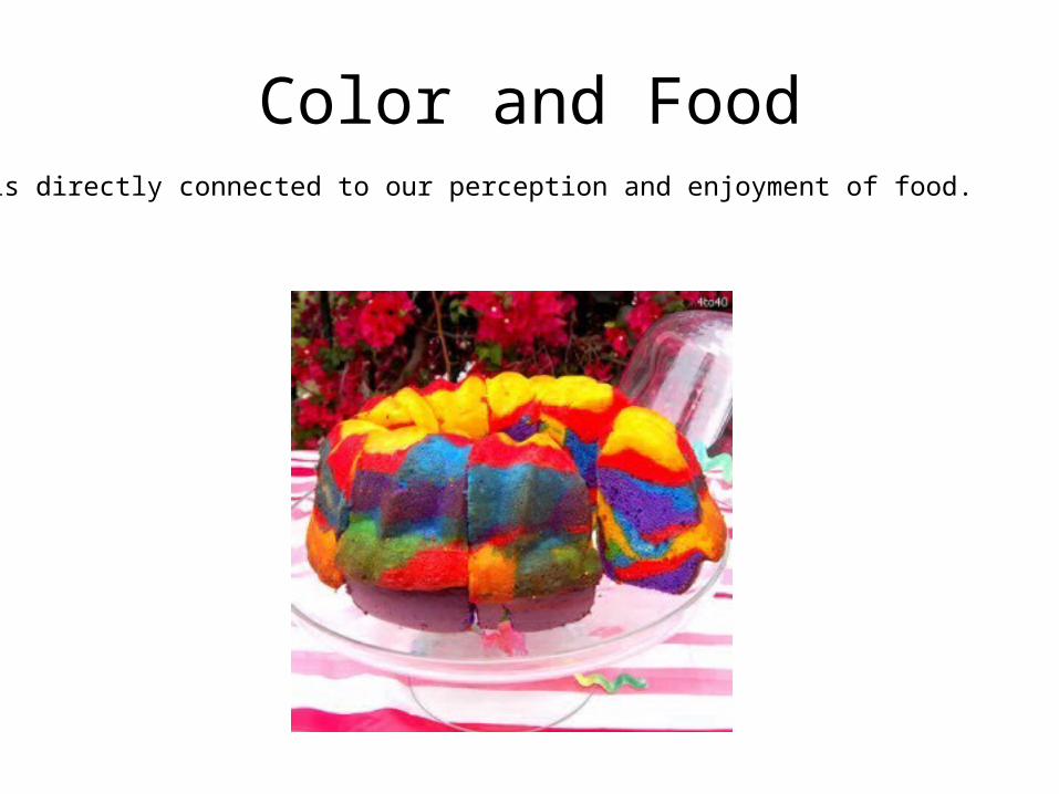
Color and FoodColor is directly connected to our perception and enjoyment of food.
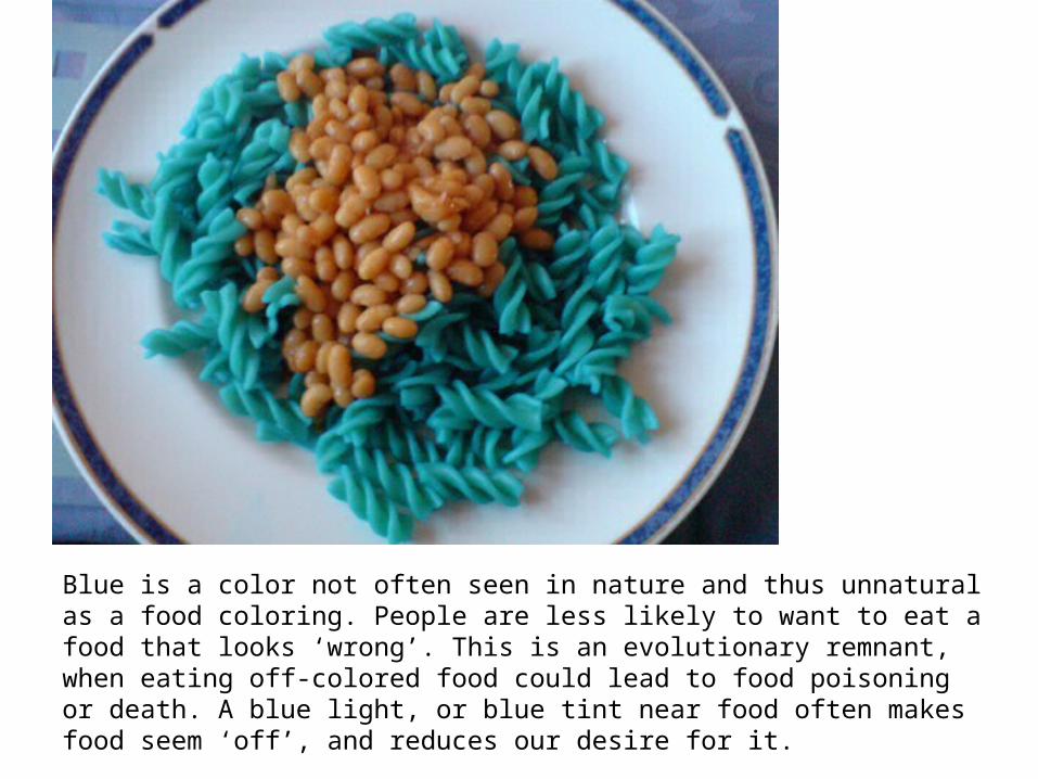
Blue is a color not often seen in nature and thus unnatural as a food coloring. People are less likely to want to eat a food that looks ‘wrong’. This is an evolutionary remnant, when eating off-colored food could lead to food poisoning or death. A blue light, or blue tint near food often makes food seem ‘off’, and reduces our desire for it.
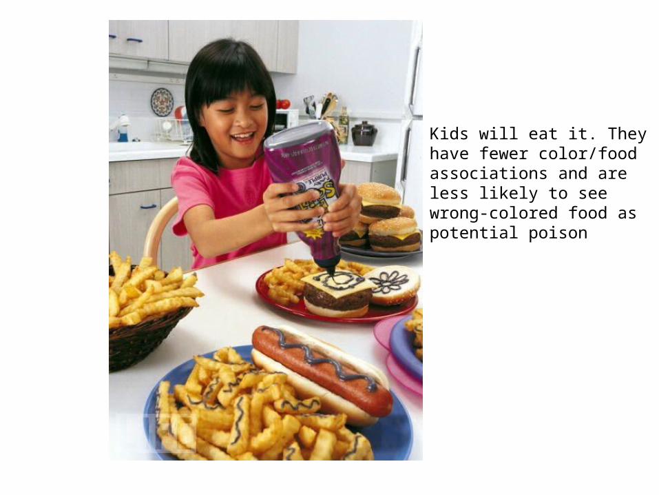
Kids will eat it. They have fewer color/food associations and are less likely to see wrong-colored food as potential poison
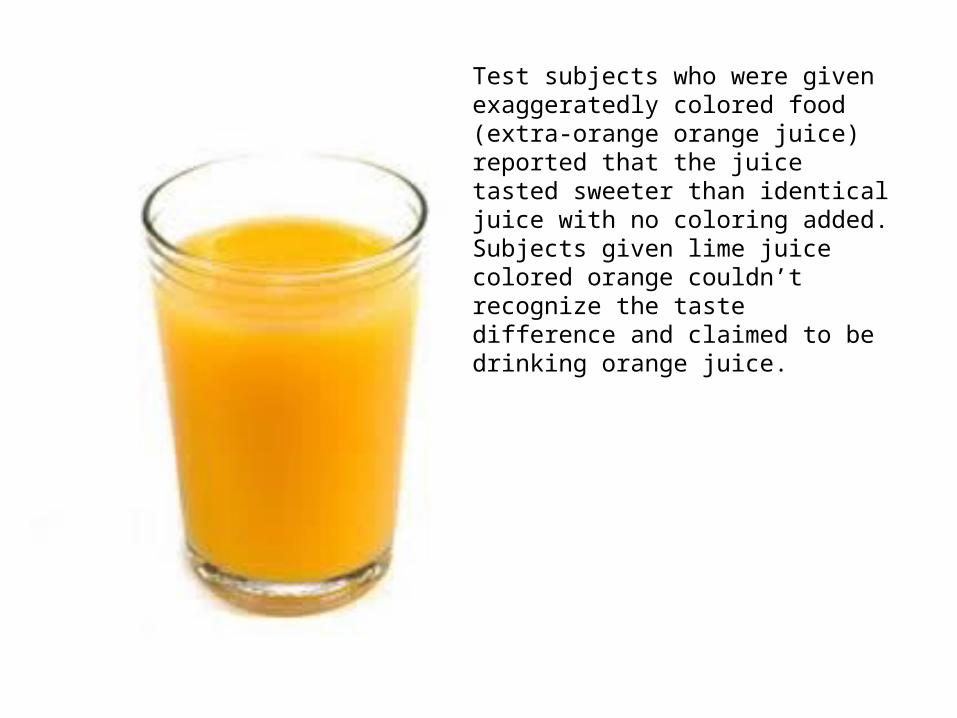
Test subjects who were given exaggeratedly colored food (extra-orange orange juice) reported that the juice tasted sweeter than identical juice with no coloring added. Subjects given lime juice colored orange couldn’t recognize the taste difference and claimed to be drinking orange juice.
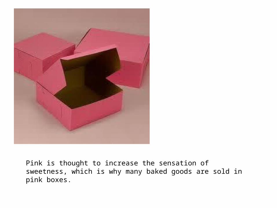
Pink is thought to increase the sensation of sweetness, which is why many baked goods are sold in pink boxes.
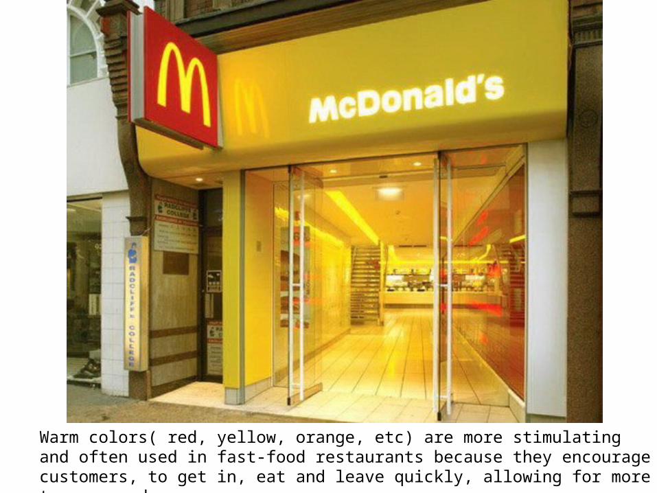
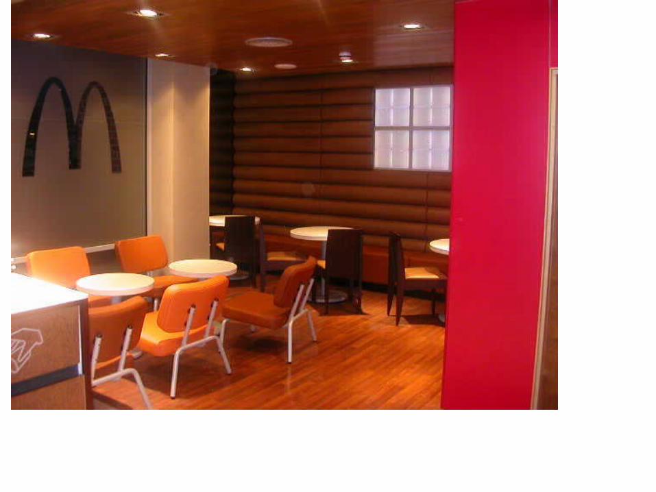
Warm colors( red, yellow, orange, etc) are more stimulating and often used in fast-food restaurants because they encourage customers, to get in, eat and leave quickly, allowing for more turn around.
Cultural Color Preferences
• People from warmer climates tend to prefer brighter, more saturated colors while individuals from colder, northern climates prefer cooler, less saturated colors
• It is theorized that in brighter environments, people’s eyes adapt to protect them from the bright light, so there is a physiological bias towards brighter colors-they resemble the natural surroundings.
• In Northern climates, people are used to less brightness, so bolder colors are more jarring, and de-saturated colors more appealing.
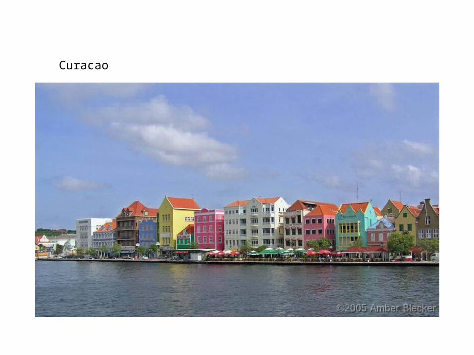
Curacao
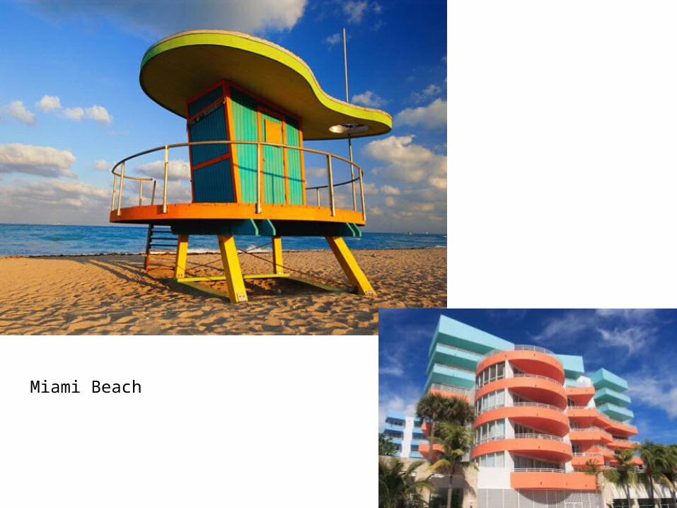
Miami Beach
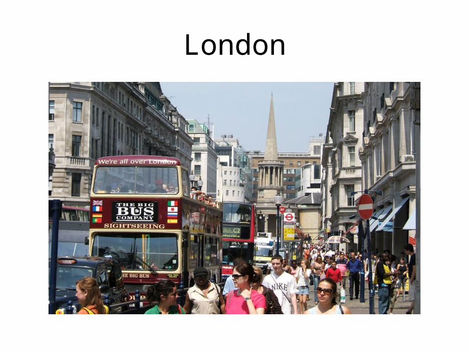
London
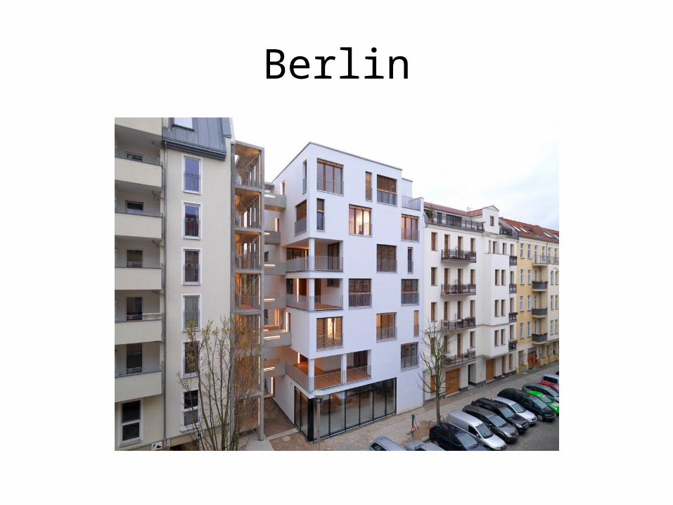
Berlin
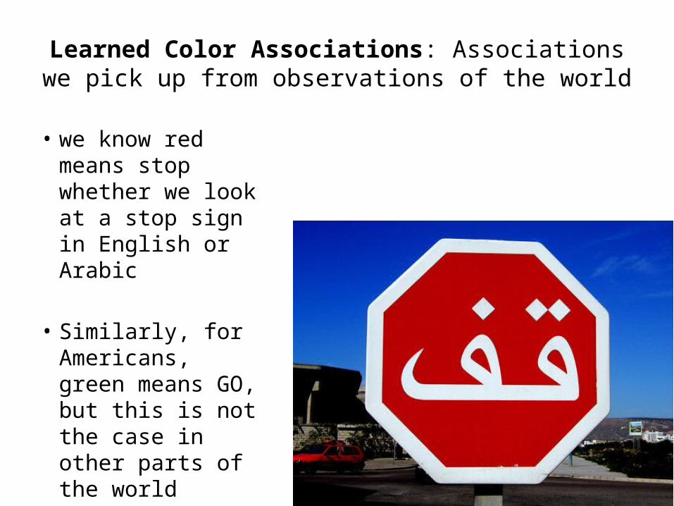
Learned Color Associations: Associations we pick up from observations of the world
• we know red means stop whether we look at a stop sign in English or Arabic
• Similarly, for Americans, green means GO, but this is not the case in other parts of the world
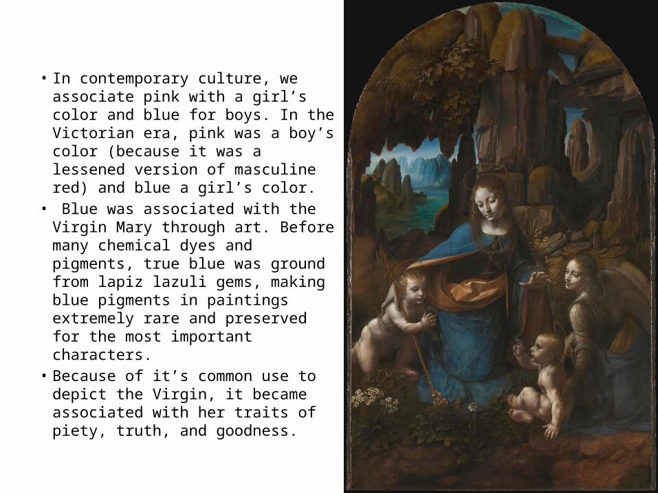
• In contemporary culture, we associate pink with a girl’s color and blue for boys. In the Victorian era, pink was a boy’s color (because it was a lessened version of masculine red) and blue a girl’s color.
• Blue was associated with the Virgin Mary through art. Before many chemical dyes and pigments, true blue was ground from lapiz lazuli gems, making blue pigments in paintings extremely rare and preserved for the most important characters.
• Because of it’s common use to depict the Virgin, it became associated with her traits of piety, truth, and goodness.
Color Associations/Color Symbolism
These are LEARNED color associations, meaning we pick up the meaning of these colors from how they are used in the world, they are not inherent meanings to the colors• In fact, many potential associations for an
individual color may directly contradict each other