Embed Size (px)
Citation preview
1ANY USE OUTSIDE OF THE FOLLOWING GUIDELINES IS CONSIDERED INCORRECT.
DEVIATIONS FROM THESE VERSIONS ARE CONSIDERED INCORRECT.
IDENTITY & GRAPHICS STANDARDS
Our Vision
Building the World’s Best Specialty Materials & Components Company™
Our Values• Integrity
• Dignity & Respect
• Innovation
• Cooperation, Accountability & Teamwork
• Ethical Behavior
• Safety, Health & Sustainability
• Product Quality
• Diversity, Creativity & Learning
Our Commitment Creating Long-Term Value Thru Relentless Innovation®
Our Principles1. Be the Best at Creating Long-Term Sustainable Value for Strategic Customers
and Shareholders
2. Deliver Compound-Annual Profitable Growth in Diversified Global Markets
3. Leverage our Technical and Manufacturing Leadership & Capabilities
4. Continuously Improve All Aspects of Our Business with Focus on Safety, Quality,
Cost and Sustainability
5. Attract, Develop, Challenge and Create Opportunities for Talented and Diverse
People Who Share a Commitment to Our Values
ATI’S VISION, VALUES, COMMITMENT & PRINCIPLES
1ANY USE OUTSIDE OF THE FOLLOWING GUIDELINES IS CONSIDERED INCORRECT.
DEVIATIONS FROM THESE VERSIONS ARE CONSIDERED INCORRECT.
Purpose
The following identity and graphic design standards are mandatory guidelines to standardize how ATI presents itself to all audiences.
Review & Approval
To ensure clarity and conformity with these guidelines, all applicable materials must be sent for review and approval with the Marketing Team prior to final printing to the attention of: [email protected]
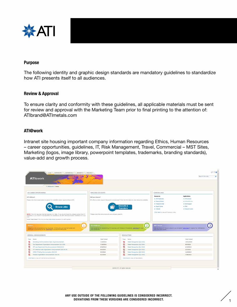
ATI@work
Intranet site housing important company information regarding Ethics, Human Resources – career opportunities, guidelines, IT, Risk Management, Travel, Commercial – MST Sites, Marketing (logos, image library, powerpoint templates, trademarks, branding standards), value-add and growth process.
INTRODUCTION
2ANY USE OUTSIDE OF THE FOLLOWING GUIDELINES IS CONSIDERED INCORRECT.
DEVIATIONS FROM THESE VERSIONS ARE CONSIDERED INCORRECT.
TABLE OF CONTENTS
I. ATI Logo . . . . . . . . . . . . . . . . . . . . . . . . . . . . . . . . . . . . . . 3-4
II. Color Specifications . . . . . . . . . . . . . . . . . . . . . . . . . . . . . 5
III. Fonts and Usage . . . . . . . . . . . . . . . . . . . . . . . . . . . . . . . . 6
IV. Slogans & Special Usage . . . . . . . . . . . . . . . . . . . . . . . . . 7
V. Relentless Innovation® Marks . . . . . . . . . . . . . . . . . . . . . 8-11
VI. Segment Identification . . . . . . . . . . . . . . . . . . . . . . . . . . . 12
VII. Business & Operating Unit Identification . . . . . . . . . . . . . . 13
VIII. Market Sector Identification . . . . . . . . . . . . . . . . . . . . . . . . . . . . 14
IX. Product Identification . . . . . . . . . . . . . . . . . . . . . . . . . . . . 15
X. Stationery . . . . . . . . . . . . . . . . . . . . . . . . . . . . . . . . . . . . . 16-25
A. Letterheads . . . . . . . . . . . . . . . . . . . . . . . . . . . . . . . . . . . . . . . 17-19
B. News Release . . . . . . . . . . . . . . . . . . . . . . . . . . . . . . . . . . . . . 20
C. Fax . . . . . . . . . . . . . . . . . . . . . . . . . . . . . . . . . . . . . . . . . . . . . 21
D. Memo . . . . . . . . . . . . . . . . . . . . . . . . . . . . . . . . . . . . . . . . . . . 22
E. Notepads . . . . . . . . . . . . . . . . . . . . . . . . . . . . . . . . . . . . . . . . 23
F. Business Cards . . . . . . . . . . . . . . . . . . . . . . . . . . . . . . . . . . . . 24
G. #10 Envelope . . . . . . . . . . . . . . . . . . . . . . . . . . . . . . . . . . . . . 25
XI. Email Signature . . . . . . . . . . . . . . . . . . . . . . . . . . . . . . . . . . . . . 26
XII. Signage Guidelines . . . . . . . . . . . . . . . . . . . . . . . . . . . . . . . . . . . 27-30
XIII. Segment Operating Locations . . . . . . . . . . . . . . . . . . . . . . . . . . 31-33
XIV. PowerPoint Templates . . . . . . . . . . . . . . . . . . . . . . . . . . . . . . . . 34
XV. Apparel . . . . . . . . . . . . . . . . . . . . . . . . . . . . . . . . . . . . . . . . . . . . 35-40

3ANY USE OUTSIDE OF THE FOLLOWING GUIDELINES IS CONSIDERED INCORRECT.
DEVIATIONS FROM THESE VERSIONS ARE CONSIDERED INCORRECT.
ATI Logo: Color Combinations
The ATI logos outlined below are the only acceptable usages for internal and external materials. Deviations from these versions areconsidered incorrect.
• Corporate Blue, Corporate Orange, black and 50%-90% black (when greyscale) may be used for print or for web.• Pantone© Metallic Silver may only be used for print.• A gradient may only be used on a white background.• The ATI letters may be die-cut when they are a scale of two inches or larger. The ATI star may not be die-cut.• The starburst may never be used without the letters “ATI”.• Corporate color values may be found on page 5.
I. ATI LOGO
A knockout1 may be used on top of an imagedark enough to keep legibility.
1In the case of a “knockout” the ATI logo becomes white and the background color or image shows through the center of the star.Gradients may not be visible when printed on an office printer.
The logo may appear as a knockout1 on black, 50% black, 60% black, 70% black, 80% black, 90% black, Corporate Blue, Corporate Orange, and Pantone® Metallic Silver.
The logo may appear as a knockout on a radial gradient over white in 2 color options:• Corporate Blue at 100% opacity gradates to Corporate Blue at 80% opacity. • Corporate Orange at 100% opacity gradatesto Corporate Orange at 80% opacity.
Two-ColorCorporate Blue100% Black
One-Color100% Black or Pantone® Metallic Silver

4ANY USE OUTSIDE OF THE FOLLOWING GUIDELINES IS CONSIDERED INCORRECT.
DEVIATIONS FROM THESE VERSIONS ARE CONSIDERED INCORRECT.
I. ATI LOGO
Measurement, Proportions and Type Specifications
Type specifications for the ATI logo are outlined below. Scale changes to the logo must be proportionate and made from a vector file. The logo must appear one-half inch or larger.
The ATI logo is based on Gill Sans Regular
Point of star locks up with the ATI cap height
Height of “A”
One-half “A”
Non-interference space
Point of star locks up with the ATI baseline
Point of star is flush right with the “A” in “ATI”
Non-Interference
A minimum frame space half the height of the “A” in “ATI” must surround the logo. Only an ATI approved tagline may enter this space.
5ANY USE OUTSIDE OF THE FOLLOWING GUIDELINES IS CONSIDERED INCORRECT.
DEVIATIONS FROM THESE VERSIONS ARE CONSIDERED INCORRECT.
II. COLOR SPECIFICATIONS
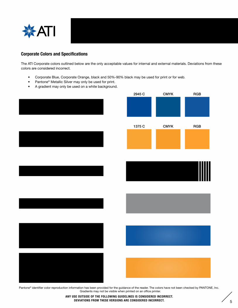
Corporate Colors and Specifications
The ATI Corporate colors outlined below are the only acceptable values for internal and external materials. Deviations from thesecolors are considered incorrect.
• Corporate Blue, Corporate Orange, black and 50%-90% black may be used for print or for web. • Pantone© Metallic Silver may only be used for print.• A gradient may only be used on a white background.
Pantone® identifier color reproduction information has been provided for the guidance of the reader. The colors have not been checked by PANTONE, Inc.Gradients may not be visible when printed on an office printer.
Corporate Orange: Pantone© 1375 C / 1375 UCMYK (print): C=0 M=45 Y=94 K=0RGB (web): R=255 G=161 B=46 (HEX #ffa12e)
Corporate Blue: Pantone© 2945 C / 2945 UCMYK (print): C=100 M=73 Y=20 K=5RGB (web): R=16 G=86 B=160 (HEX #1056a0)
Metallic Silver: Pantone© 877 C / 877 UCMYK (print): C=47 M=38 Y=38 K=2
Corporate Blue gradient includes two color stops located at 0% and 100% and a midpoint of 50%.
• Stop 1: PMS 2945 at 80% opacity• Stop 2: PMS 2945 at 100% opacity
Corporate Orange gradient includes two color stops located at 0% and 100% and a midpoint of 50%.
• Stop 1: PMS 1375 at 80% opacity• Stop 2: PMS 1375 at 100% opacity
100% black, 50% black, 60% black, 70% black, 80% black, and 90% black
2945 C
1375 C
CMYK RGB
CMYK RGB

6ANY USE OUTSIDE OF THE FOLLOWING GUIDELINES IS CONSIDERED INCORRECT.
DEVIATIONS FROM THESE VERSIONS ARE CONSIDERED INCORRECT.
ATI Fonts: Common Company Fonts and Usage
The ATI Corporate fonts outlined below are a general guideline for the fonts used throughout the company. See corresponding sections
in the manual for detailed type specifications.
III. FONTS AND USAGE
Product Identification:• Gill Sans Bold Italic• Gill Sans Bold
ATI Corporate Logo:• Gill Sans Regular
Relentless Innovation Logo:• Helvetica Neue 67 Medium Condensed
Aerospace
Segment, Operating Unit and Market Sector Logos:• Helvetica Neue 67 Medium Condensed
FirstName LastNameTitleATI Market / Unit Name
Email Signature:• Times Regular
Logos
Stationery
Personalized Letterhead/Notepad Name:• Helvetica Bold Oblique FirstName LastName
Corporate Title and Addresses:• Helvetica Light
Title
News Release, Fax and Memo Header:• Helvetica Medium NEWS RELEASE
Business Card Name / Fax, News Release and Memo Contact Info / Sign Directional Information:• Helvetica Bold
FirstName LastName / ATI Department
Corporate Letter Body:• Arial Regular
Dear FirstName,
Merem ipsum dolor sit amet, consectetuer elit, sed diam nonummy nibh as dert uiop io tincidunt ut...
7ANY USE OUTSIDE OF THE FOLLOWING GUIDELINES IS CONSIDERED INCORRECT.
DEVIATIONS FROM THESE VERSIONS ARE CONSIDERED INCORRECT.
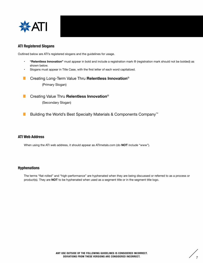
IV. SLOGANS & SPECIAL USAGE
ATI Registered Slogans
Outlined below are ATI’s registered slogans and the guidelines for usage.
• “Relentless Innovation” must appear in bold and include a registration mark ® (registration mark should not be bolded) as shown below.
• SlogansmustappearinTitleCase,withthefirstletterofeachwordcapitalized.
ATI Web Address
When using the ATI web address, it should appear as ATImetals.com (do NOT include “www”).
Hyphenations
The terms “flat-rolled” and “high-performance” are hyphenated when they are being discussed or referred to as a process or product(s). They are NOT to be hyphenated when used as a segment title or in the segment title logo.
Creating Long-Term Value Thru Relentless Innovation®
(Primary Slogan)
Creating Value Thru Relentless Innovation®
(Secondary Slogan)
Building the World’s Best Specialty Materials & Components Company™
8ANY USE OUTSIDE OF THE FOLLOWING GUIDELINES IS CONSIDERED INCORRECT.
DEVIATIONS FROM THESE VERSIONS ARE CONSIDERED INCORRECT.
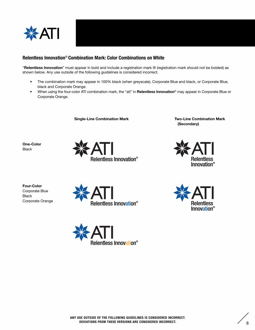
V. RELENTLESS INNOVATION® COMBINATION MARK
Relentless Innovation® Combination Mark: Color Combinations on White
“Relentless Innovation” must appear in bold and include a registration mark ® (registration mark should not be bolded) as shown below. Any use outside of the following guidelines is considered incorrect.
• The combination mark may appear in 100% black (when greyscale), Corporate Blue and black, or Corporate Blue, black and Corporate Orange.
• When using the four-color ATI combination mark, the “ati” in Relentless Innovation® may appear in Corporate Blue or Corporate Orange.
Single-Line Combination Mark Two-Line Combination Mark (Secondary)
Four-ColorCorporate BlueBlackCorporate Orange
One-ColorBlack
9ANY USE OUTSIDE OF THE FOLLOWING GUIDELINES IS CONSIDERED INCORRECT.
DEVIATIONS FROM THESE VERSIONS ARE CONSIDERED INCORRECT.
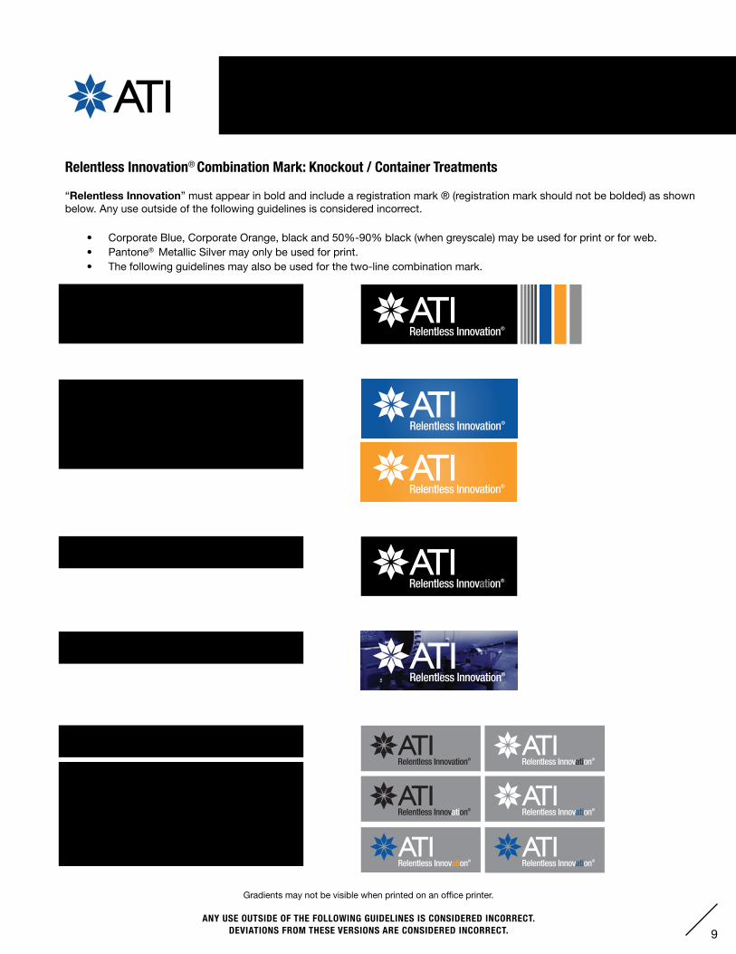
V. RELENTLESS INNOVATION® COMBINATION MARK
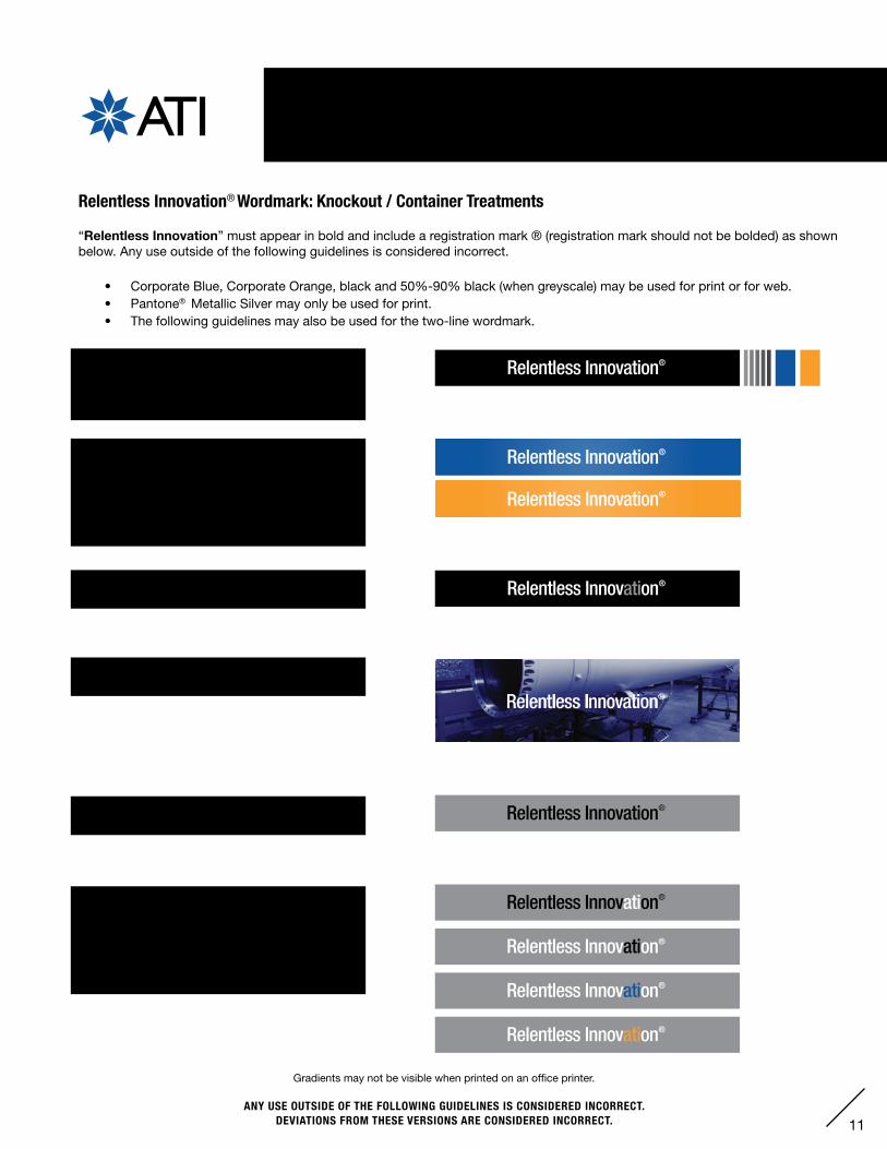
Relentless Innovation® Combination Mark: Knockout / Container Treatments
“Relentless Innovation” must appear in bold and include a registration mark ® (registration mark should not be bolded) as shown below. Any use outside of the following guidelines is considered incorrect.
• Corporate Blue, Corporate Orange, black and 50%-90% black (when greyscale) may be used for print or for web.• Pantone® Metallic Silver may only be used for print.• The following guidelines may also be used for the two-line combination mark.
The logo may appear as a knockout on black, 50% black, 60% black, 70% black, 80% black, 90% black, Corporate Blue, Corporate Orange, or Pantone® Metallic Silver.
The logo may highlight the “ati” in “Innovation” in 50% black when placed on a black background.
A knockout may occur on an image dark enough to keep legibility.
The logo may be 100% black when placed in a 50% black container.
The logo may highlight the “ati” in “Innovation” while inside a 50% black container with thefollowing color combinations:• White in 100% black.• 100% black, Corporate Blue, or Corporate
Orange in knockout, in combination with a Corporate Blue starburst.
The logo may appear as a knockout on a radial gradient over white in two color options:• Corporate Blue at 100% opacity gradates to Corporate Blue at 80% opacity. • Corporate Orange at 100% opacity gradatesto Corporate Orange at 80% opacity.
Gradients may not be visible when printed on an office printer.
10ANY USE OUTSIDE OF THE FOLLOWING GUIDELINES IS CONSIDERED INCORRECT.
DEVIATIONS FROM THESE VERSIONS ARE CONSIDERED INCORRECT.
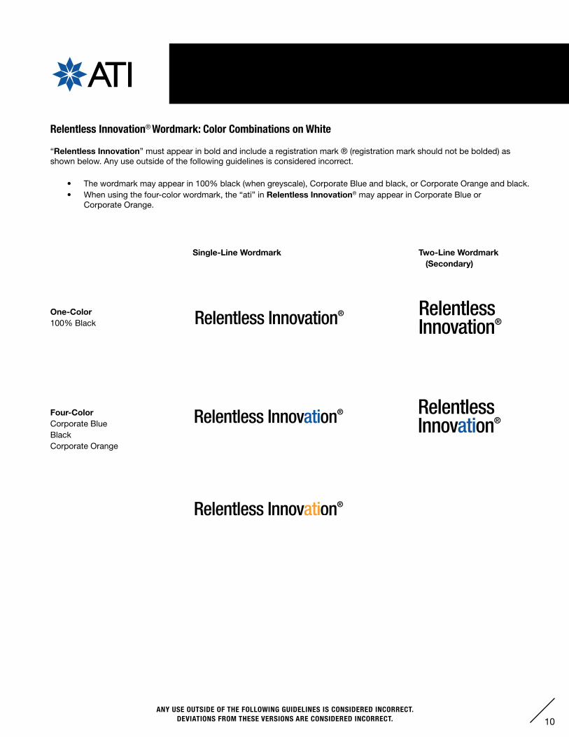
V. RELENTLESS INNOVATION® WORDMARK
Relentless Innovation® Wordmark: Color Combinations on White
“Relentless Innovation” must appear in bold and include a registration mark ® (registration mark should not be bolded) as shown below. Any use outside of the following guidelines is considered incorrect.
• The wordmark may appear in 100% black (when greyscale), Corporate Blue and black, or Corporate Orange and black.• When using the four-color wordmark, the “ati” in Relentless Innovation® may appear in Corporate Blue or
Corporate Orange.
Four-ColorCorporate BlueBlackCorporate Orange
One-Color100% Black
Single-Line Wordmark Two-Line Wordmark (Secondary)
11ANY USE OUTSIDE OF THE FOLLOWING GUIDELINES IS CONSIDERED INCORRECT.
DEVIATIONS FROM THESE VERSIONS ARE CONSIDERED INCORRECT.
V. RELENTLESS INNOVATION® WORDMARK
Relentless Innovation® Wordmark: Knockout / Container Treatments
“Relentless Innovation” must appear in bold and include a registration mark ® (registration mark should not be bolded) as shown below. Any use outside of the following guidelines is considered incorrect.
• Corporate Blue, Corporate Orange, black and 50%-90% black (when greyscale) may be used for print or for web.• Pantone® Metallic Silver may only be used for print.• The following guidelines may also be used for the two-line wordmark.
The logo may appear as a knockout on black, 50% black, 60% black, 70% black, 80% black, 90% black, Corporate Blue, Corporate Orange, or Pantone® Metallic Silver.
The logo may highlight the “ati” in “Innovation” in 50% black when placed on a black background.
A knockout may occur on an image dark enough to keep legibility.
The logo may be 100% black when placed in a 50% black container.
The logo may highlight the “ati” in “Innovation” while inside a 50% black container with thefollowing color combinations:• White in 100% black.• 100% black, Corporate Blue, or Corporate
Orange in white.
The logo may appear as a knockout on a radial gradient over white in 2 color options:• Corporate Blue at 100% opacity gradates to Corporate Blue at 80% opacity. • Corporate Orange at 100% opacity gradatesto Corporate Orange at 80% opacity.
Gradients may not be visible when printed on an office printer.
12ANY USE OUTSIDE OF THE FOLLOWING GUIDELINES IS CONSIDERED INCORRECT.
DEVIATIONS FROM THESE VERSIONS ARE CONSIDERED INCORRECT.
VI. SEGMENT IDENTIFICATION
Segment Identification
• Segment Identification will be named by text only.• The segments are:
Flat Rolled Products Segment
High Performance Materials & Components Segment
Hyphenations
The terms “flat-rolled” and “high-performance” are hyphenated when they are being discussed or referred to as a process or product(s). They are NOT to be hyphenated when used as a segment title or in the segment title logo.
13ANY USE OUTSIDE OF THE FOLLOWING GUIDELINES IS CONSIDERED INCORRECT.
DEVIATIONS FROM THESE VERSIONS ARE CONSIDERED INCORRECT.
VII. BUSINESS & OPERATING UNIT IDENTIFICATION
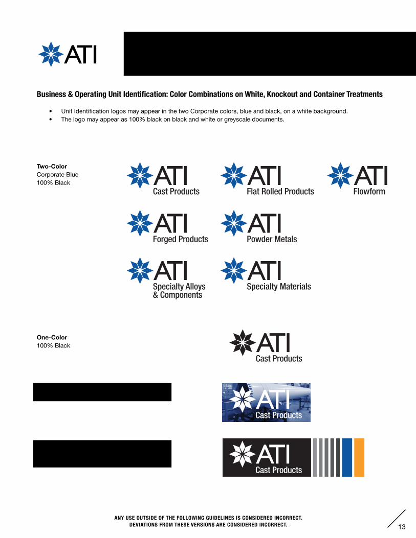
Business & Operating Unit Identification: Color Combinations on White, Knockout and Container Treatments
• Unit Identification logos may appear in the two Corporate colors, blue and black, on a white background.• The logo may appear as 100% black on black and white or greyscale documents.
Cast Products
Cast Products
Forged Products Powder Metals
Specialty Materials
Flat Rolled Products Flowform
Specialty Alloys& Components
One-Color100% Black
Two-ColorCorporate Blue100% Black
The logo may appear as a knockout on black, 50% black, 60% black, 70% black, 80% black, 90% black, Corporate Blue & Corporate Orange.
A knockout may occur on an image dark enough to keep legibility.
14ANY USE OUTSIDE OF THE FOLLOWING GUIDELINES IS CONSIDERED INCORRECT.
DEVIATIONS FROM THESE VERSIONS ARE CONSIDERED INCORRECT.
VIII. MARKET SECTOR IDENTIFICATION
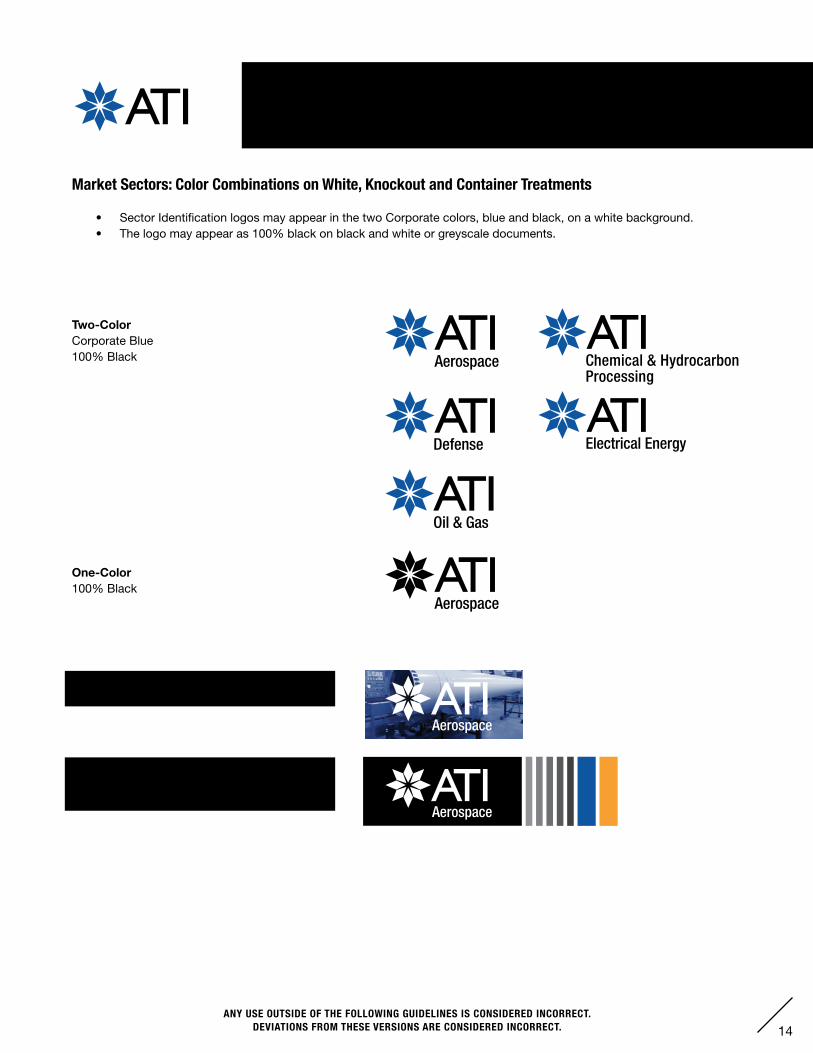
Market Sectors: Color Combinations on White, Knockout and Container Treatments
• Sector Identification logos may appear in the two Corporate colors, blue and black, on a white background.• The logo may appear as 100% black on black and white or greyscale documents.
Defense
Oil & Gas
Aerospace
Electrical Energy
Aerospace
Aerospace
Aerospace
Chemical & Hydrocarbon Processing
Defense
Oil & Gas
Aerospace
Electrical Energy
Aerospace
Aerospace
Aerospace
Chemical & Hydrocarbon Processing
Two-ColorCorporate Blue100% Black
One-Color100% Black
The logo may appear as a knockout on black, 50% black, 60% black, 70% black, 80% black, 90% black, Corporate Blue & Corporate Orange.
A knockout may occur on an image dark enough to keep legibility.
15ANY USE OUTSIDE OF THE FOLLOWING GUIDELINES IS CONSIDERED INCORRECT.
DEVIATIONS FROM THESE VERSIONS ARE CONSIDERED INCORRECT.
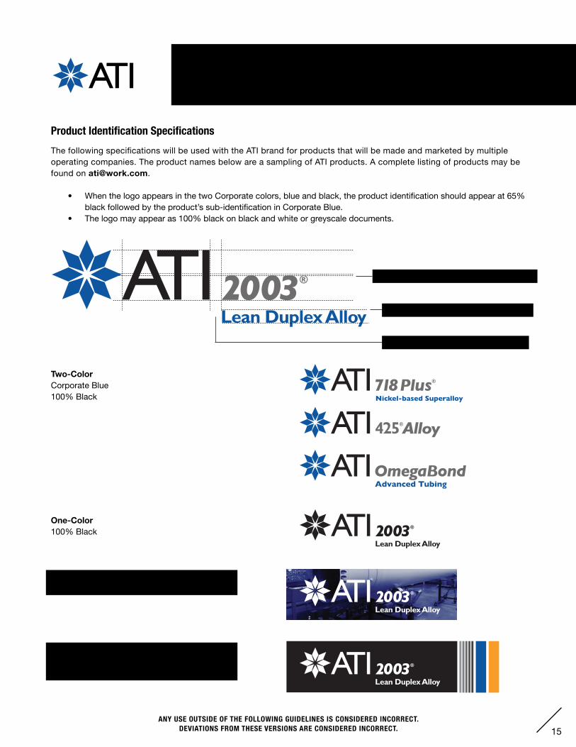
Product Identification SpecificationsThe following specifications will be used with the ATI brand for products that will be made and marketed by multiple operating companies. The product names below are a sampling of ATI products. A complete listing of products may be found on [email protected].
• When the logo appears in the two Corporate colors, blue and black, the product identification should appear at 65% black followed by the product’s sub-identification in Corporate Blue.
• The logo may appear as 100% black on black and white or greyscale documents.
IX. PRODUCT IDENTIFICATION
47% of ATI logotype, Gill Sans Bold Italic
Space equals 25% of ATI cap height
21.7% of ATI logotype, Gill Sans Bold
The logo may appear as a knockout on black, 50% black, 60% black, 70% black, 80% black, 90% black, Corporate Blue & Corporate Orange.
A knockout may occur on an image dark enough to keep legibility.
Two-ColorCorporate Blue100% Black
One-Color100% Black
16ANY USE OUTSIDE OF THE FOLLOWING GUIDELINES IS CONSIDERED INCORRECT.
DEVIATIONS FROM THESE VERSIONS ARE CONSIDERED INCORRECT.
X. STATIONERY – OVERVIEW
AddressCity, State Zip USATel: [email protected]
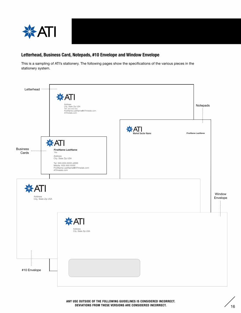
Letterhead, Business Card, Notepads, #10 Envelope and Window EnvelopeThis is a sampling of ATI’s stationery. The following pages show the specifications of the various pieces in the stationery system.
AddressCity, State Zip USA
Tel: XXX-XXX-XXXX x0000Mobile: [email protected]
TitleFirstName LastName
5.5” x 8.5”
FirstName LastNameMarket Sector Name
AddressCity, State Zip USA
AddressCity, State Zip USA
Letterhead
Notepads
Business Cards
#10 Envelope
Window Envelope
17ANY USE OUTSIDE OF THE FOLLOWING GUIDELINES IS CONSIDERED INCORRECT.
DEVIATIONS FROM THESE VERSIONS ARE CONSIDERED INCORRECT.
FirstName LastNameTitle
AddressCity, State Zip USATel: XXX-XXX-XXXX x0000Fax: [email protected]
Dear FirstName LastName,
Lorem ipsum dolor sit amet, consectetur adipiscing elit. Sed rhoncus auctor fringilla. Pellentesque non quam nec mauris laoreet sodales ac efficitur nisl. Suspendisse pretium sapien non ultrices cursus. Morbi facilisis fermentum massa bibendum lobortis. Sed vehicula nisi nisi, in laoreet ex pellentesque in.
Ut pharetra dui eget diam volutpat, non molestie augue ornare. In hac habitasse platea dictumst. Pellentesque ac ultricies quam. Pellentesque vehicula est mi, non viverra lectus ultricies sit amet. Etiam vitae congue quam. Phasellus maximus vitae risus at placerat. Phasellus porttitor, ipsum iaculis interdum pharetra, ex nulla gravida nibh, non pulvinar neque augue non tellus.
X. STATIONERY – A. LETTERHEADS
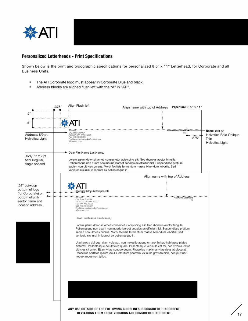
Personalized Letterheads - Print Specifications Shown below is the print and typographic specifications for personalized 8.5” x 11” Letterhead, for Corporate and all Business Units.
• The ATI Corporate logo must appear in Corporate Blue and black.• Address blocks are aligned flush left with the “A” in “ATI”.
Address: 8/9 pt. Helvetica Light
Paper Size: 8.5" x 11".375"
.5"
.5"
Name: 8/9 pt. Helvetica Bold Oblique Title: Helvetica Light
.875"
NOTE: It is optional to have your cell phone or faxnumber on personalized letterhead or otherstationery items.
If using a cell phone number, always place it after the main office telephone number.
Align Flush left
ANY USE OUTSIDE OF THE FOLLOWING GUIDELINES IS CONSIDERED INCORRECT.DEVIATIONS FROM THESE VERSIONS IS CONSIDERED INCORRECT.
Align name with top of Address
FirstName LastNameTitle
Specialty Alloys & Components
AddressCity, State Zip USATel: XXX-XXX-XXXX x0000Fax: XXX-XXX-XXXXCell: [email protected]
Dear FirstName LastName,
Lorem ipsum dolor sit amet, consectetur adipiscing elit. Sed rhoncus auctor fringilla. Pellentesque non quam nec mauris laoreet sodales ac efficitur nisl. Suspendisse pretium sapien non ultrices cursus. Morbi facilisis fermentum massa bibendum lobortis. Sed vehicula nisi nisi, in laoreet ex pellentesque in.
Ut pharetra dui eget diam volutpat, non molestie augue ornare. In hac habitasse platea dictumst. Pellentesque ac ultricies quam. Pellentesque vehicula est mi, non viverra lectus ultricies sit amet. Etiam vitae congue quam. Phasellus maximus vitae risus at placerat. Phasellus porttitor, ipsum iaculis interdum pharetra, ex nulla gravida nibh, non pulvinar neque augue non tellus.
Approved Paper Specification: Strathmore Writing 24# Platinum White Wove.
(If the above-stated Strathmore Writing paper is not available, a close substitute may be specified, with approval from ATI Corporate.)
Align name with top of Address
.25” between bottom of logo (for Corporate) or bottom of unit/sector name and location address.
ANY USE OUTSIDE OF THE FOLLOWING GUIDELINES IS CONSIDERED INCORRECT.DEVIATIONS FROM THESE VERSIONS ARE CONSIDERED INCORRECT.
Body: 11/12 pt. Arial Regular,single spaced

18ANY USE OUTSIDE OF THE FOLLOWING GUIDELINES IS CONSIDERED INCORRECT.
DEVIATIONS FROM THESE VERSIONS ARE CONSIDERED INCORRECT.
AddressCity, State Zip USATel: XXX-XXX-XXXXFax: XXX-XXX-XXXXATImetals.com
Dear FirstName LastName,
Lorem ipsum dolor sit amet, consectetur adipiscing elit. Sed rhoncus auctor fringilla. Pellentesque non quam nec mauris laoreet sodales ac efficitur nisl. Suspendisse pretium sapien non ultrices cursus. Morbi facilisis fermentum massa bibendum lobortis. Sed vehicula nisi nisi, in laoreet ex pellentesque in.
Ut pharetra dui eget diam volutpat, non molestie augue ornare. In hac habitasse platea dictumst. Pellentesque ac ultricies quam. Pellentesque vehicula est mi, non viverra lectus ultricies sit amet. Etiam vitae congue quam. Phasellus maximus vitae risus at placerat. Phasellus porttitor, ipsum iaculis interdum pharetra, ex nulla gravida nibh, non pulvinar neque augue non tellus.
X. STATIONERY – A. LETTERHEADS
Non-Personalized Letterheads - Print Specifications Shown below is the print and typographic specifications for non-personalized 8.5” x 11” Letterhead, for Corporate and all Business Units.
• The ATI Corporate logo must appear in Corporate Blue and black.• Address blocks are aligned flush left with the “A” in “ATI”.
Approved Paper Specification: Strathmore Writing 24# Platinum White Wove.
(If the above-stated Strathmore Writing paper is not available, a close substitute may be specified, with approval from ATI Corporate.)
Address: 8/9 pt. Helvetica Light
Paper Size: 8.5" x 11"
.375"
.5"
.5"
Align Flush left
Body: 11/12 pt. Arial Regular,single spaced
19ANY USE OUTSIDE OF THE FOLLOWING GUIDELINES IS CONSIDERED INCORRECT.
DEVIATIONS FROM THESE VERSIONS ARE CONSIDERED INCORRECT.
X. STATIONERY – A. LETTERHEAD FORMAT
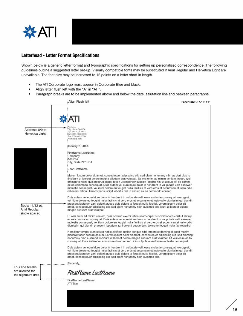
AddressCity, State Zip USATel: XXX-XXX-XXXXCell: XXX-XXX-XXXXFax: XXX-XXX-XXXXATImetals.com
January 2, 20XX
FirstName LastNameCompany AddressCity, State ZIP USA
Dear FirstName,
Merem ipsum dolor sit amet, consectetuer adipiscing elit, sed diam nonummy nibh as dert uiop iotincidunt ut laoreet dolore magna aliquam erat volutpat. Ut wisi enim ad minim veniam, nostru tyui dminim veniam, quis nostrud exerci tation ullamcorper suscipit lobortis nisl ut aliquip ex ea comm ex ea commodo consequat. Duis autem vel eum iriure dolor in hendrerit in vul putate velit essewer molestie consequat, vel illum dolore eu feugiat nulla facilisis at vero eros et accumsan et iusto odio od exerci tation ullamcorper suscipit lobortis nisl ut aliquip ex ea commodo conseq.
Duis autem vel eum iriure dolor in hendrerit in vulputate velit esse molestie consequat, wert gyuiovel illum dolore eu feugiat nulla facilisis at vero eros et accumsan et iusto odio dignissim qui blandit praesent luptatum zzril delenit augue duis dolore te feugait nulla facilisi. Lorem ipsum dolor sit amet, consectetuer adipiscing elit, sed diam nonummy nibh euismod tinc idunt ut laoreet dolore magna aliquam erat volutpat.
Ut wisi enim ad minim veniam, quis nostrud exerci tation ullamcorper suscipit lobortis nisl ut aliquip ex ea commodo consequat. Duis autem vel eum iriure dolor in hendrerit in vul putate velit essewer molestie consequat, vel illum dolore eu feugiat nulla facilisis at vero eros et accumsan et iusto odio dignissim qui blandit praesent luptatum zzril delenit augue duis dolore te feugait nulla fac retyuilisi.
Nam liber tempor cum soluta nobis eleifend option congue nihil imperdiet doming id quod mazim placerat facer possim assum. Lorem ipsum dolor sit amet, consectetuer adipiscing elit, sed diamiop nonummy nibh euismod tincidunt ut laoreet dolore magna aliquam erat volutpat. Ut wisi enim ad to consequat. Duis autem vel eum iriure dolor in drer it in vulputate velit esse molestie consequat.
Duis autem vel eum iriure dolor in hendrerit in vulputate velit esse molestie consequat, wert gyuiovel illum dolore eu feugiat nulla facilisis at vero eros et accumsan et iusto odio dignissim qui blandit praesent luptatum zzril delenit augue duis dolore te feugait nulla facilisi. Lorem ipsum dolor sit amet, consectetuer adipiscing elit, sed diam nonummy nibh euismod tinc.
Sincerely,
FirstName LastNameATI Title
Align Flush left
NOTE: It is optional to have your cell phone or faxnumber on personalized letterhead or otherstationery items.
If using a cell phone number, always place it after the main office telephone number.
Letterhead - Letter Format Specifications Shown below is a generic letter format and typographic specifications for setting up personalized correspondence. The following guidelines outline a suggested letter set-up. Visually compatible fonts may be substituted if Arial Regular and Helvetica Light are unavailable. The font size may be increased to 12 points on a letter short in length.
• The ATI Corporate logo must appear in Corporate Blue and black.• Align letter flush left with the “A” in “ATI”.• Paragraph breaks are to be implemented above and below the date, salutation line and between paragraphs.
Paper Size: 8.5" x 11"
Address: 8/9 pt. Helvetica Light
Body: 11/12 pt. Arial Regular,single spaced
Four line breaks are allowed for the signature area
Approved Paper Specification: Strathmore Writing 24# Platinum White Wove.
(If the above-stated Strathmore Writing paper is not available, a close substitute may be specified, with approval from ATI Corporate.)
20ANY USE OUTSIDE OF THE FOLLOWING GUIDELINES IS CONSIDERED INCORRECT.
DEVIATIONS FROM THESE VERSIONS ARE CONSIDERED INCORRECT.
X. STATIONERY – B. NEWS RELEASE
AddressCity, State Zip USAATImetals.com
NEWS RELEASEContact:FirstName, LastNameXXX-XXX-XXXX
Lorem ipsum dolor sit amet, consectetur adipiscing elit. Sed rhoncus auctor fringilla. Pellentesque non quam nec mauris laoreet sodales ac efficitur nisl. Suspendisse pretium sapien non ultrices cursus. Morbi facilisis fermentum massa bibendum lobortis. Sed vehicula nisi nisi, in laoreet ex pellentesque in.
Ut pharetra dui eget diam volutpat, non molestie augue ornare. In hac habitasse platea dictumst. Pellentesque ac ultricies quam. Pellentesque vehicula est mi, non viverra lectus ultricies sit amet. Etiam vitae congue quam. Phasellus maximus vitae risus at placerat. Phasellus porttitor, ipsum iaculis interdum pharetra, ex nulla gravida nibh, non pulvinar neque augue non tellus.
.5"
.5"
1.125"
8/9 pt. Helvetica Light
Paper Size: 8.5" x 11"
.375"
Top Line:8/9 pt. Helvetica Bold
24 pt. Helvetica Medium
2nd and 3rd Lines:8/9 pt. Helvetica Medium
.375"
News Release - Print Specifications
Shown below is the print and typographic specifications for an 8.5” x 11” Corporate news release.
• The ATI Corporate logo must appear in Corporate Blue and black.• Address blocks are aligned flush left with the “A” in “ATI”.• The “news release” type must appear in Corporate Blue and align with the top of “ATI”.
Approved Paper Specification: Strathmore Writing 24# Platinum White Wove.
(If the above-stated Strathmore Writing paper is not available, a close substitute may be specified, with approval from ATI Corporate.)
Body: 11/12 pt. Arial Regular,single spaced.2” from top of page
21ANY USE OUTSIDE OF THE FOLLOWING GUIDELINES IS CONSIDERED INCORRECT.
DEVIATIONS FROM THESE VERSIONS ARE CONSIDERED INCORRECT.
X. STATIONERY – C. FAX
AddressCity, State Zip USATel: XXX-XXX-XXXXFax: XXX-XXX-XXXXATImetals.com
FAXDATE:
TO:
FAX:
FROM: FIRSTNAME LASTNAME
TELEPHONE: XXX-XX-XXXX
FAX: XXX-XXX-XXXX
SENDING COVER PLUS: X — XX PAGES(S)
RE:
THIS FACSIMILE CONTAINS INFORMATION THAT MAY BE PRIVILEGED AND CONFIDENTIAL. THE INFORMATION IS INTENDED TO BE FOR THE SOLE USE OF THE INTENDED RECIPIENT(S) ONLY. IF YOU ARE NOT THE INTENDED RECIPIENT, PLEASE CONTACT THE SENDER AND DELETE ALL COPIES. DO NOT FORWARD, COPY, DISTRIBUTE OR USE THE CONTENTS OF THIS MESSAGE WITHOUT MY PERMISSION, SINCE IT COULD DESTROY ANY PRIVILEGED NATURE OF THIS COMMUNICATION.
Lorem ipsum dolor sit amet, consectetur adipiscing elit. Sed rhoncus auctor fringilla. Pellentesque non quam nec mauris laoreet sodales ac efficitur nisl. Suspendisse pretium sapien non ultrices cursus. Morbi facilisis fermentum massa bibendum lobortis. Sed vehicula nisi nisi, in laoreet ex pellentesque in.
Ut pharetra dui eget diam volutpat, non molestie augue ornare. In hac habitasse platea dictumst. Pellentesque ac ultricies quam. Pellentesque vehicula est mi, non viverra lectus ultricies sit amet. Etiam vitae congue quam. Phasellus maximus vitae risus at placerat. Phasellus porttitor, ipsum iaculis interdum pharetra, ex nulla gravida nibh, non pulvinar neque augue non tellus.
.5"
1.125” Paper Size: 8.5" x 11"
8 pt. Helvetica Bold
24 pt. Helvetica Medium
8/9 pt. Helvetica Light
.5"
.375"
All rules print black 1 Pt.
1 pt. black rule
2.25" from top edge
.375"
.375"
.375"
8 pt. Helvetica Bold
.375"
.375"
3"
6 pt. Helvetica Regular
.75"
Fax - Print Specifications
Shown below is the print and typographic specifications for an 8.5” x 11” fax.
• The ATI Corporate logo must appear as a one color logo in 100% black.• Address blocks are aligned flush left with the “A” in “ATI”.• The “fax” type is printed in black and aligns with the top of “ATI”.
Approved Paper Specification: Hammermill White 20#, Text: Smooth finish
(If the above-stated Hammermill paper is not available, a cost-effective substitutemay be specified. Corporate approval is not necessary.)
AddressCity, State Zip USATel: XXX-XXX-XXXXFax: XXX-XXX-XXXXATImetals.com
FAXDATE:
TO:
FAX:
FROM: FIRSTNAME LASTNAME
TELEPHONE: XXX-XX-XXXX
FAX: XXX-XXX-XXXX
SENDING COVER PLUS: X — XX PAGES(S)
RE:
THIS FACSIMILE CONTAINS INFORMATION THAT MAY BE PRIVILEGED AND CONFIDENTIAL. THE INFORMATION IS INTENDED TO BE FOR THE SOLE USE OF THE INTENDED RECIPIENT(S) ONLY. IF YOU ARE NOT THE INTENDED RECIPIENT, PLEASE CONTACT THE SENDER AND DELETE ALL COPIES. DO NOT FORWARD, COPY, DISTRIBUTE OR USE THE CONTENTS OF THIS MESSAGE WITHOUT MY PERMISSION, SINCE IT COULD DESTROY ANY PRIVILEGED NATURE OF THIS COMMUNICATION.
Lorem ipsum dolor sit amet, consectetur adipiscing elit. Sed rhoncus auctor fringilla. Pellentesque non quam nec mauris laoreet sodales ac efficitur nisl. Suspendisse pretium sapien non ultrices cursus. Morbi facilisis fermentum massa bibendum lobortis. Sed vehicula nisi nisi, in laoreet ex pellentesque in.
Ut pharetra dui eget diam volutpat, non molestie augue ornare. In hac habitasse platea dictumst. Pellentesque ac ultricies quam. Pellentesque vehicula est mi, non viverra lectus ultricies sit amet. Etiam vitae congue quam. Phasellus maximus vitae risus at placerat. Phasellus porttitor, ipsum iaculis interdum pharetra, ex nulla gravida nibh, non pulvinar neque augue non tellus.
Body: 11/12 pt. Arial Regular,single spaced
22ANY USE OUTSIDE OF THE FOLLOWING GUIDELINES IS CONSIDERED INCORRECT.
DEVIATIONS FROM THESE VERSIONS ARE CONSIDERED INCORRECT.
X. STATIONERY – D. MEMO
1.125”
Paper Size: 8.5" x 11"
1000 Six PPG PlacePittsburgh, PA 15222-5479 U.S.A.Tel: 412-000-0000Fax: 412-000-0000ATImetals.com
MEMORANDUM
DATE:
TO:
CC:
FROM:
SUBJECT:
Lorem ipsum dolor sit amet, consectetur adipiscing elit. Sed rhoncus auctor fringilla. Pellentesque non quam nec mauris laoreet sodales ac efficitur nisl. Suspendisse pretium sapien non ultrices cursus. Morbi facilisis fermentum massa bibendum lobortis. Sed vehicula nisi nisi, in laoreet ex pellentesque in.
Ut pharetra dui eget diam volutpat, non molestie augue ornare. In hac habitasse platea dictumst. Pellentesque ac ultricies quam. Pellentesque vehicula est mi, non viverra lectus ultricies sit amet. Etiam vitae congue quam. Phasellus maximus vitae risus at placerat. Phasellus porttitor, ipsum iaculis interdum pharetra, ex nulla gravida nibh, non pulvinar neque augue non tellus.
8 pt.Helvetica Bold
Body: 11/12 pt. Arial Regular,single spaced
24 pt. Helvetica Medium Align type with top of “ATI”Prints in ATI Blue
1.25" from top
edge
.5"
.5”
Rule prints ATI Blue 1 Pt.
.875".875"
.5"
Memo - Print Specifications
Shown below is the print and typographic specifications for an 8.5” x 11” memo.
• The ATI Corporate logo must appear in Corporate Blue and black.• The “memo” type is printed in Corporate Blue aligns with the top of “ATI”.• Correspondence info is aligned left with “memo” heading.
Approved Paper Specification: Strathmore Writing 24# Platinum White Wove
(If the above-stated Strathmore Writing paper is not available, a close substitutemay be specified, with approval from ATI Corporate.)
AddressCity, State Zip USATel: XXX-XXX-XXXXFax: XXX-XXX-XXXXATImetals.com
FAXDATE:
TO:
FAX:
FROM: FIRSTNAME LASTNAME
TELEPHONE: XXX-XX-XXXX
FAX: XXX-XXX-XXXX
SENDING COVER PLUS: X — XX PAGES(S)
RE:
THIS FACSIMILE CONTAINS INFORMATION THAT MAY BE PRIVILEGED AND CONFIDENTIAL. THE INFORMATION IS INTENDED TO BE FOR THE SOLE USE OF THE INTENDED RECIPIENT(S) ONLY. IF YOU ARE NOT THE INTENDED RECIPIENT, PLEASE CONTACT THE SENDER AND DELETE ALL COPIES. DO NOT FORWARD, COPY, DISTRIBUTE OR USE THE CONTENTS OF THIS MESSAGE WITHOUT MY PERMISSION, SINCE IT COULD DESTROY ANY PRIVILEGED NATURE OF THIS COMMUNICATION.
Lorem ipsum dolor sit amet, consectetur adipiscing elit. Sed rhoncus auctor fringilla. Pellentesque non quam nec mauris laoreet sodales ac efficitur nisl. Suspendisse pretium sapien non ultrices cursus. Morbi facilisis fermentum massa bibendum lobortis. Sed vehicula nisi nisi, in laoreet ex pellentesque in.
Ut pharetra dui eget diam volutpat, non molestie augue ornare. In hac habitasse platea dictumst. Pellentesque ac ultricies quam. Pellentesque vehicula est mi, non viverra lectus ultricies sit amet. Etiam vitae congue quam. Phasellus maximus vitae risus at placerat. Phasellus porttitor, ipsum iaculis interdum pharetra, ex nulla gravida nibh, non pulvinar neque augue non tellus.
23ANY USE OUTSIDE OF THE FOLLOWING GUIDELINES IS CONSIDERED INCORRECT.
DEVIATIONS FROM THESE VERSIONS ARE CONSIDERED INCORRECT.
X. STATIONERY – E. NOTEPADS
FirstName LastName
8.5” x 11”8.5" x 11"
.5"
.5"
.375"
5.5” x 8.5”
Terry Dunlap
FirstName LastName
5.5" x 8.5"
Name (for all notepad sizes): 8/9 pt. Helvetica Bold Oblique
Align name with baseline of “ATI.”
.875"
.375"
Star Height
.375"
4.25” x 5.5”
FirstName LastName
4.25" x 5.5"
1/4" (.25")Cap Height of “ATI”
1/4"
1/4" (.25").25"
Star Height
Union logo
NOTE: The union logo may be used small and placed at the bottom right of the notepad page, 1/4" from thebottom and flush right with the personalized name (on whichever size notepad being printed). If used, the union logo must be printed in black.
Notepads - Print Specifications
Shown below is the print and typographic specifications for notepads.
• The ATI logo must appear in Corporate Blue and black.• There are three approved sizes for Corporate notepads: 4.25” x 5.5,” 5.5” x 8.5” and 8.5” x 11”• The approved paper specifications for ATI notepads is : Hammermill White 20#. Text: Smooth finish.
.375"
.4375"

24ANY USE OUTSIDE OF THE FOLLOWING GUIDELINES IS CONSIDERED INCORRECT.
DEVIATIONS FROM THESE VERSIONS ARE CONSIDERED INCORRECT.
X. STATIONERY – F. BUSINESS CARDS
Business Card - Print Specifications
Shown below is the print and typographic specifications for business cards. Employees who interface with customers, suppliers and external stakeholders are expected to maintain ATI business cards. The example below shows the proper usage of the logo and also a typical example of a title, and a title and unit/sector name.
• The ATI logo must appear in Corporate Blue and black.• The approved size for Corporate business cards is: 2” x 3.5”
• The approved paper specifications is as follows: Executive Business Cards: Strathmore Writing 100# Platinum White Wove Cover. Non-Executive Business Cards: Strathmore Writing 80# Platinum White Wove Cover.
• Thermography may be used on executive cards for the Corporate logo. All other type is to be printed as flat black ink.
AddressCity, State Zip USA
Tel: XXX-XXX-XXXX x0000Mobile: [email protected]
TitleFirstName LastName
5/8" (.625")
Align all copy with left edge of “ATI”
For 1-line Title Cards:Begin card copy lines 5/8" down from top edge of card.
Address/Numbers: 7.5/8.5 pt. Helvetica Light Helvetica Light(Note: 14.5 leading between address and numbers)
Star 7/16” (.4375”)
1/8" (.125")
1/4" (.25")
Name: 9/10 pt. Helvetica Bold
Title: 6.75 pt. Helvetica Light Note: 7 pt. Titles are permissible if they are short (14.5 leading between title and address)
Business Card Size: 2" x 3.5"
NOTE: It is optional to have your cell phone or faxnumber on businesscards or other stationery items.
If using a cell phone number, always place it after the main office telephone number.
FirstName LastNameTitleATI Market/Unit/Segment Name
AddressCity, Country Zip
Tel: +00-00-000-0000 Cell: +00-00-000-0000Fax: [email protected]
Title & Unit/Sector Name: 6.75 pt. Helvetica Light Note: Unit or Sectors can be applied directly under titles, where applicable. (14.5 leading between title and address)
25ANY USE OUTSIDE OF THE FOLLOWING GUIDELINES IS CONSIDERED INCORRECT.
DEVIATIONS FROM THESE VERSIONS ARE CONSIDERED INCORRECT.
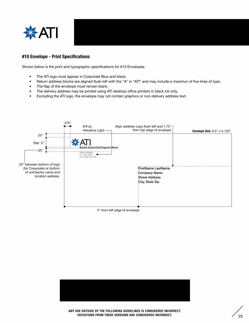
X. STATIONERY – G. #10 ENVELOPE
Point of Star locks up with Cap Height
Point of Star locks up with Base Line
The ATI logotype is based on Gill Sans Regular
Star is flush right with Base Cap Height
Allegheny Technologies Incorporated1000 Six PPG PlacePittsburgh, PA 15222-5479 U.S.A.
Street AddressP.O. Box 0000City, State Zip USA
Market Sector/Unit/Segment Name
Envelope Size: 9.5" x 4.125"
.375"Align address copy flush left and 1.75"
from top edge of envelope8/9 pt. Helvetica Light
Star .5"
.25"
4" from left edge of envelope
.25” between bottom of logo (for Corporate) or bottom of unit/sector name and
location address.
FirstName LastNameCompany Name Street Address City, State Zip
Envelope Paper Specification: Strathmore Writing #10. 24# Platinum White Wove.
(If the above-stated Strathmore Writing paper is not available, a close substitute may be specified, with approval from ATI Corporate. It must match the correspondingletterhead.)
#10 Envelope - Print Specifications
Shown below is the print and typographic specifications for #10 Envelopes.
• The ATI logo must appear in Corporate Blue and black.• Return address blocks are aligned flush left with the “A” in “ATI” and may include a maximun of five lines of type.• The flap of the envelope must remain blank.• The delivery address may be printed using ATI desktop office printers in black ink only.• Excluding the ATI logo, the envelope may not contain graphics or non-delivery address text.
.25"
26ANY USE OUTSIDE OF THE FOLLOWING GUIDELINES IS CONSIDERED INCORRECT.
DEVIATIONS FROM THESE VERSIONS ARE CONSIDERED INCORRECT.
XI. EMAIL SIGNATURE
Email Signature - Specifications
The example below shows the proper usage of the ATI logo and ATI employee name, title, address and phone number. This format is the standard throughout the company.
The ATI logo measures 3/4" from left side of star to the right side of the “I” in “ATI”.
“ATI” Height (.3341”)
.75"
Font: Times New RomanUsed for the name, title, address, phone number and extensionFont Size: 12 pt
FirstName LastNameTitleATI Market/Unit/Segment Name
AddressCity, State ZIPATImetals.com
T: 412-000-0000 Ext. 000F: 412-000-0000
Double Paragraph Break
Single Line Break
Single Paragraph Break
27ANY USE OUTSIDE OF THE FOLLOWING GUIDELINES IS CONSIDERED INCORRECT.
DEVIATIONS FROM THESE VERSIONS ARE CONSIDERED INCORRECT.
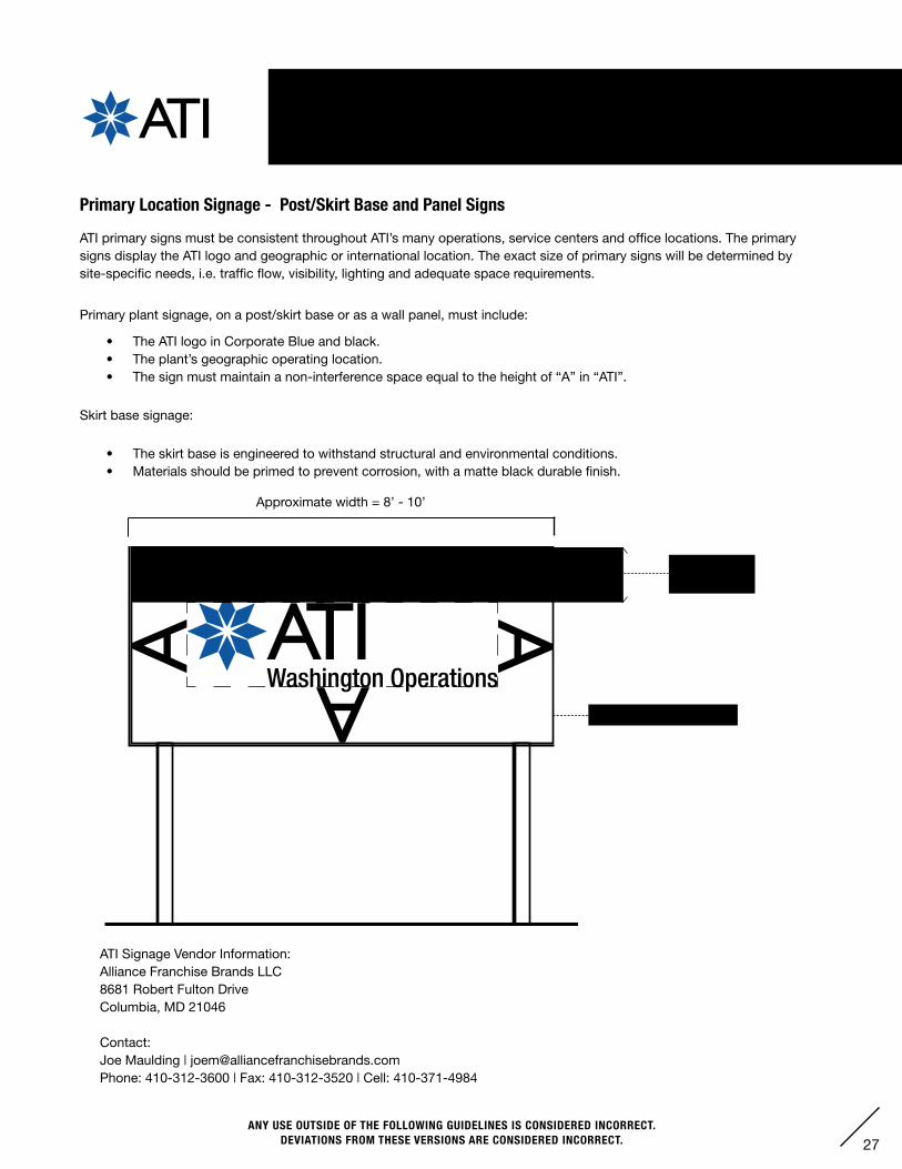
XII. SIGNAGE GUIDELINES
Primary Location Signage - Post/Skirt Base and Panel Signs
ATI primary signs must be consistent throughout ATI’s many operations, service centers and office locations. The primary signs display the ATI logo and geographic or international location. The exact size of primary signs will be determined by site-specific needs, i.e. traffic flow, visibility, lighting and adequate space requirements.
Primary plant signage, on a post/skirt base or as a wall panel, must include:
• The ATI logo in Corporate Blue and black.• The plant’s geographic operating location.• The sign must maintain a non-interference space equal to the height of “A” in “ATI”.
Skirt base signage:
• The skirt base is engineered to withstand structural and environmental conditions.• Materials should be primed to prevent corrosion, with a matte black durable finish.
Non-interference space
Approximate width = 8’ - 10’
Washington Operations
Height of “A”in “ATI”
ATI Signage Vendor Information:Alliance Franchise Brands LLC8681 Robert Fulton DriveColumbia, MD 21046
Contact:Joe Maulding | [email protected]: 410-312-3600 | Fax: 410-312-3520 | Cell: 410-371-4984
28ANY USE OUTSIDE OF THE FOLLOWING GUIDELINES IS CONSIDERED INCORRECT.
DEVIATIONS FROM THESE VERSIONS ARE CONSIDERED INCORRECT.
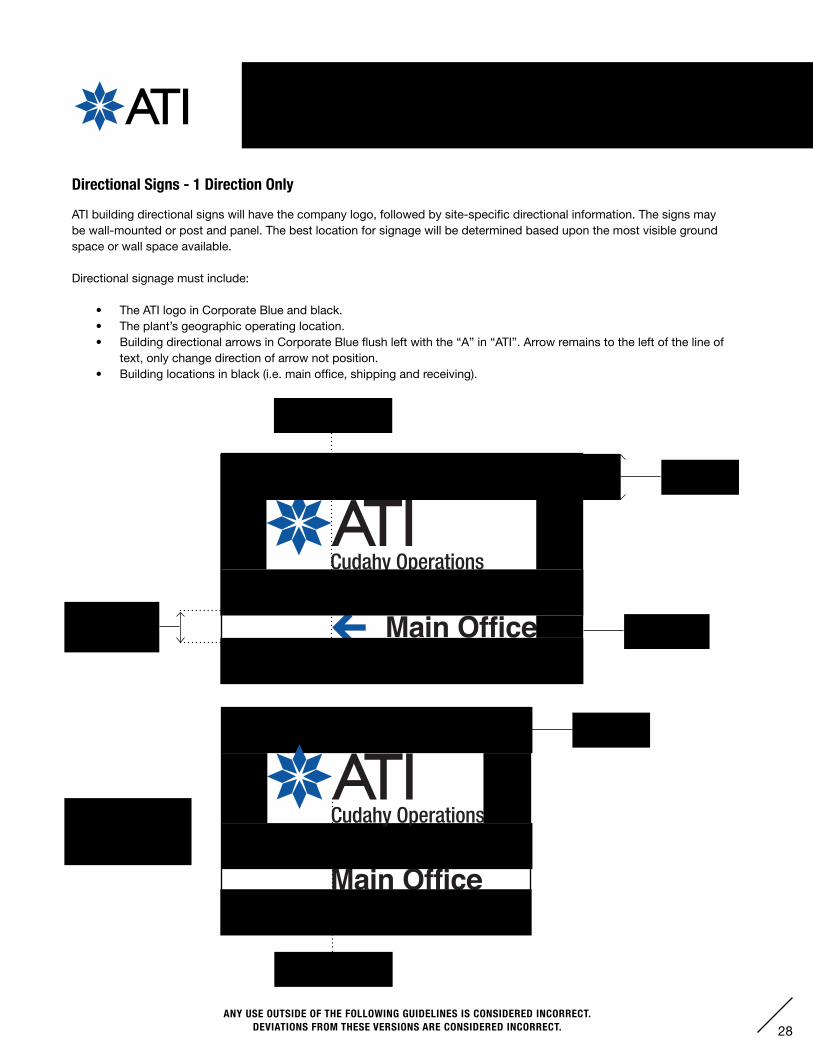
XII. SIGNAGE GUIDELINES
Directional Signs - 1 Direction Only
ATI building directional signs will have the company logo, followed by site-specific directional information. The signs may be wall-mounted or post and panel. The best location for signage will be determined based upon the most visible ground space or wall space available.
Directional signage must include:
• The ATI logo in Corporate Blue and black.• The plant’s geographic operating location.• Building directional arrows in Corporate Blue flush left with the “A” in “ATI”. Arrow remains to the left of the line of
text, only change direction of arrow not position.• Building locations in black (i.e. main office, shipping and receiving).
RowleyOperations
Purchasing
Main Office
Main OfficeWashington Operations
Albany Operations
Monroe Operations
Distribution Center
Vandergrift Operations
Shanghai Sales
Technical Center Cudahy Operations
Rowley Operations
Height of “A”in “ATI”
Font:Helvetica Bold
1.5 height ofbuilding location(i.e. Main Office)
At location, when a direction is no longer needed, align location with “A”
RowleyOperations
Purchasing
Main Office
Main Office
Align arrow flush left with “A” in “ATI”
Align location flush left with “A” in “ATI”
Height of “A”in “ATI”
Washington Operations
Albany Operations
Monroe Operations
Distribution Center
Vandergrift Operations
Shanghai Sales
Technical Center Cudahy Operations
Rowley Operations
29ANY USE OUTSIDE OF THE FOLLOWING GUIDELINES IS CONSIDERED INCORRECT.
DEVIATIONS FROM THESE VERSIONS ARE CONSIDERED INCORRECT.
XII. SIGNAGE GUIDELINES
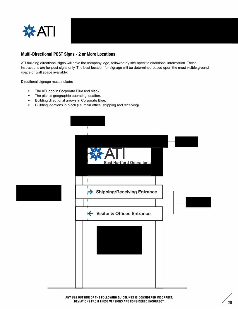
Multi-Directional POST Signs - 2 or More Locations
ATI building directional signs will have the company logo, followed by site-specific directional information. These instructions are for post signs only. The best location for signage will be determined based upon the most visible ground space or wall space available.
Directional signage must include:
• The ATI logo in Corporate Blue and black.• The plant’s geographic operating location.• Building directional arrows in Corporate Blue.• Building locations in black (i.e. main office, shipping and receiving).
Height of “A”in “ATI”
Font:Helvetica Bold
Align arrow flush left with logo
Location signs remain 3 sq. feet or less, to be placed underneath logo sign.
Only Multi-Drectional Post Signs will align arrows with logo instead of “A”, this is to better visually balance the space on all seperate signs.
30ANY USE OUTSIDE OF THE FOLLOWING GUIDELINES IS CONSIDERED INCORRECT.
DEVIATIONS FROM THESE VERSIONS ARE CONSIDERED INCORRECT.
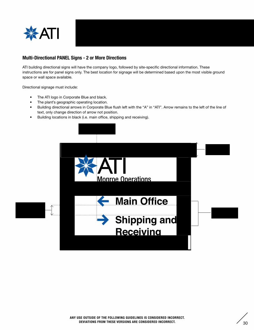
Multi-Directional PANEL Signs - 2 or More Directions
ATI building directional signs will have the company logo, followed by site-specific directional information. These instructions are for panel signs only. The best location for signage will be determined based upon the most visible ground space or wall space available.
Directional signage must include:
• The ATI logo in Corporate Blue and black.• The plant’s geographic operating location.• Building directional arrows in Corporate Blue flush left with the “A” in “ATI”. Arrow remains to the left of the line of
text, only change direction of arrow not position.• Building locations in black (i.e. main office, shipping and receiving).
Height of “A”in “ATI”
Font:Helvetica Bold
1.5 height ofbuilding location(i.e. Main Office)
Align arrow flush left with “A” in “ATI”
Shipping andReceiving
Monroe Operations
XII. SIGNAGE GUIDELINES
31ANY USE OUTSIDE OF THE FOLLOWING GUIDELINES IS CONSIDERED INCORRECT.
DEVIATIONS FROM THESE VERSIONS ARE CONSIDERED INCORRECT.
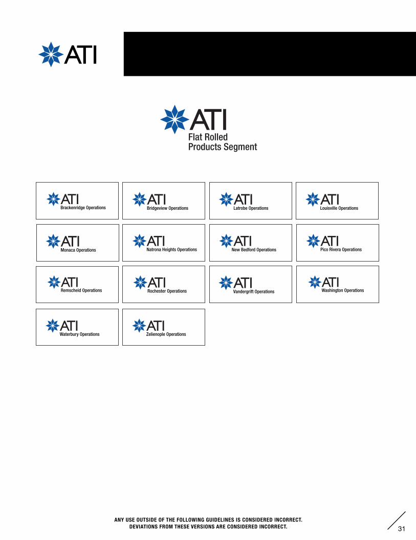
XIII. SEGMENT OPERATING LOCATIONS:FLAT ROLLED PRODUCTS
Washington Operations
Zelienople Operations
Rochester Operations
Brackenridge Operations Latrobe Operations
Remscheid Operations Vandergrift Operations
Waterbury Operations
Bridgeview Operations
New Bedford Operations
Louisville Operations
Pico Rivera OperationsMonaca Operations Natrona Heights Operations
Flat Rolled Products Segment
Flat Rolled Products Segment
High Performance Materials & Components Segment
Flat Rolled Products Segment
Flat Rolled Products Segment
High Performance Specialty Components Segment
32ANY USE OUTSIDE OF THE FOLLOWING GUIDELINES IS CONSIDERED INCORRECT.
DEVIATIONS FROM THESE VERSIONS ARE CONSIDERED INCORRECT.
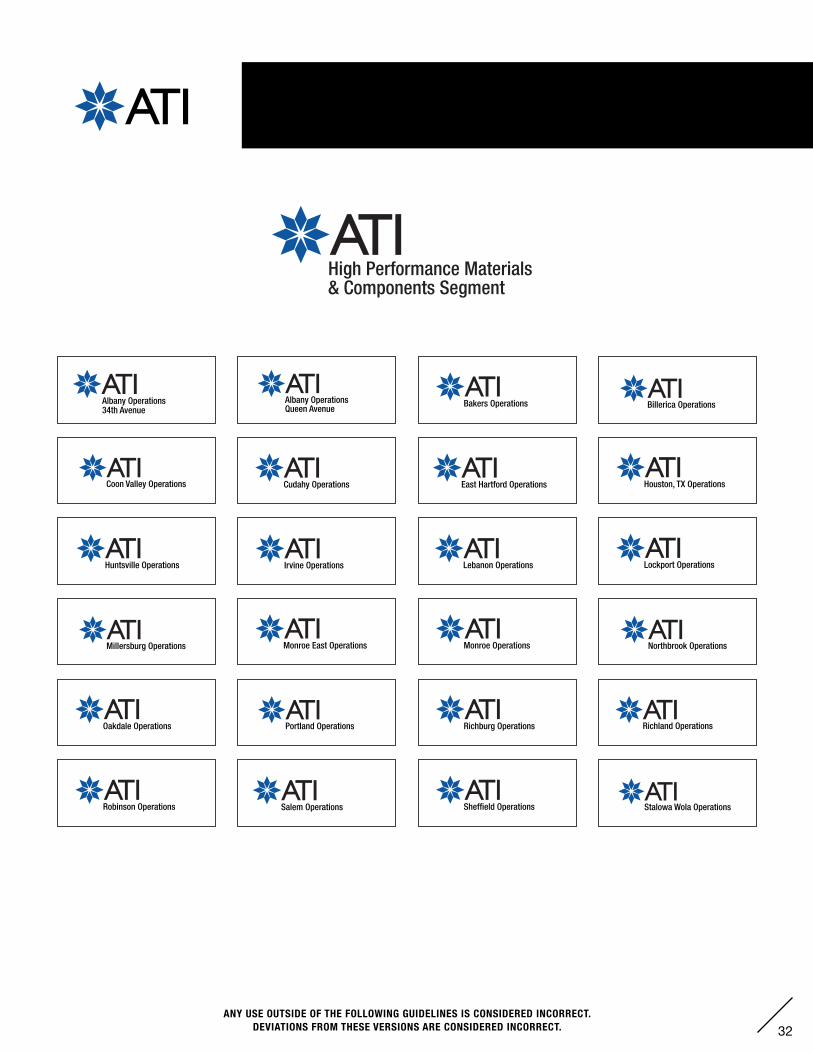
XIII. SEGMENT OPERATING LOCATIONS: HIGH PERFORMANCE MATERIALS & COMPONENTS
Flat Rolled Products Segment
Flat Rolled Products Segment
High Performance Materials & Components Segment
Flat Rolled Products Segment
Flat Rolled Products Segment
High Performance Specialty Components Segment
Salem Operations
Irvine Operations
East Hartford Operations
Stalowa Wola Operations
Portland Operations
Lebanon Operations
Millersburg Operations
Huntsville Operations
Richland Operations
Northbrook Operations
Albany Operations 34th Avenue
Albany Operations Queen Avenue
Bakers Operations
Houston, TX Operations
Lockport Operations
Monroe East Operations Monroe Operations
Oakdale Operations
Sheffield Operations
Richburg Operations
Robinson Operations
Billerica Operations
Coon Valley Operations Cudahy Operations
33ANY USE OUTSIDE OF THE FOLLOWING GUIDELINES IS CONSIDERED INCORRECT.
DEVIATIONS FROM THESE VERSIONS ARE CONSIDERED INCORRECT.
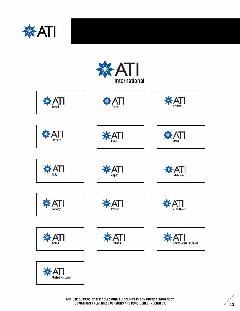
Japan
Germany India
Poland South Korea
China
Italy
United Kingdom
Norway
United Arab EmiratesTaiwan
France
Malaysia
Brazil
Spain
Israel
International
XIII. SEGMENT OPERATING LOCATIONS: INTERNATIONAL COUNTRIES
34ANY USE OUTSIDE OF THE FOLLOWING GUIDELINES IS CONSIDERED INCORRECT.
DEVIATIONS FROM THESE VERSIONS ARE CONSIDERED INCORRECT.
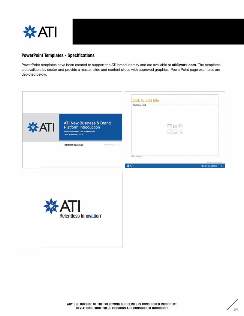
XIV. POWERPOINT TEMPLATES
PowerPoint Templates - Specifications
PowerPoint templates have been created to support the ATI brand identity and are available at [email protected]. The templates are available by sector and provide a master slide and content slides with approved graphics. PowerPoint page examples are depicted below.
35ANY USE OUTSIDE OF THE FOLLOWING GUIDELINES IS CONSIDERED INCORRECT.
DEVIATIONS FROM THESE VERSIONS ARE CONSIDERED INCORRECT.
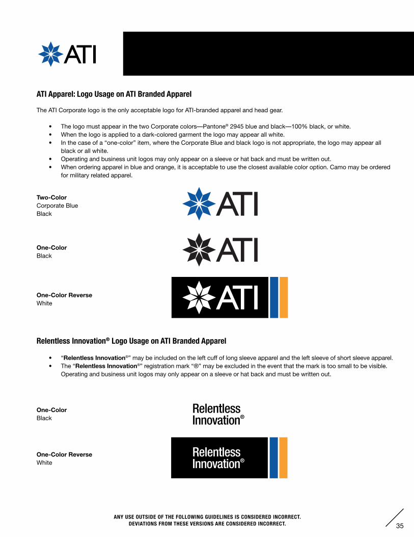
XV. APPAREL — LOGO USAGE
ATI Apparel: Logo Usage on ATI Branded Apparel
The ATI Corporate logo is the only acceptable logo for ATI-branded apparel and head gear.
• The logo must appear in the two Corporate colors—Pantone® 2945 blue and black—100% black, or white.• When the logo is applied to a dark-colored garment the logo may appear all white.• In the case of a “one-color” item, where the Corporate Blue and black logo is not appropriate, the logo may appear all
black or all white.• Operating and business unit logos may only appear on a sleeve or hat back and must be written out.• When ordering apparel in blue and orange, it is acceptable to use the closest available color option. Camo may be ordered
for military related apparel.
Two-ColorCorporate BlueBlack
One-Color ReverseWhite
One-ColorBlack
One-Color ReverseWhite
One-ColorBlack
Relentless Innovation® Logo Usage on ATI Branded Apparel
• “Relentless Innovation®” may be included on the left cuff of long sleeve apparel and the left sleeve of short sleeve apparel.• The “Relentless Innovation®” registration mark “®” may be excluded in the event that the mark is too small to be visible. Operating and business unit logos may only appear on a sleeve or hat back and must be written out.
36ANY USE OUTSIDE OF THE FOLLOWING GUIDELINES IS CONSIDERED INCORRECT.
DEVIATIONS FROM THESE VERSIONS ARE CONSIDERED INCORRECT.
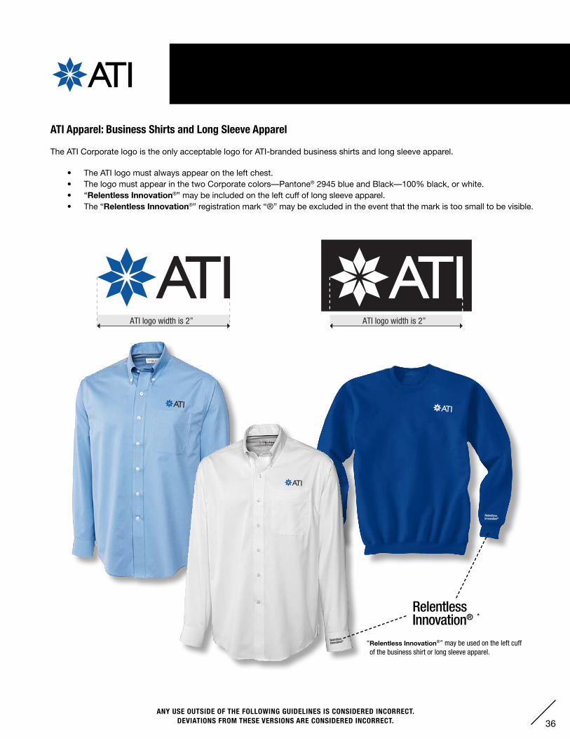
“Relentless Innovation®” may be used on the left cuff of the business shirt or long sleeve apparel.
XV. APPAREL — LONG SLEEVE APPAREL
ATI logo width is 2” ATI logo width is 2”
ATI Apparel: Business Shirts and Long Sleeve Apparel
The ATI Corporate logo is the only acceptable logo for ATI-branded business shirts and long sleeve apparel.
• The ATI logo must always appear on the left chest.• The logo must appear in the two Corporate colors—Pantone® 2945 blue and Black—100% black, or white.• “Relentless Innovation®” may be included on the left cuff of long sleeve apparel.• The “Relentless Innovation®” registration mark “®” may be excluded in the event that the mark is too small to be visible.
*
37ANY USE OUTSIDE OF THE FOLLOWING GUIDELINES IS CONSIDERED INCORRECT.
DEVIATIONS FROM THESE VERSIONS ARE CONSIDERED INCORRECT.
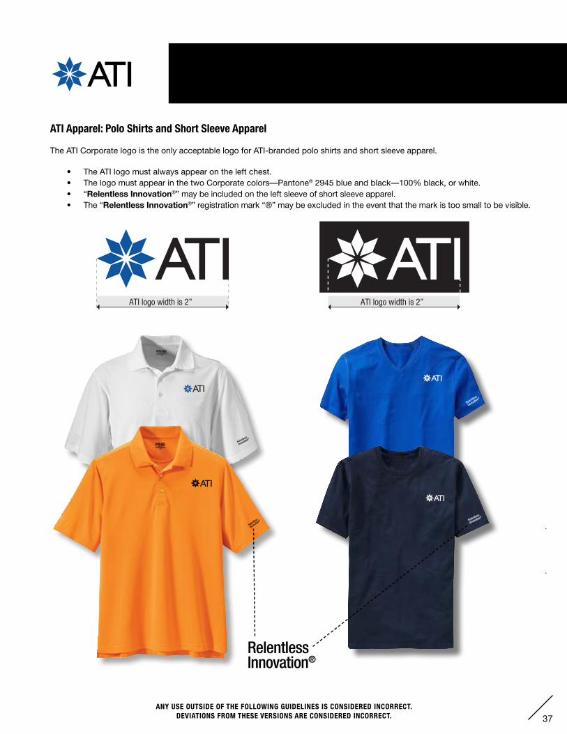
XV. APPAREL — SHORT SLEEVE APPAREL
ATI Apparel: Polo Shirts and Short Sleeve Apparel
The ATI Corporate logo is the only acceptable logo for ATI-branded polo shirts and short sleeve apparel.
• The ATI logo must always appear on the left chest.• The logo must appear in the two Corporate colors—Pantone® 2945 blue and black—100% black, or white.• “Relentless Innovation®” may be included on the left sleeve of short sleeve apparel.• The “Relentless Innovation®” registration mark “®” may be excluded in the event that the mark is too small to be visible.
ATI logo width is 2” ATI logo width is 2”
38ANY USE OUTSIDE OF THE FOLLOWING GUIDELINES IS CONSIDERED INCORRECT.
DEVIATIONS FROM THESE VERSIONS ARE CONSIDERED INCORRECT.
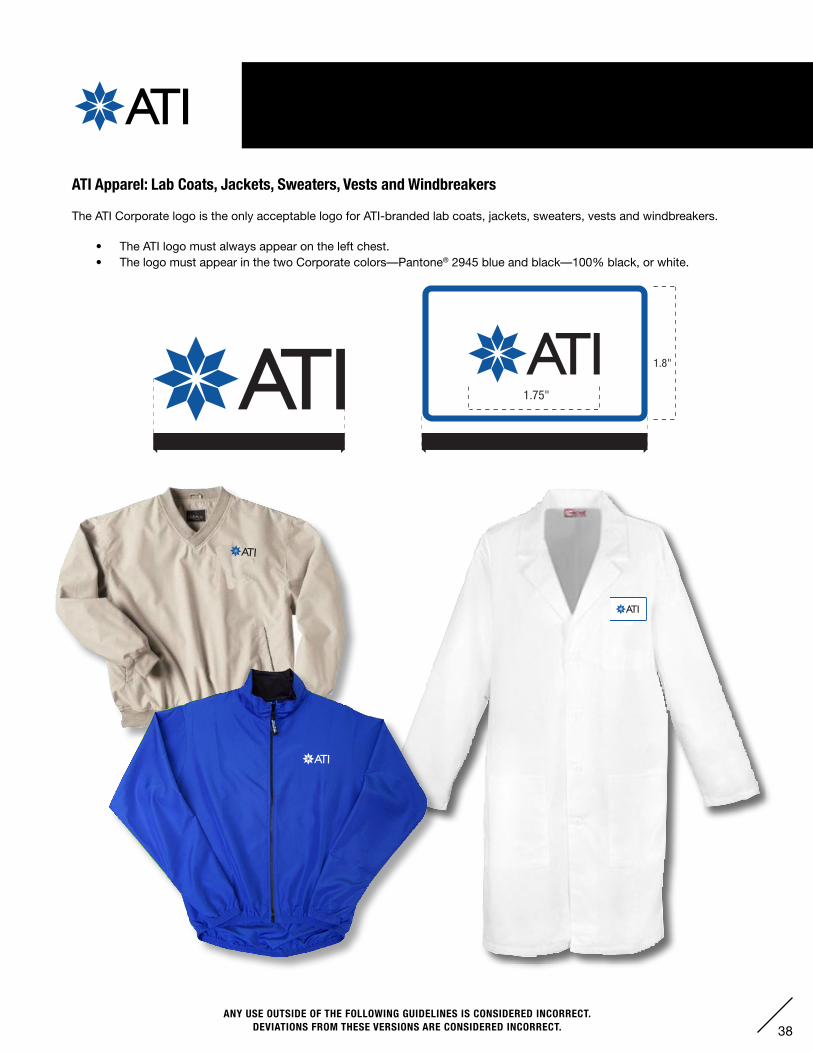
XV. APPAREL — OUTERWEAR
ATI Apparel: Lab Coats, Jackets, Sweaters, Vests and Windbreakers
The ATI Corporate logo is the only acceptable logo for ATI-branded lab coats, jackets, sweaters, vests and windbreakers.
• The ATI logo must always appear on the left chest.• The logo must appear in the two Corporate colors—Pantone® 2945 blue and black—100% black, or white.
ATI logo patch width is 3” ATI logo width is 2.25”
1.8"
1.75"
39ANY USE OUTSIDE OF THE FOLLOWING GUIDELINES IS CONSIDERED INCORRECT.
DEVIATIONS FROM THESE VERSIONS ARE CONSIDERED INCORRECT.
Option 2Relentless Innovation width is 2.5”
Option 1ATI logo width is 2.5”
Option 3Segment Operating Location width is 2.5”
Option 2Relentless Innovation width is 2.5”
Option 1ATI logo width is 2.5”
Option 3Segment Operating Location width is 2.5”
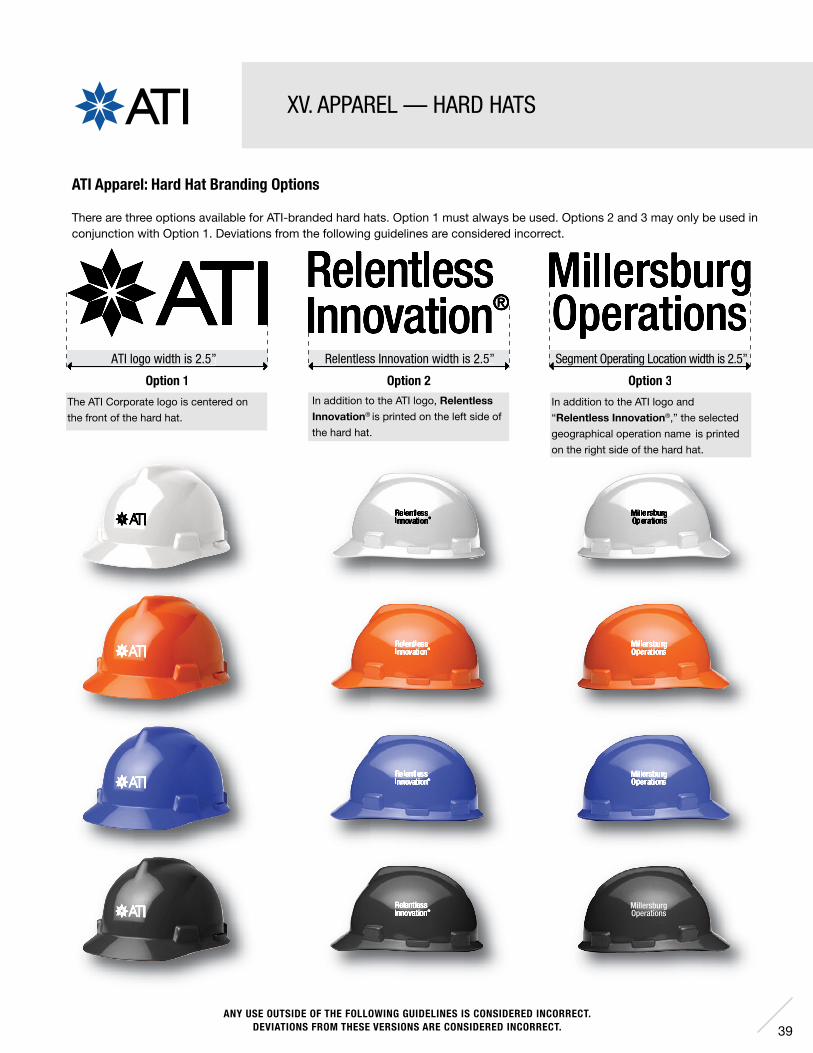
XV. APPAREL — HARD HATS
The ATI Corporate logo is centered on
the front of the hard hat.
In addition to the ATI logo, Relentless Innovation® is printed on the left side of
the hard hat.
In addition to the ATI logo and
“Relentless Innovation®,” the selected
geographical operation name is printed
on the right side of the hard hat.
ATI Apparel: Hard Hat Branding Options
There are three options available for ATI-branded hard hats. Option 1 must always be used. Options 2 and 3 may only be used inconjunction with Option 1. Deviations from the following guidelines are considered incorrect.
40ANY USE OUTSIDE OF THE FOLLOWING GUIDELINES IS CONSIDERED INCORRECT.
DEVIATIONS FROM THESE VERSIONS ARE CONSIDERED INCORRECT.
Cudahy Operations
Cudahy Operations
CudahyOperations
CudahyOperations
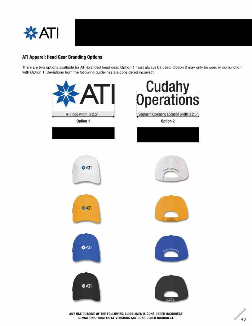
Option 1ATI logo width is 2.5”
Option 2Segment Operating Location width is 2.5”
XV. APPAREL — HEAD GEAR
ATI Apparel: Head Gear Branding Options
There are two options available for ATI-branded head gear. Option 1 must always be used. Option 2 may only be used in conjunction with Option 1. Deviations from the following guidelines are considered incorrect.
The ATI Corporate logo is centered on
the front of the head gear.
In addition to the ATI logo, the segment
operating location is placed on the sizing
strap or directly above it on the body.
ATI Corporate Headquarters1000 Six PPG Place Pittsburgh, PA 15222-5479USA
412-394-2800ATImetals.com
AMERICASUSA - Brazil
EUROPEUK - Germany - France - Italy - Spain - Norway - Poland
ASIA PACIFIC / EAST ASIAJapan - China - Singapore - Taiwan - South Korea - India
MIDDLE EASTIsrael - Dubai
We believe in Creating Long-Term Value Thru Relentless Innovation®. This commitment has resulted in the industry’s most advanced production capabilities for specialty materials and components.ATImetals.com
Innovation that creates value
ANY DEVIATIONS FROM THESE VERSIONS ARE CONSIDERED INCORRECT, UNLESS COMPLETED BY THE ATI COMMERCIAL MARKETING OR SUBMITTED TO AND APPROVED BY THE ATI COMMERCIAL MARKETING PRIOR TO EXECUTION.