Embed Size (px)
Citation preview
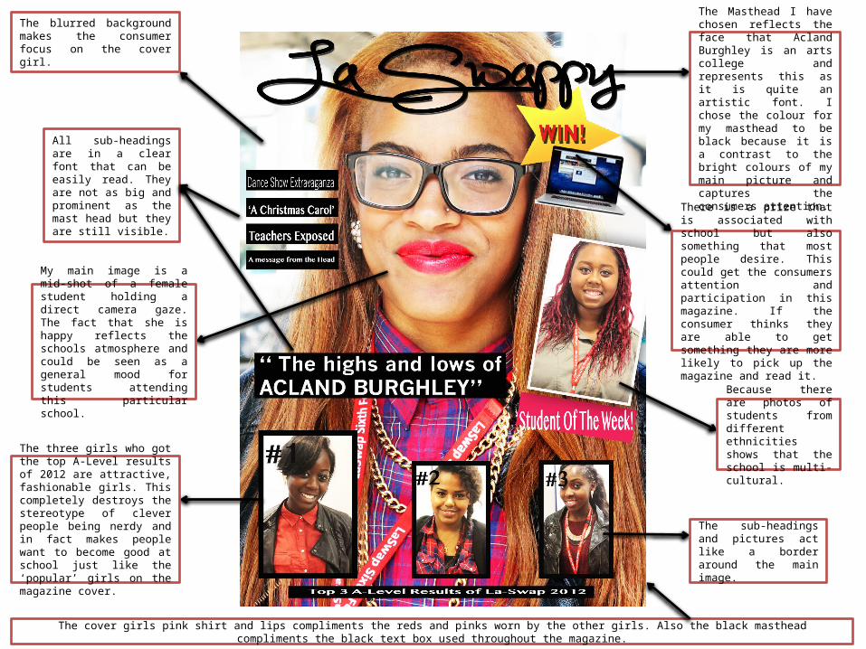
The Masthead I have chosen reflects the face that Acland Burghley is an arts college and represents this as it is quite an artistic font. I chose the colour for my masthead to be black because it is a contrast to the bright colours of my main picture and captures the consumers attention.
My main image is a mid-shot of a female student holding a direct camera gaze. The fact that she is happy reflects the schools atmosphere and could be seen as a general mood for students attending this particular school.
Because there are photos of students from different ethnicities shows that the school is multi-cultural.
There is a prize that is associated with school but also something that most people desire. This could get the consumers attention and participation in this magazine. If the consumer thinks they are able to get something they are more likely to pick up the magazine and read it.
The blurred background makes the consumer focus on the cover girl.
All sub-headings are in a clear font that can be easily read. They are not as big and prominent as the mast head but they are still visible.
The sub-headings and pictures act like a border around the main image.
The three girls who got the top A-Level results of 2012 are attractive, fashionable girls. This completely destroys the stereotype of clever people being nerdy and in fact makes people want to become good at school just like the ‘popular’ girls on the magazine cover.
The cover girls pink shirt and lips compliments the reds and pinks worn by the other girls. Also the black masthead compliments the black text box used throughout the magazine.
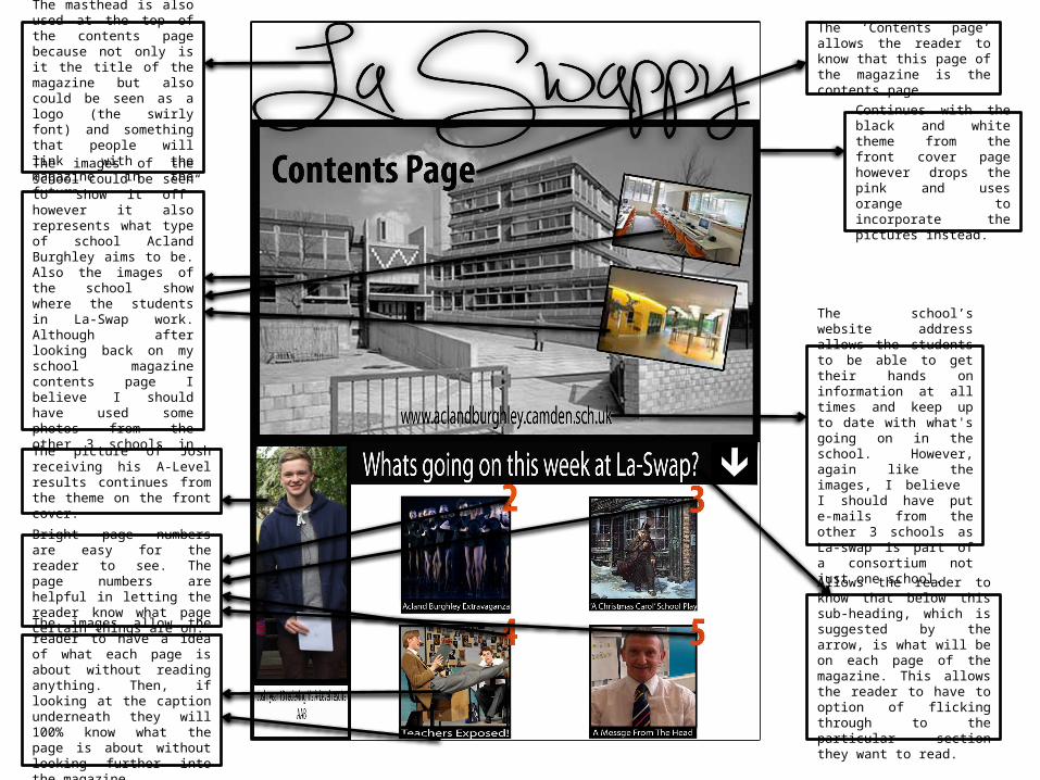
The school’s website address allows the students to be able to get their hands on information at all times and keep up to date with what's going on in the school. However, again like the images, I believe I should have put e-mails from the other 3 schools as La-swap is part of a consortium not just one school.
Continues with the black and white theme from the front cover page however drops the pink and uses orange to incorporate the pictures instead.
The masthead is also used at the top of the contents page because not only is it the title of the magazine but also could be seen as a logo (the swirly font) and something that people will link with the magazine in the future.
The images of the school could be seen to “show it off” however it also represents what type of school Acland Burghley aims to be. Also the images of the school show where the students in La-Swap work. Although after looking back on my school magazine contents page I believe I should have used some photos from the other 3 schools in the consortium.
The picture of Josh receiving his A-Level results continues from the theme on the front cover.
The ‘Contents page’ allows the reader to know that this page of the magazine is the contents page.
Allows the reader to know that below this sub-heading, which is suggested by the arrow, is what will be on each page of the magazine. This allows the reader to have to option of flicking through to the particular section they want to read.
Bright page numbers are easy for the reader to see. The page numbers are helpful in letting the reader know what page certain things are on.
The images allow the reader to have a idea of what each page is about without reading anything. Then, if looking at the caption underneath they will 100% know what the page is about without looking further into the magazine.