Embed Size (px)
DESCRIPTION
Presenting Data in Tables & Charts. Organizing Numerical Data. Data with 20 or more observations should be organized. The Ordered Array : arranges raw data in order from the smallest observation to the largest observation. Raw Data Arranged in an Ordered Array. - PowerPoint PPT Presentation
Citation preview

Presenting Data in Tables & Charts
Organizing Numerical Data
Data with 20 or more observations should be organized
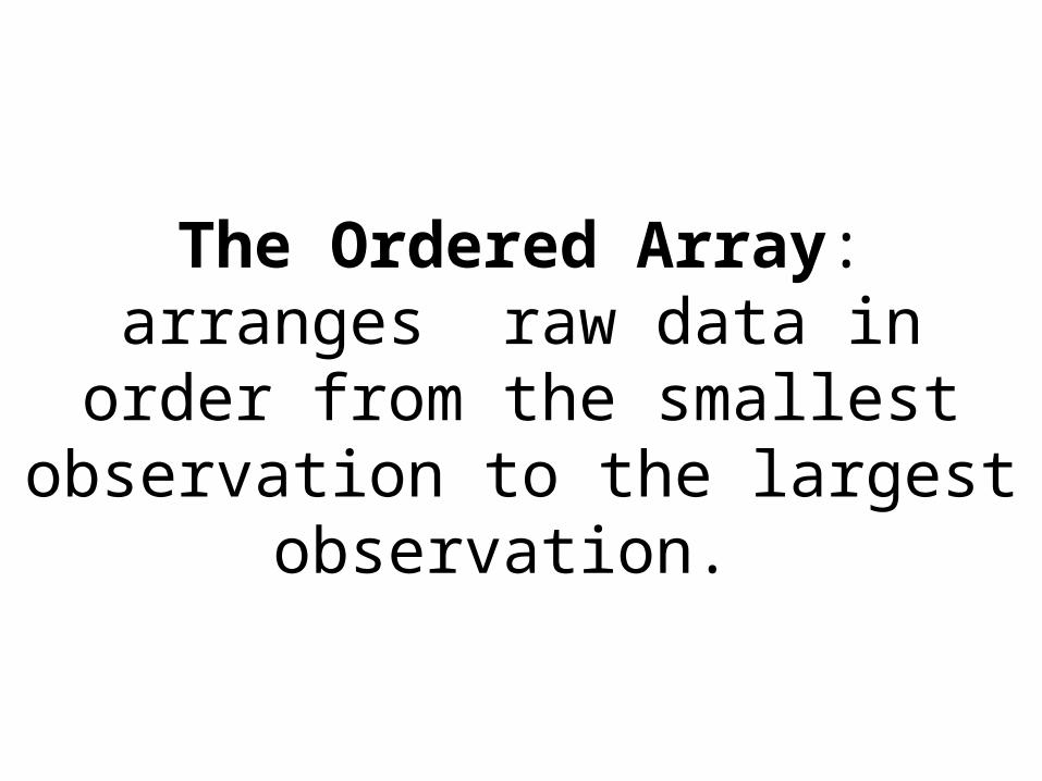
The Ordered Array: arranges raw data in order from the smallest
observation to the largest observation.
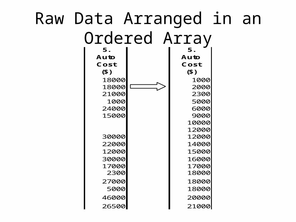
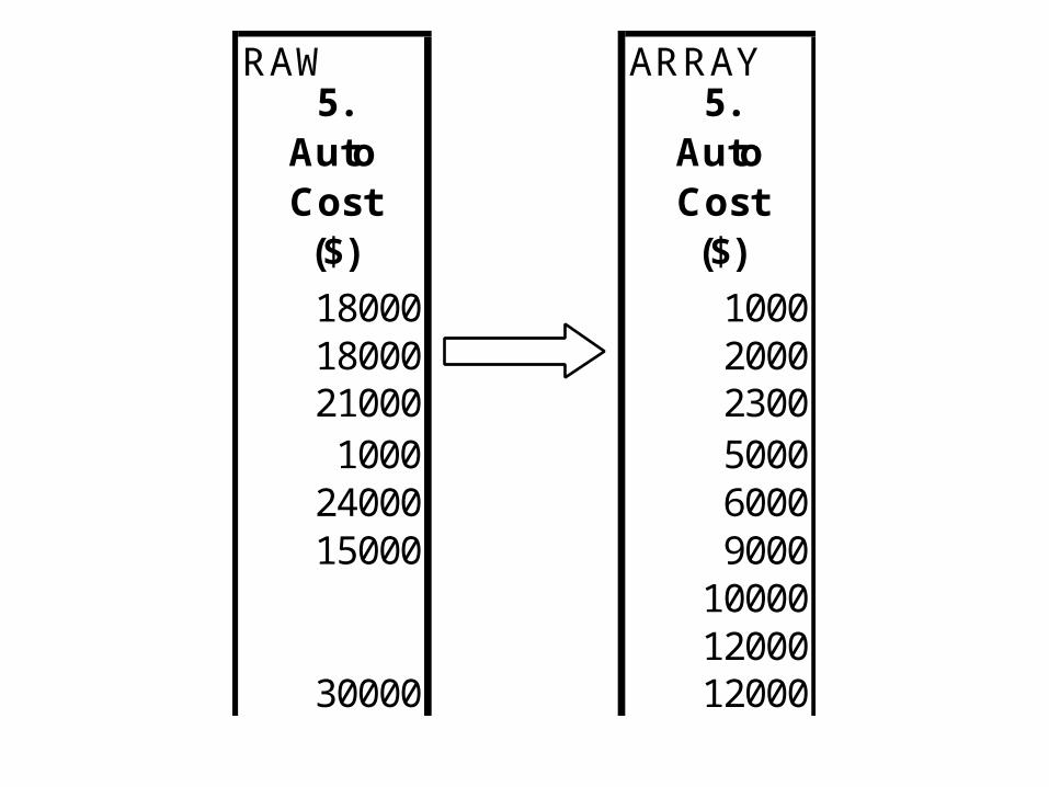
Raw Data Arranged in an Ordered Array
5. Auto Cost($)
5. Auto Cost($)
18000 100018000 200021000 23001000 5000
24000 600015000 9000
1000012000
30000 1200022000 1400012000 1500030000 1600017000 170002300 18000
27000 180005000 18000
46000 20000
26500 21000
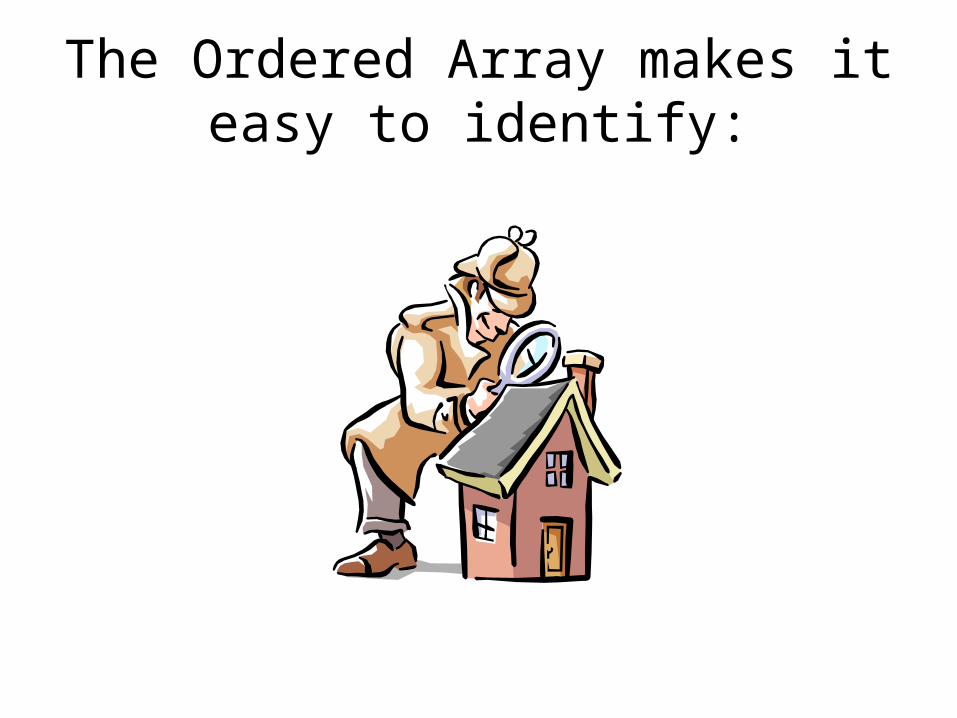
The Ordered Array makes it easy to identify:
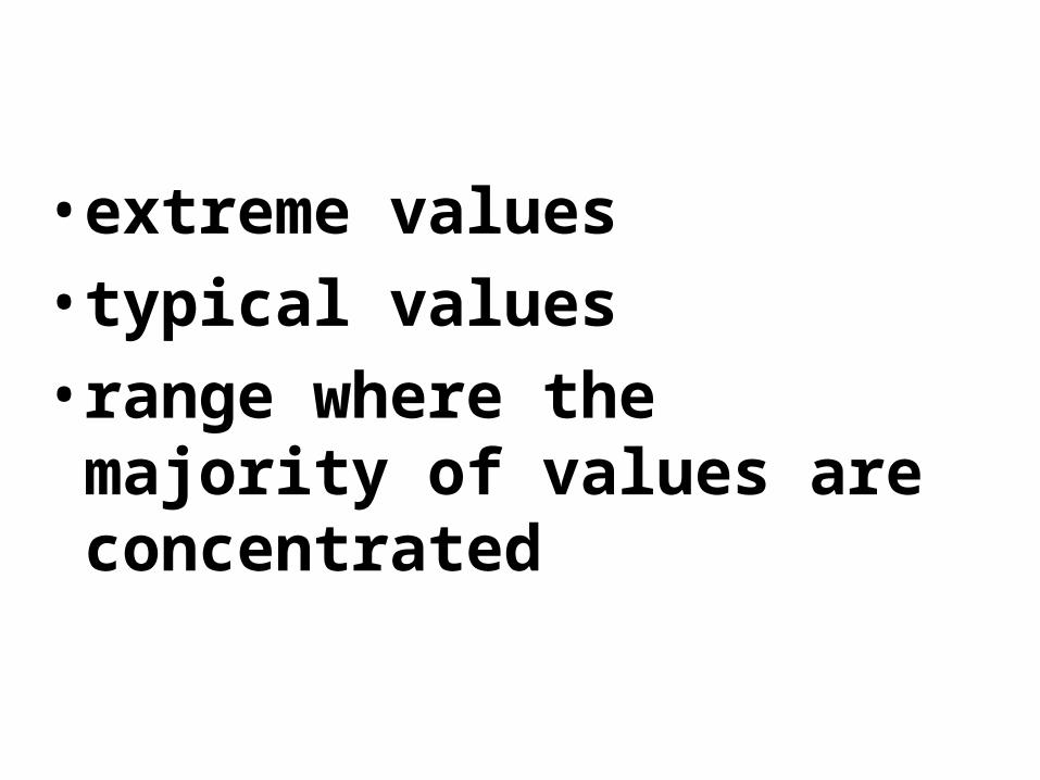
• extreme values
• typical values
• range where the majority of values are concentrated
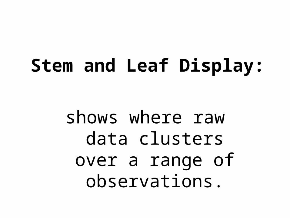
Stem and Leaf Display:
shows where raw data clusters over a range
of observations.
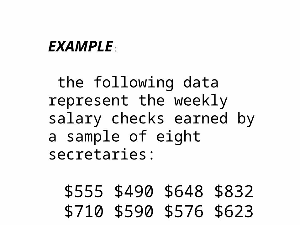
EXAMPLE:
the following data represent the weekly salary checks earned by a sample of eight secretaries:
$555 $490 $648 $832$710 $590 $576 $623
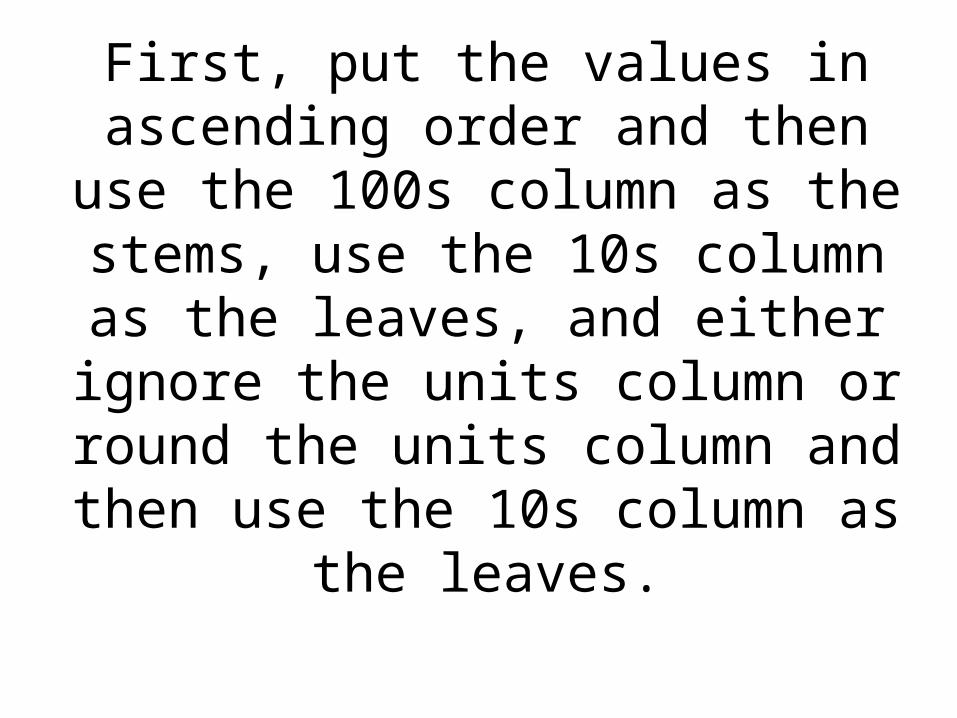
First, put the values in ascending order and then use the 100s column as the stems, use the 10s column as
the leaves, and either ignore the units column or round the units
column and then use the 10s column as the leaves.
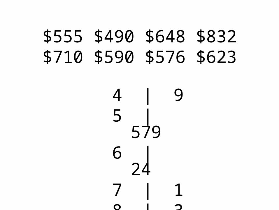
$555 $490 $648 $832 $710 $590 $576 $623
4 | 95 | 5796 | 247 | 18 | 3
To further illustrate, how we can organize data to present, analyze
and interpret findings,
we will study data from a previous QBA questionnaire:
1) USD students’ auto costs
• 2) USD students’ maximum auto speeds
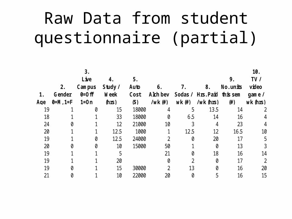
Raw Data from student questionnaire (partial)
1.Age
2.Gender
0=M, 1=F
3.Live
Campus0=Off 1=On
4.Study / Week (hrs)
5. Auto Cost($)
6.Alch bev / wk (#)
7.Sodas / wk (#)
8.Hrs. Paid / wk (hrs)
9.No. units this sem
(#)
10.TV /
video game /
wk (hrs)19 1 0 15 18000 4 5 13.5 14 218 1 1 33 18000 0 6.5 14 16 424 0 1 12 21000 10 3 4 23 420 1 1 12.5 1000 1 12.5 12 16.5 1019 1 0 12.5 24000 2 0 20 17 520 0 0 10 15000 50 1 0 13 319 1 1 5 21 0 18 16 1419 1 1 20 0 2 0 17 219 0 1 15 30000 2 13 0 16 2021 0 1 10 22000 20 0 5 16 15
RAW ARRAY5.
Auto Cost($)
5. Auto Cost($)
18000 100018000 200021000 23001000 5000
24000 600015000 9000
1000012000
30000 12000
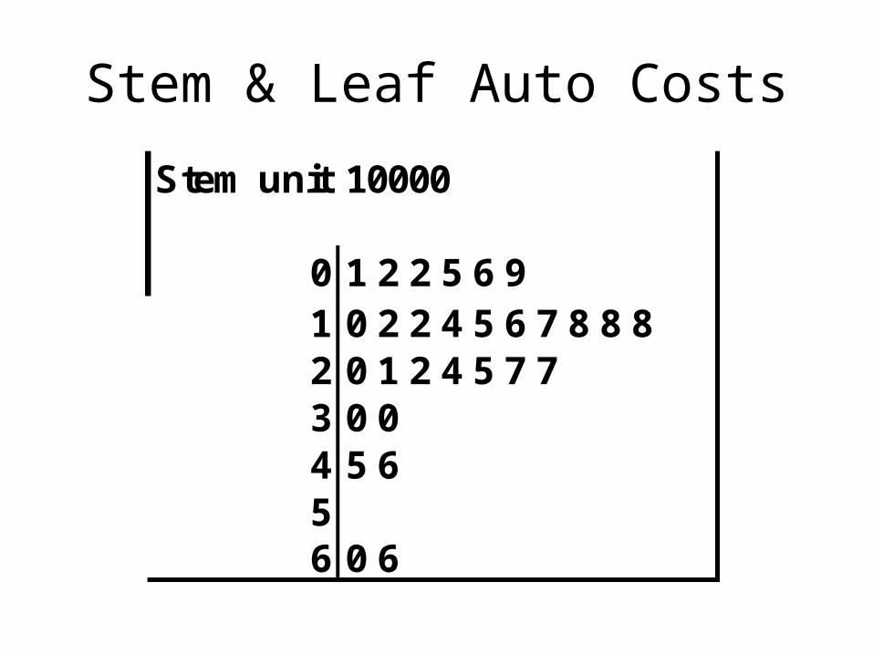
Stem & Leaf Auto Costs
Stem unit:10000
0 1 2 2 5 6 91 0 2 2 4 5 6 7 8 8 82 0 1 2 4 5 7 73 0 04 5 656 0 6
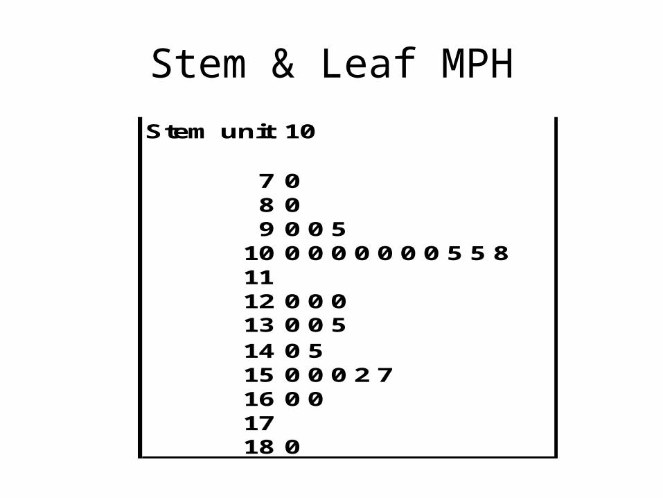
Stem & Leaf MPH
Stem unit:10
7 08 09 0 0 5
10 0 0 0 0 0 0 0 5 5 81112 0 0 013 0 0 514 0 515 0 0 0 2 716 0 01718 0
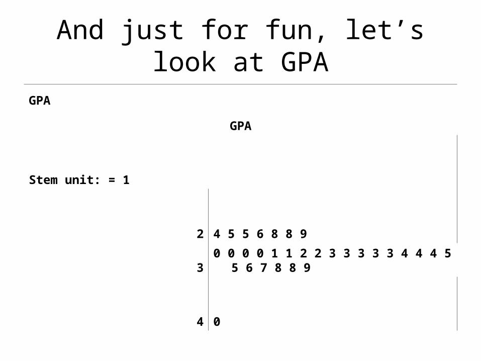
And just for fun, let’s look at GPA
GPA
GPA
Stem unit: = 1
2 4 5 5 6 8 8 9
3 0 0 0 0 1 1 2 2 3 3 3 3 3 4 4 4 5 5 6 7 8 8 9
4 0

How Else Can We Organize our Data?
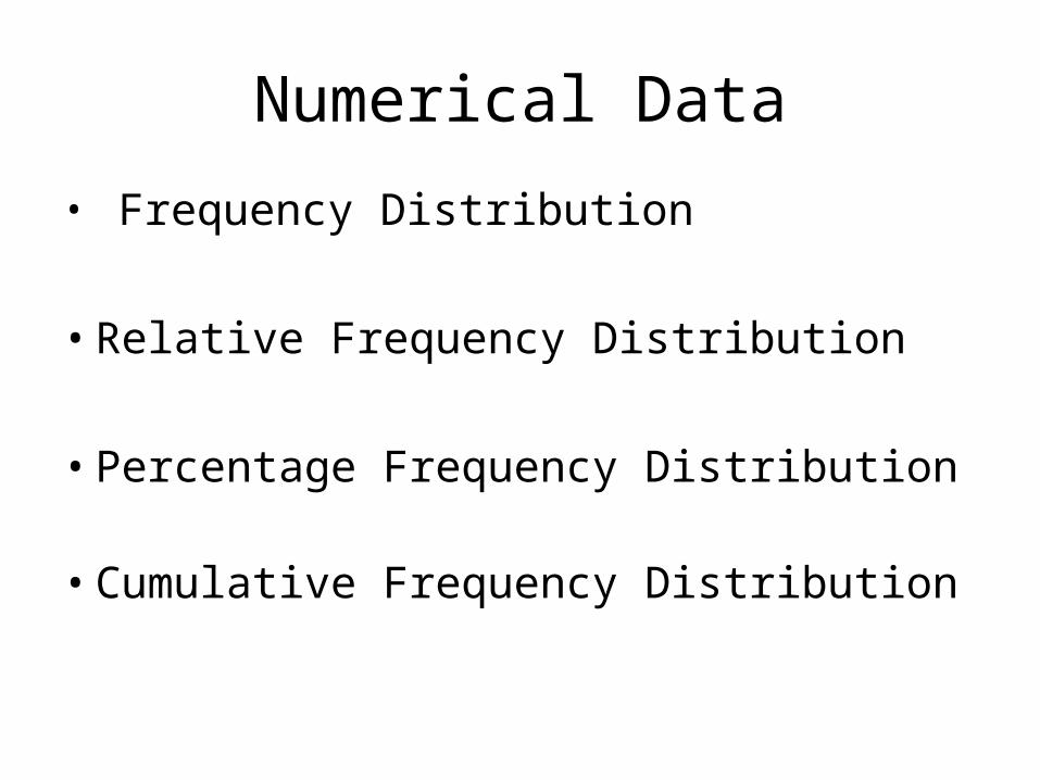
Numerical Data
• Frequency Distribution
• Relative Frequency Distribution
• Percentage Frequency Distribution
• Cumulative Frequency Distribution
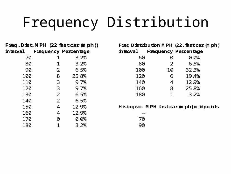
Frequency Distribution
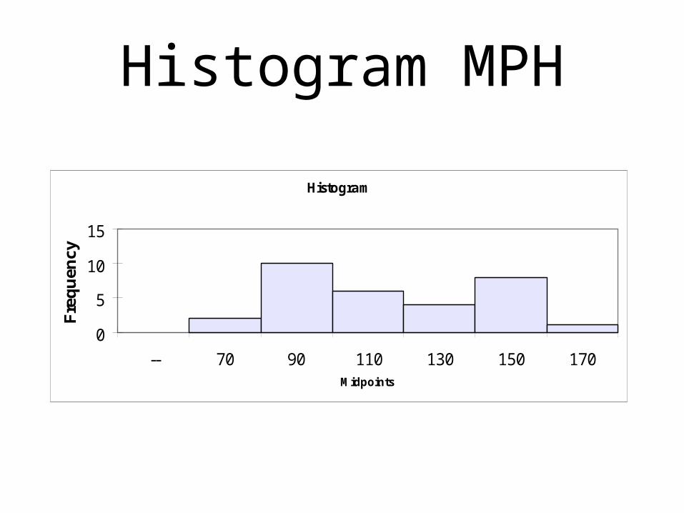
interval Frequency Percentage interval Frequency Percentage
70 1 3.2% 60 0 0.0%80 1 3.2% 80 2 6.5%90 2 6.5% 100 10 32.3%
100 8 25.8% 120 6 19.4%110 3 9.7% 140 4 12.9%120 3 9.7% 160 8 25.8%130 2 6.5% 180 1 3.2%140 2 6.5%150 4 12.9%160 4 12.9% --170 0 0.0% 70180 1 3.2% 90
Histogram MPH fast car (mph) midpoints
Freq Distribution MPH (22. fast car (mph)Freq. Dist. MPH (22 fast car (mph))
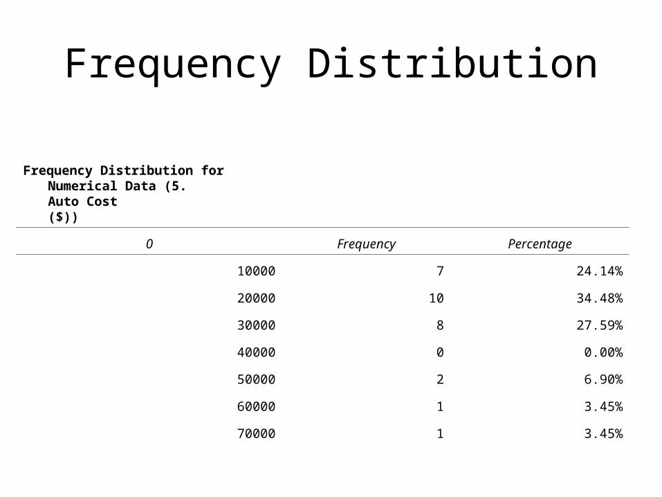
Frequency Distribution
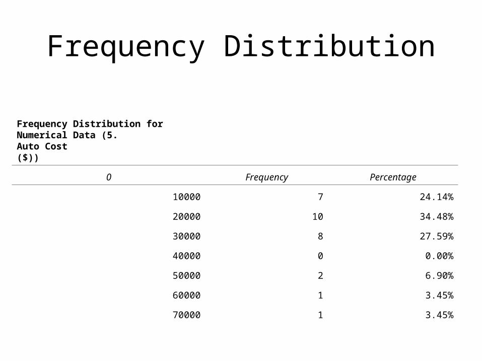
Frequency Distribution for Numerical Data (5. Auto Cost($))
0 Frequency Percentage
10000 7 24.14%
20000 10 34.48%
30000 8 27.59%
40000 0 0.00%
50000 2 6.90%
60000 1 3.45%
70000 1 3.45%
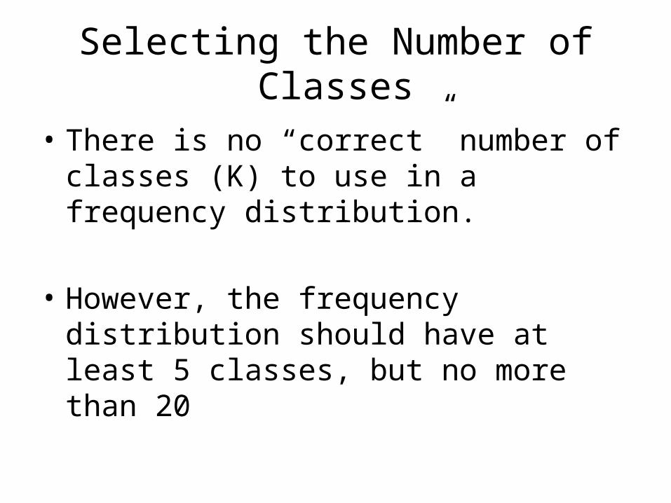
Selecting the Number of Classes
• There is no “correct” number of classes (K) to use in a frequency distribution.
• However, the frequency distribution should have at least 5 classes, but no more than 20
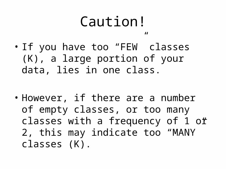
Caution!
• If you have too “FEW” classes (K), a large portion of your data, lies in one class.
• However, if there are a number of empty classes, or too many classes with a frequency of 1 or 2, this may indicate too “MANY” classes (K).
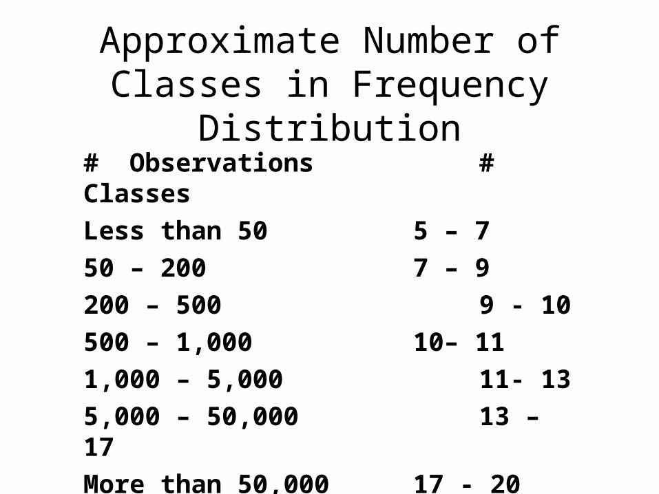
Approximate Number of Classes in Frequency Distribution
# Observations # Classes
Less than 50 5 – 7
50 – 200 7 – 9
200 – 500 9 - 10
500 – 1,000 10– 11
1,000 – 5,000 11- 13
5,000 – 50,000 13 – 17
More than 50,000 17 - 20
What do you gain by organizing your data in a Frequency
Distribution?

Hint!From pages of raw data
Answer
• Reduce large numbers of data points to a workable number of classes and frequencies.
• Study the frequency distribution and learn a great deal about the shape of the data set.

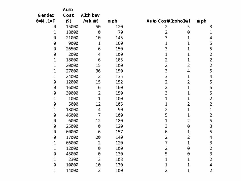
Raw Data from student questionnaire (partial)
1.Age
2.Gender
0=M, 1=F
3.Live
Campus0=Off 1=On
4.Study / Week (hrs)
5. Auto Cost($)
6.Alch bev / wk (#)
7.Sodas / wk (#)
8.Hrs. Paid / wk (hrs)
9.No. units this sem
(#)
10.TV /
video game /
wk (hrs)19 1 0 15 18000 4 5 13.5 14 218 1 1 33 18000 0 6.5 14 16 424 0 1 12 21000 10 3 4 23 420 1 1 12.5 1000 1 12.5 12 16.5 1019 1 0 12.5 24000 2 0 20 17 520 0 0 10 15000 50 1 0 13 319 1 1 5 21 0 18 16 1419 1 1 20 0 2 0 17 219 0 1 15 30000 2 13 0 16 2021 0 1 10 22000 20 0 5 16 15

Frequency Distribution
interval Frequency Percentage interval Frequency Percentage
70 1 3.2% 60 0 0.0%80 1 3.2% 80 2 6.5%90 2 6.5% 100 10 32.3%
100 8 25.8% 120 6 19.4%110 3 9.7% 140 4 12.9%120 3 9.7% 160 8 25.8%130 2 6.5% 180 1 3.2%140 2 6.5%150 4 12.9%160 4 12.9% --170 0 0.0% 70180 1 3.2% 90
Histogram MPH fast car (mph) midpoints
Freq Distribution MPH (22. fast car (mph)Freq. Dist. MPH (22 fast car (mph))
Frequency Distribution
Frequency Distribution for Numerical Data (5. Auto Cost($))
0 Frequency Percentage
10000 7 24.14%
20000 10 34.48%
30000 8 27.59%
40000 0 0.00%
50000 2 6.90%
60000 1 3.45%
70000 1 3.45%
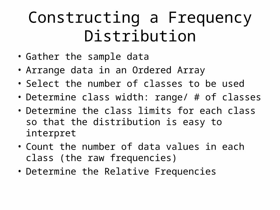
Constructing a Frequency Distribution
• Gather the sample data• Arrange data in an Ordered Array• Select the number of classes to be used• Determine class width: range/ # of classes• Determine the class limits for each class so that
the distribution is easy to interpret• Count the number of data values in each class
(the raw frequencies)• Determine the Relative Frequencies
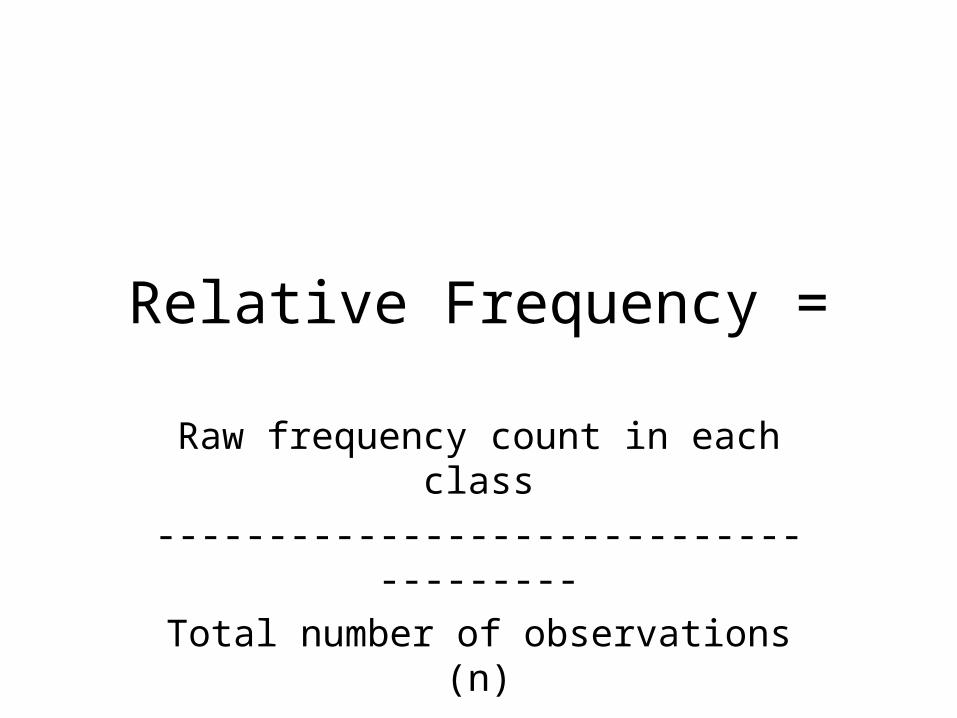
Relative Frequency =
Raw frequency count in each class
--------------------------------------
Total number of observations (n)
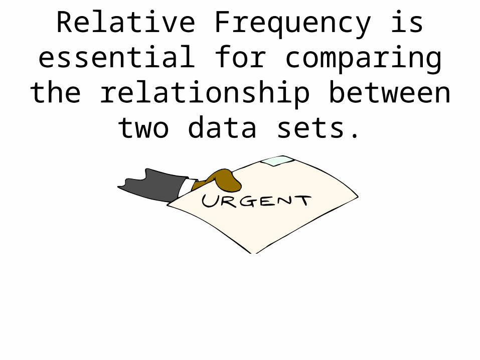
Relative Frequency is essential for comparing the relationship
between two data sets.
To Convert Relative Frequency to Percent Frequency:
Multiply Relative Frequency X 100
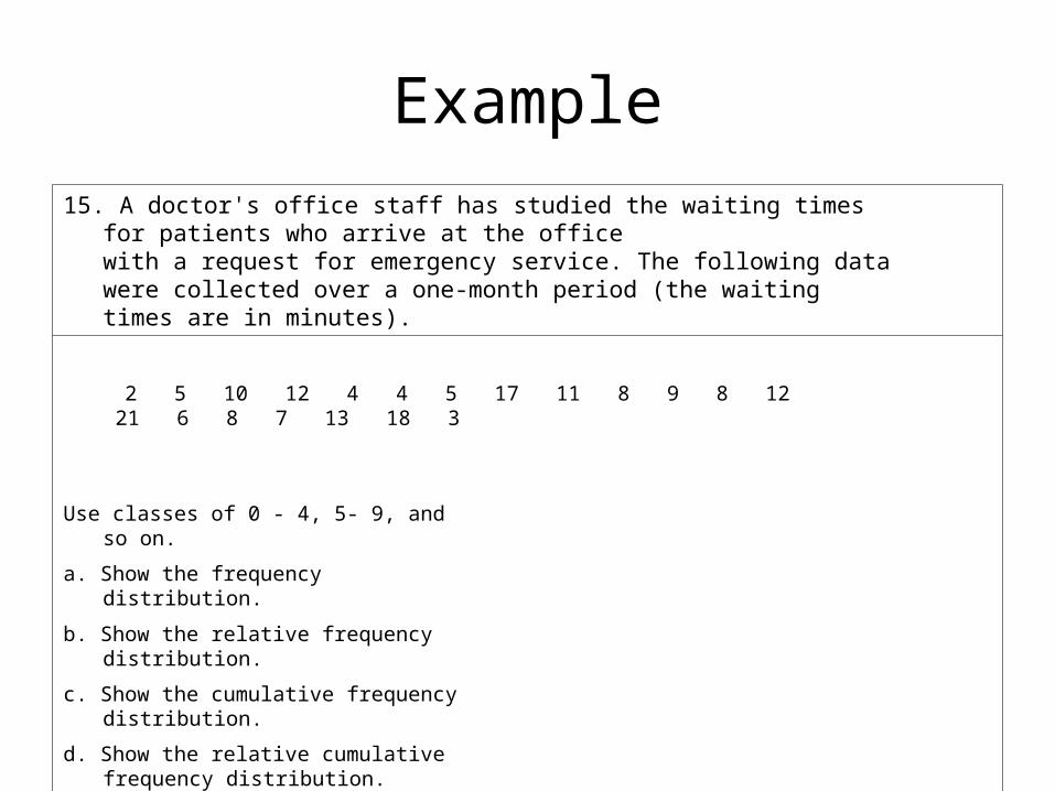
Example
15. A doctor's office staff has studied the waiting times for patients who arrive at the office with a request for emergency service. The following data were collected over a one-month period (the waiting times are in minutes).
2 5 10 12 4 4 5 17 11 8 9 8 12 21 6 8 7 13 18 3
Use classes of 0 - 4, 5- 9, and so on.
a. Show the frequency distribution.
b. Show the relative frequency distribution.
c. Show the cumulative frequency distribution.
d. Show the relative cumulative frequency distribution.
How Else Can We Organize our Data?
Graphic Techniques to Describe Numerical Data
1) Histogram (continuous data)
2) Polygon
3) Ogive
4) Scattergram
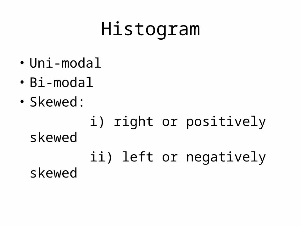
Histogram
• Uni-modal
• Bi-modal
• Skewed:
i) right or positively skewed
ii) left or negatively skewed
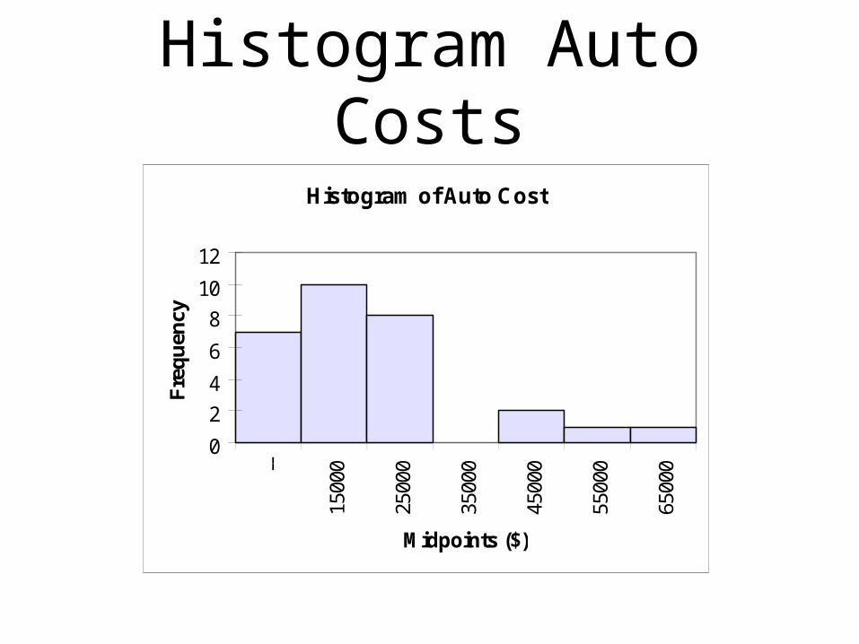
Histogram Auto Costs
Histogram of Auto Cost
0
2
4
6
8
10
12--
1500
0
2500
0
3500
0
4500
0
5500
0
6500
0
Midpoints ($)
Fre
qu
ency
Histogram MPH
Histogram
0
5
10
15
-- 70 90 110 130 150 170Midpoints
Fre
qu
ency
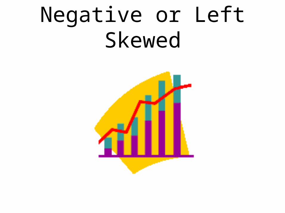
Negative or Left Skewed
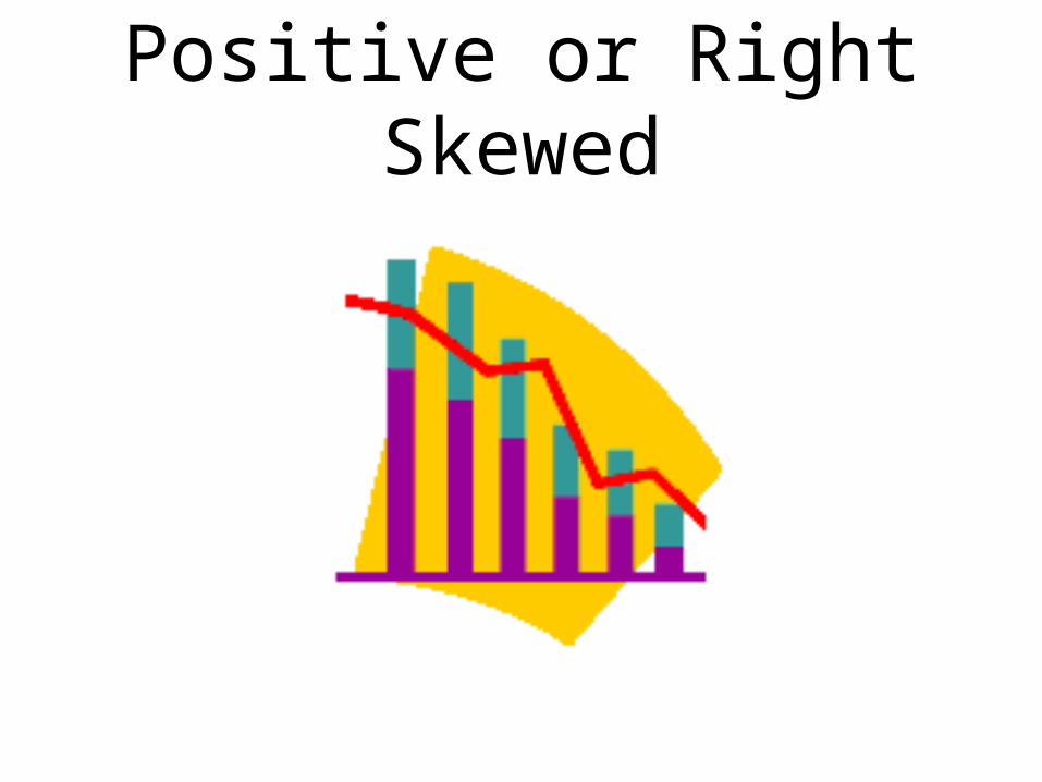
Positive or Right Skewed

Quiz Would incomes
of employees in large firms tend to be positively or negatively skewed? Why?

Quiz Do exam
grades tend to be positively or negatively skewed? Why?
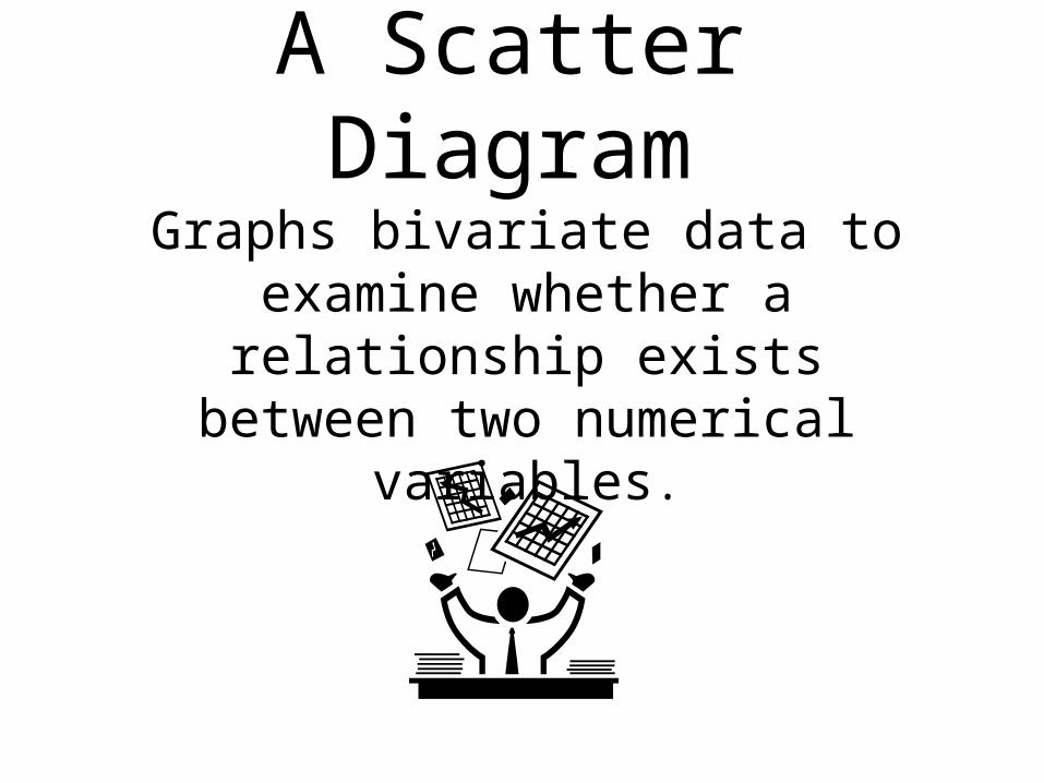
A Scatter Diagram
Graphs bivariate data to examine whether a relationship exists between two numerical
variables.
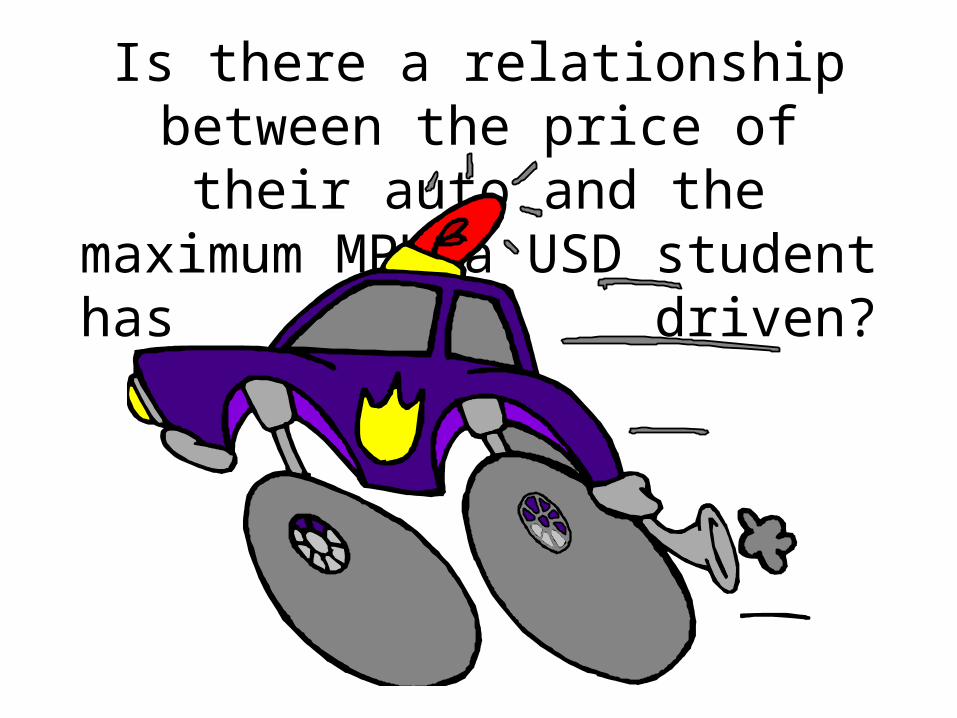
Is there a relationship between the price of their auto and the
maximum MPH a USD student has driven?
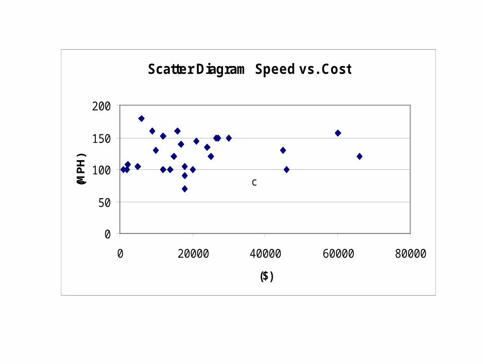
Scatter Diagram Speed vs. Cost
0
50
100
150
200
0 20000 40000 60000 80000
($)
(MP
H)
c
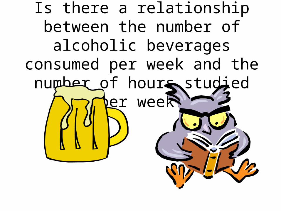
Is there a relationship between the number of alcoholic beverages consumed per week and the number of hours studied per
week?
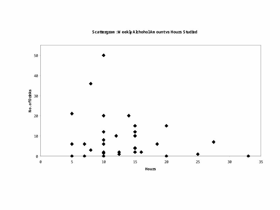
Scattergram: Weekly Alchohol Amount vs Hours Studied
0
10
20
30
40
50
0 5 10 15 20 25 30 35
Hours
No
. of
Dri
nks
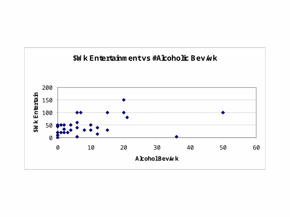
$Wk Entertainment vs #Alcoholic Bev/wk
0
50
100
150
200
0 10 20 30 40 50 60
Alcohol Bev/wk
$W
k E
nte
rta
in
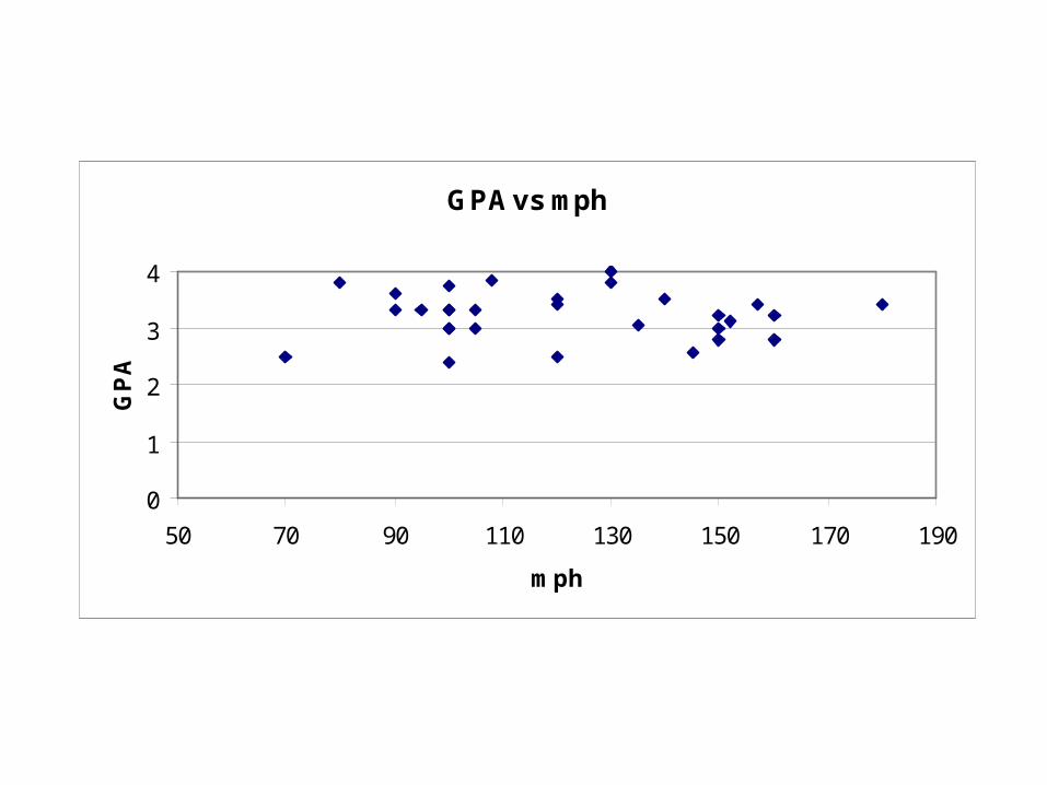
GPA vs mph
0
1
2
3
4
50 70 90 110 130 150 170 190
mph
GP
A
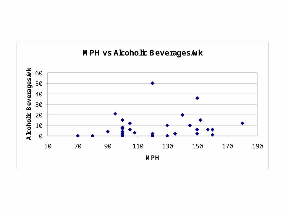
MPH vs Alcoholic Beverages/wk
0
10
20
30
40
50
60
50 70 90 110 130 150 170 190
MPH
Alc
oh
olic
Be
ve
rag
es
/wk
Alch bev / wk (#) mph
0 70
0 80
4 90
21 95
8 100
4 100
15 100
1 100
7 100
0 100
2 100
6 105
12 105
3 108
50 120
0 120
2 120
0 130
10 130
2 135
MPH vs Alcoholic Beverages/wk
0
10
20
30
40
50
60
50 70 90 110 130 150 170 190
MPH
Alc
oh
olic
Be
ve
rag
es
/wk
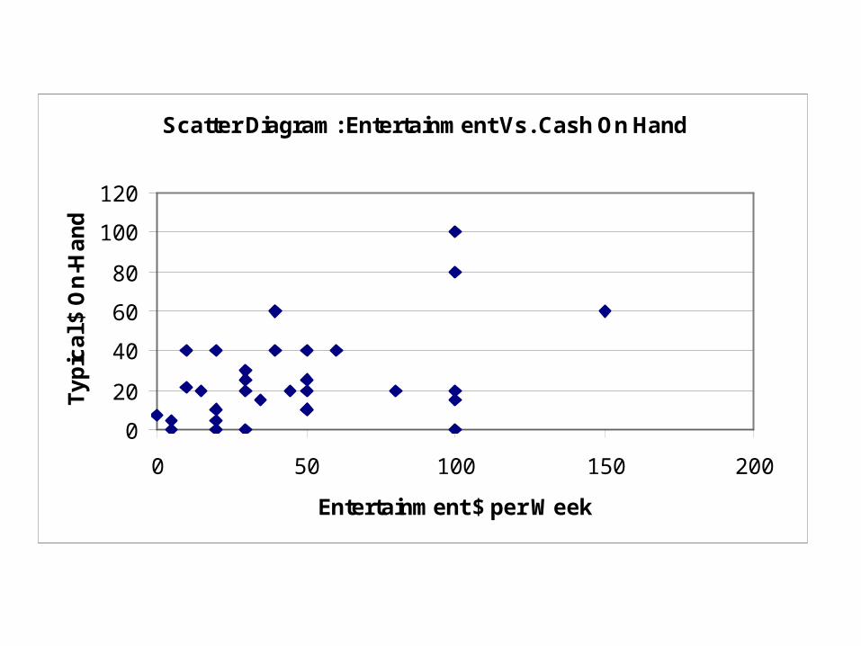
Scatter Diagram: Entertainment Vs. Cash On Hand
0
20
40
60
80
100
120
0 50 100 150 200
Entertainment $ per Week
Ty
pic
al $
On
-Ha
nd
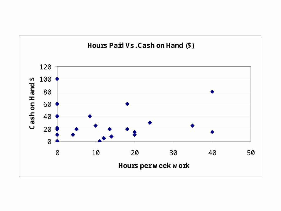
Hours Paid Vs. Cash on Hand ($)
0
20
40
60
80
100
120
0 10 20 30 40 50
Hours per week work
Ca
sh
on
Ha
nd
$
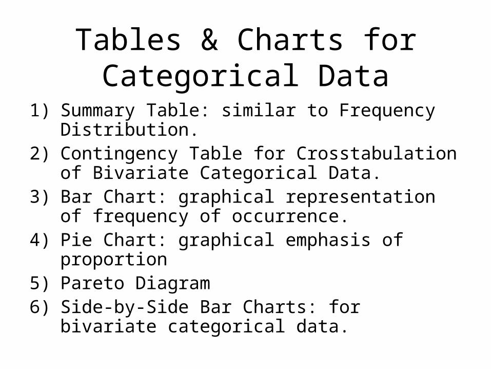
Tables & Charts for Categorical Data
1) Summary Table: similar to Frequency Distribution.
2) Contingency Table for Crosstabulation of Bivariate Categorical Data.
3) Bar Chart: graphical representation of frequency of occurrence.
4) Pie Chart: graphical emphasis of proportion5) Pareto Diagram6) Side-by-Side Bar Charts: for bivariate
categorical data.
Summary Table
Coke Classic Sprite Pepsi-Cola
Diet Coke Pepsi-Cola Coke Classic
Pepsi-Cola Coke Classic Dr. Pepper
Diet Coke Coke Classic Pepsi-Cola
Coke Classic Coke Classic Sprite
Coke Classic Pepsi-Cola
Dr. Pepper Coke Classic Show:
Diet Coke Sprite a. Freq distribution
Pepsi-Cola Dr. Pepper b. Relative Freq
Pepsi-Cola Pepsi-Cola c. Percent Freq
Coke Classic Diet Coke d. Bar graph
Dr. Pepper Pepsi-Cola e. Pareto diagram
Sprite Coke Classic f. Pie chart.
Coke Classic Coke Classic
Diet Coke Coke Classic
Coke Classic Pepsi-Cola
Coke Classic Dr. Pepper
Sprite Coke Classic
Coke Classic Diet Coke
Diet Coke Pepsi-Cola
Coke Classic Pepsi-Cola
Diet Coke Pepsi-Cola
Coke Classic
Presentation of Categorical Data
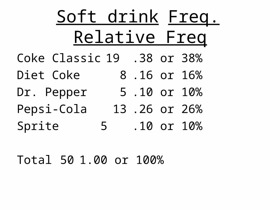
Soft drink Freq. Relative Freq
Coke Classic 19 .38 or 38%
Diet Coke 8 .16 or 16%
Dr. Pepper 5 .10 or 10%
Pepsi-Cola 13 .26 or 26%
Sprite 5 .10 or 10%
Total 50 1.00 or 100%
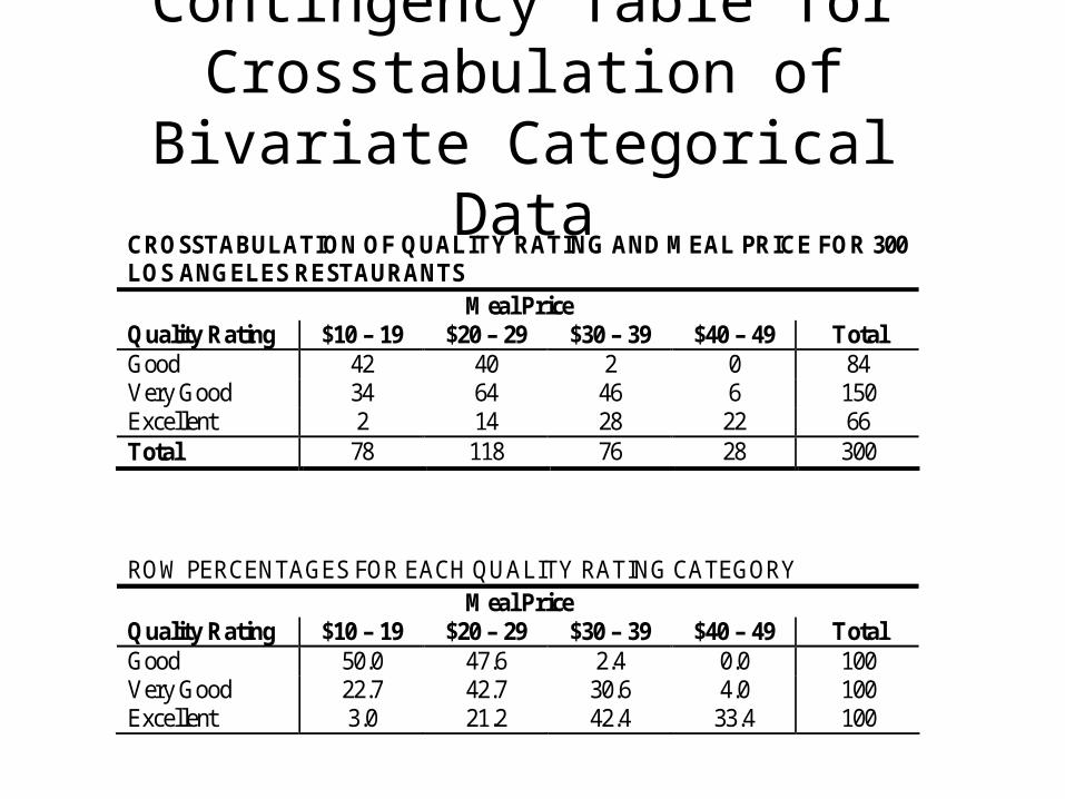
Contingency Table for Crosstabulation of Bivariate
Categorical DataCROSSTABULATION OF QUALITY RATING AND MEAL PRICE FOR 300 LOS ANGELES RESTAURANTS
Meal Price Quality Rating $10 – 19 $20 – 29 $30 – 39 $40 – 49 Total Good 42 40 2 0 84 Very Good 34 64 46 6 150 Excellent 2 14 28 22 66 Total 78 118 76 28 300 ROW PERCENTAGES FOR EACH QUALITY RATING CATEGORY
Meal Price Quality Rating $10 – 19 $20 – 29 $30 – 39 $40 – 49 Total Good 50.0 47.6 2.4 0.0 100 Very Good 22.7 42.7 30.6 4.0 100 Excellent 3.0 21.2 42.4 33.4 100
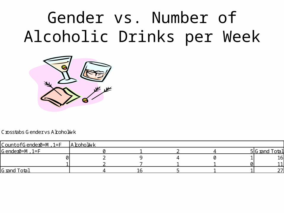
Gender vs. Number of Alcoholic Drinks per Week
Crosstabs Gender vs Alcohol/wk
Count of Gender0=M, 1=F Alcohol/wkGender0=M, 1=F 0 1 2 4 5 Grand Total
0 2 9 4 0 1 161 2 7 1 1 0 11
Grand Total 4 16 5 1 1 27
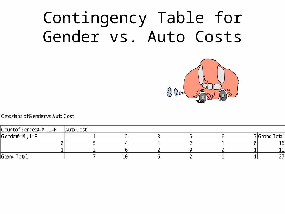
Contingency Table for Gender vs. Auto Costs
Crosstabs of Gender vs Auto Cost
Count of Gender0=M, 1=F Auto CostGender0=M, 1=F 1 2 3 5 6 7 Grand Total
0 5 4 4 2 1 0 161 2 6 2 0 0 1 11
Grand Total 7 10 6 2 1 1 27
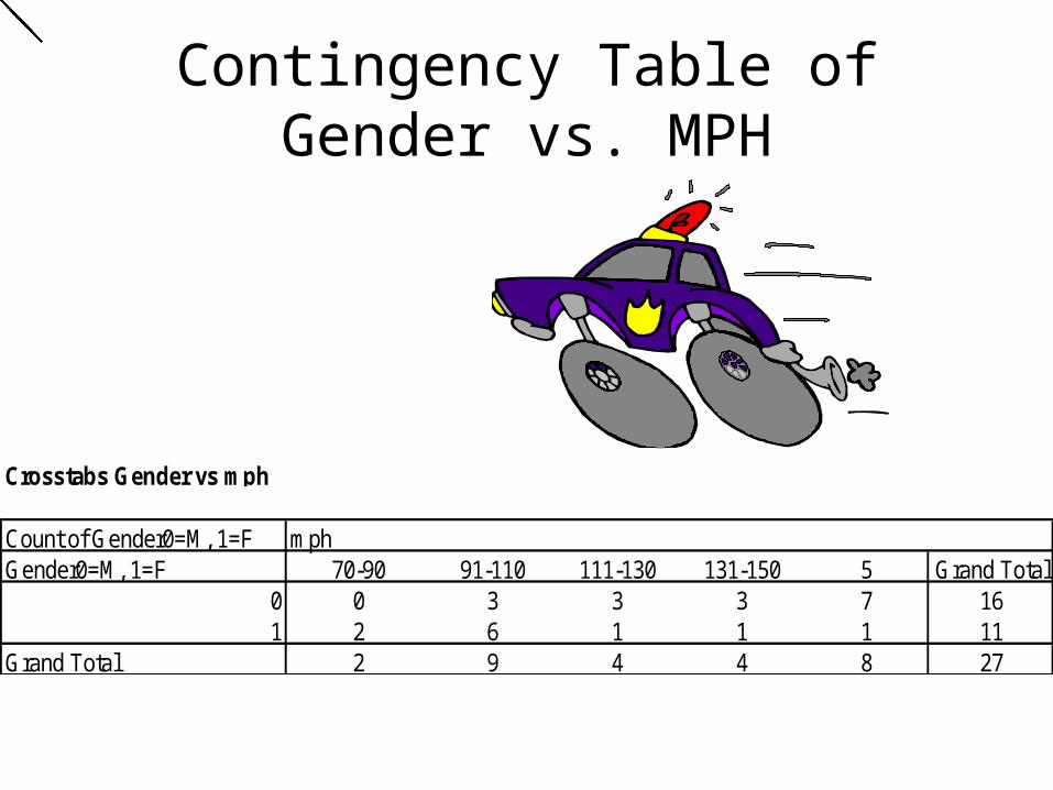
Contingency Table of Gender vs. MPH
Crosstabs Gender vs mph
Count of Gender0=M, 1=F mphGender0=M, 1=F 70-90 91-110 111-130 131-150 5 Grand Total
0 0 3 3 3 7 161 2 6 1 1 1 11
Grand Total 2 9 4 4 8 27
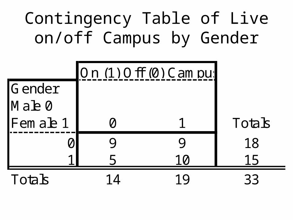
Contingency Table of Live on/off Campus by Gender
GenderMale 0Female 1 0 1 Totals
0 9 9 181 5 10 15
Totals 14 19 33
On (1) Off (0) Campus
Gender0=M, 1=F
Auto Cost($)
Alch bev / wk (#) mph Auto CostAlcohol/wk mph
0 15000 50 120 2 5 31 18000 0 70 2 0 10 21000 10 145 3 1 40 9000 1 160 1 1 50 26500 6 150 3 1 50 2000 4 100 1 1 21 18000 6 105 2 1 21 20000 15 100 2 2 21 27000 36 150 3 4 51 24000 2 135 3 1 40 12000 15 152 2 2 50 16000 6 160 2 1 50 30000 2 150 3 1 51 1000 1 100 1 1 20 5000 12 105 1 2 21 18000 4 90 2 1 10 46000 7 100 5 1 20 6000 12 180 1 2 50 25000 0 120 3 0 30 60000 6 157 6 1 50 17000 20 140 2 2 41 66000 2 120 7 1 31 12000 0 100 2 0 20 45000 0 130 5 0 31 2300 3 108 1 1 20 10000 10 130 1 1 41 14000 2 100 2 1 2
The following data are for 30 observations on two qualitative
variables, X and Y. The categories for X are A, B, and C; the
categories for Y are 1 and 2.
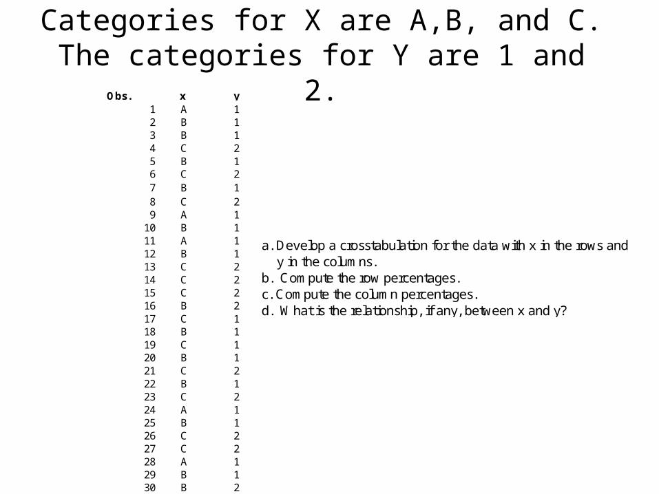
a. Develop a crosstabulation for the data with x in the rows and y in the columns.b. Compute the row percentages.c. Compute the column percentages.d. What is the relationship, if any, between x and y?
Obs. x y1 A 12 B 13 B 14 C 25 B 16 C 27 B 18 C 29 A 1
10 B 111 A 112 B 113 C 214 C 215 C 216 B 217 C 118 B 119 C 120 B 121 C 222 B 123 C 224 A 125 B 126 C 227 C 228 A 129 B 130 B 2
Categories for X are A,B, and C. The categories for Y are 1 and 2.
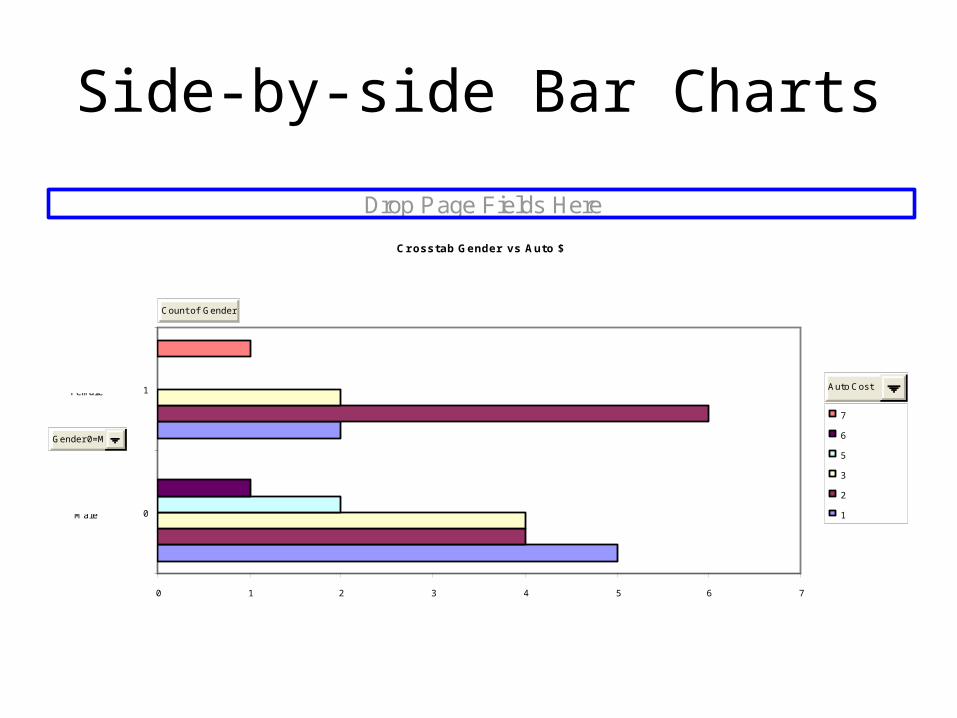
Side-by-side Bar Charts
Crosstab Gender vs Auto $
0 1 2 3 4 5 6 7
0
1
7
6
5
3
2
1
Drop Page Fields Here
Count of Gender 0=M, 1=F
Gender 0=M, 1=F
Auto Cost
Male
Male
Female
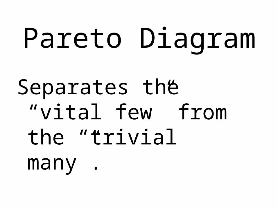
Pareto Diagram
Separates the “vital few” from the “trivial many”.