Embed Size (px)
DESCRIPTION
yb boards
Citation preview
Brief 2: Fine Art Yearbook Chloe WilkinsonBoard 1/5
OUGD303 FMP Tags: Brief 2: Fine Art LCA Yearbook [Context], Brief 2: Fine Art Yearbook, OUGD303
H e l v e t i c a N e u e R e g u l a r
A B C D E F G H I J K L M N O P Q R S T U V X Y Za b c d e f g h i j k l m n o p q r s t u v w x y z 0 1 2 3 4 5 6 7 8 9
H e l v e t i c a N e u e B o l dA B C D E F G H I J K L M N O P Q R S T U V X Y Za b c d e f g h i j k l m n o p q r s t u v w x y z 0 1 2 3 4 5 6 7 8 9
PerpetuaABCDEFGHIJKLMNOPQRSTUVXYZabcdefghijklmnopqrstuvwxyz 0123456789
05
My spreads less.indd 4-5 27/05/2013 20:51
C : 0 M : 1 0 0 Y: 0 K : 0
C : 0 M : 1 0 0 Y: 0 K : 1 0 0
Brief
Leeds College of Art’s Fine Art course required a professional yearbook to exibit their third years work, evidence their indivual identity and promote their end of year show. This outcome would also be used to show prospective students what to expect from the course before applying.
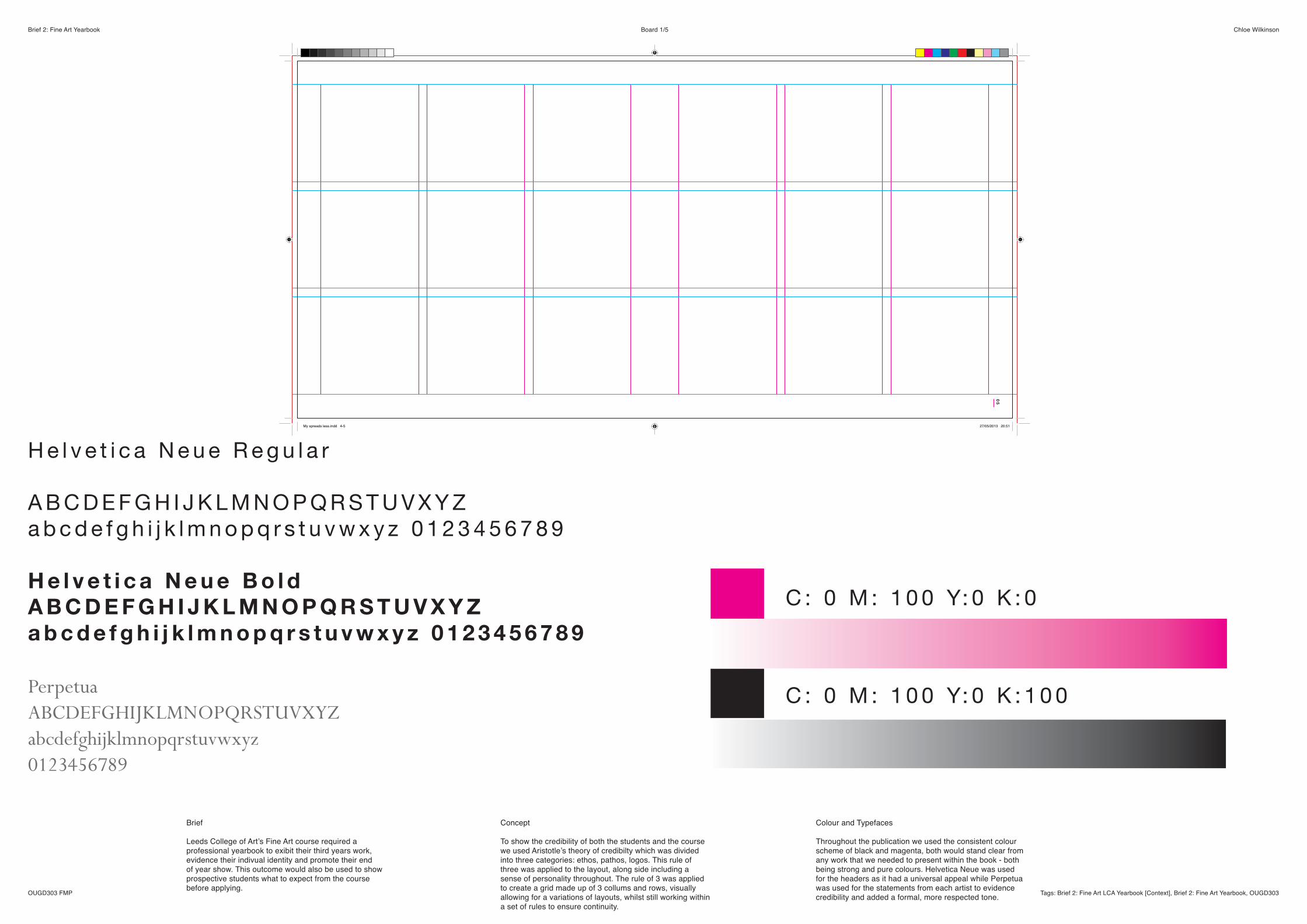
Concept
To show the credibility of both the students and the course we used Aristotle’s theory of credibilty which was divided into three categories: ethos, pathos, logos. This rule of three was applied to the layout, along side including a sense of personality throughout. The rule of 3 was applied to create a grid made up of 3 collums and rows, visually allowing for a variations of layouts, whilst still working within a set of rules to ensure continuity.
Colour and Typefaces
Throughout the publication we used the consistent colour scheme of black and magenta, both would stand clear from any work that we needed to present within the book - both being strong and pure colours. Helvetica Neue was used for the headers as it had a universal appeal while Perpetua was used for the statements from each artist to evidence credibility and added a formal, more respected tone.
Brief 2: Fine Art Yearbook Chloe Wilkinson
OUGD303 FMP Tags: Brief 2: Fine Art LCA Yearbook [Context], Brief 2: Fine Art Yearbook, OUGD303
Board 2/5
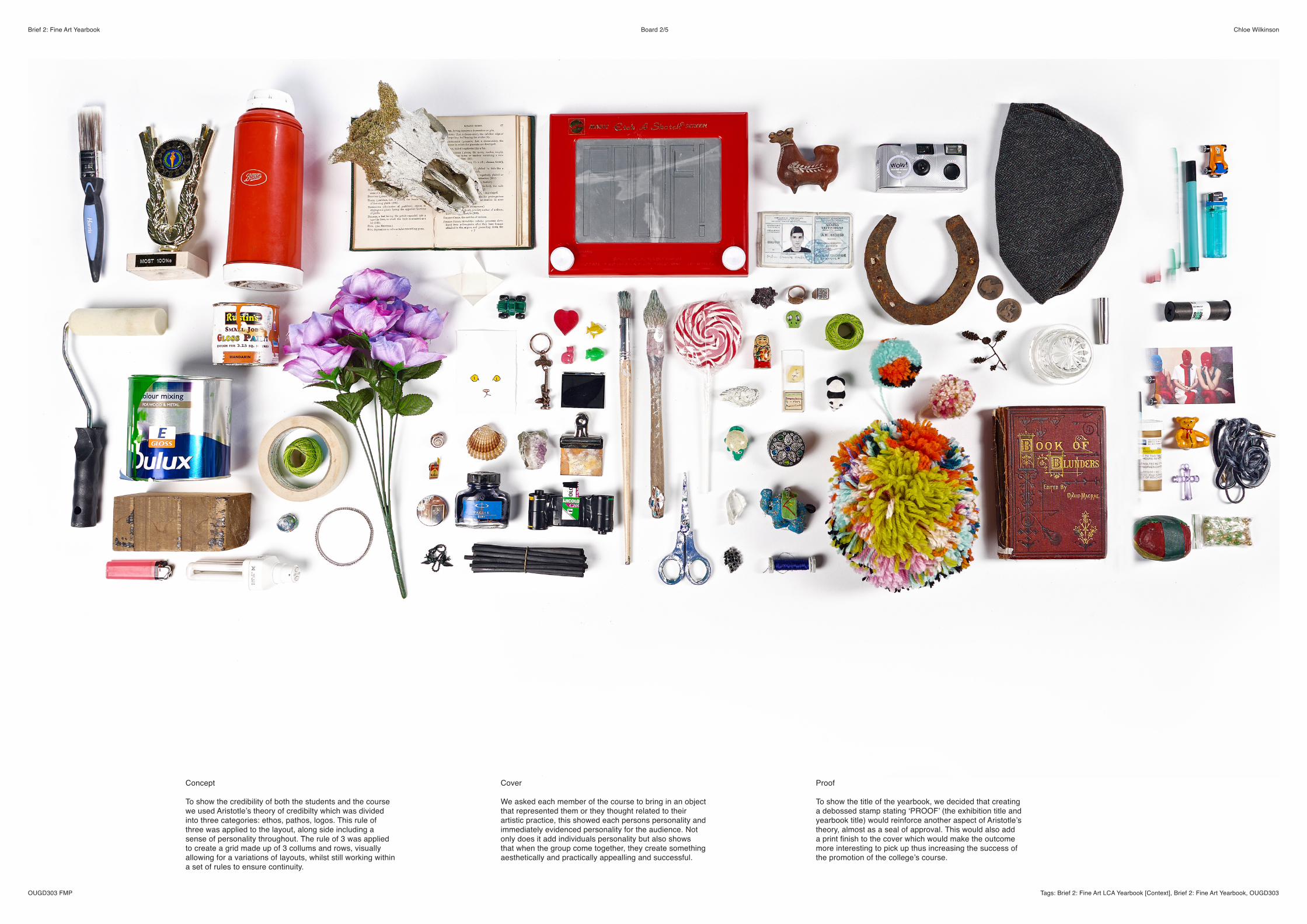
Cover
We asked each member of the course to bring in an object that represented them or they thought related to their artistic practice, this showed each persons personality and immediately evidenced personality for the audience. Not only does it add individuals personality but also shows that when the group come together, they create something aesthetically and practically appealling and successful.
Concept
To show the credibility of both the students and the course we used Aristotle’s theory of credibilty which was divided into three categories: ethos, pathos, logos. This rule of three was applied to the layout, along side including a sense of personality throughout. The rule of 3 was applied to create a grid made up of 3 collums and rows, visually allowing for a variations of layouts, whilst still working within a set of rules to ensure continuity.
Proof
To show the title of the yearbook, we decided that creating a debossed stamp stating ‘PROOF’ (the exhibition title and yearbook title) would reinforce another aspect of Aristotle’s theory, almost as a seal of approval. This would also add a print finish to the cover which would make the outcome more interesting to pick up thus increasing the success of the promotion of the college’s course.
Brief 2: Fine Art Yearbook Chloe Wilkinson
OUGD303 FMP Tags: Brief 2: Fine Art LCA Yearbook [Context], Brief 2: Fine Art Yearbook, OUGD303
Board 3/5
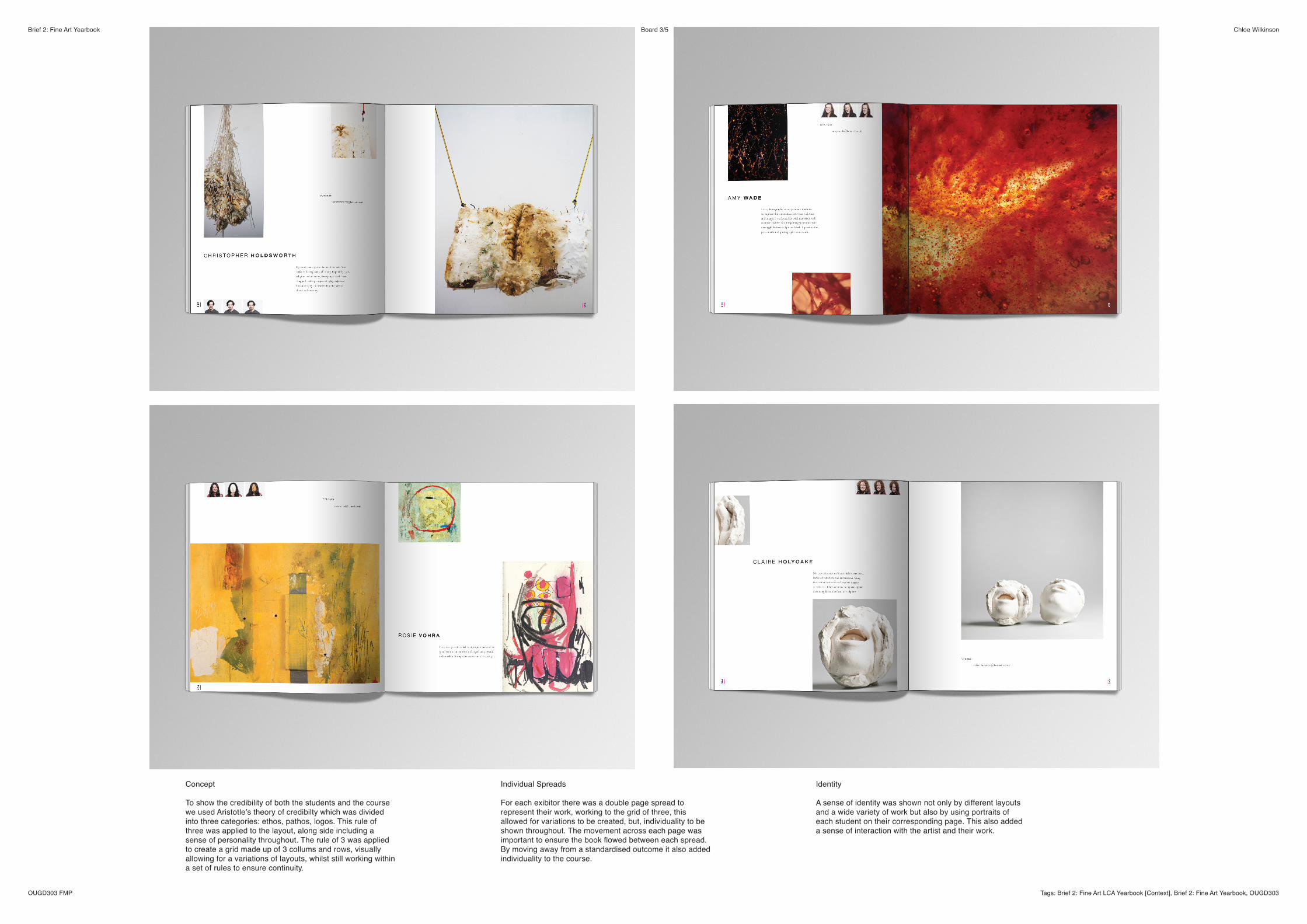
Individual Spreads
For each exibitor there was a double page spread to represent their work, working to the grid of three, this allowed for variations to be created, but, individuality to be shown throughout. The movement across each page was important to ensure the book flowed between each spread. By moving away from a standardised outcome it also added individuality to the course.
Concept
To show the credibility of both the students and the course we used Aristotle’s theory of credibilty which was divided into three categories: ethos, pathos, logos. This rule of three was applied to the layout, along side including a sense of personality throughout. The rule of 3 was applied to create a grid made up of 3 collums and rows, visually allowing for a variations of layouts, whilst still working within a set of rules to ensure continuity.
Identity
A sense of identity was shown not only by different layouts and a wide variety of work but also by using portraits of each student on their corresponding page. This also added a sense of interaction with the artist and their work.
Brief 2: Fine Art Yearbook Chloe Wilkinson
OUGD303 FMP Tags: Brief 2: Fine Art LCA Yearbook [Context], Brief 2: Fine Art Yearbook, OUGD303
Board 4/5
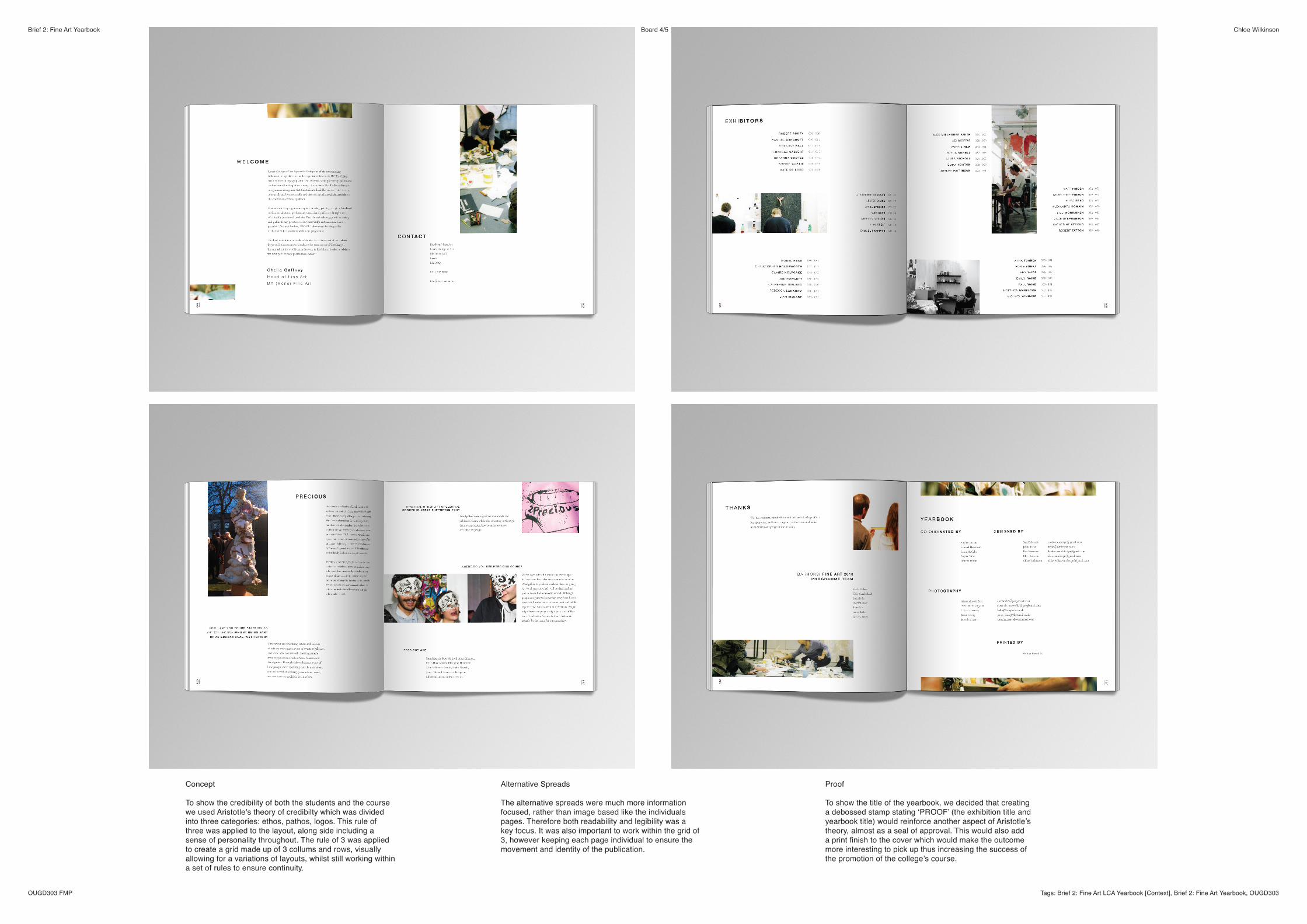
Alternative Spreads
The alternative spreads were much more information focused, rather than image based like the individuals pages. Therefore both readability and legibility was a key focus. It was also important to work within the grid of 3, however keeping each page individual to ensure the movement and identity of the publication.
Concept
To show the credibility of both the students and the course we used Aristotle’s theory of credibilty which was divided into three categories: ethos, pathos, logos. This rule of three was applied to the layout, along side including a sense of personality throughout. The rule of 3 was applied to create a grid made up of 3 collums and rows, visually allowing for a variations of layouts, whilst still working within a set of rules to ensure continuity.
Proof
To show the title of the yearbook, we decided that creating a debossed stamp stating ‘PROOF’ (the exhibition title and yearbook title) would reinforce another aspect of Aristotle’s theory, almost as a seal of approval. This would also add a print finish to the cover which would make the outcome more interesting to pick up thus increasing the success of the promotion of the college’s course.
Brief 2: Fine Art Yearbook Chloe Wilkinson
OUGD303 FMP Tags: Brief 2: Fine Art LCA Yearbook [Context], Brief 2: Fine Art Yearbook, OUGD303
Board 5/5
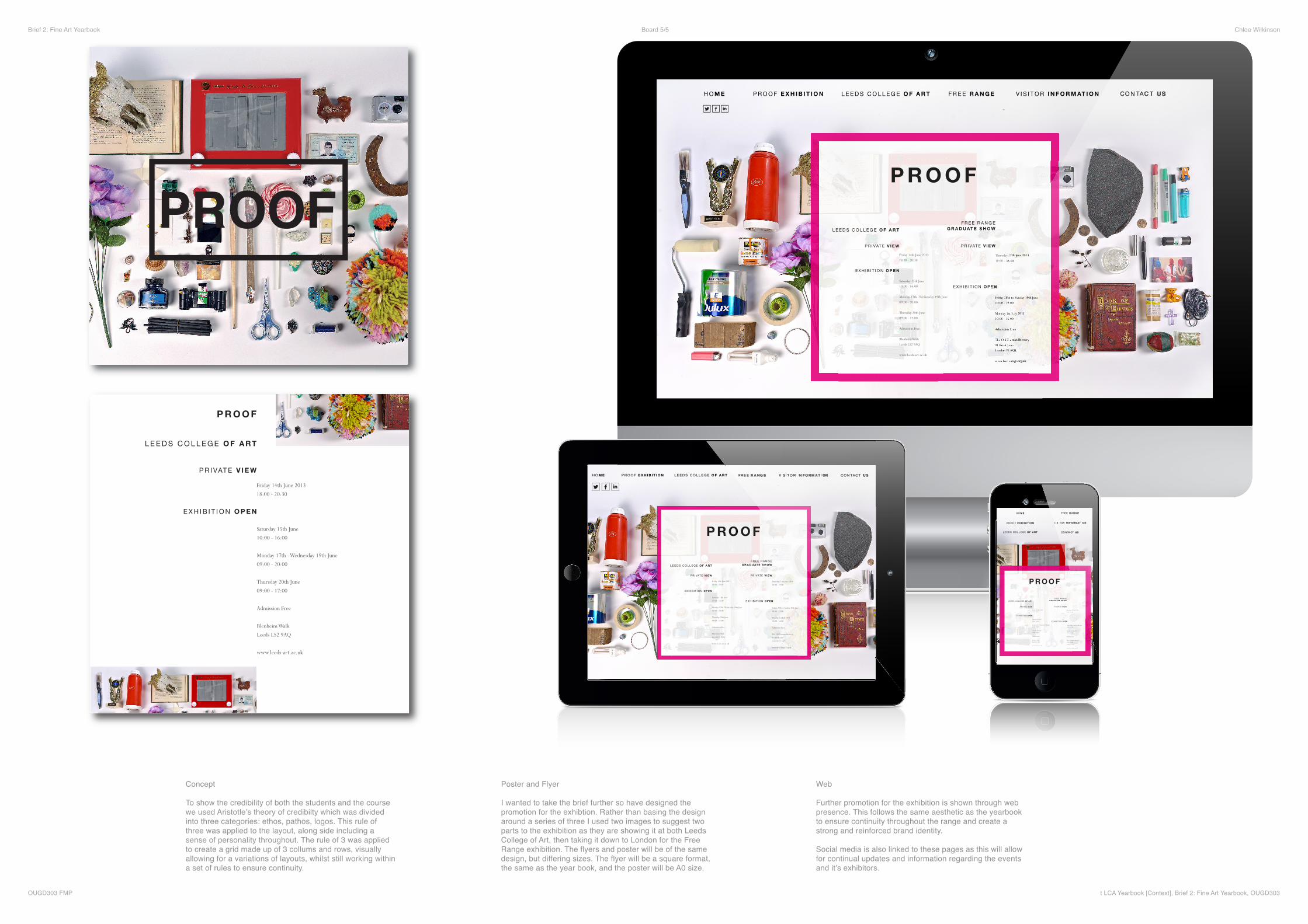
Poster and Flyer
I wanted to take the brief further so have designed the promotion for the exhibtion. Rather than basing the design around a series of three I used two images to suggest two parts to the exhibition as they are showing it at both Leeds College of Art, then taking it down to London for the Free Range exhibition. The flyers and poster will be of the same design, but differing sizes. The flyer will be a square format, the same as the year book, and the poster will be A0 size.
Concept
To show the credibility of both the students and the course we used Aristotle’s theory of credibilty which was divided into three categories: ethos, pathos, logos. This rule of three was applied to the layout, along side including a sense of personality throughout. The rule of 3 was applied to create a grid made up of 3 collums and rows, visually allowing for a variations of layouts, whilst still working within a set of rules to ensure continuity.
Web
Further promotion for the exhibition is shown through web presence. This follows the same aesthetic as the yearbook to ensure continuity throughout the range and create a strong and reinforced brand identity.
Social media is also linked to these pages as this will allow for continual updates and information regarding the events and it’s exhibitors.