Embed Size (px)
Citation preview
HOW EFFECTIVE IS THE COMBINATION OF YOUR MAIN PRODUCT AND ANCILLARY TEXTS?
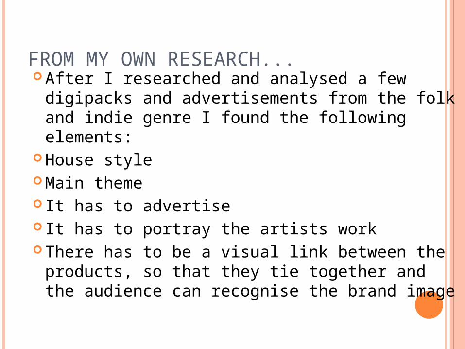
FROM MY OWN RESEARCH... After I researched and analysed a few
digipacks and advertisements from the folk and indie genre I found the following elements:
House style Main theme It has to advertise It has to portray the artists work There has to be a visual link between the
products, so that they tie together and the audience can recognise the brand image
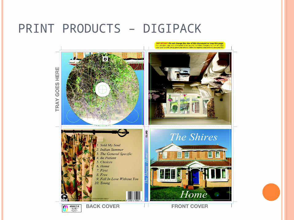
PRINT PRODUCTS – DIGIPACK
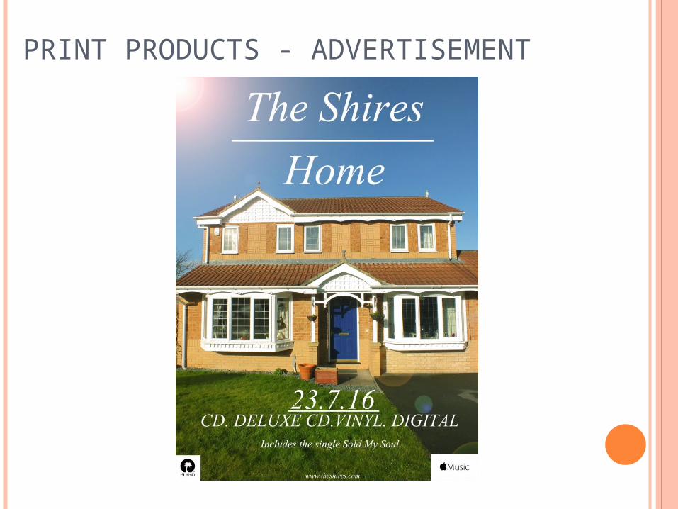
PRINT PRODUCTS - ADVERTISEMENT
HOW EFFECTIVE ARE THEY?• The main element of my ancillary texts was to ensure there was a visual link between all three. This ensures that all three products tie together and the audience are able to associate each product to one another.
• To do this, I used the image from the poster and album cover which is very similar to the first scene of the video. This is an important visual link between all of the products.
• The first scene that we see in the video is of the house, it is the first image that we associate with video, so when the audience sees the advertisement and CD they are able to make the link between the products – they recognise the image and are able to associate it with the band and the song.
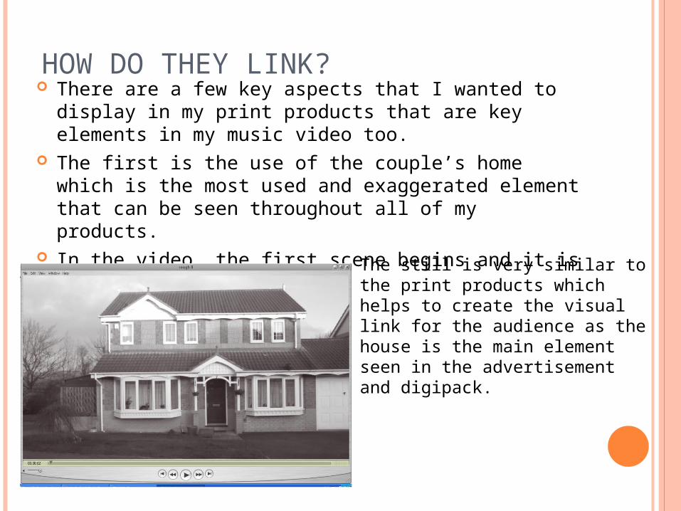
HOW DO THEY LINK? There are a few key aspects that I wanted to display in
my print products that are key elements in my music video too.
The first is the use of the couple’s home which is the most used and exaggerated element that can be seen throughout all of my products.
In the video, the first scene begins and it is a long shot of the house. The still is very similar to the
print products which helps to create the visual link for the audience as the house is the main element seen in the advertisement and digipack.
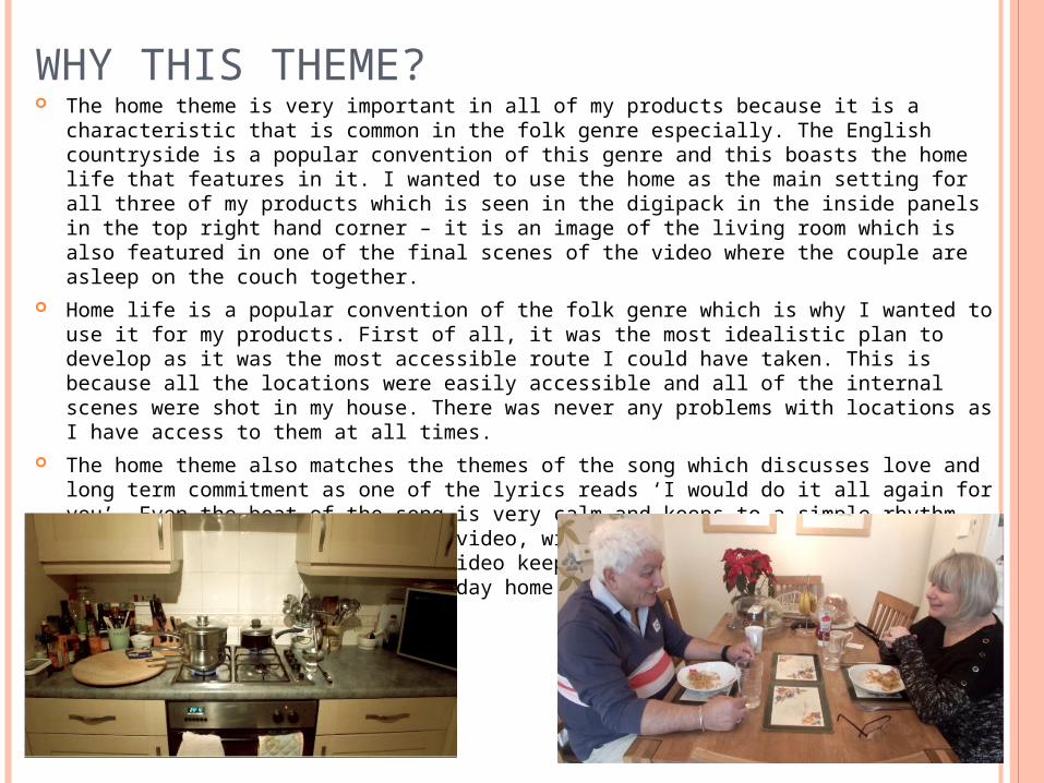
WHY THIS THEME? The home theme is very important in all of my products because it is a characteristic that
is common in the folk genre especially. The English countryside is a popular convention of this genre and this boasts the home life that features in it. I wanted to use the home as the main setting for all three of my products which is seen in the digipack in the inside panels in the top right hand corner – it is an image of the living room which is also featured in one of the final scenes of the video where the couple are asleep on the couch together.
Home life is a popular convention of the folk genre which is why I wanted to use it for my products. First of all, it was the most idealistic plan to develop as it was the most accessible route I could have taken. This is because all the locations were easily accessible and all of the internal scenes were shot in my house. There was never any problems with locations as I have access to them at all times.
The home theme also matches the themes of the song which discusses love and long term commitment as one of the lyrics reads ‘I would do it all again for you’. Even the beat of the song is very calm and keeps to a simple rhythm which is evident throughout the video, with the use of black and white images and slowed footage. The video keeps to a simplistic theme by exaggerating the couple’s every day home life, which is a quiet and calm affair.
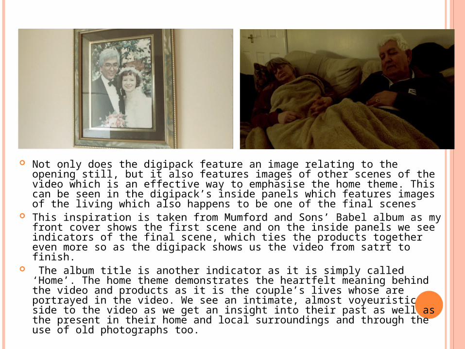
Not only does the digipack feature an image relating to the opening still, but it also features images of other scenes of the video which is an effective way to emphasise the home theme. This can be seen in the digipack’s inside panels which features images of the living which also happens to be one of the final scenes
This inspiration is taken from Mumford and Sons’ Babel album as my front cover shows the first scene and on the inside panels we see indicators of the final scene, which ties the products together even more so as the digipack shows us the video from satrt to finish.
The album title is another indicator as it is simply called ‘Home’. The home theme demonstrates the heartfelt meaning behind the video and products as it is the couple’s lives whose are portrayed in the video. We see an intimate, almost voyeuristic side to the video as we get an insight into their past as well as the present in their home and local surroundings and through the use of old photographs too.
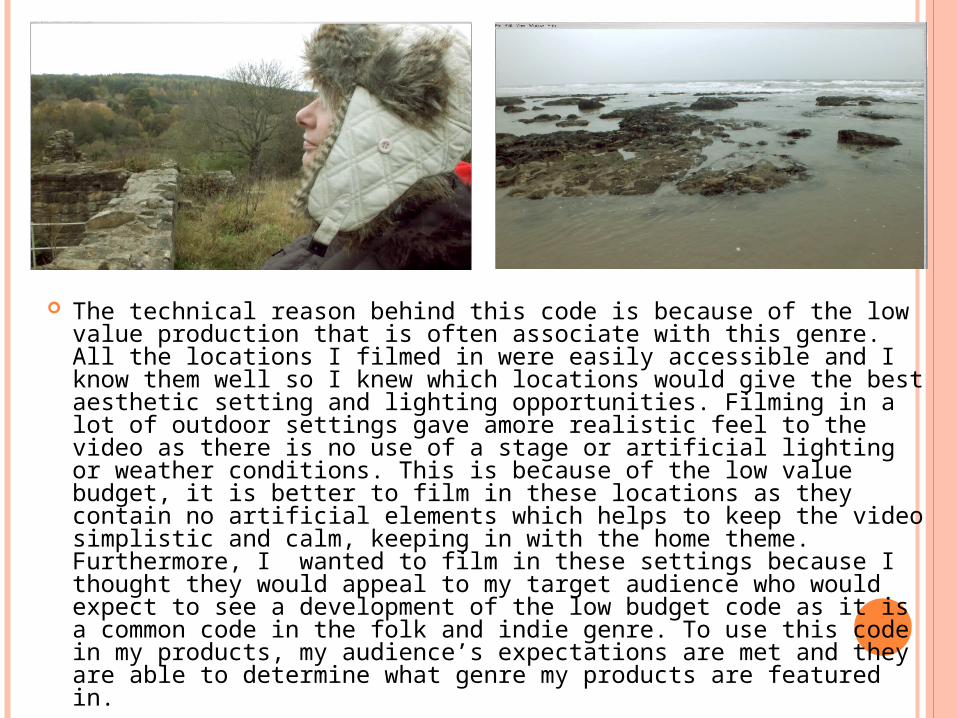
The technical reason behind this code is because of the low value production that is often associate with this genre. All the locations I filmed in were easily accessible and I know them well so I knew which locations would give the best aesthetic setting and lighting opportunities. Filming in a lot of outdoor settings gave amore realistic feel to the video as there is no use of a stage or artificial lighting or weather conditions. This is because of the low value budget, it is better to film in these locations as they contain no artificial elements which helps to keep the video simplistic and calm, keeping in with the home theme. Furthermore, I wanted to film in these settings because I thought they would appeal to my target audience who would expect to see a development of the low budget code as it is a common code in the folk and indie genre. To use this code in my products, my audience’s expectations are met and they are able to determine what genre my products are featured in.
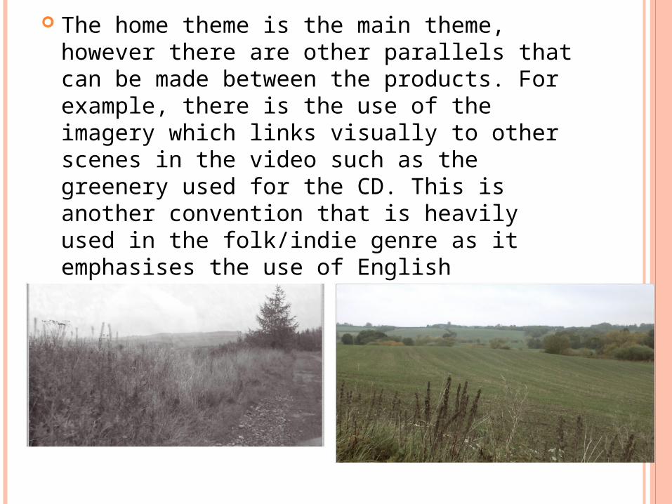
The home theme is the main theme, however there are other parallels that can be made between the products. For example, there is the use of the imagery which links visually to other scenes in the video such as the greenery used for the CD. This is another convention that is heavily used in the folk/indie genre as it emphasises the use of English countryside.
HOUSE STYLE Another small feature of the environment is the use
of blue skies in the ancillary products which was another emphasis on the environment. It is used for the advertisement, CD cover and CD back panel behind the disk. This creates a theme for the digipack whilst visually linking to the advertisement as well. Although the use of blue skies isn’t heavily endorsed in the music video, I wanted to use it as a colour scheme for the ancillary products so that they would link together effectively to create a theme. This colour scheme helps to create the visual link as the audience would see one of the texts and would later recognize the house style when they see the other ancillary text.
THE PRACTICALITIES The advertisement has to advertise and sell the product so to encourage
this I included a few elements that would do so. This includes a release date, a website, the mediums it is available in and a sneak peak of the track list. This is an extremely important factor for all ancillary texts in the music industry as it provides the audience with vital information for how they can obtain the album, where they can obtain it from, and what platforms they can access it on.
The digipack, on the other hand, has to portray the artists work and in doing so it has to look professional in order to sell the brand image. As I’ve already mentioned, there is a house style that runs throughout the product which the audience can recognise and then associate it with the other products. They will recognise the theme of the product and will be able to make the visual links between the ancillary texts and the music video. In order for the products to do this, there must be an effective combination of all three of them. The audience must be able to make the visual link between them all them to establish the connection between the products. In my opinion, the combination of my main product and ancillary texts is very effective as there obvious links between the visuals, the house styles and the common themes of the digipack and video; therefore it is effective because it works. The audience is able to make the link between the products.