Embed Size (px)
Citation preview
Film Corporate image
By Erin Harper
Definition:
• In terms of film, a corporate image is vital. It is what makes a film recognisable to audiences, certain colours, fonts and even images spark recognition in an audiences head. A typical convention for a horror film for example is to have blood red font, or a distressed font. To make a film corporate, these various conventions will need to be adopted by all marketing mediums for the film so they are cohesive, such as trailers, posters, product packaging and merchandise, this in turn ensures that the film will be recognised as a brand.
In order for films to be seen as unique, they must follow various conventions, here are these conventions and why my film follows them.
Differentiation: 'brands need to have a clear differentiation or reason for being' My film stands apart form others of a similar genre because it includes thriller elements to generate a complex plot line, lack of violent imagery typically associated with z-ombie films, a female protagonist, from the z-ombies perspective and how it is set after the recovery of an apocalypse. • Relevance: 'To build demand, they need to understand/ fulfil the needs/ aspirations of their intended audiences' My film complies with this because I adapted various elements of my film to my questionnaire, for example my age group/audience preferred thrillers, and they watch trailers on a variety of applications (my trailer will be widely available). I have produced a typical audience profile to evaluate a typical audience member for my demographic. My film also attracts a younger audience because of the younger protagonist involved. • Coherence: 'brands must be coherent in what they say and do. All the marketing communications need to add up to something meaningful' My marketing scheme will involve various print media and online/viral marketing, this coherent system of marketing will follow various corporate images and attract a younger audience who are in key with the internet/online age.• Esteem: 'Esteem is the reputation a brand has earned by executing clearly on both its promised and delivered experience' To find this out I will conduct a series of focus groups and gather results to see if my film has delivered the promised experience.
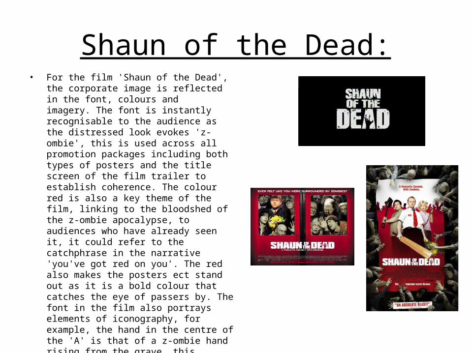
Shaun of the Dead:• For the film 'Shaun of the Dead', the corporate
image is reflected in the font, colours and imagery. The font is instantly recognisable to the audience as the distressed look evokes 'z-ombie', this is used across all promotion packages including both types of posters and the title screen of the film trailer to establish coherence. The colour red is also a key theme of the film, linking to the bloodshed of the z-ombie apocalypse, to audiences who have already seen it, it could refer to the catchphrase in the narrative 'you've got red on you'. The red also makes the posters ect stand out as it is a bold colour that catches the eye of passers by. The font in the film also portrays elements of iconography, for example, the hand in the centre of the 'A' is that of a z-ombie hand rising from the grave, this instantly tells the audience that the film is that of a z-ombie genre. The imagery on these publications is similar, in both posters the protagonist is shown so that audience can establish an instant connection with him, also, z-ombies are shown to highlight the genre and to indicate the possibility of violent elements.
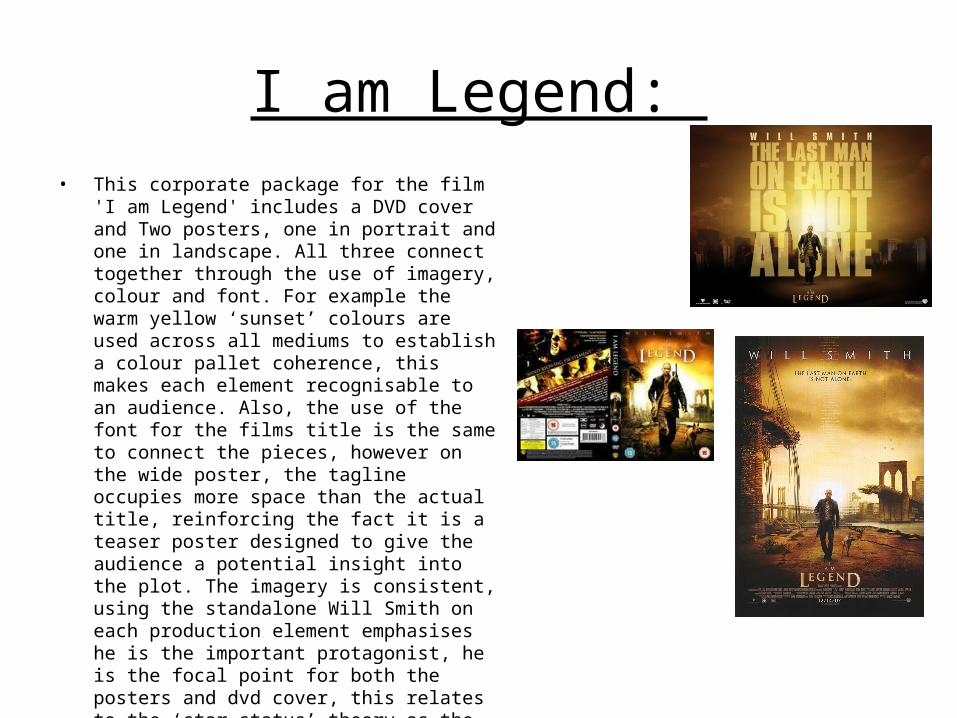
I am Legend: • This corporate package for the film 'I am Legend'
includes a DVD cover and Two posters, one in portrait and one in landscape. All three connect together through the use of imagery, colour and font. For example the warm yellow ‘sunset’ colours are used across all mediums to establish a colour pallet coherence, this makes each element recognisable to an audience. Also, the use of the font for the films title is the same to connect the pieces, however on the wide poster, the tagline occupies more space than the actual title, reinforcing the fact it is a teaser poster designed to give the audience a potential insight into the plot. The imagery is consistent, using the standalone Will Smith on each production element emphasises he is the important protagonist, he is the focal point for both the posters and dvd cover, this relates to the ‘star status’ theory as the production company has used the established actor Will Smith (the star) to advertise the film to potential audiences.
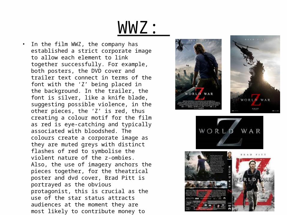
WWZ: • In the film WWZ, the company has established a strict
corporate image to allow each element to link together successfully. For example, both posters, the DVD cover and trailer text connect in terms of the font with the ‘Z’ being placed in the background. In the trailer, the font is silver, like a knife blade, suggesting possible violence, in the other pieces, the ‘Z’ is red, thus creating a colour motif for the film as red is eye-catching and typically associated with bloodshed. The colours create a corporate image as they are muted greys with distinct flashes of red to symbolise the violent nature of the z-ombies. Also, the use of imagery anchors the pieces together, for the theatrical poster and dvd cover, Brad Pitt is portrayed as the obvious protagonist, this is crucial as the use of the star status attracts audiences at the moment they are most likely to contribute money to the company, at the DVD shop or when viewing the poster. The teaser poster does not contain an imagethe protagonist, only a thought provoking image that creates an enigma of shock and the name if the lead actor, the image teases the audience into finding more about the film as the relatively ambiguous format doesn’t give much about the plot.