Embed Size (px)
Citation preview
PLANS FOR MY DOUBLE PAGE
SPREAD
• Colour pallet
• Text (font)
• Images
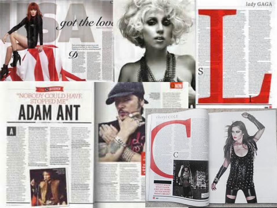
COLOUR PALLET Colours have inherent meanings, which can vary depending on
the country or culture. These meanings have a direct impact on the
way your visitors perceive products especially magazines.
In the previous examples, there is a constant use of the colours
red , black and white. The red is harsh against the black and white
theme and therefore stands out more and attracts more attention
to the page.
In my magazine . I will take in to account that the colour pallet
needs to be engaging towards my target audience and be able to
stand out making the page look more appealing.

TEXT (FONTS)On the majority of these examples, the font is formal where the text is .
The vast majority of fonts are classified into types that separate distinguishing
characteristics of a group of fonts. Most common font types are serif, sans serif and
script fonts. Other types of fonts are characterized as dingbats or graphic fonts
Individual fonts have the ability to convey a wide variety of meanings based on the
way they are used in the typed materials. Selecting a font which helps to express
the meaning of the document will allow you to have a greater impact on the reader.
For my magazine I will use a serif font alike these example pages because it will
classify the formal approach to music the artists I have chosen to be part of my
magazine have. .
IMAGES All four of the example pages have one large main image that instantly makes
the artist recognisable to the audience.
A successful shot attracts the eye for a while. Visual elements that a
photographer uses in the composition are for example lines, forms, textures,
balance, symmetry, depth, colours, perspective, scale, and lighting.
Composition can have a dramatic effect on the resulting image and in my
opinion is equally important with the subject itself. When composing an image
one should always think about what he wants to tell with the photo.
I will use one main image on my double page spread and use two to three
smaller images that reveal/ support more information for the reader ( e.g: CD
covers or other artists )