Embed Size (px)
Citation preview
USES OF TABLES & CHARTS
Teacher: Ibironke Sonuga
Ibironke Sonuga 2
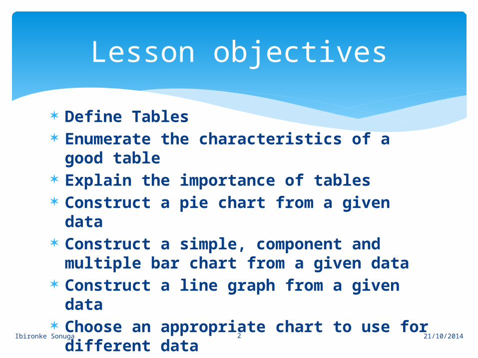
Define Tables Enumerate the characteristics of a good
table Explain the importance of tables Construct a pie chart from a given data Construct a simple, component and
multiple bar chart from a given data Construct a line graph from a given
data Choose an appropriate chart to use for
different data
Lesson objectives
21/10/2014
Ibironke Sonuga 3
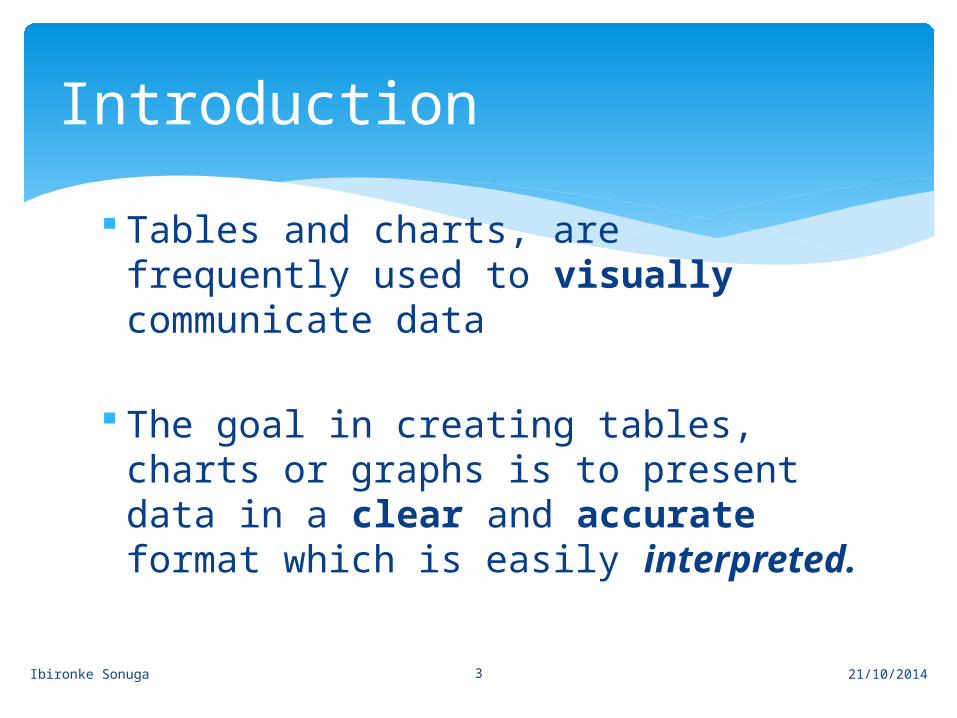
Tables and charts, are frequently used to visually communicate data
The goal in creating tables, charts or graphs is to present data in a clear and accurate format which is easily interpreted.
Introduction
21/10/2014
Ibironke Sonuga 4
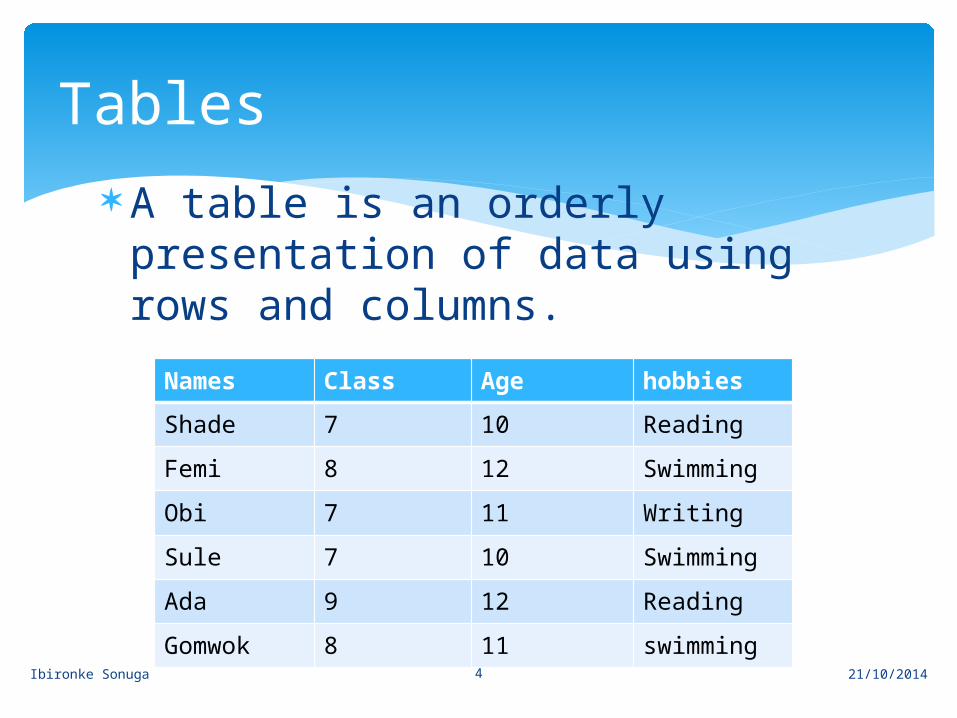
A table is an orderly presentation of data using rows and columns.
Tables
Names Class Age hobbiesShade 7 10 ReadingFemi 8 12 SwimmingObi 7 11 WritingSule 7 10 SwimmingAda 9 12 ReadingGomwok 8 11 swimming
21/10/2014
Ibironke Sonuga 5
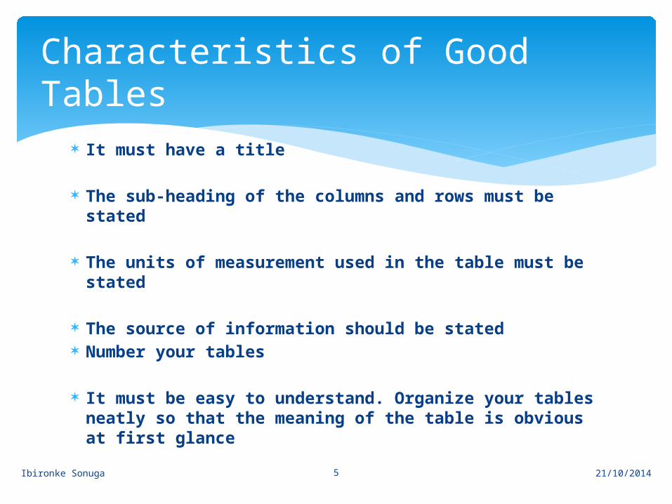
It must have a title
The sub-heading of the columns and rows must be stated
The units of measurement used in the table must be stated
The source of information should be stated Number your tables
It must be easy to understand. Organize your tables neatly so that the meaning of the table is obvious at first glance
Characteristics of Good Tables
21/10/2014
Ibironke Sonuga 6
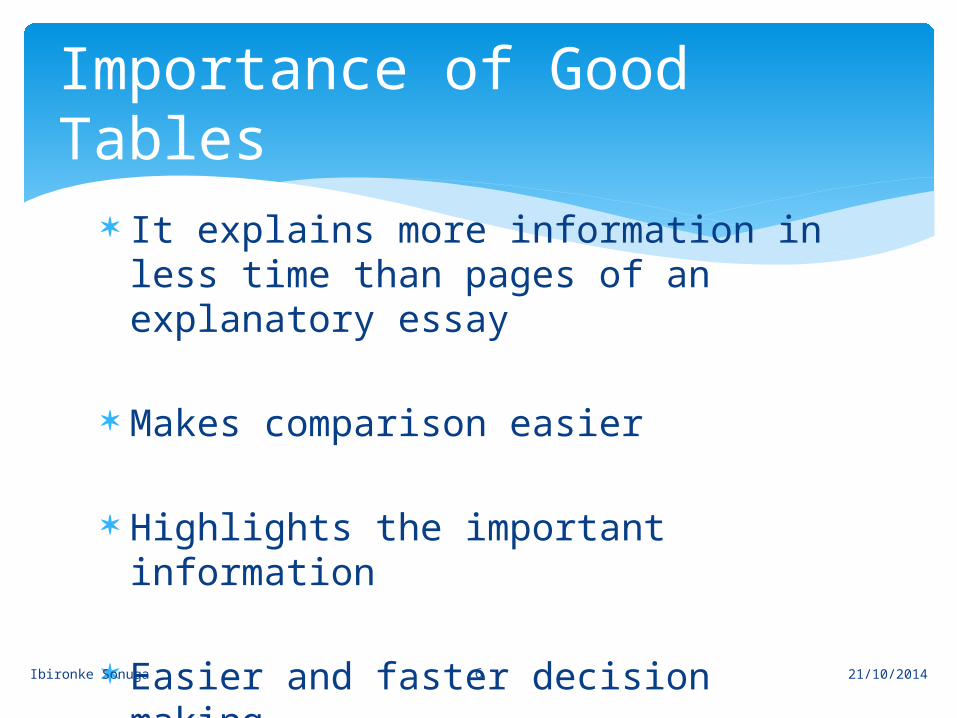
It explains more information in less time than pages of an explanatory essay
Makes comparison easier
Highlights the important information
Easier and faster decision making
Importance of Good Tables
21/10/2014
Ibironke Sonuga 7
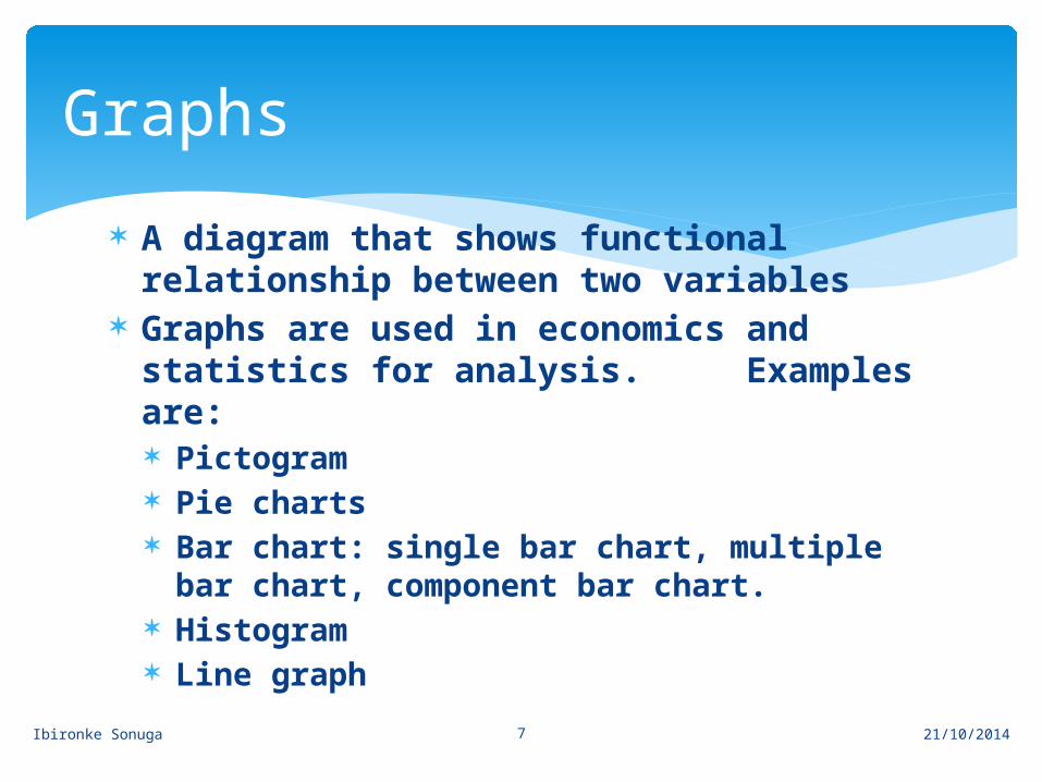
A diagram that shows functional relationship between two variables
Graphs are used in economics and statistics for analysis. Examples are: Pictogram Pie charts Bar chart: single bar chart, multiple bar
chart, component bar chart. Histogram Line graph
Graphs
21/10/2014
Ibironke Sonuga 8
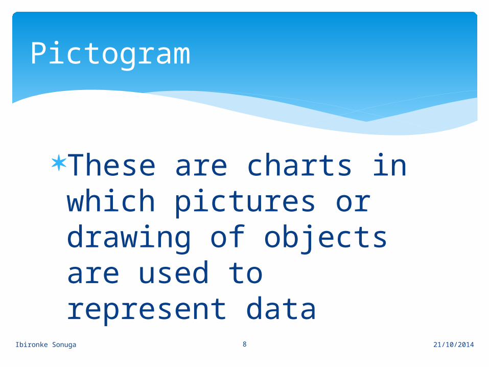
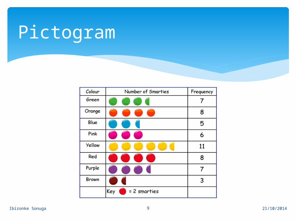
These are charts in which pictures or drawing of objects are used to represent data
Pictogram
21/10/2014
Ibironke Sonuga 9
Pictogram
21/10/2014
Ibironke Sonuga 10
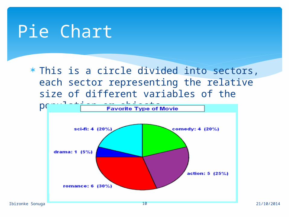
This is a circle divided into sectors, each sector representing the relative size of different variables of the population or objects
Pie Chart
21/10/2014
Ibironke Sonuga 11
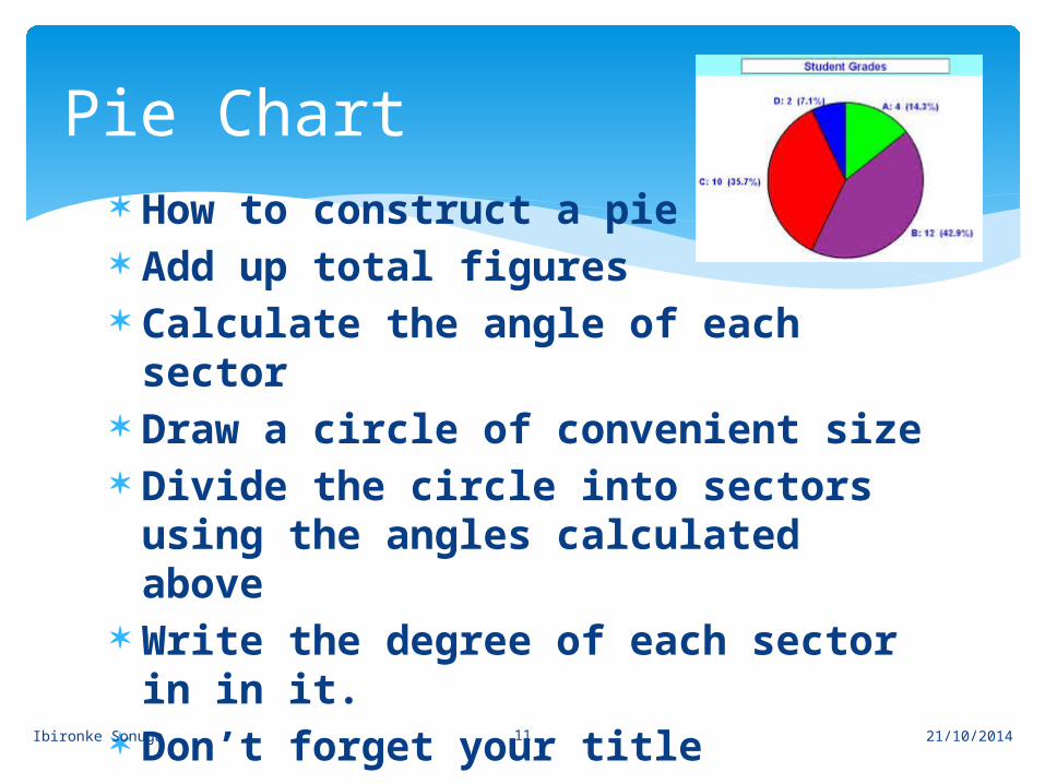
How to construct a pie chart: Add up total figures Calculate the angle of each sector Draw a circle of convenient size Divide the circle into sectors
using the angles calculated above Write the degree of each sector in
in it. Don’t forget your title
Pie Chart
21/10/2014
Ibironke Sonuga 12
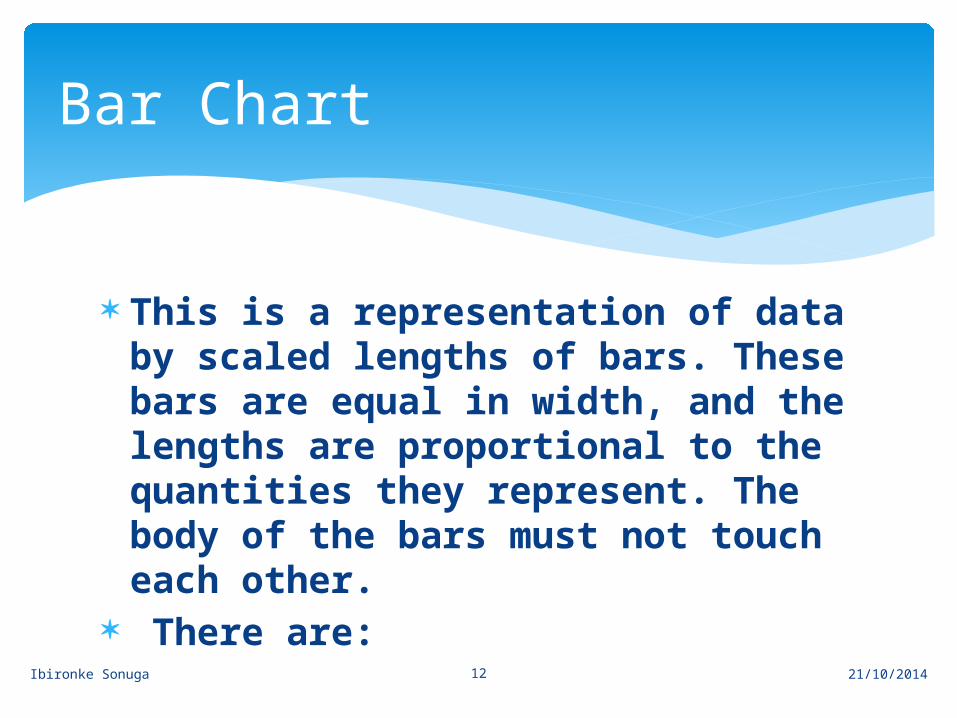
This is a representation of data by scaled lengths of bars. These bars are equal in width, and the lengths are proportional to the quantities they represent. The body of the bars must not touch each other.
There are:
Bar Chart
21/10/2014
Ibironke Sonuga 13
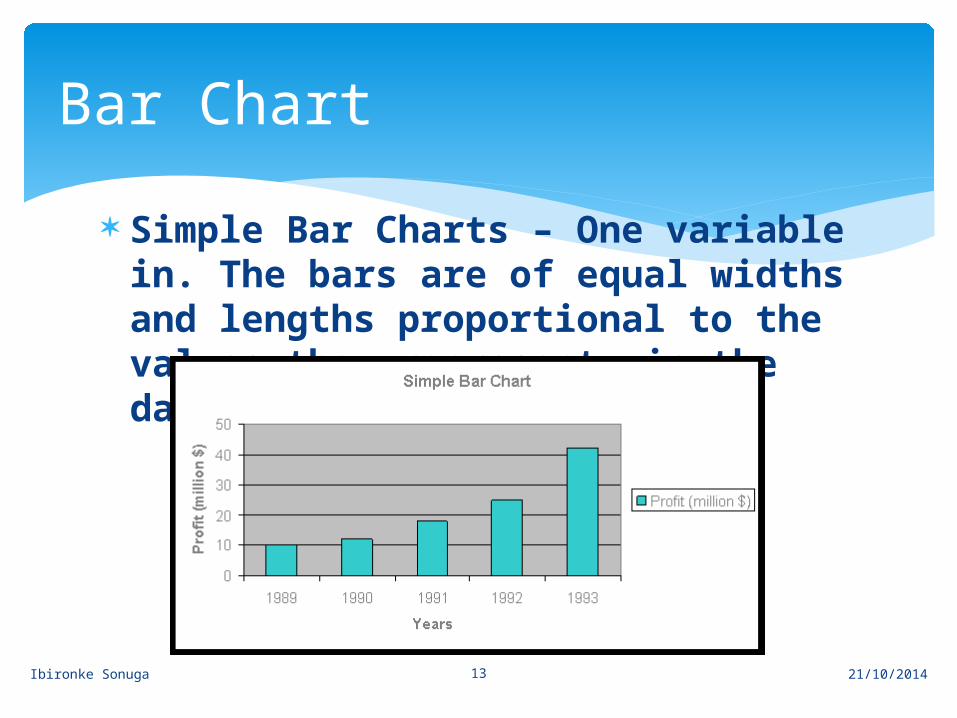
Simple Bar Charts – One variable in. The bars are of equal widths and lengths proportional to the values they represent in the data
Bar Chart
21/10/2014
Ibironke Sonuga 14
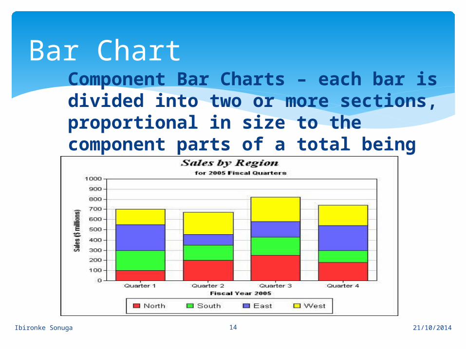
Component Bar Charts – each bar is divided into two or more sections, proportional in size to the component parts of a total being displayed by each bar
Bar Chart
21/10/2014
Ibironke Sonuga 15
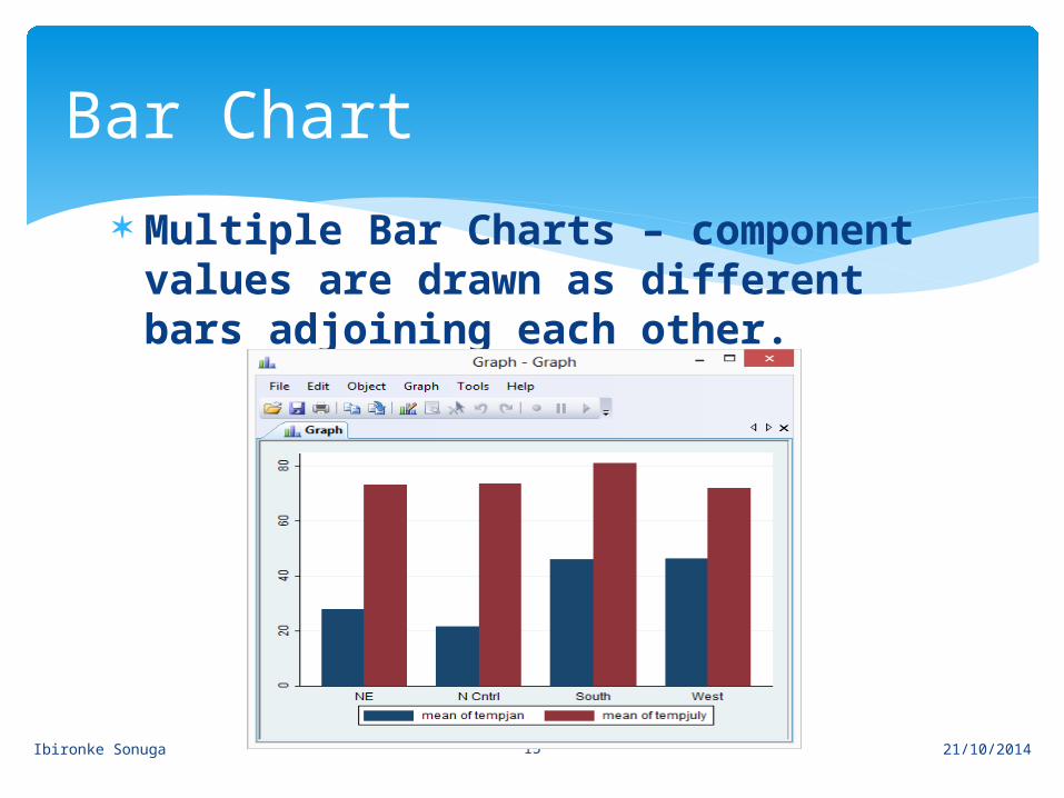
Multiple Bar Charts – component values are drawn as different bars adjoining each other.
Bar Chart
21/10/2014
Ibironke Sonuga 16
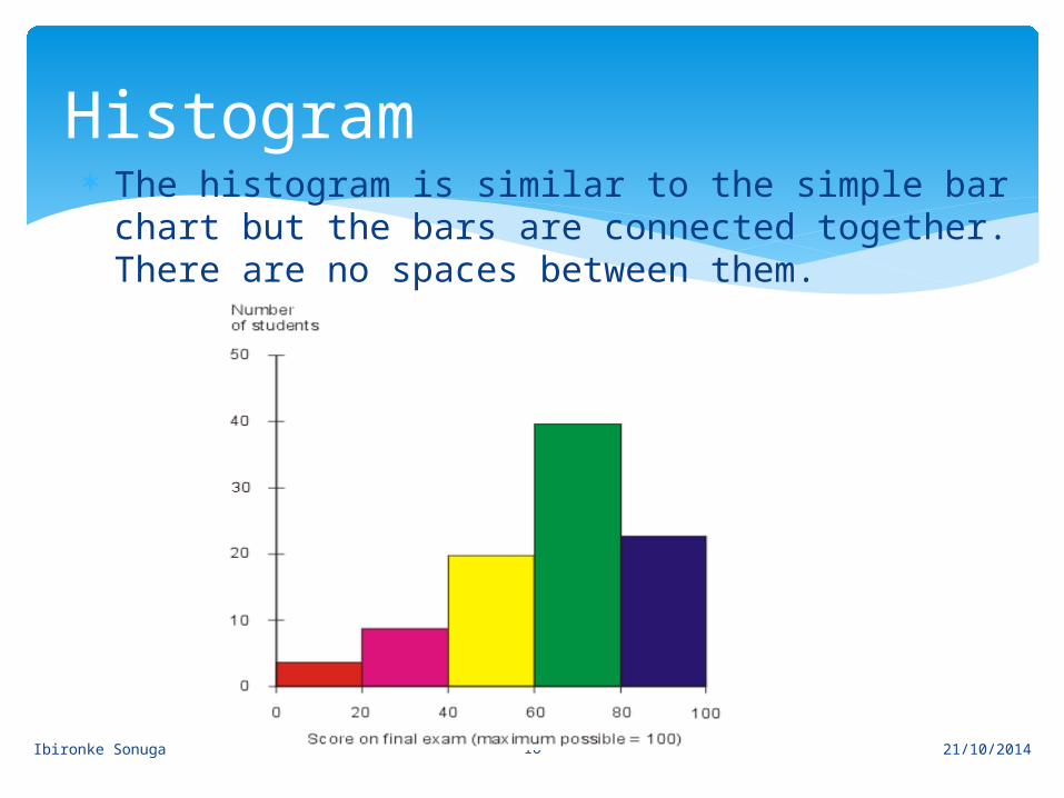
The histogram is similar to the simple bar chart but the bars are connected together. There are no spaces between them.
21/10/2014
Histogram
Ibironke Sonuga 17
Line Graph
21/10/2014
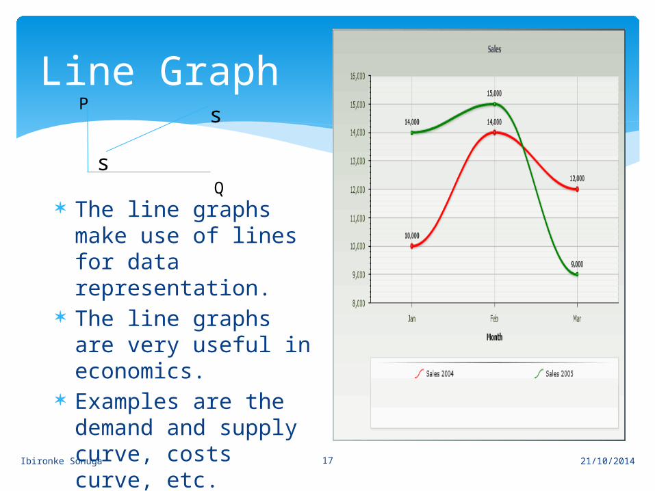
The line graphs make use of lines for data representation.
The line graphs are very useful in economics.
Examples are the demand and supply curve, costs curve, etc.
s
sP
Q
Ibironke Sonuga 18
Define Tables Enumerate the characteristics of a good table Explain the importance of tables Construct a pie chart from a given data Construct a simple, component and multiple
bar chart from a given data Construct a line graph from a given data Choose an appropriate chart to use for
different data
21/10/2014
Can you now….