Embed Size (px)
Citation preview

Question 2
How effective is the combination of your main
product and ancillary texts?

Our USP One thing we wanted to keep consistent and at the forefront of our
products was the image of the shot glasses. We decided to corporate this image within our video, poster and CD covers. This image brands the group as we do not use images of the band mates on our CD cover, we wanted to reinforce the idea of the lyrics “one shot too many”, as we thought this was the main message of the song and it also ties in with our narrative.
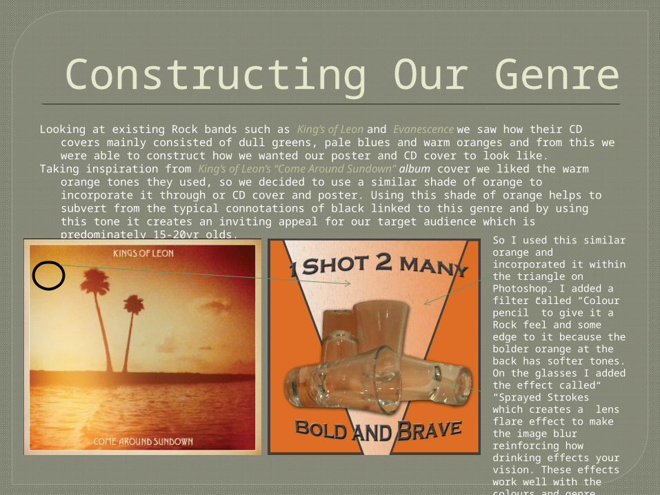
Constructing Our GenreLooking at existing Rock bands such as King’s of Leon and Evanescence we saw how their CD covers
mainly consisted of dull greens, pale blues and warm oranges and from this we were able to construct how we wanted our poster and CD cover to look like.
Taking inspiration from King’s of Leon’s “Come Around Sundown” album cover we liked the warm orange tones they used, so we decided to use a similar shade of orange to incorporate it through or CD cover and poster. Using this shade of orange helps to subvert from the typical connotations of black linked to this genre and by using this tone it creates an inviting appeal for our target audience which is predominately 15-20yr olds.
So I used this similar orange and incorporated it within the triangle on Photoshop. I added a filter called “Colour pencil” to give it a Rock feel and some edge to it because the bolder orange at the back has softer tones. On the glasses I added the effect called “Sprayed Strokes” which creates a lens flare effect to make the image blur reinforcing how drinking effects your vision. These effects work well with the colours and genre because they all stand out and compliment each other and it sums up the idea of the song and album as a whole.

Marketing our Brand to our Audience
To draw my target audience to my overall package:• I’ve kept the same font “Copperplate Gothic Bold” consistent through our
Poster, CD cover/In-lay and in the opening sequence of our video. The effect of using this font connotes masculinity and I feel that this is a strong font which is easily noticeable and it reiterates the idea of our music video being predominately male, and we wanted to target mainly teenaged boys, even though some teenaged females may be interested.
• I used the same shade of orange and the same filter “Colour Pencil” through all products to show the continuity and having it tied in with our chosen genre
• Effectively I’ve used the image of the shot glasses to brand the group just how Kings of Leon used the palm tree to symbolise their group. Using this creates an enigma for my group, highlighting the message of being intoxicated and this may appeal to a teenaged audience as it will persuade them to buy our album because it’s based on controversial topic.
Poster CD In-lay CD Cover Back of CD
Opening Sequence of Video

Combination of All Products
How effective is the Ancillary task combined with the video
How effective is the motif of the excessive drinking linked with the shot glass decreasing?
Do you think our music video is successful ?
Person1 I think it works because the use of the shot glass links the band members together and it correlates with the images on the poster and CD cover
It shows continuity throughout the video and a reflection of teenagers today. As the liquid in the glass decreases the more the actors get drunk
Yes I think it was a success because there was a sense of fluidity and it was easy to understand
Person 2 The actors work well with the story line of the song and the repetitive use of the shot glasses help tie everything together
It works well as it shows progression to what happens when they continue to drink
I agree because the story line has humour to it and that’s what I enjoy when I watch music videos. I think the most successful parts are the repeated images of the people taking the shots
Person 3 The colours of the poster work well but it there could’ve been more effects on the front cover as it looks a little bit plain. But the image ties in very well with the poster, CD cover and video
I thought it was slightly predictable but the idea still worked with the concept of the song
Yes because from what I can see the actors look like they’re young and for me I think it shows a reflection of what young people do at this age. And I like the use of the first person technique it’s very creative,