Embed Size (px)
Citation preview
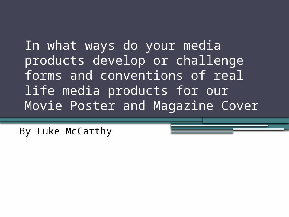
In what ways do your media products develop or challenge forms and conventions of real life media products for our Movie Poster and Magazine Cover
By Luke McCarthy
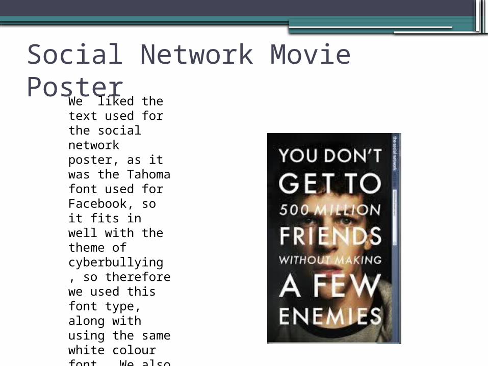
Social Network Movie Poster We liked the text used for the social network poster, as it was the Tahoma font used for Facebook, so it fits in well with the theme of cyberbullying , so therefore we used this font type, along with using the same white colour font. We also used the blue parts from Facebook like this too.
Catfish Poster
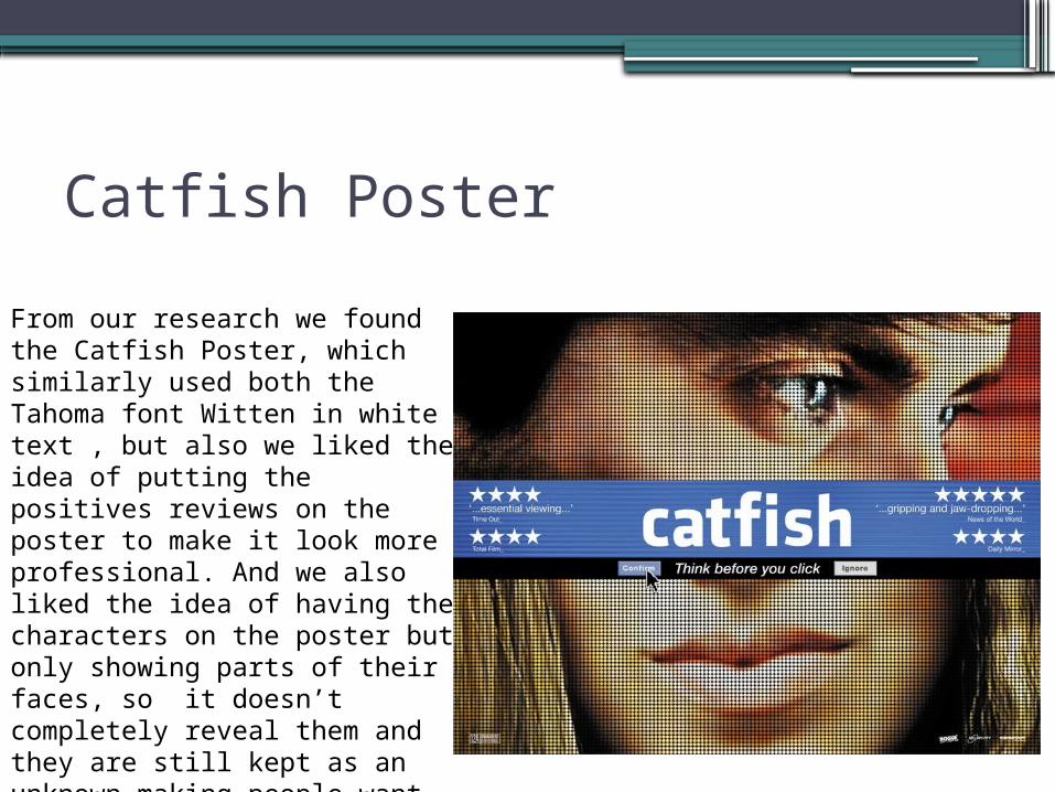
From our research we found the Catfish Poster, which similarly used both the Tahoma font Witten in white text , but also we liked the idea of putting the positives reviews on the poster to make it look more professional. And we also liked the idea of having the characters on the poster but only showing parts of their faces, so it doesn’t completely reveal them and they are still kept as an unknown making people want to watch the film.
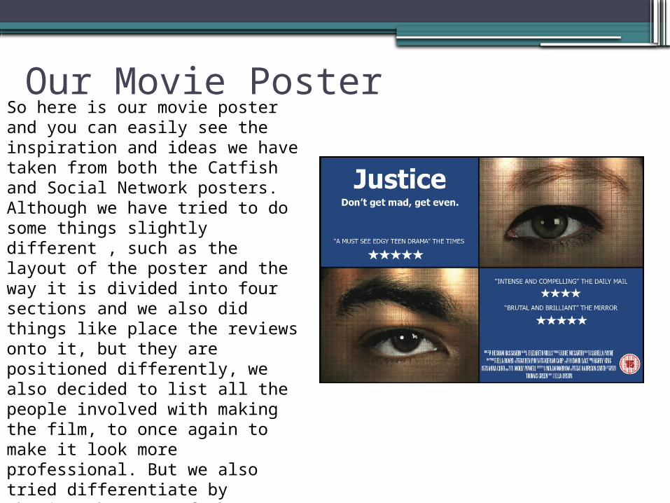
Our Movie Poster So here is our movie poster and you can easily see the inspiration and ideas we have taken from both the Catfish and Social Network posters. Although we have tried to do some things slightly different , such as the layout of the poster and the way it is divided into four sections and we also did things like place the reviews onto it, but they are positioned differently, we also decided to list all the people involved with making the film, to once again to make it look more professional. But we also tried differentiate by showing the eyes of the two main characters rather than showing half their faces like in the Catfish poster, so the characters and the way they look are not completely revealed.
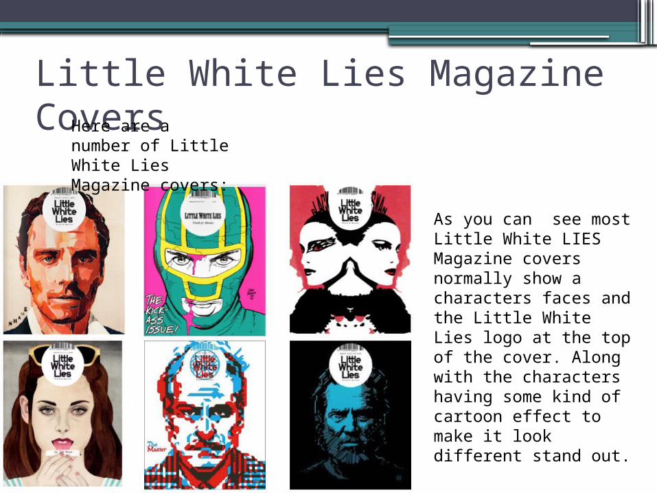
Little White Lies Magazine Covers Here are a number
of Little White Lies Magazine covers:
As you can see most Little White LIES Magazine covers normally show a characters faces and the Little White Lies logo at the top of the cover. Along with the characters having some kind of cartoon effect to make it look different stand out.
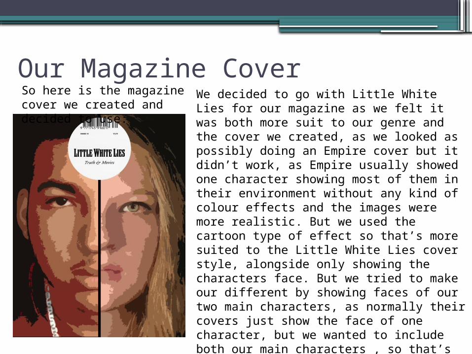
Our Magazine Cover So here is the magazine cover we created and decided to use:
We decided to go with Little White Lies for our magazine as we felt it was both more suit to our genre and the cover we created, as we looked as possibly doing an Empire cover but it didn’t work, as Empire usually showed one character showing most of them in their environment without any kind of colour effects and the images were more realistic. But we used the cartoon type of effect so that’s more suited to the Little White Lies cover style, alongside only showing the characters face. But we tried to make our different by showing faces of our two main characters, as normally their covers just show the face of one character, but we wanted to include both our main characters , so that’s what we did and it has also helped to make our cover look more different compared to the other covers they have previously created.