Embed Size (px)
Citation preview
Question 3
What have you learned from your audience feedback?
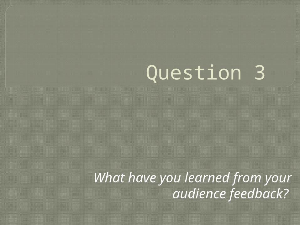
Visual Evaluation of PosterSince last years production I’ve been able to find my way around Photoshop and know what works well in terms of composition and layout, I’ve become more advance in knowing what certain tools and filters do to the image and backgrounds and by working on this production I was able to create a first draft of what the poster may have looked like. After gaining back my peers and teachers feed back, one thing that was consistent was the idea of changing the colour of the background on the poster and the layout and appeal of the font. That’s when I came across the filter “Colour Pencil” which I liked the most after search through several other filters, then we decided to take off the Gradient tool on the typography and keep it tied in with the name of the album and reposition the appeal of the text so that it correlates with CD cover. After making these minor changes I felt that everything tied in together and worked well with our chosen genre. Our peers liked the composition of the text at the bottom and on the shot glass and we also kept the idea of the gradient on our background, similar to the King’s of Leon’s album cover.
Previous Poster Final Poster
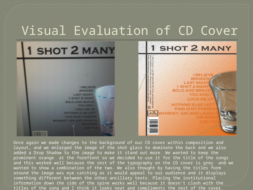
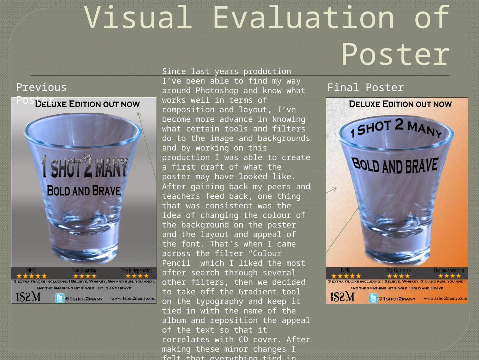
Visual Evaluation of CD Cover
Once again we made changes to the background of our CD cover within composition and layout, and we enlarged the image of the shot glass to dominate the back and we also added a Drop Shadow to the image to make it stand out more. We wanted to keep the prominent orange at the forefront so we decided to use it for the title of the songs and this worked well because the rest of the typography on the CD cover is grey and we wanted to show a combination of the two. We also thought by having the titles form around the image was eye catching as it would appeal to our audience and it displays something different between the other ancillary texts. Placing the institutional information down the side of the spine works well because it doesn’t clash with the titles of the song and I think it looks neat and compliments the rest of the cover.