Embed Size (px)
Citation preview

AnAlysing Three of my fAvouriTe music mAgAzines
“nme,KerrAng & Q”KERRANG has to be my all-time favourite magazine, it has loads of attitude and is up to date with all the latest rock/metal bands whom I love. The layout is easy to read and it engages with the reader via competitions and loads of interviews.
I find the use of colloquial language engaging as I feel I am talking with a friend rather than a stranger.
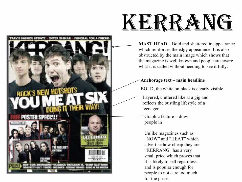
KerrAngMAST HEAD – Bold and shattered in appearance which reinforces the edgy appearance. It is also obstructed by the main image which shows that the magazine is well known and people are aware what it is called without needing to see it fully.
Anchorage text – main headline
BOLD, the white on black is clearly visible
Layered, cluttered like at a gig and reflects the bustling lifestyle of a teenager
Graphic feature – draw people in
Unlike magazines such as “NOW” and “HEAT” which advertise how cheap they are “KERRANG” has a very small price which proves that it is likely to sell regardless and is popular enough for people to not care too much for the price.
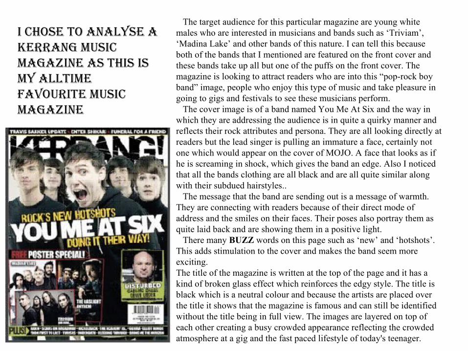
The target audience for this particular magazine are young white males who are interested in musicians and bands such as ‘Triviam’, ‘Madina Lake’ and other bands of this nature. I can tell this because both of the bands that I mentioned are featured on the front cover and these bands take up all but one of the puffs on the front cover. The magazine is looking to attract readers who are into this “pop-rock boy band” image, people who enjoy this type of music and take pleasure in going to gigs and festivals to see these musicians perform. The cover image is of a band named You Me At Six and the way in which they are addressing the audience is in quite a quirky manner and reflects their rock attributes and persona. They are all looking directly at readers but the lead singer is pulling an immature a face, certainly not one which would appear on the cover of MOJO. A face that looks as if he is screaming in shock, which gives the band an edge. Also I noticed that all the bands clothing are all black and are all quite similar along with their subdued hairstyles.. The message that the band are sending out is a message of warmth. They are connecting with readers because of their direct mode of address and the smiles on their faces. Their poses also portray them as quite laid back and are showing them in a positive light. There many BUZZ words on this page such as ‘new’ and ‘hotshots’. This adds stimulation to the cover and makes the band seem more exciting. The title of the magazine is written at the top of the page and it has a kind of broken glass effect which reinforces the edgy style. The title is black which is a neutral colour and because the artists are placed over the title it shows that the magazine is famous and can still be identified without the title being in full view. The images are layered on top of each other creating a busy crowded appearance reflecting the crowded atmosphere at a gig and the fast paced lifestyle of today's teenager.
i chose To AnAlyse A KerrAng music mAgAzine As This is my AllTime fAvouriTe music mAgAzine
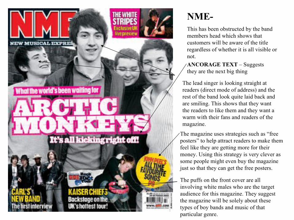
The puffs on the front cover are all involving white males who are the target audience for this magazine. They suggest the magazine will be solely about these types of boy bands and music of that particular genre.
The magazine uses strategies such as “free posters” to help attract readers to make them feel like they are getting more for their money. Using this strategy is very clever as some people might even buy the magazine just so that they can get the free posters.
The lead singer is looking straight at readers (direct mode of address) and the rest of the band look quite laid back and are smiling. This shows that they want the readers to like them and they want a warm with their fans and readers of the magazine.
ANCORAGE TEXT – Suggests they are the next big thing
NME-This has been obstructed by the band members head which shows that customers will be aware of the title regardless of whether it is all visible or not.
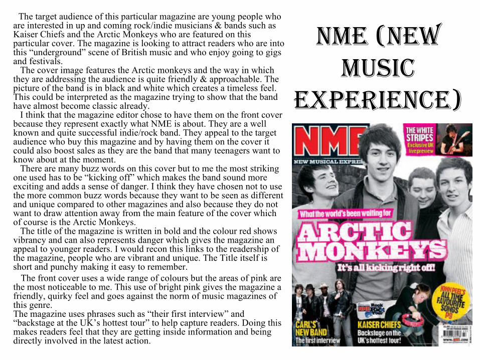
nme (new music
experience)
The target audience of this particular magazine are young people who are interested in up and coming rock/indie musicians & bands such as Kaiser Chiefs and the Arctic Monkeys who are featured on this particular cover. The magazine is looking to attract readers who are into this “underground” scene of British music and who enjoy going to gigs and festivals. The cover image features the Arctic monkeys and the way in which they are addressing the audience is quite friendly & approachable. The picture of the band is in black and white which creates a timeless feel. This could be interpreted as the magazine trying to show that the band have almost become classic already. I think that the magazine editor chose to have them on the front cover because they represent exactly what NME is about. They are a well known and quite successful indie/rock band. They appeal to the target audience who buy this magazine and by having them on the cover it could also boost sales as they are the band that many teenagers want to know about at the moment. There are many buzz words on this cover but to me the most striking one used has to be “kicking off” which makes the band sound more exciting and adds a sense of danger. I think they have chosen not to use the more common buzz words because they want to be seen as different and unique compared to other magazines and also because they do not want to draw attention away from the main feature of the cover which of course is the Arctic Monkeys. The title of the magazine is written in bold and the colour red shows vibrancy and can also represents danger which gives the magazine an appeal to younger readers. I would recon this links to the readership of the magazine, people who are vibrant and unique. The Title itself is short and punchy making it easy to remember.
The front cover uses a wide range of colours but the areas of pink are the most noticeable to me. This use of bright pink gives the magazine a friendly, quirky feel and goes against the norm of music magazines of this genre.The magazine uses phrases such as “their first interview” and “backstage at the UK’s hottest tour” to help capture readers. Doing this makes readers feel that they are getting inside information and being directly involved in the latest action.

Firstly, the main image on the front cover is Bruce "The Boss" Springsteen, as an iconic rock star, having an image of him will attract fans to buy the magazine. The tagline "The Only interview with Bruce Springsteen" will interest fans even more as the word "only" is used, this makes the reader feel like he/she is reading something unique. Q uses an old picture of Blur, which could signify that Q wants to appeal to many generations, rather than being completely modern. Finally, Q attracts customers by advertising a prize which can be won by reading the magazine. The words "WIN" are written in a large font, so that it stands out (being gold).
LARGE, BOLD, PUNCHY –gives the magazine a sense of style and its
easily identified and remembered.
Classy use of Black, red and white, the limited palette gives it a classic feel which will appeal to an older audience.
Attract readers – large font to catch the eye
The ellipsis in this tagline intrigues you to pick up the magazine and read further, it is also the only one written in red causing it to stand out clearly