Embed Size (px)
Citation preview
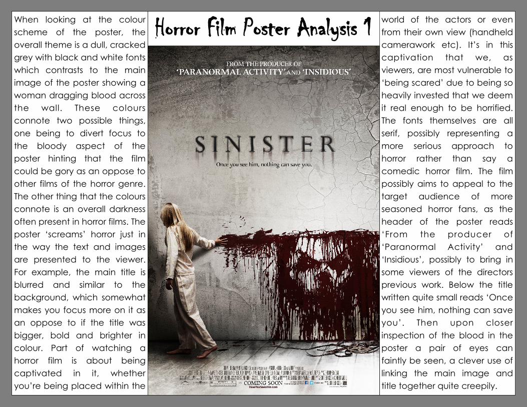
Horror Film Poster Analysis 1 world of the actors or even
from their own view (handheld
camerawork etc). It’s in this
captivation that we, as
viewers, are most vulnerable to
‘being scared’ due to being so
heavily invested that we deem
it real enough to be horrified.
The fonts themselves are all
serif, possibly representing a
more serious approach to
horror rather than say a
comedic horror film. The film
possibly aims to appeal to the
target audience of more
seasoned horror fans, as the
header of the poster reads
‘From the producer of
‘Paranormal Activity’ and
‘Insidious’, possibly to bring in
some viewers of the directors
previous work. Below the title
written quite small reads ‘Once
you see him, nothing can save
you’. Then upon closer
inspection of the blood in the
poster a pair of eyes can
faintly be seen, a clever use of
linking the main image and
title together quite creepily.
When looking at the colour
scheme of the poster, the
overall theme is a dull, cracked
grey with black and white fonts
which contrasts to the main
image of the poster showing a
woman dragging blood across
the wall. These colours
connote two possible things,
one being to divert focus to
the bloody aspect of the
poster hinting that the film
could be gory as an oppose to
other films of the horror genre.
The other thing that the colours
connote is an overall darkness
often present in horror films. The
poster ‘screams’ horror just in
the way the text and images
are presented to the viewer.
For example, the main title is
blurred and similar to the
background, which somewhat
makes you focus more on it as
an oppose to if the title was
bigger, bold and brighter in
colour. Part of watching a
horror film is about being
captivated in it, whether
you’re being placed within the
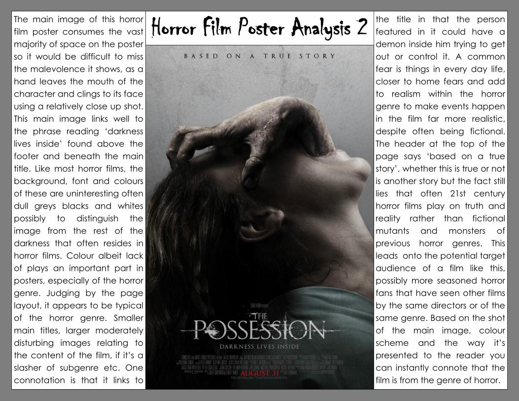
Horror Film Poster Analysis 2 the title in that the person
featured in it could have a
demon inside him trying to get
out or control it. A common
fear is things in every day life,
closer to home fears and add
to realism within the horror
genre to make events happen
in the film far more realistic,
despite often being fictional.
The header at the top of the
page says ‘based on a true
story’, whether this is true or not
is another story but the fact still
lies that often 21st century
horror films play on truth and
reality rather than fictional
mutants and monsters of
previous horror genres. This
leads onto the potential target
audience of a film like this,
possibly more seasoned horror
fans that have seen other films
by the same directors or of the
same genre. Based on the shot
of the main image, colour
scheme and the way it’s
presented to the reader you
can instantly connote that the
film is from the genre of horror.
The main image of this horror
film poster consumes the vast
majority of space on the poster
so it would be difficult to miss
the malevolence it shows, as a
hand leaves the mouth of the
character and clings to its face
using a relatively close up shot.
This main image links well to
the phrase reading ‘darkness
lives inside’ found above the
footer and beneath the main
title. Like most horror films, the
background, font and colours
of these are uninteresting often
dull greys blacks and whites
possibly to distinguish the
image from the rest of the
darkness that often resides in
horror films. Colour albeit lack
of plays an important part in
posters, especially of the horror
genre. Judging by the page
layout, it appears to be typical
of the horror genre. Smaller
main titles, larger moderately
disturbing images relating to
the content of the film, if it’s a
slasher of subgenre etc. One
connotation is that it links to
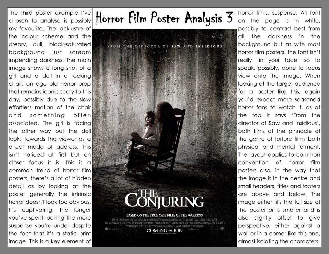
Horror Film Poster Analysis 3 horror films, suspense. All font
on the page is in white,
possibly to contrast best from
all the darkness in the
background but as with most
horror film posters, the font isn’t
really ‘in your face’ so to
speak, possibly, done to focus
view onto the image. When
looking at the target audience
for a poster like this, again
you’d expect more seasoned
horror fans to watch it, as at
the top it says ‘From the
director of Saw and Insidious’,
both films at the pinnacle of
the genre of torture films both
physical and mental torment.
The layout applies to common
convention of horror film
posters also, in the way that
the image is in the centre and
small headers, titles and footers
are above and below. The
image either fills the full size of
the poster or is smaller and is
also slightly offset to give
perspective, either against a
wall or in a corner like this one,
almost isolating the characters.
The third poster example I’ve
chosen to analyse is possibly
my favourite. The lacklustre of
the colour scheme and the
dreary, dull, black-saturated
background just scream
impending darkness. The main
image shows a long shot of a
girl and a doll in a rocking
chair, an age old horror prop
that remains iconic scary to this
day, possibly due to the slow
effortless motion of the chair
a n d s o m e t h i n g o f t e n
associated. The girl is facing
the other way but the doll
looks towards the viewer as a
direct mode of address. This
isn’t noticed at first but on
closer focus it is. This is a
common trend of horror film
posters, there’s a lot of hidden
detail as by looking at the
poster generally the intrinsic
horror doesn't look too obvious.
It’s captivating, the longer
you’ve spent looking the more
suspense you’re under despite
the fact that it’s a static print
image. This is a key element of