Embed Size (px)
DESCRIPTION
Visual Communication 130 final of all design products.
Citation preview
Rand J. Rasmussen
Portfolio
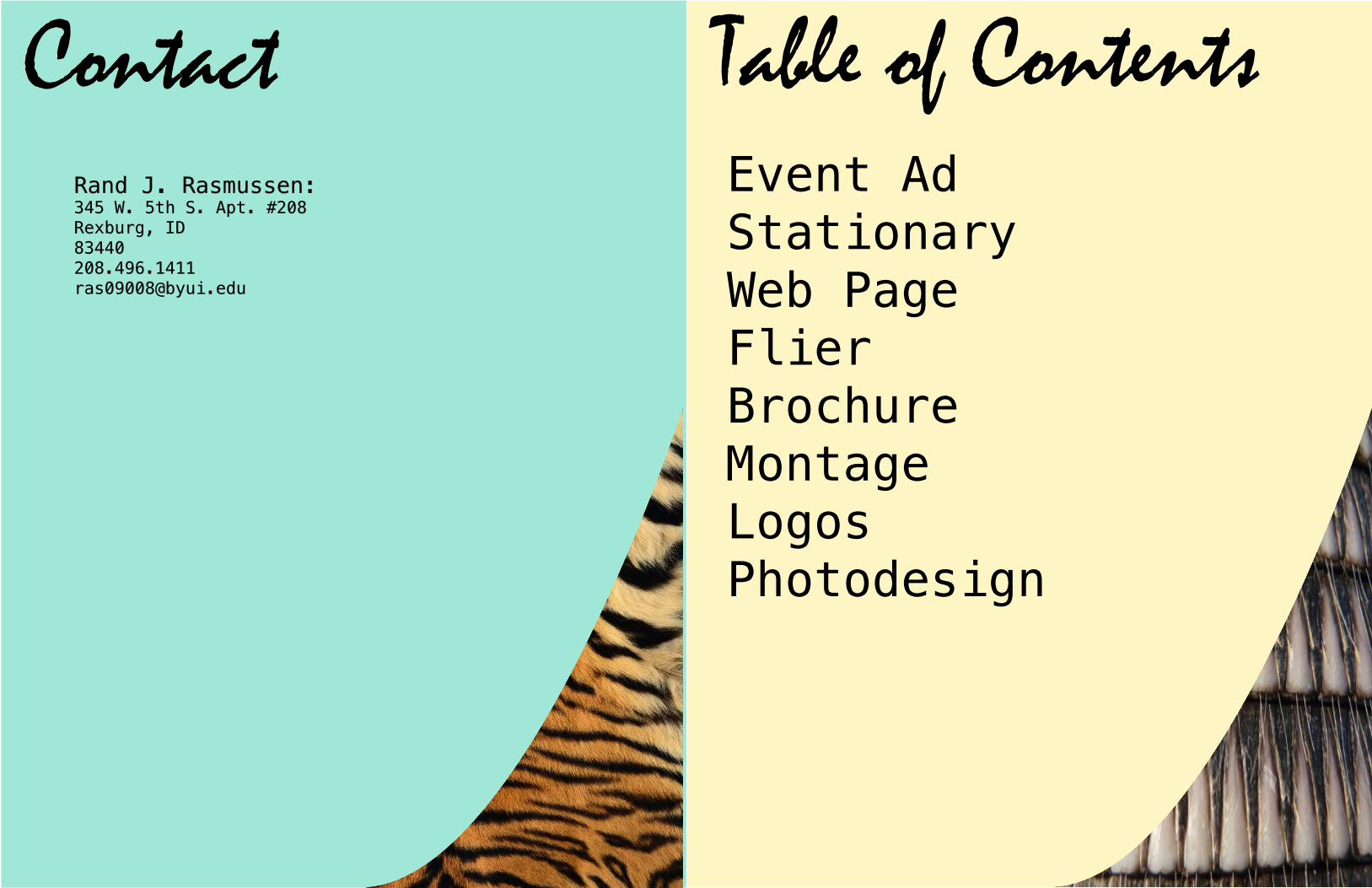
ContactRand J. Rasmussen:345 W. 5th S. Apt. #208Rexburg, [email protected]
Table of ContentsEvent AdStationaryWeb PageFlierBrochureMontageLogosPhotodesign
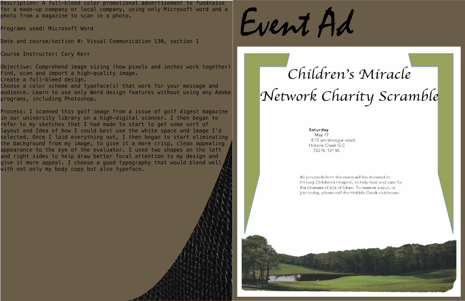
Event AdDescription: A full-bleed color promotional advertisement to fundraise for a made-up company or local company, using only Microsoft word and a photo from a magazine to scan in a photo.
Programs used: Microsoft Word
Date and course/section #: Visual Communication 130, section 1
Course Instructor: Cory Kerr
Objective: Comprehend image sizing (how pixels and inches work together)Find, scan and import a high-quality image.Create a full-bleed design.Choose a color scheme and typeface(s) that work for your message and audience. Learn to use only Word design features without using any Adobe programs, including Photoshop.
Process: I scanned this golf image from a issue of golf digest magazine in our university library on a high-digital scanner. I then began to refer to my sketches that I had made to start to get some sort of layout and Idea of how I could best use the white space and image I’d selected. Once I laid everything out, I then began to start eliminating the background from my image, to give it a more crisp, clean appealing appearance to the eye of the evaluator. I used two shapes on the left and right sides to help draw better focal attention to my design and give it more appeal. I choose a good typography that would blend well with not only my body copy but also typeface.
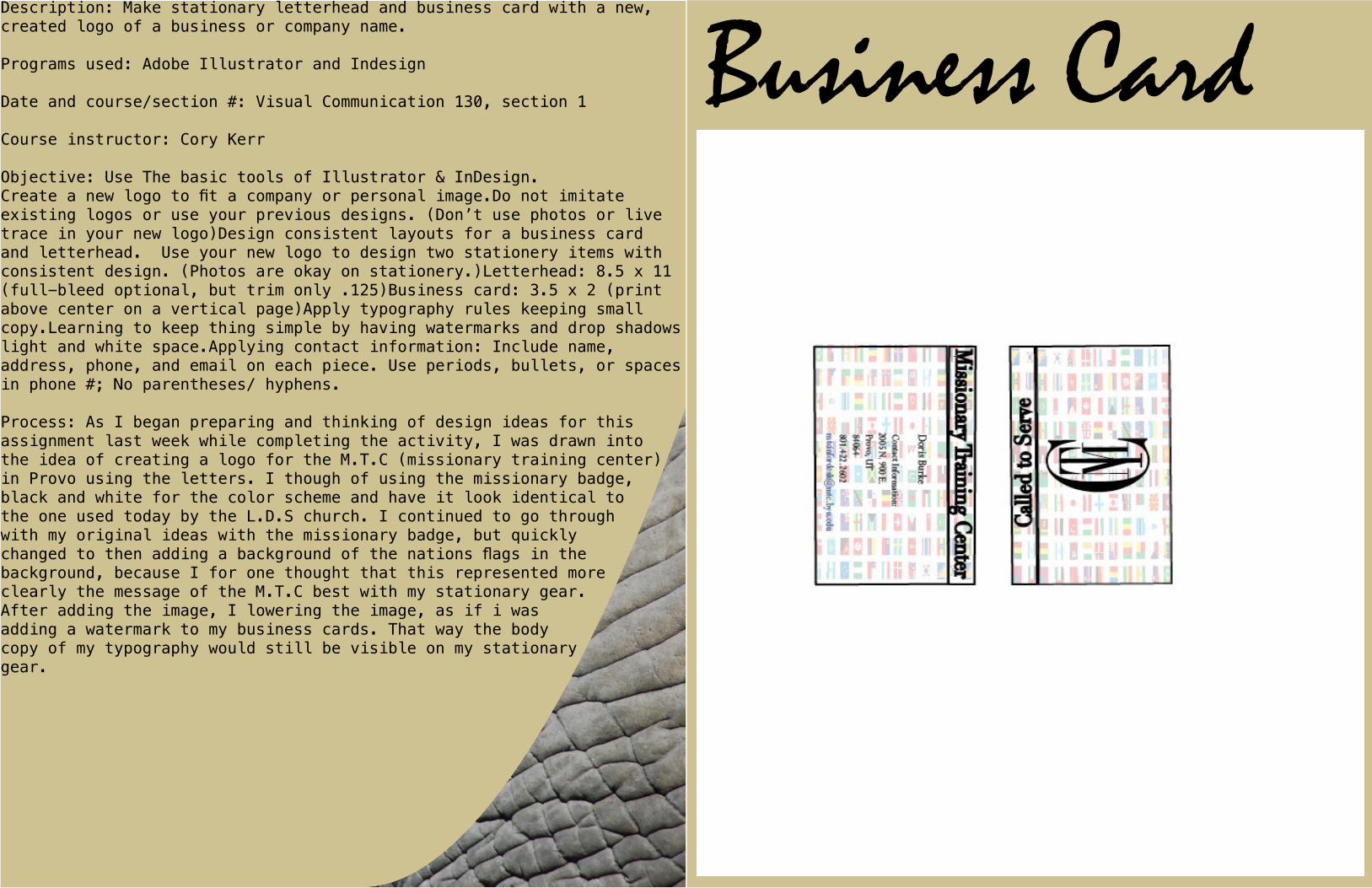
Business CardDescription: Make stationary letterhead and business card with a new, created logo of a business or company name.
Programs used: Adobe Illustrator and Indesign
Date and course/section #: Visual Communication 130, section 1
Course instructor: Cory Kerr
Objective: Use The basic tools of Illustrator & InDesign.Create a new logo to fit a company or personal image.Do not imitate existing logos or use your previous designs. (Don’t use photos or live trace in your new logo)Design consistent layouts for a business card and letterhead. Use your new logo to design two stationery items with consistent design. (Photos are okay on stationery.)Letterhead: 8.5 x 11 (full-bleed optional, but trim only .125)Business card: 3.5 x 2 (print above center on a vertical page)Apply typography rules keeping small copy.Learning to keep thing simple by having watermarks and drop shadows light and white space.Applying contact information: Include name, address, phone, and email on each piece. Use periods, bullets, or spaces in phone #; No parentheses/ hyphens.
Process: As I began preparing and thinking of design ideas for this assignment last week while completing the activity, I was drawn into the idea of creating a logo for the M.T.C (missionary training center) in Provo using the letters. I though of using the missionary badge, black and white for the color scheme and have it look identical to the one used today by the L.D.S church. I continued to go through with my original ideas with the missionary badge, but quickly changed to then adding a background of the nations flags in the background, because I for one thought that this represented more clearly the message of the M.T.C best with my stationary gear. After adding the image, I lowering the image, as if i was adding a watermark to my business cards. That way the body copy of my typography would still be visible on my stationary gear.
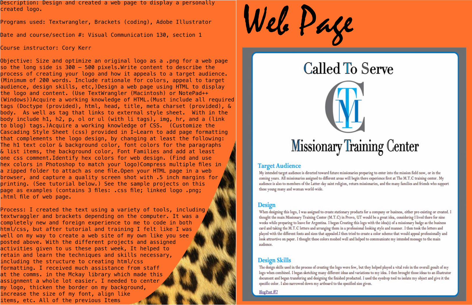
Web PageDescription: Design and created a web page to display a personally created logo.
Programs used: Textwrangler, Brackets (coding), Adobe Illustrator
Date and course/section #: Visual Communication 130, section 1
Course instructor: Cory Kerr
Objective: Size and optimize an original logo as a .png for a web page so the long side is 300 – 500 pixels.Write content to describe the process of creating your logo and how it appeals to a target audience. (Minimum of 200 words. Include rationale for colors, appeal to target audience, design skills, etc,)Design a web page using HTML to display the logo and content. (Use TextWrangler (Macintosh) or NotePad++ (Windows))Acquire a working knowledge of HTML.(Must include all required tags (Doctype (provided), html, head, title, meta charset (provided), & body. As well as tag that links to external style sheet. With in the body include h1, h2, p, ol or ul (with li tags), img, hr, and a (link to blog) tags.)Acquire a working knowledge of CSS. (Customize the Cascading Style Sheet (css) provided in I-Learn to add page formatting that complements the logo design, by changing at least the following: The h1 text color & background color, font colors for the paragraphs & list items, the background color, Font Families and add at least one css comment.Identify hex colors for web design. (Find and use hex colors in Photoshop to match your logo)Compress multiple files in a zipped folder to attach as one file.Open your HTML page in a web browser, and capture a quality screen shot with .5 inch margins for printing. (See tutorial below.) See the sample projects on this page as examples (contains 3 files: .css file; linked logo .png; .html file of web page.
Process: I created the text using a variety of tools, including textwraggler and brackets depending on the computer. It was a completely new and foreign experience to me to code in both html/css, but after tutorial and training I felt like I was well on my way to create a web site of my own like you see posted above. With the different projects and assigned activities given to us these past week, It helped to retain and learn the techniques and skills necessary, including the structure to creating html/css formatting. I received much assistance from staff at the comms. in the Mckay library which made this assignment a whole lot easier. I needed to center my logo, thicken the border on my background, increase the size of my font, align like items, etc. All of the previous Items
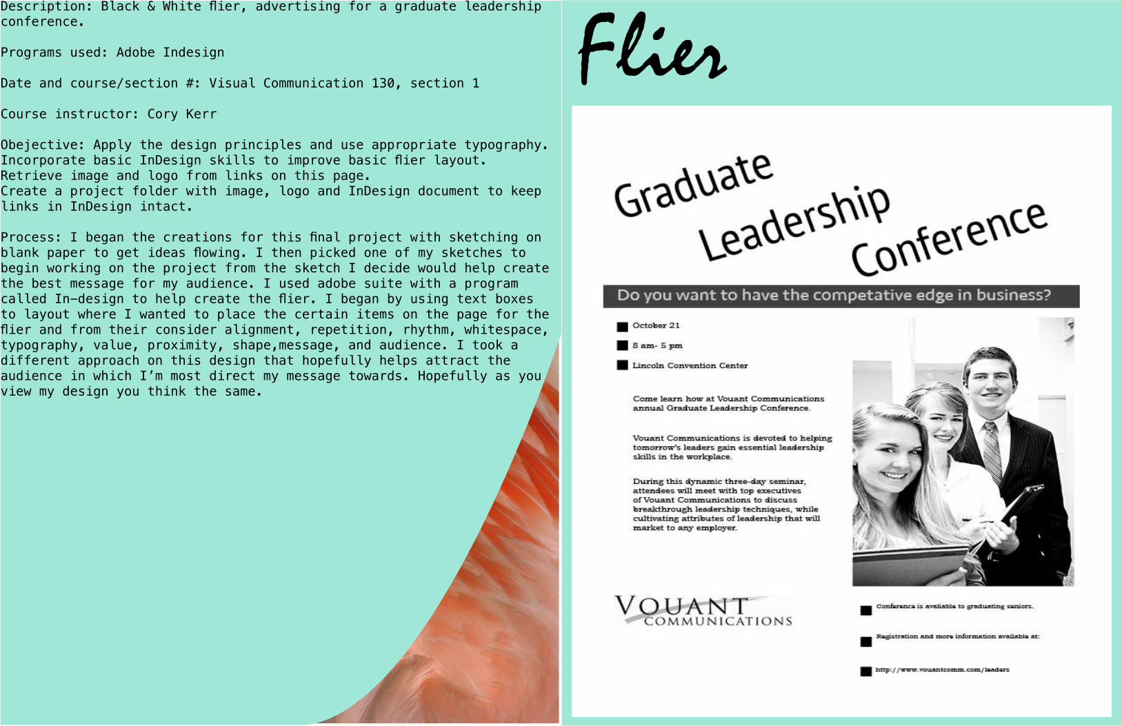
FlierDescription: Black & White flier, advertising for a graduate leadership conference.
Programs used: Adobe Indesign
Date and course/section #: Visual Communication 130, section 1
Course instructor: Cory Kerr
Obejective: Apply the design principles and use appropriate typography.Incorporate basic InDesign skills to improve basic flier layout.Retrieve image and logo from links on this page.Create a project folder with image, logo and InDesign document to keep links in InDesign intact.
Process: I began the creations for this final project with sketching on blank paper to get ideas flowing. I then picked one of my sketches to begin working on the project from the sketch I decide would help create the best message for my audience. I used adobe suite with a program called In-design to help create the flier. I began by using text boxes to layout where I wanted to place the certain items on the page for the flier and from their consider alignment, repetition, rhythm, whitespace, typography, value, proximity, shape,message, and audience. I took a different approach on this design that hopefully helps attract the audience in which I’m most direct my message towards. Hopefully as you view my design you think the same.
BrochureDescription: Create a two sided (duplex) brochure with at least one fold, for a company or business of our choice.
Programs used: Adobe Illustrator, Photoshop and Indesign.
Date and course/section #: Visual Communication 130, section 1
Course instructor: Cory Kerr
Objective: Set up and align a two-sided, folded document.Create an original company logo and use it in a brochure.Incorporate quality images. (Incorporate at least four quality images (Not including the logo). One should be clipped in Photoshop and text-wrapped in InDesign so the text follows the cutout shape of the image.Write at least 250 words of original copy with at least three paragraphs, headers, and subheaders.Trim for a full bleed and print in duplex (two-sided) color.
Process: To begin this process, I started out like I have with all the other design projects with pen and paper. I began sketching any ideas of a logo that came to my mind and hopefully coming up with an idea that I could work with. I then transfer my ideas on my sketch pad to adobe illustrator and ran with it. I used a axe, plaid and dark green and red color scheme as the design concepts to my logo. I was very impressed with the way my logo turned out in illustrator, especially with the way I was able to build and create an axe so realistically with the tools available. I used the pen tool to help add and subtract anchor points inside the object to refine and create the precise shape I was looking for in the axe. I also used the eraser tool to help remove excessive errors made that could easily be dealt with. I was able to use the pathfinder tool to place the plaid pattern design inside my inner circle, which was later on chosen to be a soiled color. I used the eye-dropper tool to help match and change colors within my logo.
I will insert a printed out copy of my brochure.
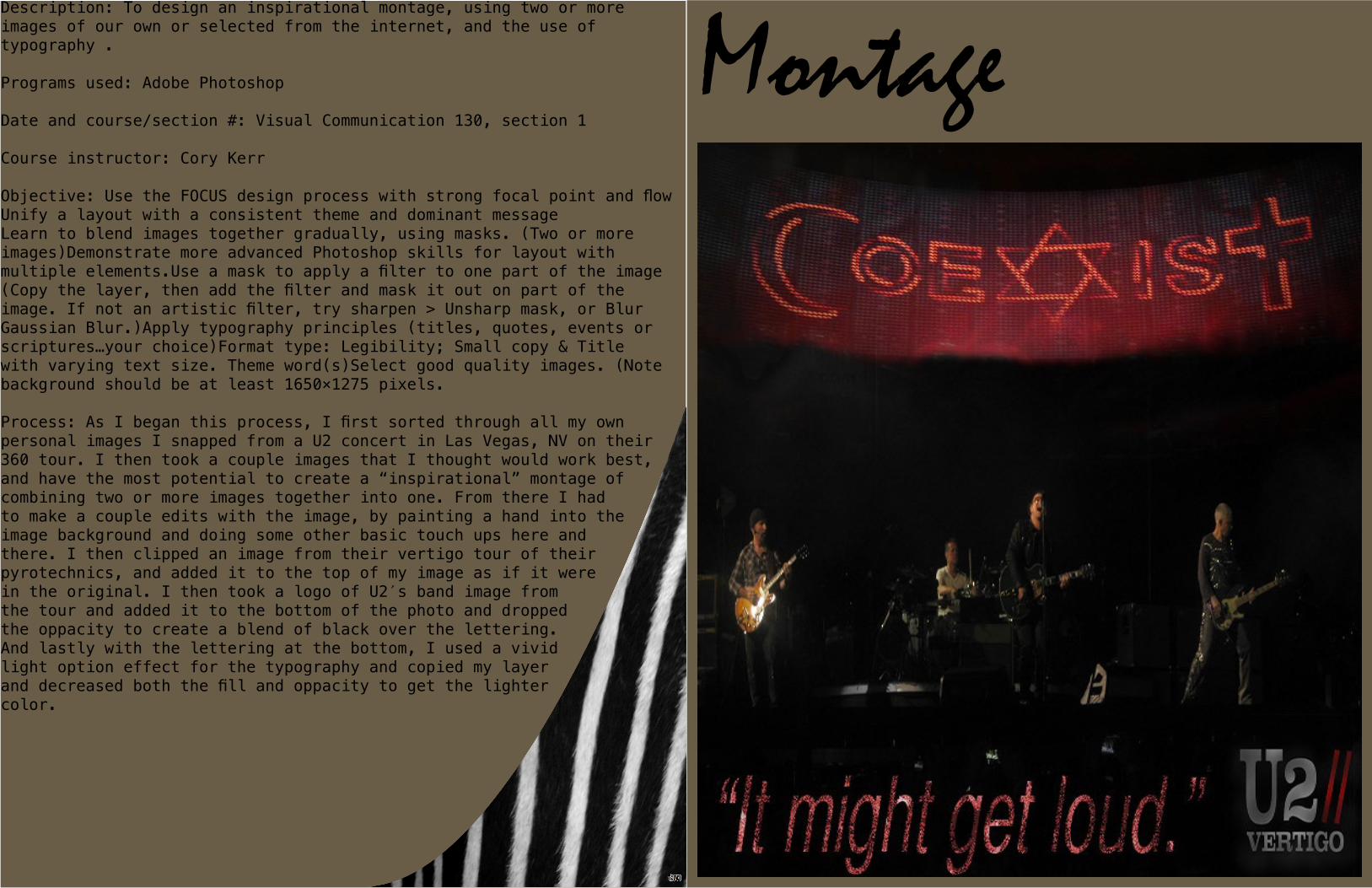
MontageDescription: To design an inspirational montage, using two or more images of our own or selected from the internet, and the use of typography .
Programs used: Adobe Photoshop
Date and course/section #: Visual Communication 130, section 1
Course instructor: Cory Kerr
Objective: Use the FOCUS design process with strong focal point and flowUnify a layout with a consistent theme and dominant messageLearn to blend images together gradually, using masks. (Two or more images)Demonstrate more advanced Photoshop skills for layout with multiple elements.Use a mask to apply a filter to one part of the image (Copy the layer, then add the filter and mask it out on part of the image. If not an artistic filter, try sharpen > Unsharp mask, or Blur Gaussian Blur.)Apply typography principles (titles, quotes, events or scriptures…your choice)Format type: Legibility; Small copy & Title with varying text size. Theme word(s)Select good quality images. (Note background should be at least 1650×1275 pixels.
Process: As I began this process, I first sorted through all my own personal images I snapped from a U2 concert in Las Vegas, NV on their 360 tour. I then took a couple images that I thought would work best, and have the most potential to create a “inspirational” montage of combining two or more images together into one. From there I had to make a couple edits with the image, by painting a hand into the image background and doing some other basic touch ups here and there. I then clipped an image from their vertigo tour of their pyrotechnics, and added it to the top of my image as if it were in the original. I then took a logo of U2′s band image from the tour and added it to the bottom of the photo and dropped the oppacity to create a blend of black over the lettering. And lastly with the lettering at the bottom, I used a vivid light option effect for the typography and copied my layer and decreased both the fill and oppacity to get the lighter color.
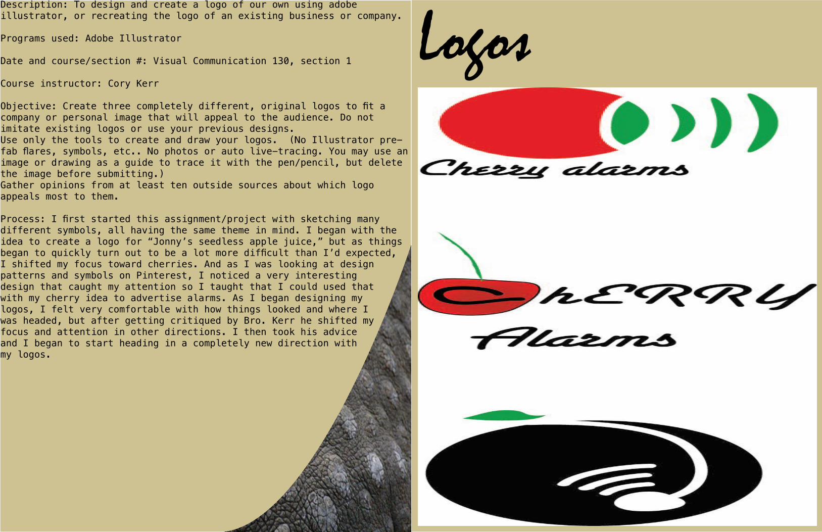
LogosDescription: To design and create a logo of our own using adobe illustrator, or recreating the logo of an existing business or company.
Programs used: Adobe Illustrator
Date and course/section #: Visual Communication 130, section 1
Course instructor: Cory Kerr
Objective: Create three completely different, original logos to fit a company or personal image that will appeal to the audience. Do not imitate existing logos or use your previous designs.Use only the tools to create and draw your logos. (No Illustrator pre-fab flares, symbols, etc.. No photos or auto live-tracing. You may use an image or drawing as a guide to trace it with the pen/pencil, but delete the image before submitting.)Gather opinions from at least ten outside sources about which logo appeals most to them.
Process: I first started this assignment/project with sketching many different symbols, all having the same theme in mind. I began with the idea to create a logo for “Jonny’s seedless apple juice,” but as things began to quickly turn out to be a lot more difficult than I’d expected, I shifted my focus toward cherries. And as I was looking at design patterns and symbols on Pinterest, I noticed a very interesting design that caught my attention so I taught that I could used that with my cherry idea to advertise alarms. As I began designing my logos, I felt very comfortable with how things looked and where I was headed, but after getting critiqued by Bro. Kerr he shifted my focus and attention in other directions. I then took his advice and I began to start heading in a completely new direction with my logos.
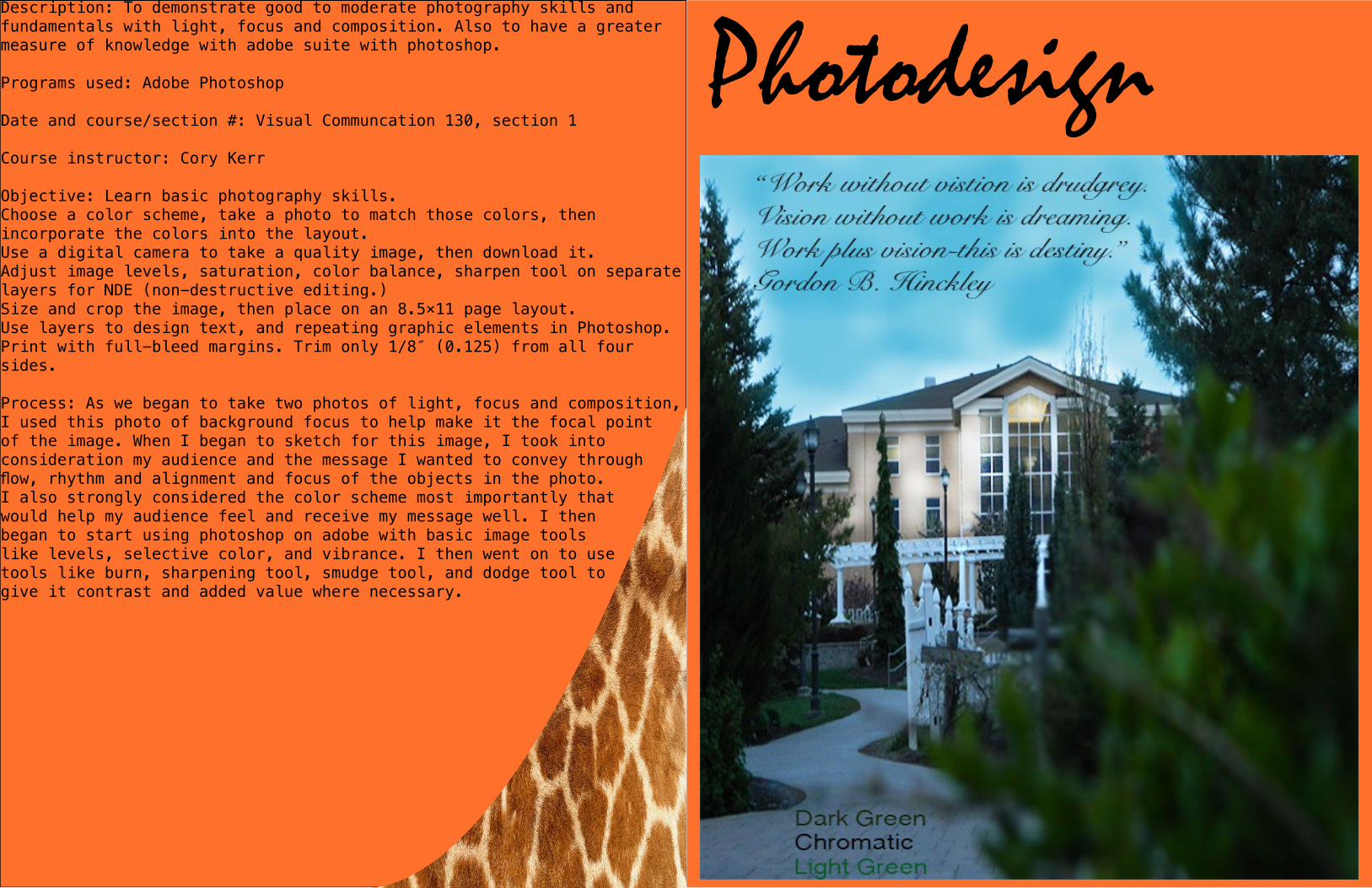
PhotodesignDescription: To demonstrate good to moderate photography skills and fundamentals with light, focus and composition. Also to have a greater measure of knowledge with adobe suite with photoshop.
Programs used: Adobe Photoshop
Date and course/section #: Visual Communcation 130, section 1
Course instructor: Cory Kerr
Objective: Learn basic photography skills.Choose a color scheme, take a photo to match those colors, then incorporate the colors into the layout.Use a digital camera to take a quality image, then download it.Adjust image levels, saturation, color balance, sharpen tool on separate layers for NDE (non-destructive editing.)Size and crop the image, then place on an 8.5×11 page layout.Use layers to design text, and repeating graphic elements in Photoshop.Print with full-bleed margins. Trim only 1/8″ (0.125) from all four sides.
Process: As we began to take two photos of light, focus and composition, I used this photo of background focus to help make it the focal point of the image. When I began to sketch for this image, I took into consideration my audience and the message I wanted to convey through flow, rhythm and alignment and focus of the objects in the photo. I also strongly considered the color scheme most importantly that would help my audience feel and receive my message well. I then began to start using photoshop on adobe with basic image tools like levels, selective color, and vibrance. I then went on to use tools like burn, sharpening tool, smudge tool, and dodge tool to give it contrast and added value where necessary.